Aesthetic White SW 7035
Sherwin-WilliamsA top-rated off-white paint color with a soft base, resembling the lightest greige variation that radiates comfort, style, and of course, an aesthetically pleasing feel.
Aesthetic White (SW 7035): what color is, review, and use
White is definitely the most popular category when referring to interior and exterior design. We simply cannot deny its timelessness that works for any style. Still, the range of white shades that manufacturers come with is so wide that one can easily get overwhelmed. This is why we write paint color reviews, and today, we would like to reveal a renowned white paint color with the inspiring name Aesthetic White by Sherwin-Williams.
The fact that it is part of the Top 50 Colors collection is a reliable reason to believe that SW 7035 is a popular shade. What hides behind such a promising name? Generally speaking, Aesthetic White is a soft off-white giving the slightest beige vibe. It is far beyond the aesthetics only. Let’s dive into details!
Aesthetic White paint color features
As the name implies, the popular shade of white from Sherwin-Williams replicates a perfect variation of the kind that looks visually appealing. It is definitely not a stark white. On the contrary, the slight beige and gray traces make it reach a refined level. Still a white shade, Aesthetic White is often referred to as the finest mix of beige and gray, all due to its soft appearance. If bright whites are not your thing, the first shade that serves as beautifully yet with more body to it is undoubtedly SW 7035.
Aesthetic White: is it warm or cold?
What if we revealed another secret? The appealing white that has taken the lead at Sherwin-Williams is also referred to as light beige. This practically answers the question about the color temperature. Aesthetic White is a warm paint color, and a space painted this way feels impressively welcoming.
How does lighting affect Aesthetic White?
This is when gray and beige particles take the lead separately. One should consider that the light greige variation loses a bit from its range of undertones when bathed in direct natural light. What happens when different exposures enter the game? Aesthetic White reveals the gray notes in rooms with northern exposure, and the color itself acquires a coolish surface. On the other side, SW 7035 let the beige hint of color prevail over its appearance in south-facing spaces, providing a promising warm vibe.
Aesthetic White LRV
This is actually one of the most important features one should consider about a paint color since it renders relevant information about how light or dark a shade is and how it behaves towards lighting. In this case, the refined white shade reaches a Light Reflectance Value of 73, which is pretty low in contrast with true white variations with an LRV of 100. The relatively intense undertones explain why. Although absorbing a substantial part of the light that penetrates the space, Aesthetic White is no less skilled at reflecting it back, serving as a perfect alternative for bright whites when it comes to rooms that overwise feel too dark.
Aesthetic White undertones
One answer flows from the other. Considering that Aesthetic White seems light greige, there is no doubt gray and beige undertones penetrate it. Frankly speaking, it defines the almost unnoticeable line between the two for a paint color that doesn’t gravitate towards either of these sides – a perfect mix of gray and beige. Still, particular lighting conditions make this shade feel one way or another.
Similar colors
It is no surprise Aesthetic White has many cousins both at SW and other brands when white is so popular. Still, the slightest change of undertones leads to different paint colors. Nevertheless, there are a few shades that can safely be called alternatives to SW 7035, and we would like to make you acquainted with them.
Coordinating colors
As usual, we refer to trim color first. You may probably wonder if combining one shade of white with another and preserving contrast is possible. It is when one considers a variation closer to the bright side for the trim. As regards the rest, the attractive white from SW works with various colors due to its neutrality. True shades of blue, blue-green variations, more intense greiges, other neutrals, and even a few accents, such as warm pink or stark black, are among its favorites. Let’s see what colorists suggest!
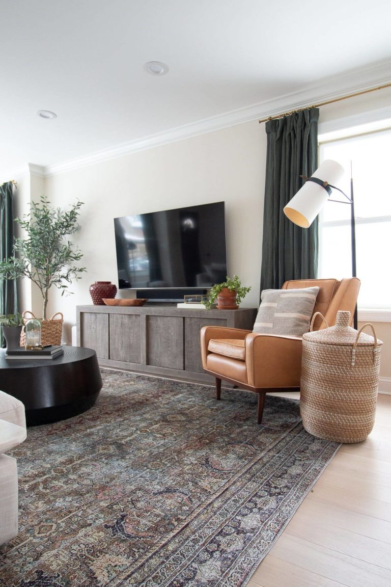
Use of Aesthetic White in the interior
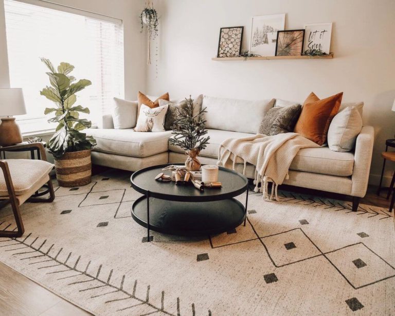
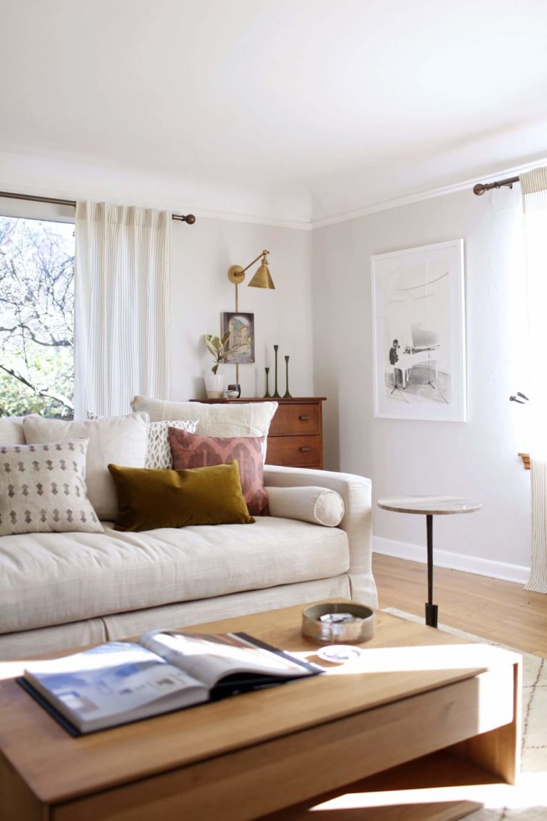
First of all, this close-to-the-heart shade is relatively neutral, which means it pairs well with accents. Still, a monochromatic palette with Aesthetic White as a base feels no less appropriate. When referring to texture, this white shade likes to play with wood for an enhanced warm environment that radiates comfort. The list goes on, and you are free to paint with almost any shade on this classic canvas. We would like to inspire you with a bunch of design ideas implying this timeless shade. Take a look!
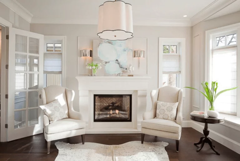
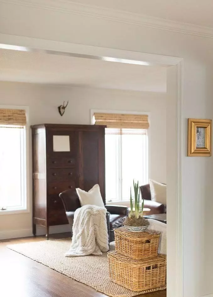
Timeless white and wood texture
Regardless of what type of wood we speak about, Aesthetic White is always a good option for a companion. In south-facing spaces, where it reveals its warm notes, the connection between SW 7035 and wood is irreplaceable, radiating a cozy feel. On the other side, in north-facing rooms, where it brings the gray scents to the surface, the wood texture perfectly contrasts the cool sense of neutrality. Be it any style and any space, the timeless white and wood pairing is a no-fail option.
Versatile base color for any living design
The living space is one of the best rooms to experiment with styles and find the one that defines your personality. Luckily, with such base colors as Aesthetic White, everything is possible. A Mid-Century inspired interior with Modern traces? A monochromatic palette with a splash of white shades? A comfy Farmhouse interior with a contemporary air? Literally, anything you want, and SW 7035 will keep pace.
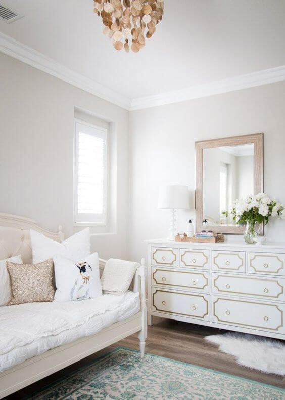
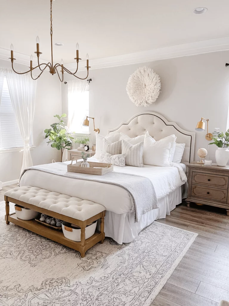
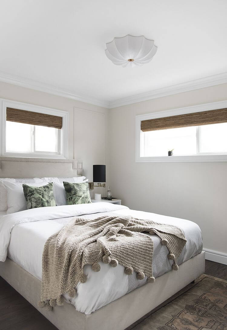
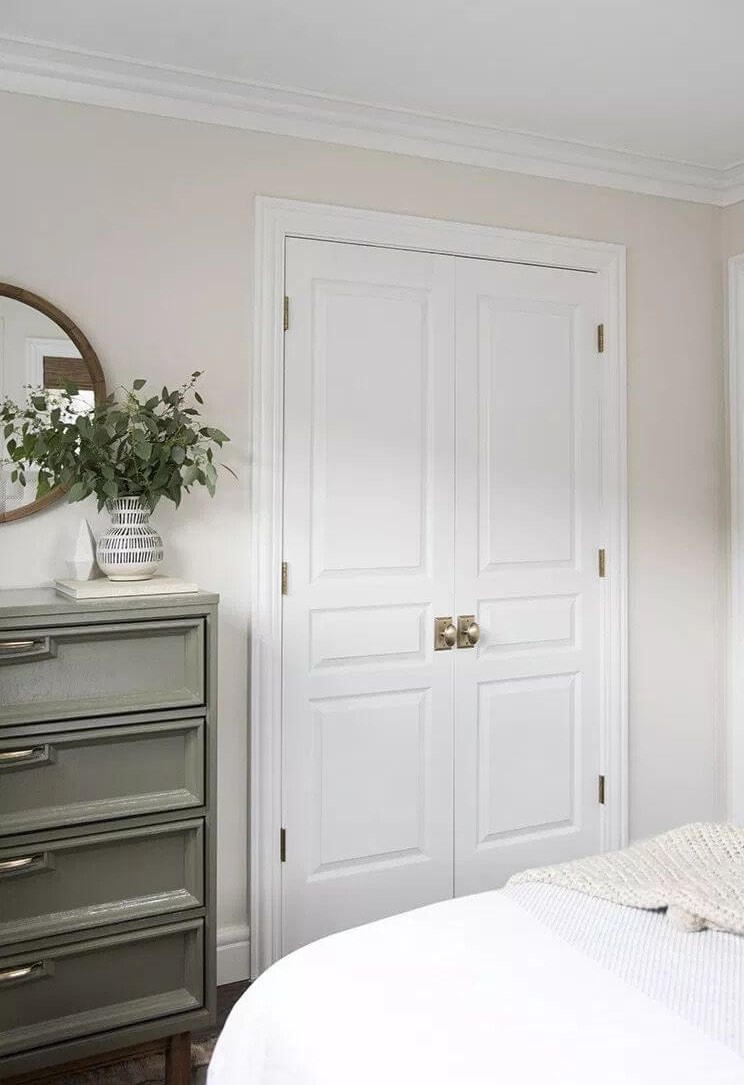
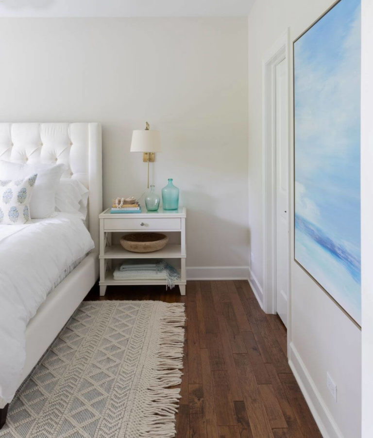
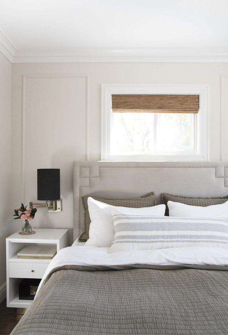
Bedroom with a Modern appeal
Add character to your personal space by working with colors and textures that feel close to your personality. Of course, SW 7035 will serve as a background color, coming with a benefit – a slight touch of Modern sleekness due to its neutral base. Keep it all-white with slight pops of color for the bedding. Go fully Farmhouse with lots of wood texture. Add the softest shades and textures to keep it as comfy as possible. Again, the list of design solutions is wide enough to cover any preferences. Let your imagination play its magic on the light greige background!
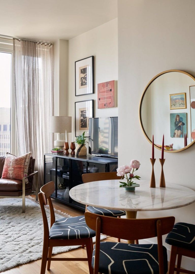
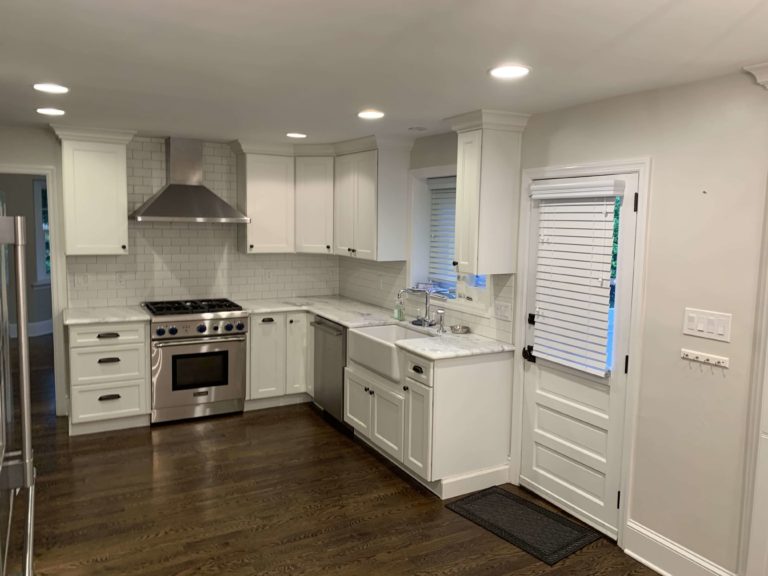
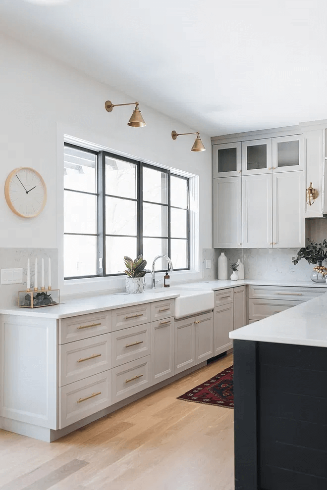
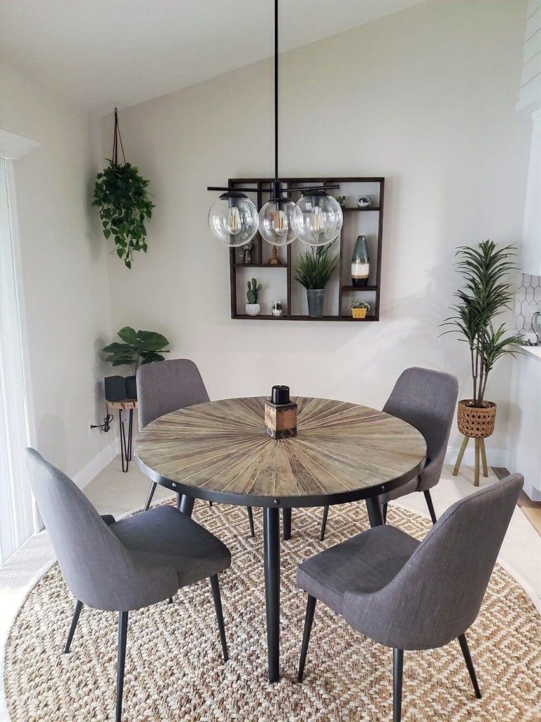
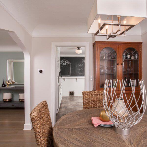
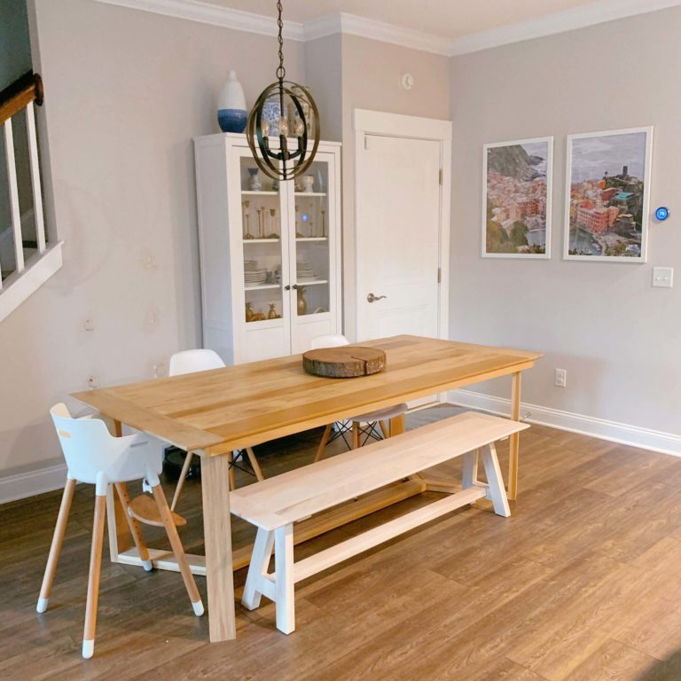
Kitchen and dining room
It cannot be any easier – paint either the walls or kitchen cabinets in this flexible shade of white, and it will do the rest. Consider a brighter white for the backdrop when going with cabinets painted in SW 7035. On the other hand, if painting the walls feels closer to you, consider any shade you want for the cabinets. That’s right! Go with the boldest accents for a unique result!
In the dining area, Aesthetic White goes courageously for the walls and leaves lots of space for wood pieces of furniture so that every time you take a meal, you feel at peace surrounded by familiar sources of comfort.
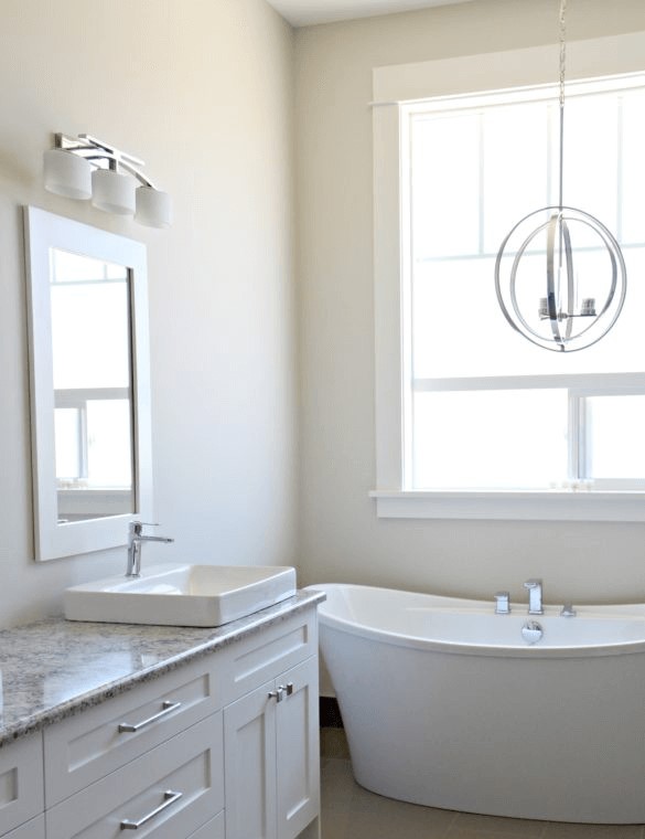
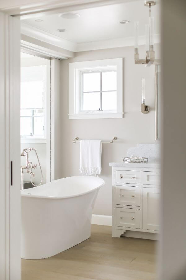
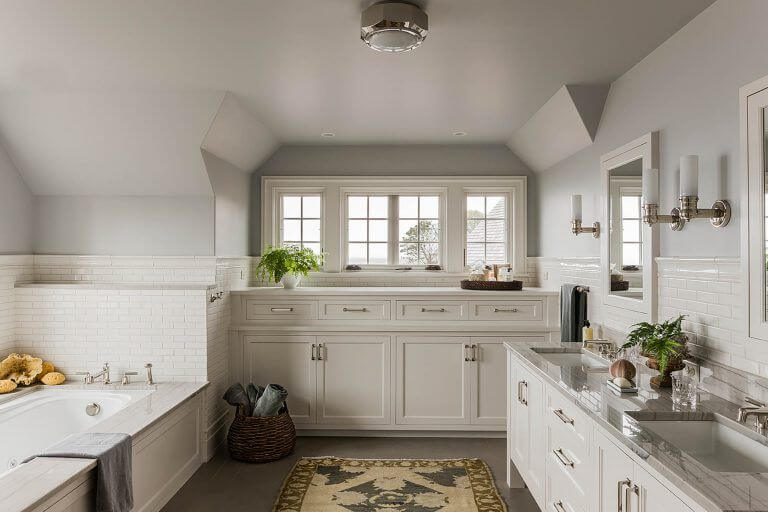
Aesthetically pleasing bathroom
If you always wanted to go for an all-white bathroom, but you were afraid it would seem too stark, now you can safely opt for this design solution with Aesthetic White. You can either paint the walls in the appealing light greige and opt for brighter white cabinetry or the opposite. The clean effect will be preserved, while the environment will not feel overly cool.
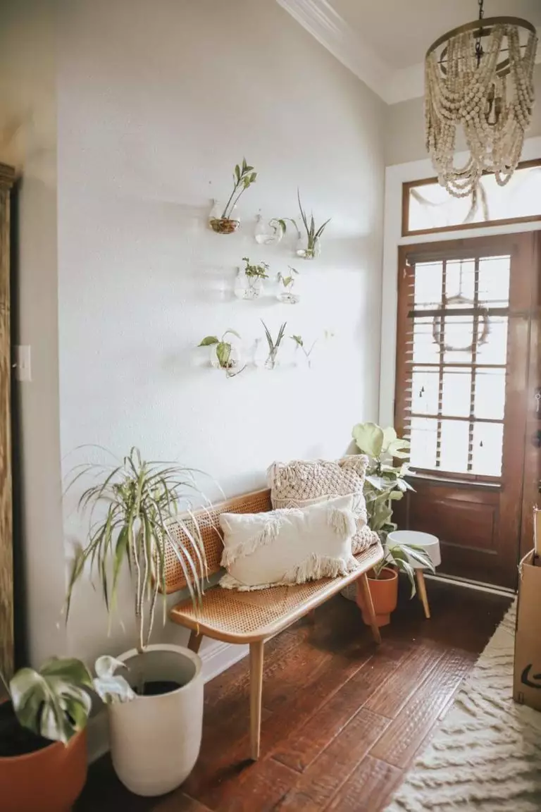
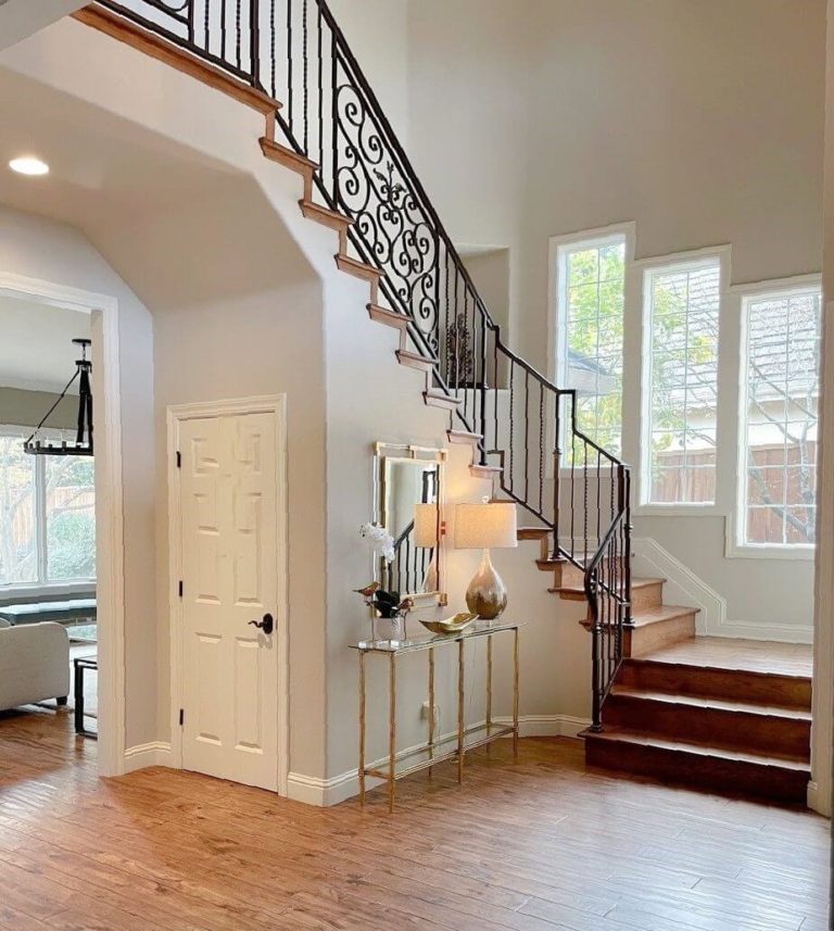
Inviting hallway
Slightly formal yet full of welcoming notes, Aesthetic White is your go-to paint color for the walls in the hallway if the mix of neutrality and subtle comfort sounds perfect to you. Next comes the most important part – with dark wood as a companion, you will ensure a classic look with a contemporary appeal; with light wood, your interior will feel more spacious and modern; with a few greeneries, you will stylishly dilute the palette.
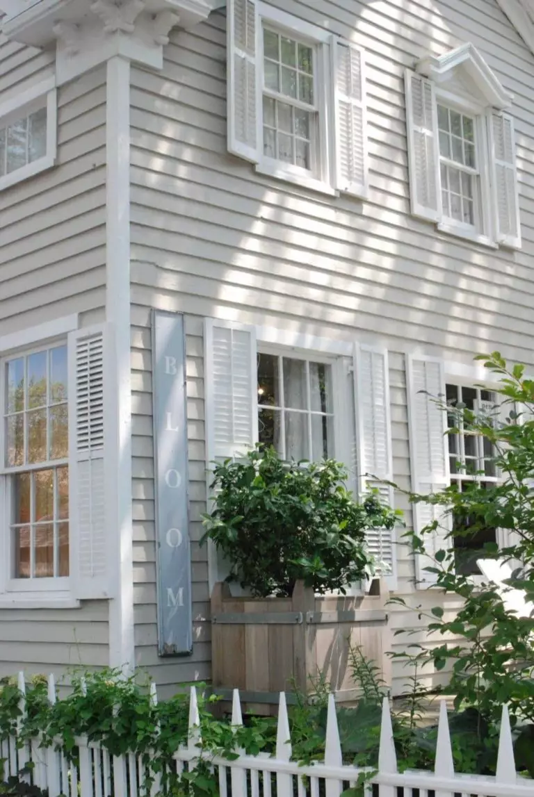
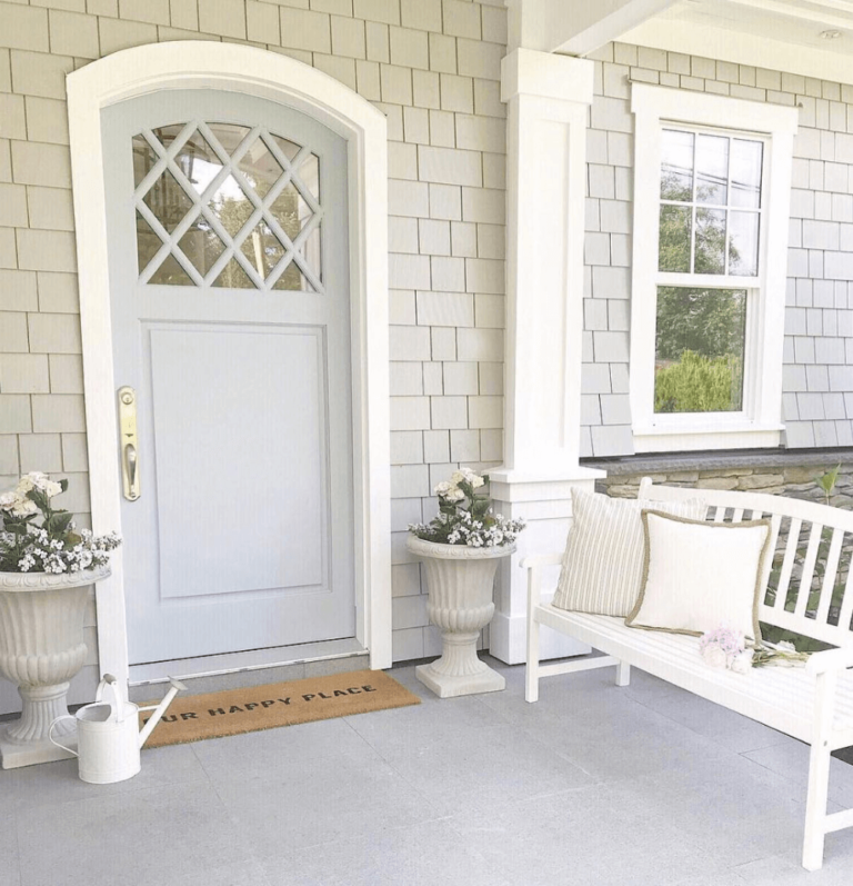
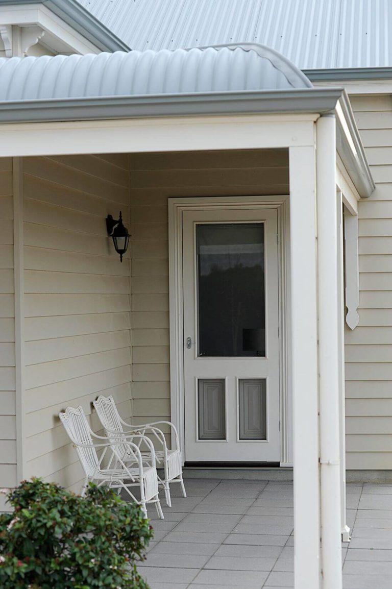
Use of Aesthetic White for the house exterior
Do you fancy an aesthetically pleasing exterior so that the passers-by turn their heads every time your house arises on the horizon? We bet you do. As the name implies, SW 7035 can elevate your exterior to such a level. One should consider that Aesthetic White looks particularly well on wood walls, and it tends to change the way it looks under particular conditions.
The Aesthetic White SW 7035 paint that colorists from Sherwin-Williams came up with is one of the top-rated shades that designers cannot give up on and homeowners don’t get tired of. A perfect alternative for stark white shades, this light mix of gray and beige brings the right amount of comfort and neutrality that one can only dream of.
