Agreeable Gray SW 7029
Sherwin-WilliamsA warm shade of gray, and its pronounced beige undertones are quite a reliable explanation.
Agreeable Gray (SW 7029): what color is, review, and use
Another color review article, another shade of gray, but what a shade! The number one selling color at Sherwin-Williams, Agreeable Gray, is at its top of popularity and doesn’t seem to leave the scene for a long time. It is an outstanding greige, which means that it has a bit of both gray and beige. Its originality results from this particular contrast – a balanced pairing between a coolish and a warm shade that led to an exceptionally versatile and mesmerizing color.
Gray shades have been prevailing over interior design solutions for the last few years, and by gray, we mean true shades of gray devoid of any standout undertones. Nevertheless, the 2020 events completely changed the perception. Considering that people spent a substantial amount of time at home, which some still are, they were looking to fill their spaces with warmth and comfort while preserving the neutrality only a shade of gray can provide. This was when greige took the leading role, and one of the favorite shades in this sense is Agreeable Gray. Homeowners still wonder whether this color will be popular in 2022, and designers hasten to assure them that greige shades are now popular more than ever, particularly the defining color of this category – Agreeable Gray.
The number of interiors that have already integrated this color is a reliable reason to call this unique shade from Sherwin-Williams one of the most popular colors, and we do not limit our statement to the gray category only. We are sure you would like to know what makes this color so special, and there is no better way to answer your question than by diving deep into its features. Let’s take a narrower look at Agreeable Gray and reveal its secrets for gaining so much popularity!
Agreeable Gray paint color features
This charming color from Sherwin-Williams is indeed a shade of gray, as the name implies, although one cannot deny its neutral combination of gray and beige that reaches the level of perfection due to its ability to add an airy feeling, to stay true to its values while adapting to particular situations, to enrich the space with coziness, and not the least, to fill the interior with an exquisite sense of beauty.
What do experts at Sherwin-Williams have to say about their most popular color? The director of Color Marketing, Sue Wadden, stated that SW 7029 is a favorite since it serves as a canvas for homeowners, who can add their own touches by means of decor. Furthermore, one cannot simply overlook the versatility of this shade, particularly when everybody is looking for ways to integrate several areas in the same space, such as the living room that can also include a mini home-office and the kids’ playing space. Luckily, Agreeable Gray is this shade that makes it possible.
Among other defining features we referred to, this shade is also part of the chameleon colors. It is extremely friendly towards other shades and very cooperative in various conditions, adapting to every situation in part. No wonder it is so popular when it has such a wide arsenal of positive features. There is more to it! Let’s dive deeper into its peculiarities!
Agreeable Gray: is it warm or cold?
It is definitely a warm shade of gray, and its pronounced beige undertones are quite a reliable explanation. A single glance at this color will hypnotize you with its appealingly soft notes that cannot help but spread all over the space. No other greige feels this welcoming, pleasant for the eye, and surprisingly calming the way Agreeable Gray does. Sometimes, it is even hard to explain what stands behind such impressive features since this color can change its appearance in different conditions. One thing we know for sure: homeowners and designers fall in love with every variation of it, which means that it is probably all about the perfect combination between gray and beige that stays the same in any situation.
How does lighting affect Agreeable Gray?
Lighting is one of the factors that influence the appearance of this color. There is no doubt that daylight offers it the possibility to bloom in its entire beauty and reveal the whole range of undertones. Once artificial lighting takes the leading role, regardless if it has warm or cool notes, Agreeable Gray does not cease to impress with its quite refreshing features but, most of all, soft scents that simply make you fall in love with their appealing effect. Some may say it seems like you are surrounded by a cocoon feel that ensures your comfort and safety inside your house borders.
Let’s analyze the effect of daylight from a narrow perspective! Northern light is rather cool and emphasizes the gray basis of this color, making it seem cooler. If we speak about a south-facing room, one should note that daylight will bring out the beige undertones, offering this shade the possibility to reveal its full warming potential. What about the east and west-facing rooms? One should pay attention to the particular time of the day. Eastern light is warmer in the morning and cooler in the evening, while western light supposes the opposite. Therefore, you should play with artificial light to achieve the wanted effect.
Agreeable Gray LRV
For those unfamiliar with the term, LRV (light reflectance value) is a figure that shows how light or dark a color is, based on a scale from 0 to 100. Therefore, the closer the color is to 100, the lighter it is, working the opposite way for dark colors.
Now, let’s get back to Agreeable Gray! It reaches a value of 60, which makes it a light color that stands at the border between medium tones and true light shades, being directed more towards the former. The neutral gray notes are responsible for the brightening effect that stands behind the ability of this color to reflect a substantial amount of light, while the soft beige undertones play down this refreshing feature, reducing a bit its reflectance ability, although compensating for it with its comfy effect.
Agreeable Gray undertones
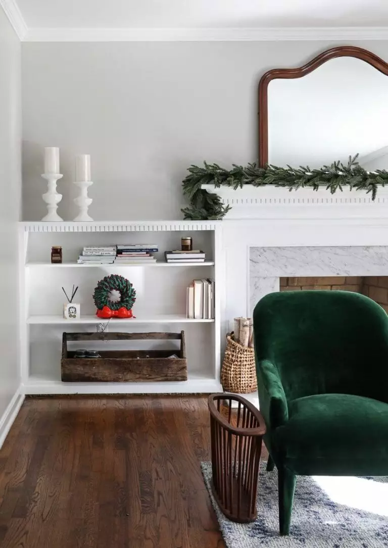
Do you still wonder what the undertones of this color are? Undoubtedly, beige has a leading role in this sense, reaching a quite even contrast, although gray still prevails. Nevertheless, during the night and under the effect of warm artificial light, the almost yellowish beige undertones will spread all over the surface of this shade, radiating a sense of appealing comfort and ease, so pleasant and calming that you will simply not want to leave a space in which this color prevails. There is still one secret to be revealed. Agreeable Gray is also penetrated by subtle green undertones noticed in particular conditions. Of course, how this color would read depends on the surroundings.
Similar colors
Undoubtedly, there is a sea of greige variations that share some particular features with Agreeable Gray. Still, nothing compares with the exquisite sense of flair only this color can provide, although the other shades come with unique characteristics as well. The color palette of this kind is quite wide at Sherwin-Williams, which we will refer to, although other paint manufacturers are not to be overlooked when speaking about such a popular shade. Let’s dive into the world of greige shades!
Coordinating colors
Agreeable Gray stays true to its versatility within any style and is ready to cooperate with shades from different categories, preserving the harmony or serving as a background. Therefore, it will surely suit any interior and meet your preferences. Its ability to work efficiently with other colors is one of the reasons this shade is so popular. Experts suggest pairing Agreeable Gray with classic neutral shades such as black and white or off-white, among which is ivory and cream, soothing variations of brighter colors, and bold accents, among which blue and pink, all of which can be found at Sherwin-Williams. Let’s get more specific!
Use of Agreeable Gray in interior
After going such a long adventure through the world of this color, there is no way we could doubt the integration of Agreeable Gray into any style. What about the rooms? Well, there is not a room this shade would not look appropriate in. Now, it is really clear why so many homeowners consider this particular color for their interior; there is no way you could go wrong with it. Still, let’s go through some design solutions and analyze how this shade works when put into practice!
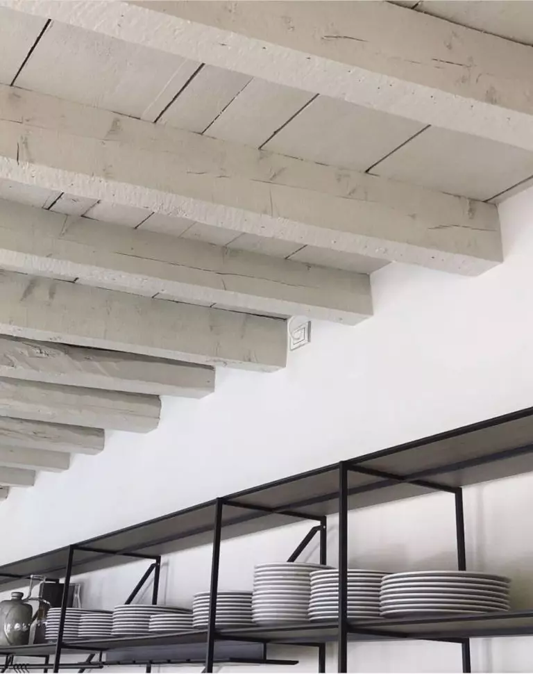
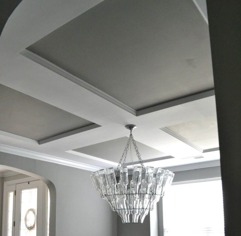
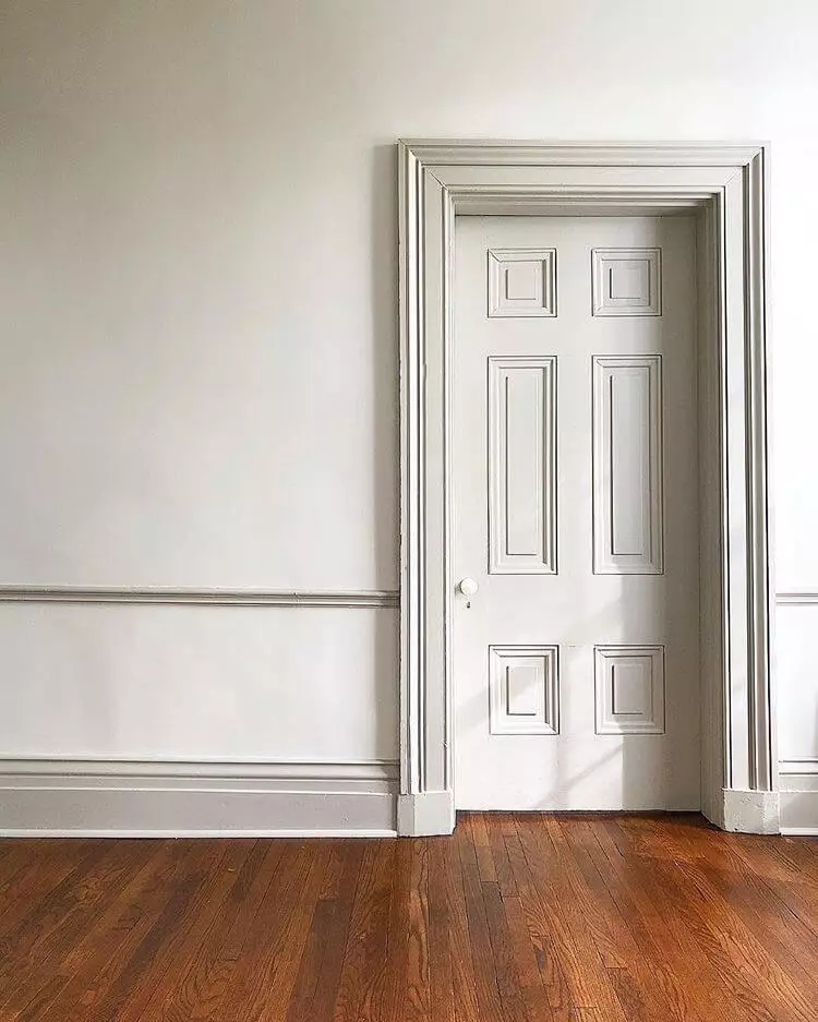
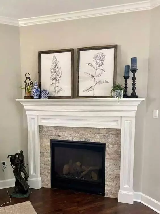
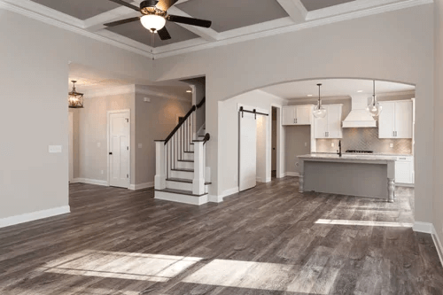
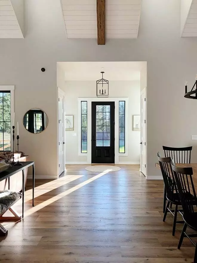
Ceiling and trim
We usually refer to walls when tackling the integration of a particular shade into the interior. Still, Agreeable Gray is so versatile that it can be as easily applied to such details as ceiling and trim. Accompany them with a lighter background and let the gray and beige notes make a fairytale out of your interior. Even a small splash of this color will enrich your living room, bedroom, or any other room with an appropriate amount of comfort. Applying Agreeable Gray to the ceiling will substantially enhance coziness, while a similar approach to the trim will add a sense of exquisite taste and a contemporary feel to the environment.
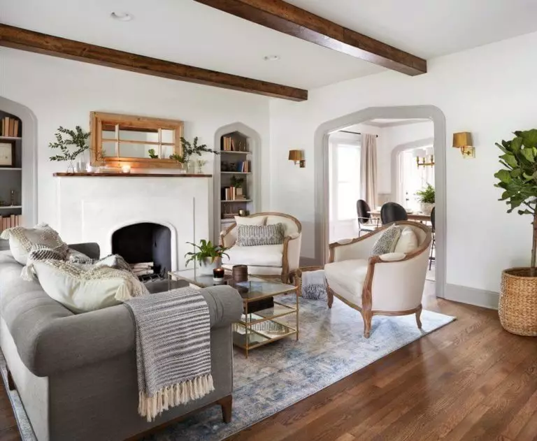
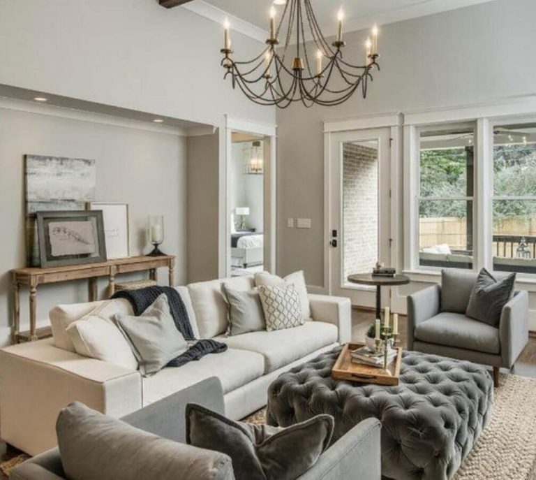
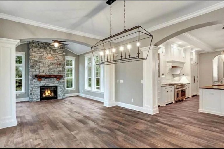
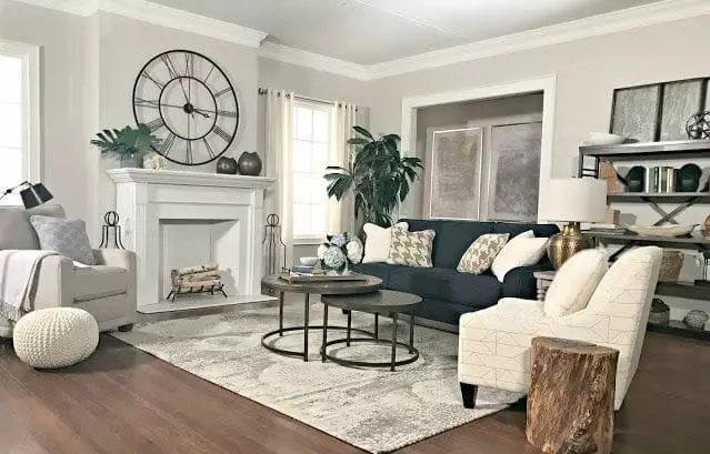
Living room
You can use this color as a background for your wildest design ideas. Add colors, texture, a bit of originality, and don’t forget to accompany them all with Agreeable Gray, and your living room will reach a whole new level. Although you are free to choose the companions for this color, designers who have already worked with this shade suggest to pair it either with white or wooden texture, even considering it all at once. Such an approach will surely suit a Modern Farmhouse interior that strives for comfort at the highest level, which, luckily, Agreeable Gray is happy to provide it with. Nevertheless, a neutral like that is a must in contemporary settings that usually lack an extra sense of comfort. Guess what! SW 7029 will keep you on the safe side here as well.
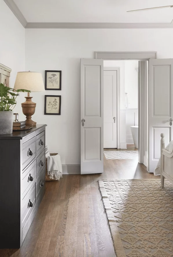
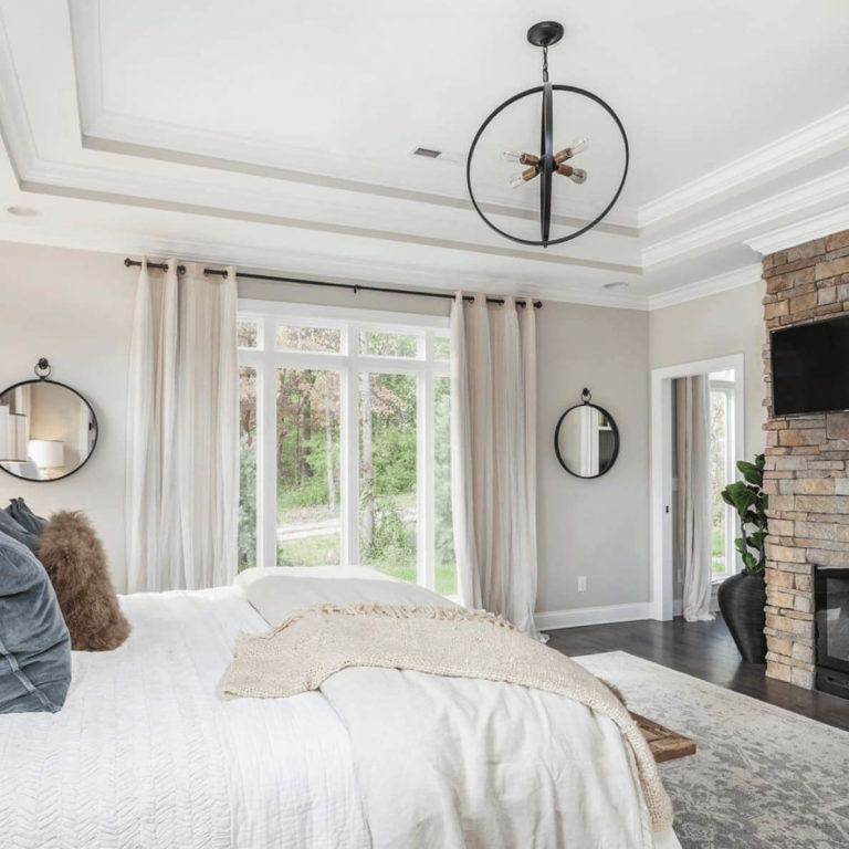
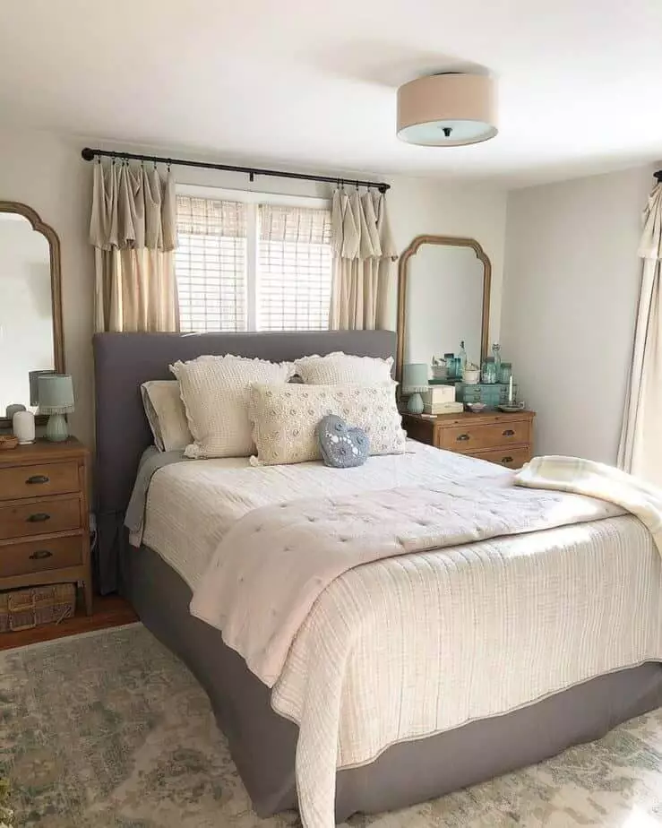
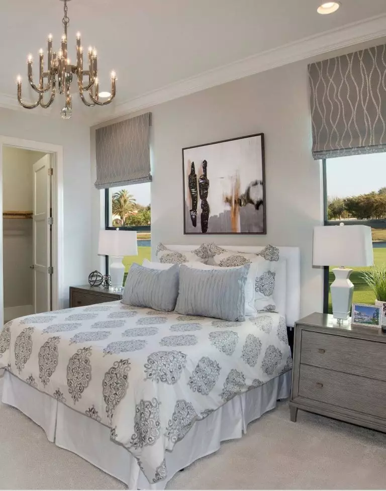
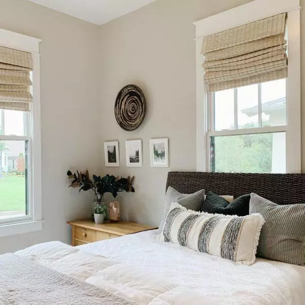
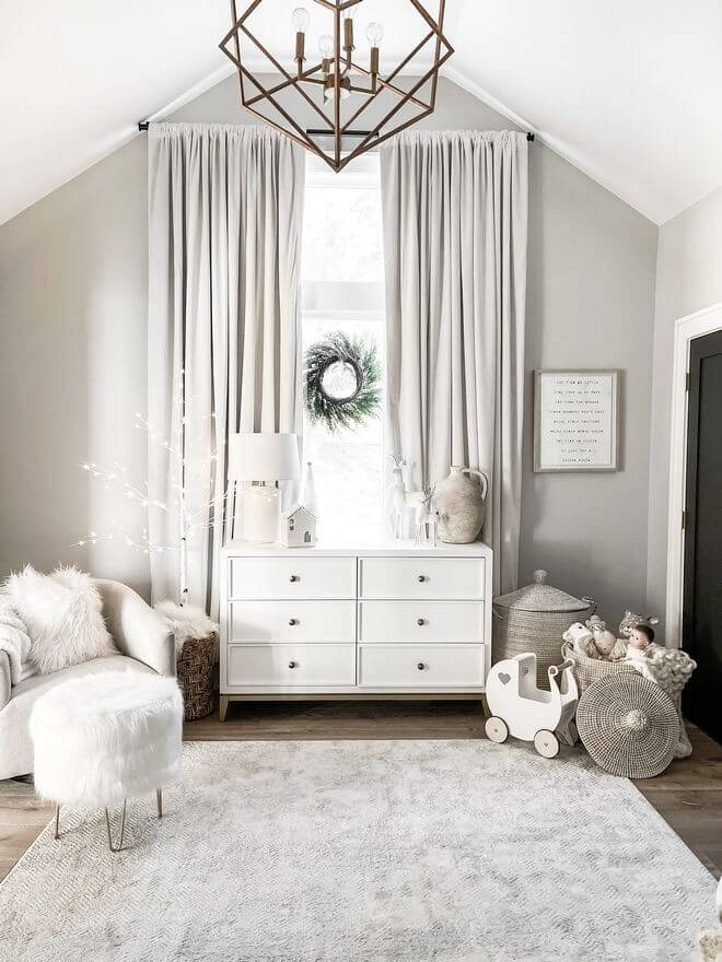
Bedroom
In such spaces as the bedroom, Agreeable Gray is the definition of comfort itself. The soft neutral shade is nothing else but a source of safety and calmness. What else would you like to be surrounded by in this personal space? Of course, we advise painting the walls in this color and decorating this neutral canvas with wooden elements, particularly for the furniture, and a splash of crispy white for the bedding. Such a balanced combination of contrasts keeps everything in place: coziness, invigoration, and warmth. It usually doesn’t work this way with neutrals, but we all know that Agreeable Gray is quite an exception, which means that it doesn’t require additional decor elements to keep everything in harmony. This shade itself is enough to fill the space with substantial visual interest.
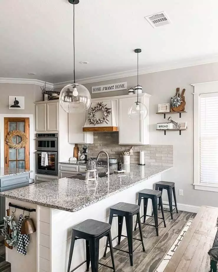
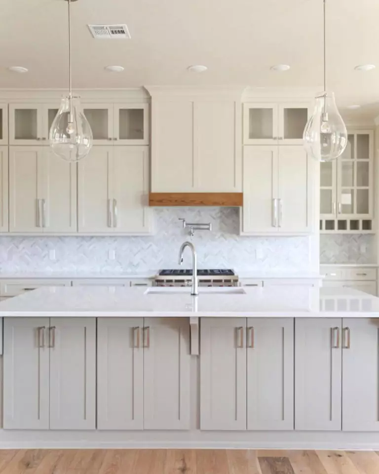
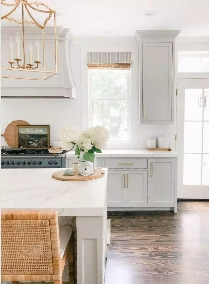
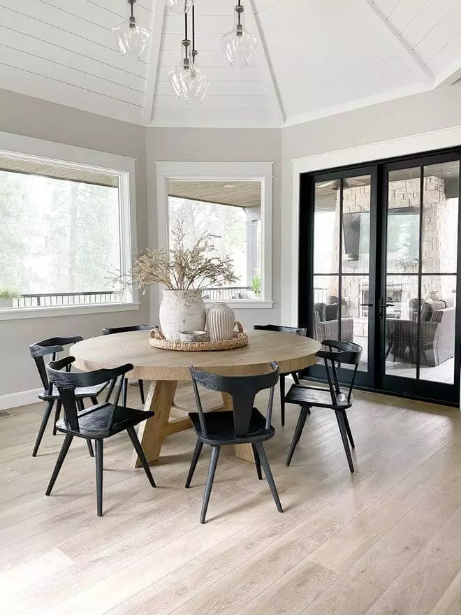
Kitchen and dining room
The noticeable beige undertones that enrich Agreeable Gray with an outstanding sense of softness reveal a new ability once applied in such spaces. They become impressively appetizing and fill the room with an environment where you would happily spend a particular amount of time while taking any particular meal. Even breakfast in your own company will not feel lonely when such a lovely shade surrounds you. For the kitchen, you can consider painting the walls or the cabinets. It is interesting to witness how Agreeable Gray plays with various textures. Therefore, brass hardware or wooden elements will surely enhance the result.
Are you planning a dining makeover? There is no need to go extra when a splash of Agreeable Gray adds a stylish effect to the design and a wide range of appealing notes to the environment.
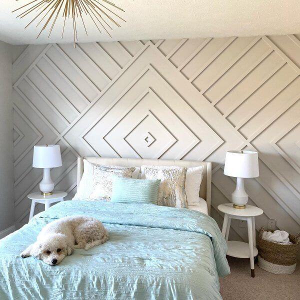
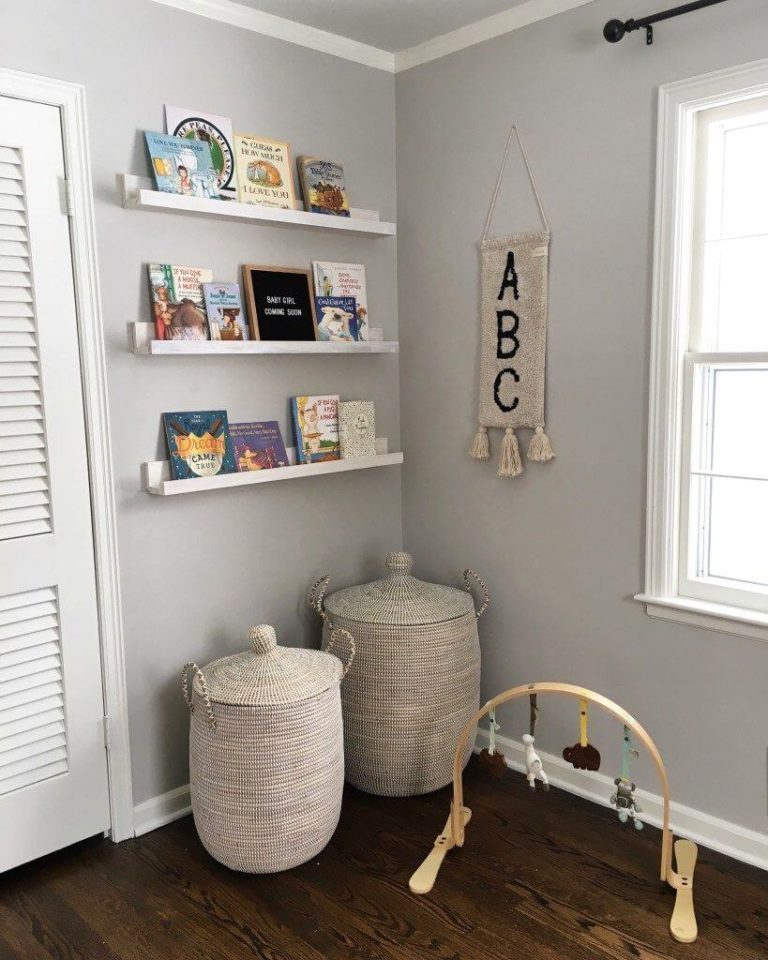
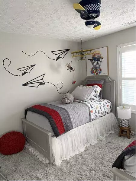
Kids’ room
A room meant for children, regardless of their age, should be filled with calming notes so that the little ones can get a good night’s sleep after a long day of adventures. It seems like a task Agreeable Gray will surely manage. Besides its relaxing feature, this neutral serves as a perfect background to display the rich accents of such spaces. Furthermore, the latter will acquire even more visual interest and draw the attention of your children, who are eager to discover the world. What a perfect color Agreeable Gray is for the kids’ room! It contributes to the style of this space and the state of safety and comfort, offering a bit of inspiration for your children.
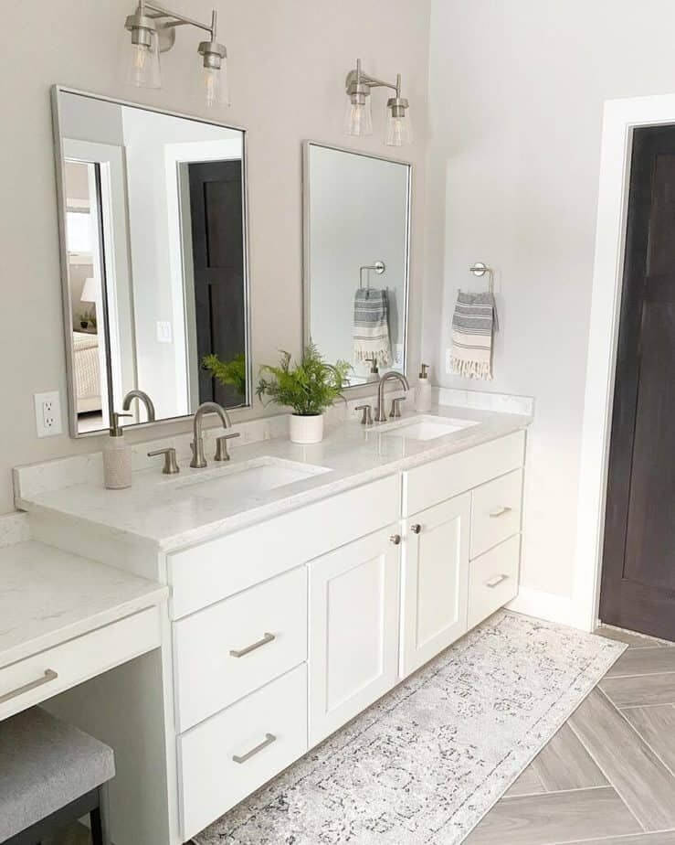
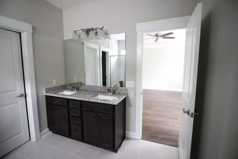
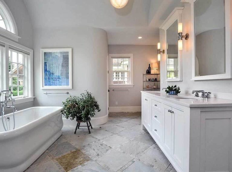
Bathroom
The bathroom is not to be skipped when we speak about comfort. This feature is no less welcome in such spaces. We usually suggest opting for neutral paints for the walls or cabinets, but again, Agreeable Gray is a fabulous exception. This time we advise you to limit the use of this color to the walls and accompany them with white or wooden cabinets. Do you fancy a functional bathroom devoid of unnecessary units or a space full of flair and enriched with reflective elements? Agreeable Gray is at your disposal either way.
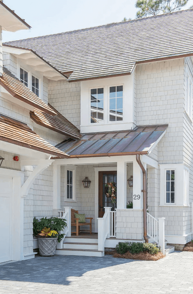
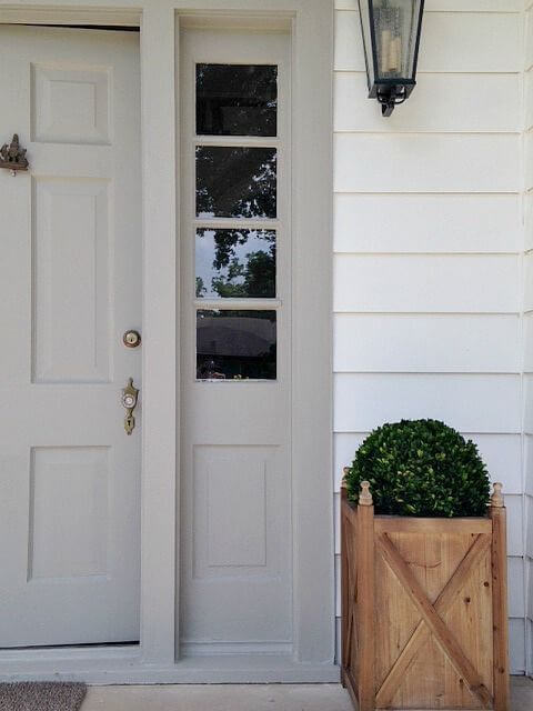
Use of Agreeable Gray for house exterior
Make softness a defining feature for your house even with the first impression by applying Agreeable Gray to the house exterior. Luckily, it works perfectly for both the house walls and the front door. As already mentioned, it acquires even more originality when paired with white paint or wooden texture. With a single decision to opt for Agreeable Gray, you instantly ensure your house exterior with a stately look, welcoming feel, and a state of safety and comfort that starts at the front door and goes on into the interior.
The Agreeable Gray paint SW 7029 paint color from Sherwin Williams is the definition of perfection, the replication of comfort, and simply a standout neutral you cannot go without in a contemporary interior.
