Alabaster SW 7008
Sherwin-WilliamsIt reveals a clear white surface with an unprecedented softness that homeowners cannot help but fall in love with.
Alabaster (SW 7008): what color is, review, and use
As designers say, the perfect creamy white – this is about no other paint color but Alabaster SW 7008 from Sherwin-Williams. The soft white with creamy warm undertones, on the verge of almost entering the off-white category, still staying true to its white nature, is one the most popular shades of the kind.
White as a neutral can be quite tricky because of its undertones, but not Alabaster. It reveals a clear white surface with an unprecedented softness that homeowners cannot help but fall in love with. Furthermore, it was named the color of the year in 2016 at Sherwin-Williams and has not stepped back since. What makes it a go-to paint color that experts cannot give up on? Let’s find out!
Alabaster paint color features
What makes this paint color special is that, in contrast with common white shades that replicate a rather crispy effect, this one feels exceptionally soft yet neutral. It is not about any beige or yellow notes but creamy, which add to its refinement. According to Jackie Jordan, the director of color marketing at the time, Alabaster refers to new beginnings, which come as a source of revival. It is all about simplicity, well-being, and mindfulness.
Alabaster: is it warm or cold?
There is no doubt that Alabaster is a warm shade, by which we do not mean it has striking yellow undertones but soft creamy ones, which make it stand out in the category of warm whites. It should be noted that even the coolest light that penetrates the space cannot make this paint color feel devoid of its softness. Maybe it would feel more neutral but never cool since the warm notes are always part of its appearance.
How does lighting affect Alabaster?
It is proven that lighting influences the appearance of any color, and it is worth considering how it affects every shade in part. Let’s go through the basics! In north-facing spaces, neutral colors seem slightly muted, and since Alabaster is a light paint color, it shows a bit of this feature. As colorists love to say, Alabaster lives its best life in south-facing rooms, where it can reveal its warm side to the fullest without seeming yellow, which is partially true within spaces with east and west-facing windows, depending on how the sunlight penetrates the room.
Alabaster LRV
It sounds a bit scientific but replicates a comprehensible concept. LRV stands for the Light Reflectance Value, which determines how light or dark a color is based on the ability to reflect the light. The LRV of this beautiful shade from Sherwin-Williams is 82. We can safely place it in the white category, although it slightly gravitates towards the off-white side. In plain words, Alabaster reflects impressively the light and makes the space feel exceptionally spacious.
Alabaster undertones
Although we like to stick to creamy, the already revealed yellow notes are undoubtedly the main characters when it comes to the undertones of this color. Of course, Alabaster feels exquisitely warm, yet it is more about a balance since slightly refreshing notes are also to be felt. Some may even say it has greige undertones, a mix of beige and gray. Let’s put it this way: Alabaster is a bit warmer than the popular White Dove from Benjamin Moore, although not as yellow as the no less renowned Simply White from the same color brand.
Similar colors
The range of white shades is so varied that you cannot simply go through it and not find at least a few siblings of Alabaster at the same Sherwin-Williams and other manufacturers. We cannot deny its uniqueness, but some similarities are indeed fabulous. Take a look!
Coordinating colors
Alabaster is neutral, light, with balanced undertones, being perfect for a vast range of colors. Experts suggest earthy shades resonate perfectly with its undertones. Following the same idea, we cannot skip the suitability of gray, beige, and greige shades for rather monochromatic interiors. No less impressive are the combinations between Alabaster and bold accents, such as grays with deep undertones. Let’s see what options there are!
Use of Alabaster in interior
Another aspect that makes this paint color popular is its adaptability to every style, while its neutrality serves as a perfect background for any decor. You can safely play with texture and colors on such a backdrop, implementing design solutions that feel close to you. Let’s go through a few options that Alabaster fits best and take a look at how it works within different spaces!
Modern Farmhouse
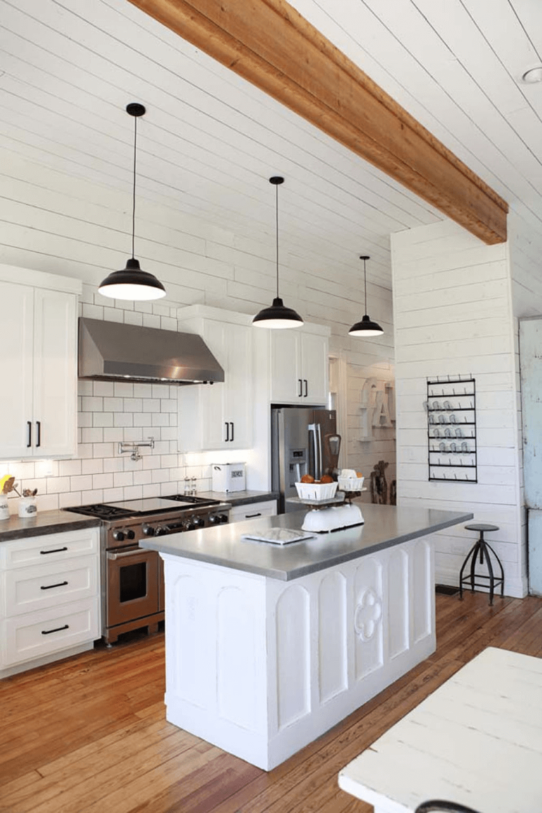
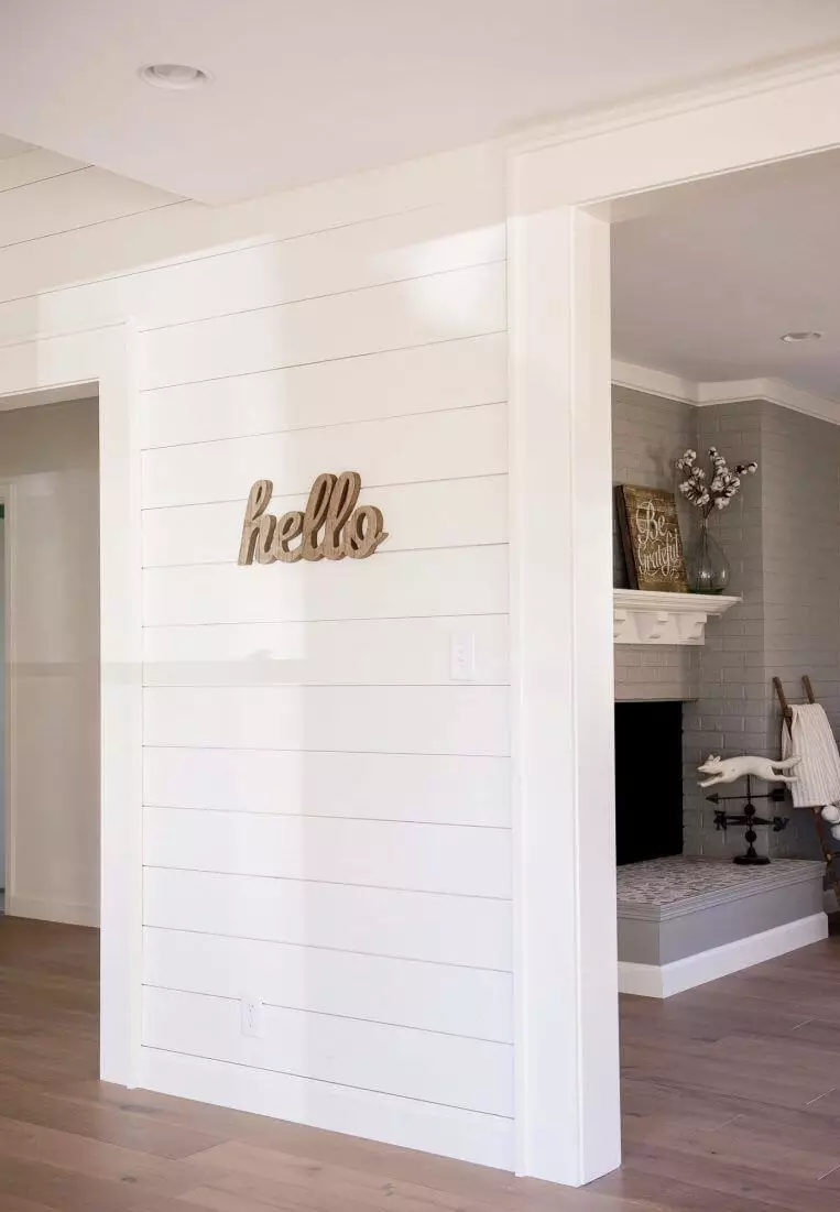
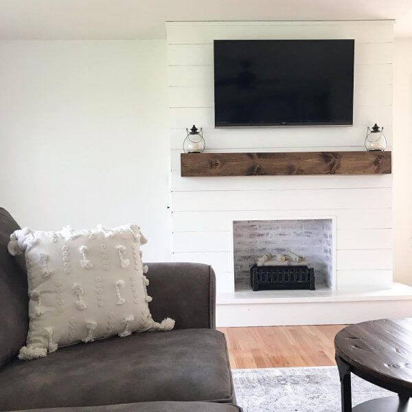
How could we skip the style that defines comfort when speaking about such a lovely shade? Alabaster brings Farmhouse to the next level, offering it a modern appearance. Consider this creamy shade for the walls, pair it with natural wood, and go with a no less light palette regarding the other elements for a contemporary approach to the cozy environment. SW 7008 works particularly well for shiplap, which is one of the elements peculiar to Farmhouse.
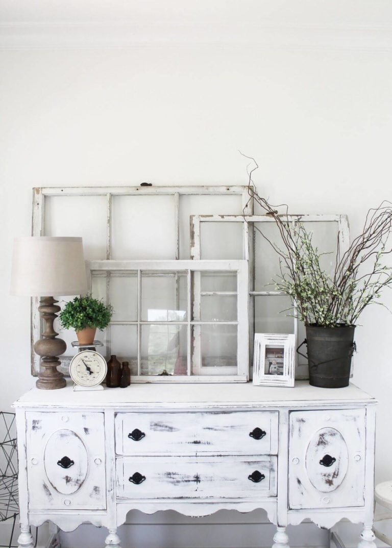
Vintage charm
Alabaster has the irreplaceable ability to resonate with the inner beauty of vintage units. Is it the creamy notes that harmonize with the past values or the slightly coolish scents that balance the eye-catching pieces? Probably both of them. One thing is clear – you cannot go wrong with walls painted in this shade when Vintage is the defining style of your interior or slightly touches it. You can successfully combine the old with new for an indeed original result.
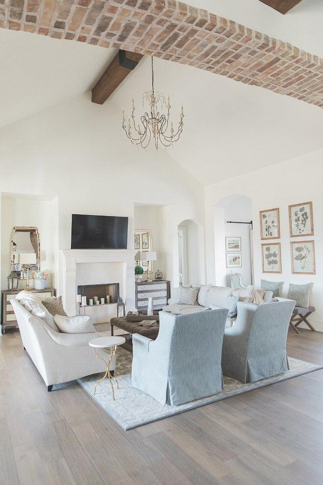
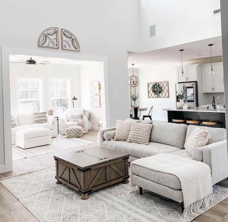
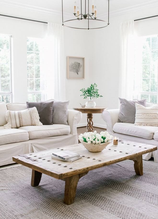
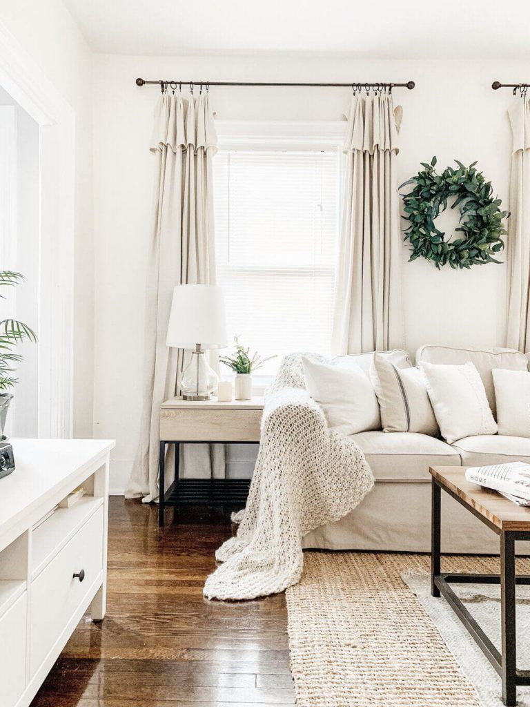
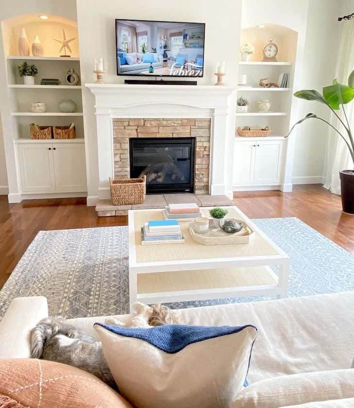
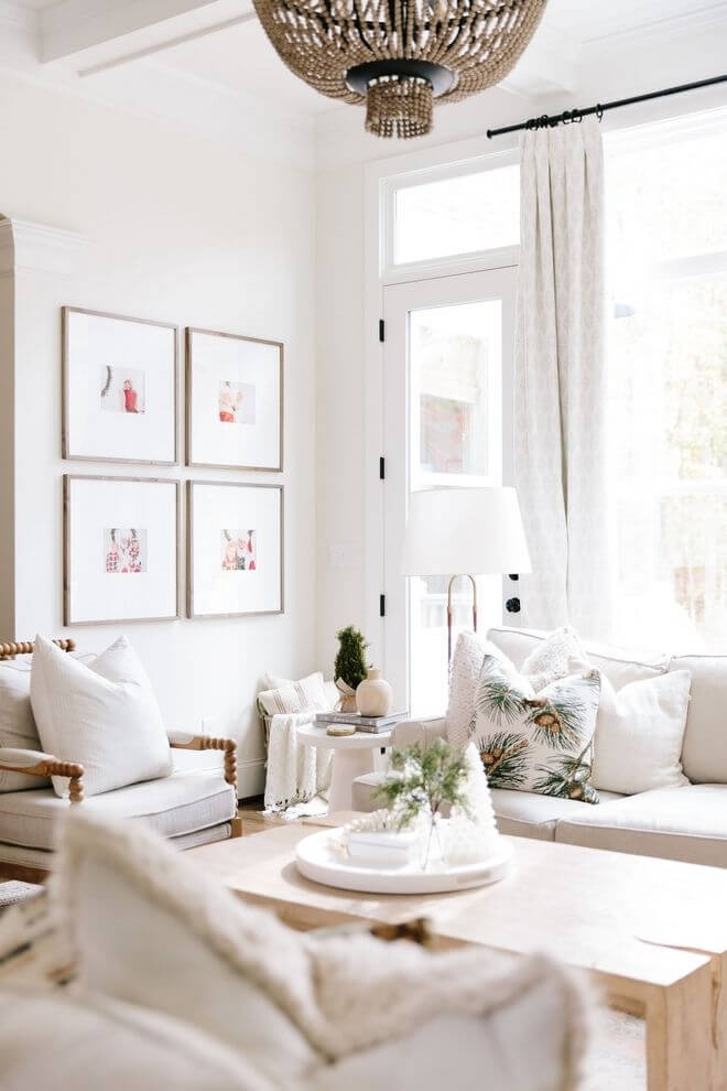
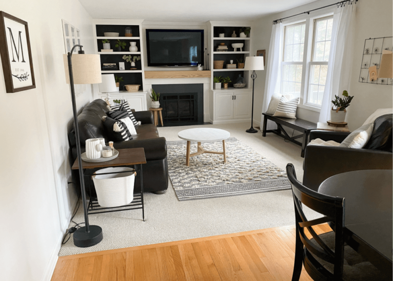
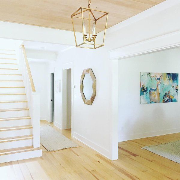
Living room
This creamy shade of white adds softness to an all-white living, goes hand in hand with wood pieces of furniture, serves as a perfect background for bold accents, and collaborates with any style. You can safely paint the walls in this color and display your design solution, while Alabaster will adapt to each approach individually. The living is probably the best space to experiment with colors and textures, and you should definitely benefit from the friendly white shade.

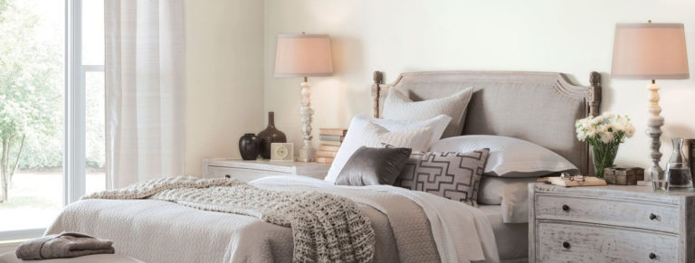
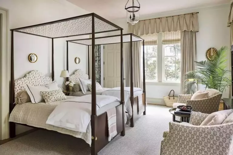
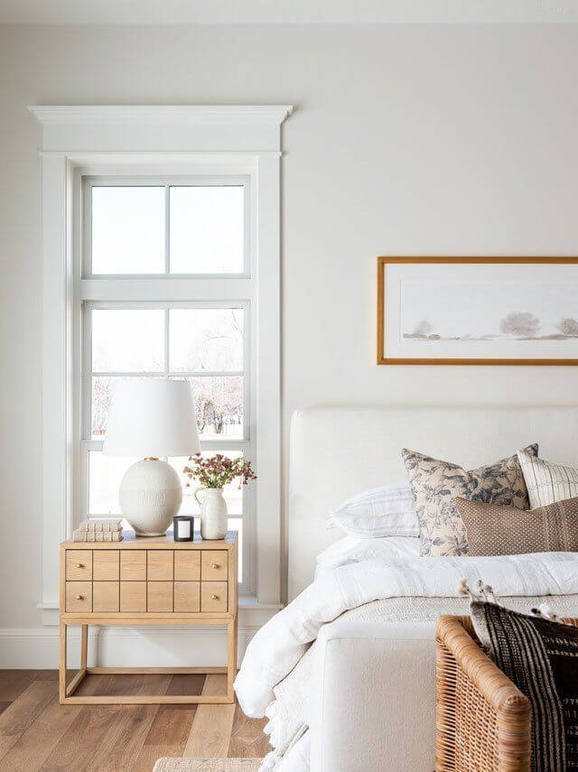
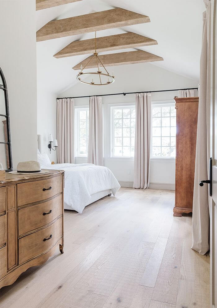
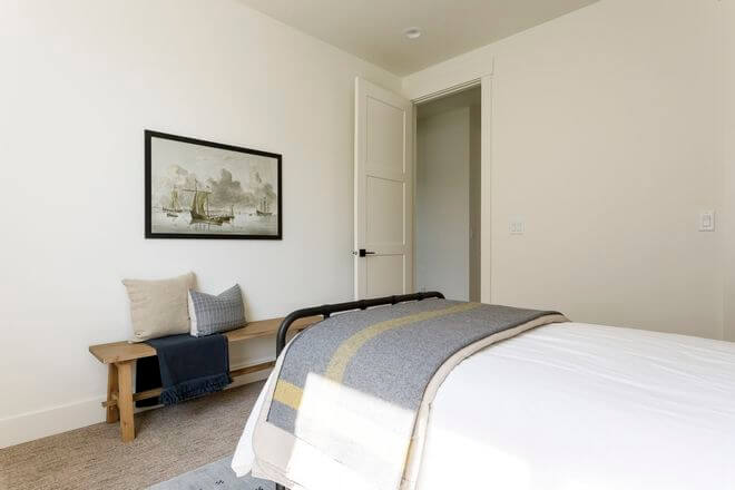
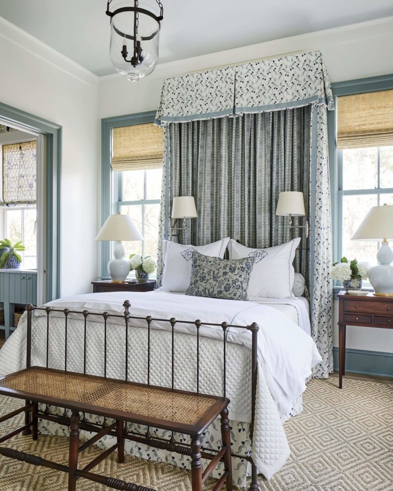
Bedroom
Undoubtedly, Alabaster goes for the walls, and light wood accompanies it. Why light wood particularly? It preserves the calmness set by the creamy shade and ensures a comfy environment. Isn’t it what everybody is looking in their personal space for? Do you fancy an accent? Go with a few splashes of bold colors yet soothing ones for textiles. Don’t overload the room with many pieces of furniture or decor. Keep it simple, and let the soft undertones of Alabaster do their part.
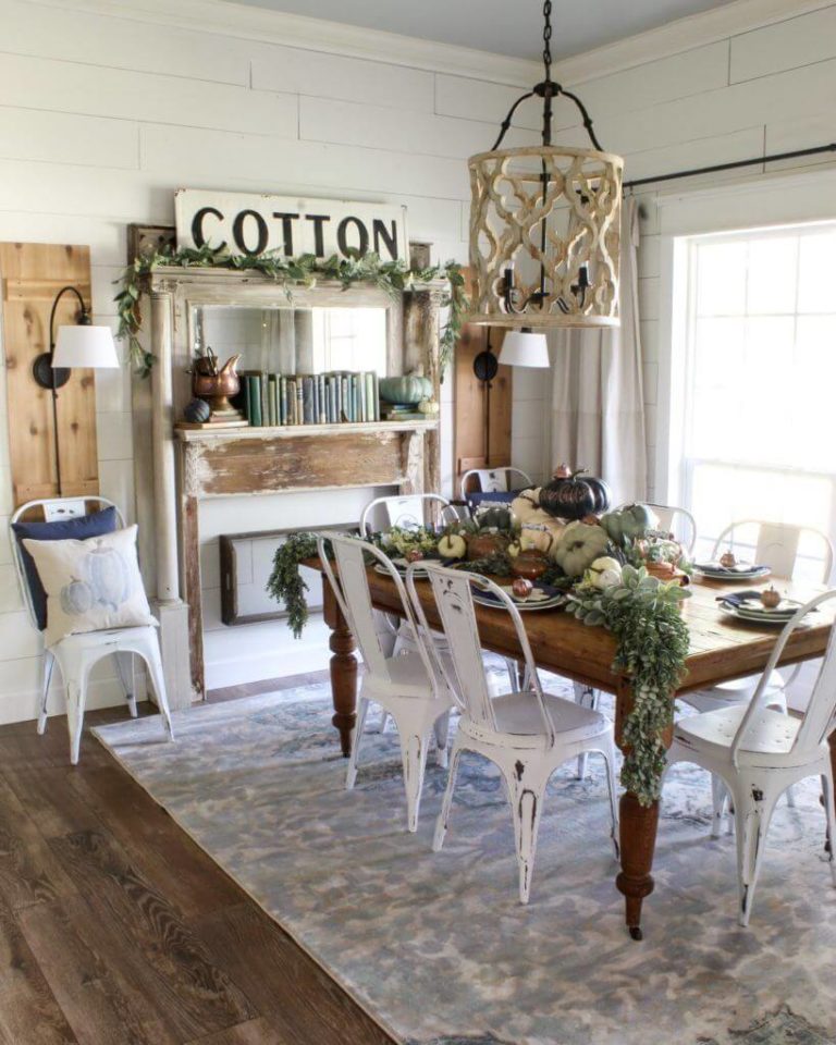
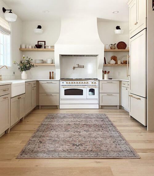
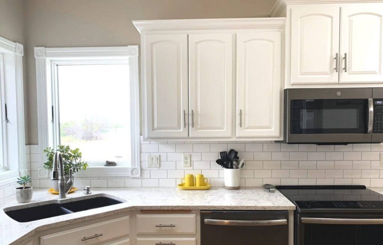
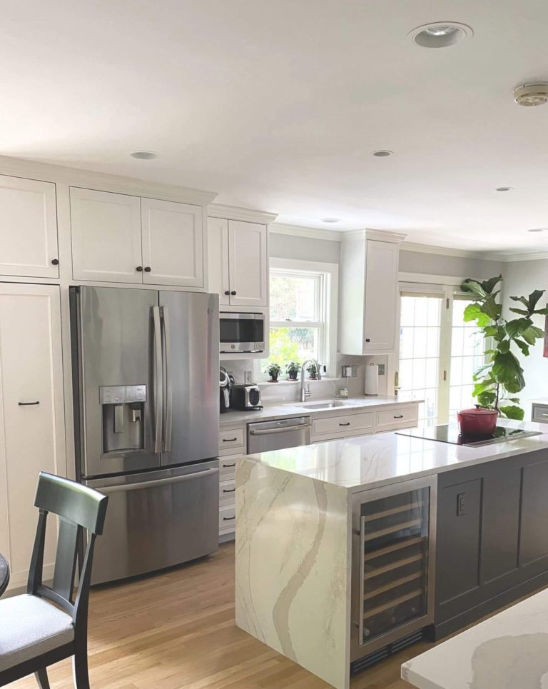
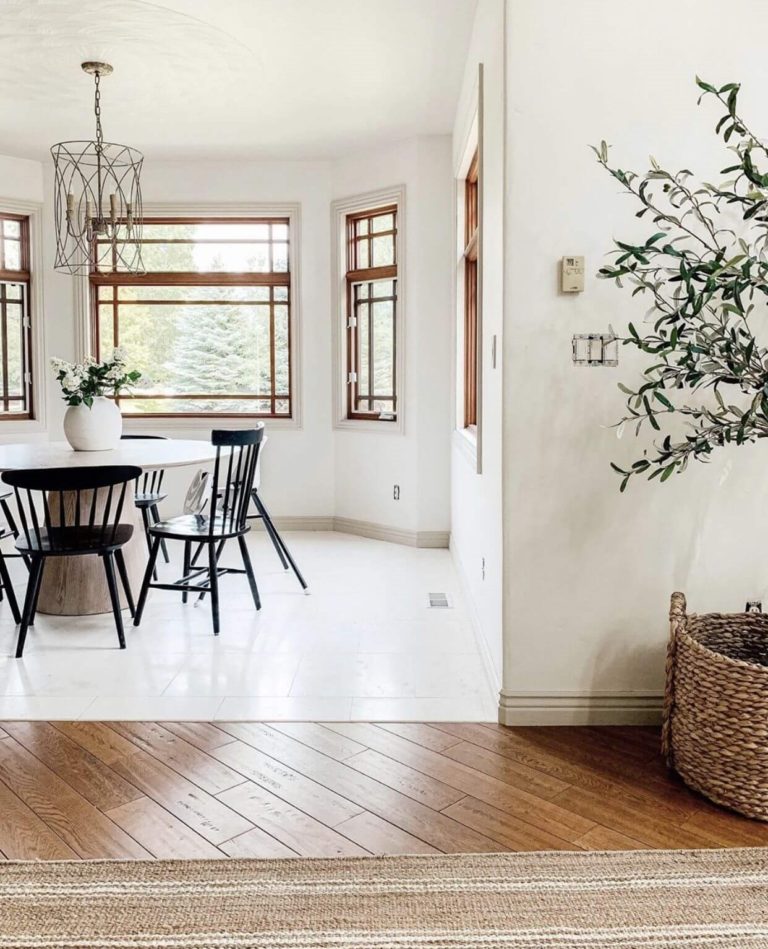
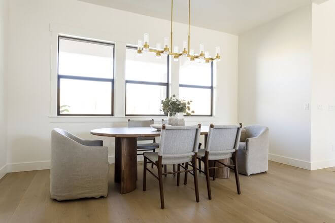
Kitchen and dining room
As suitable as this white shade is for any other style, nothing compares with its integration into a traditional kitchen. Whether you paint the walls and pair them with more intense colored cabinets or go with creamy white cabinets combined with a muted shade of gray or beige for the walls, Alabaster will perfectly complete the style.
This color implies simplicity and harmony. We suggest sticking to these concepts when planning a dining area makeover. Consider SW 7008 for the walls and go on with a wood table and chairs. Consider upholstered chairs for an extra source of comfort or even paint them in black for a modern statement.
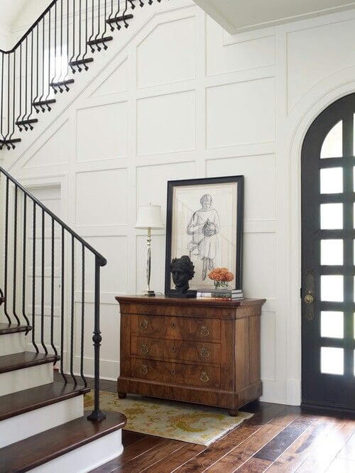
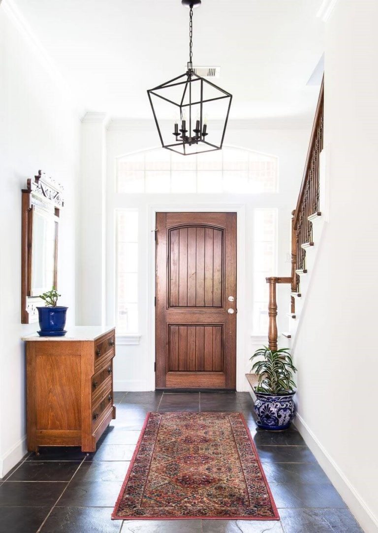
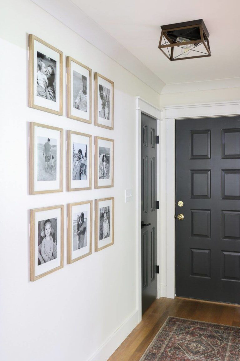
Hallway
Are you looking for a paint color that feels both fresh and soft, inviting and formal, unobtrusive and original? Alabaster will surely meet such standards and even keep pace with your style. Pair it with dark wood to embrace tradition, and don’t hesitate to switch to light wood for the perfect integration of modern values. In a hallway painted this way, black accent interior doors are just the right complement for a contemporary statement.
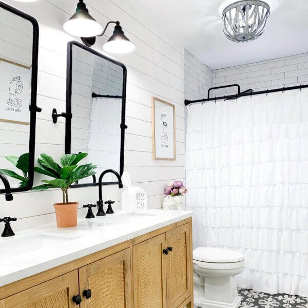
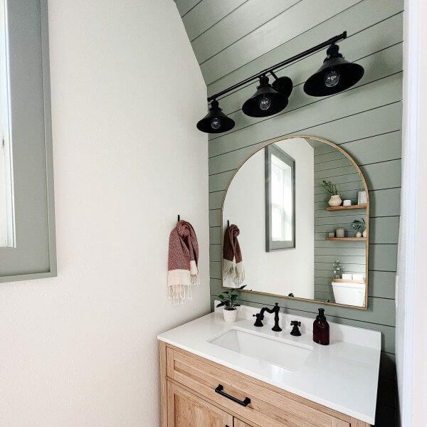
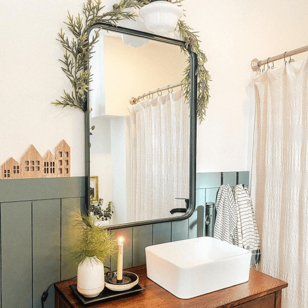
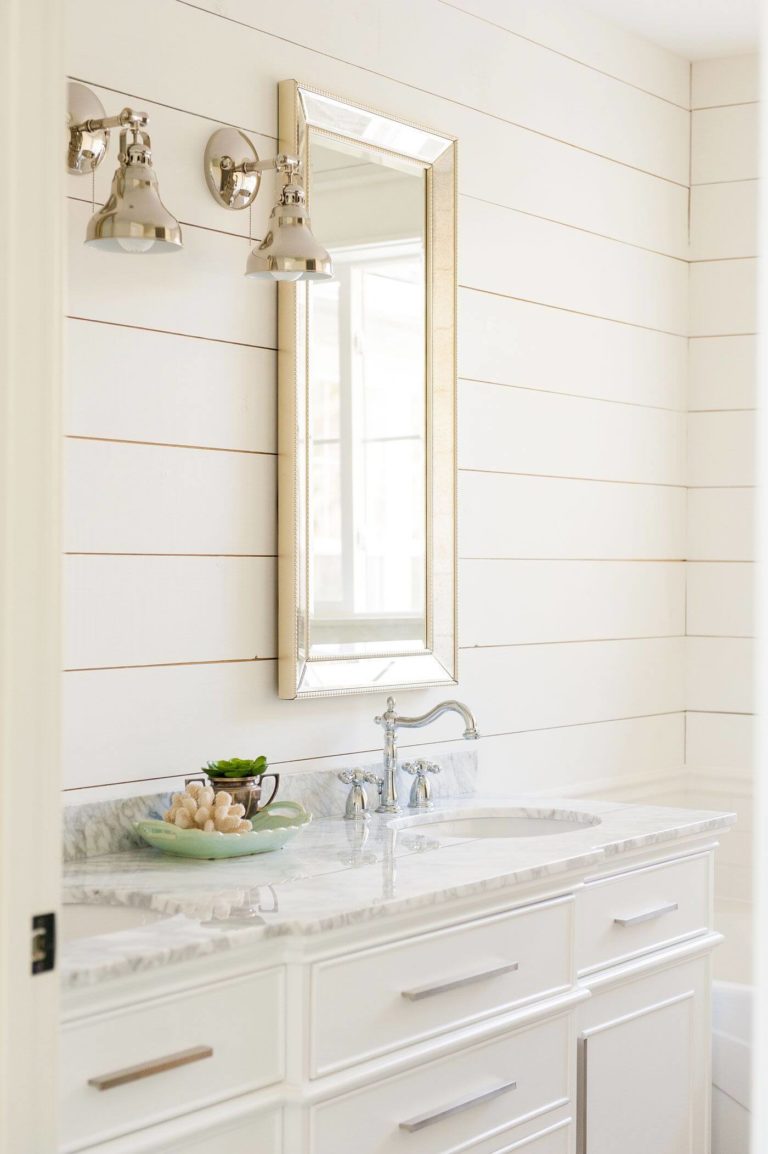
Bathroom
Designers suggest sticking to the Farmhouse style, which reveals itself fantastically when complemented with Alabaster. You can take two directions: go with a Traditional Farmhouse with shiplap walls painted in this creamy shade, combined with light wood cabinets. On the other hand, consider warm white walls paired with accent shiplap walls in green, combined with the same wood cabinets and black accents for a Modern Farmhouse. You can still opt for a bathroom fully painted in Alabaster, decorated with a marble countertop and metallic accents for an elegant approach.
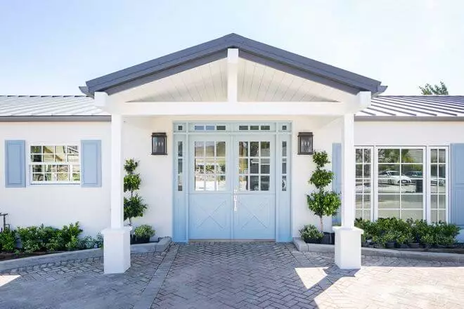
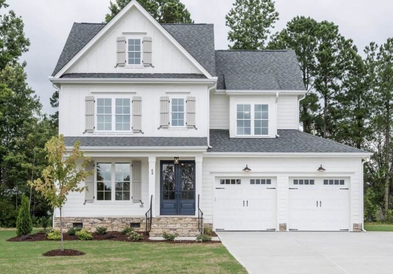
Use of Alabaster for house exterior
Alabaster looks exceptionally light when exposed to daylight. One may even mistake it with a true white shade. If you wonder if there is any sense to paint the house exterior in this shade and not go for an indeed true white, the answer is: you should definitely go for Alabaster. It may seem unnoticeable, but this paint color replicates an irreplaceable welcoming feel hidden behind the seemingly pure white shade. As regards the front door, it is up to you to paint it with this shade or with a true white color; the effect will be much or less the same.
The Alabaster SW 7008 paint color from Sherwin-Williams defines revival, peace, and harmony, besides its exceptional neutrality and flexibility. It is a go-to shade for any design approach and a trendy paint color that does not plan on getting out of date.
