Antique White (Behr 23): what color is, review, and use
When it comes to warm shades of white that impress with their softness yet no less imposing balance, Antique White, a timeless white variation with clear yet not too striking warm notes, holds a leading position. One should note that a paint color with the name Antique White can also be found at Sherwin-Williams, Benjamin Moore, Dulux, and Pantone. Today, we are here to reveal the beauty of this timeless variation of white known under the number 23 from Behr.
The name itself implies features beyond the time borders and an appealing effect that perfectly embraces the past by modern means. It already sounds inspiring. Still, this paint color has more to reveal. Let’s go through the main aspects that define Antique White as one of a kind!
Antique White paint color features
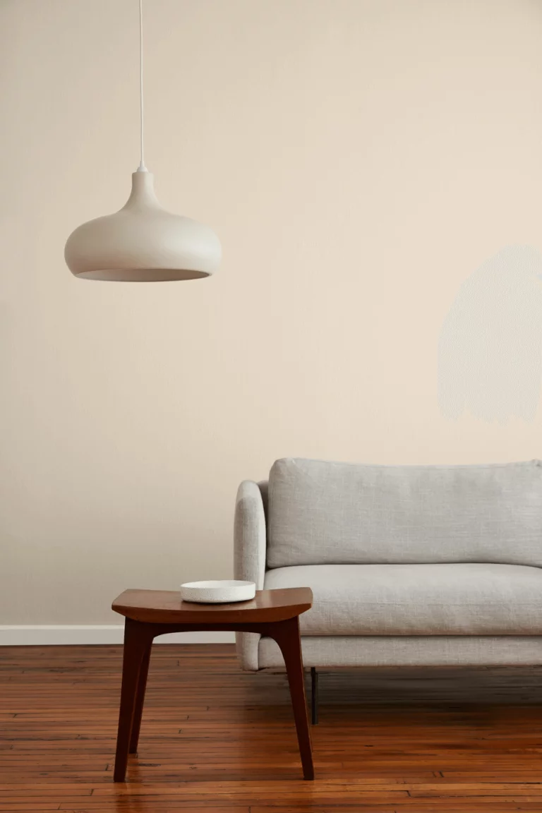
The timeless shade from Behr beautifully embraces the values of the past and adapts them to contemporary rules of design. The white base is penetrated by soft beige particles that originated in a soothing shade of earthy brown. It may not seem a white shade on the sample, yet the much lighter appearance proves that it is a white variation when applied on a surface. The warm and worn-by-time hint of softness stands behind the relatively antique appearance. Reminiscent of the good old days, filling the heart with warmth, this paint color cannot help but make you get attracted by its familiarity.
Antique White: is it warm or cold?
We cannot mention the word “cold” in the presence of such a standout representative of the warm category. Although it looks quite balanced on the sample, once put into practice, it acquires an appealing warm look that you want to admire continuously. Especially the spaces with south exposure bring the warmest variation to the surface.
How does lighting affect Antique White?
As already stated, in rooms with south-facing windows, this paint color is all about warmth. It can even show a slightly yellowish tone that makes you wonder where it came from. On the other hand, in north-facing spaces, Antique White becomes muted, and a subtle gray hint flows through its veins. It is much easier with artificial lighting, which, depending on either cold or warm undertones, brings a similar effect on the color.
Antique White LRV
You probably wonder what these letters are about if you are new here. Light Reflectance Value helps us determine on a scale from 0 to 100 which category a paint color is part of. For reference, consider 0 as a true black shade and 100 as a pure variation of white. Antique White has an LRV of 73, which stands between the mid-tone and light groups. It can hardly be called a shade of white due to the intense beige notes. In terms of light reflection, particularly in a well-lit room, this paint color shows an impressive ability to reflect the light particles throughout the space and make it seem larger.
Antique White undertones
All clear with the beige notes; what about the rest of the scents that hide behind Antique White? Let’s start with the fact that the beige notes are balanced by a slightly visible hint of gray that reveals itself under poor lighting conditions. Nevertheless, the same mix of beige and gray leads to a subtle purple effect when the paint color is bathed in the warm sun rays; quite an intricate shade, which is not that easy to work with. Still, the best results are achieved through thorough work, and a bit of play with a sample through your house will indicate what an appearance this paint color will take within your interior.
Similar colors
Resembling a soft and balanced shade of beige, Antique White shows off a wide range of paint colors that almost perfectly resemble its essence. As usual, we do not stick to one manufacturer only, and today, we also go beyond Behr’s borders. Let’s see what the alternatives are in case you cannot find this particular shade or want a slightly lighter, darker, warmer, or cooler variation.
Coordinating colors
Antique White is mostly neutral, and it perfectly collaborates with bright paint colors of any kind. Still, a balance should be considered when the timeless shade from Behr holds a leading position. The same variation of warm white is a real find within monochromatic palettes, combining astonishingly with cooler neutrals. Depending on which directions you go, be it contrasting or monochromatic, you should choose matching partners from one of the mentioned color groups. Although you are free to pick your favorites since Antique White is relatively flexible when it comes to combinations, we suggest sticking to one of the following exact color matching representatives:
Use of Antique White in interior
Antique White is no less versatile when it comes to different styles, combining with shades that are close to it and bolder ones depending on the design direction you take. Still, a few solutions work best in this sense, which shall be revealed as follows. As for the rest, you are free to experiment with this paint color as long as you keep the contrast within borders and make sure that your interior brings the desired variation in Antique White.
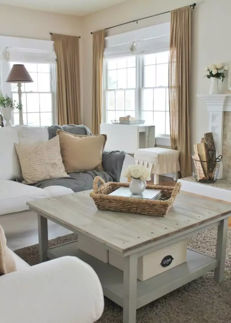
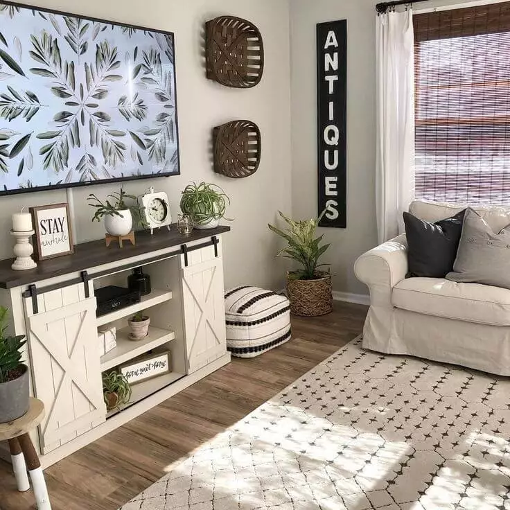
Comfy Farmhouse
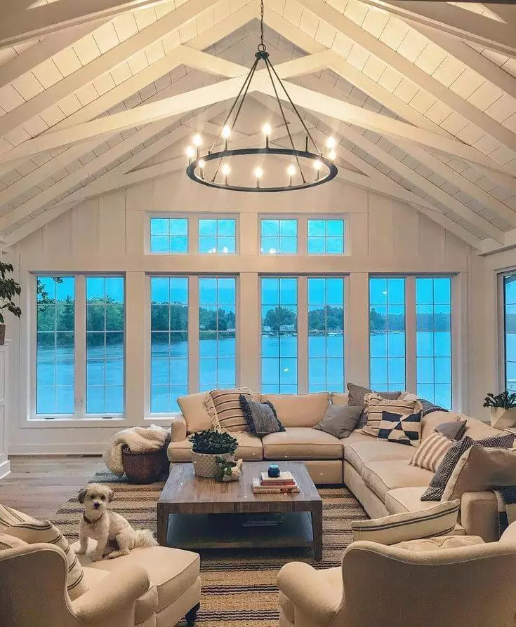
Is there any other style that replicates comfort as much as Farmhouse does? When speaking about a paint color as cozy as Antique White, which feels comfy and replicates a strong sense of familiarity, a Farmhouse interior seems like the perfect space to start with. Paint the walls in this beautiful shade from Behr. Complement them with crispier splashes of white for a contemporary look and add the defining elements of the style, such as wood texture, soft textiles, nature-inspired decorative units, and pieces close to your heart to enhance the feel of well-being set by the warm white background.
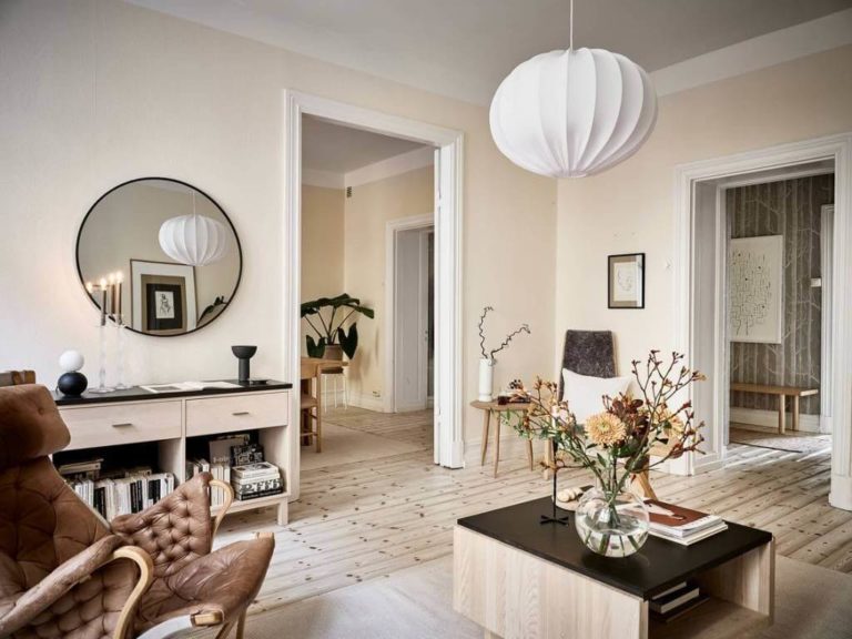
Two-faced Scandi
On the one hand – the cool Scandi background that resembles the Nordic weather. On the other – the constant desire to bring as much comfort to the interior as possible. Designers came up with a solution that meets both standards – the gorgeous Antique White with its warm beige and gray notes. The latter reveal themselves under northern exposure in particular. Your Scandinavian interior will be redefined in one step, while the constituent elements of the style have to be the same, considering the functional layout, natural texture, soft textiles, and the perfect mix between practicality, comfort, and sleek contemporaneity.
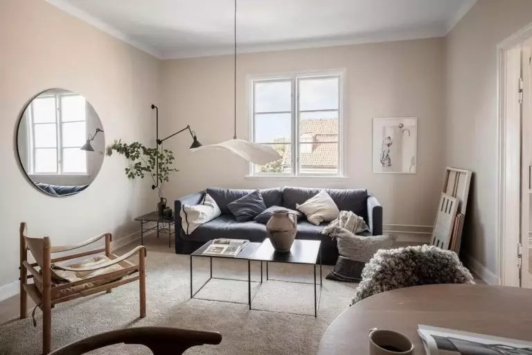
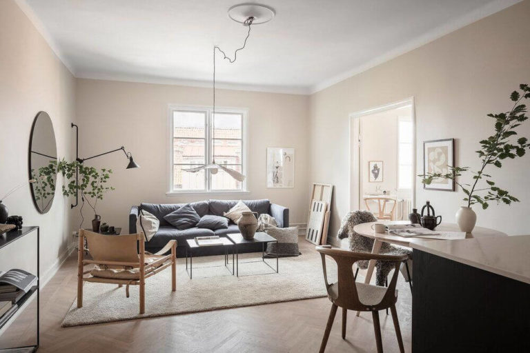
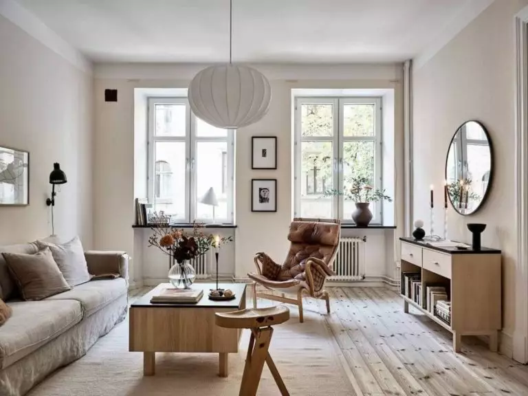
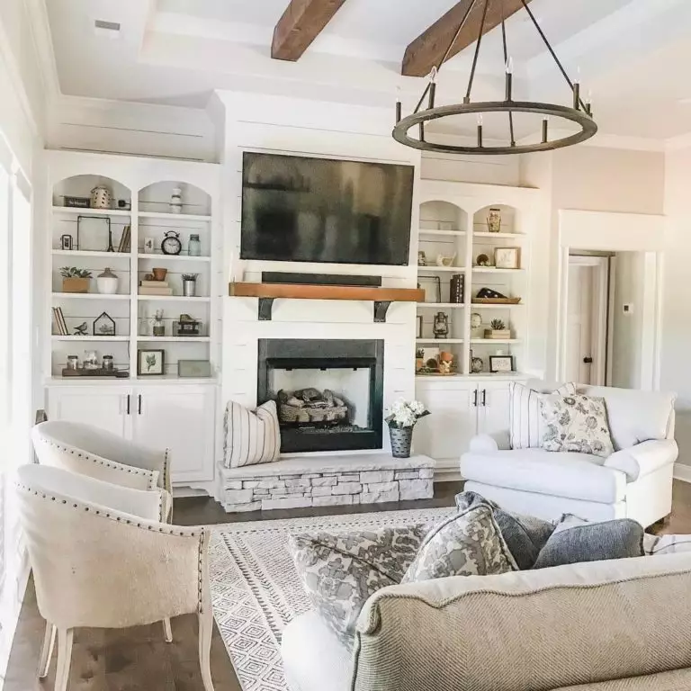
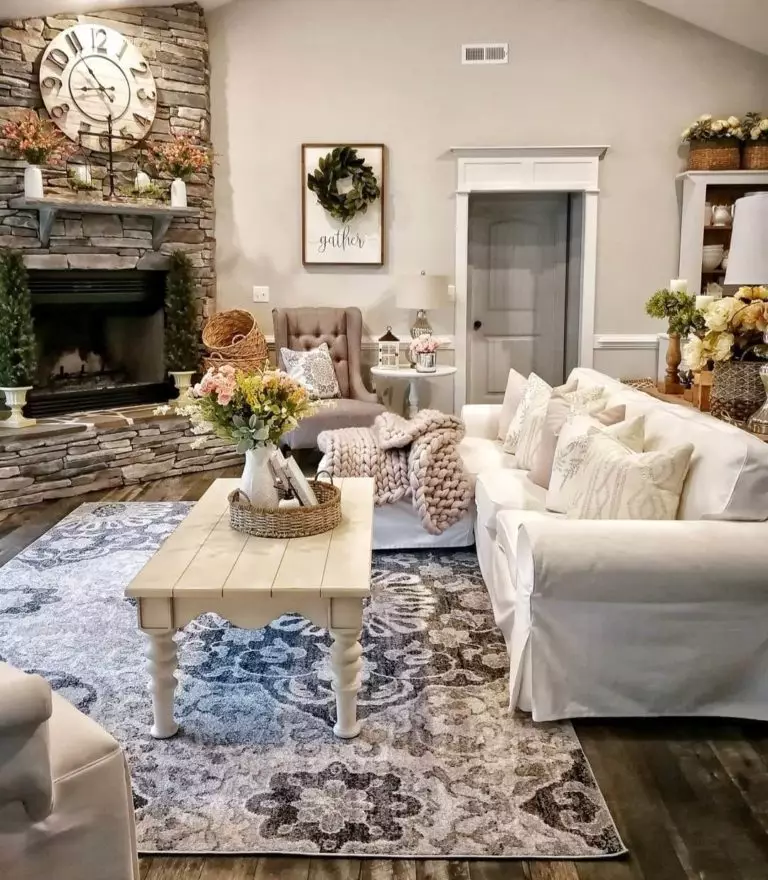
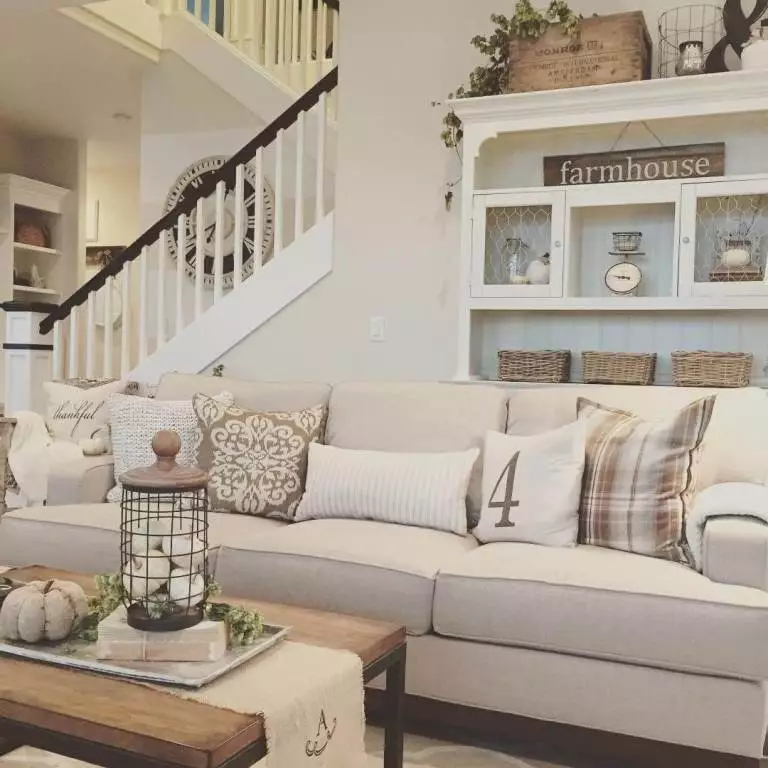
Living room
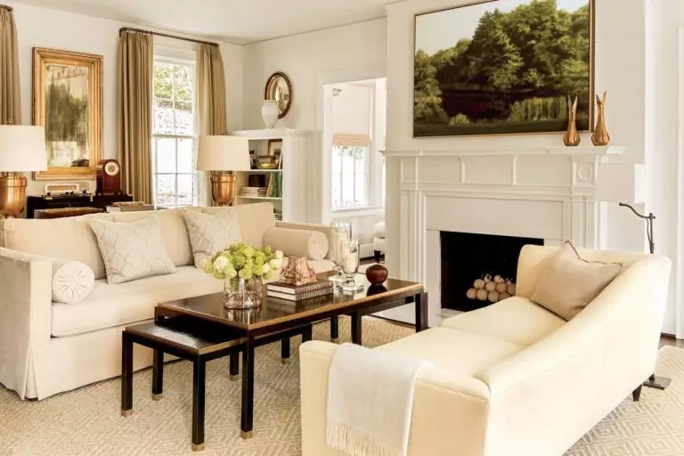
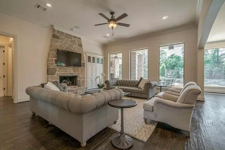
You are the author of your interior design unless you opt for a professionally designed space. Still, Antique White is not that hard to work with if you carefully choose its partners. Even the boldest companions should not suppress the warm white background so that the paint color can fully reveal its potential. Keep it sleek and monochromatic, or go for contrasting pairings. What about a traditional interior with wood furniture and comfort-reflecting light beige-painted walls? Would you go bolder? Then, consider bright splashes on the neutral background to make a statement.
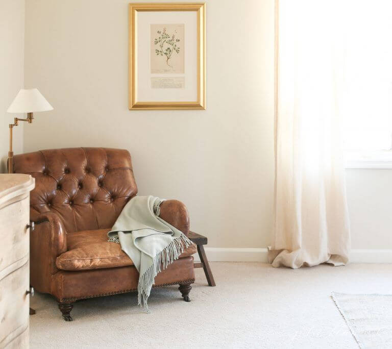
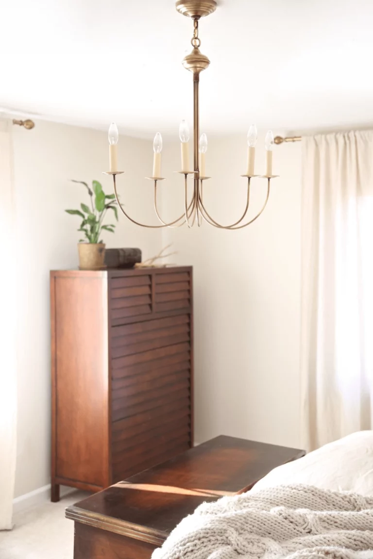
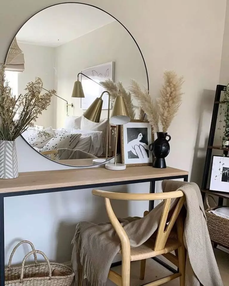
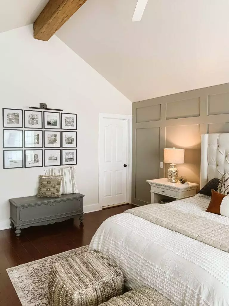
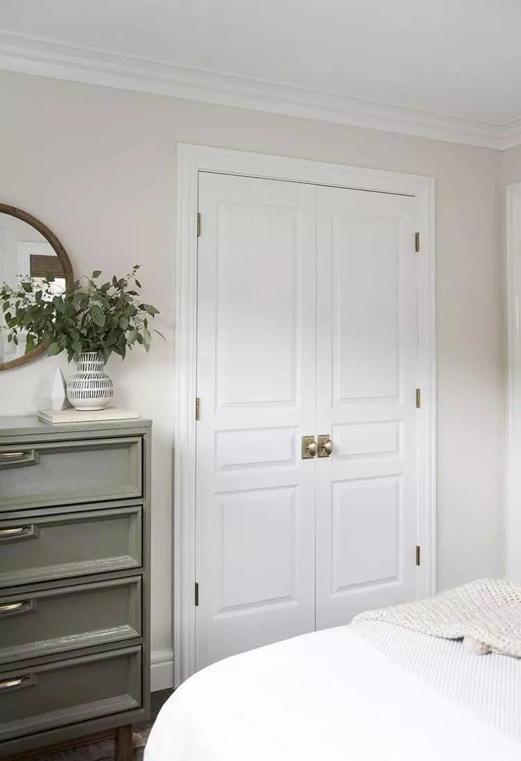
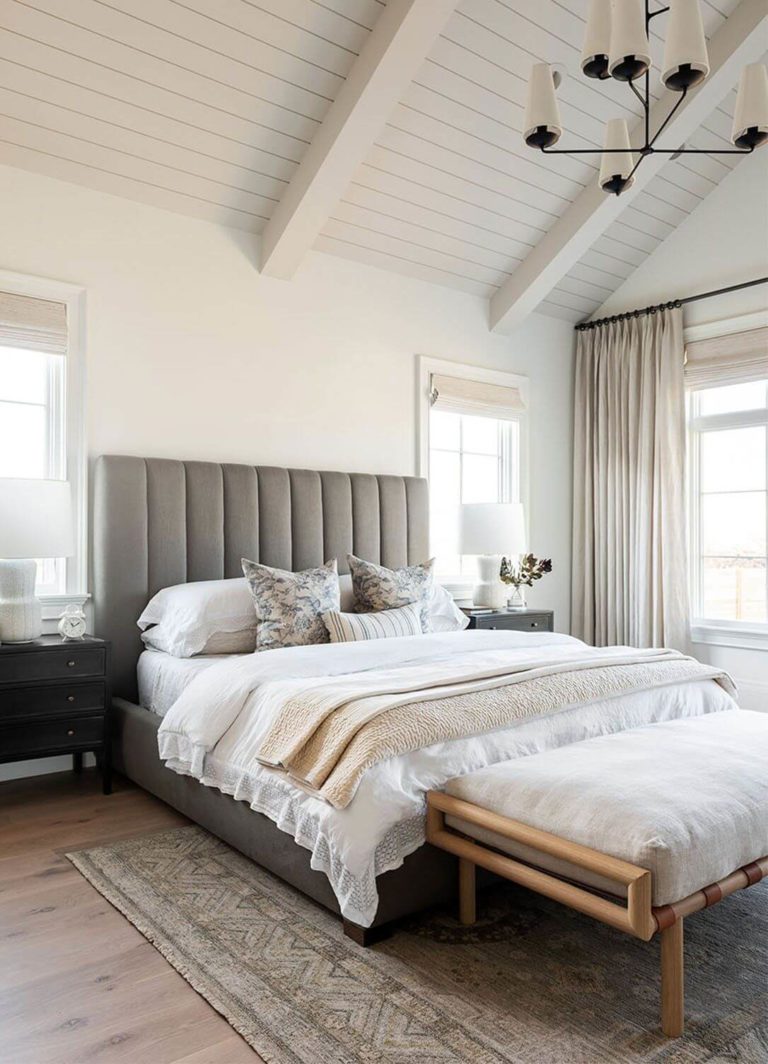
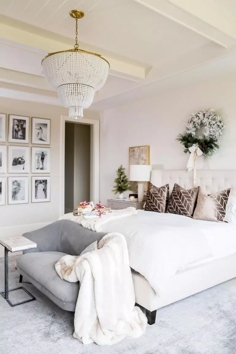
Bedroom
There is something special about the combination of walls painted in Antique White and a pastel green accent wall or piece of furniture painted this way – calming, intriguing, and full of personality. On the other hand, nothing compares with an all-white bedroom where the walls slightly refer to a pleasant sense of comfort to warm up the space. There is also a design solution between the two extremities – bringing in a new neutral, such as gray, particularly a cool variation, to dilute and contrast the palette.
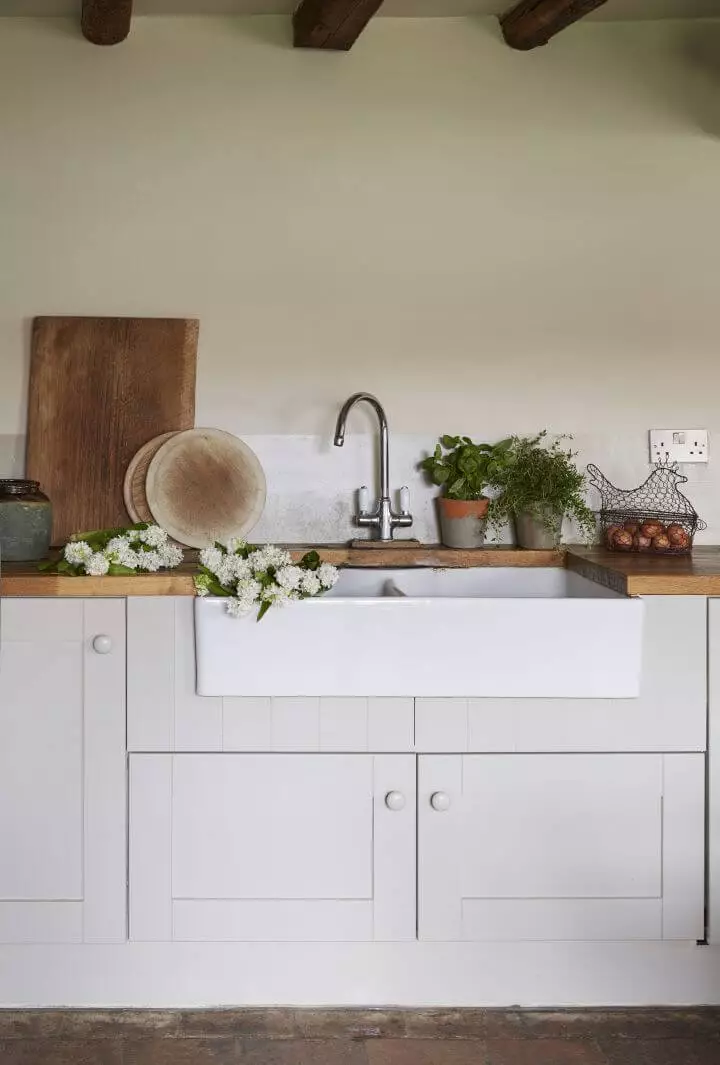
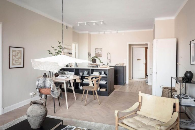
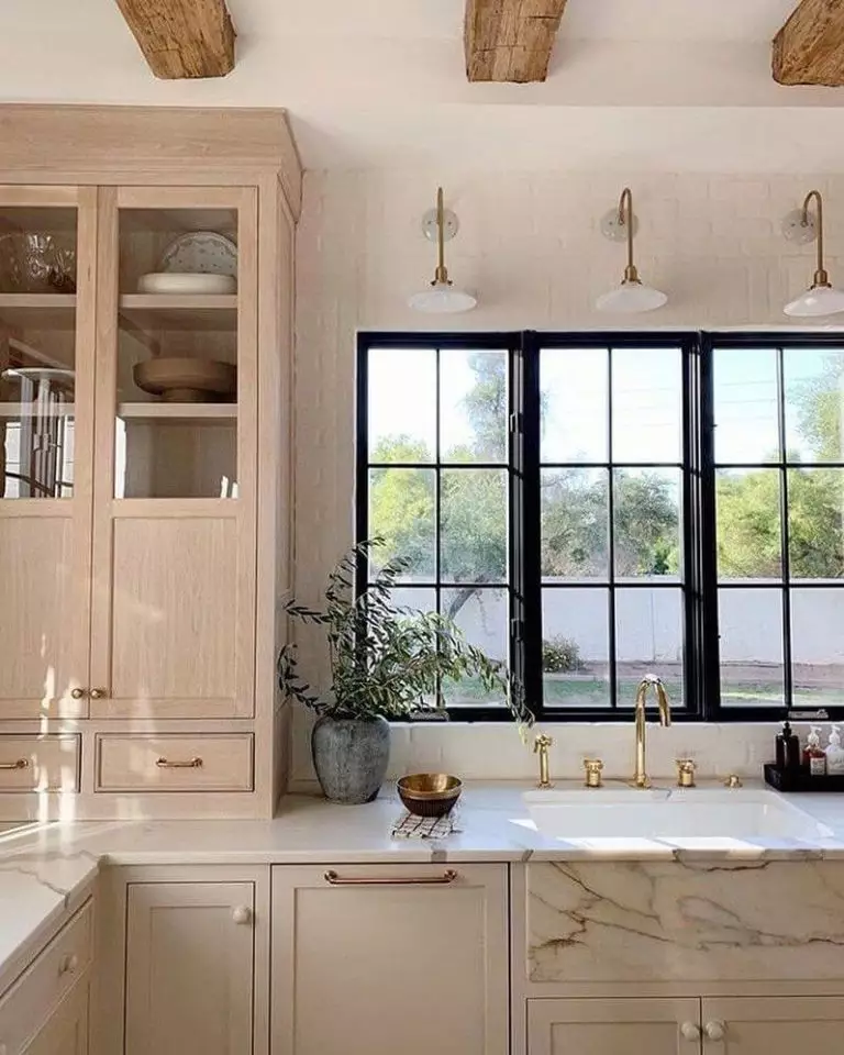
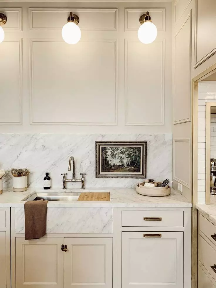
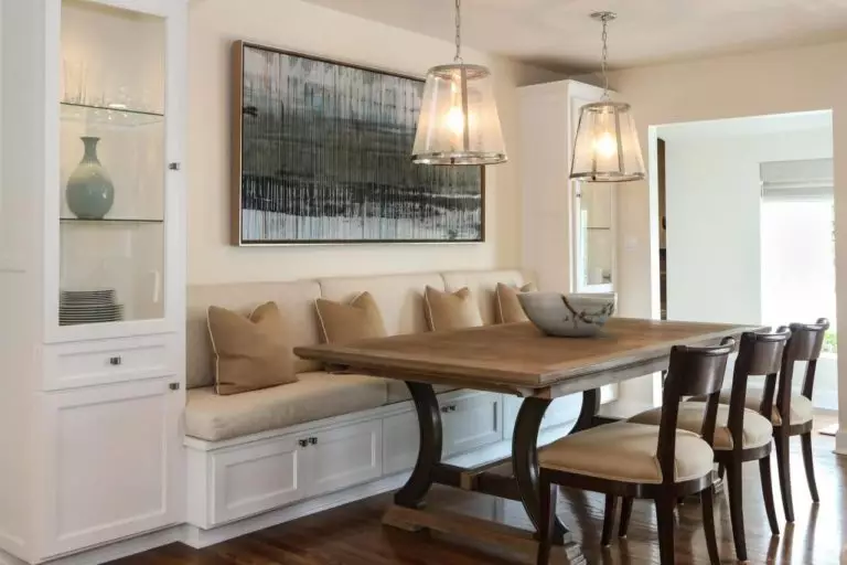
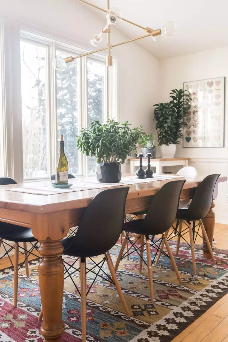
Kitchen and dining room
Whether you paint the walls or kitchen cabinets in Antique White, its warm notes will play their magic on the interior, making this space feel comfortable. What about its companions? Wood, marble, and brass. An appropriate combination of the mentioned elements can ensure both a traditional or modern interior, depending on what direction you take.
Antique White cannot go any other way in the dining space but for the walls, accompanied by furniture that suits the chosen style. It could be a marble table and flamboyant velvety chairs for an Art Deco statement, a large wood table and black accent chairs for a mix between the old and the new, or a classic wood table and chairs of the same material for a formal setting.
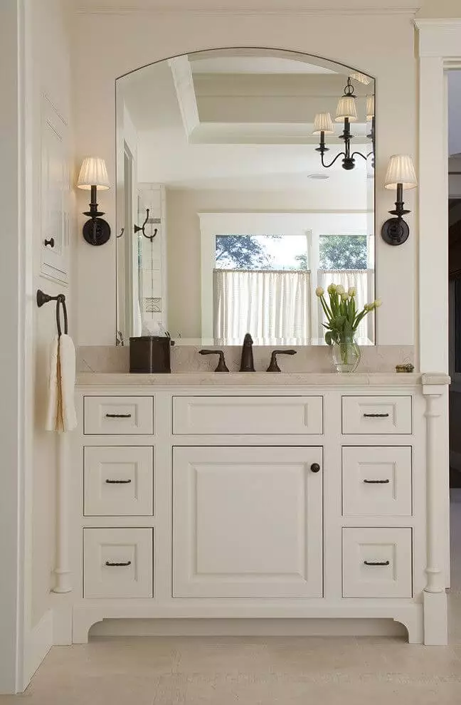
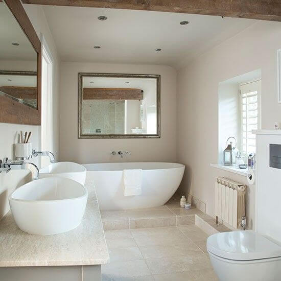
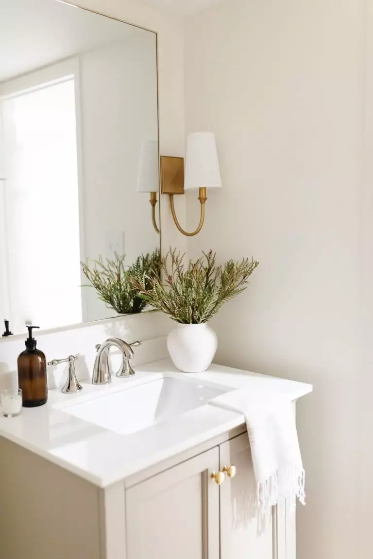
Bathroom
As much as we want to fully go with this cozy paint color within the bathroom and let it fill the space with its defining feature, we should keep it balanced, and painting the walls only seems like a well-balanced decision. As for the rest, you are free to go with either a monochromatic palette for a sleek contemporary look, pair Antique White with white painted cabinets and copper hardware to embrace the past values, or add brass for an original sense of elegance.
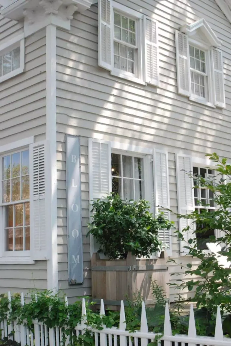
Use of Antique White for house exterior
This lovely shade of white, which acquires an even lighter appearance under natural light, is a real find for traditional wood house exteriors, accompanied by white trim. The composition as a whole shines in a new way on the natural background. To emphasize this shade’s welcoming feel, don’t hesitate to use this paint color for the front door, particularly on a darker background.

The Antique White 23 paint color from Behr is a standout mix of comfort, traditional, modern, and style that goes with any design approach, ensures calmness, and makes you fall in love with the environment it leads to again and again. Could it get any better? Yes, if you appropriately integrate it into your interior and exterior, which can easily be done if you go at least one more time through our article.
