Bracing Blue SW 6242
Sherwin-WilliamsA standout neutral with a bright blue base slightly played down by gray notes for an unforgettable accent you could only dream about.
Bracing Blue (SW 6242): what color is, review, and use
While true neutrals still dominate the stage, a few slightly bolder color variations try to win their place in the top list of paint colors. A fascinating representative of the kind, exceptionally refined and impressive, is the beautiful gray-blue Bracing Blue SW 6242 from Sherwin-Williams.
The medium shade of blue, gravitating towards the dark side, filled with gray notes yet not devoid of an eye-catching blue base, although a muted one, is a no-fail option for lovers of slightly striking neutrals. With Bracing Blue as part of your makeover, you can forget about additional paint colors to elevate your interior. SW 6242 will take care of it. Considering the large list of gray-blue shades, we wonder what makes this one stand out. We invite you on this colorful journey!
Bracing Blue paint color features
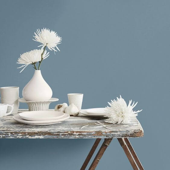
The lovely mix of gray and blue, where the latter prevails, is not as simple as you think. This color reveals a pastel surface that offers an exquisite mix of softness and pureness. Once you catch a glimpse of it, you cannot go any other way but admire it. All this considered, Bracing Blue is still relatively bright in contrast with other gray-blue variations, which makes it look unique. Any space painted this way will instantly be filled with a contemporary air of freshness, a standout feel of individuality, and slightly bold yet pleasing-to-the-eye softness.
Bracing Blue: is it warm or cold?
Considering that this shade is close to the dark category and covers such colors as gray and blue, one may think it is rather cold, or at least, cool. Still, this outstanding splash of notes cannot simply be called “cold”, nor can we call it warm. Only one word would perfectly describe this paint color – soft, with a bit more freshness in spaces with northern exposure and slightly more welcoming with southern exposure.
How does lighting affect Bracing Blue?
Bracing Blue is quite bright regardless of the gray notes, which simply reduce a bit from this feature rather than prevailing over it. When bathed in the warm sun rays, SW 6242 reveals the prettiest paint color that feels exceptionally inviting despite its rather dark notes. Once the surface is covered by shadow, the gray-blue variation brings a dark blue appearance to the surface. One should note that the blue side still prevails. The gray particles seem to dominate only in pure lit spaces. The same goes for artificial lighting that brings a similar effect depending on the cool or warm undertone.
Bracing Blue LRV
Do you wonder how we determined that Bracing Blue is a medium-to-dark paint color? It is all about the Light Reflectance Value, which is considered on a scale from 0 to 100. Bear in mind that 0 stands for true black; take 25 as the value of Bracing Blue, and it is clear that this shade is gravitating between the medium and dark color groups. If you asked colorists what it means in terms of light reflection, they would tell you that an LRV like this shows that the paint color is not proficient at reflecting the light throughout the room. Still, a few particles are still bounced back if an appropriate amount of light is ensured.
Bracing Blue undertones
The main notes in this shade are the blue ones. Next come the gray undertones that evenly penetrate the surface of this paint color and offer a muted effect. It is all about the perfect combination of gray and blue that slightly plays down the bright base without affecting its boldness and brings the most pleasant pastel blue to the surface that one might have dreamt about.
Similar colors
It should not surprise you that Bracing Blue has many similar shades both at Sherwin-Williams and other brands. As usual, we would like to reveal a few impressively identical alternatives, some lighter shades, and some more intense variations if you are looking for a slightly different effect. Consider the following representatives:
Coordinating colors
Ideally, Bracing Blue works with lighter paint colors so that it can reveal its intense notes. One can either opt for a classic white shade or white variations with subtle blue undertones for a monochromatic interior or exterior. Next come light shades of blue with pastel surfaces that would perfectly harmonize with their darker companion. Designers also suggest combining SW 6242 with warmer shades of earthy brown, slightly played down, for a contemporary contrasting solution. You can gravitate between these color possibilities. Still, experts from Sherwin-Williams suggest three exact color matches for each case.
Use of Bracing Blue in the interior
If you want to switch from neutrals to a slightly bolder paint color yet are afraid it may look too striking, you can safely consider Bracing Blue, whose gray notes will keep it under control. You can easily go from an accent to a base color with SW 6242 in mind. The only thing you should consider is combining it with lighter or warmer shades for a balanced effect. It seems the range of possibilities can get quite impressive. Let’s go through a few design solutions!
Modern accent
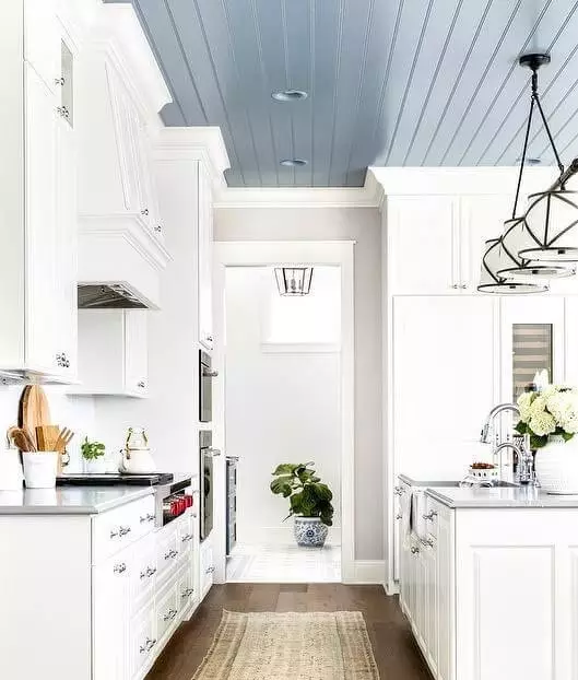
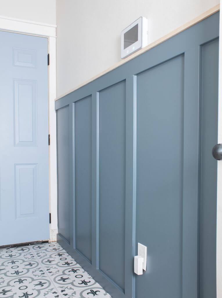
Consider any element you want, be it a wall, interior door, kitchen island, ceiling, or a bookcase, and paint it in the gray-blue shade that experts from SW came up with. Don’t you dare mix it with similarly bold shades (just kidding!). Still, such an accent requires a light background, particularly a classic white one. A splash of this kind in a natural interior is a combination worth admiring that brings individuality and sets a standout modern environment.
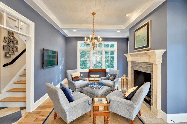
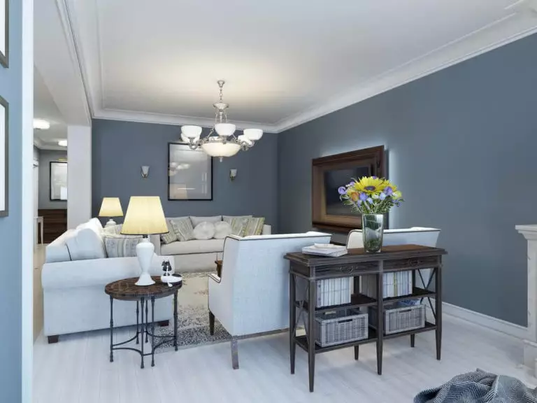
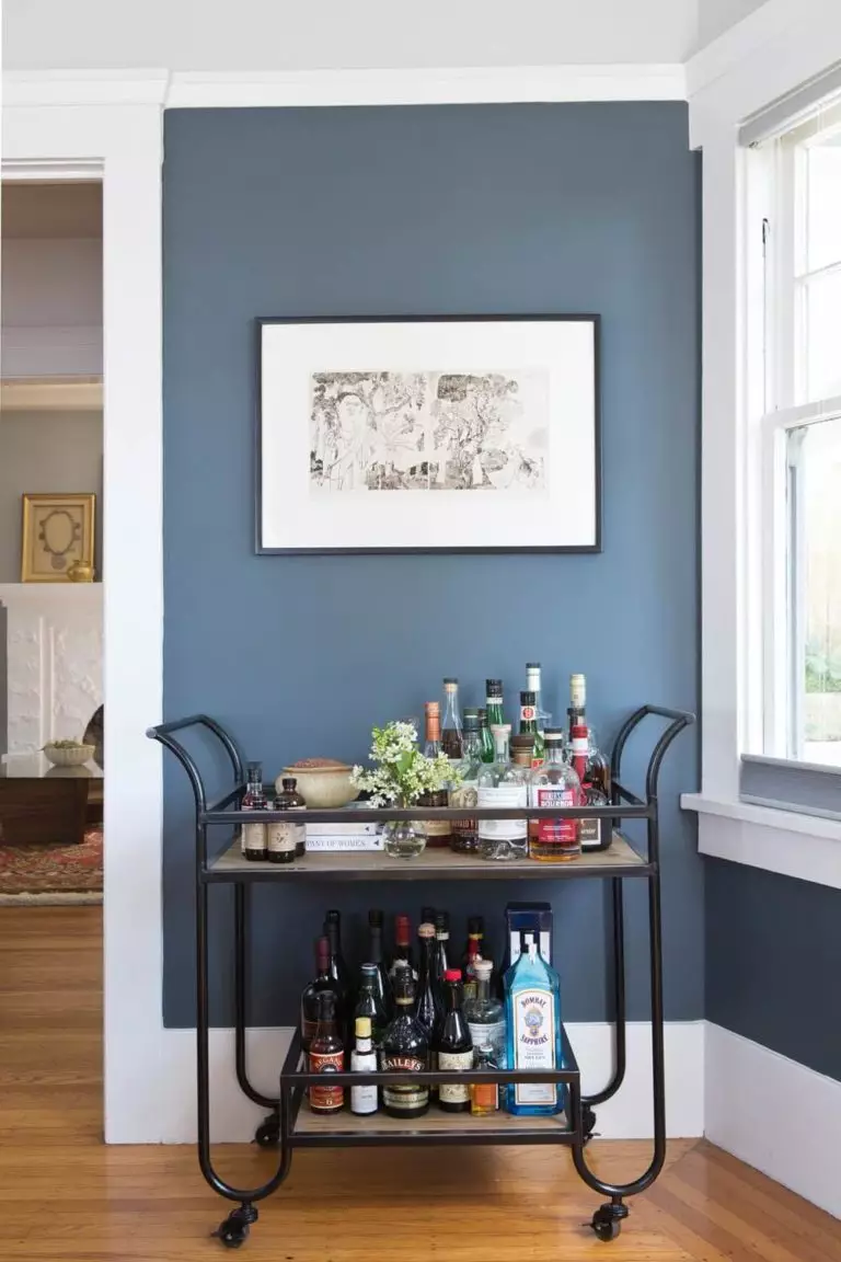
Versatility in the living room
It is impressive how the same paint color works simultaneously for a modern interior with sleek lines and a monochromatic approach to colors (a contrast with white is no less appropriate), a traditional interior with a familiar layout, soft upholstery, and slight color deviation, a rustic interior with natural wood texture, and even a vintage one with exquisite pieces of the old times. All this on the gray-blue background and your living room acquires an exceptional appearance that you witness in magazines only.
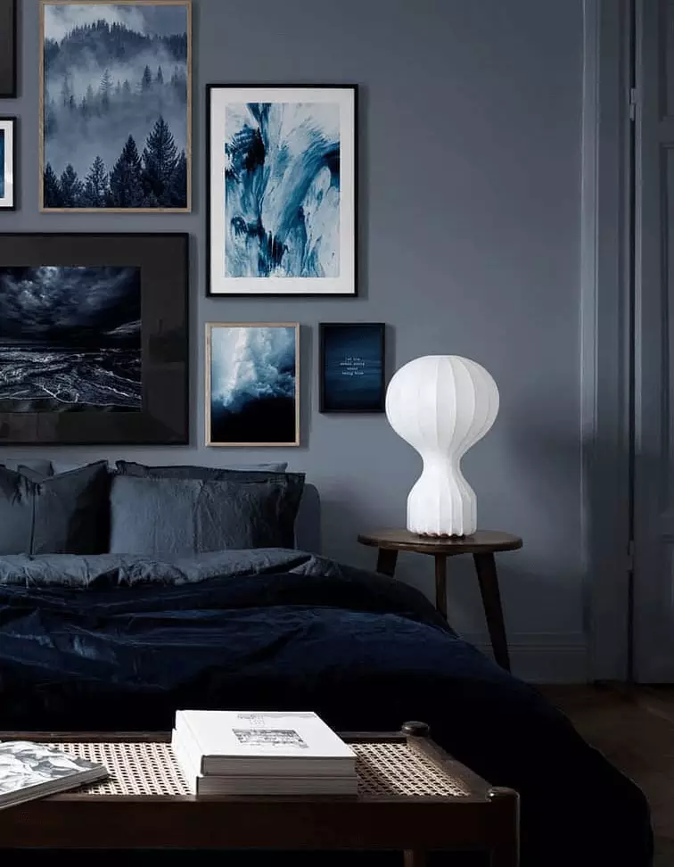
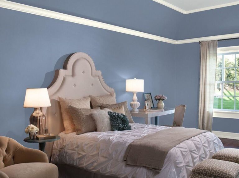
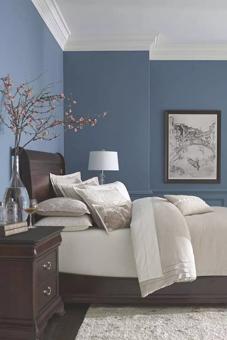
Originality in the bedroom
Do you know what would surely elevate your personal space? A modern splash of gray-blue, and not a tiny one but a whole background painted this way. Again, this color impresses with its flexibility. One can pair white and SW 6242 with a sleek contemporary sense of formality, consider a combination of gray-blue, dark wood, and beige bedding for the most authentic mix of colors and textures, or mix Bracing Blue and bolder accents for a personal statement.
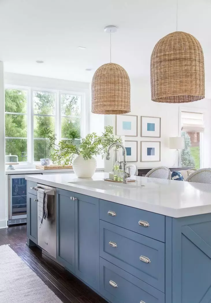
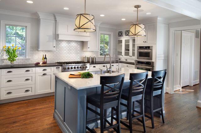
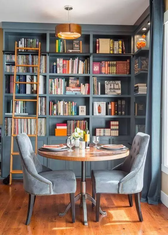
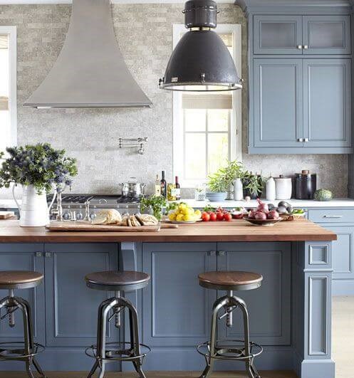
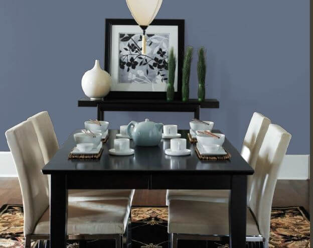
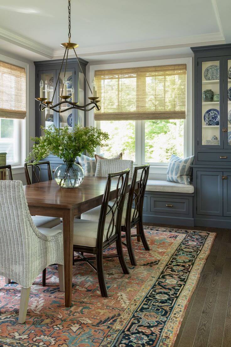
Kitchen and dining room
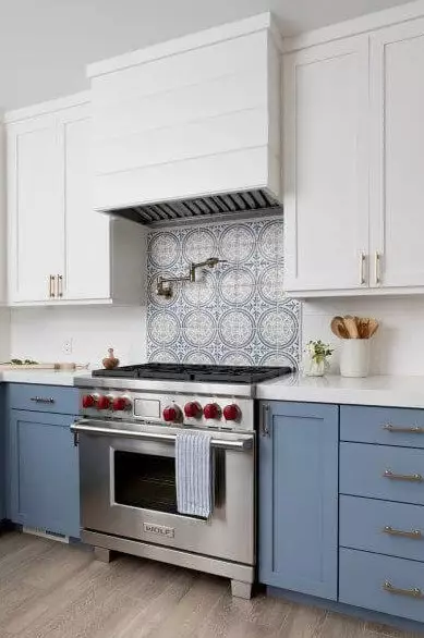
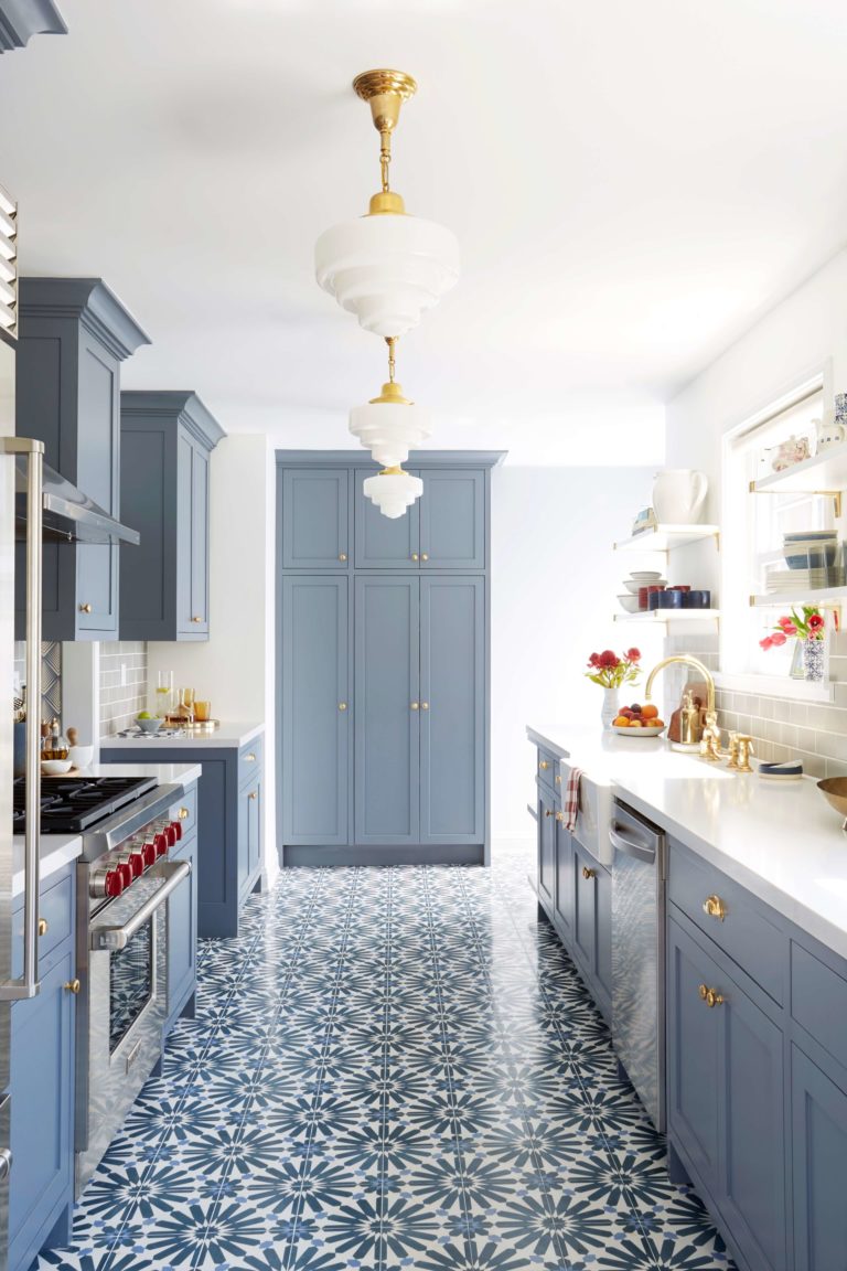
The already beloved gray-blue cannot skip the kitchen and offers the inspiring solution of combining lower cabinets painted in SW 6242 with white upper cabinets, beautifully underlined by a Mediterranean-inspired backsplash. This type of tiles can be considered for the floor as well, with kitchen cabinets entirely painted in Bracing Blue. Fresh, sleek, contemporary, and unique – that’s how it feels.
Entering the dining area, we instantly recommend using Bracing Blue for the walls and complementing them with white and black pieces of furniture for the most contemporary approach. Still, nothing compares with a traditional interior featuring a wood table, accompanied by a soft carpet on the floor, and the pearl of the space – cabinets painted in gray-blue with displayed collections of pottery.
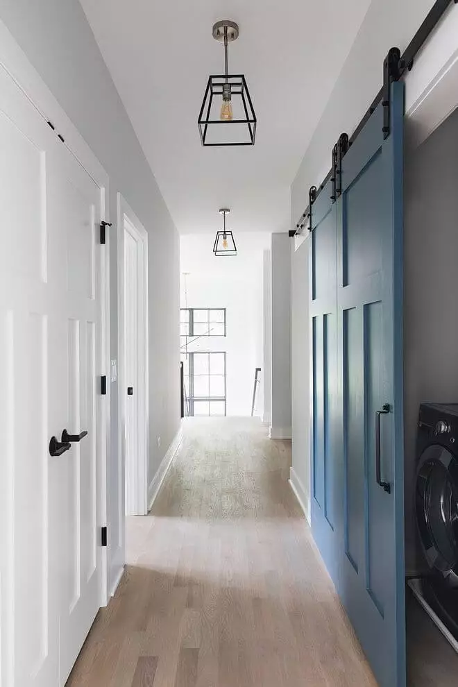
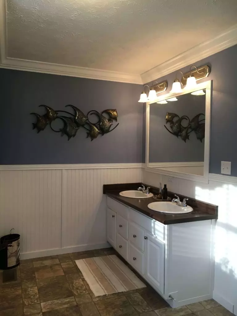
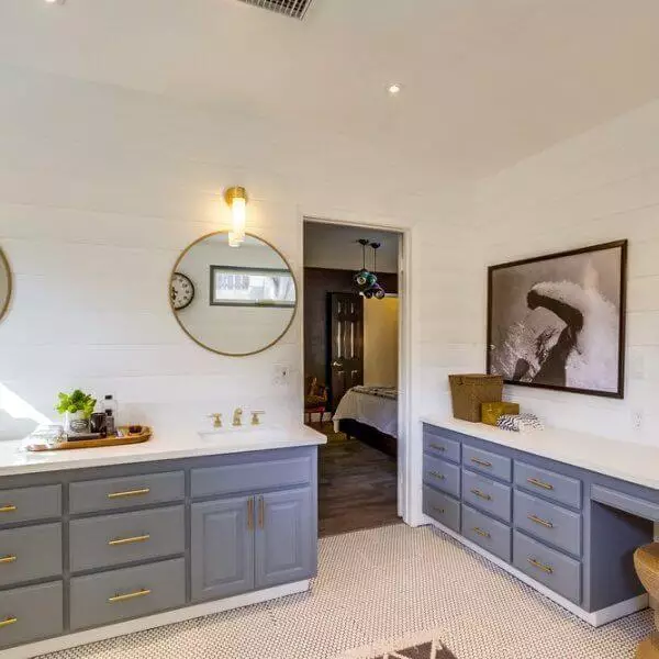
Bathroom and laundry room
You can always go with a pastel blue backdrop. Still, make sure the cabinetry is painted in a light shade, and an appropriate amount of light is ensured so that SW 6242 does not feel too imposing. On the other hand, painting the cabinets in gray-blue and combining them with white walls solves the problem automatically since the light background will balance the bold sparkle of color.
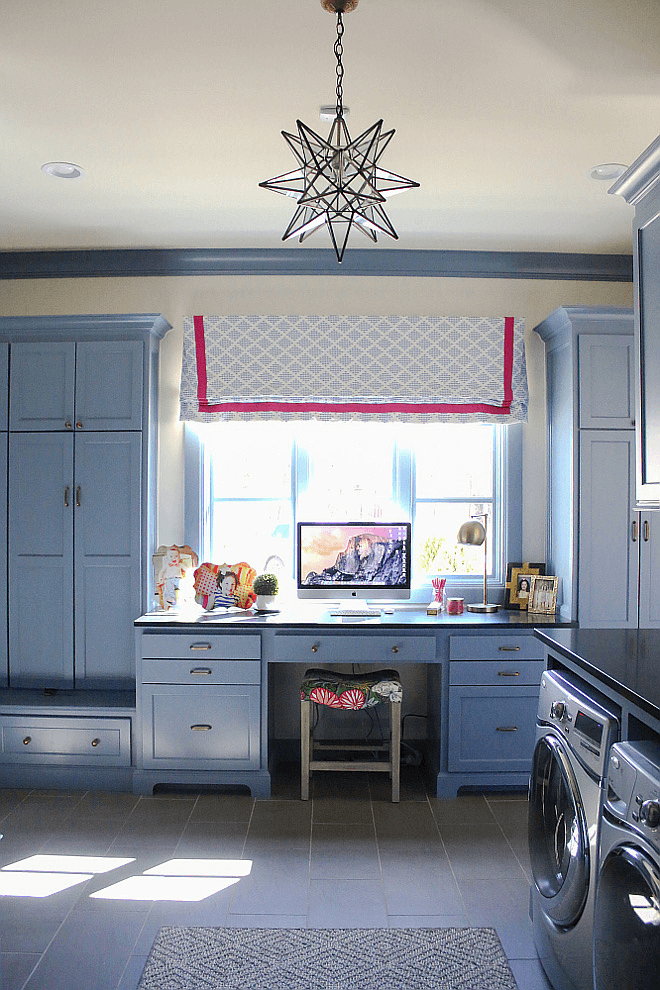
SW 6242 seems no less relevant in the laundry room. In a few words, it is a unique neutral that breathes new life into spaces that feel rather functional. Furthermore, you can smartly use the room as a home office as well if the space allows, where the balanced splash of blue will surely serve as a source of calmness so that you can direct your attention to work.
Use of Bracing Blue for the house exterior
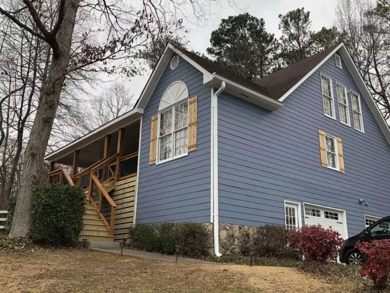
Under the influence of daylight, Bracing Blue seems more neutral than on the sample, while the blue notes offer authenticity, making it a standout paint color for the exterior. It looks exceptionally well on wood walls. You can even brighten them with wood details. Nevertheless, if the gray-blue shade still seems bold, we suggest pairing it with gray and using it partially on the house exterior for an ultra-modern approach.
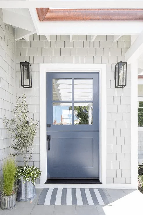
Don’t forget the front door, which sets an inviting and stylish entrance once painted in this shade. Consider a light paint color for the walls to set a trendy contrast.
The Bracing Blue SW 6242 paint color from Sherwin-Williams is not that popular yet and only because designers want to keep this pearl for themselves. It is all due to the fact that a single splash of this variation can elevate your interior and exterior to the next level.
