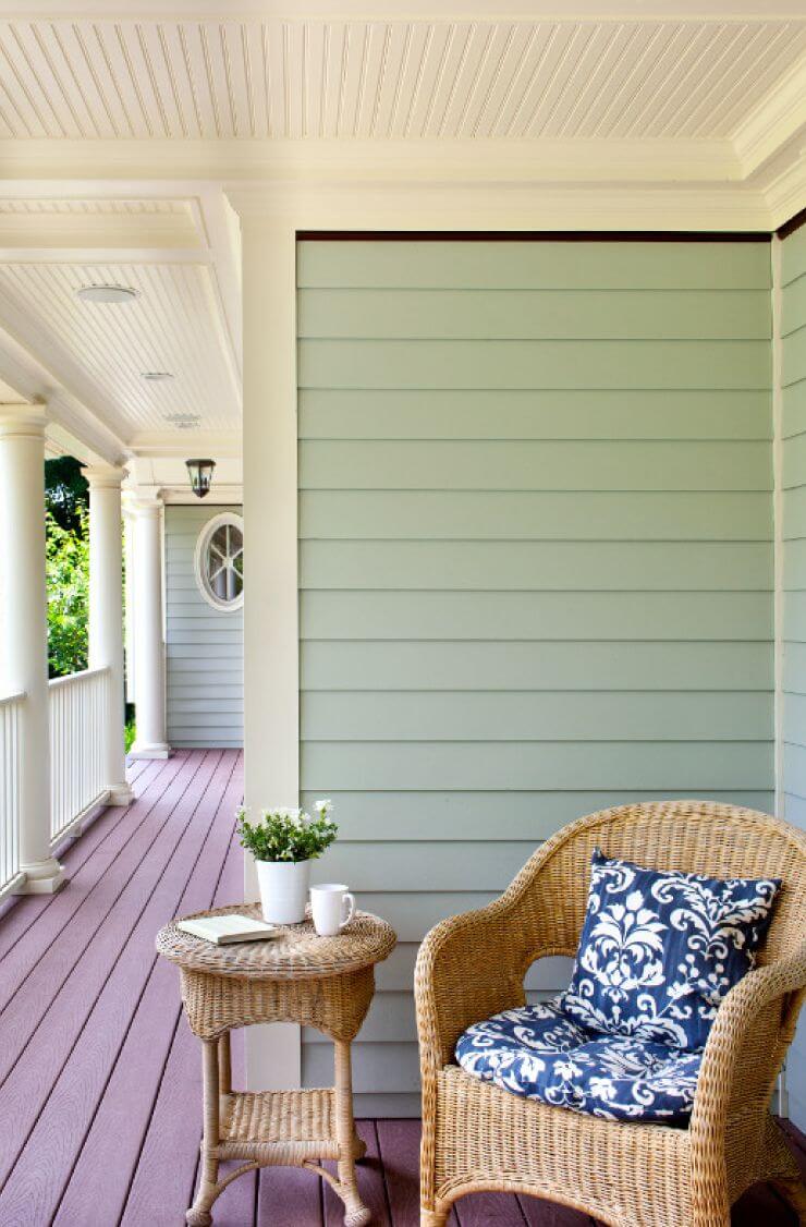
The first association is sea glass, delicate green and polished by ocean waves. Light and cheerful and at the same time calm, balanced, and very natural.
Breezeway (Behr MQ3-21): what color is, review, and use
Autumn is coming to an end, but we already know in what colors we will decorate and update our interiors next year. All well-known paint manufacturers have already presented their colors for the year 2022, and it should be noted that most of them showed a charming unanimity in favoring cool and natural greenish-gray tones. For example, Sherwin-Williams presented its updated version of sage called Evergreen Fog, and Benjamin Moore chose his interpretation of sage green called October Mist 1495 as the color of the year – a lighter and more refined cool.
Following the trend, Behr also turned towards cool hues but opted for an incredibly airy, refreshing, and atmospheric option that evokes thoughts of walking along the coast on a sunny day. So, meet – Breezeway MQ3-21, the color of 2022 from Behr. Light and cheerful and at the same time calm, balanced, and very natural.
Breezeway paint color features
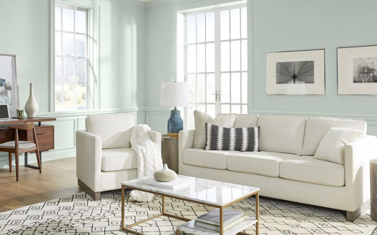
When looking at a surface painted with a Breezeway paint, the first association is sea glass, delicate green and polished by ocean waves. If you see it that way, you have solved the design riddle. Indeed, this airy blue-green and slightly matte tone is inspired by this remarkable phenomenon, but it was chosen not only for this reason.
According to Erika Woelfel, vice president of color and creative services at Behr, Breezeway is a story in which a coat of new paint meets a breath of fresh air. Everything speaks of change and a willingness to head towards exciting events and new hobbies. According to Erika, this shade also symbolizes recovery and healing – primarily mental and spiritual.
Breezeway: is it warm or cold?
As is the case with many colors, Breezeway is a warm or cold color in the name itself. The presence of blue and gray shades clearly indicates that it belongs to the cold, even despite the predominance of green. However, I still can’t call him cold but cool and fresh – this is definitely about Breezeway!
How does lighting affect Breezeway?
Even the brightest sunlight will not be able to reveal any warm glare in this greenish-blue hue – but this does not mean at all that it is not interesting to observe it in this or that lighting. Breezeway is by no means a chameleon, but his play of undertones is fascinating.
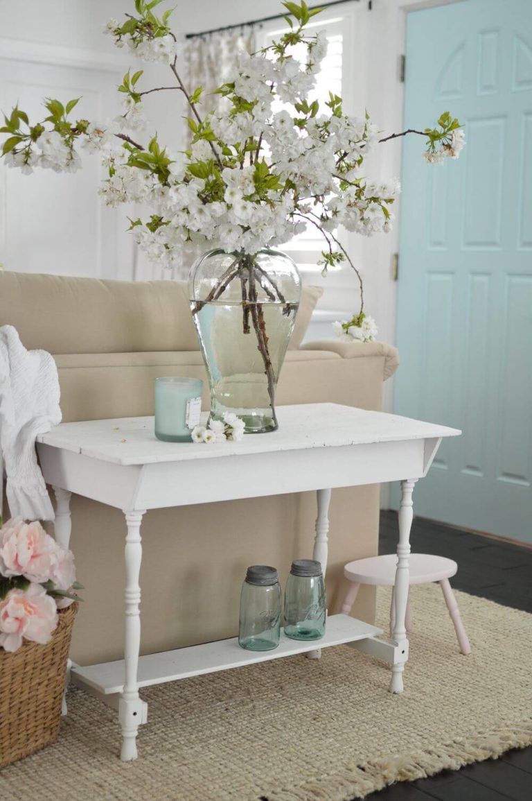
So, in intense natural or artificial light, it goes into a very delicate mint – and so light that, for example, a door painted with such paint can practically merge with white walls. In normal light, it exhibits an excellent balance of light blues and light greens, while in insufficient light and at dusk, blue and silver tones take over.
Breezeway LRV
Breezeway boasts a very high coefficient of light reflectance (LRV) – for it, it is 66. This means that although the color is in the middle range, it confidently approaches the value after which light tones begin.
This LRV demonstrates the shade’s ability to reflect light perfectly and visually transform rooms. If you need to expand a space with poor lighting visually, Breezeway may well be a more colorful alternative to the usual white and beige tones. It is no less charming in rooms with good lighting, where it creates the atmosphere of a sunny beach and eternal summer.
Breezeway undertones
Green shades are essential for Breezeway, which are expressed as much as possible within the specified lightness in this color. At the same time, there are much fewer blue undertones, but they are also presented in sufficient quantities to give the paint a refreshing coolness. In addition, one cannot fail to note the hidden participation of gray notes, which impart a remarkable serenity to Breezeway.
Similar colors
It can hardly be argued that Breezeway’s color is unique. However, both in the palette of Behr itself and in other manufacturers, it is quite possible to find shades that are pretty close to it:
Coordinating colors
For a pleasing and eye-pleasing contrast, use Breezeway in combination with the following opposite shades:
Use of Breezeway paint color in interior and exterior
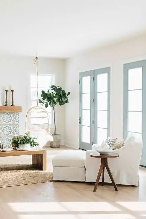
The delightful benefit of this delicate shade of green is its ability to be used in a wide variety of interiors. The key message of Breezeway is to evoke the personality of your interior without the slightest overpowering of the surrounding space. Perhaps that is why in interiors where this color predominates, almost everyone feels an amazing lightness and an upsurge of strength. If you are also fascinated by its amazing serenity, let’s take a closer look at how it behaves in certain design decisions.
Coastal style
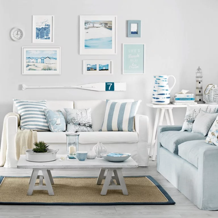
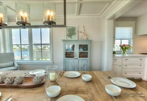
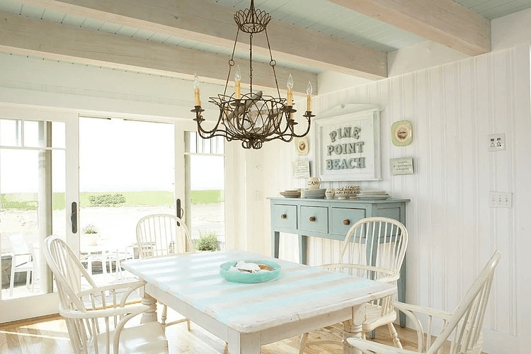
There is perhaps no environment more organic for Breezeway than a style influenced by the finishes and decor of wealthy coastal homes. Use it to paint accent walls, furniture, textiles to create a fresh and breezy atmosphere, and if you can find frosted glass lamps in a similar shade or landscapes in greenish-blue tones, it will be even easier to achieve harmony.
Vintage
In vintage interiors, Breezeway reveals how serene and soothing – and even sun-faded. With an abundance of antique wood furniture, natural dense textiles, and old-fashioned patterns, it looks even slightly dusty and bluer while adding lightness to the atmosphere.
Living room
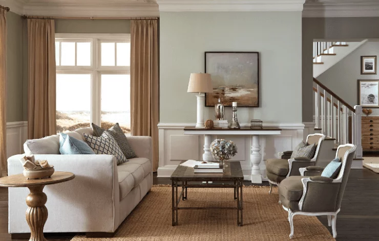
If you want to use Breezeway to paint the walls in your living room, you have two options – go into freshness and coolness or resort to contrasts. In the first case, cool white and gray tones combined with deep blue and emerald tones will help you. The second option is even more interesting: a creamy ceiling and window frames, furniture with coral upholstery, and a dark wood coffee table create a feeling of perfect, unshakable comfort that you will hardly want to leave.
Dining room and kitchen
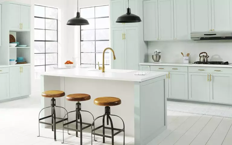
Cabinets in the shade of sea glass will look great in a modern, bright kitchen. Don’t forget brass hardware, black metal fixtures, and light wood furniture in greyish tones for a spacious and welcoming space.
Home office
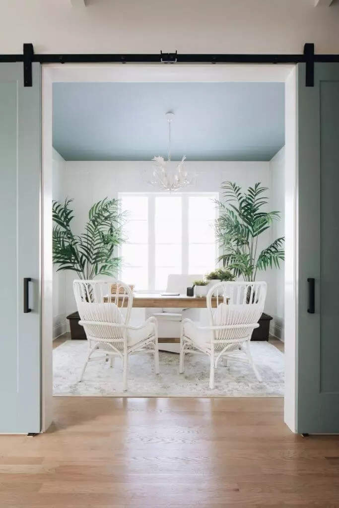
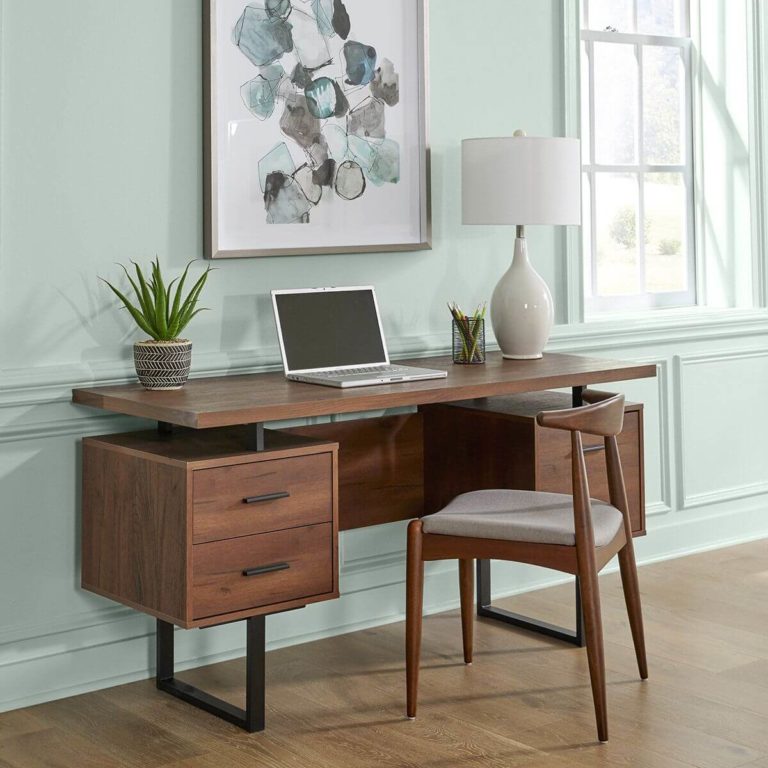
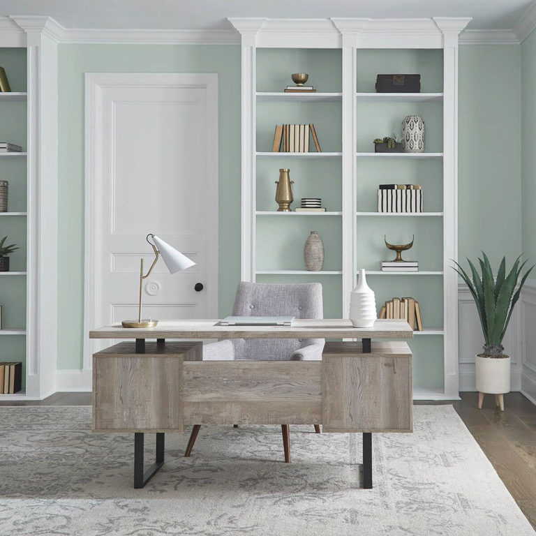
Designers warmly approve the use of Breezeway paint color for home office walls, as it invigorates, refreshes, and does not tire the eyes in the least. Another undoubted advantage of the color is that it is equally well combined with both classic cabinet furniture made of solid wood and with modern furniture, where metal and glass are often used.
For the exterior walls of the house
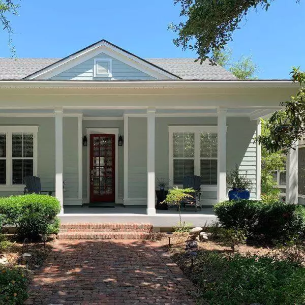
If your home is located in a sunny region, you will significantly benefit from using Breezeway for its exterior walls, as it will create a feeling of greater volume, friendliness, and hospitality, combined with the lightness of lines and proportions. In overcast areas, you should be careful, as Breezeway on the outside walls and surrounded by gray and slush runs the risk of looking unnecessarily faded. However, the situation can be easily corrected with the help of dark architectural elements – the roof, door, porch, and window frames.
Behr’s green-blue Breezeway is a symbol of great hope for 2022. The desire to breathe freely, enjoying the fresh wind and exciting events, is especially urgent for us in the light of the past two years. And, perhaps, with the help of this color, we will become closer to our dreams.

