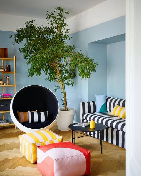
A breezy shade of soft blue full of life; a perfect trendy paint color to use in small and poorly lit spaces, with a bonus - it enlivens the room with its vibrant and uplifting properties.
Breezy Half (Dulux): What Color Is, Review, and Use
Today we speak about one of the most popular colors on the planet – blue. Mainly associated with the clear blue sky or the deep ocean bottom, all things natural, blue reflects serenity, calmness, and relaxation. Although some blue shades may read sad and depressive, this is definitely not about the soft yet full-of-life Breezy Half blue from one of our favorite brands, Dulux.
Some enjoy the healing properties of Dulux’s trendy, nature-traced paint colors in the Connect (connect to nature) and Balance (harmonious watery colors) color collections. Only a few find balance and feel more secure than ever when surrounded by the brightest colors possible from the Revive palette. Breezy Half confidently enters the last category. Use paint with no boundaries and share your style with the world. The light and joyful blue is a great way to start with!
Breezy Half Paint Color Features
“A soft mid-tone blue whose innate brightness adds life to a space” that’s how Dulux’s colorists accurately describe this innovative paint color. Analyzing the psychology of blue shades, we came across features like confidence, reliability, intelligence, concentration, and predictability simultaneously with security, tranquility, safety, and peace. Most share those characteristics regardless of what blue shade we speak about.
Breezy Half is a modern blue tone that also resonates with the emerging bright colors of the self-expressive and roaring design styles from the second half of the last century. To be more precise, BH is a softer version of the vivid blue found in design projects from the ‘50s to ‘80s.
You’ll most likely fall in love with this breezy blue if you crave responsibility, thoughtful decision-making, meditation, and well-organized places, and generally show yourself as a reserved person with a trustworthy individuality.
Breezy Half: Is It Warm or Cold?
When looking at the color sample, we get the idea that this bright blue tone gives off a very happy vibe. Analyzing it thoroughly, we found out that the concentration of blue in its RGB value (Red, Green, Blue) significantly outruns the other two. What does it result in? Breezy Half is a cool blue shade.
How Does Lighting Affect Breezy Half?
Breezy Half is one of those paint colors that will appear slightly different on a surface in your house than on the color sample you can find on Dulux’s website. If you get lucky, you can witness the same flawlessly soft blue with a summer-sky effect when this color spreads all over a south-facing room. A no less beautiful blue reveals in spaces with north-facing windows, where Breezy Half turns into a powdery gray-blue, definitely blue-biased yet more balanced and neutralized.
Overall, this trendy blue tone is bright, and you can easily apply it to smaller rooms with tiny windows. At night Breezy Half switches to a relatively muted version of gray-blue.
Breezy Half LRV
Colorists operate with the technical term Light Reflectance Value to help us understand how light or dark a color is on a scale from 0 (true black) to 100 (pure white). We have already stated that Breezy Half is a mid-tone paint color. How come? It has an LRV of 69, standing at the border between medium tones and light shades.
There is another purpose for using LRV; for instance, in the case of Breezy Half, a value close to 70 shows that this color perfectly reflects light, and colorists even recommend it in small spaces to make them seem larger and lighter.
Breezy Half Undertones
We identified a single additional color fragrance in the pure blue tone from Dulux. You probably already know that this is gray. A subtle gray undertone resurfaces under poorer lighting conditions, especially if accompanied by northern exposure.
Similar Colors
Aside from Breezy, a bright blue hue as double intense as Breezy Half, from the same brand, we are happy to share a wide range of breezy blues of similar beauty and style. Enjoy!
Coordinating Colors
Keep it immaculate by pairing this perfect baby blue color with a neutral white tone. On the other hand, underline its vivid effect by scheming it with brighter blues, pinks, and greens. Choose deep gray tones for a balanced palette with Breezy Half. And, of course, two no-fail expert-choice suggestions from Dulux:
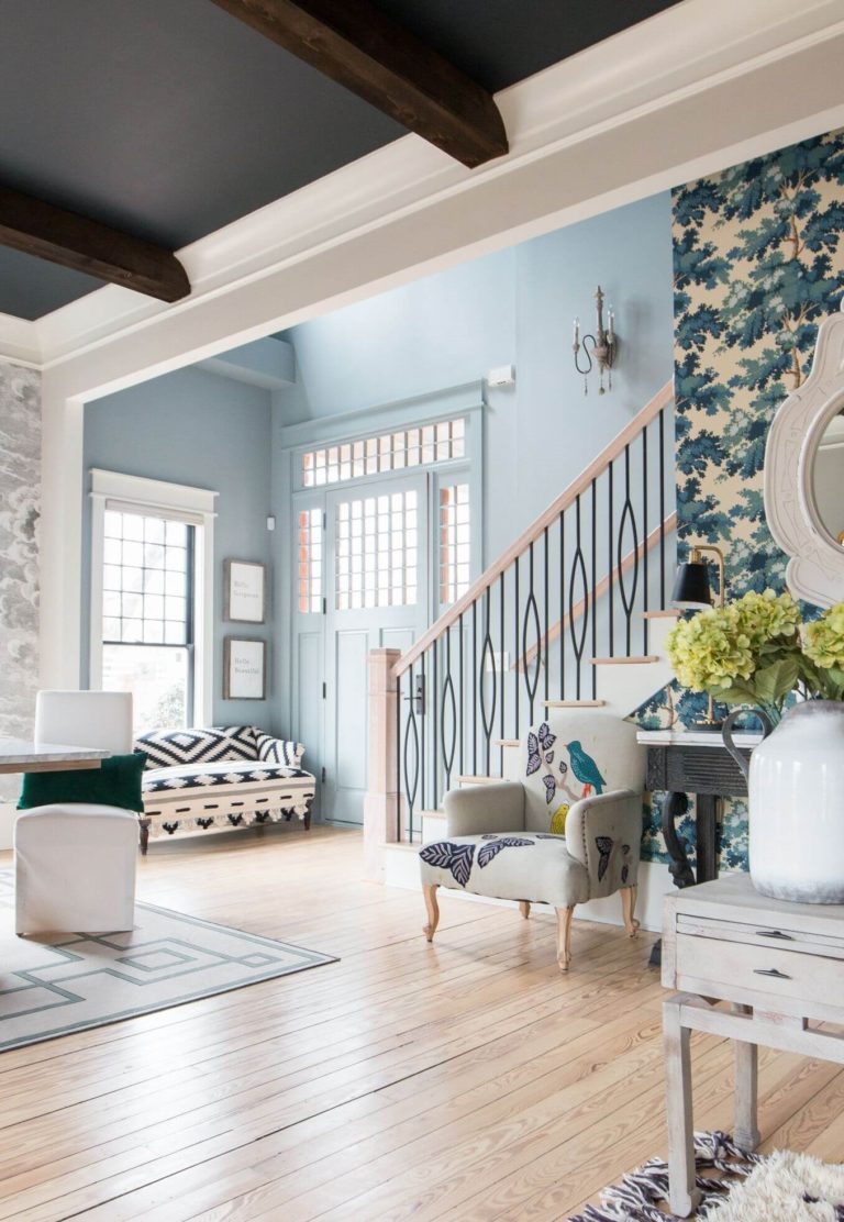
Use of Breezy Half in Interior Design
Professionals recommend Breezy Half for sleeping spaces, hallways, kids’ rooms, and home offices. Ideally, it works for any room needing a lift-up, especially if this is a small or poorly lit space. As for design styles, you can use this blue shade to recreate a retro vibe, complete a Modern colorful palette, or underline the defining features of a Contemporary design style. Some of the following design ideas will undoubtedly win your heart.
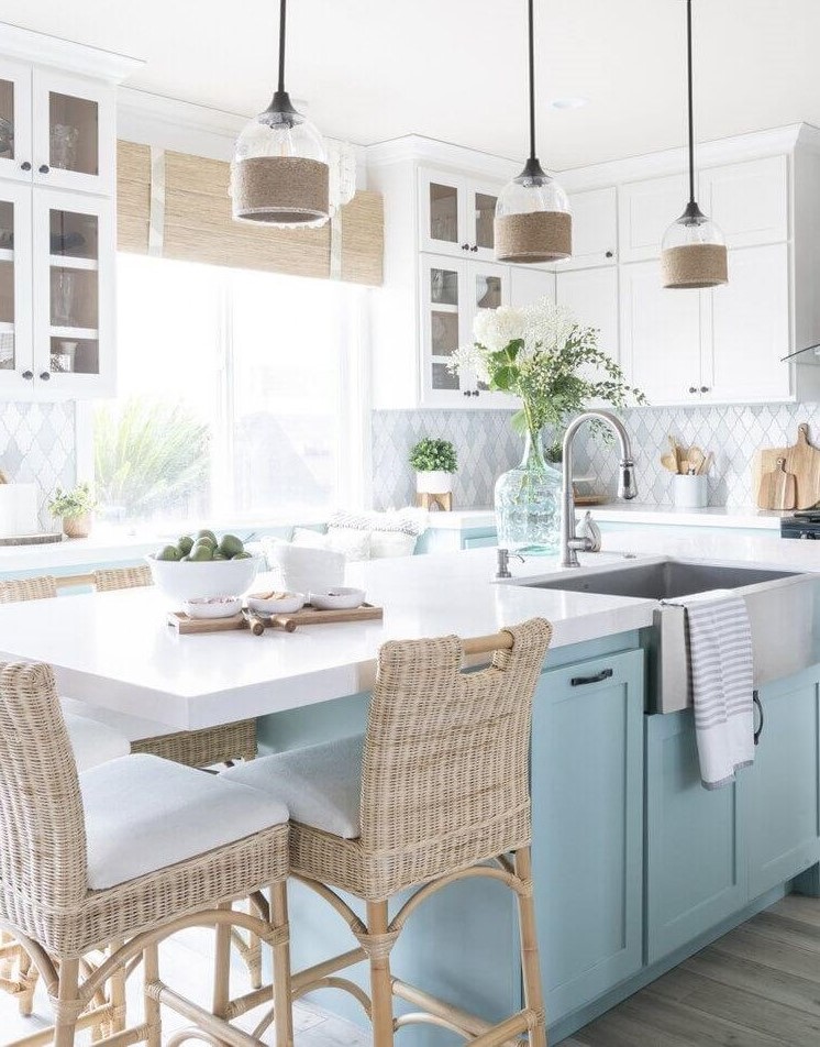
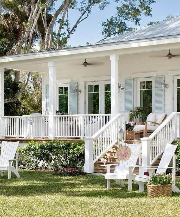
Coastal Blue
The two main features you should always find in a Coastal-style design are bright and breezy. Breezy Half from Dulux perfectly fits this role. Ensure a light color palette that blends with the outdoors prevailed by white, sandy shades, and blue (the breezy blue from Dulux). Add textured furniture and wood, sisal, wicker, or jute decor. And, of course, enjoy the beach ambiance at your home even if you don’t live on the coast.
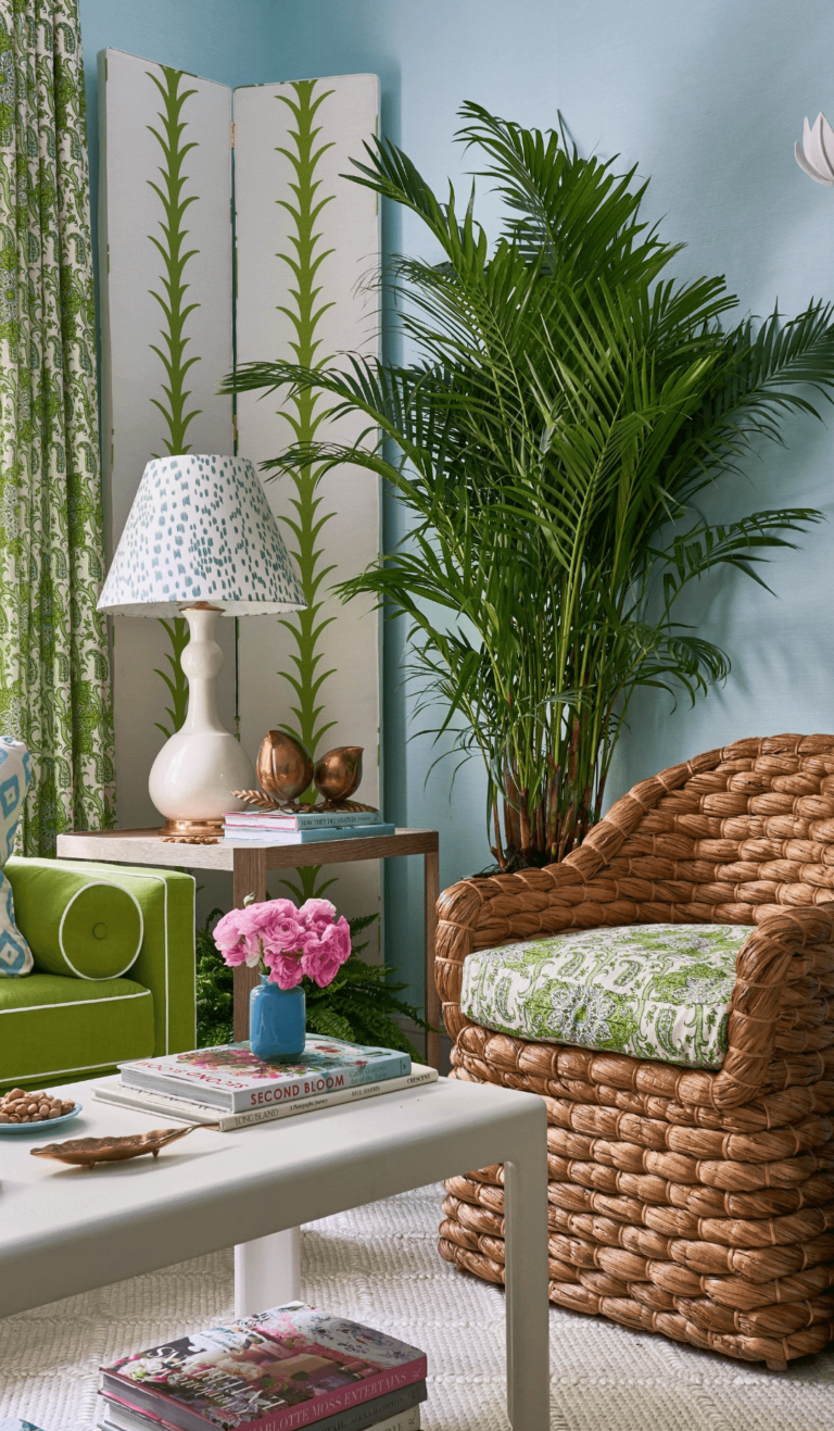
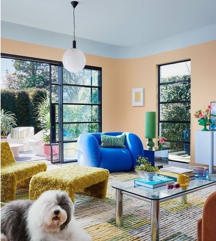
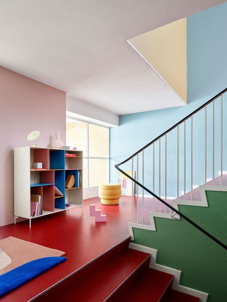
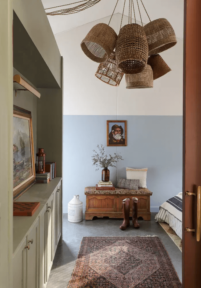
A Piece of Art: Retro Mood
2023 and the following design seasons will pay tribute to the last century’s nostalgic and lively color and pattern trends. Expect many asymmetric shapes, geometric patterns, eye-catching color pairings, and individual designer marks. There is undoubtedly a place for Breezy Half in this Bohemian chaos. Use the Modern retro design ideas and the pastel blue from Dulux to celebrate the beauty of mood-boosting colors and forms.
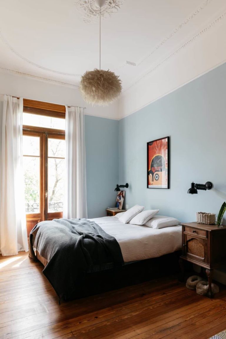
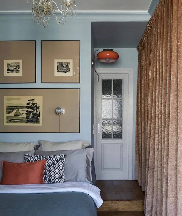
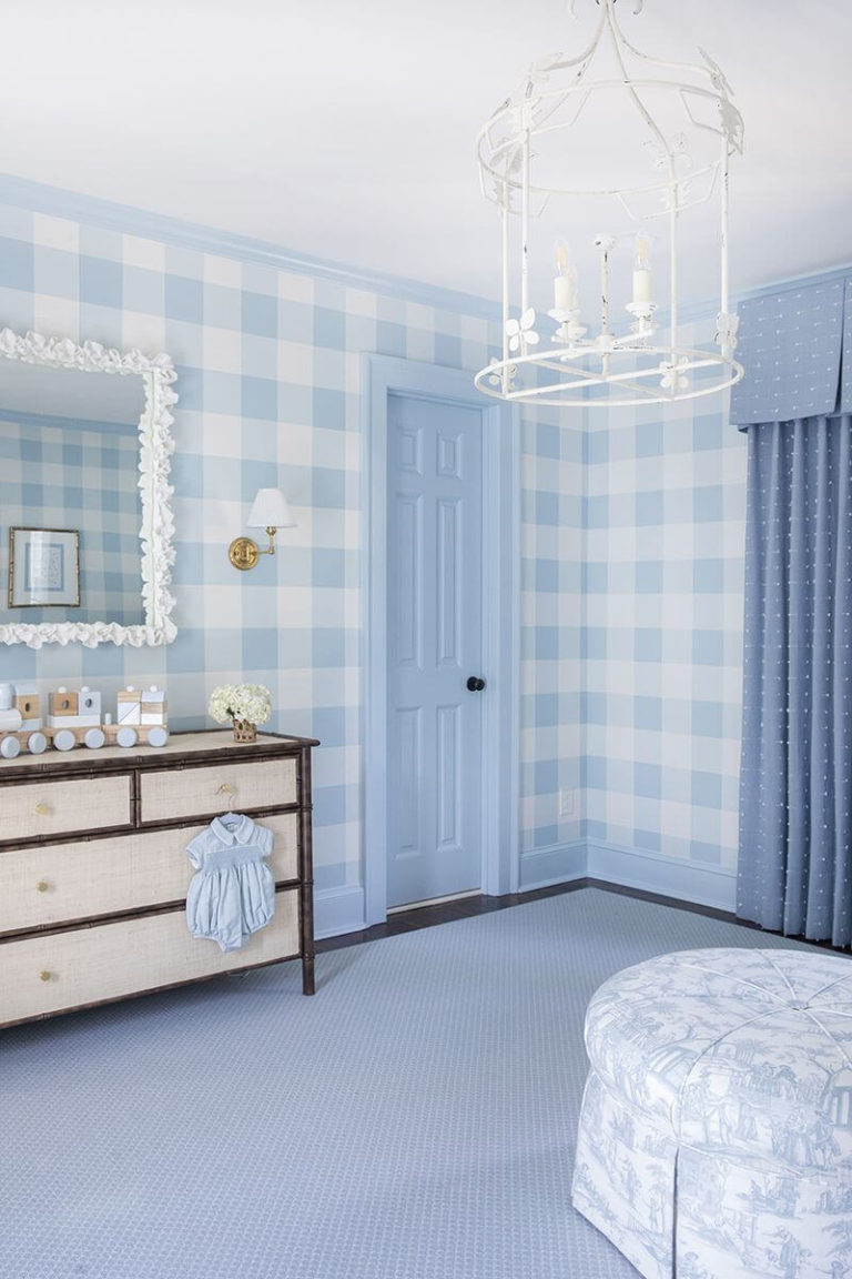
Blue Bedroom with Ethnic Motifs
Do you know that blue is highly associated with traditional and conservative patterns? No surprise, experts recommend customizing your bedroom by opting for a blue background, which is Breezy Half, and traditional mixed with vintage patterns. Consider rich earthy colors and textures paired with ethnic motifs on furniture and textiles, and enjoy their contrastive yet harmonious effect on the pale blue canvas.
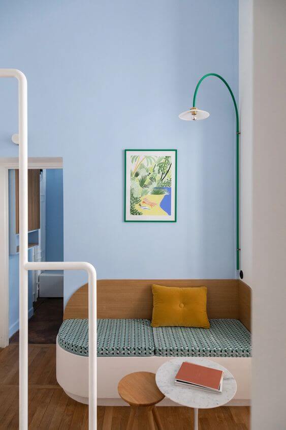
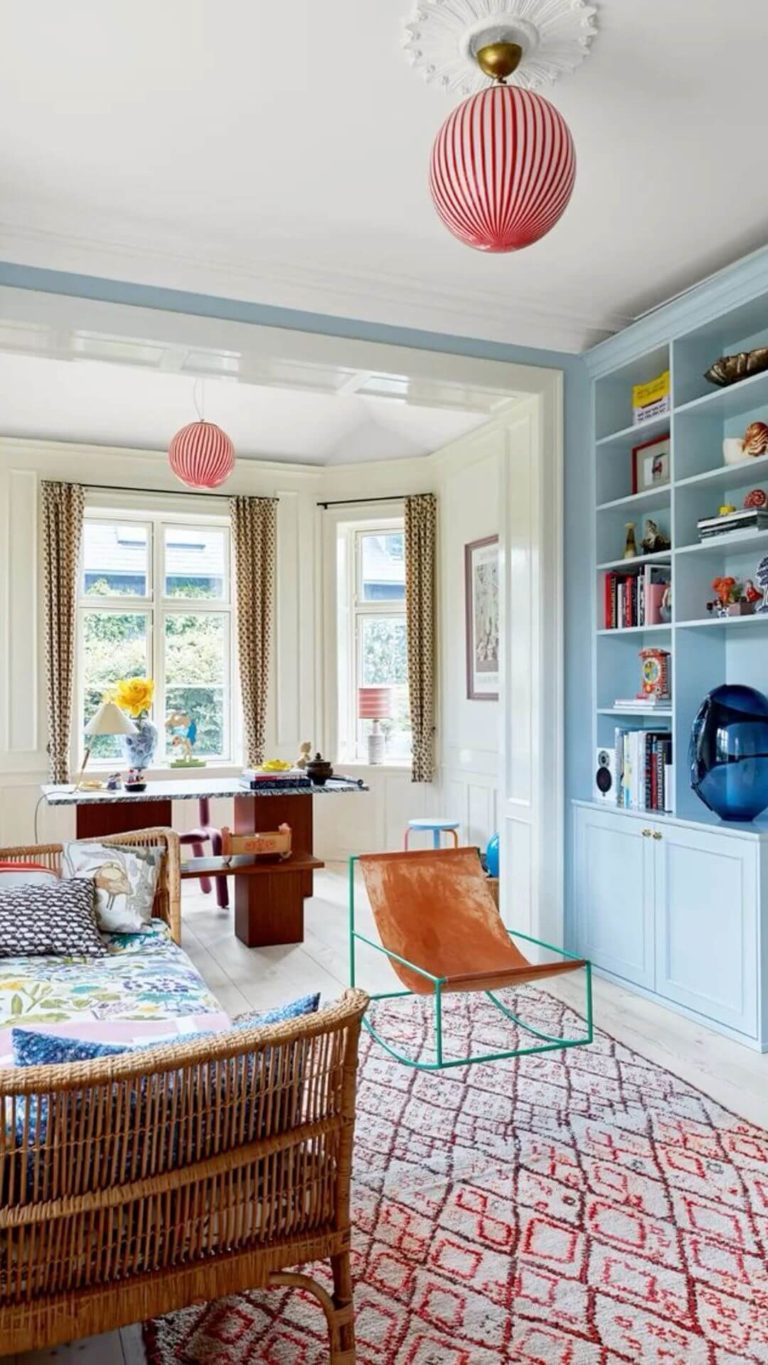
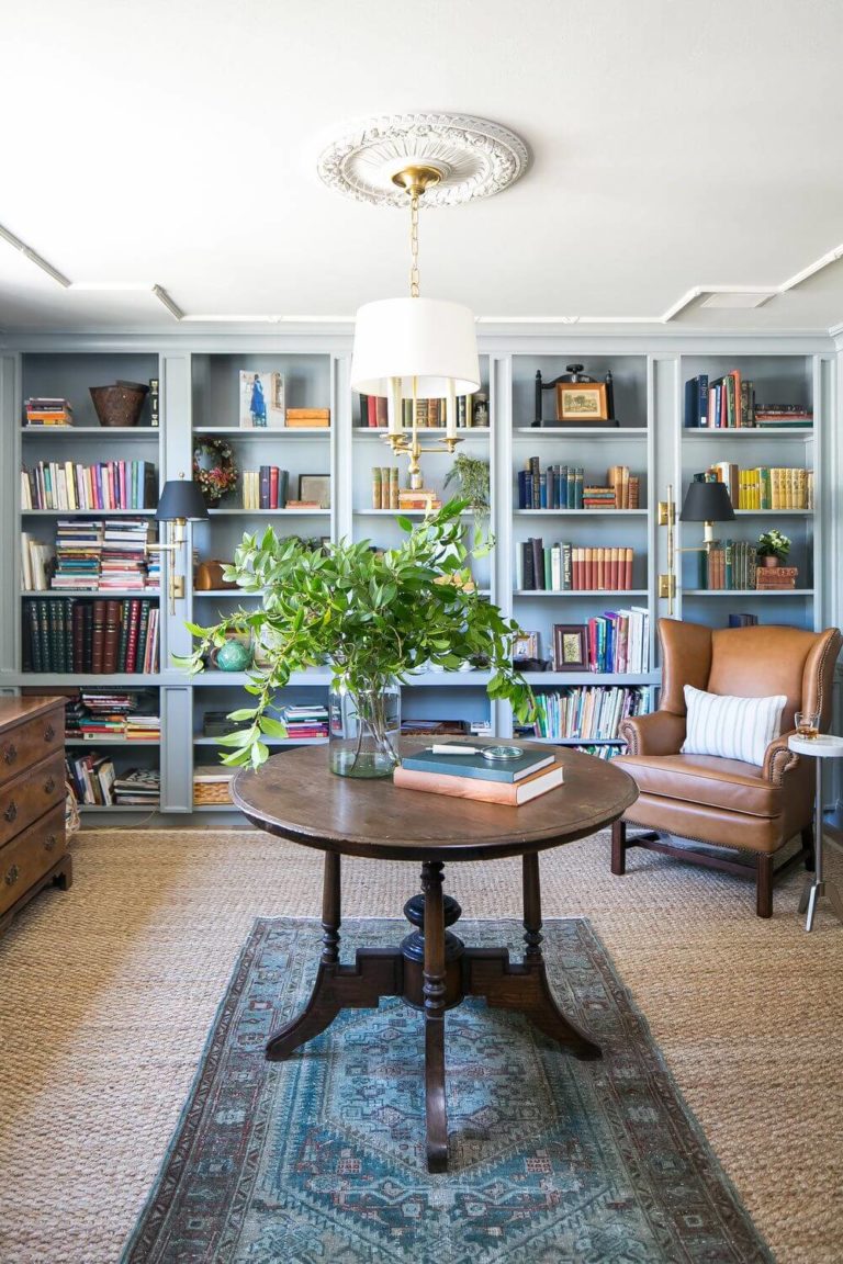
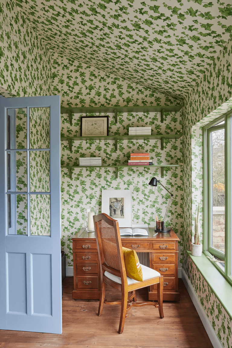
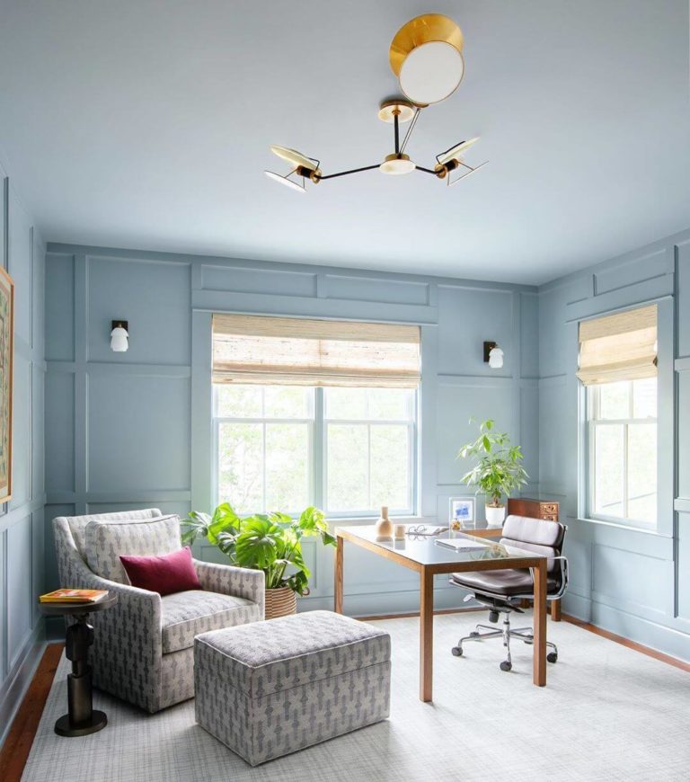
A Calm Place for Work: Blue Study
It is not always enough to have perfect concentration abilities only. The surroundings play a great role in our work efficiency. If you work remotely or like spending your free time in the company of a good book, you’ll most probably enjoy Breezy Half in the background. So far, designers have used this paint color in Traditional home offices with classic furniture. This soft blue and the rich wood texture are a very collaborative pairing.
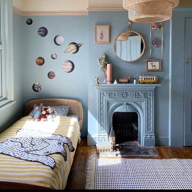
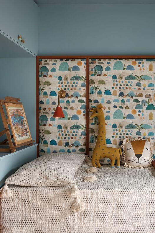
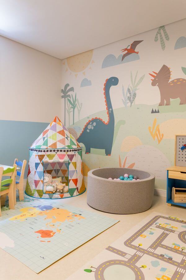
Peaceful Kids Room
Breezy Half is known for its calming and uplifting properties. Make them part of your kid’s room and choose an appropriate decor. Professionals work with white and blue palettes for nurseries to ensure a 100% tranquil ambiance. Rich colors and patterns paired with this blue shade sound amazing for grown-up children.
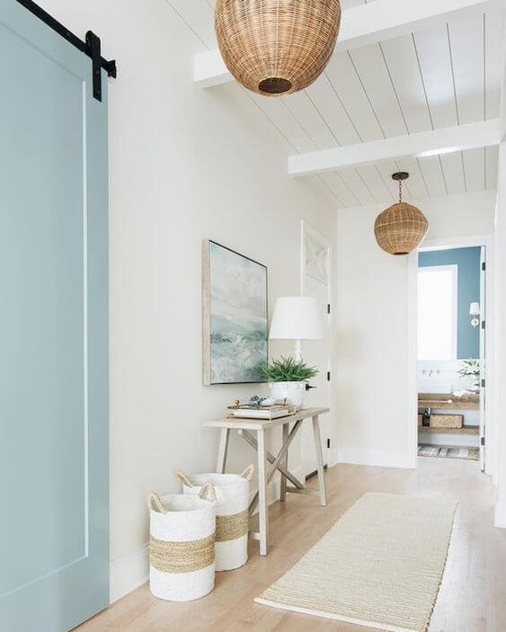
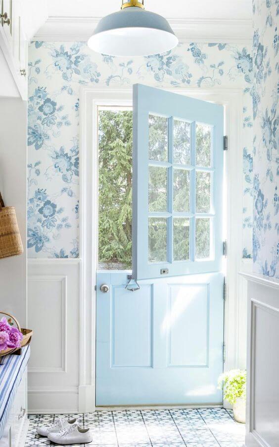
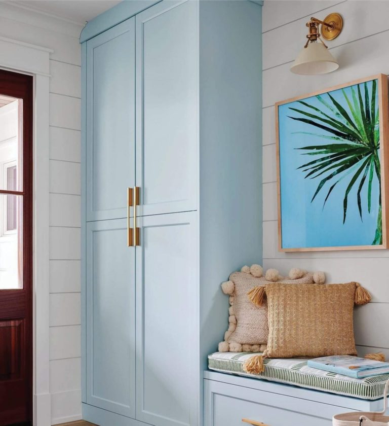
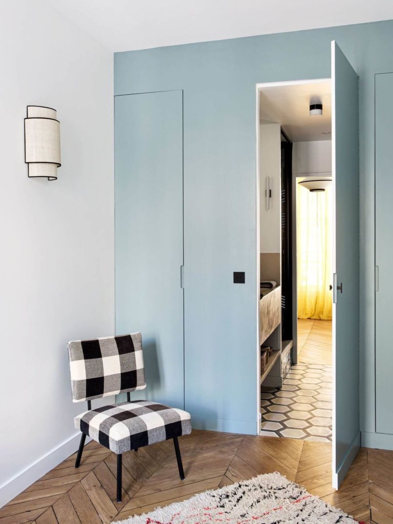
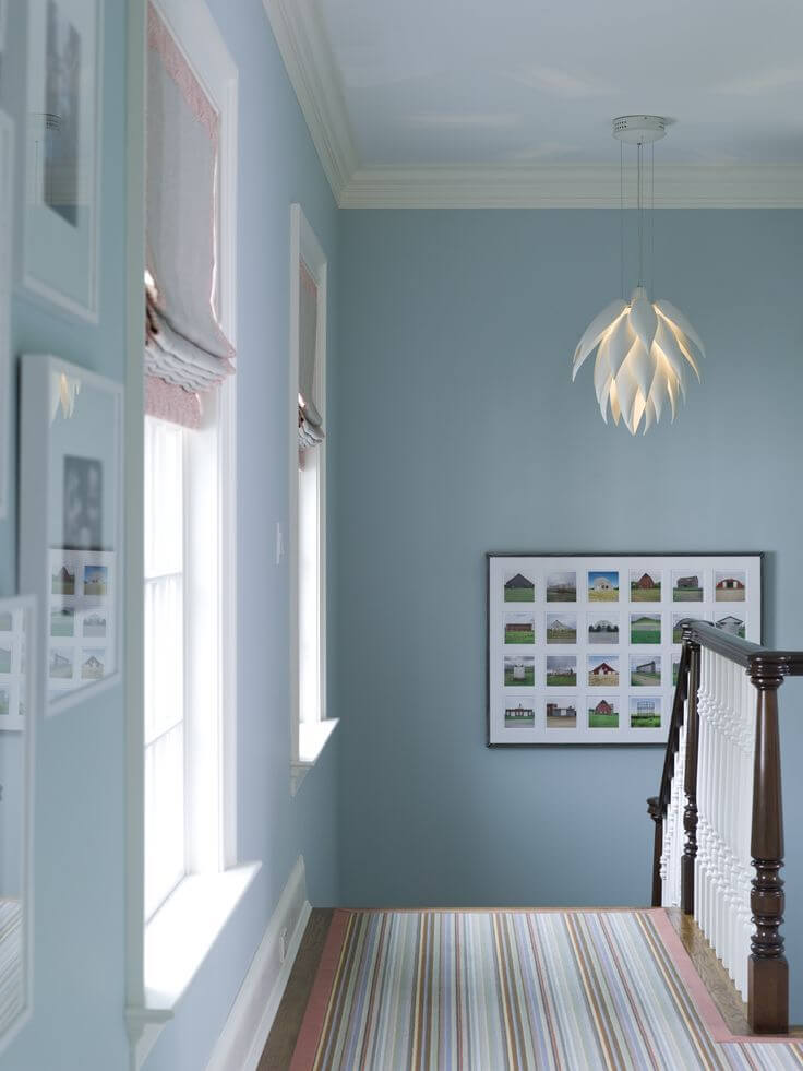
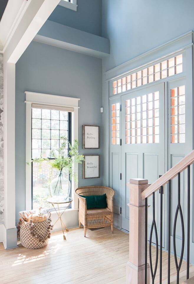
Bright-Colored Hallway
Breezy Half is one of the top blue paint color options for the entryway and hallway. Due to its bright base, this color perfectly suits small and poorly lit spaces. Paired with white, it compensates for the lack of natural light and makes for a fresh introduction to your interior design and a subtle transition from one room to another.
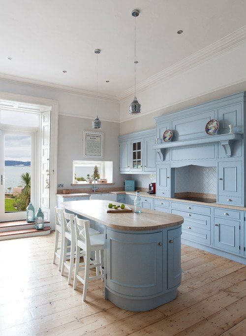
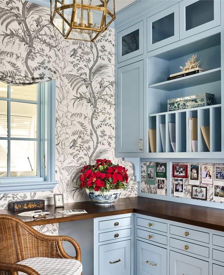
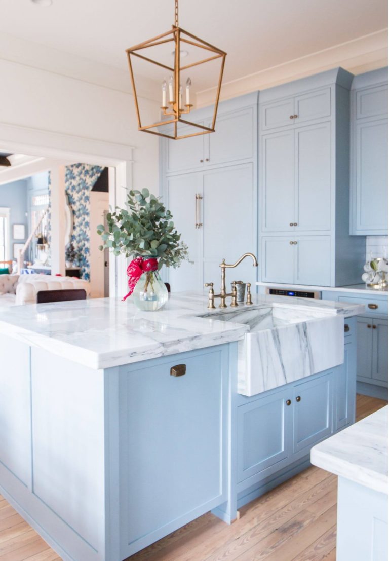
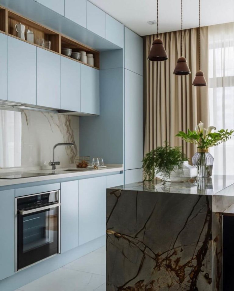
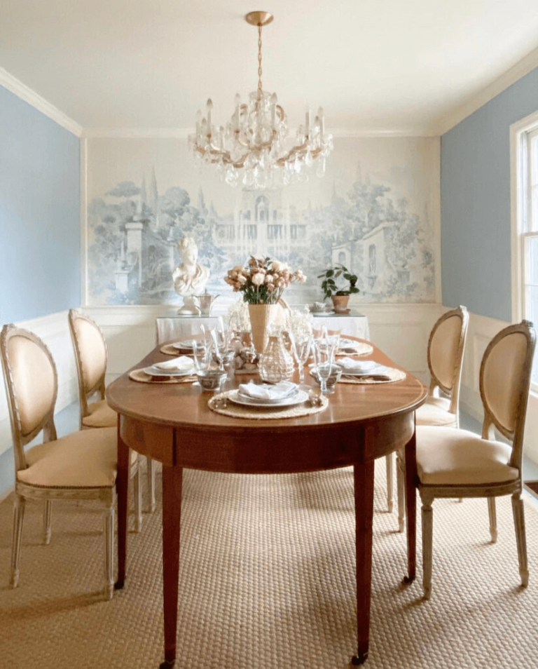
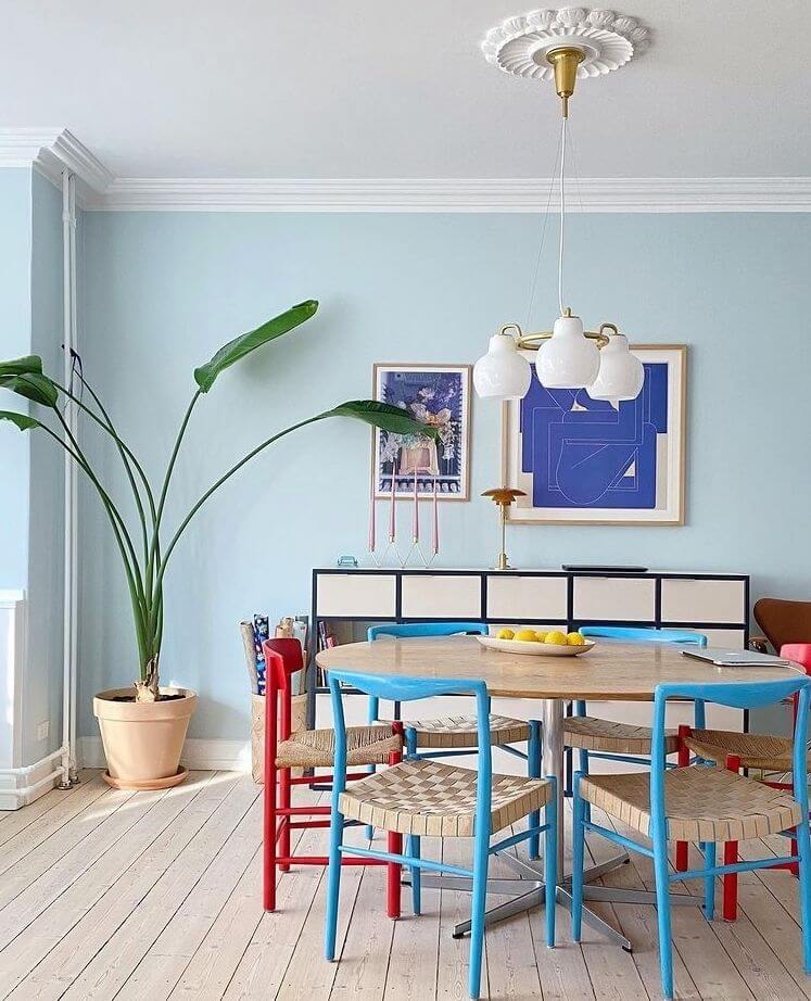
Kitchen and Dining Room
In the kitchen, Breezy Half goes firstly for traditional cabinets accessorized with gold hardware and light or dark marble texture. You can also use it to repaint your Modern kitchen cabinets to enliven the space.
You are free for design interpretation in the dining room, where Breezy Half works for the walls and accepts any design style, from pure Classic to colorful Modern. Feel free to dive deep into your imagination and develop unique design ideas.
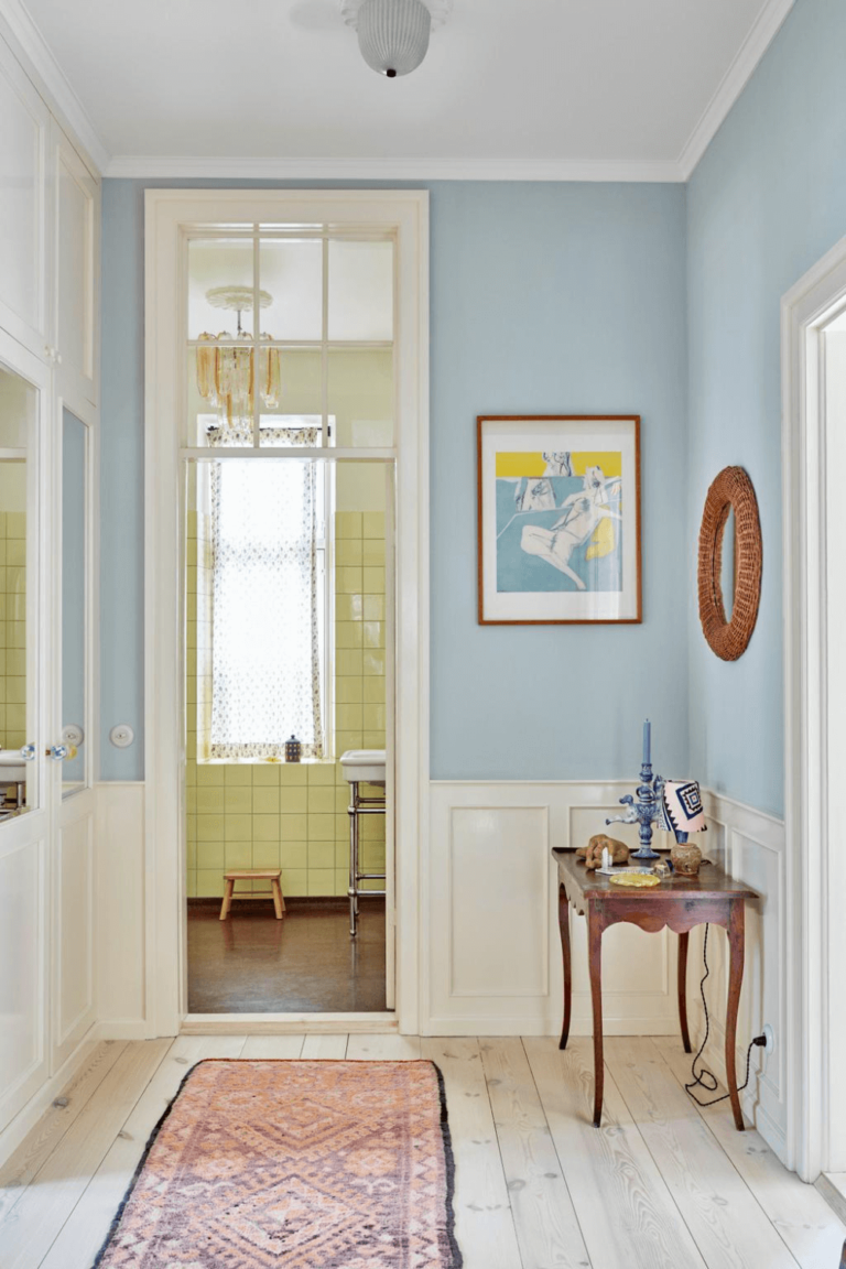
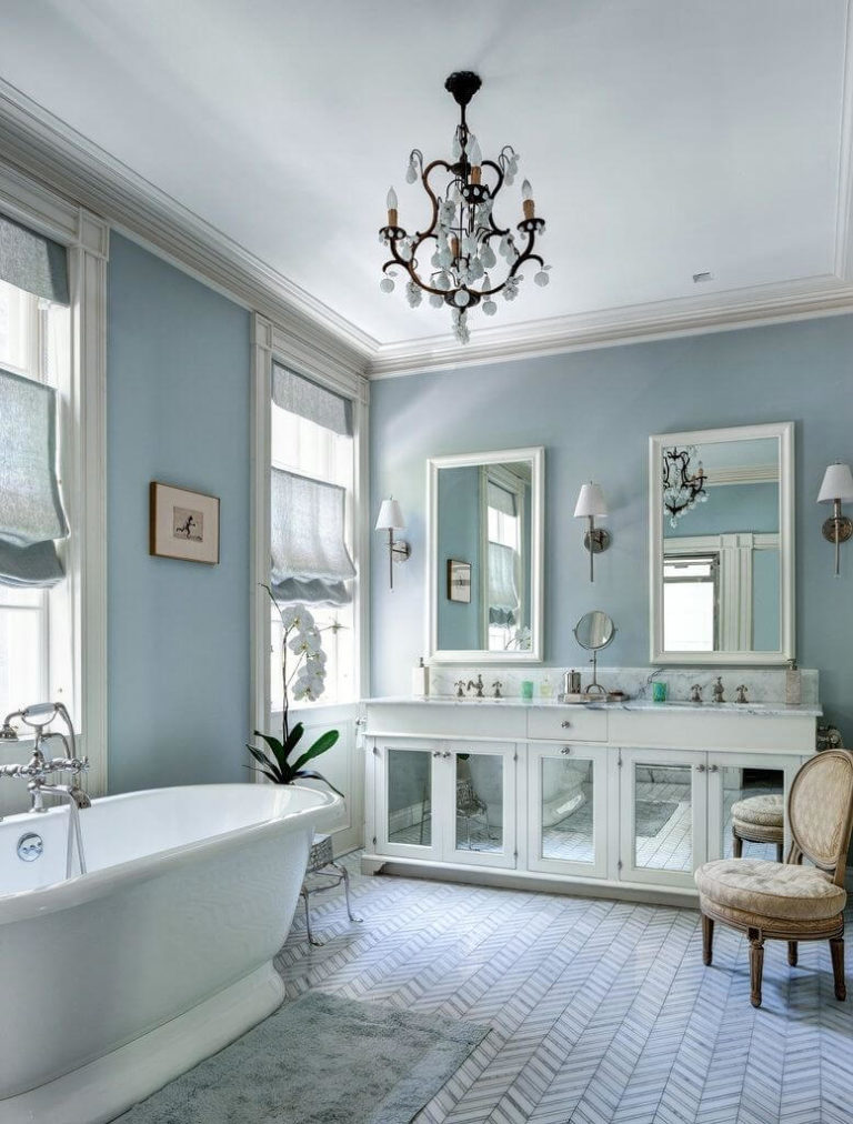
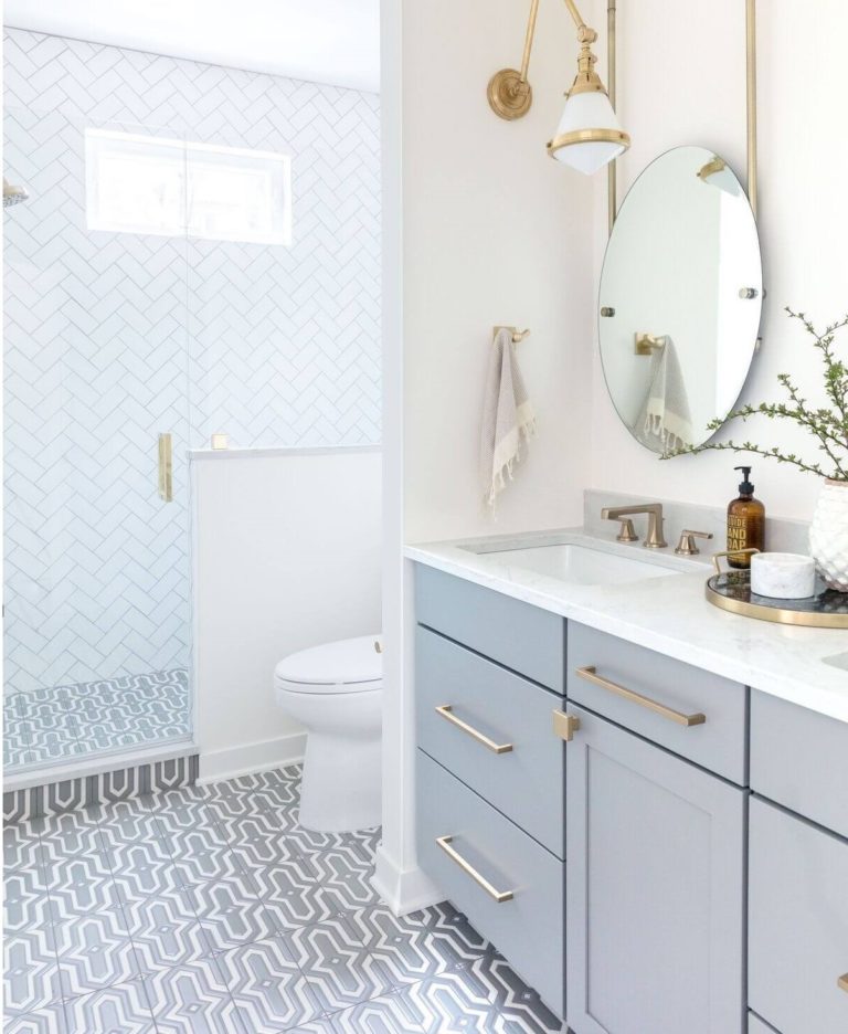
Bathroom
There is not a single color that would work in the bathroom better than blue. Any shade, undertone, and variation of blue, especially the one from Dulux, works for this room. Following the designers’ recommendations, we found the best companions for blue in the bathroom – white paint, gold hardware, and a few traces of expensive-looking stone.
Use of Breezy Half for House Exterior
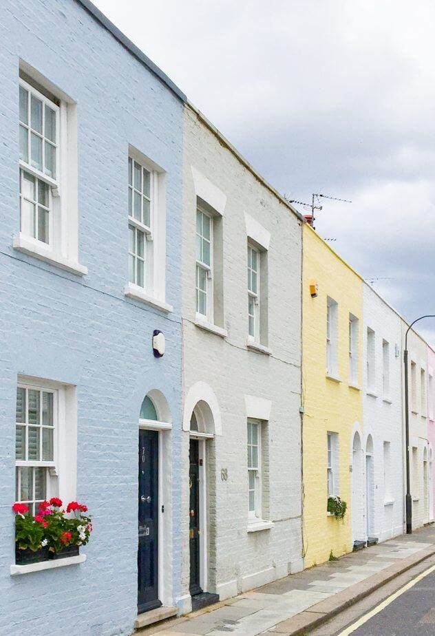
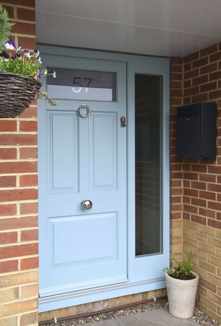
Although Breezy Half appears much lighter when applied to the house exterior, all due to direct access to natural light, designers are happy to use this paint color on exterior walls, window shutters, trim, and front doors. This baby blue shade resonates mostly with beach house styles. Still, using it directly on brick walls or as a feature door paired with brick walls makes for a high-class design.
Dulux’s Breezy Half paint color is more than a calm and harmonious blue shade that brings balance to your house. It is one of the best-rated colors for personalized design projects, covering a wide range of design style options, Retro, Traditional, Classic, Vintage, and Modern, to name a few.
