Carnelian SW 7580
Sherwin-WilliamsA dark brownish-purple with red undertones resembling royal burgundy; a heritage paint color that changed the world of design through its legacy.
Carnelian (SW 7580): What Color Is, Review, and Use
One of the defining features of the favorite paint colors is their story. In the Lore collection from Sherwin-Williams, which shares a selection of heritage tones that serve as an impetus to passionate creativity, one can find the precious Carnelian paint color, a dark reddish brown shade from the Purple Color Family. This saturated violet paint is also known for being the April 2021 color of the month.
The story behind Carnelian is impressive, adding interest to the shade. The variation of color that reads brownish purple is also known as “puce”, the French word for flea, a bloodsucking insect. That’s how Louis XVI used to refer to his wife Marie Antoinette, the renowned rule-breaker queen of France, because of her self-expressive looks, particularly her brown-purple dress that led to the introduction of the new color. They say puce was the “it” color of the 18th century.
Today, we witness the comeback of the innovative brownish-purple shade of color that reminds us of the royal past and shows how vintage colors can be adapted to contemporary needs.
Carnelian Paint Color Features
The historic purple with brown veins of color notes stands out with an original name. Carnelian is a red-brown gemstone known for such features as stability, inspiration, courage, confidence, energy, and not least, creativity. All those can be connected to the paint color from SW. The motivational and refreshing shade of purple is also traced to a nostalgic feel for the past, rendering a vintage modern color for customized design projects that follow the rules of the heritage style, used for telling one’s own story particularly.
Carnelian: Is It Warm or Cold?
On the color wheel, Carnelian stands between dark purple, deep crimson, and not far from earthy brown. Since this is a reddish brown-purple, we cannot associate it with anything that feels any other way but warm. Carnelian is a muted shade, which may lead to different warmth variations under particular lighting. Still, the perceivable red undertones will always keep it on the same side.
How Does Lighting Affect Carnelian?
Although the intense brown-purple gets slightly influenced by lighting, we cannot deny the effect of different light temperatures. If your room has north-facing windows, the cold natural light will intensify the crimson blush feature, making the color feel like a less saturated shade of dark brown. You will notice the same result in east-facing rooms in the evening and west-facing rooms in the morning when the sun rays don’t have direct access to the interior.
On the other side of the house, in rooms with southern exposure, Carnelian shows how much earthy red it hides, leading to a reddish aubergine, slightly dusted. A similar effect is revealed in rooms with eastern exposure in the morning and western exposure in the evening when the warm sun rays directly hit a surface painted brownish-purple.
Artificial lighting makes SW 7580 seem darker than on the sample due to the lack of natural light, with increased earthy purple notes.
Carnelian LRV
Experts use the Light Reflectance Value to determine how light or dark a color is, from 0 to 100, or from true blacks to true shades of white. Interestingly, no paint manufacturer has created a true black or white so far. Still, the scale works pretty well in determining how much light a shade reflects.
Carnelian has an LRV of 6, close to black, not a true dark shade, yet not far from the darkest colors. While it absorbs large amounts of light, it bounces back little to no light. Therefore, using it in small rooms with poor light conditions is not the best idea.
Carnelian Undertones
Nothing new on the color wheel horizon. We have pretty much revealed the story behind the endeared Carnelian paint. SW 7580 is a brownish-purple shade with red undertones. Consequently, it may seem, at times, dusty crimson and, at others, earthy aubergine, reddish brown, or nostalgic foggy rose.
Similar Colors
If you ever wonder whether there are alternatives to the famous Carnelian, for one reason or another, remember this article and the following comprehensive list of similar paint colors from SW and other popular brands.
Coordinating Colors
We always operate with coordinating colors for monochromatic schemes and contrastive color scenarios. Carnelian is a muted paint color that works well with softer shades, say, light and powdery pink and soothing purples. Don’t forget the cool whites for the trim. Still, the expert choice is green, which completes the nostalgic and romance-infused rose picture. Consider the following Sherwin-Williams designer picks for SW 7580:
Use of Carnelian in the Interior
Related to the past and bearing heritage connotation, Carnelian still leaves free space for your creative interpretation and your own story. The romantic and royal style on the one side and the modernized brownish-purple on the other. You can update the vintage paint color with light neutrals, saturated hues, metallic accents, and bright accents. Personalize the paint color with one of the suggested design solutions.
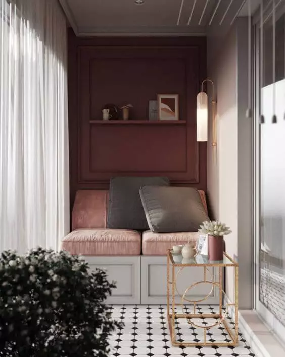
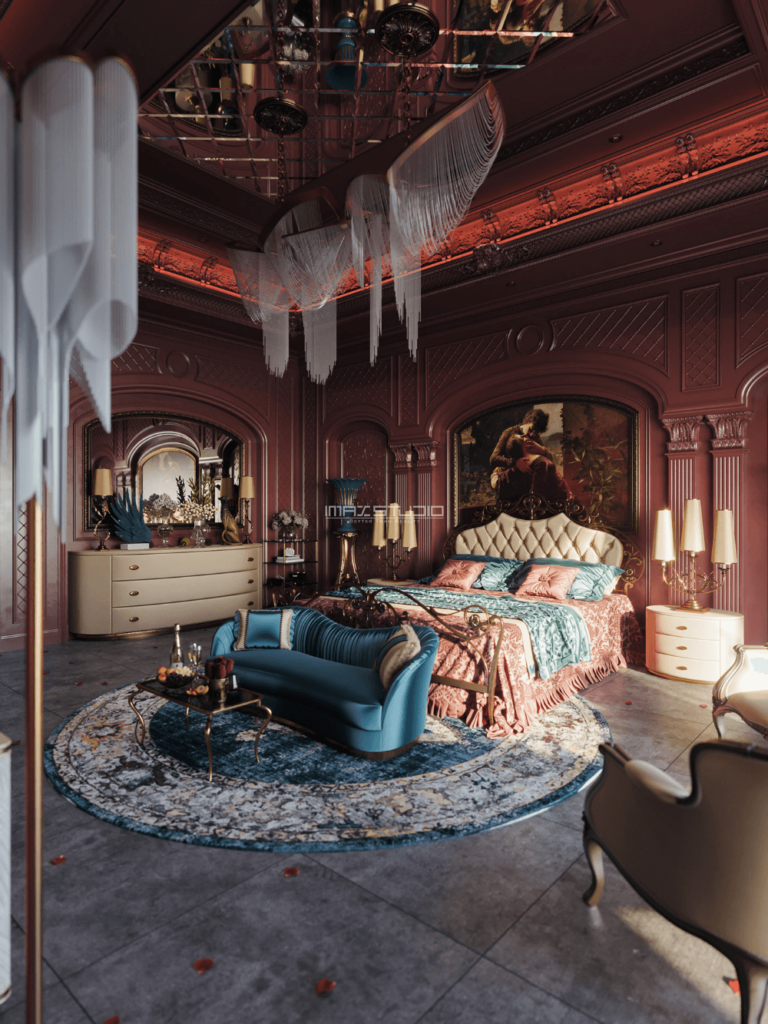
Royal Architectural Features
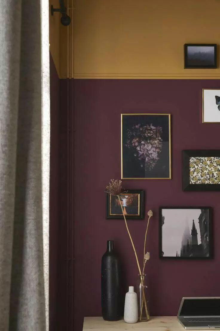
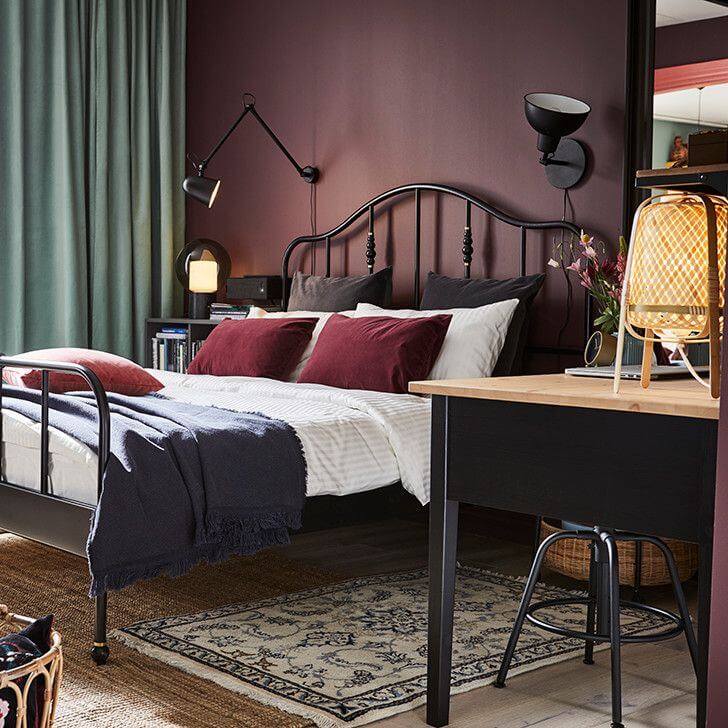
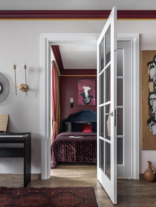
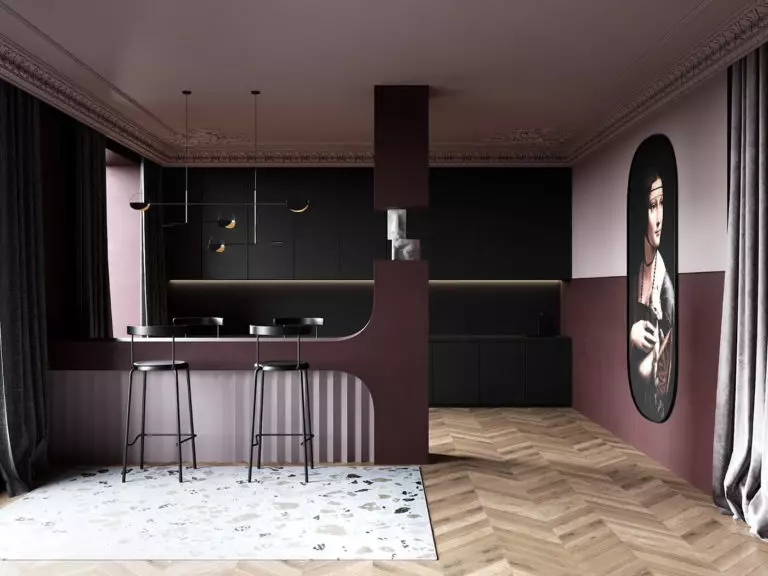
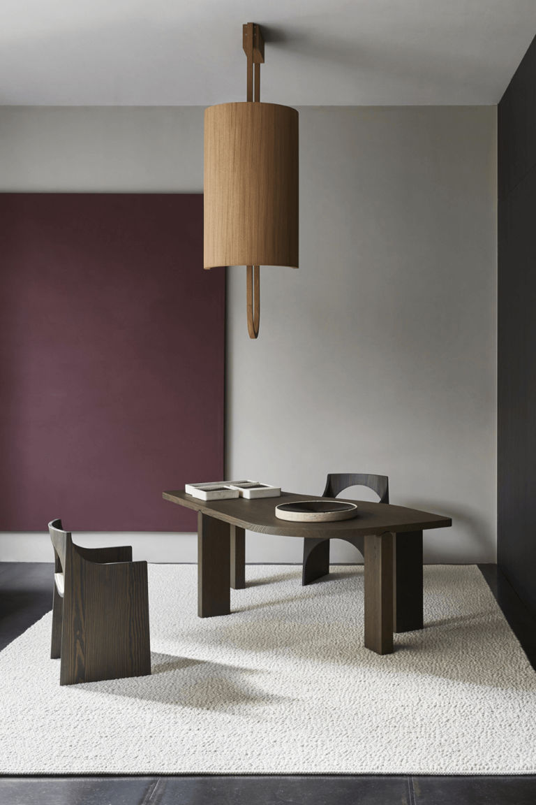
The dusty rose paint color is perfect for emphasizing Neoclassical-style wall molding. For years, grays and light blues have been used for this purpose. Now, designers propose darker colors, and Carnelian, a shade traced to the royal palace fashion of the last centuries, seems suitable. This technique is highly applied to bedrooms, lounge spaces, and bathrooms.
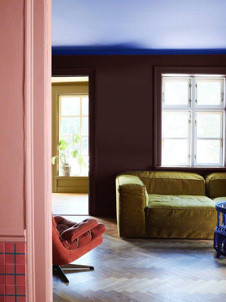
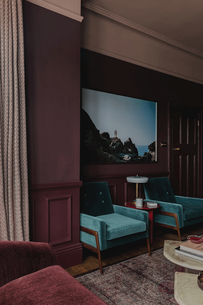
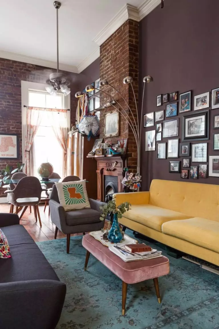
Designer-Approved: Dusty Rose Living Room
If you‘ve always dreamt of a contemporary living room that stands out from thousands of lounge areas alike, here is your solution for the current season: a full or partial dark crimson living room. A dramatic color choice to make a statement. Keep it ergonomic and let the wall color speak for the whole design, or insert subtle hints to other styles, say, Mid-Century Modern. Don’t hesitate to give yourself the liberty of painting with other saturated shades, such as yellow, green, or orange. Such bright contrasts are indisputably welcome in modern design concepts.
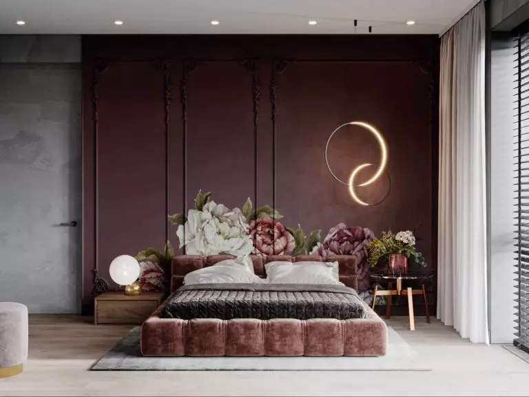
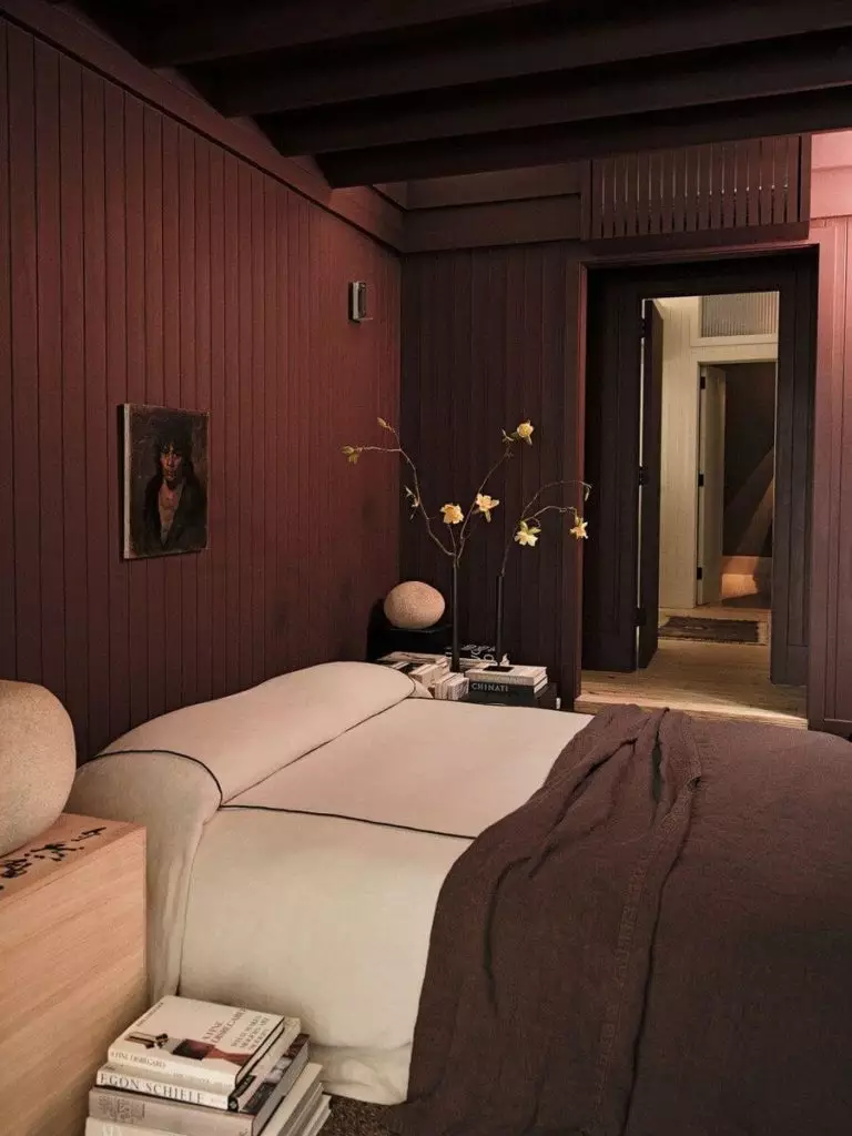
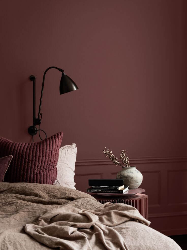
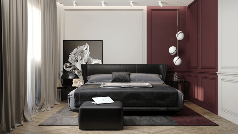
Modern Bedroom with Artistic Roots
Carnelian is that moody color that calms, stimulates, supports, and inspires all at once. Since it is considered an exceptionally romantic paint color, designers see it as suitable for the bedroom. It will fit your taste, especially if you like to fall asleep in complete darkness once you decide to paint all walls brown-purple. Leave space for a lighter contrast, at least for the bedding.
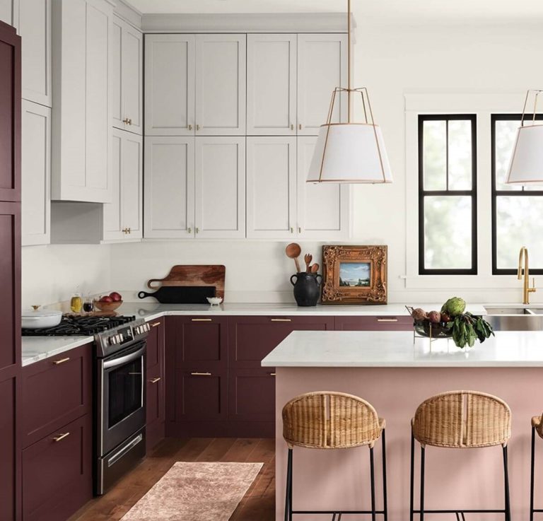
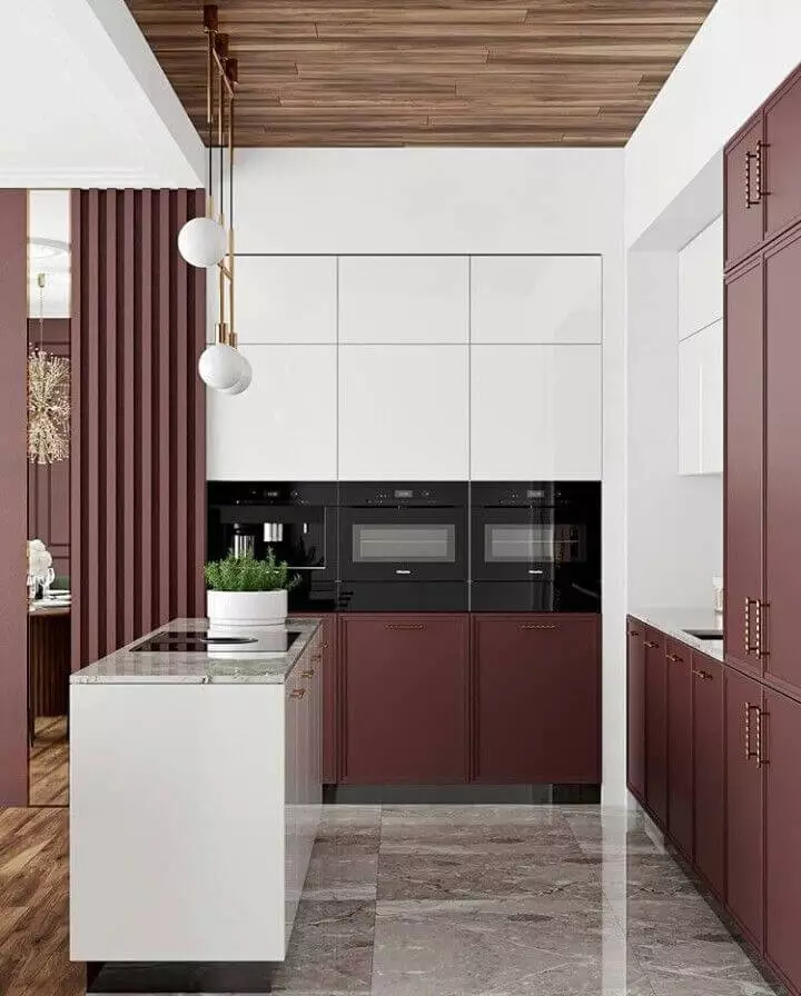
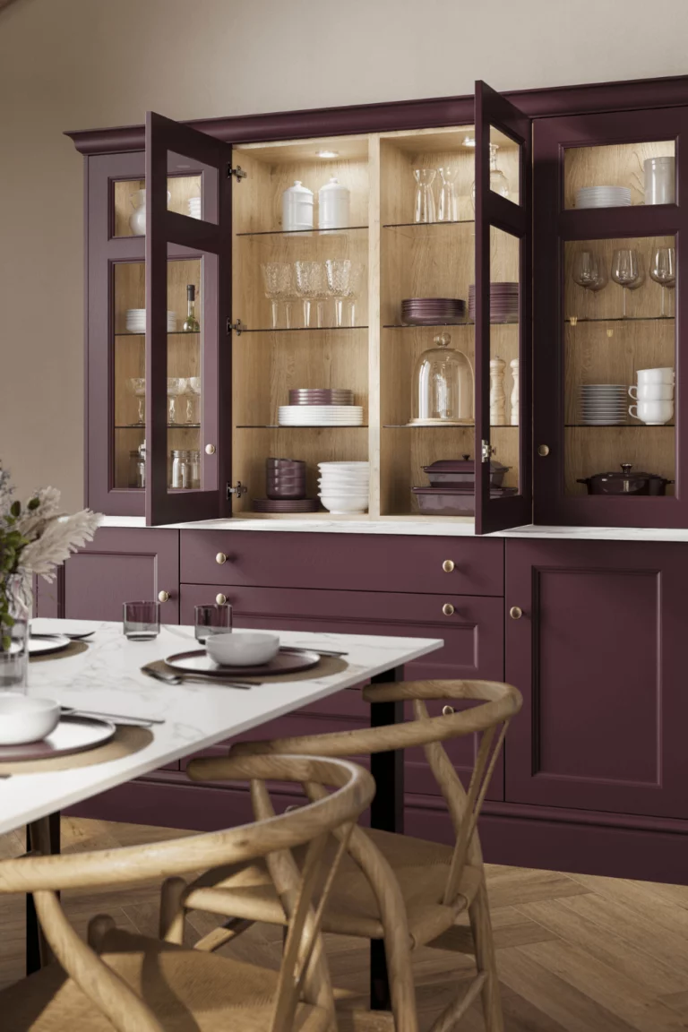
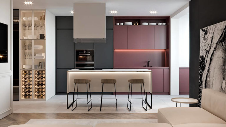
Dark Red Kitchen Cabinets
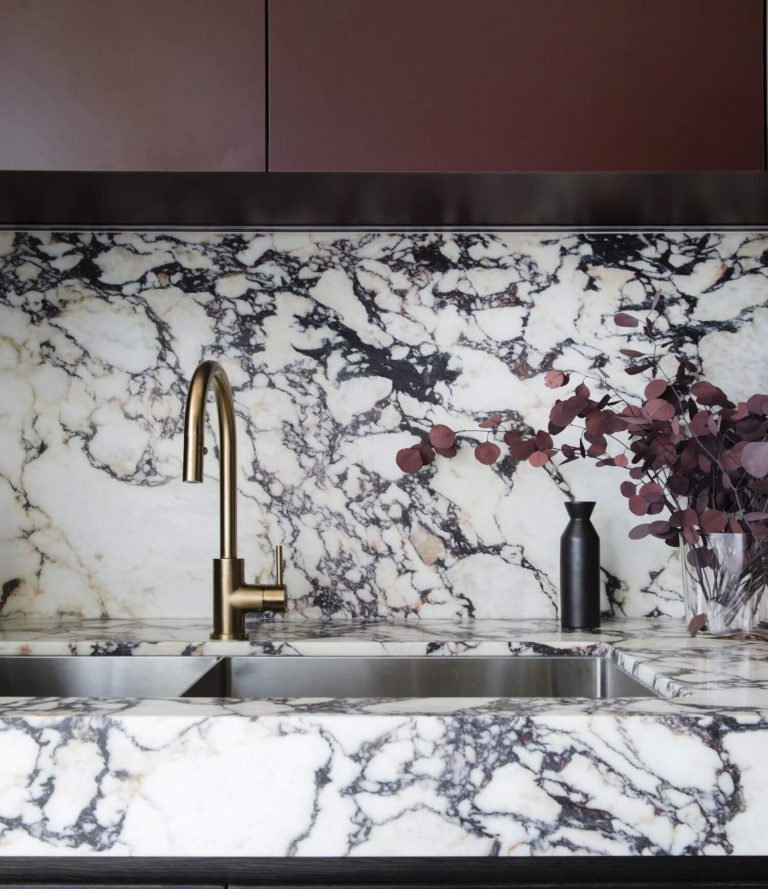
Since red is clearly perceived in Carnelian, the latter can be easily mistaken for a dark red hue, which is okay. The wide list of Carnelian variations allows for easier integration into the interior design. If you are looking for a dark paint color for your kitchen cabinets, think of the timeless Carnelian, once a very stately shade of brown violet that gains more power. White, black, and richly-grained marble are some of the most successful pairings. Don’t forget the hardware, for which brass, copper, rose gold, and classic gold work.
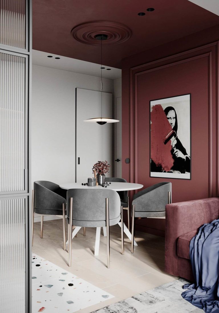
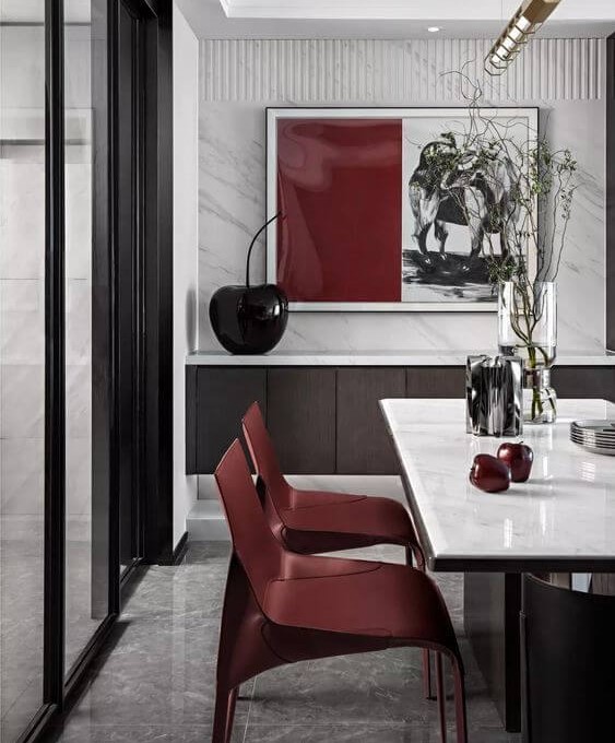
Cherry Dining Room
If you use to gather in large companies around the dining table, you should definitely decide upon accents to entertain the guests and show off your taste. The slightly appetite-awakening, engaging, and first-class cherry brown from SW will not disappoint. It can either be Neoclassical wall molding in the reddish aubergine shade, an accent wall, or even chairs painted in the royal color on a white background.
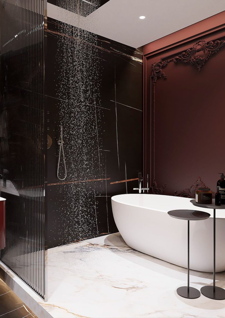
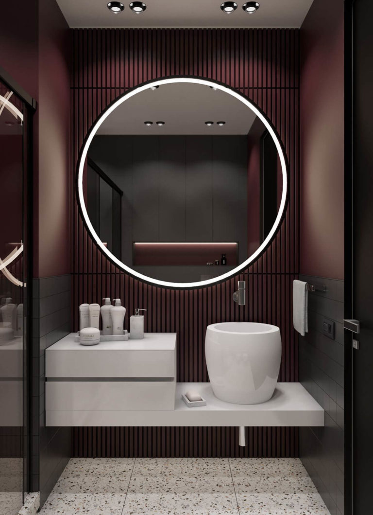
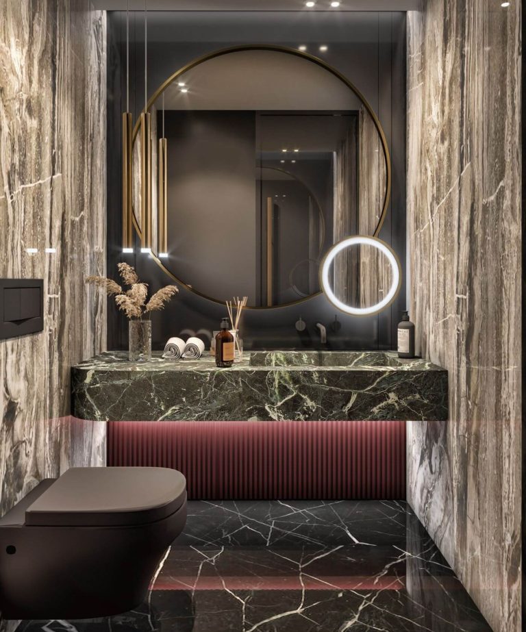
Pomegranate Bathroom
Homeowners are advised to use the popular bathroom color – dark burgundy, in the variation present at Carnelian, paired with warm artificial light to open up the warm reddish undertones. The romantic rose shade is a top choice for luxury interiors when combined with expensive stone and sparkling accent details alongside white, black, and gray.
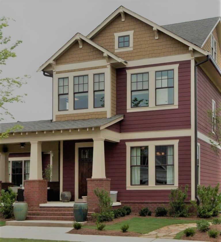
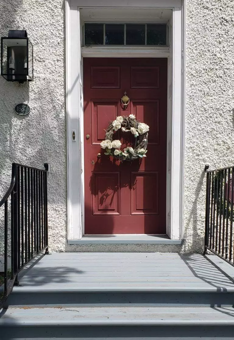
Use of Carnelian for the Exterior
Since Carnelian is such a good friend of green, one cannot doubt its suitability for the exterior house walls on the background of the natural greenery. This is why the renowned paint color is a beloved shade of designers regarding the house exterior. A front door painted smoky burgundy feels as stylish on white-colored exterior walls. In both cases, Carnelian, the royal brownish purple, lends nobility and status to any exterior, be it a modern cubic house or a traditional one.
The Carnelian SW 7580 paint color by Sherwin-Williams is deeply rooted in the past. It inherited the flamboyance of royal times. Its return into the fashion and design world is a new chance for designers and homeowners to create their own legacy by decorating interiors and exteriors with one of the top expert color choices.
