Chartreuse SW 0073
Sherwin-WilliamsA cheerfully enthusiastic yellow-green, inspired by the lemon yellow French liqueur color; an unconventional paint color for energetic, vibrant, and unique designs.
Chartreuse (SW 0073): What Color Is, Review, and Use
The Origin color collection from the Sherwin-Williams 2023 Colormix Forecast encourages us to find inspiration within ourselves by offering a wide range of historic colors that have made a comeback and are ready to raise our hopes for better times. Here you can see the energetic Chartreuse paint color, a gorgeous yellow-green with brilliant sparkles. Do you feel like you’ve met the color before? Most probably, since SW 0073 was the color of the month of July 2022 and part of the 2022 Colormix Forecast at Sherwin-Williams. It hits the trends two years in a row. It should be a pretty unique hue, and we will show you why.
Chartreuse Paint Color Features
The dazzling yellow-green paint color is part of the Green color family. As for the name, Chartreuse is a pale yellow-green French liqueur, revealing a relatively lemon color. Therefore, the name precisely shows what this paint color looks like.
Chartreuse is a very unconventional tone, yet it proudly holds the title of the color of cheerfulness. Its vibrant yellow and green notes elevate your mood, encourage you to try something new, inspire you to step out of your comfort zone, and energize the ambiance. SW 0073 is a flattering shade that feels dynamic, inviting, and enthusiastic. Regardless of how alluring these features may sound, you better avoid this paint color if you like routine since the sparkling yellow-green is not a fan of habit but instead inspires new adventures every day. The only drawback is that Chartreuse may seem unpredictable, at times, due to its bright undertones.
Chartreuse: Is It Warm or Cold?
Chartreuse may seem pale on the sample, yet, on the surface, this paint color reveals vivid yellow undertones as if sunkissed, which makes the yellow-green shade feel warm and close to the heart, like a beautiful summer day.
How Does Lighting Affect Chartreuse?
Chartreuse needs the slightest tinge of sunlight to unfold its vibrant yellow notes, a lemon-clean shade noticed in rooms with southern exposure. You can witness the same bold effect in spaces with east-facing windows in the morning and west-facing windows in the evening.
On the other hand, the rather pastel yellow-green you can see on the color sample reveals itself in rooms with north-facing windows where the cold lighting makes the color seem less saturated. Under artificial lighting, Chartreuse becomes darker, yet it preserves the yellow base color. One more thing to note: SW 0073 can easily get influenced by the outside greeneries and indoor plants, acquiring a less yellow and more greenish look.
Chartreuse LRV
How much light a color reflects equals how light or dark a color is. The Light Reflectance Value of Chartreuse is 64, which is closer to light shades on a scale from 0 to 100. Indeed, the optimistic yellow-green from SW looks pretty bright and reflects significant amounts of light. Usually, paint colors with such LRVs can safely be used in small spaces even with poor light conditions, but not in this case. Chartreuse is relatively saturated and may seem too overwhelming. For this promising paint color, you better ensure a larger room with sizable windows.
Chartreuse Undertones
When looking at Chartreuse, we cannot help but wonder how this clearly pastel yellow-green can hide additional color notes. Although not much different from the base colors, the lemon yellow and lime green undertones are irreplaceable parts of this paint color, coming to the surface under different conditions.
Similar Colors
Yellow-green shades are trendy among colorists now, and the most popular paint manufacturers, among which Sherwin-Williams, reveal a comprehensive list of paint colors similar to Chartreuse:
Coordinating Colors
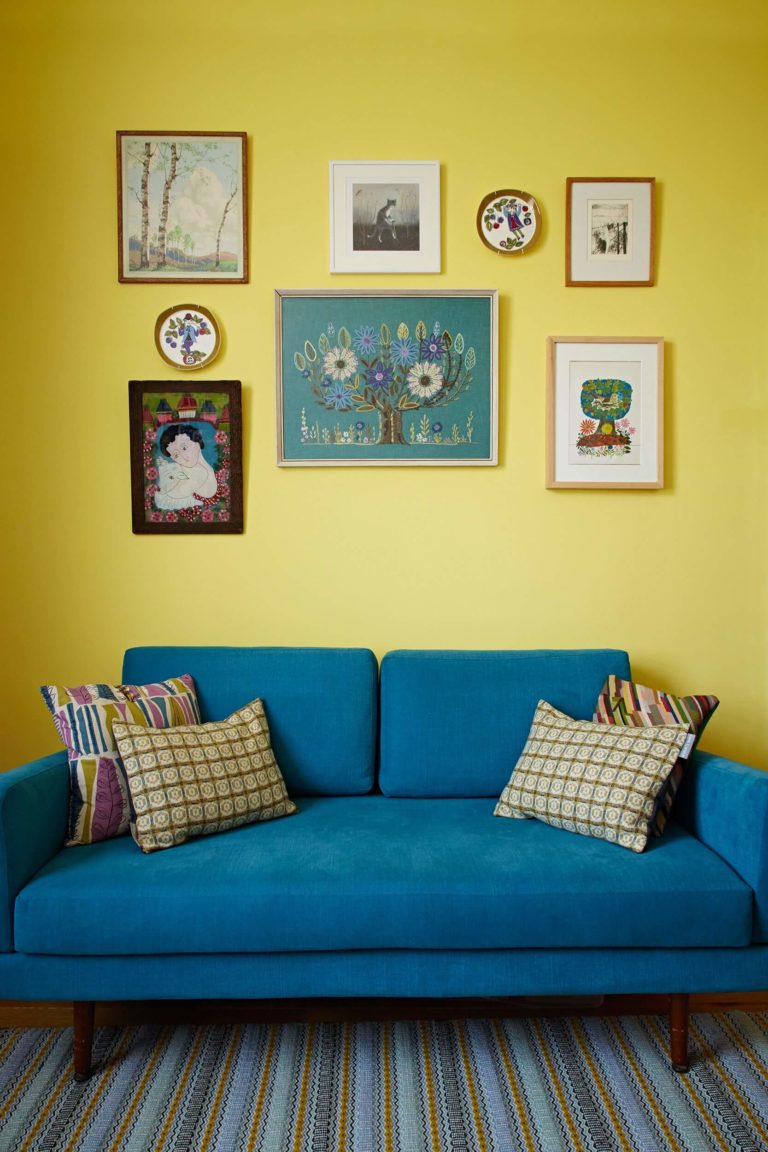
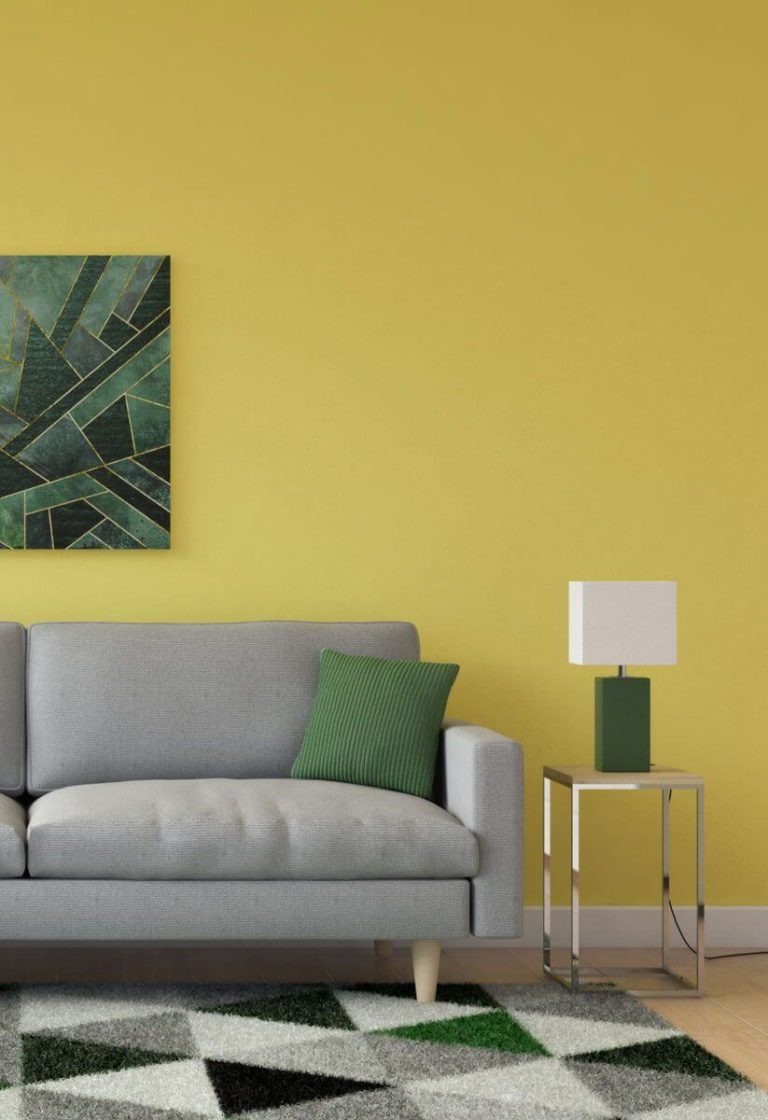
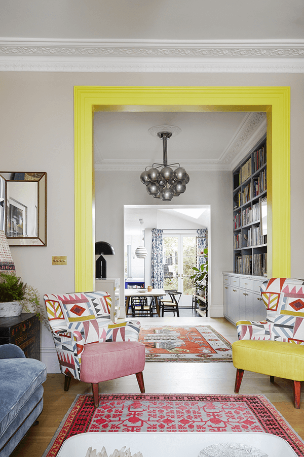
Generally, you are free to choose almost any green or yellow color to pair with Chartreuse. Whites and grays are great for keeping the vibrant shade balanced. We would like to underline the perfect combination of the yellow-green paint color and blue hues. Simultaneously, colorists from SW offer two precise color matchings you cannot go wrong with:
Use of Chartreuse in the Interior
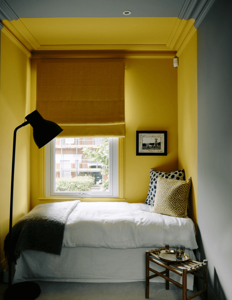
Despite its loyalty to the cheerful yellow-green concept, Chartreuse is open to new friends, which can be different design styles, color palettes, and rooms. For a start, the naturally vibrant color works for lounge areas and dining rooms since it suits large gatherings, encouraging conversations. Next in line is the kids’ room since the yellow-green paint color is all about imagination, exploration, and learning. Still, there is more to Chartreuse. Discover its design potential with us!
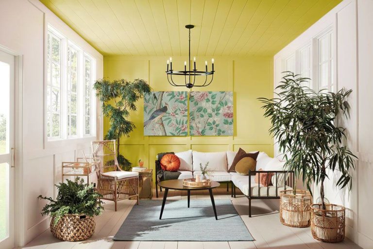
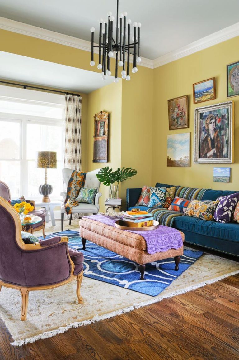
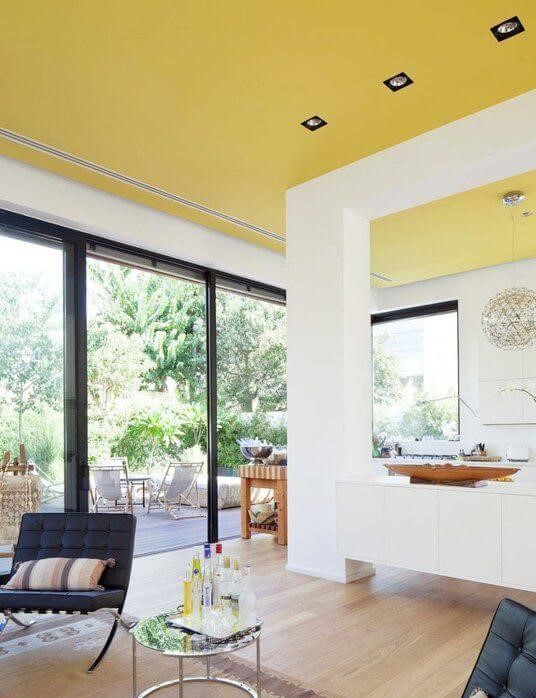
Entertaining Living Room
Have you always dreamt of a positively colored living room to gather with your family and friends in? Now minimalist design rules now longer dictate the color palette. Thrive in your favorite colorful environment with one of the most energetic and enthusiastic paint colors from SW – Chartreuse. Paint the walls or furniture, and opt for a maximalist makeover with eclectic accessories from all design genres.
In such a pleasant environment, everybody will be free to enter the conversation, share an experience, or express their feelings without the fear of being misunderstood (another great feature of SW 0073 – it knows everything about understanding and acceptance).
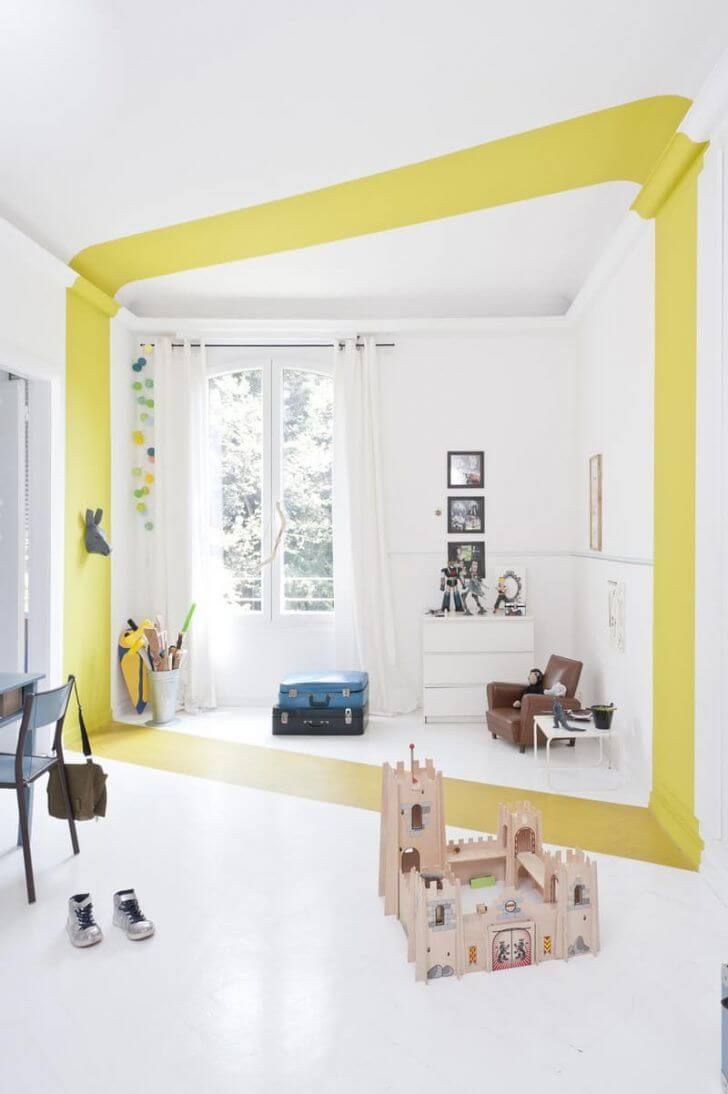
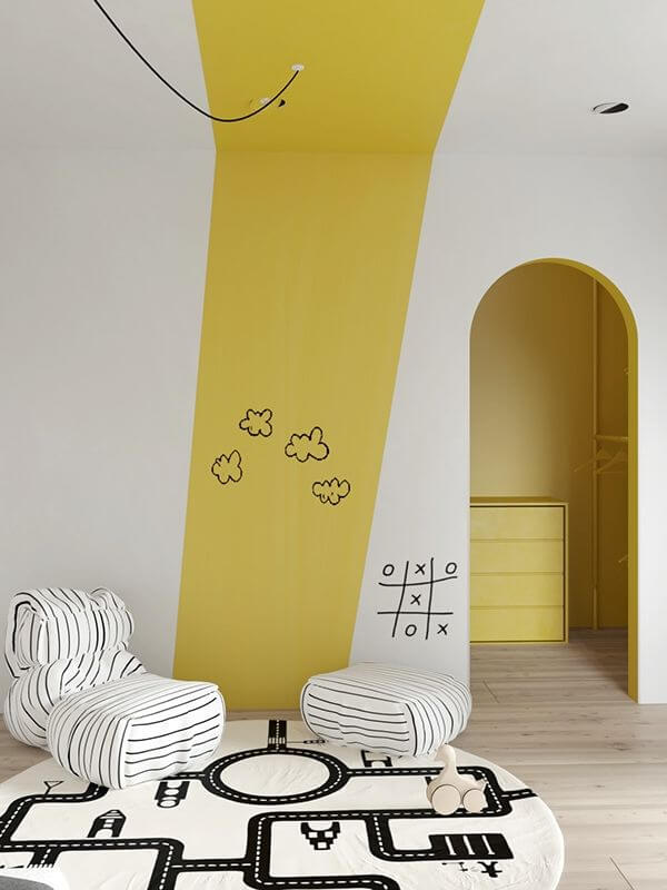
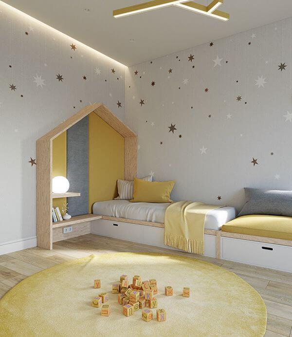
Kids Room
At this young age, children need more colorful inspiration in their lives. Pass by the usual neutrals that were popular two years ago, and give a thought to this tropical and yummy yellow-green. Since the color may seem too bright if used to paint all walls, designers suggested going with accents. Think of a customized DIY project with sparkling yellow-green wall accents.
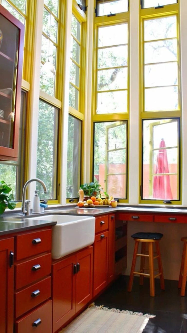
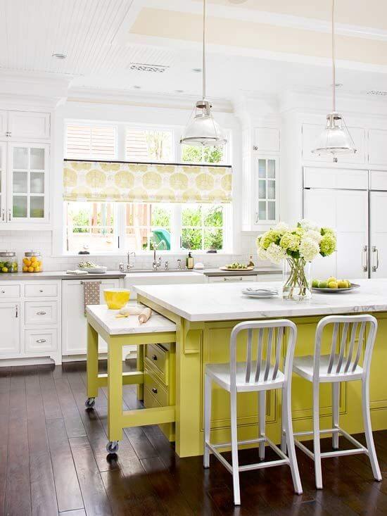
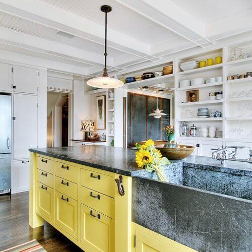
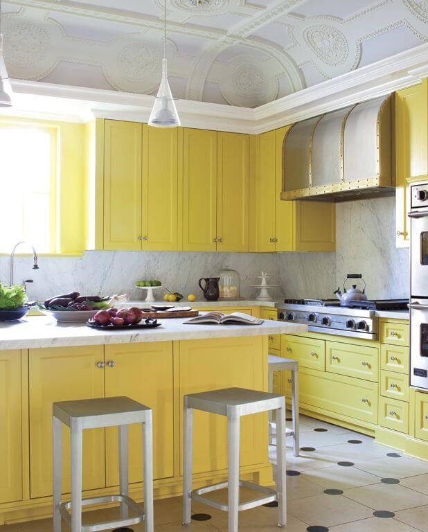
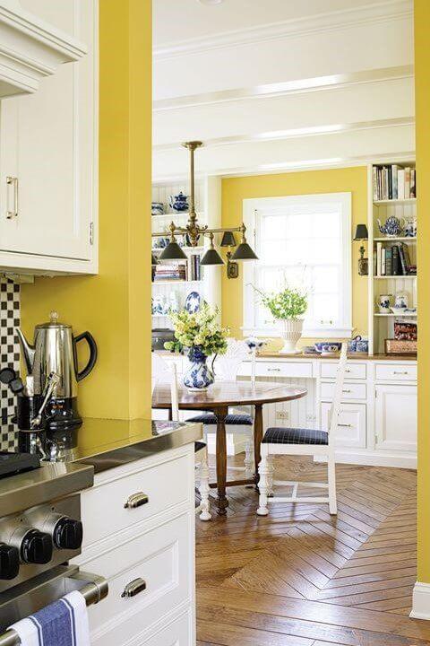
Kitchen and Dining Room
Among other features, SW 0073 is an appetizing paint color, and professionals who work with exclusive design projects cannot skip such a bright yellow-green. Again, designers advise us to limit this cheerful color to accents only, say, the kitchen cabinets or kitchen island.
Chartreuse appears to be a perfect paint color in the dining room for an accent wall and even the chairs around the dining table. In a few words, add a twist to your favorite dining space and elevate everyone’s mood.
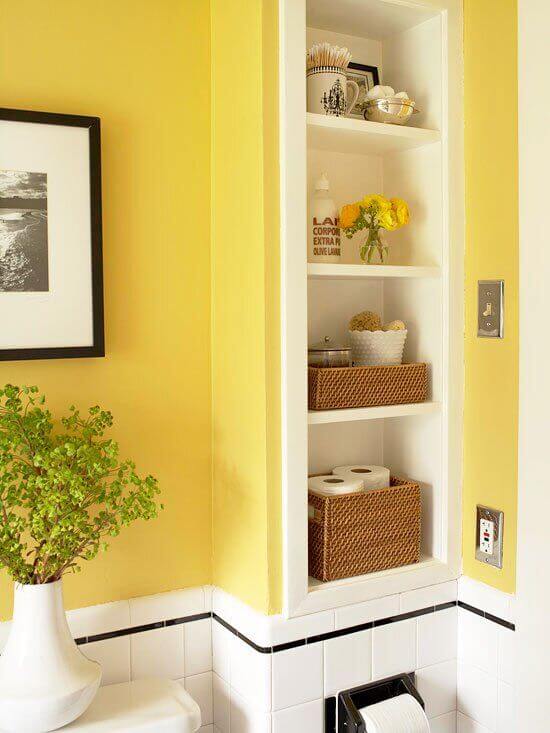
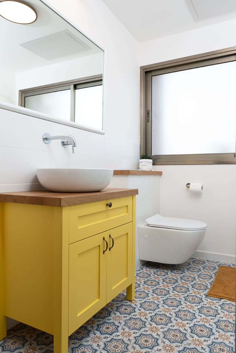
Bathroom
We are used to neutrally colored bathrooms and primarily see this space as functional. Change your perspective with Chartreuse and reshape your bathroom design with a bold splash of color, say an accent wall or bright-colored vanity cabinets. The best part is that you can arrange a makeover without many expenses. Simply add a touch of color.
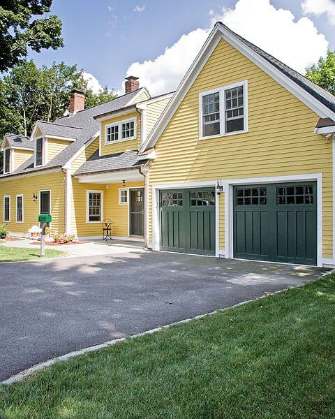
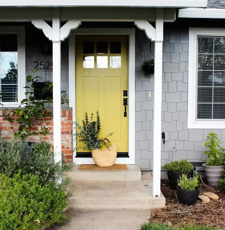
Use of Chartreuse for the Exterior
At Sherwin-Williams, Chartreuse is represented as available for interiors only. Nevertheless, the saturated color is very friendly toward outdoor surroundings and would look very well on a natural background. If you fell in love with this color and are ready to enjoy its beauty on the exterior of your house, you can safely go with one of the alternatives mentioned at Similar Colors. The following pictures may inspire you.
The Chartreuse SW 0073 paint color by Sherwin-Williams is a unique paint color with a tongue-twister name that resonates with the roaring yellow-green behind. It is a lemon-juicy paint color of exclusive beauty that connoisseurs of original and bold only dream about.
