Cinnamon 2174-20
Benjamin MooreA new-era neutral - a gorgeous orange-brown with a subtle trace of earthy red that reaches with its warmth and appeal any design style.
Cinnamon 2174-20 (Benjamin Moore): What Color Is, Review, and Use
Gorgeous bold shades, new neutrals, and irresistible warm hues feature the new interior design season. Earthy colors are the brand-new hit of the season, and the renowned manufacturer Benjamin Moore definitely won the lottery with its freshly designated trendy paint color – Cinnamon.
The interesting shade known under code 2174-20 is a deep and warm brown with an orange tinge. At some level, it does resemble cinnamon or at least the comfort we associate with the spice. As colorists claim, Cinnamon reveals neutral colors from a new perspective, and this is the paint color you should go for if you are searching for a neutral with a deeper character. Although, we simply cannot allow ourselves the liberty of calling it neutral. Find out why!
Cinnamon Paint Color Features
What’s the secret of Cinnamon? It is a very rich brown shade, quite dark (later on this), and imposingly warm, welcoming, inviting, familiar, and cozy. On the sample, we can clearly notice the orange tinge – some warm earthy undertones that make us question the dark brown feature. The interesting part begins when you apply this paint color to a surface. Under particular lighting, Cinnamon may reveal a gorgeous terracotta shade – another favorite of the season. All because the brown accent color is close to the red color family.
Cinnamon: Is It Warm or Cold?
Without question, Cinnamon is a warm color. The hidden orange undertones will tell you that. Its close positioning to the red color family will tell the same. The earthy tinge will not hesitate to back this up. The name alone – Cinnamon – reveals the color from the perspective of a warm cup of coffee with cinnamon on a cold winter day, which, by the way, doesn’t deny the relevance of this paint color in the interior all year long.
How Does Lighting Affect Cinnamon?
Regardless of how deep Cinnamon may seem, it requires a southern, at least eastern, exposure to reveal its true earthy undertones of pleasantly overwhelming warmth and appeal. In spaces with north and west-facing windows, Cinnamon feels somehow cool, yet not cold. Under cooler light, the warm paint color gets covered by a terracotta veil, with an impressive effect on the interior.
Cinnamon LRV
In terms of light reflectance ability, Cinnamon has a value of 12.93 on a scale from 0 to 100, where 0 stands for true dark colors. Consequently, the paint color known for its rich earthy orange undertones with a red tinge and trendy terracotta vibe appears to be pretty dark. To be honest even darker than it seems on the sample. It doesn’t bounce back most of the light, which requires its use either in a large space with enormous windows or even small interiors yet with appropriate artificial lighting.
Cinnamon Undertones
The flavored paint color stands out with a rich combination of undertones – earthy orange notes, tricky red splashes, a terracotta tinge, and even a very light crimson trace. All they collaborate and underline the personality of this “neutral” paint color that we can all agree is more than neutral. It is true that these undertones decide to penetrate the surface under different conditions, yet small amounts of each are perceived every single time.
Similar Colors
Browns, earthy oranges, reds, and the known terracotta variations are common among the trendy color palettes. It wasn’t that hard to find paint colors similar to Cinnamon at Benjamin Moore and other renowned manufacturers. If, by any chance, you find one of the following similar shades, don’t hesitate to choose them as alternatives in case you want the same shade, a deeper, darker, softer, richer, warmer, or cooler variation of Cinnamon. There are options for any case.
Coordinating Colors
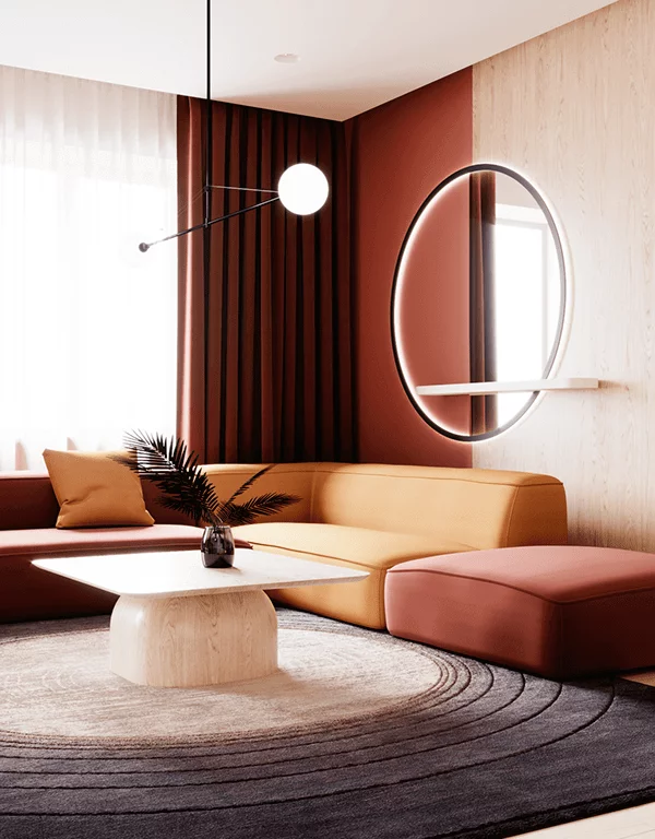
You should definitely combine this deep brown with a light and refreshing paint, even if your space receives enough light to balance the dark color. To our surprise, this intricate orange-brown doesn’t require particular white partners. The fact that the selected white shade is white is enough since the contrast will surely be noticed with such a rich and intense brown at hand. Even a lighter shade of gray will work. We were even more surprised and enchanted by the solution offered by colorists to pair Cinnamon with shades of blue, which look organic together and bring the popular paint colors to something familiar that we are happy to accept.
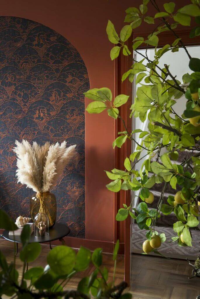
Use of Cinnamon in the Interior
At first glance, one may see the exclusive orange-brown shade as specific for traditional interiors. Allow us to broaden this perspective. When combined successfully, the trending shade of earthy brown becomes the highlight of the most contemporary interiors. Primarily as an accent yet no less relevant as the key color of a living room, bedroom, kitchen, dining room, and even bathroom, Cinnamon is conquering the world.
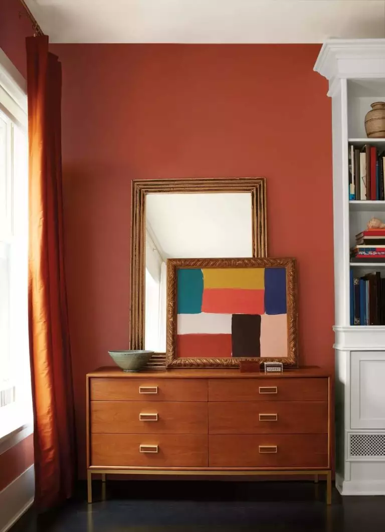
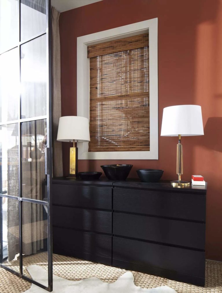
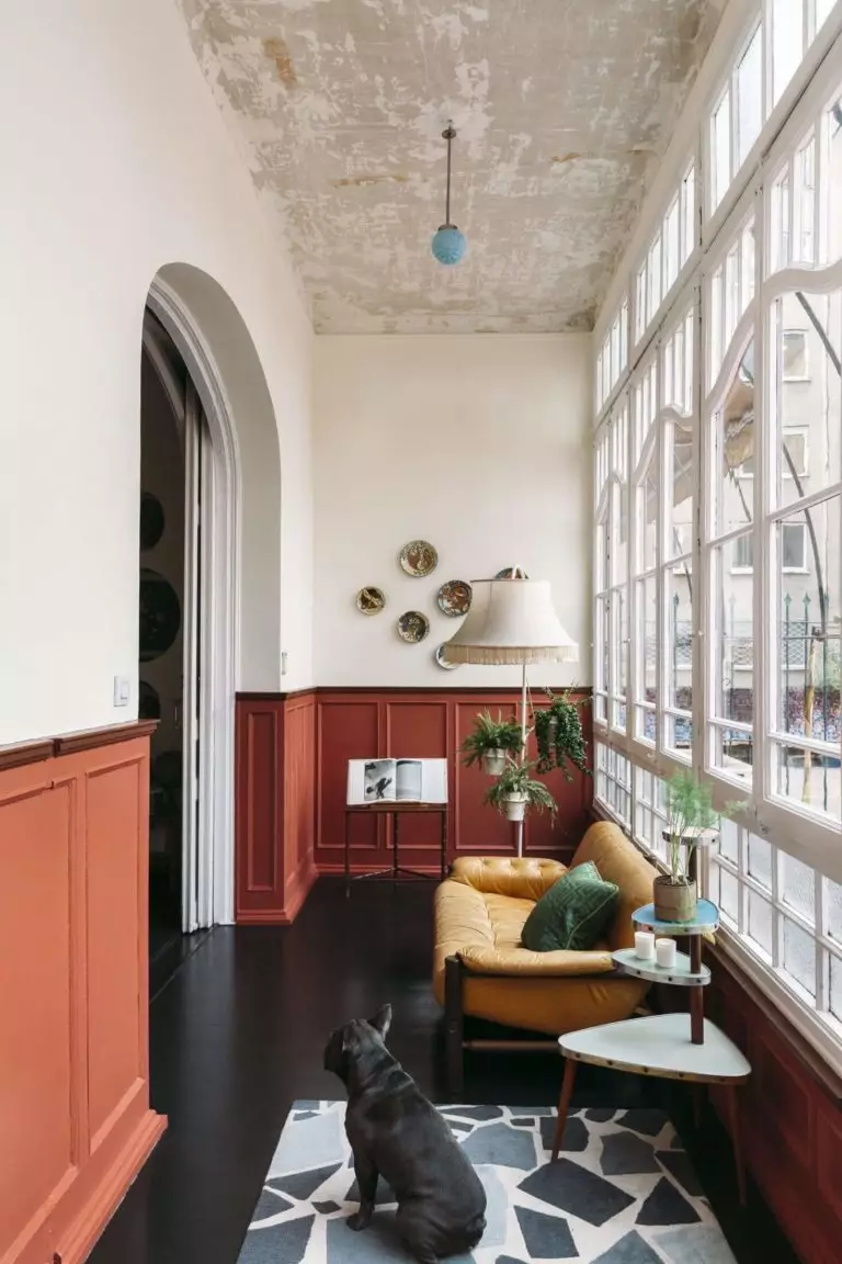
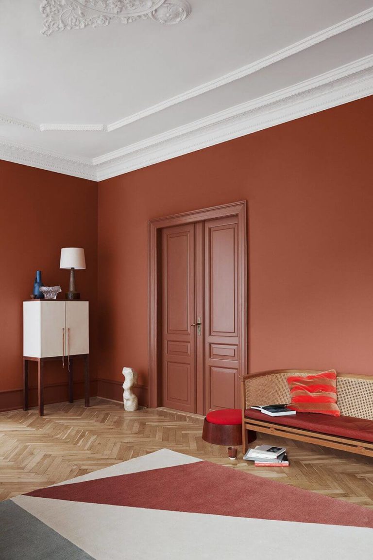
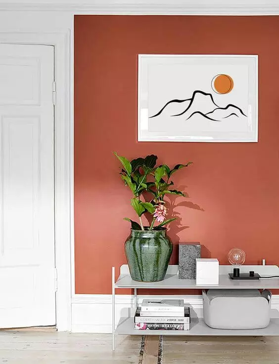
Flavored Living Room
The rich brown paint color is the dream splash of trendy comfort when applied directly to the walls or considering wall paneling first. A seeming sophistication of deep and warm undertones would appear hard to work with in particular design styles, yet the thing is that Cinnamon easily integrates into any approach to design. Rustic, Farmhouse, Neoclassical, Boho, you say.
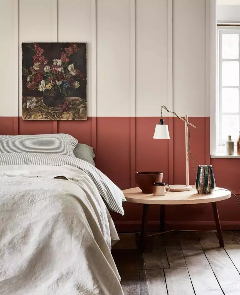
If painting all walls this way would overload the ambiance of the space where you usually spend your time, consider the half-brown half-white technique with wall paneling. Still, we cannot help but emphasize the beauty of this pearl of color in rather Classic interiors. By the way, a few pots with fresh greenery may help freshen up the stark brown.
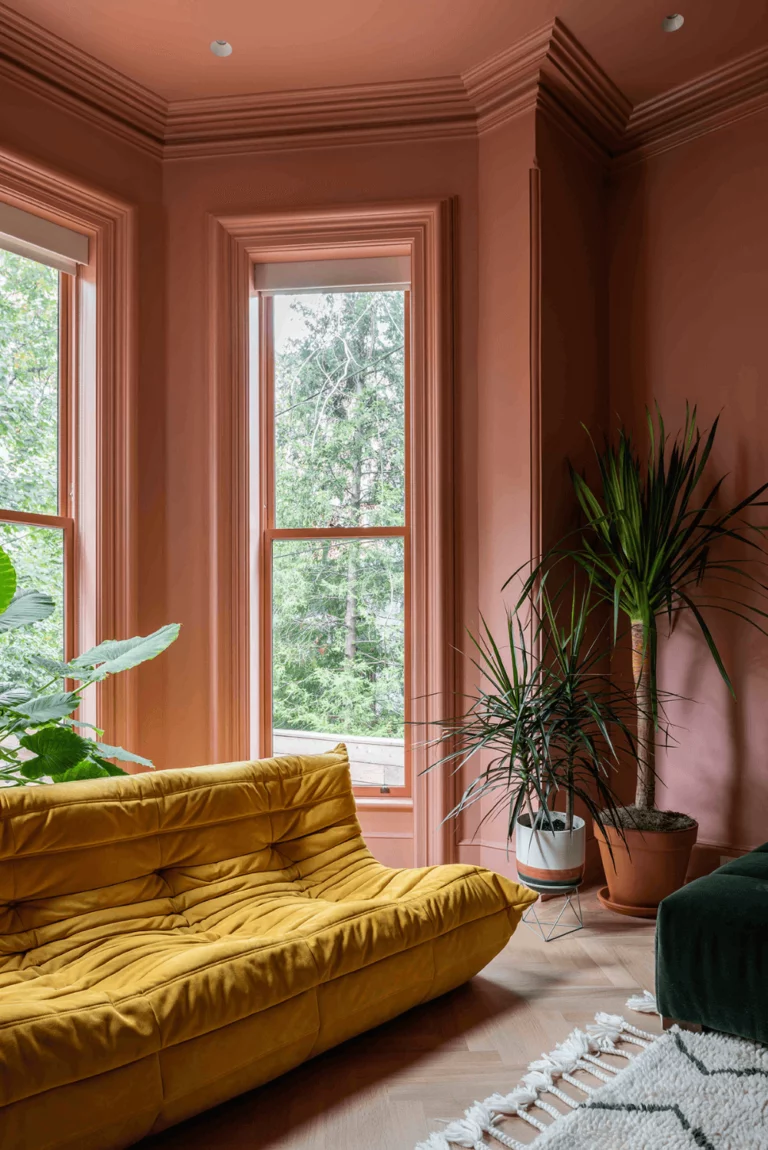
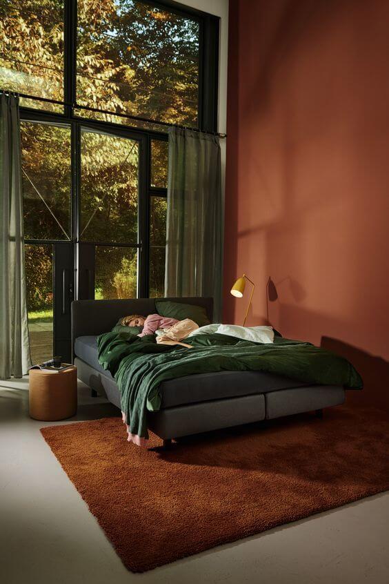
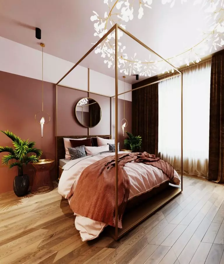
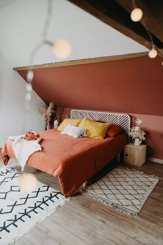
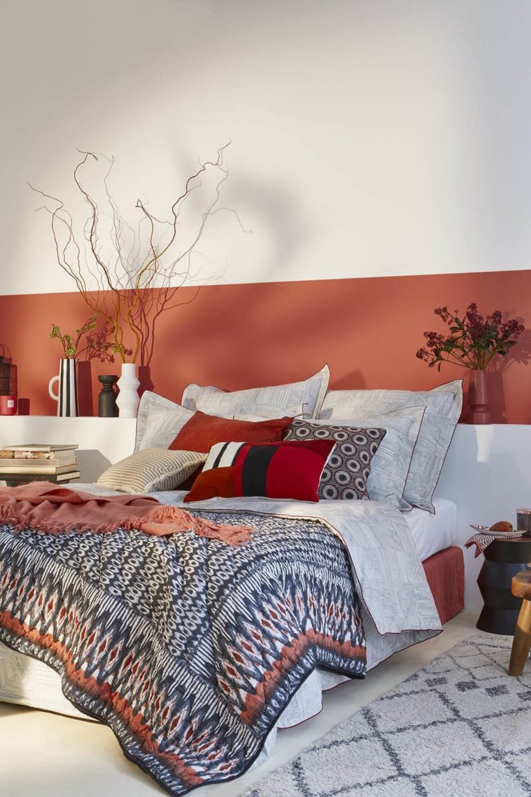
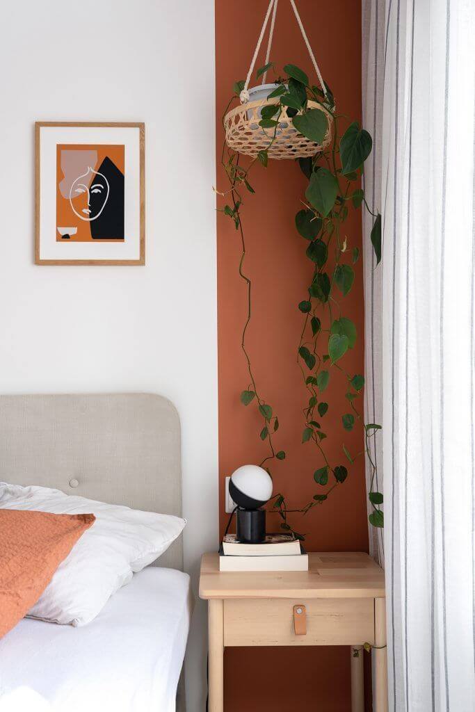
Warm Terracotta in the Bedroom
When deciding on the predominant colors in the 2023 bedroom, designers paid attention to the use of earthy colors, and terracotta won the interest of most colorists. This shade looks very calm and comfortable, reducing stress and making you feel at home. A feeling we would surely suggest integrating into a space you fall asleep and wake up in.
Cinnamon works pretty well when applied to all walls with light wood flooring and a white-washed ceiling. Particular attention should be paid to the pairing of the clay brown with Boho, including the favorite decor units of natural materials, fluffy textiles with ethnic motifs, and lots of indoor plants. For Modern spaces for relaxation, professionals suggest considering partial painting of the walls in brown, paired with downlight lighting fixtures and sleek furnishing. Gold accents on the brown background are recommended for daring and creative minds. Yet, be sure they stand out on the so-called neutral paint to make it look with taste.
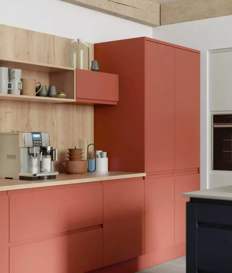
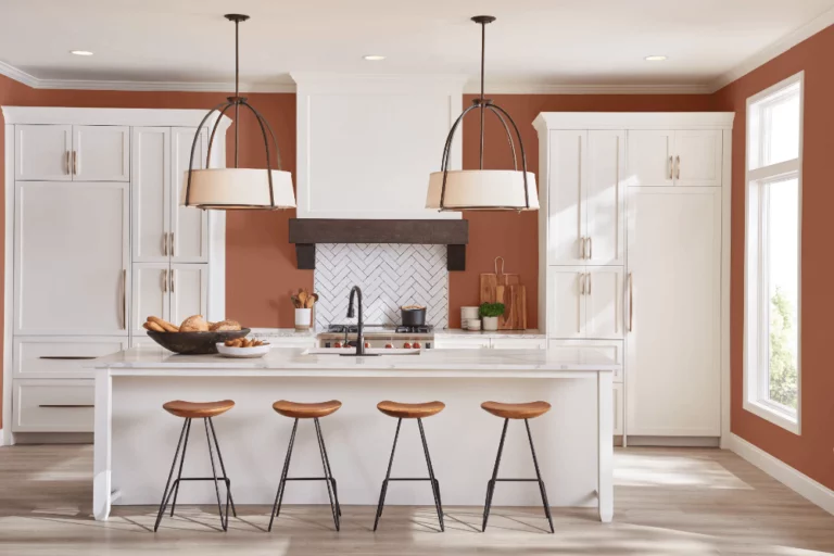
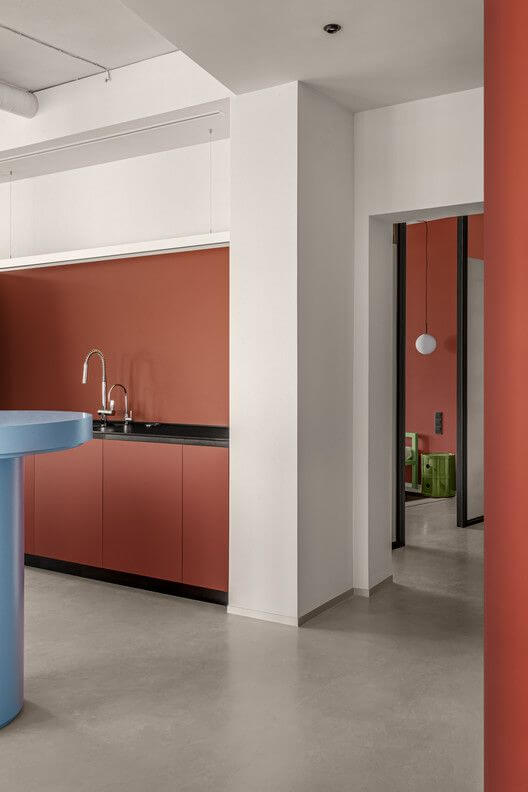
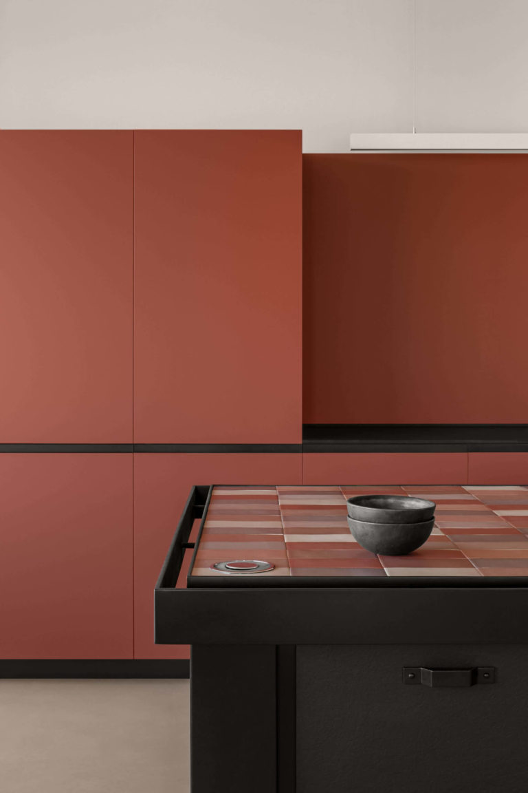
Ultra-modern Brown Kitchen
You will be impressed by what a change the right furnishing can make. Consider the deep brown paint on sleek kitchen cabinets with “touch-to-open” systems, and you will become the owner of the trendiest and most authentic kitchen. Pair it with light wood, white, or black for the walls, backdrop, and backsplash. For a relatively more traditional approach, switch places. Paint the walls in the timeless shade of brown, and choose light paint of your liking for the cabinets.
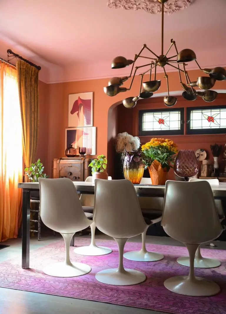
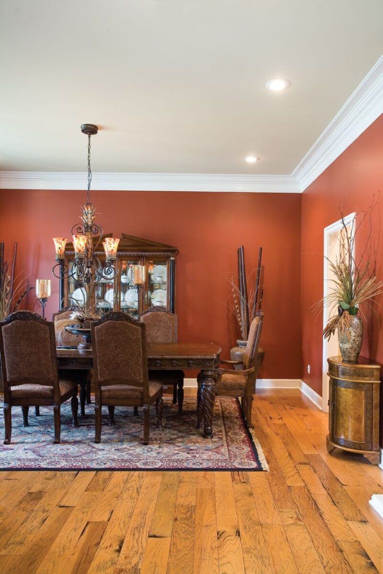
Awakening the Appetite in the Dining Room
The orange undertones of the cinnamon paint are quite skillful at awakening the appetite, and designers suggest it as a high-class option for spaces you use to take your meal in. The interesting part begins when you have to choose the design style. It may sound strange, but Cinnamon gets quite versatile, from a full Classic style to a courageous Eclectic approach. Be careful with the latter – bold accents on a pretty bold background are a dangerous game with a guaranteed trendy result now that original mixes of colors are a priority in contemporary design.
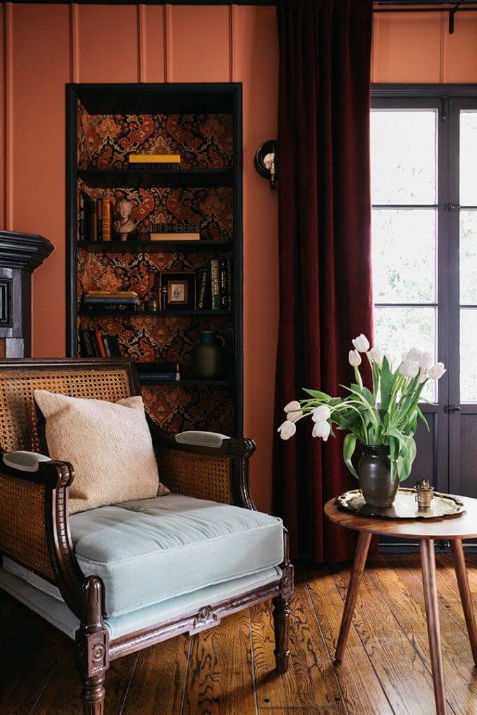
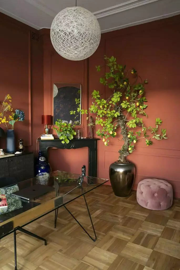
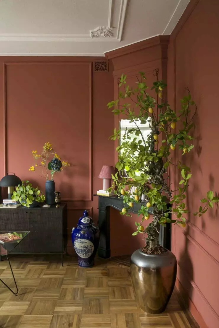
Tasteful Home Office
Here is a great idea for an aesthetically pleasing home office that will make you feel happier and more comfortable in your workspace. A Neoclassical interior with sumptuous wall molding painted in the beautiful Cinnamon paint, white-washed ceiling, light wood parquet on the floor, black furniture, a glass work desk, and large pots with greenery, such as fruits trees just like in this design project. Additionally, add one or two trendy mushroom-design table lamps, and your home office will surely become a place of inspiration.
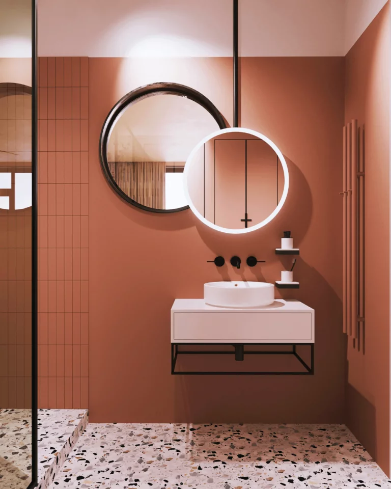
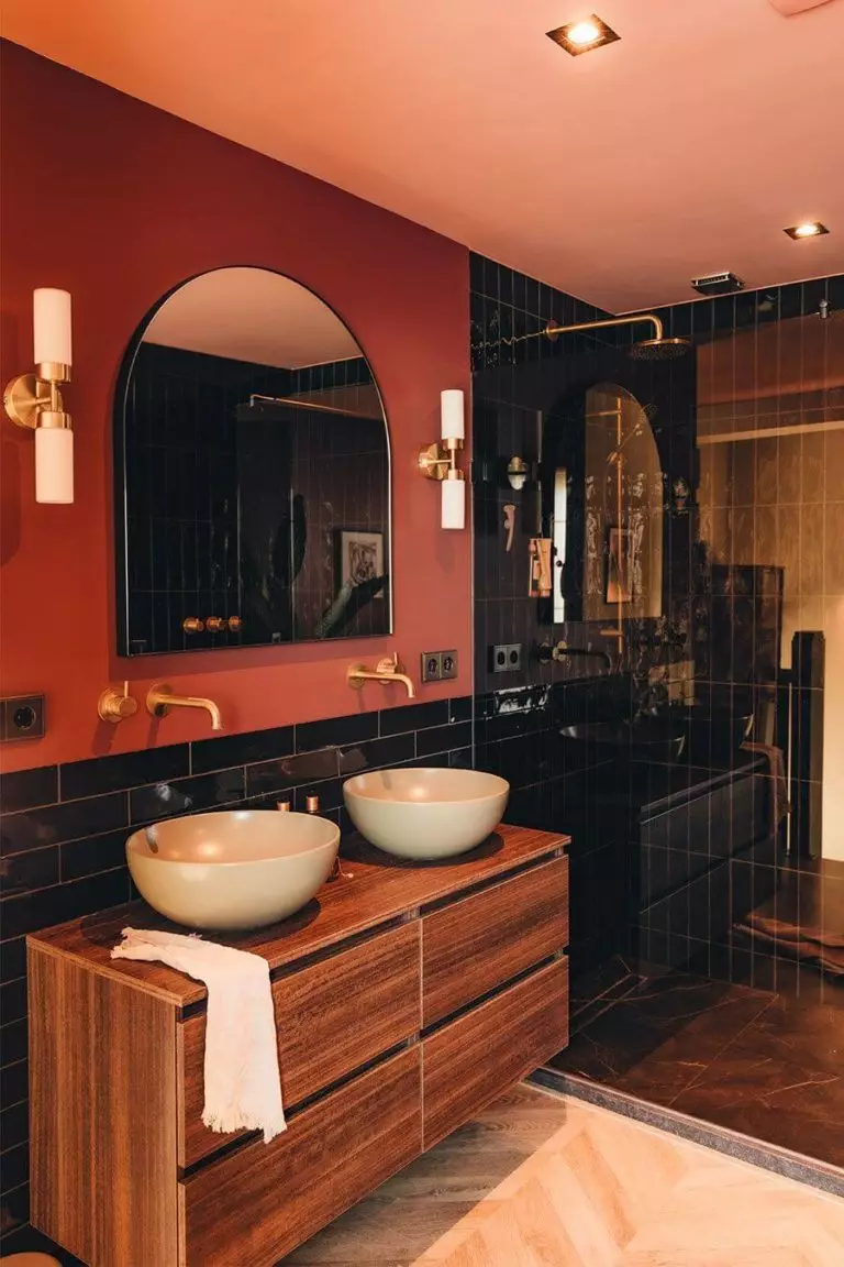
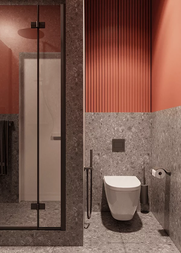
Bathroom with Spanish Motifs
The beloved Spanish vibe ensured by the magazine-style terracotta color is a must for contemporary bathrooms. The secret of Cinnamon in the bathroom is its flexibility. It can effortlessly pair with another Spanish find – Terrazzo style stone, wood texture, black furnishing, and even other bold colors, such as a natural green hue that looks organically beside such a skillful earthy shade of cinnamon.

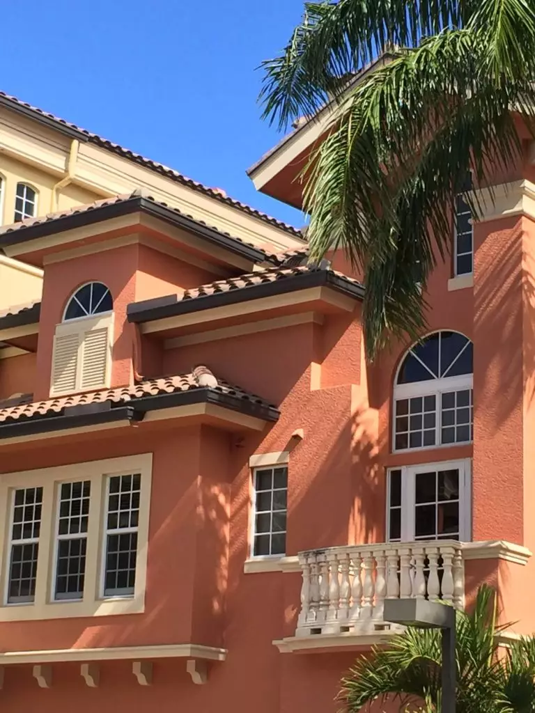
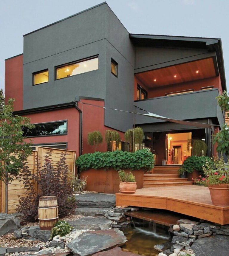
Use of Cinnamon for the Exterior
Cinnamon won’t leave you disappointed, even when applied to the exterior design. It looks organically stylish on house walls in southern locations with all-year warm weather, where this color can show the world its true earthy nature. Still, a slightly cooler and softer terracotta variation caused by northern exposure fits modern exteriors with cubical architectural features. Again, one of the best paint colors by Benjamin Moore doesn’t cease to astonish with its ease of change from one style to another.
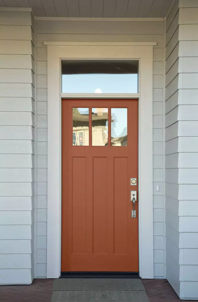
For a less expensive invigoration of your exterior, choose Cinnamon for the front door in combination with light-painted walls. Think of one of the earlier suggested coordinating paint colors.
The Cinnamon 2174-20 paint color by Benjamin Moore opens a new era of neutrals when a deep shade like this can be safely used as a background or accent color, enriching the space with rich undertones that don’t feel overwhelming but personal, familiar, and well thought-out.
