Classic Gray OC-23
Benjamin MooreClassic Gray is an off-white shade, to be precise - a light gray penetrated by particles of warm yet not devoid of a slight crisp effect.
Classic Gray (Benjamin Moore): what color is, review, and use
In the world of neutrals, gray holds a leading role with its wide range of shades. Today, we will tackle a unique gray variation, which is no less usual than special; it is a classic. The Classic Gray 1548 (OC-23) from Benjamin Moore is the designer’s favorite gray at this manufacturer. What makes this paint color stand out?
The so-called classic shade is a light gray with warm undertones not devoid of freshness. Some may see it as a simple light gray. Others may feel like it resembles a greige, a mix of gray and beige, or even a white variation. The interesting part is that all of them would be right. Classic Gray can take on any of these versions. Still, this paint color is part of the Off-White collection, which says a lot about its chameleon features that depend on particular factors. One more statement to get you even more interested: Classic Gray is regarded as a perfect alternative to white in spaces where the latter does not look well. It seems that the popular shade from Benjamin Moore is more than gray. Let’s dive deep into its essence!
Classic Gray paint color features
Classic Gray is an off-white shade, to be precise – a light gray penetrated by particles of warm yet not devoid of a slight crisp effect. Designers claim that it perfectly refreshes the space, adding a touch of calmness for an indeed serene environment yet serving as a background for accents within a dynamic setting is no less an ability peculiar to this shade. Furthermore, a considerable number of experts pointed at the fact that this paint color serves as an impressively neutral backdrop for pieces of art. At the same time, homeowners regard it as a breath of fresh air that instantly sets a relaxing environment. One should note that Classic Gray may seem lighter, darker, cooler, or warmer, and it all depends on such factors as lighting and complementary colors, which will be tackled as follows.
Classic Gray: is it warm or cold?
The fabulous shade of gray from BM is undoubtedly warm. Regardless of how fresh it seems, it cannot help but show off the slight beige undertones that reveal themselves differently according to particular conditions, preserving the softness of this color. The statement that Classic Gray may seem greige is enough to prove that this gray is diluted with a few drops of beige, which is the source of warmth.
How does lighting affect Classic Gray?
Let’s tackle the daylight first! In east, west, and south-facing spaces, this gray tone reveals its whole range of beige undertones, the shade feeling more greige than off-white. The scenario changes in rooms with north-facing windows, where this paint color leans light gray, being closer to the off-white category, and shows even a few green or purple notes. During the night, artificial lighting plays the leading role, influencing how this color looks based on specific warm or cool undertones, which bring a similar effect on this shade.
Classic Gray LRV
Now, you will understand why this shade of gray is regarded as off-white. The Light Reflectance Value, used to determine how light or dark a color is, places Classic Gray in the light-tone group with a value of almost 74. 100 stands for true shades of white, and this gray shade is quite close, while its position on this scale indicates that it is off-white. What does it seem like in practice? Classic Gray reflects enormous amounts of light, going beyond the room borders and making it feel spacious. Experts even warn about an extra bright effect within spaces that receive a lot of daylight.
Classic Gray undertones
The underlayer of this shade has been revealed. We will only summarize the information. Classic Gray has a wide range of undertones that reveal themselves under the influence of particular factors. Besides the visible hint of beige, this shade is injected with particles of purple and green that are less perceived and prefer to come to the surface in north-facing spaces particularly. Furthermore, the neutrality of this shade offers it the ability to reflect a particular amount of neighboring colors that once again makes us look at it from another perspective.
Similar colors
If we were to list all gray variations that may seem off-white, true light grays, or greige, all together, but in different conditions, we would cover more than all the color review articles we have written so far. Still, the fantastic mix of softness, crispiness, and relaxation that feels like an escape is not so common to such light neutral shades but is definitely peculiar to Classic Gray. A few paint colors from BM and other manufacturers can proudly show off their, probably not perfect yet still impressive, similarity to the inner beauty of this shade. We will reveal the most prominent alternatives to you!
Coordinating colors
When it comes to this aspect, the first thing all designers will point out is the light shades to suit the ceiling or trim in the neighborhood of Classic Gray. This is what we will start with. BM’s popular shade of gray simply fell in love with clean white shades that complement its crisp effect. If we speak about accents, this shade of gray likes to play with more intense variations of greige and pale shades of bold colors to preserve harmony. No less impressively, it works with the all-time classic companion of white: black. Let’s get more specific!
Use of Classic Gray in interior
We do not often say about paint colors that they work for any style and space within the interior. The classic shade of gray that Benjamin Moore’s colorists came up with is a paint color entering this category. Its versatility adapts surprisingly well to each case in part. It even adds a tiny splash of individuality due to its sophisticated inner beauty that radiates cool and soft notes. The most important thing is its impeccable relaxing ability, which sets an inexplicable sense of comfort highly appreciated by designers and sought after by homeowners. We like to state, but we also like to prove. Let’s see how much truth is in our words by referring to a few design solutions implying the unique shade of gray!
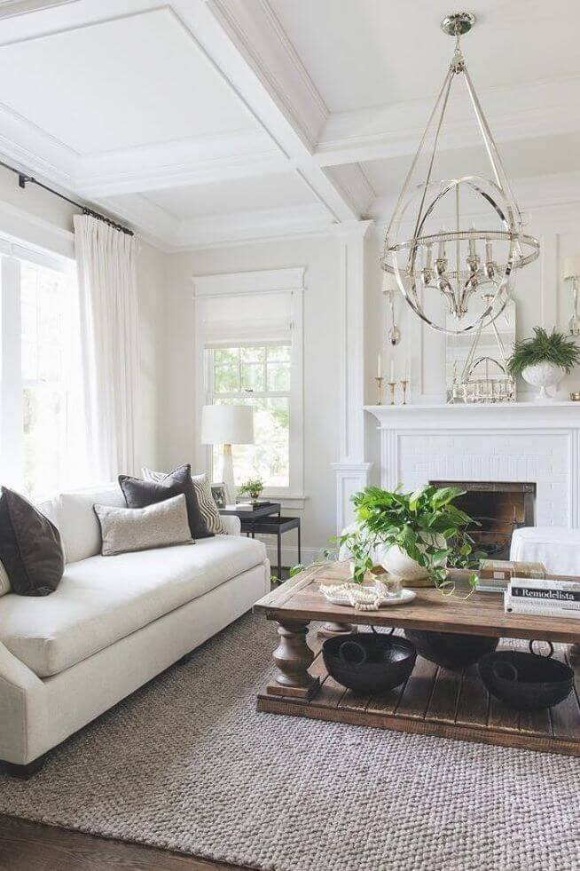
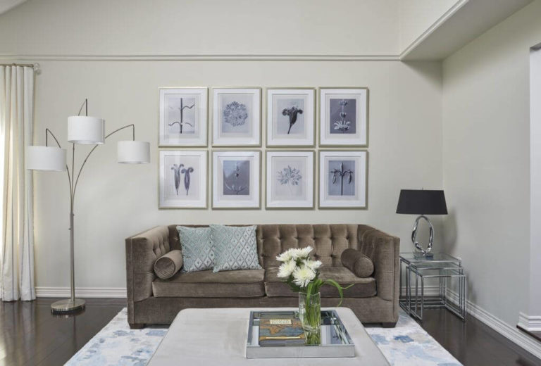
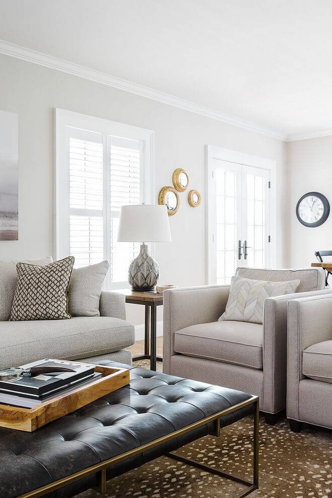
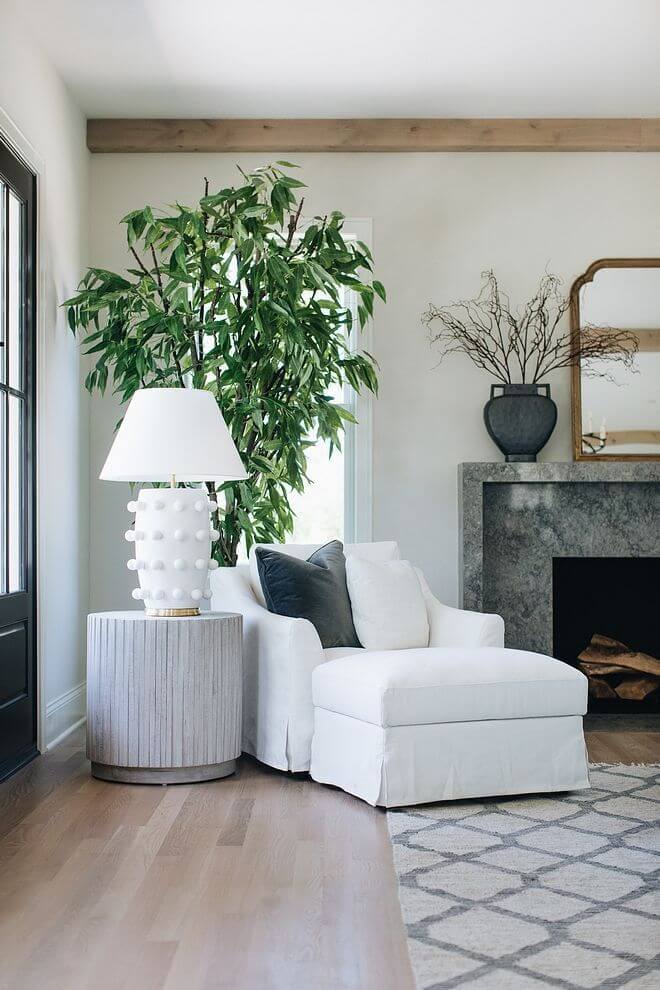
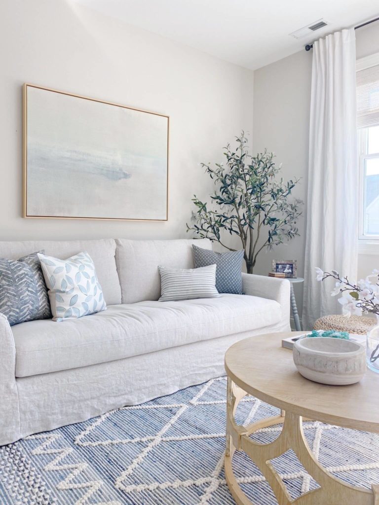
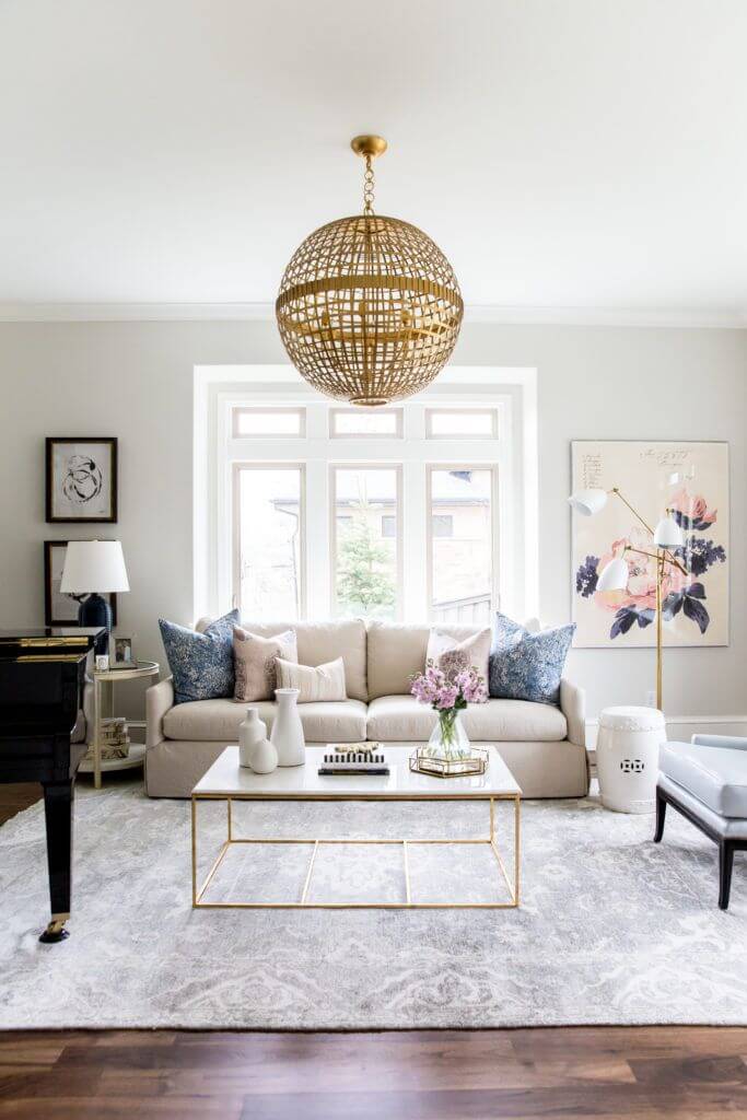
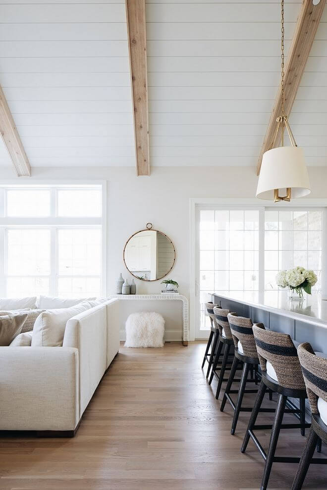
Living room
Paint the walls with Classic Gray and let your imagination run wild when it comes to interior design. Pick any style and add as much individuality as you want. Of course, we have a few suggestions. For a start, think about an all-white living where the warm gray, which seems like an off-white, will ensure comfort. Next comes the outstanding combination between the warm undertones of Classic Gray and wood. Even a single wood unit will perfectly harmonize with the walls for an indeed balanced environment. No less impressive are leather sofas or the same natural gray ones that would work astonishingly with the hidden notes of the background color.
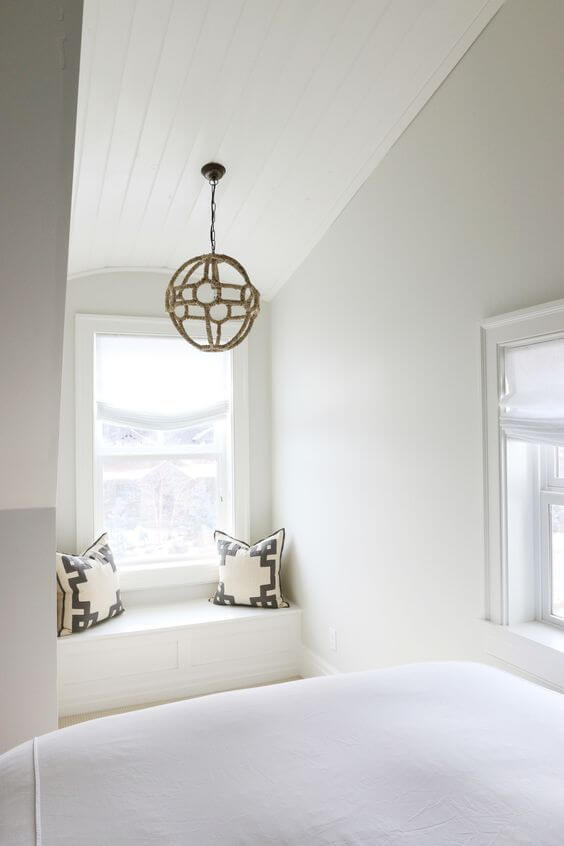
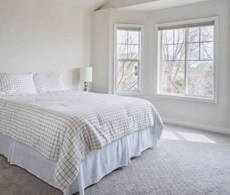
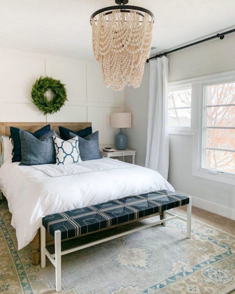
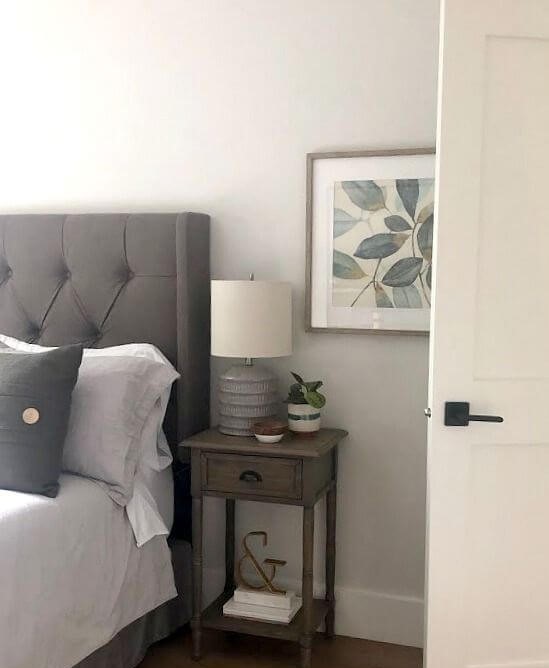
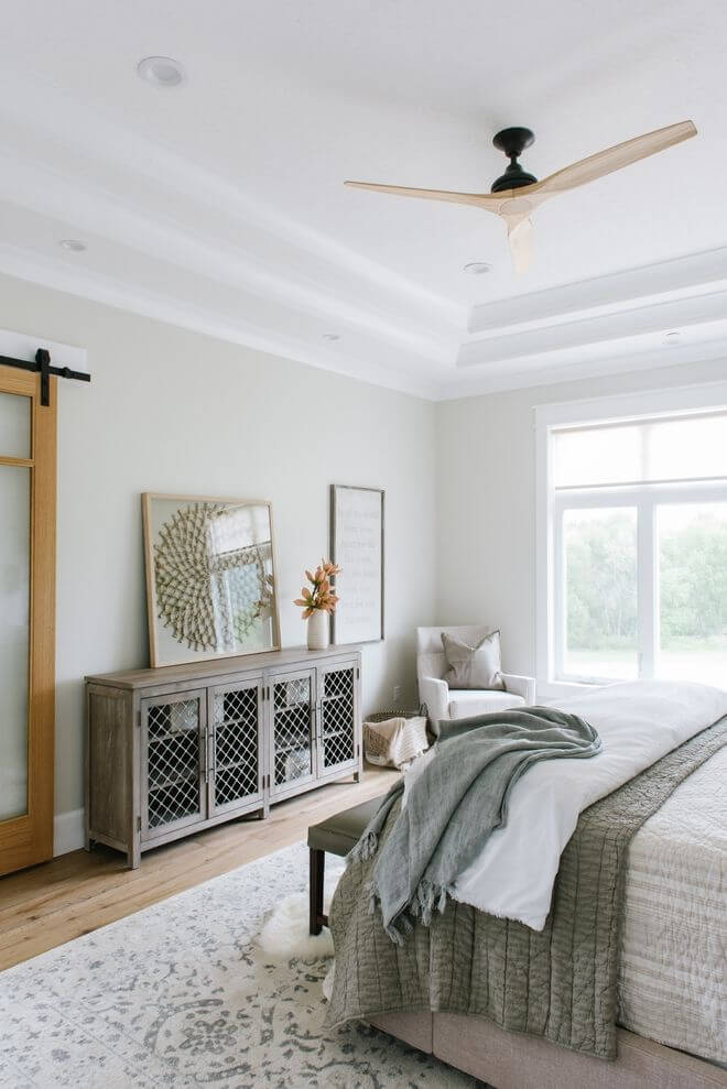
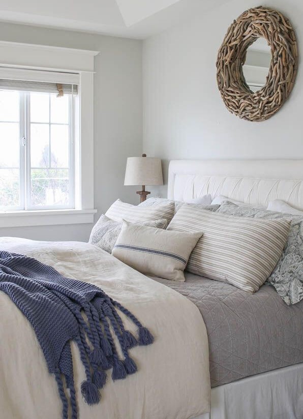
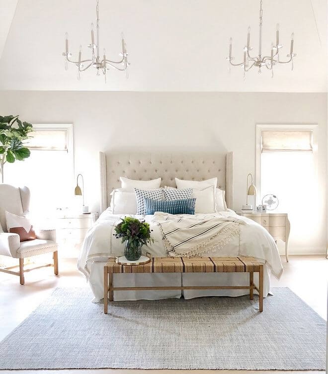
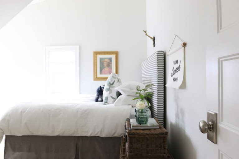
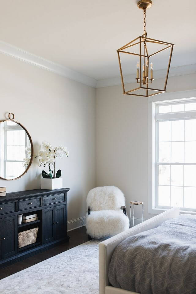
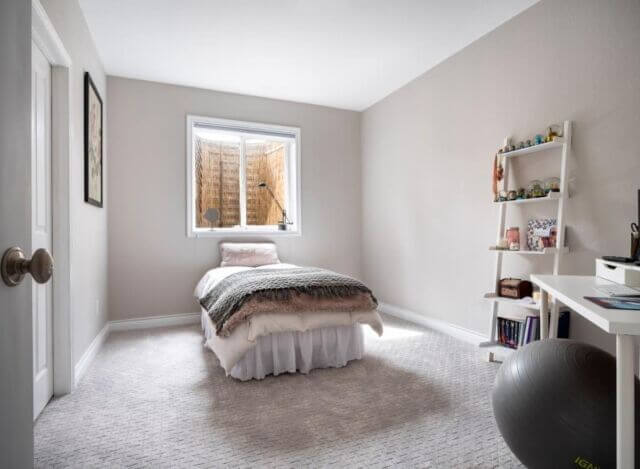
Bedroom
Designers love using this paint color in bedrooms. They literally love it since Classic Gray is, first of all, a replication of comfort. The amount of calmness that this seemingly neutral shade can bring to a space is astonishing. Besides, you can decorate your personal space any way you want, and this beautiful shade of gray will keep pace with your ideas. It is impressive to witness how Classic Gray may seem an actual white shade that combines perfectly with an all-white interior and a soft greige that goes hand in hand with wood surfaces. It all depends on the lighting. This is why you should experiment with a sample within your bedroom and make sure that it matches your expectations.
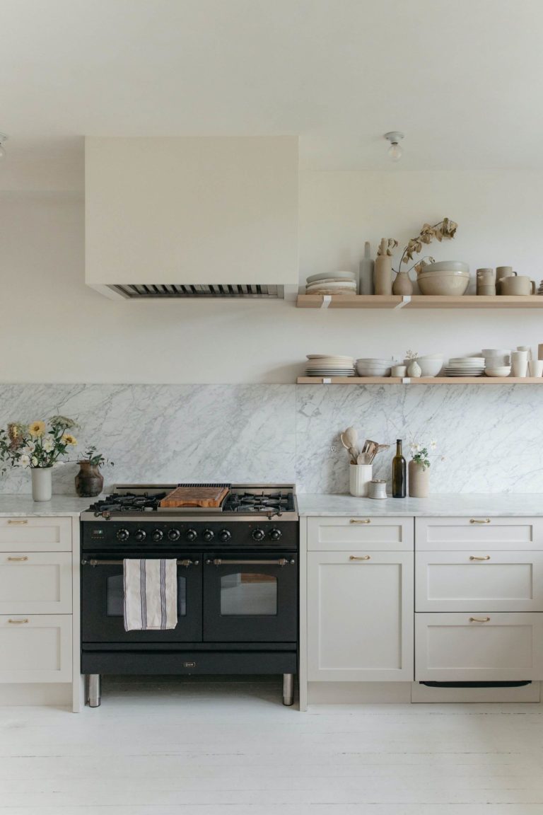
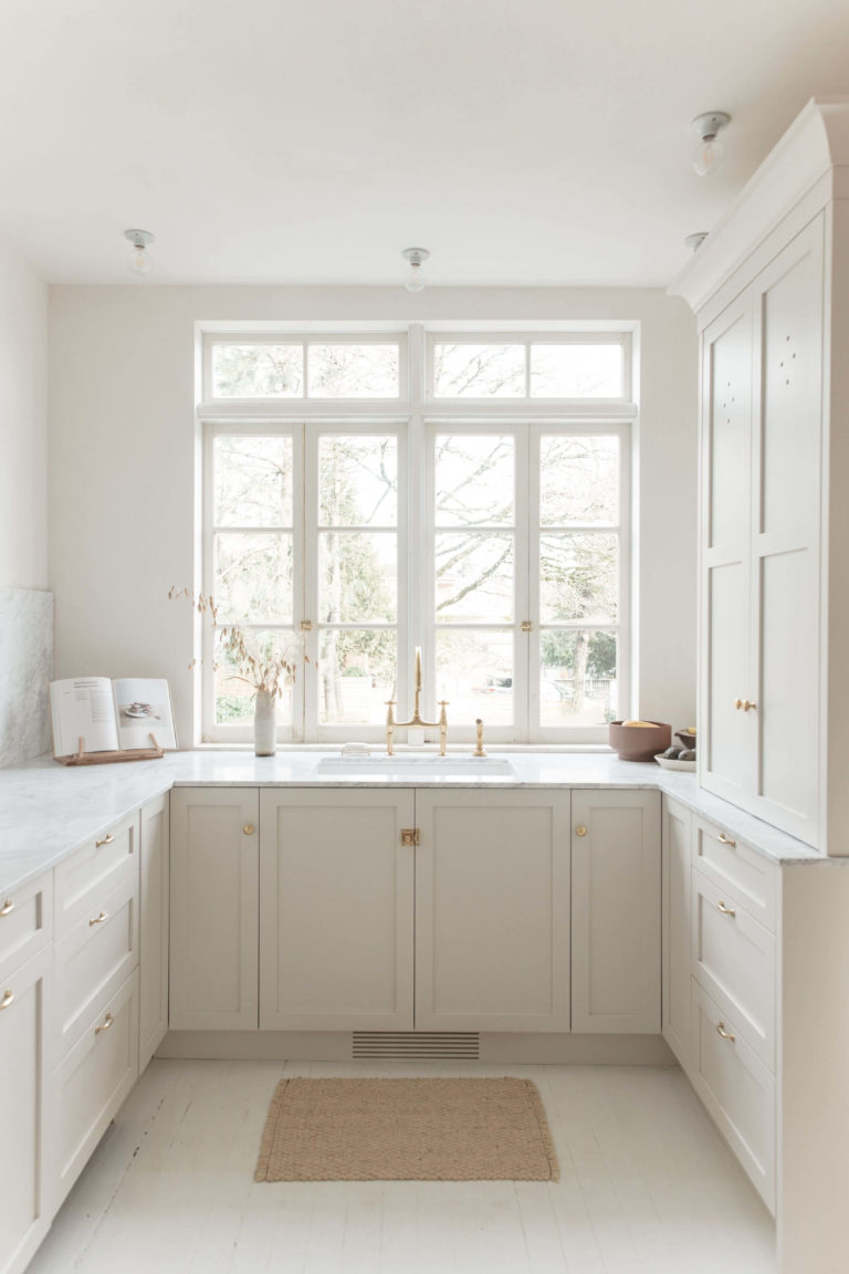
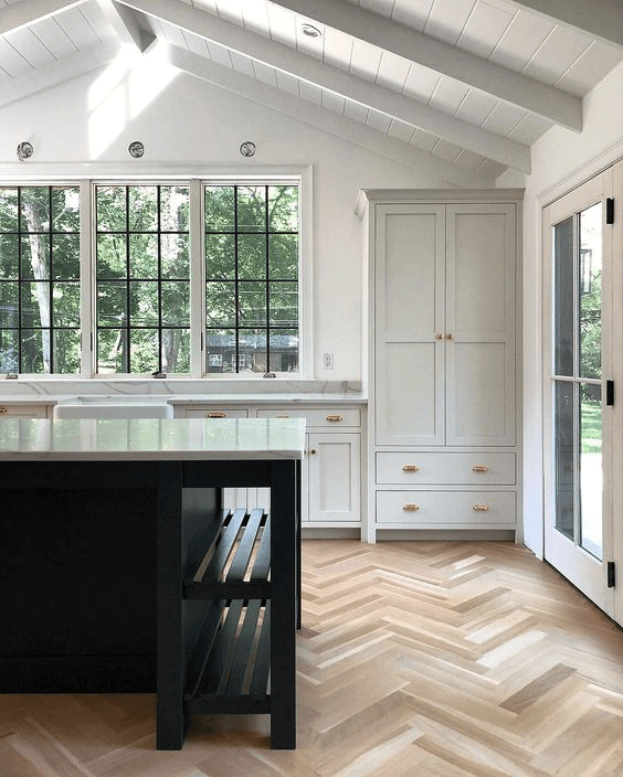
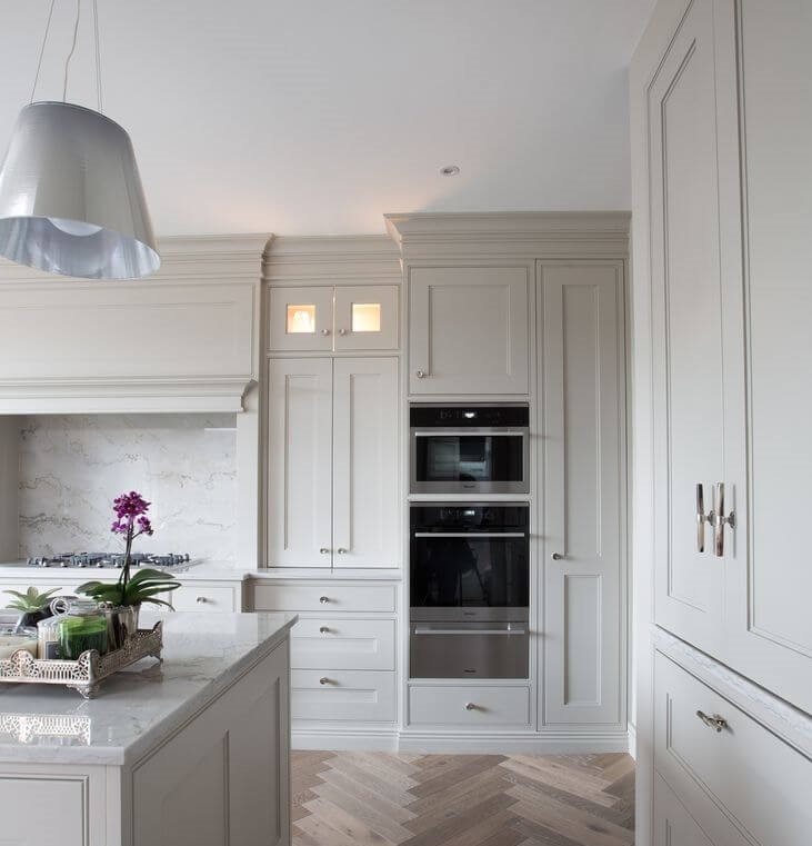
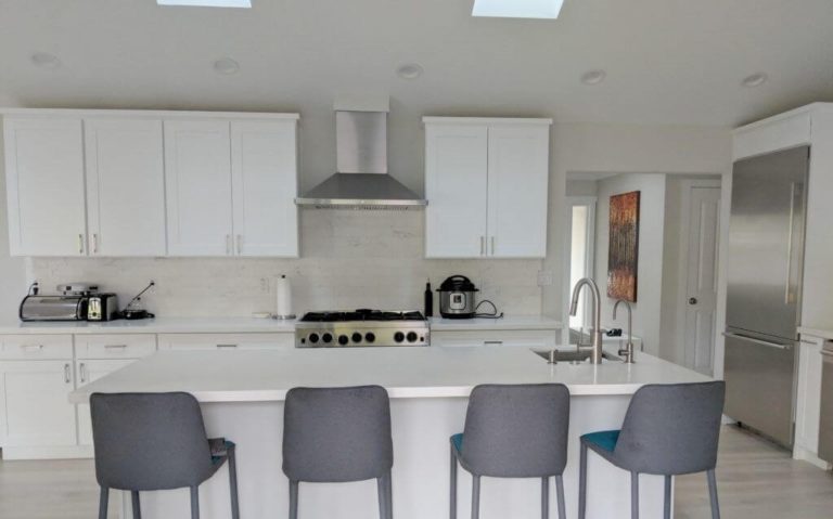
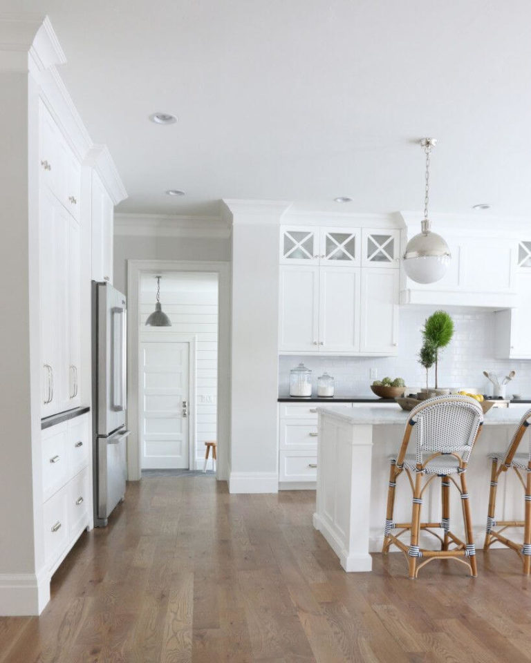
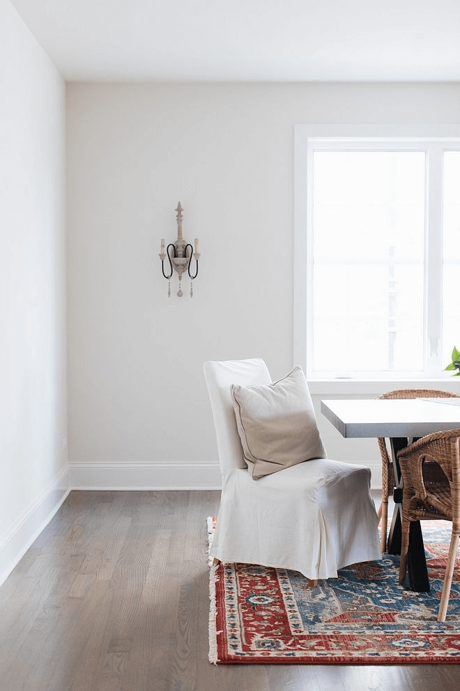
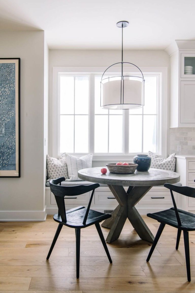
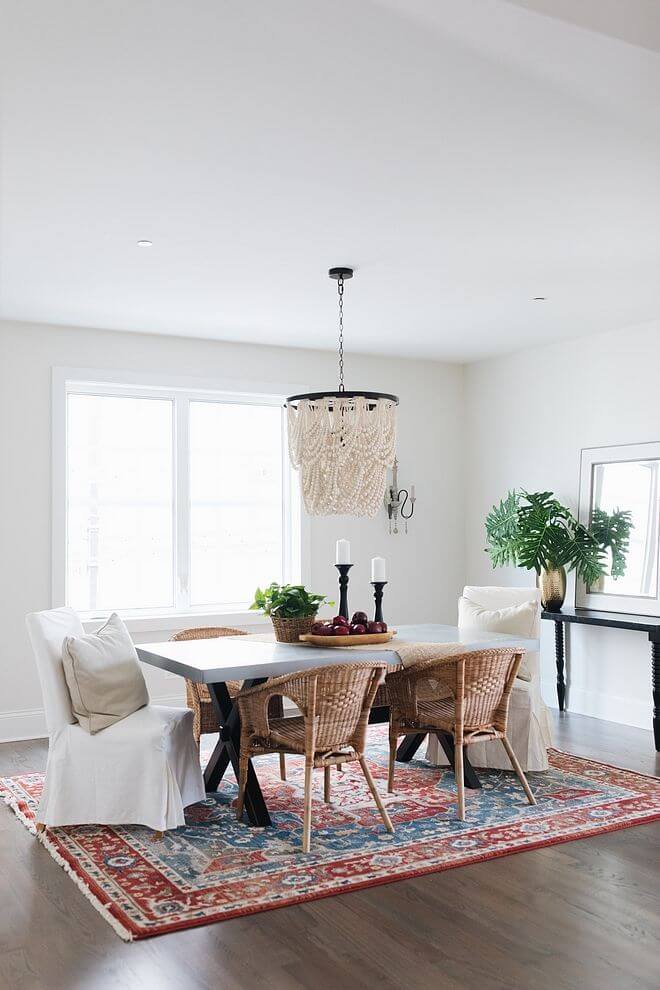
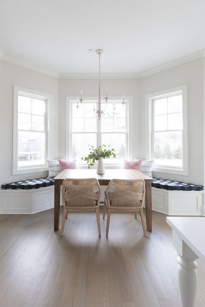
Kitchen and dining room
One thing one should consider for both spaces is that the best compliment to Classic Gray is a functional layout devoid of additional units and colors. This way, this paint color can reveal its inner beauty and ensure a delicately clean environment fully penetrated by calmness. Consider the classic shade of gray for the walls to display the crispy white cabinets or paint both the walls and cabinets in this shade, separating them with a marble countertop or backsplash. A bit of light wood would complete the final result for an unobtrusive and natural sense of comfort.
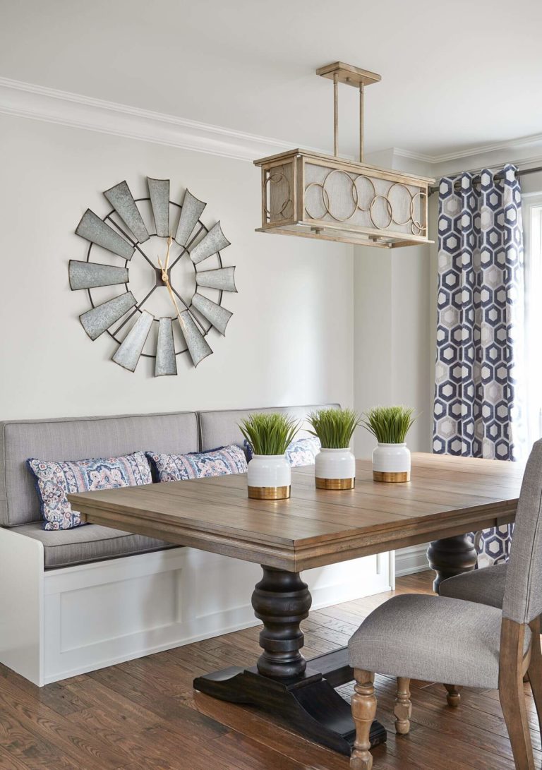
Classic Gray is not ready to give up on wood in the dining area either. With walls painted in this off-white, a natural wood table, and a discrete decor, your dining space will reach the highest level of comfort, which, surprisingly, is ensured by a simple approach to design.
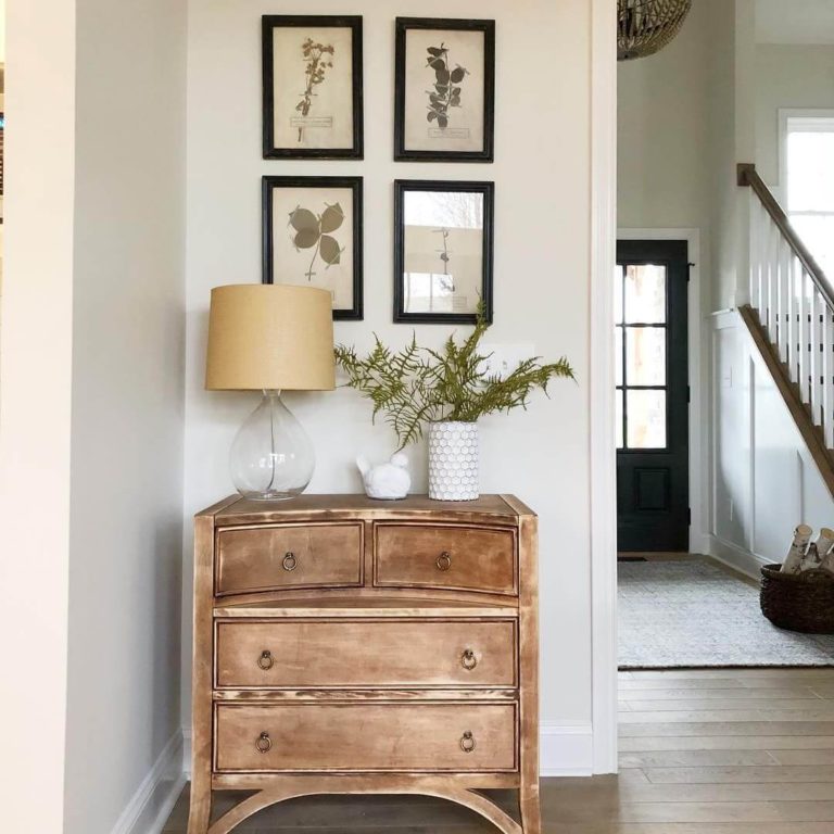
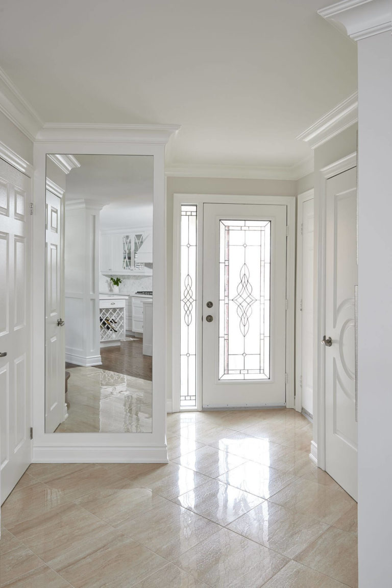
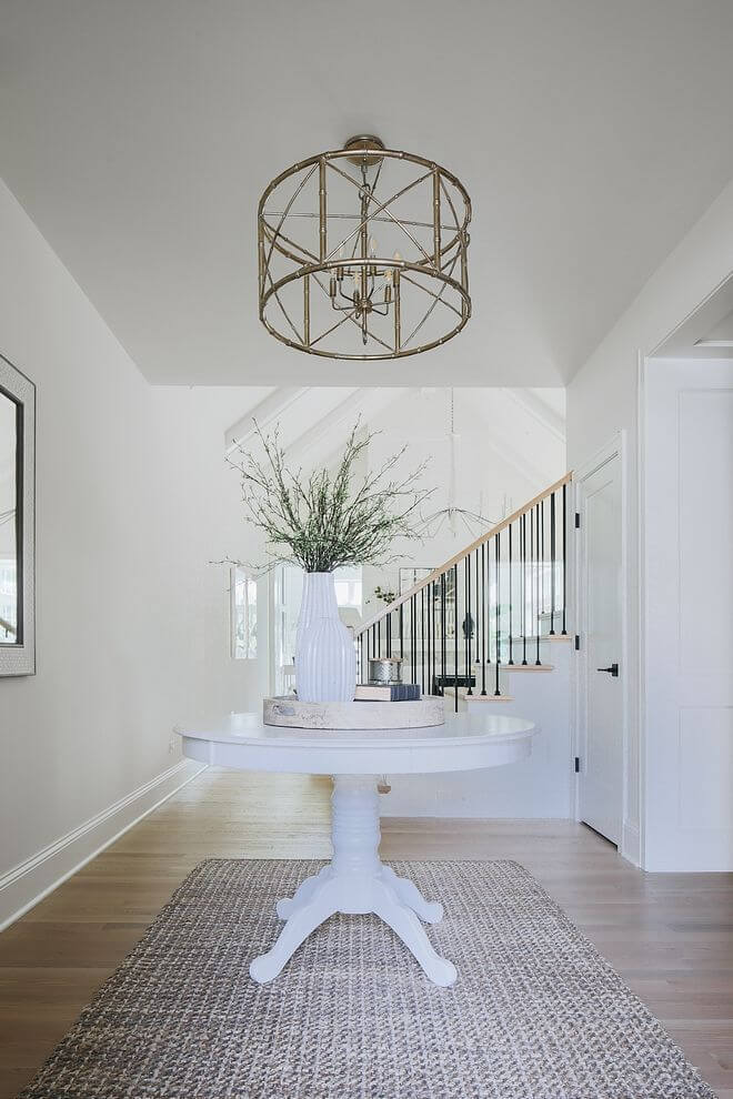
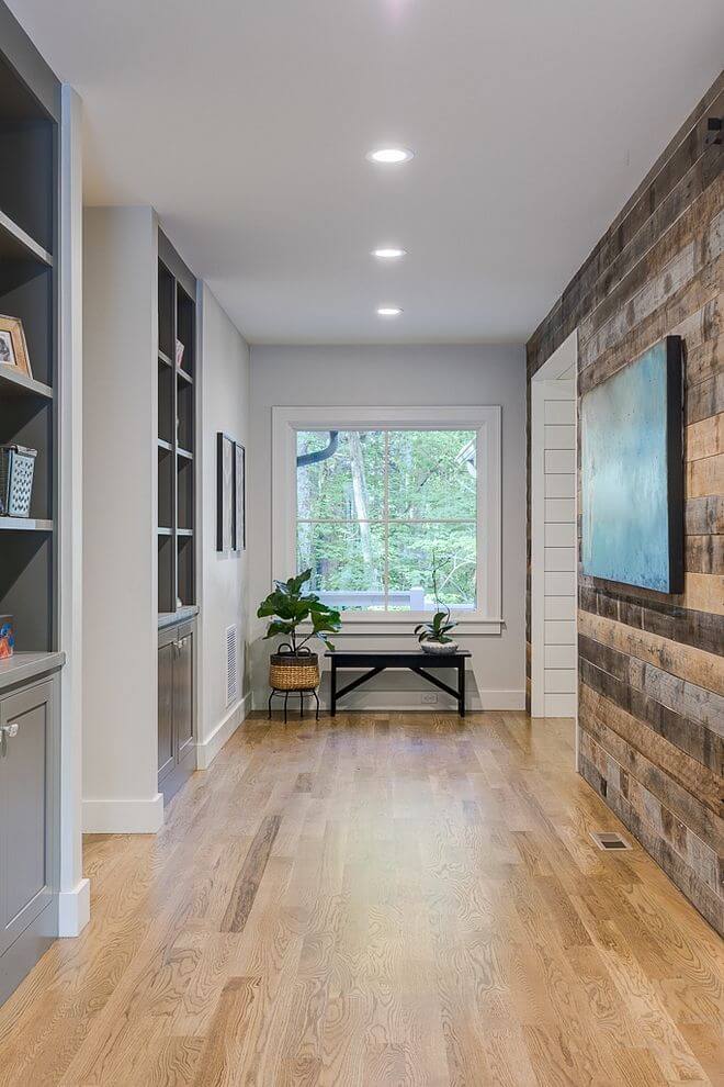
Hallway
Classic Gray goes hand in hand with functionality, which seems welcome within such spaces as the hallway. Above all things that are perfect about this paint color, the defining feature that is most important within this space is the welcoming effect. The partners in crime are the white trim and wood flooring with a minimum of decor and maximum of free space. Such conditions allow the timeless gray from BM to reveal its range of soft feelings that make every return home a pleasure due to its ability to offer the space a familiar look.
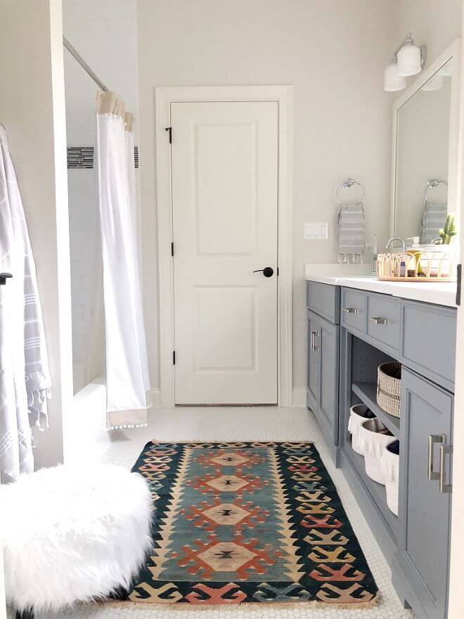
Bathroom
As fascinating as this color looks on kitchen cabinets, designers cannot simply allow us to use it the same way in the bathroom since this space is usually much smaller. At the same time, painting the walls in Classic Gray and accompanying them with white cabinets is a perfect choice. Such gray shades usually work well with brass, although this variation is more of a steel lover to contrast slightly with its warm undertones. The same functional approach goes here, while the warm gray ensures comfort even in such spaces like the bathroom.
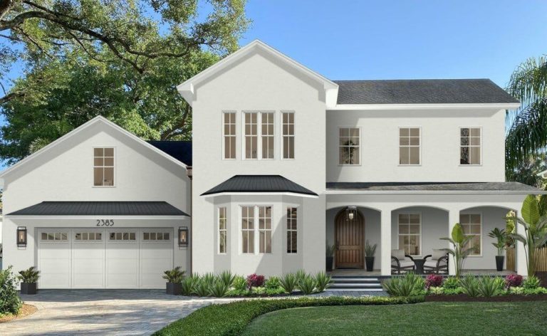
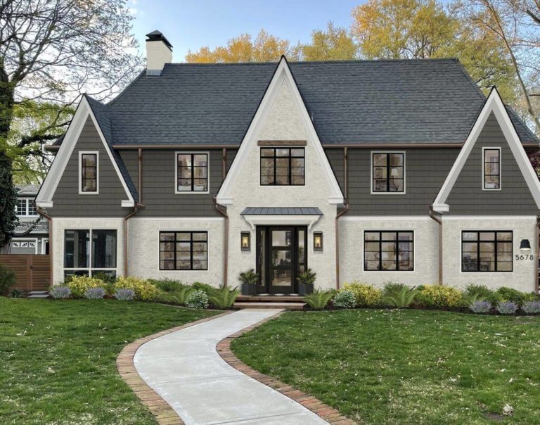
Use of Classic Gray for house exterior
Classic Gray looks like an actual off-white when applied to the house exterior, penetrated only by a few particles of gray and beige. Still, it does not lose its charming sense of comfort and inviting effect. Among the popular approaches, which seem to fit this gray perfectly, is painting a wood or brick house in this shade and opting for a dark roof to emphasize the borders and preserve the balanced look of the exterior.
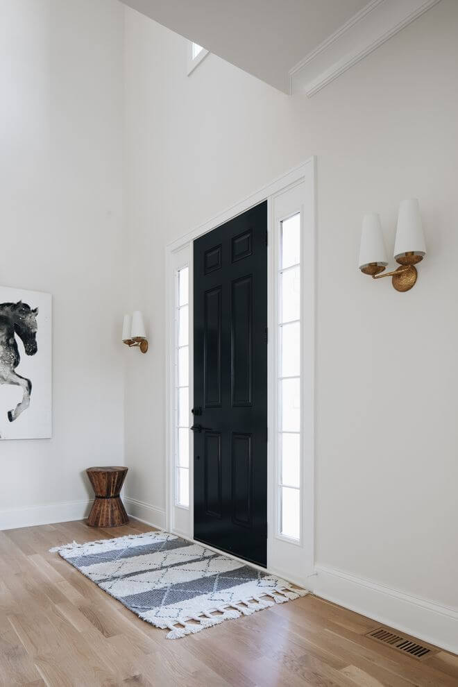
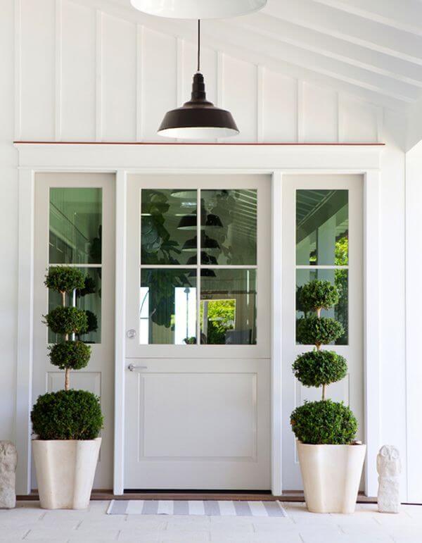
On the only possible background, which is white, Classic Gray may seem faded in full daylight if applied to the front door. Nevertheless, the tiny splash of softness is playing inexplicable magic on the exterior. You don’t know where it comes from, but you definitely feel it. We tend to believe it is all about Classic Gray that manages to offer the exterior an impressive look even when used in small quantities.
The Classic Gray OC-23 paint color from Benjamin Moore is what we call the perfect alternative to white. Its neutral gray base, irreplaceable beige notes, unique soft scents, and no less remarkable refreshing properties are all led by a fabulous sense of calmness. Quite an advantageous alternative so that it would be a shame not giving it a try.
