Classic Silver is a medium gray with a neutral base. It borrowed a few warm notes from yellow and a few cool scents from blue, coming up with a perfect combination.
Classic Silver (Behr PPU18-11): what color is, review, and use
You have probably not heard about the shade of gray we will speak about in this article, not because it is less perfect than other variations of the kind. Instead, it is so perfect that designers want to keep it for themselves and play the magic in interior and exterior designs using it. To your attention: Classic Silver PPU18-11 paint color by Behr. It meets the standards of perfection even more than other shades of gray. Do you know why? This paint color is all about balance. Classic Silver is a timeless gray shade of the medium category with a perfect balance of cool and warm undertones. It stands right where the two extremities meet. Of course, we cannot help but say a few words about its name, which replicates a timeless drop of silverfish refinement. What stands behind such an outstanding balance that only a few shades can show? Let’s find out!
Classic Silver paint color features
Classic Silver is a medium gray with a neutral base. It borrowed a few warm notes from yellow and a few cool scents from blue, coming up with a perfect combination. Therefore, such features as freshness and softness, inspiration and relaxation, modern and traditional pair ideally within this shade. It doesn’t feel confusing but offers a bit from each side, filling the space with everything and preserving a balance.
Classic Silver: is it warm or cold?
The question has already been answered. Classic Silver is warm and cold at the same time. We wouldn’t say cold, but cool would fit this shade. Still, particular lighting conditions and combinations with other colors can change how one feels about this color. The PPU18-11 paint color may gravitate towards a specific side, feeling warmer or cooler.
How does lighting affect Classic Silver?
If the sun rays fully cover the surface of this paint color, it looks like a very light shade of gray. Once a shadow touches it, the intense gray notes come to the surface. Regardless of lighting conditions, the combination of yellow and blue notes is always preserved. What changes is towards which of these sides Classic Silver gravitates. Therefore, this unusual paint color seems a rather cool gray with blue notes prevailing in north-facing spaces. The opposite happens in south-facing rooms, where Classic Silver is pretty warm, and the yellow notes are more noticeable. With cool and warm undertones of artificial lighting, you can achieve a similar result. Still, this shade would look more intense due to the lack of daylight that influences how light the color looks.
Classic Silver LRV
Back to perfection; the LRV (Light Reflectance Value) of Classic Silver is 48 (50 stands for a true medium shade). Well, nothing is perfect, but at least this shade is very close to meeting such standards. Still, the PPU18-11 enters the category of true medium shades. As regards its ability to reflect the light, it is quite skilled in this sense. In full daylight, this shade makes the room feel spacious and spreads light particles all over the space.
Classic Silver undertones
It is probably clear this far that Classic Silver is a neutral gray diluted with a few drops of blue and a few particles of yellow, each responsible for part of the magic that this shade is playing on us. Still, it may seem a rather very soothing shade of blue in most cases, while the yellow notes are responsible for the warm feel that balances the cool scents.
Similar colors
Of course, such perfect balances of cool and warm undertones are not so often met at paint colors. Still, there are a few shades that impressively resonate with the beauty of Classic Silver, with some being very close to PPU18-11. Luckily, we can expand our horizons and go outside the Behr borders. Let’s find out the alternatives at both this and other manufacturers!
Coordinating colors
This is it! This is the neutral shade that is ready to combine with the brightest colors possible. It seems that Classic Silver wants to compensate for its neutrality with every juicy shade inspired by nature possible. Any bold accent would pop up fabulously on such a background. Still, the PPU18-11 paint color does not skip other neutrals and soothing shades, which are harder to play with. Let’s go through a few prominent representatives!
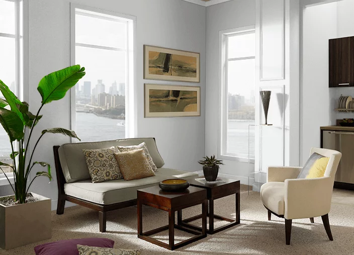
Use of Classic Silver in interior
We mean literally: Classic Silver goes with any style within any space due to its balance of notes that can take any direction. Use it within a monochromatic palette for an exquisite reference to contemporary values, or apply it together with rich textures for a harmonious play with undertones. No less effectively, it works with bold accents. So, if you are looking for a perfect neutral to expose your brightest design solutions, the fabulous gray from Behr is your true companion. Let’s see how it works within interior design and how much truth is in our recent statements!
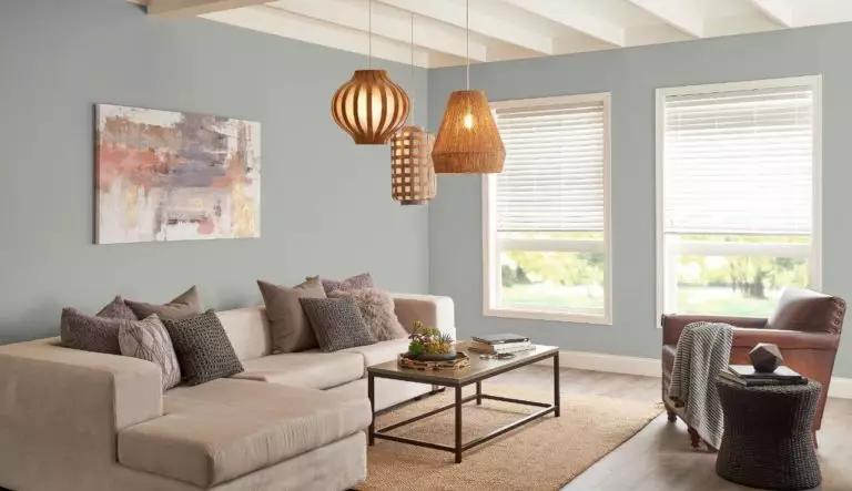
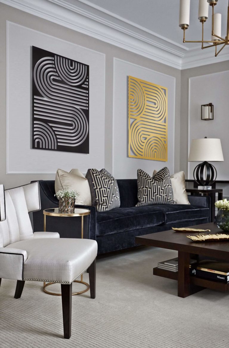
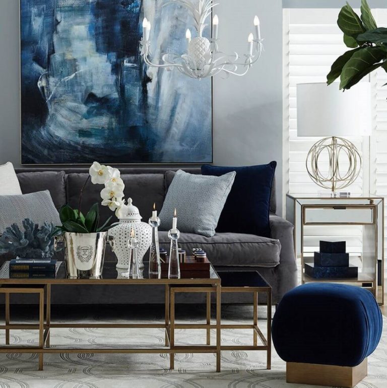
Living room
Sleek Neoclassical, functional Minimalist, comfortable Farmhouse, irreplaceable Classical; which one suits your preferences? It could probably be an entirely different style, which is not a problem for the neutral gray from Behr that is ready to serve as a background for accents of any kind. Even furniture painted this way would shine exquisitely on a lighter background. Still, it would be a shame to have such an impartial shade at your disposal and not use it to expose bold accents, particularly in the living, where a touch of eclecticism would not spoil the overly simplified contemporary interior.
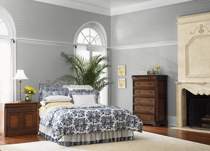
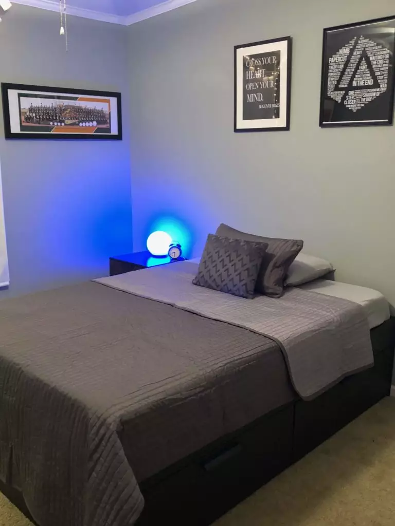
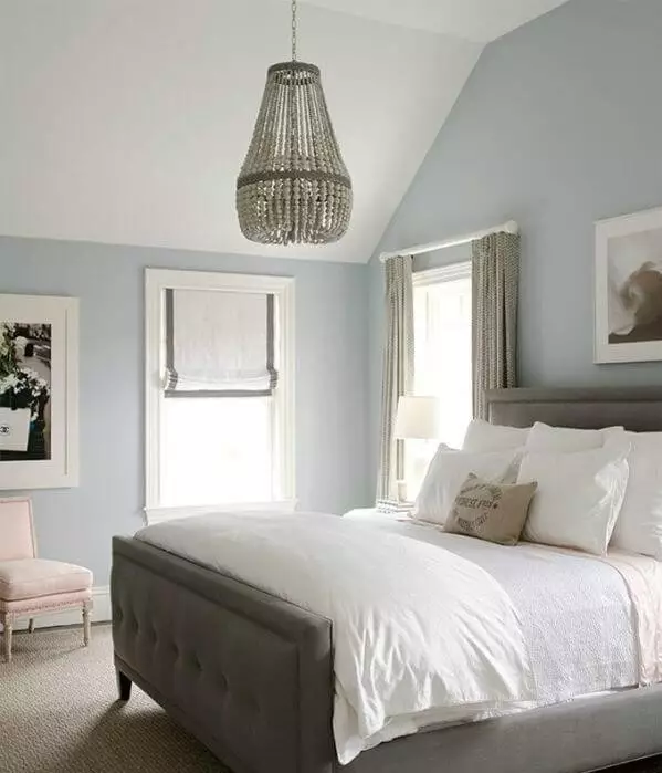
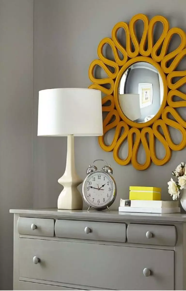
Bedroom
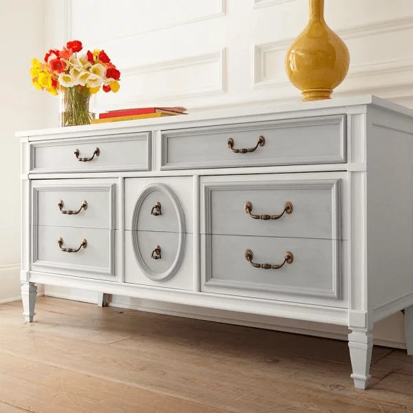
You are free to experiment with this color as long as you want within such a personal space. Still, designers suggest paying attention to dark wood, which has a special connection with gray, for a fantastic contrastive combination. On the other hand, a monochromatic interior with Classic Silver on the walls is what a contemporary bedroom would benefit from. At the same time, you can use this color for the furniture, such as for painting particular parts of a chest of drawers paired with other gray variations to breathe new life into a traditional unit.
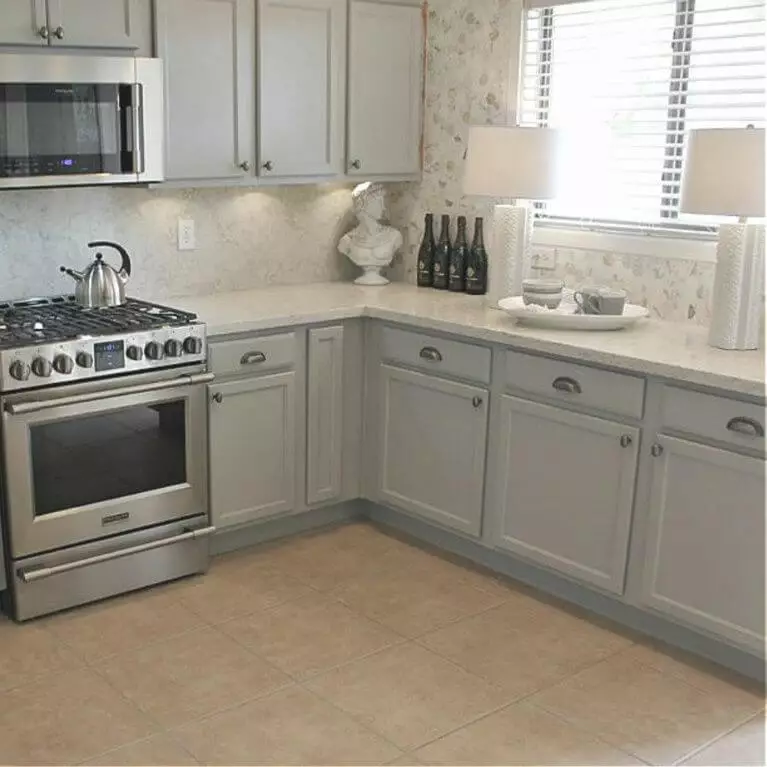
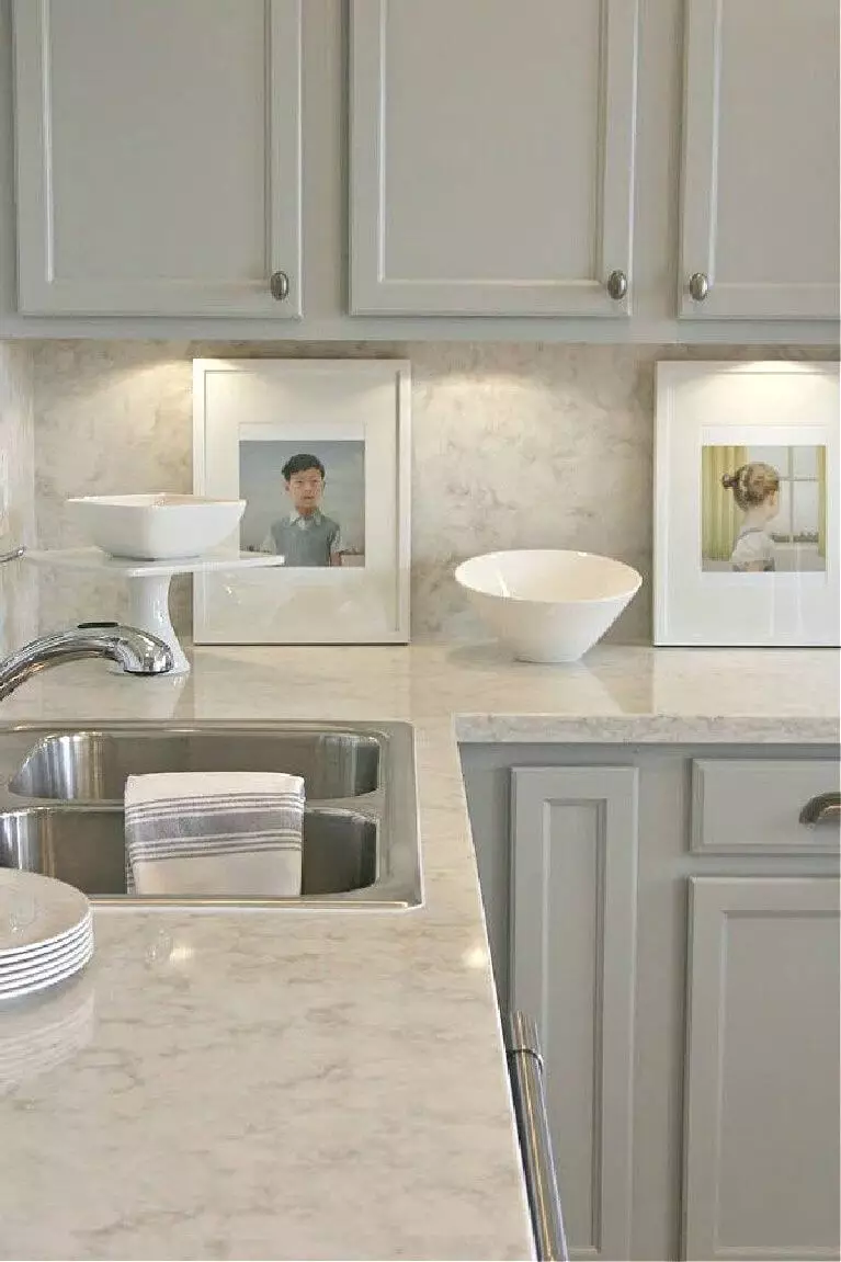
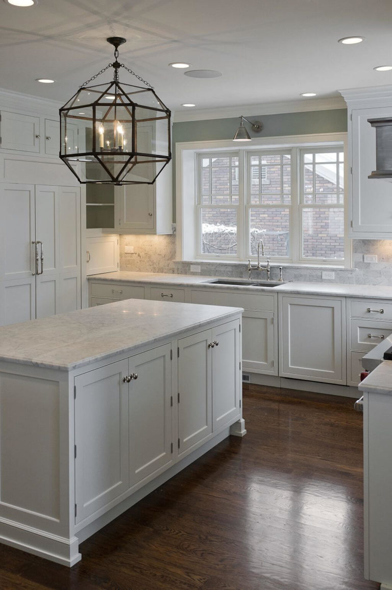
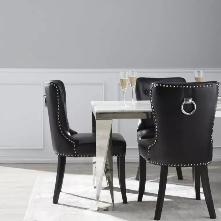
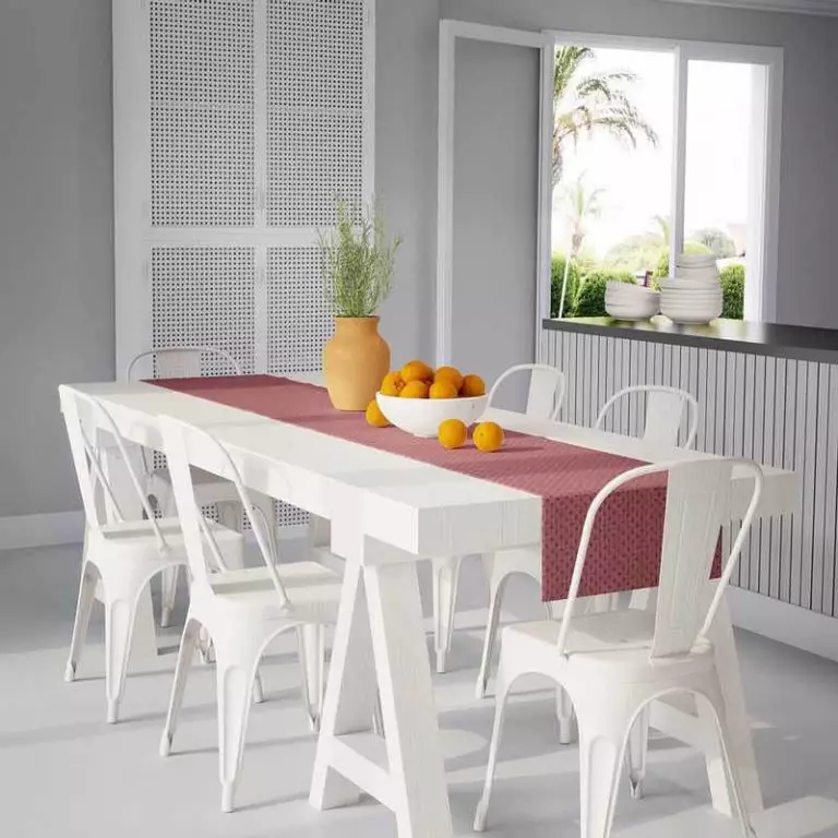
Kitchen and dining room
These are the spaces where experts suggest sticking to a gray and white combination, particularly in the kitchen. Use the gray color to paint the walls or cabinets, and remember that the lack of additional accents compliments a contemporary setting.
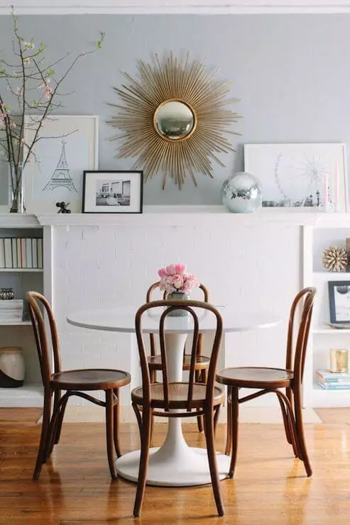
You are free to add a few bolder details in the dining space, where the PPU18-11 should be used as a background. Stick to a gray-white-black palette or enrich the environment with new feelings through an amalgam of colors and textures to ensure vibrancy.
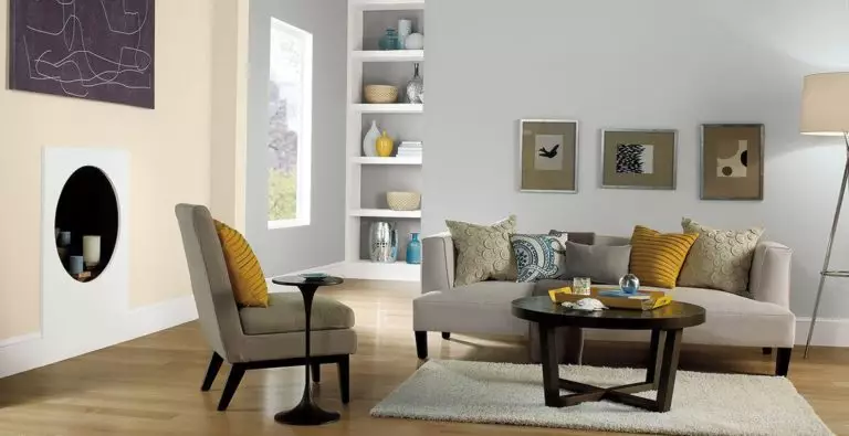
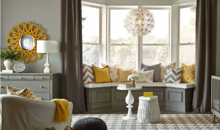
Nursery
Classic Silver is a no-fail option for gender-neutral nurseries. It can take any design direction and serve as a background even when your child grows up. Why nursery particularly? You can use this neutral gray to expose bold pops of color in a balanced way. Experts from Behr suggest combining it with yellow for a splash of energy that such a space certainly requires. Furthermore, the stylish gray and yellow pairing is trendy, and this room will definitely stay up to date for years to come.
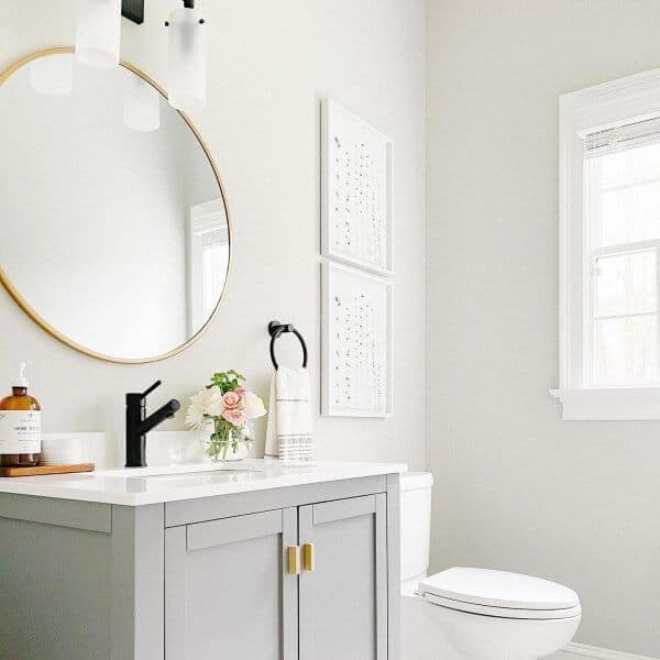
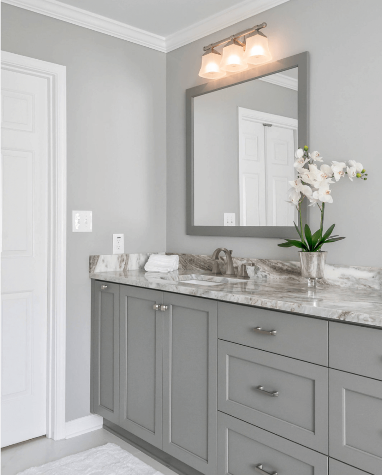
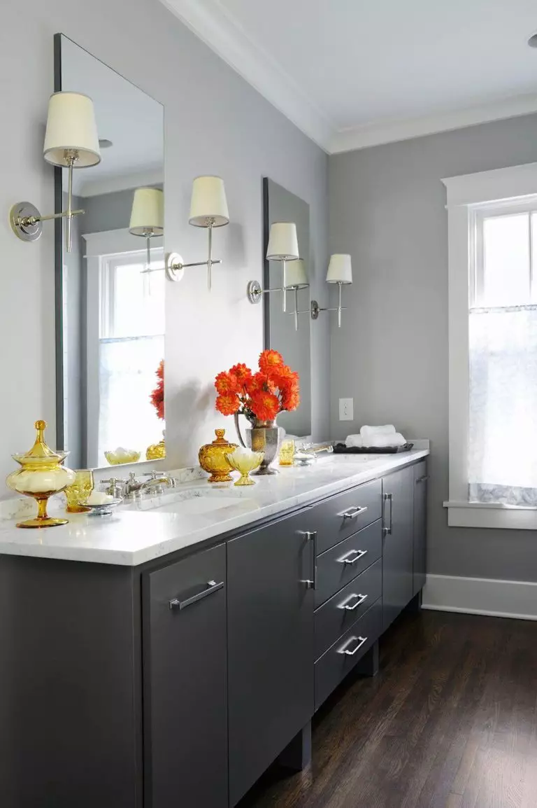
Bathroom
Consider this neutral gray for the cabinets or walls paired with lighter shades. Such spaces are usually poorly lit, and this is when Classic Silver plays the trick on you. A slight change in the lighting can make this shade seem entirely different. Nevertheless, it can be used as a tool to adjust this paint color to your standards. Keep it simple, or add a few accents for a pop of color within an overly neutralized palette. You can opt for brass hardware or decorate the countertop with a few bold decorative units.
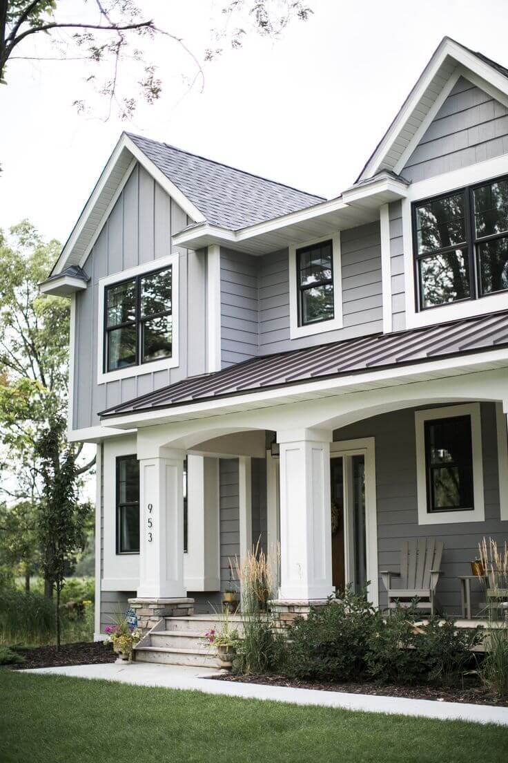
Use of Classic Silver for house exterior
The seemingly neutral gray can instantly become a source of aristocratic grandeur when applied to the house exterior walls and paired with white trim and a dark brown roof. This particular shade of gray with these specific companions leads to a result you have never expected. Stick to this combination for a timeless house exterior.
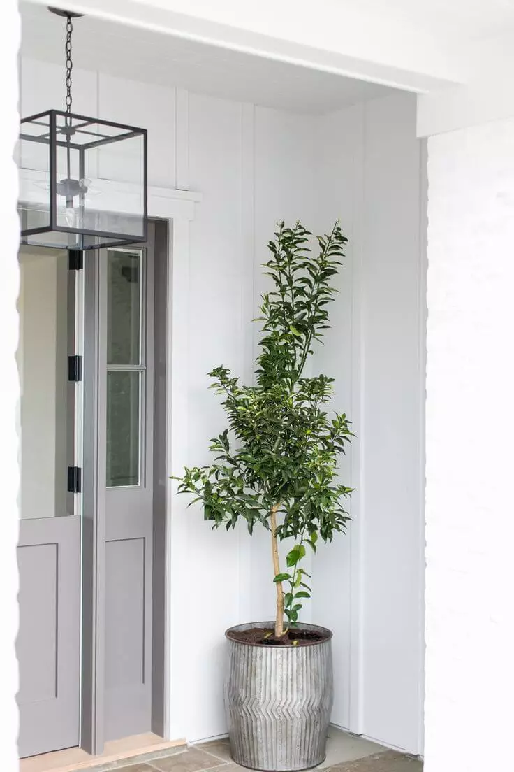
The smaller the unit you apply this color to, the more intense the gray notes and wide range of undertones seem, which makes it a win-win option for the front door. Consider it mandatorily on a light background.
The Classic Silver PPU18-11 paint color from Behr is indeed a classic gray and an irreplaceable shade that works within any style, any space, collaborating with any shade and adjusting to any preferences. Isn’t it what every designer and homeowner is looking for when searching for a neutral?
