Collingwood OC-28
Benjamin MooreA renowned mix of prevailing gray notes and a slight beige trace with sophisticated purple scents that still manage to keep it neutral.
Collingwood OC-28 (Benjamin Moore): what color is, review, and use
Today, we refer to one of the widest color groups – gray, and the paint color we will speak about is definitely a favorite, leading the best-selling colors. Get ready to fall in love with Collingwood OC-28 from Benjamin Moore.
This is not a usual shade of gray. For a start, it is close to the category of true grays while showing a tiny trace of beige. At the same time, this paint color is part of the Off-White Collection. Simultaneously, colorists from BM refer to it as “an appealing gray with light cool notes.” What is it then? A very light shade of true gray or a greige variation (a mix of gray and greige)? Once you reach the undertones, you get even more confused. No worries! We are here to reveal the secrets behind one of the most popular paint colors.
Collingwood paint color features
Let’s take it step by step! Collingwood is definitely light. We would even say exceptionally light. Since most designers integrate it into the greige family, there is no doubt this shade has a trace of beige, which makes it feel slightly warm. Nevertheless, the cool undertones are there to balance it, offering this paint color exquisite versatility. All in all, Collingwood is a light greige, mostly neutralized yet diluted with a bit of warmth that perfectly combines with the cool notes. This shade feels the same when applied to a space – fresh, soft, and balanced.
Collingwood: is it warm or cold?
It definitely has a cool base, yet the beige undertones make it gravitate towards the warm side. Take for reference Gray Owl from the same manufacturer, which looks cool on the walls despite the fact that it is regarded as a slightly warmed-up shade. Even in the neighborhood of this color, Collingwood seems warmer, which proves our words.
How does lighting affect Collingwood?
On one side of the coin, we have the northern exposure that brings the coolest variation of OC-28, making this shade seem slightly muted and throwing light on the gray base in particular. Simultaneously, in spaces with south-facing windows, the pleasant beige notes, still balanced, come to the surface, making us believe that it is indeed a greige variation. One may even notice a few pinkish scents when the sun rays interact with a surface painted this way.
Collingwood LRV
To be precise, Collingwood has a Light Reflectance Value of 61.52. Considering that 100 stands for true shades of white, it seems OC-28 is not that much of an off-white. Still, when applied to a surface, it feels much lighter, which means that it can bounce back impressive amounts of light and even make the room feel more spacious. This is when we discover the true face of this shade – it is a light-to-medium paint color.
Collingwood undertones
While most grays reveal blue or green undertones, the slight beige notes perceived at Collingwood cannot simply allow such a scenario. Instead, they bring the prettiest purple hint that almost unnoticeably flows through the veins of the renowned paint color. This is why the warm natural light can bring seemingly pink scents to the surface.
Similar colors
You don’t have to be a specialist in the field to know that the range of gray, or let’s say – greige variations is wide enough to offer at least a few alternatives to each shade in part. Let’s see how much truth is there about this statement. We searched through the color palettes of BM and other color brands and came up with the following list of alternatives:
Coordinating colors
Luckily, Collingwood comprises the most versatile neutral variations – gray and beige. Therefore, it is a no-fail paint color for any style, color combination, room, and design approach. You can literally go with almost any shade in the neighborhood of OC-28, whether close to its inner beauty for a monochromatic solution or contrasting to set a personalized interior. While you are free to choose the matching colors, we still want to draw your attention to a few exact matches that experts from BM suggest.
Use of Collingwood in the interior
Prevailing in versatility, Collingwood is a true companion to any design solution regardless of the approach and space. Don’t hesitate to use it as a background the next time you plan a makeover since this flexible shade will surely meet your expectations. Designers suggest it is a great choice for modern interiors, yet generally speaking, it works for any style in any room of your house. Let’s see how it works in actual settings!
Modern neutral for modern interiors
Complement the minimalist layout, the sleek and even surfaces, round shapes, simple approach to colors, and any other solution that replicates the modern design with a no less contemporary paint color that has simplicity in appearance and sophistication in composition for an irreplaceable touch on the interior. Consider Collingwood for the walls and let it bloom in its full beauty. One should note that particular lighting brings specific effects. Before applying it to your interior, play with a sample and make sure it matches your taste.
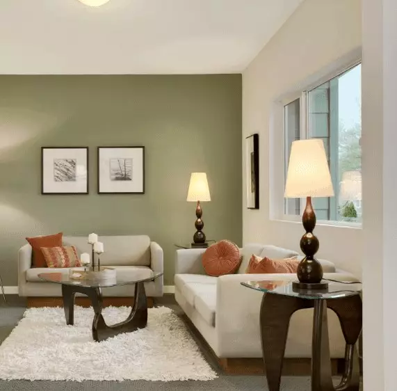
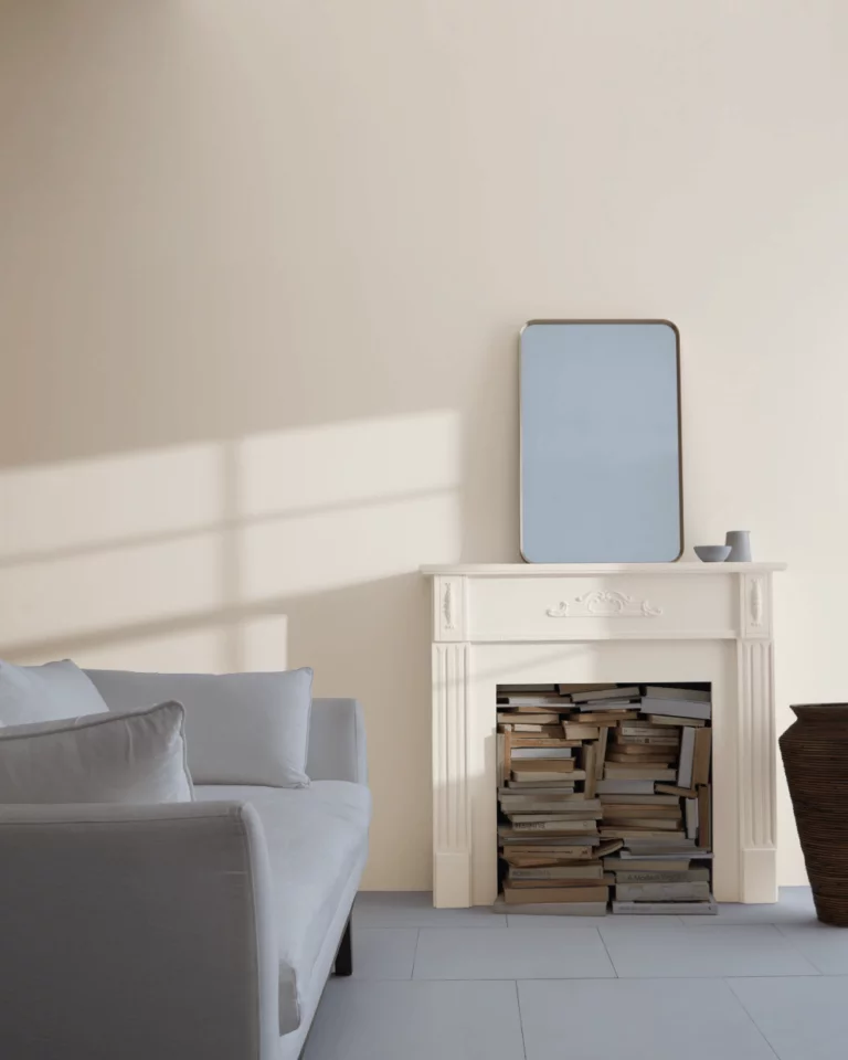
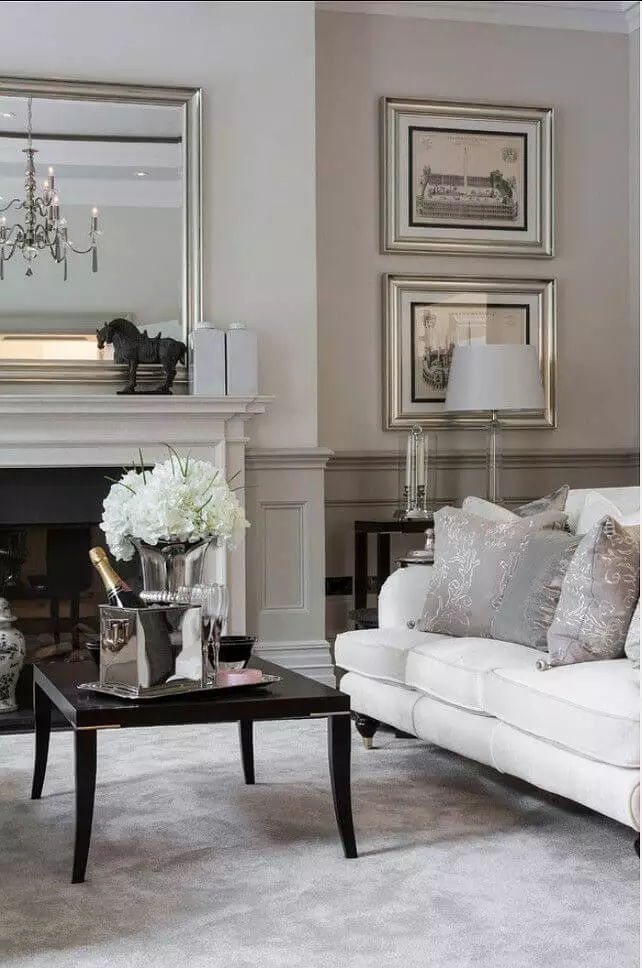
Living room
It is clear that Collingwood behaves truly like a neutral and adapts to any situation in part, but we were not ready for such a wide range of possibilities. Sleek contemporary interior with a monochromatic approach to colors, elegant Neoclassical living room with a minimalist layout, Classic design with comfy textiles and eye-catching textures, these and more with Collingwood as a backdrop, and every design solution reveals its essence to the fullest.
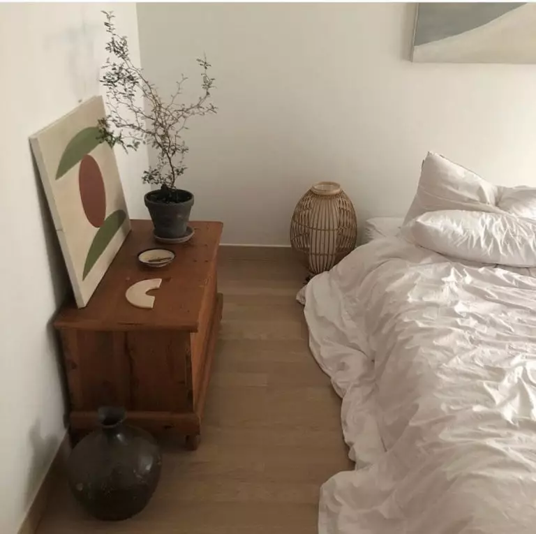
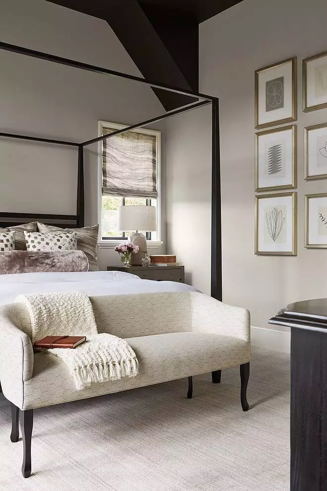
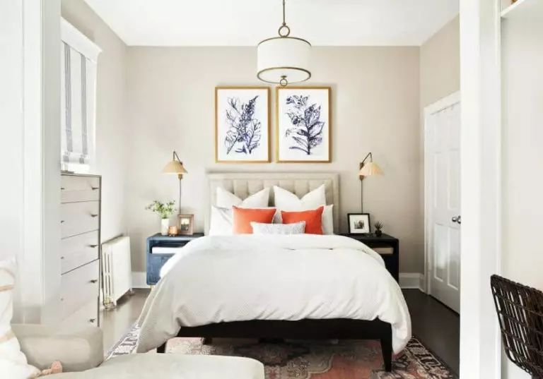
Bedroom
Are you still looking for the perfect neutral to enrich your bedroom with the appropriate amount of softness and freshness yet adapt to any design solution of yours? Don’t go any further than Collingwood. This neutral shade astonishingly combines with other neutrals of this kind. Do you fancy a statement? Go with the irreplaceable pairing between the warm gray shade, black accents, and brass details. Are you ready to step deeper into the world of colors? Go with bold shades for the textiles since the impartial background is exceptionally collaborative.

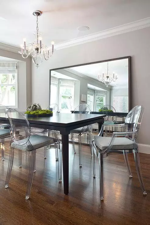
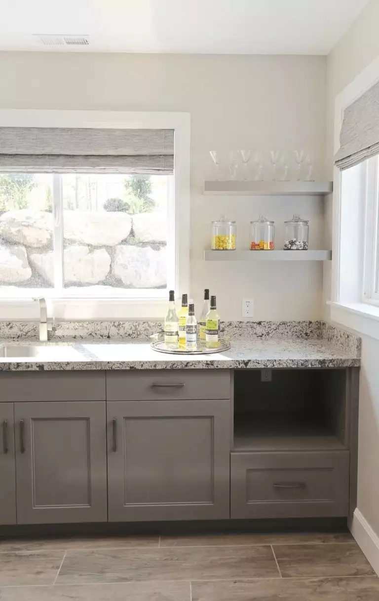
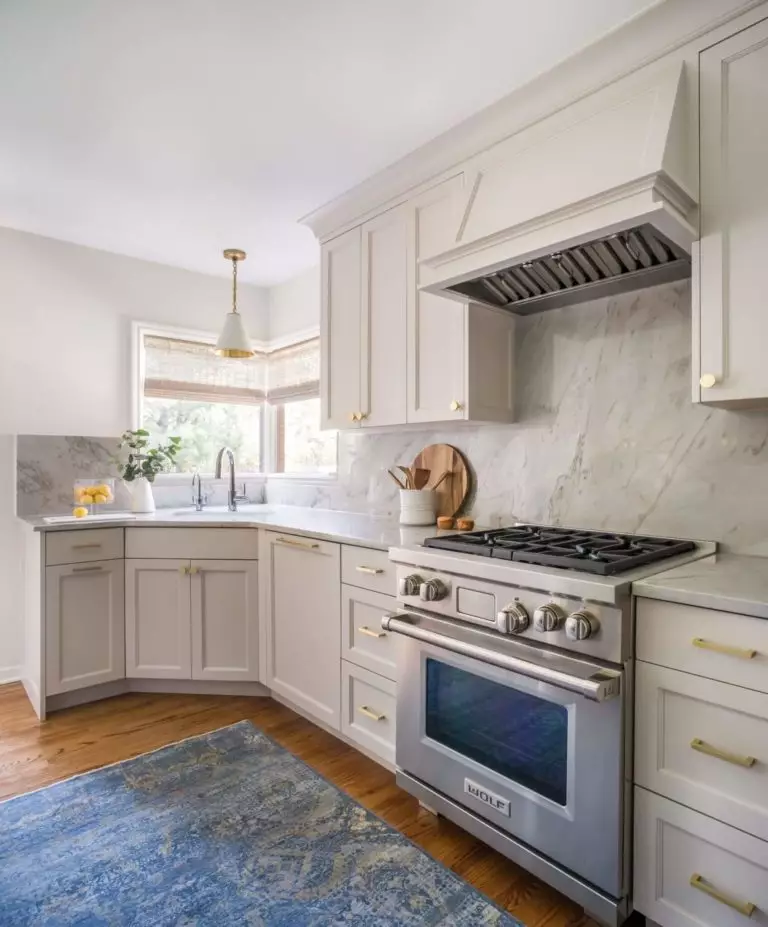
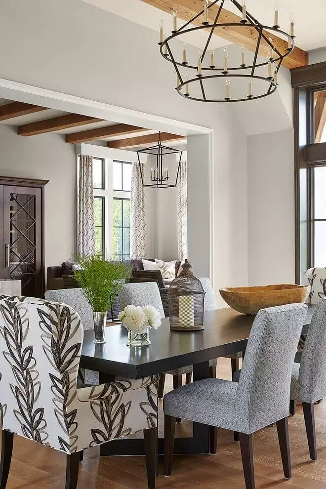
Kitchen and dining room
Whether you consider it for the walls or cabinets, there is no way you can go wrong with OC-28 in the kitchen. If you go with the first option, choose a darker gray shade for the cabinets. In the second case, opt for a lighter backdrop and complement the interior with large marble tiles for the backsplash and brass hardware for the most elegant look.
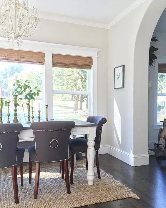
In the dining area, things work the following way: Collingwood for the walls, a large wood table, upholstered chairs, and a striking chandelier. The question is: what style do you consider? Rustic, Modern, Traditional, maybe even Transitional? It is up to you as long as you keep the mentioned elements.


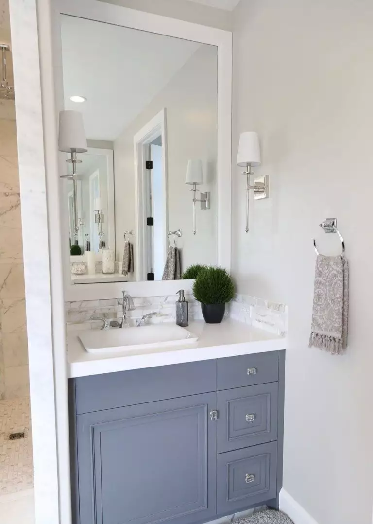
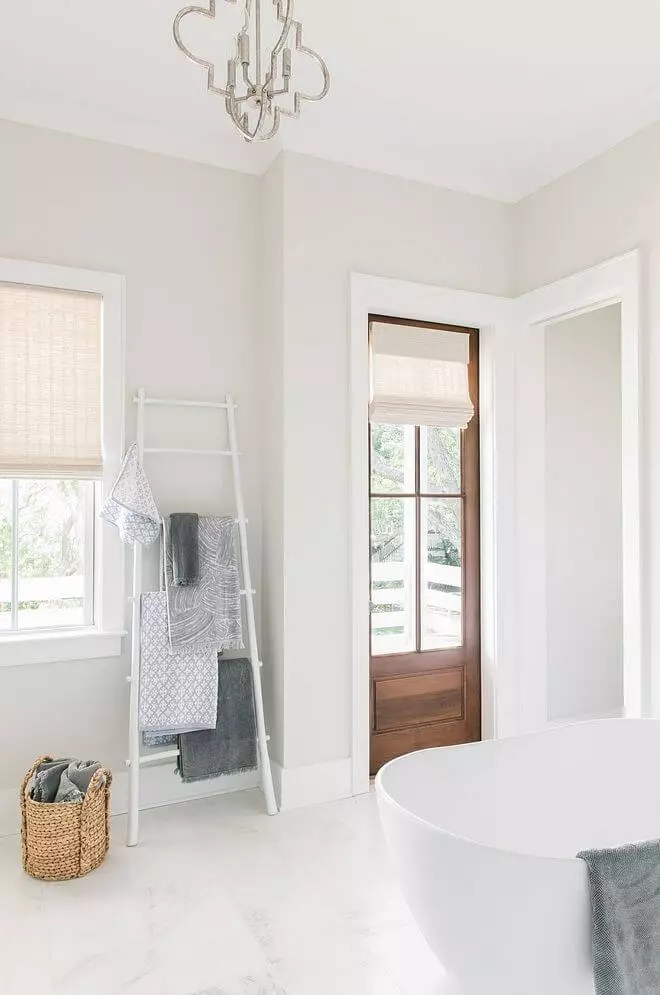
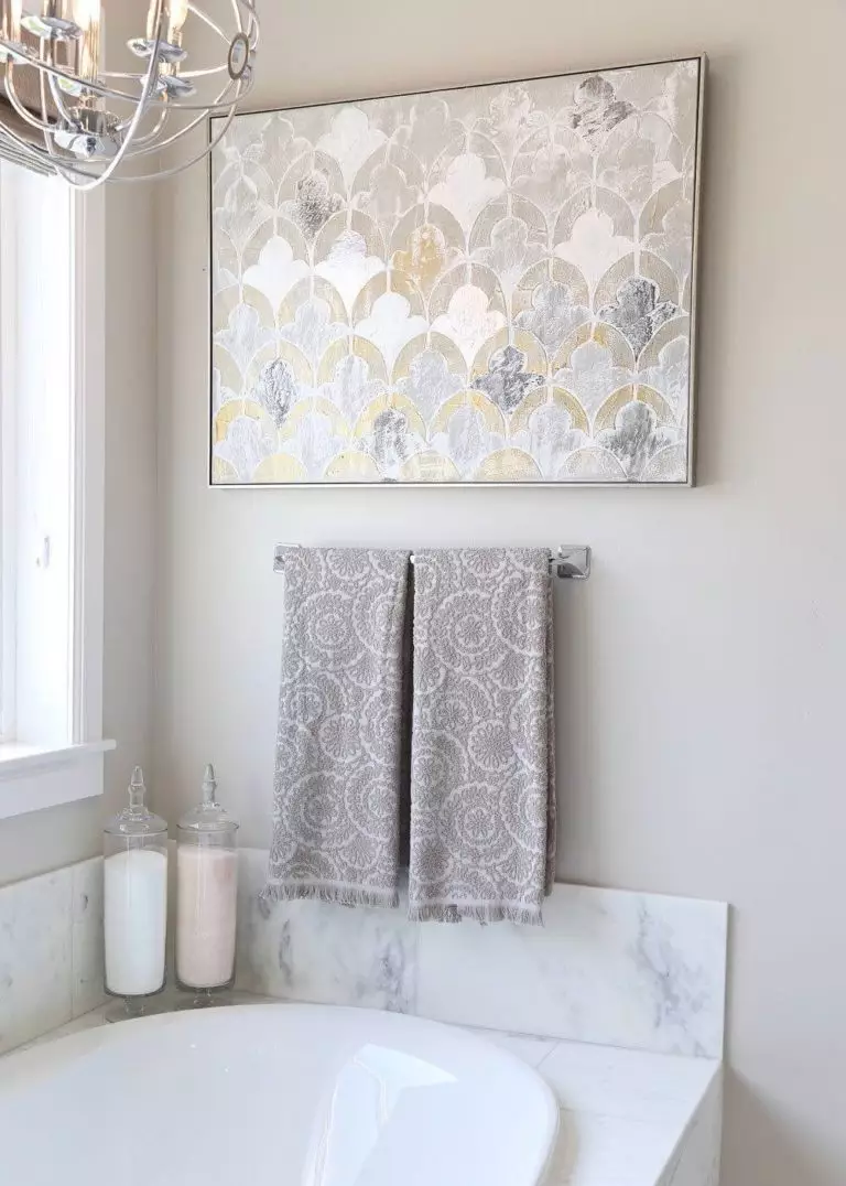
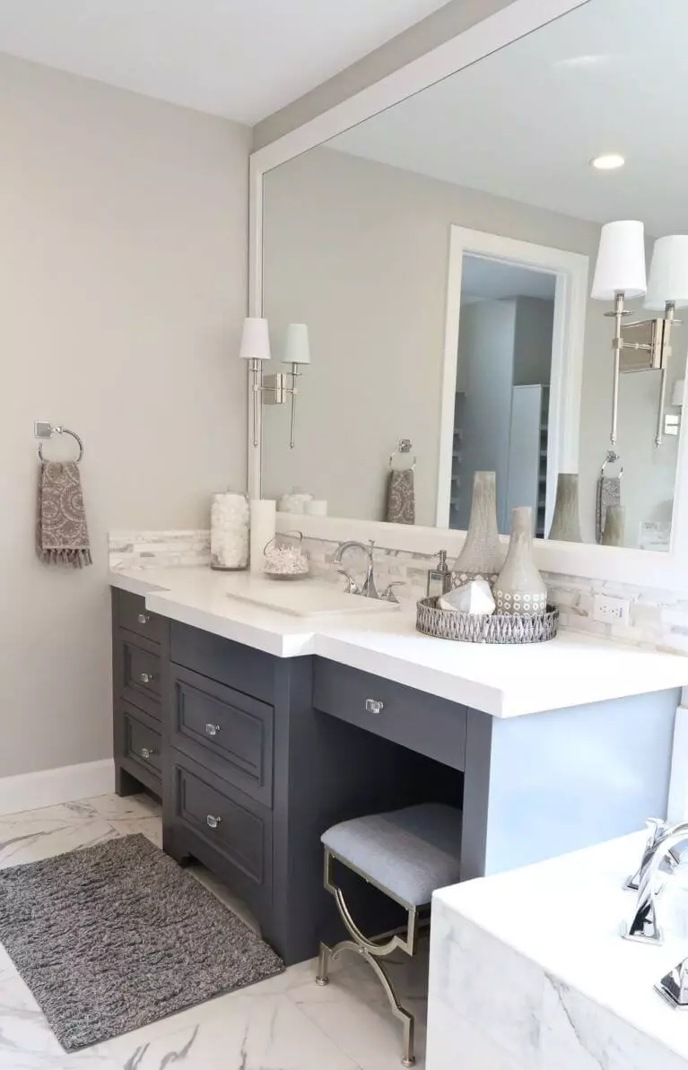
Bathroom
Depending on the lighting and neighboring colors, particularly in a room that is usually purely lit, Collingwood takes various appearances under different conditions. Anyway, you cannot go wrong with such companions as marble tiles, dark gray cabinetry, and gold and silver accents. Consider them in combination or separately with the soft gray for the walls. One should note that such a light paint color will make the room feel spacious, which is a feature worth considering in bathrooms that are usually smaller than other spaces.
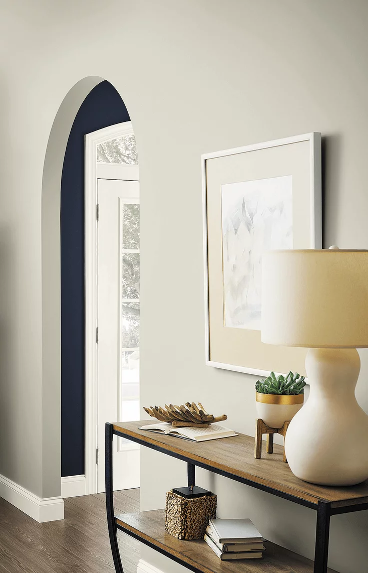
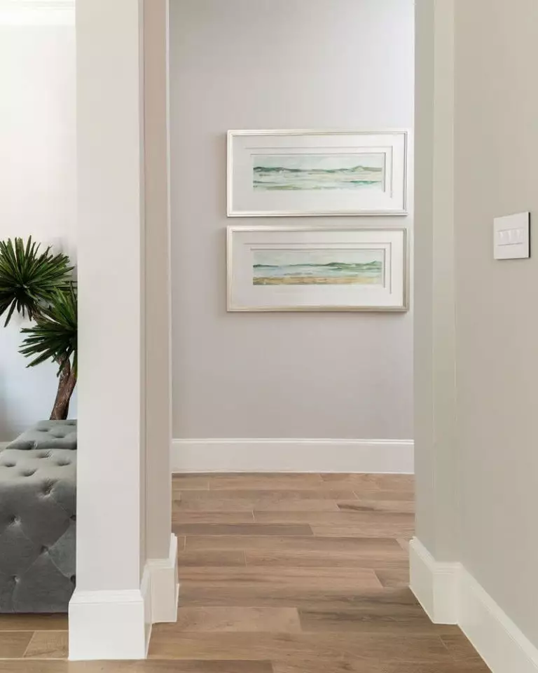
Hallway
The seemingly neutral paint color acquires an inviting feel once applied to the hallway and brightened up with warm artificial lighting. Don’t hesitate to make a welcoming intro to your interior by considering this shade for the walls and completing the puzzle with light wood and white trim.
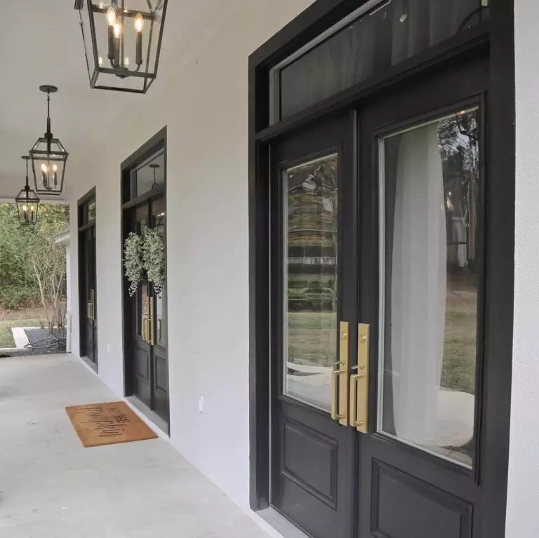
Use of Collingwood for the house exterior
Collingwood is no less popular when it comes to house exteriors. The best you can go with is opting for warm gray walls, black accents, such as a black front door, and a brown roof for a modern approach to any exterior style. On a cloudy day, this shade may seem much lighter without losing the slight inviting feel. As for the front door, you can paint with OC-28 if your exterior features darker walls. On the contrary, your front door risks fading into the background.

The Collingwood OC-28 paint color from Benjamin Moore has everything a neutral should feature – an impartial gray base and soft beige notes, which results in a versatile combination, and a bit of personality for an original result, which is safely provided by the subtle purple hint.
