Cotton White SW 7104
Sherwin-WilliamsA soft shade of white with pronounced pinkish-orange notes. An interpretation of softness at its finest.
Cotton White (SW 7104): what color is, review, and use
It is not that often that we speak about white in our articles, but when we do that, it is indeed about outstanding shades. Luckily, we found another hue of this kind and would like to share our impressions with you. Frankly speaking, there are no words to describe how lovely, mesmerizing, and soft the Cotton White paint color from Sherwin-Williams is.
SW 7104 is a soft shade of white with pronounced pinkish-orange notes. No wonder why experts from Sherwin-Williams gave it this name since its appearance perfectly resembles the soft cotton texture. This is when a color goes beyond the borders since a space painted in this shade makes you feel surrounded by a puffy cotton blanket. Such an effect leads to a sense of comfort, ease, freedom to explore your thoughts, and a kind of escape from the world. This is one way to appreciate this color. From a designer’s perspective, one cannot fail but notice the invigoration and breath of fresh air that enter the space once this beautiful shade is part of the game. Can it get better? Yes, this shade of white has no limits, and the list of its benefits can go on and on. We will do our best and help you discover at least a part of this fabulous color.
Cotton White paint color features
The newly discovered paint color from Sherwin-Williams is an interpretation of softness at its finest. Let’s put it this way: it seems that a wall painted in this shade feels like cotton at the touch. A seemingly creamy base penetrates the surface, although the slight particles of soothing orange with pink notes cannot be simply underlooked. At some level, they are responsible for this sense of hope and tiny scents of love that this shade radiates. You cannot help but fall in love with this color.
Cotton White: is it warm or cold?
SW 7104 is indeed refreshing, but the previously mentioned undertones are nothing else but a source of warmth, which explains why Cotton White is a warm shade. This is only in daylight, but wait and see when the artificial lighting enters the game. The warm undertones are so perceived that softness goes beyond the limits and spreads all over the space.
How does lighting affect Cotton White?
In full daylight, this shade finds itself at its most refreshing stage, although the soft notes are to be perceived as well. The darker it gets, the more pronounced the creamy scents become. Therefore, there is no way to feel embraced by any other feeling but softness in a space where this color prevails. Once artificial lighting takes the leading role, it seems that Cotton White transforms into an entirely new color – a very creamy beige or rather peach shade. It is so appealing and inviting that you fall in love again and again with this color and are ready to return to it as soon as possible.
Cotton White LRV
Considering that it is a white shade, there is no doubt that it has a high LRV. Indeed, Cotton White enters the light tones category with a light reflectance value of 87. Do you know what that means? Impressive light and spacious space, all due to the friendliness of this color towards the light.
Cotton White undertones
Although it was already mentioned, it would not spoil the fairytale to refer once again to the magical notes of softness that hide behind this shade. Cotton White is penetrated by creamy undertones that may seem peachy, beige, and even pinkish in particular conditions. Is it possible that so many undertones can hide behind a shade of white? It surely is, and Cotton White is a perfect interpretation of this statement.
Similar colors
We were surprised to find so many similar shades at Sherwin-Williams alone and other paint manufacturers as well. Do you know what surprised us more? As similar as they may seem, each one is impressively unique. Let’s offer you an insight into what we are trying to say!
Coordinating colors
Yes, Cotton White is neutral. Yes, it seems perfect to combine with any shade. But! One thing is what we see from a general perspective, and a totally different image appears when referring to experts. Why go further and risk the overall result? We tend to stick to what experts have to say. According to them, this unusual shade of white works with contrastive shades with cold undertones and a rather soothing base. Let’s get more specific!
Use of Cotton White in interior
Cotton White is a great alternative for neutral shades of white that are so popular today. Everything is traced to the idea that people want a fresh, clean, and neutral background that would also bring in a bit of softness and calmness. This is what Cotton White consists of. As regards particular design approaches, this impressive shade of white is not picky at all and ready to adapt to any style. Sleek contemporaneity or refined tradition? It is up to you! Consider the combination partners mentioned above, and there is no way you can go wrong. Let’s discover some of the most efficient design solutions!
New Scandi
We are used to the cool rather grayish backgrounds of the Scandinavian style that resembles the cloudy Nordic sky. Why not keep the main peculiarities of life in Scandinavia and add a little bit of individuality. Cotton White will keep pace with the functional and cozy arrangement while enriching the space with a new splash of calmness and make us look at this style from a new perspective. The lack of clutter, clear lines of furniture, and minimalist decor will simply thrive surrounded by the lovely shade of white. The thing is that it works for any room so that you can make the most of this color and benefit from its fabulous softening effect to the fullest.
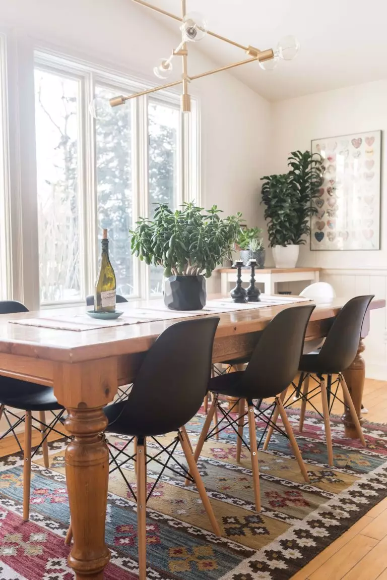
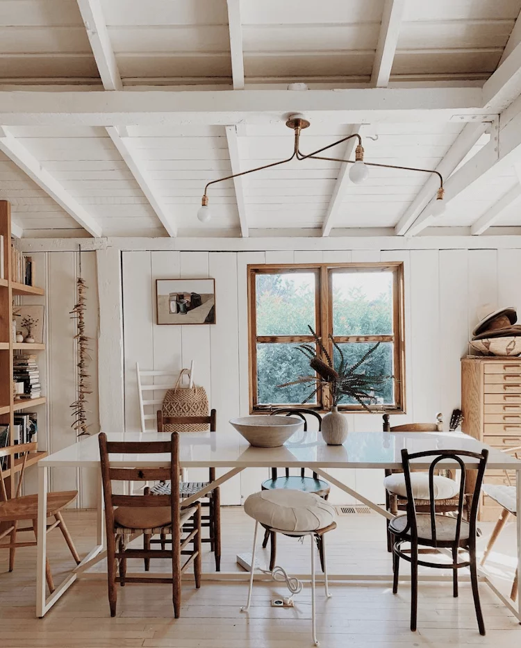
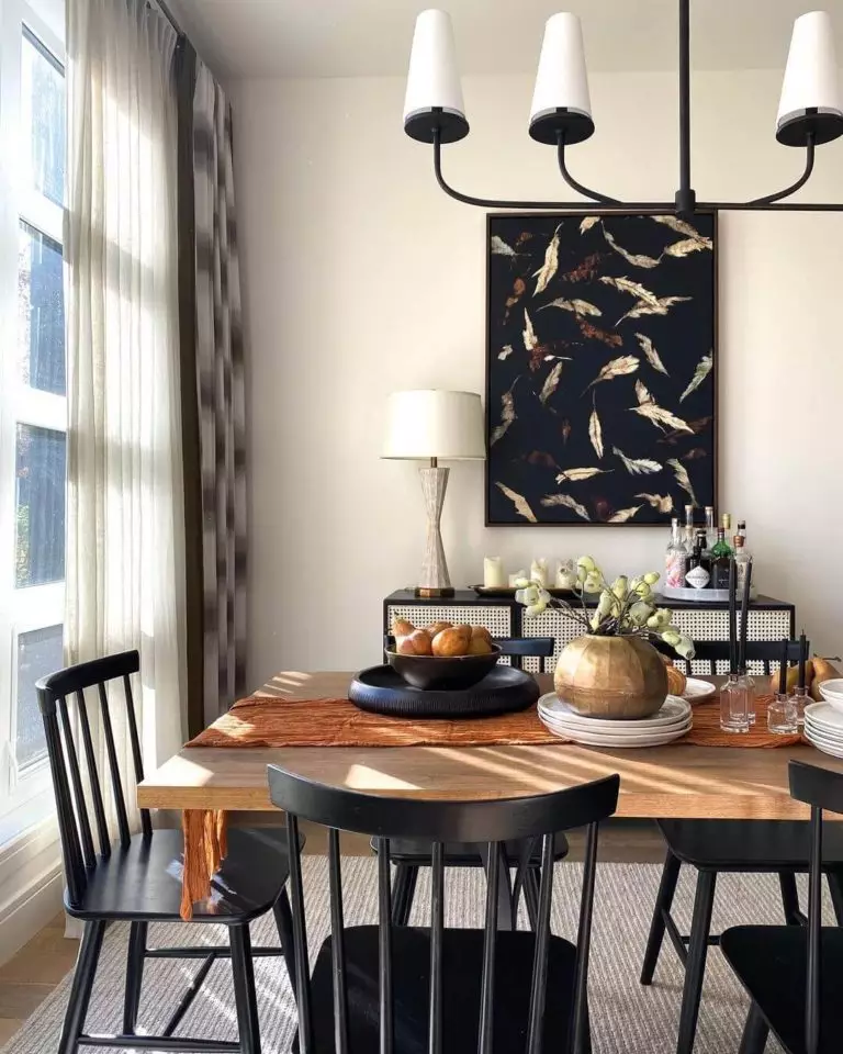
Rustic softness
Can we relate softness to the raw natural texture? Yes, we can, particularly when adding a splash of Cotton White. The color itself serves as a fabulous backdrop due to its neutral and refreshing features, while its warm undertones cannot help but penetrate the organic surfaces leading to what we call a perfect harmony of notes. One should note that such an approach works particularly well in the dining room: walls painted in Cotton White, a large wooden table in its natural beauty, a few elements with an aged effect, and your organic composition will become the definition of comfort itself.
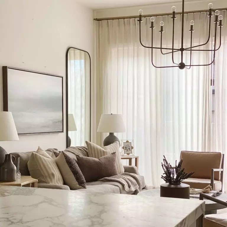
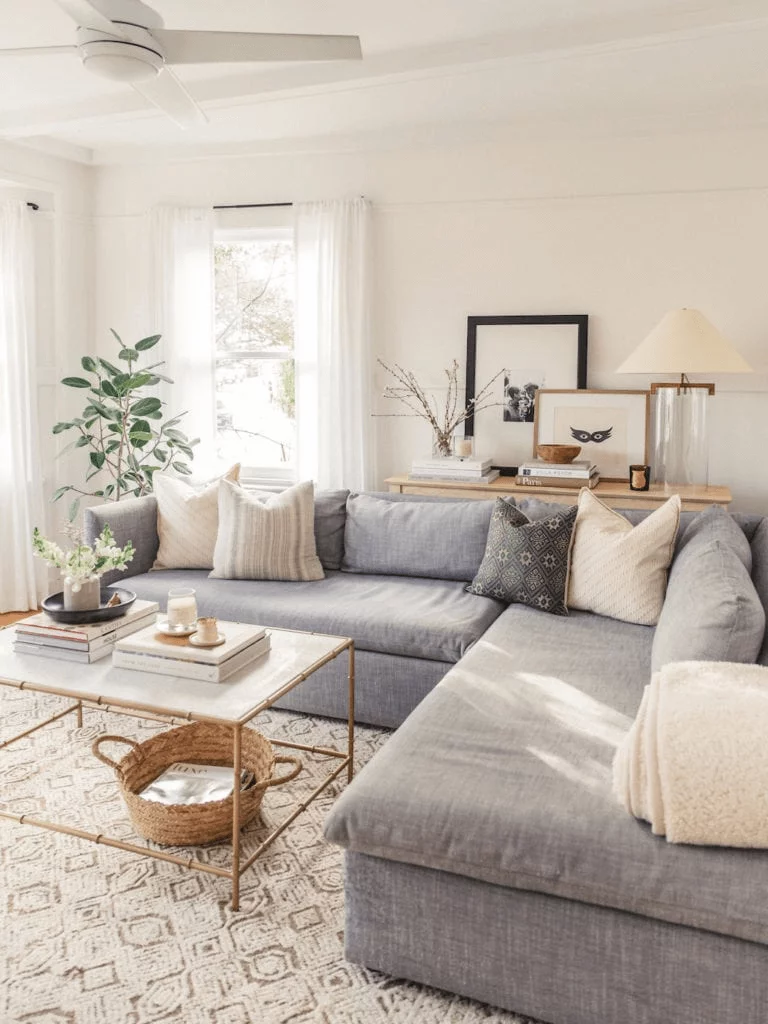
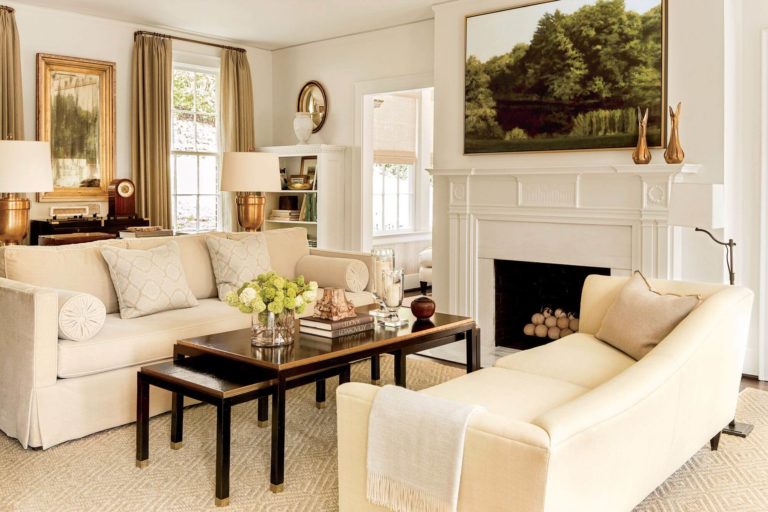
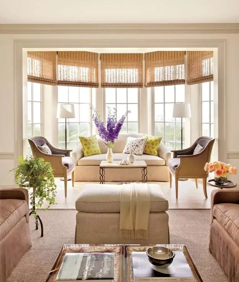
Living room
Contemporary functionality, outstanding vintage, organic rustic, raw industrial, comfy farmhouse, or refined French country; which one is closer to you? You could probably have other ideas in mind as well. Either way, Cotton White will work as a canvas on which you will paint with your favorite colors and textures. A little extra bonus from your new background: limitless comfort regardless of the style. Of course, the living room is the first space you should think about when deciding upon the defining style of your interior. Besides that, such a lovely color will surely fill your life with a pleasant feeling of ease and freedom.
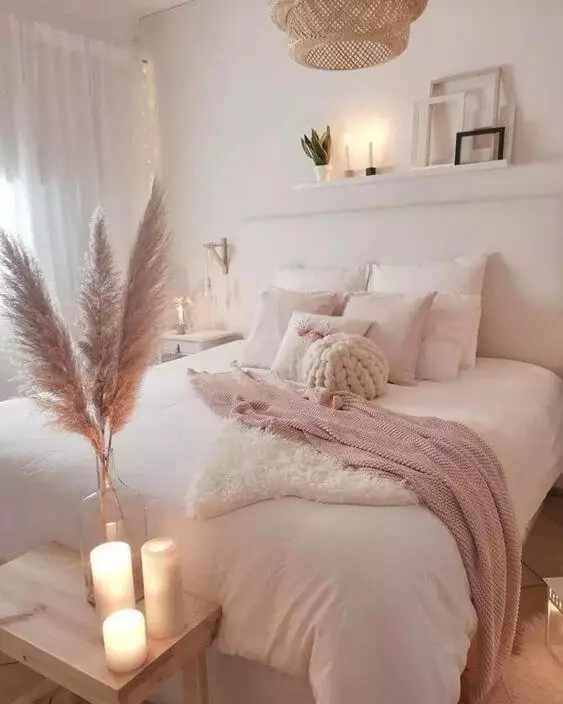
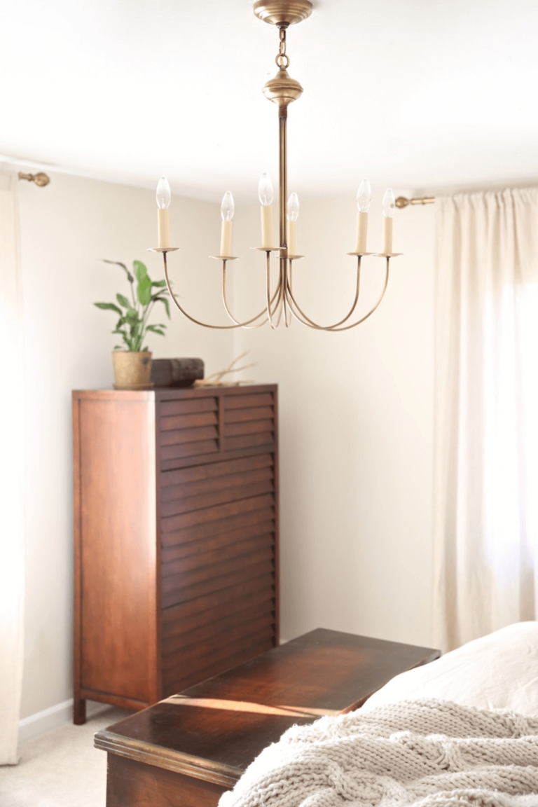
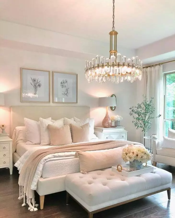
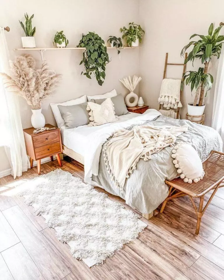
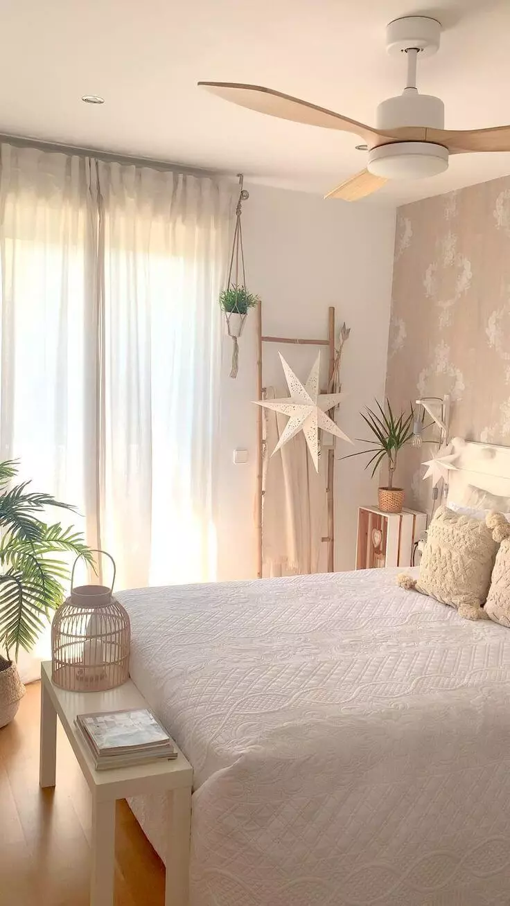
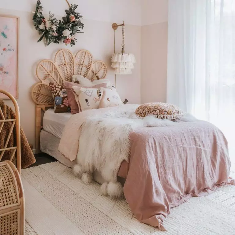
Bedroom
When applied to such spaces, Cotton White puts on its romantic mask and a sea of emotions penetrates the space. Furthermore, it is about harmony, both within the interior and with oneself. As regards the former, this mesmerizing shade is a compliment for nature-inspired pieces of furniture and decor units. You can opt for a harmonious collaboration between colors with the same undertones or consider a new splash, although no less neutral. The Boho style stands out in such a context with its flamboyant combination of pastels and raw surfaces. Nevertheless, you can go with any other design solution as long as the harmony between the constituent elements is not disturbed.
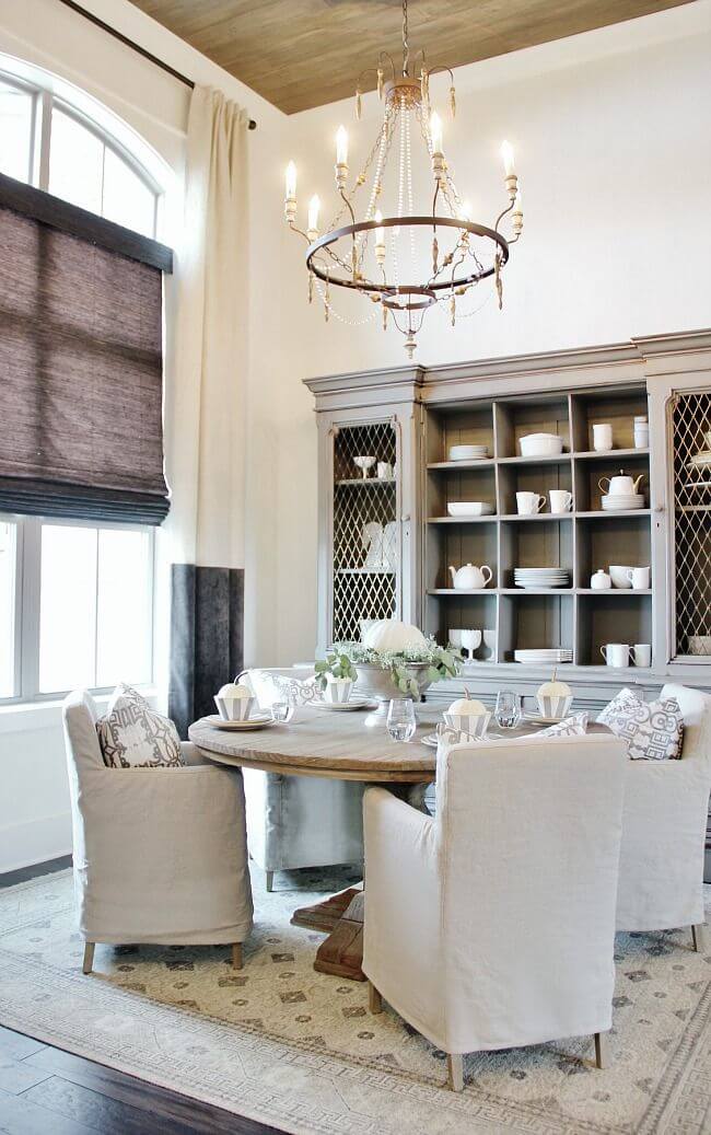
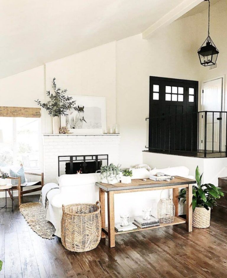
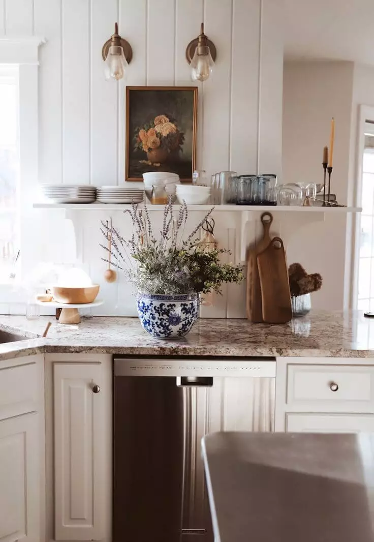
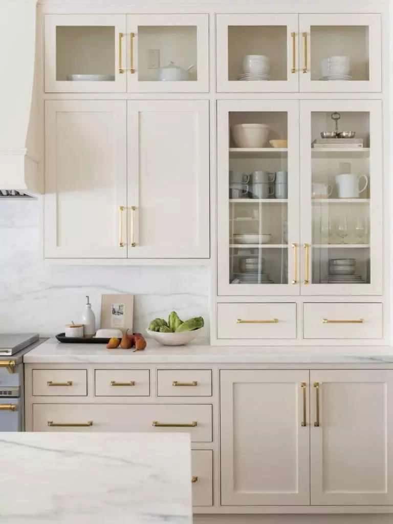
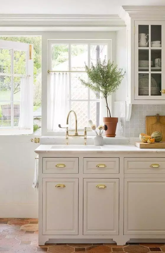
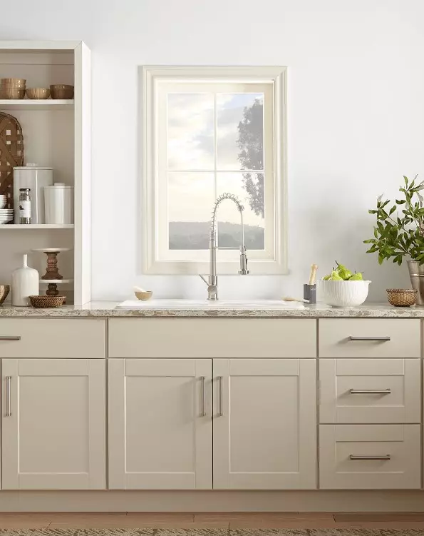
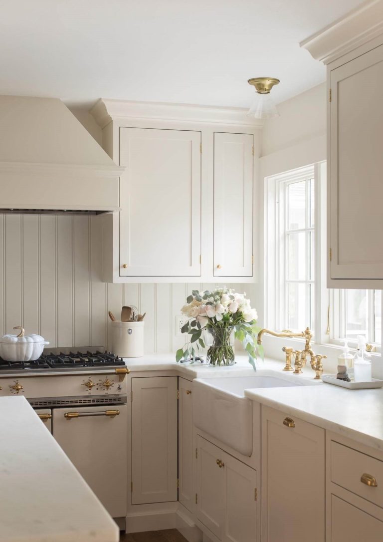
Kitchen
Cotton White seems created for Farmhouse kitchens with traditional cabinets, shiplap backdrops, and comfy wooden elements. The best way to integrate it into such a setting is by painting the cabinets. One cannot fail but notice the particles of softness that instantly spread all over the space. Nevertheless, such an impressive color will not look less astonishing as a background for darker contrasts. If the dining area is part of this space, consider a large wooden table, which will serve as a point of interest and go hand in hand with the warm undertones that the Cotton White radiates.
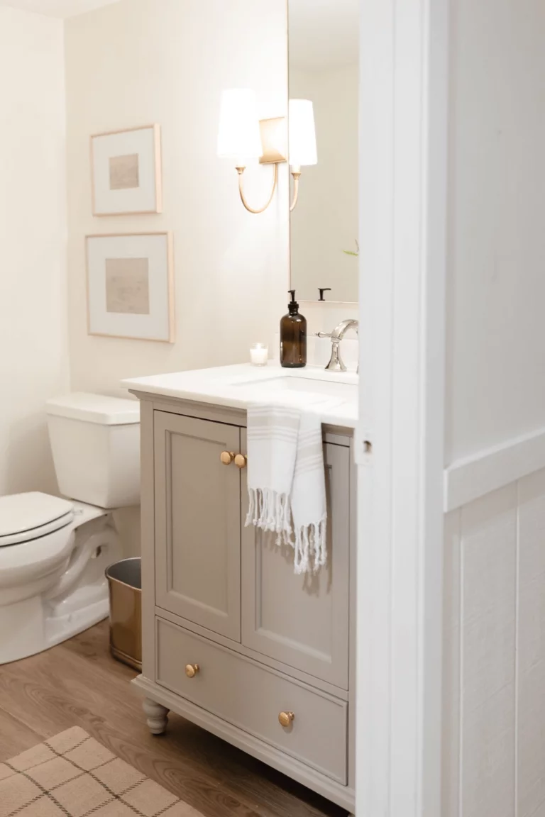
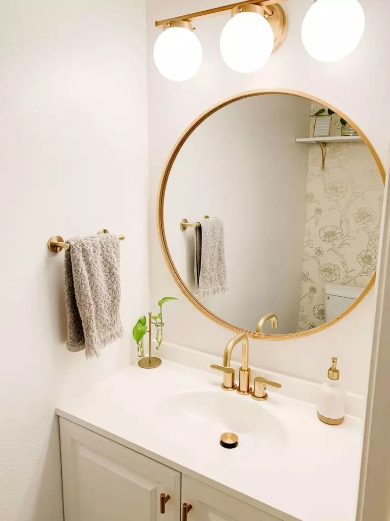
Bathroom
We usually use cool colors in the bathroom since they relate more to water. However, designers suggest considering a whole new approach and integrating soft shades. Therefore, your bathroom will be no less comfortable than other rooms. Add a few elements of brass, and this space will reach the level of an actual piece of art. Use Cotton White to paint the walls, decorate them with elegant sconces, and opt for white or darker colors for the cabinets.
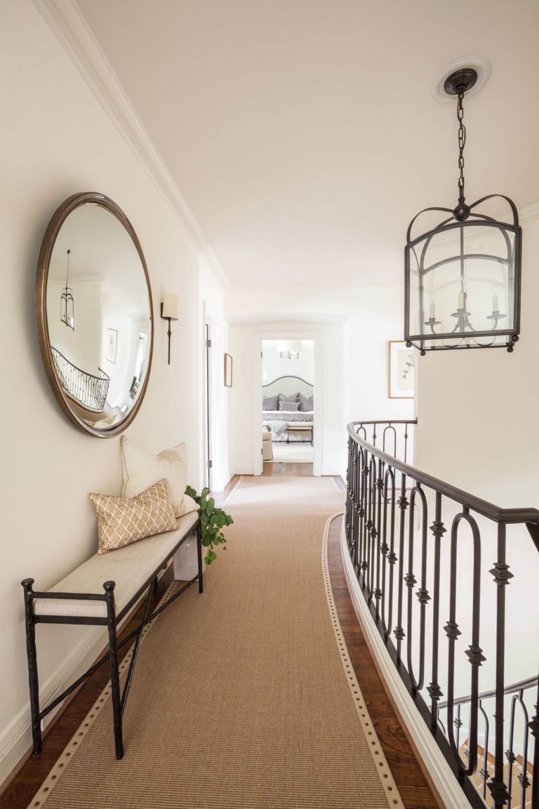
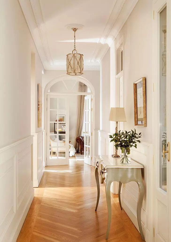
Hallway
Such a lovely color cannot reach the bedroom or living and skip the hallway. Inviting, appealing, and stylish – this is what we associate with this color as well. We are sure that you would like your hallway to radiate the same features. It should be noted that such a background is perfect for showing off your vintage pieces of furniture, although they should be painted in a light color.
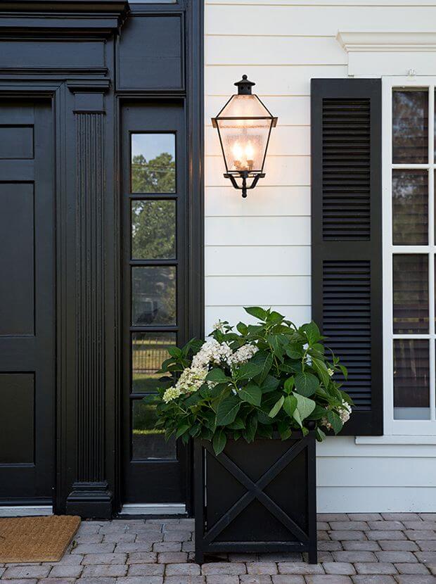
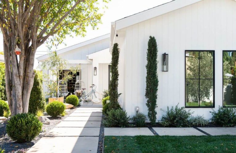
Use of Cotton White for house exterior
Cotton White has not revealed all its secrets yet. Here is another trick: once applied to the house exterior, it loses a bit from its warm undertones, although the result is an appealing shade of white that doesn’t look faded but rather stately. Opt for dark colors for the front door and window frames. Surprisingly well works in this sense black, although dark wood is no less impressive. A similar approach would not work for the front door. Therefore, experts do not suggest painting it with Cotton White.
The Cotton White SW 7104 paint color from Sherwin-Williams is a combination of softness, reflection, ease, and comfort, all put together in a paint can. A single touch of this lovely shade on your interior, and you will simply fall in love with the result.
