Cracked Pepper (Behr PPU18-1): what color is, review, and use
We have been reviewing only light shades lately, and today, we want to surprise you with a fresh splash of color, far from the light paint colors. Cracked Pepper PPU18-1 from Behr is the accent color that will surely win your love with its intriguing uniqueness.
The designers ‘ secret tool is the grayish-black shade with a surprisingly dark and cool appearance featuring an irreplaceable feel of luxury. Well, you cannot keep such a bold paint color secret for long. What made experts in the field choose this particular variation out of an endless array of almost black paint colors? We cannot wait to share the results of our research.
Cracked Pepper paint color features
Let’s start with the name: no need to wonder why they call it this way. The grayish-black shade indeed looks like the thin pepper dust – not too dark to call it black yet as spicy as pepper in terms of its effect on the interior and exterior.
Undoubtedly, this shade makes a statement as fast as it enters the play. Still, too much of this paint color can overwhelm the space, while too little can feel like not enough. Generally, any interior or exterior design that this dramatic paint color has touched acquires a modern, rather contemporarily glamorous appearance.
Cracked Pepper: is it warm or cold?
Hot like pepper but never warm; the dark gray paint color almost reaching the black category is surely a cool color. Since it is quite intense, it can quickly make an exterior or interior space feel exceptionally cold. All this paint color needs is a competitive matching paint to balance it.
How does lighting affect Cracked Pepper?
Such a dark color definitely requires exceptional amounts of light. Still, there is natural and artificial light, additionally to the northern, southern, eastern, and western exposures. How does it work for each case? Under direct daylight, Cracked Pepper looks rather gray than black, with north-facing spaces bringing a slight blue undertone to the surface and south-facing ones revealing a relatively earthy black color. What about artificial lighting? There are also artificial light sources with warm and cool undertones that bring a similar effect to the paint color. Of course, this shade would not look warm under similar light notes but definitely a degree softer than its surface under the cool light influence.
Cracked Pepper LRV
We were surprised to find out that such a dark shade has a Light Reflectance Value of 8. If you are a bit confused, consider 0 as defining true shades of black. It is pretty close to black, still not close enough, and this is when the gray prevalence explains everything. Regardless of how dark a gray shade may seem, it cannot have a value that equals pure variations of black.
This paint color simply absorbs all the light, making the room look darker and smaller. This is why it should be used in a balanced way. One more thing to state: under an enormous natural light influence, Cracked Pepper creates an illusionary reflective shield that bounces back the neighboring outdoor colors, such as the greenery, which is a rare phenomenon.
Cracked Pepper undertones
To our surprise, we haven’t found anything new regarding this aspect. Still, it is impressive how the blue undertones come as out of nowhere when cool light touches the surface of this paint color. Even more exceptional is the trick this shade is playing on us by looking either dark gray or a true black (which is an illusion), all in the same space under different conditions.
Similar colors
This “drama queen” may be a unique shade of its kind, but the array of almost black variations is so wide that you cannot simply go through it and not find at least a few paint colors that resonate with the intriguing sense of luxury PPU18-1 radiates. We would like to make you acquainted with a few prominent representatives.
Coordinating colors
As usual, experts from Behr came up with a list of paint colors that perfectly pair with Cracked Pepper and are quite skilled at serving as a balance for this splash of darkness. First come the light variations of blue, followed by brighter shades of the same color, to harmonize with the hidden blue notes at the gray-black. Oher bright paint colors are welcome since PPU18-1 is also part of the neutral group of colors. Don’t dare skip lighter gray shades, the perfect companions for a balanced result. To meet the latter feature, you can also consider warm shades, even dark, if the combination is displayed on a light background.
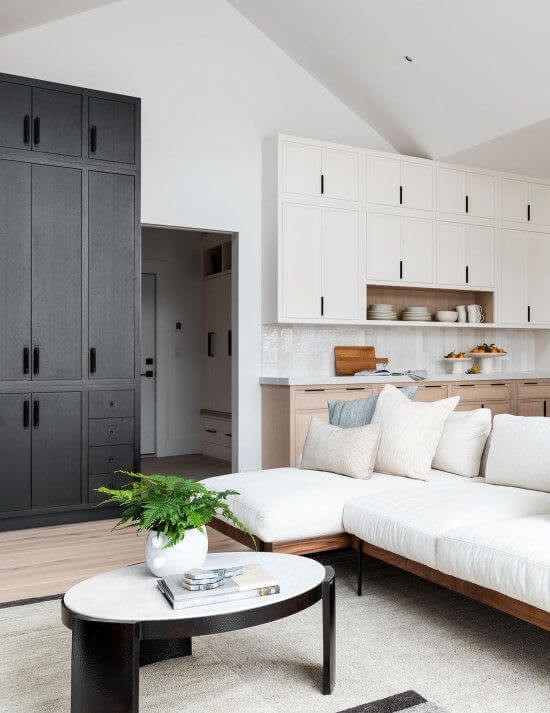
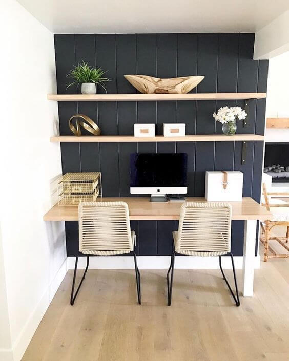
Use of Cracked Pepper in the interior
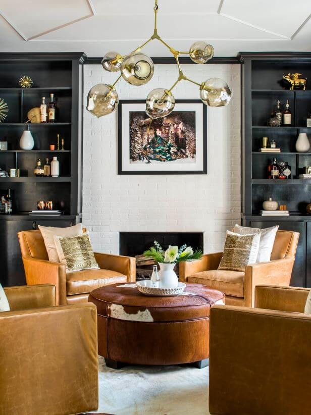
Cracked Pepper is undoubtedly one of the boldest paint colors available at this brand, and its boldness doesn’t manifest itself through saturated notes and bright scents of color but particularly through its exceptionally dark base that can be used as a base for the most standout design solutions. You can safely use this paint color to integrate a modern approach to such styles as Art Deco or simply use it as an accent for exquisitely modern interiors, bringing an unexpected bonus: a refined sense of luxury.
Modern Art Deco
Art Deco has recently made a comeback, requiring a fresh approach to its defining features. Cracked Pepper is ready to accompany it by being applied to walls entirely or accents. Don’t hurry to integrate as many splashes of colors as you want. Stick to the unforgettable mix of black, white, and gold. Additionally, consider a rather functional layout, and don’t forget to complete the puzzle with the irreplaceable element of this style – an extravagant pendant that radiates the unique sense of elegance that seems to preserve the authenticity of the style.
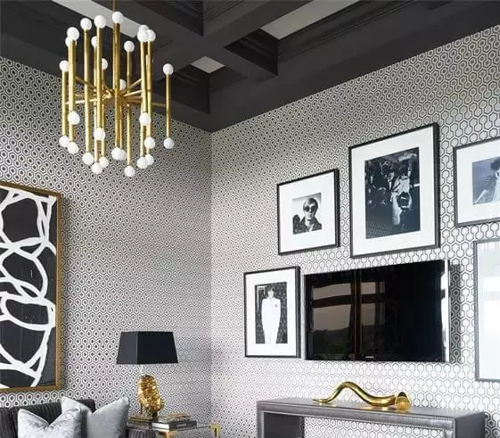
Up-to-date with the grayish-black
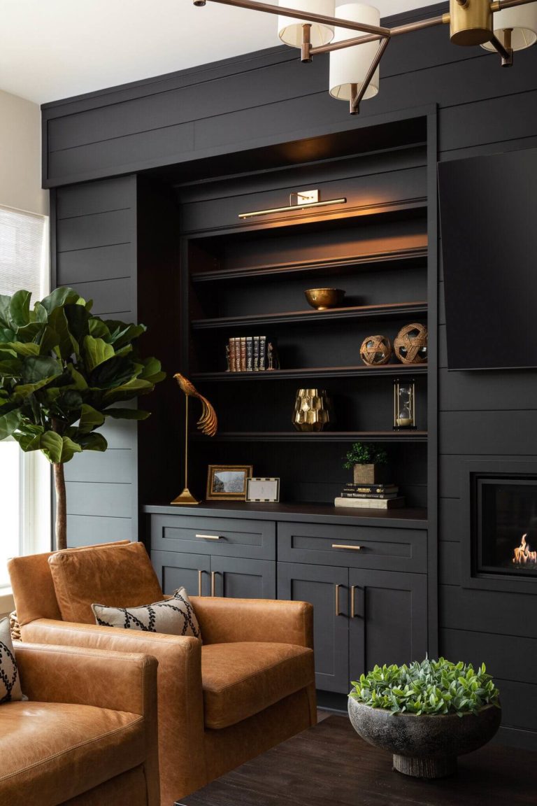
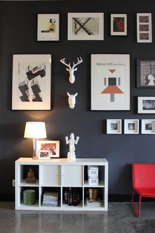
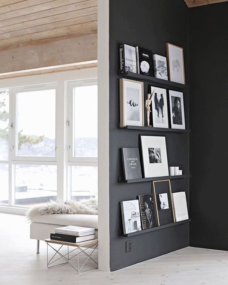
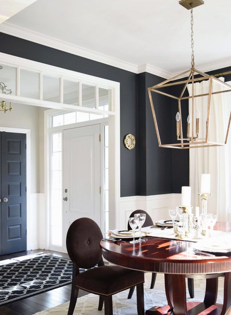
The once-forgotten combination of black and white has also made a comeback. Designers integrate this pairing in contemporary interiors and make the most of the balance. Whether you opt for an accent, such as an accent wall, built-in bookcase, the space surrounding the fireplace, or any other element painted in black and combined with a crispy white shade, it will feel like your interior is out of a magazine. Cracked Pepper is more of a dark gray that beautifully harmonizes with white for an updated black and white mix. Additionally, you can consider a few elements inspired by Art Deco or Retro to smooth the transition from one shade to another.
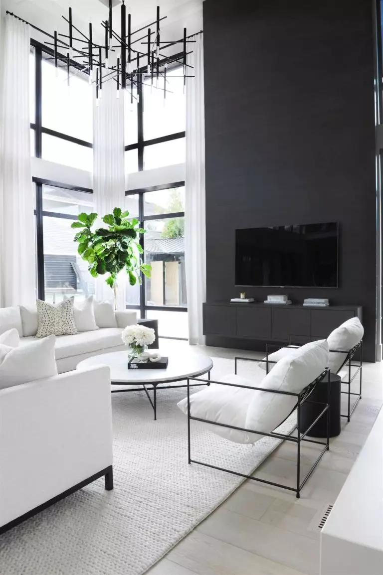
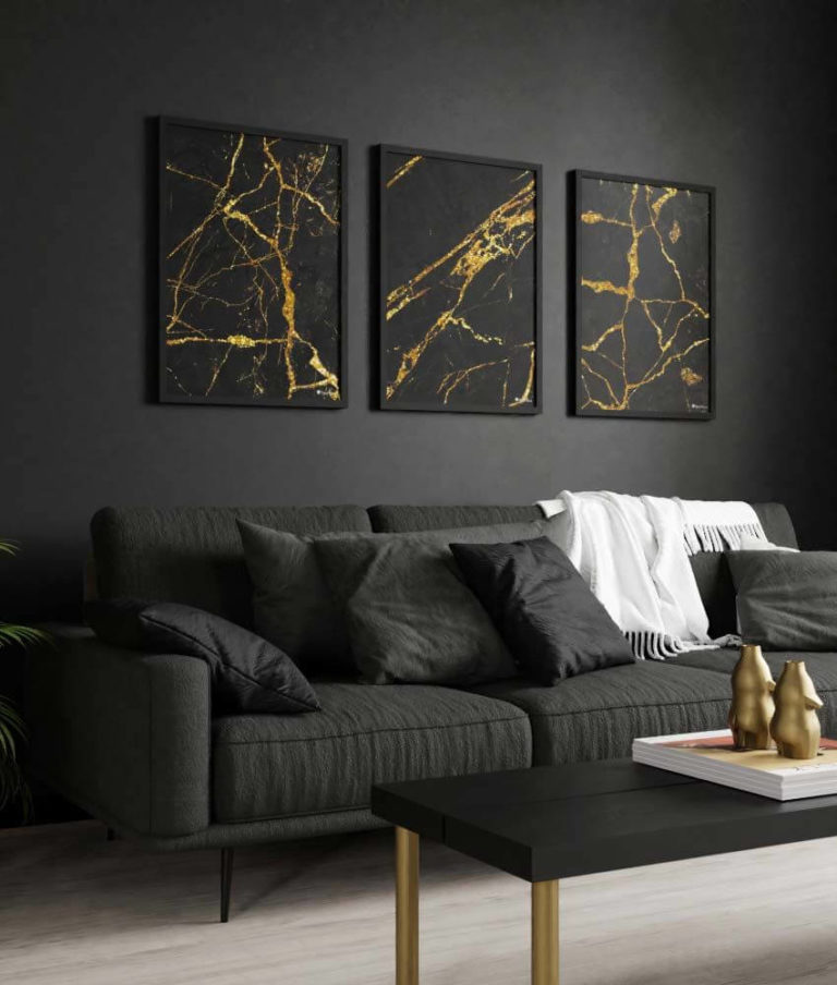
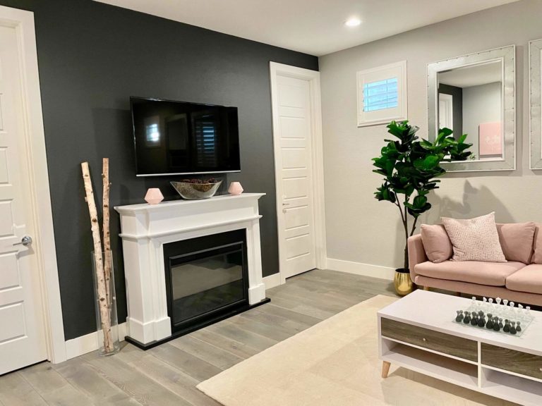
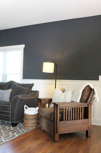
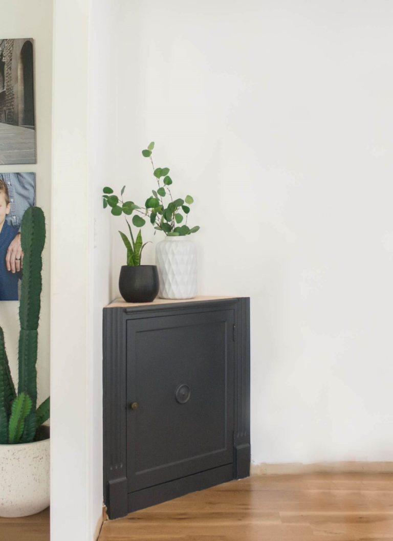
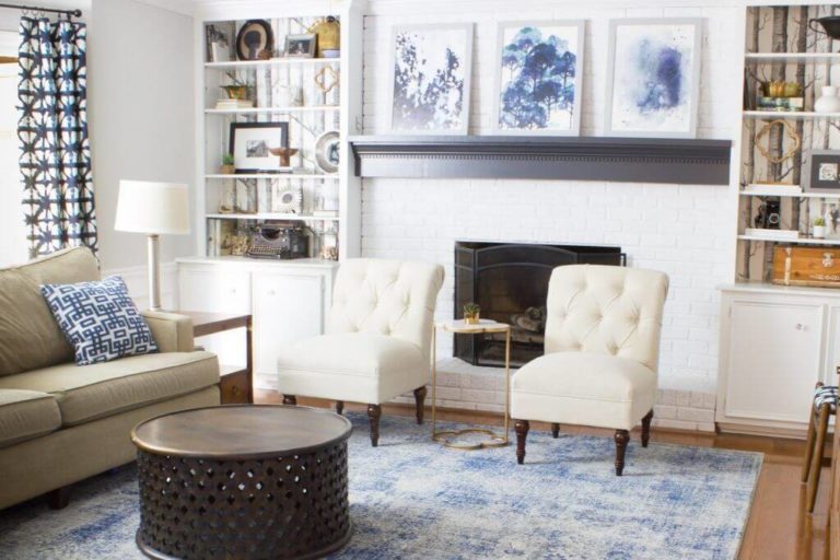
Living room
When playing with such bold paint colors, particularly as dark as this one, you should not forget about balance. It would not hurt to go with a smaller amount of gray-black, yet it would spoil the interior if too much of this shade were added. In the living room, you can safely paint an accent wall, a piece of furniture, even as small an element as the mantel, all on a light background, and even add a few new accents. What would you say about a sparkle of red to dilute the formal balance? Still, a minimalist approach with a slight black accent feels just as appropriate.
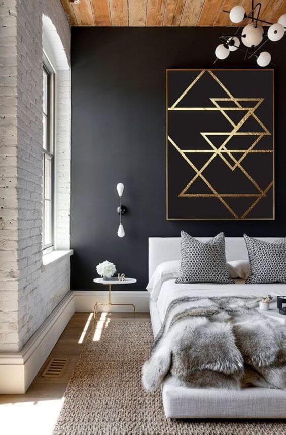
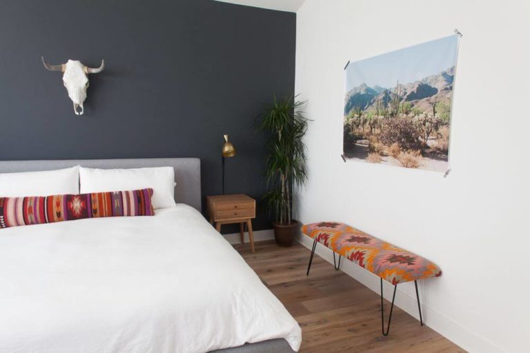
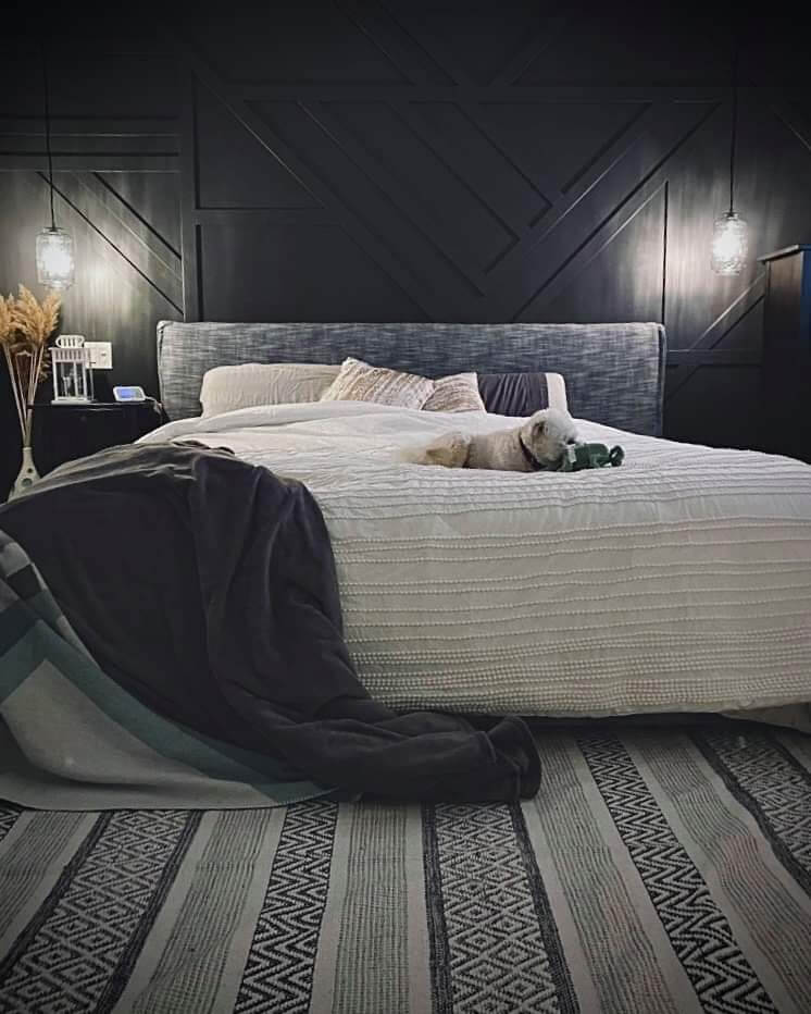
Bedroom
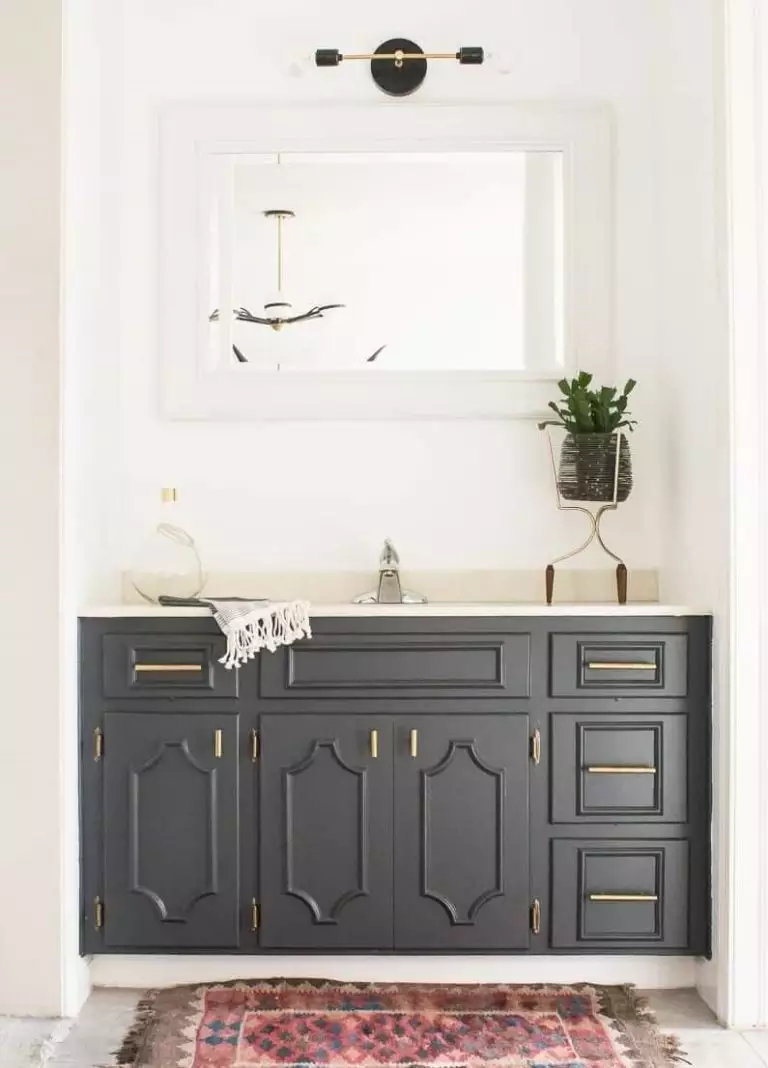
Do you want an indeed personalized space, hard to repeat and full of individuality? Go with an all-black interior, maybe a few splashes of white on the bedding, and your modern bedroom is ready. To add even more intrigue, consider wall paneling painted this way so that the shadows can play their magic. Nevertheless, you can always stick to the classic black and white palette, adding a bit of wood texture and even brass if you want to embrace a particular style.
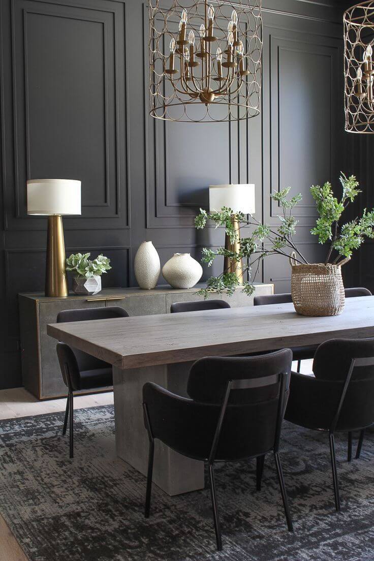
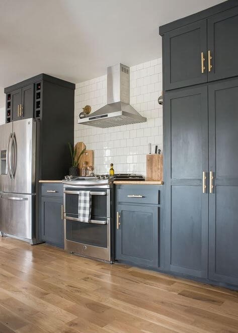
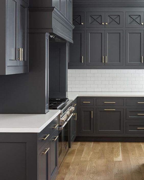
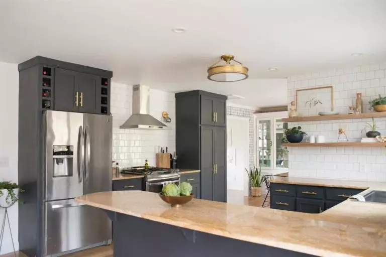
Kitchen and dining room
Would you like to know the recipe for a perfect kitchen design that will surely stay up to date for a long time? Read with the utmost attention: cabinets painted in the dark gray shade, white-tile backsplash, brass hardware, and an accent pendant of choice. As simple as that, but the result… We don’t have the right words to describe it. Better take a look!
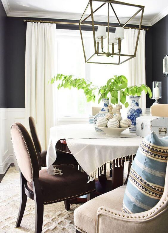
What has this shade prepared for us in the dining area? Gray-black walls, upholstered chairs, dark wood table, white accents, and a formal layout – just like the paint color from Behr requires.
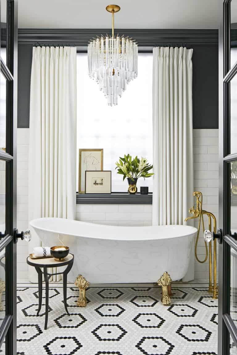
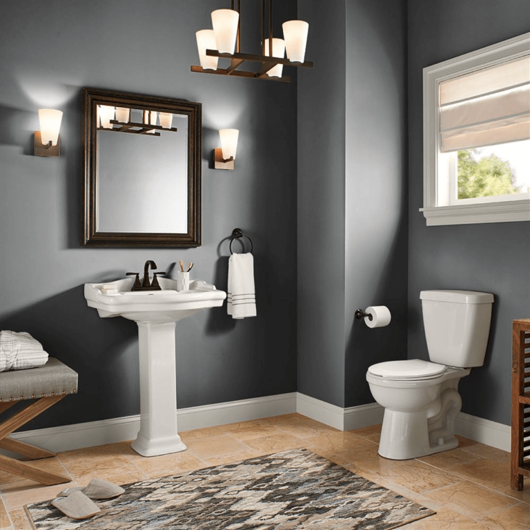
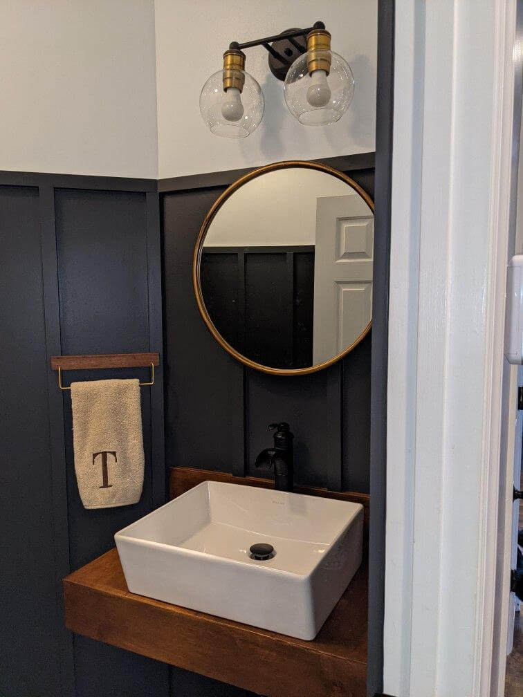
Bathroom
Our favorite trio is back as if it has never left. Go particularly with white, black, and gold with white for the main elements, black for the walls, and gold for decor. It seems relatively modern, yet it embraces the elegant values of the past. It depends on what furniture you choose and how you decorate the walls, with an all-black approach for the most contemporary view and half black, half white, considering wall paneling for a slightly traditional perspective on design.
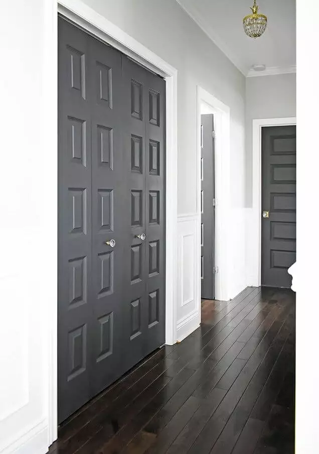
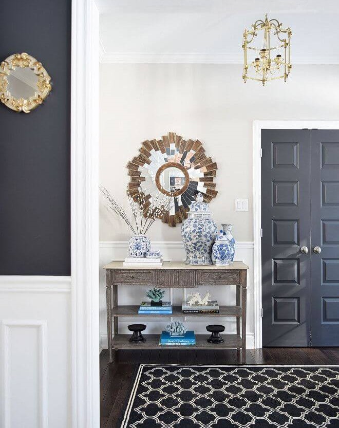
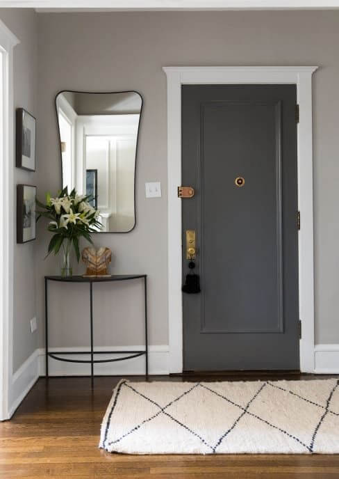
Hallway
We have noticed an authentic trend of painting the interior doors in black shades on a white background in the hallway. Of course, Cracked Pepper fits in perfectly, while the shade of white can vary from the coolest to a slightly warm variation. Once again, gold decor comes to the rescue if you feel that the space lacks a bit of individuality.
Use of Cracked Pepper for the exterior
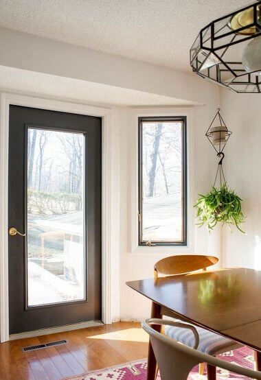
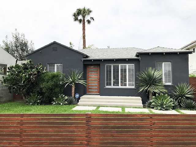
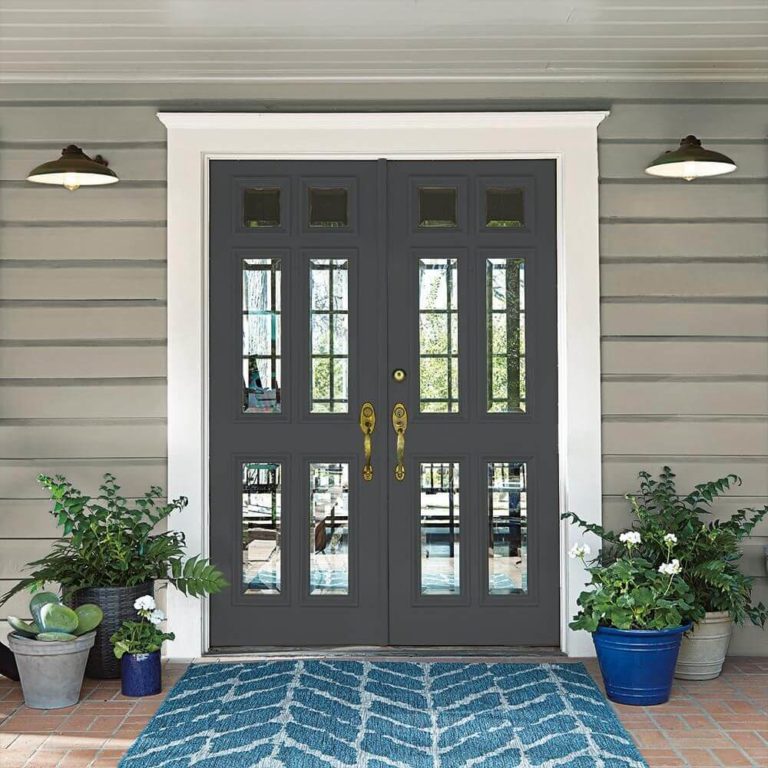
By the use of this shade for the exterior, we don’t mean only the house exterior. You can paint any exterior structure near your house in this gray-black from Behr. This color variation has the property of beautifully playing with our imagination when bathed in natural light. Of course, Cracked Pepper is a go-to paint for the house walls, particularly when combined with a wooden front door – classic and modern simultaneously.
Speaking of the front door, give this shade a try for this element. You will surely not regret the result if you consider a light gray background.
The Cracked Pepper PPU18-1 paint color from Behr comprises the right amount of intrigue, individuality, and accent features to redefine your interior and exterior to a level you didn’t expect but will surely be satisfied with. Even the most humble minds will be astonished by the grandeur that hides behind the gray-black shade.
