Cushing Green HC-125
Benjamin MooreThe dark green hue, which is called pacifying and softening, simply cannot fail to attract attention.
Cushing Green HC-125 (Benjamin Moore): what color is, review, and use
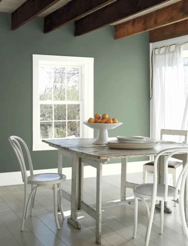
Speaking about the dark green shades relevant today, we have repeatedly emphasized their valuable qualities for the interior and psychological perception – namely, depth, richness of tone, relaxation, comfort, warmth, and tranquility. As you probably already know, the family of these colors can be roughly divided into two groups. In one of them, there will be luxurious blue-green shades; in the other – natural, warmer, and “forest” ones. Of course, there is no point in discussing which one will be better – all this is exclusively a matter of taste, preferences, and perception. However, the fact that the representatives of both of these groups have included the trendy palettes of the last two to three seasons says a lot.
Paying tribute to the trends for naturalness and environmental friendliness, designers will certainly seek out green shades that can become the real favorites. And although natural dark greens are much less involved in their hit lists than complex and fickle blue-greens, they really make you fall in love with them even more deeply. We propose to study this phenomenon using the example of another shade from Benjamin Moore – HC-125 called Cushing Green.
Cushing Green paint color features
The fact that the very name of this color reflects its essence seems to us a nice bonus. Indeed, the dark green hue, which is called pacifying and softening, simply cannot fail to attract attention. Not being as overtly luxurious as, for example, emerald or teal, it at the same time has an amazing ability to embrace and envelop, and in its depths reveals that purity, freshness, and mystery that we can feel when looking at forest landscapes.
Cushing Green’s history is as compelling as its features. The fact is that this color was developed by designers back in 1976 as part of a line of paints called the Historical Collection. Designed to celebrate the US bicentennial, color experts were inspired by the architecture of 18th and 19th century American buildings, which were an interpretation of English classics entwined with thick ivy. Of course, dark greens, including HC-125, took pride of place in this list of 191 paint tones.
As we all know, the past two years have brought significant changes to our daily lives, and therefore we all felt the need for a sense of warmth, protection, and stability. So Cushing Green is back on the trendy color palette list for 2020. We are sure that the designers have made the right decision. In its ability to create an atmosphere of stability and a cozy refuge, this dark green color is practically unmatched.
Cushing Green: is it warm or cold?
The dark green Cushing Green does not seem cold at all – on the contrary, it is the very enveloping effect that we talked about above that is created thanks to its warmth. At the same time, it cannot be called unconditionally warming, and in some cases, it can manifest itself slightly cool – of course, it all depends on the lighting used. However, in a neutral environment, Benjamin Moore’s paint color does look warm.
How does lighting affect Cushing Green?
Among the many reasons why we remain in love with Cushing Green is its belonging to the straightforward shades without any ambiguity. Yes, it does have a certain amount of gray and brown undertones. Still, it is so insignificant that the soft and charming foliage color reveals itself in all its serenity in sufficient lighting.
If you use this paint color for surfaces exposed to direct sunlight or cold light beams from lamps, it may well show its gray tones and look a little cooler and more mysterious. And at dusk or when there is a lack of light, it will simply appear darker. This is excellent news for those who carefully check every step and are afraid to go wrong with the choice of paint.
Cushing Green LRV
Benjamin Moore’s dark green Cushing Green turns out not all that dark. Its LRV reflectivity is 16, which means that it confidently takes its place in the group of medium-dark shades. This means that it doesn’t need much light to reveal its tone fully, but if you are interested in its key natural perception, make sure you have enough light.
Cushing Green undertones
Another advantage of Cushing Green is the rather small presence of undertones – just enough to make the color look voluminous and, at the same time, as natural and warm as possible. This feeling is due to the very noticeable brown undertones. However, if you look closely, this wonderful dark green is also marked by the presence of light gray tones, which, like a haze, glide over its surface, giving it a pleasant and unobtrusive freshness in bright lighting.
Similar colors
Benjamin Moore’s Cushing Green bears similarities to many shades with a relatively small number of undertones while maintaining its individuality. If you are mesmerized by the beauty of natural dark green shades, exploring a list of similar colors will indeed seem fascinating to you:
Coordinating colors
As with any natural dark green, Cushing Green is especially good with equally natural lighter tones, including whites, creams, and grays. Equally successful combinations can be obtained by using matte black, brass, bronze, and, of course, warm brown tones. If you don’t know where to start, we suggest you check out the palettes compiled by Benjamin Moore’s designers, at least for inspiration:
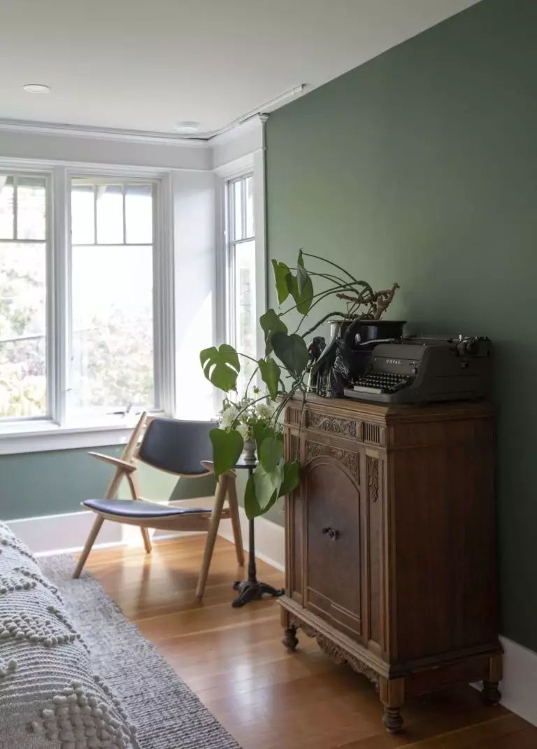
The use of Cushing Green in interior
Despite the extremely low lightness and the corresponding coefficient of light reflectance, Cushing Green proves itself as an almost universal solution. First of all, this concerns such an aspect as the style of the interior. For example, if the same dark green Backwoods from Benjamin Moore has a vintage flavor, then hardly anyone can say the same about HC-125. It is thanks to the discreet influence of gray tones that it keeps neutrality and at the same time easily adapts to any design. Are you intrigued? Well, let’s take a closer look at how to use Cushing Green in the interior of your home successfully.
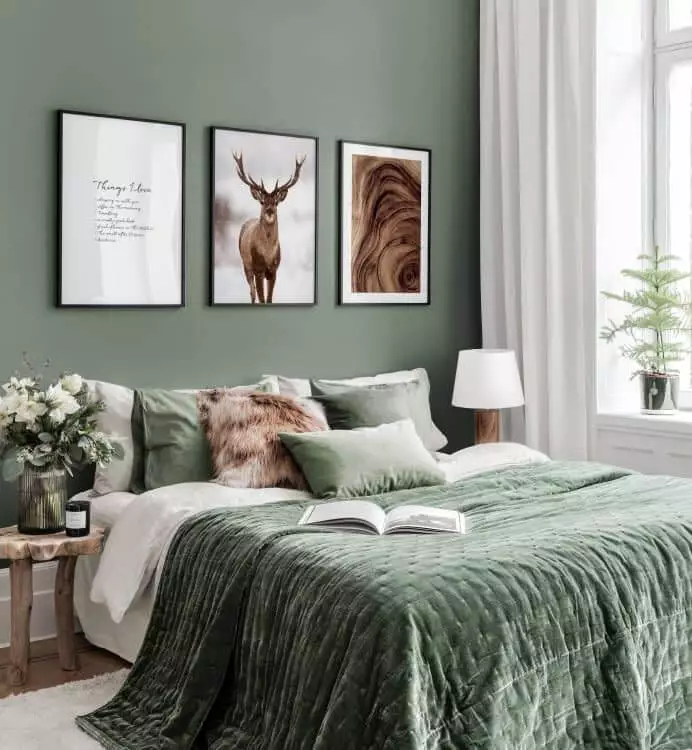
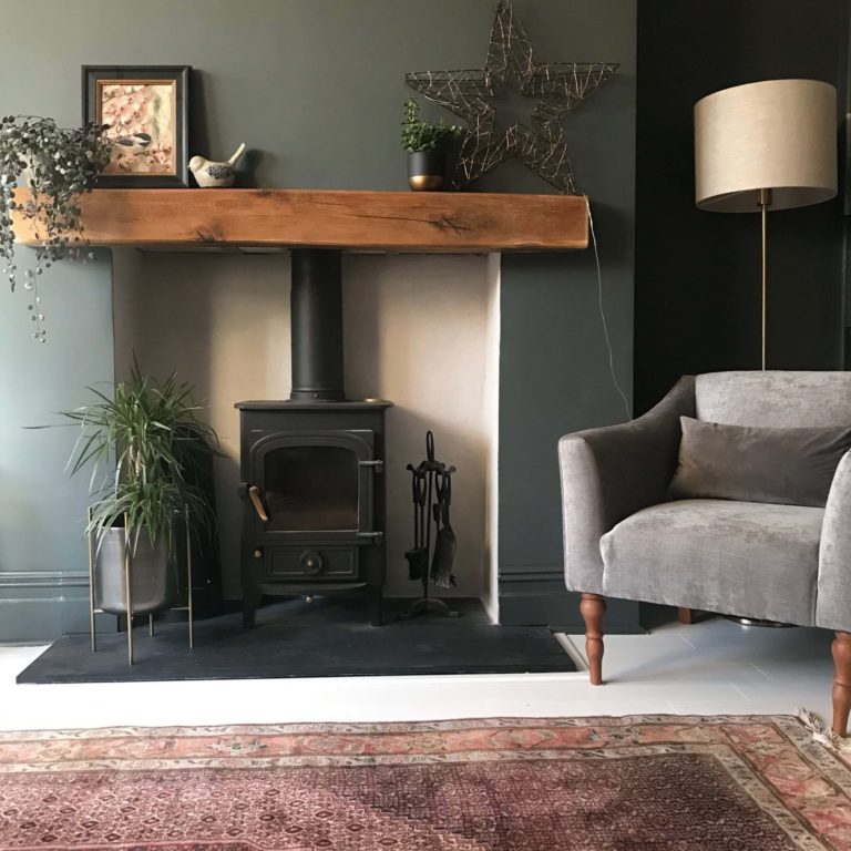
Bedroom
Oh, those classic and traditional bedrooms! Even if you are an ardent fan of minimalism, we do not doubt that from time to time, you still dream of plunging into their luxurious atmosphere, at least for a short time. If this style is close to you, and you have chosen it for the bedroom, Cushing Green is an up-and-coming option.
Firstly, the walls painted in this green are in perfect harmony with the dark parquet floor made of precious wood. Secondly, against their background, finishing in soft white tones, combined with golden and brass accents and expensive textiles, looks especially impressive. And thirdly, it is Cushing Green that creates a feeling of reliability and peace, as if you are falling asleep in a kind of warm cocoon.
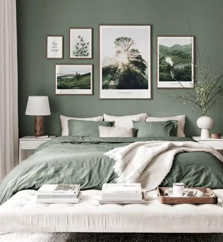
Do you like modern restraint better, but Cushing Green did not leave you indifferent either? All this is quite compatible! Use the same white finish, replace heavy volume curtains with roll-up systems, prefer light wood in warm colors, simple glass lamps, and carpet with a rug in light gray tones. Do not forget about the decor for the walls: mirror and metal panels, as well as light posters, will be handy.
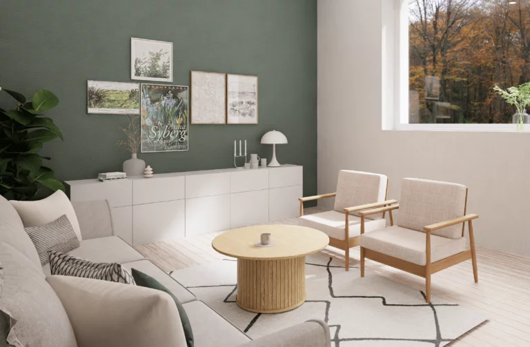
Living room
Are you planning to decorate one of the most important spaces in your home in Cushing Green? Try the good old American style or opt for traditional classics. If this is the case, look for wood or parquet floors in walnut color (pattern is highly appreciated) – they will perfectly match the dark green walls, creating a welcoming and elegant atmosphere. A Chesterfield sofa and armchairs with leather upholstery, elegant lamps, and mirrors in gilded frames will complement the picture. Want a fireplace? A stone in cream tones will look great.
However, in a modern interior, Cushing Green will look no worse. Use white window frames and similar furniture for contrast, laconic floor lamps with chrome bases, and light rattan accessories.

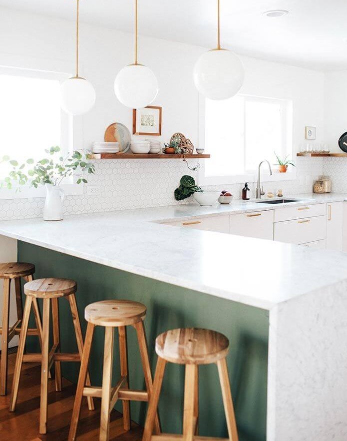
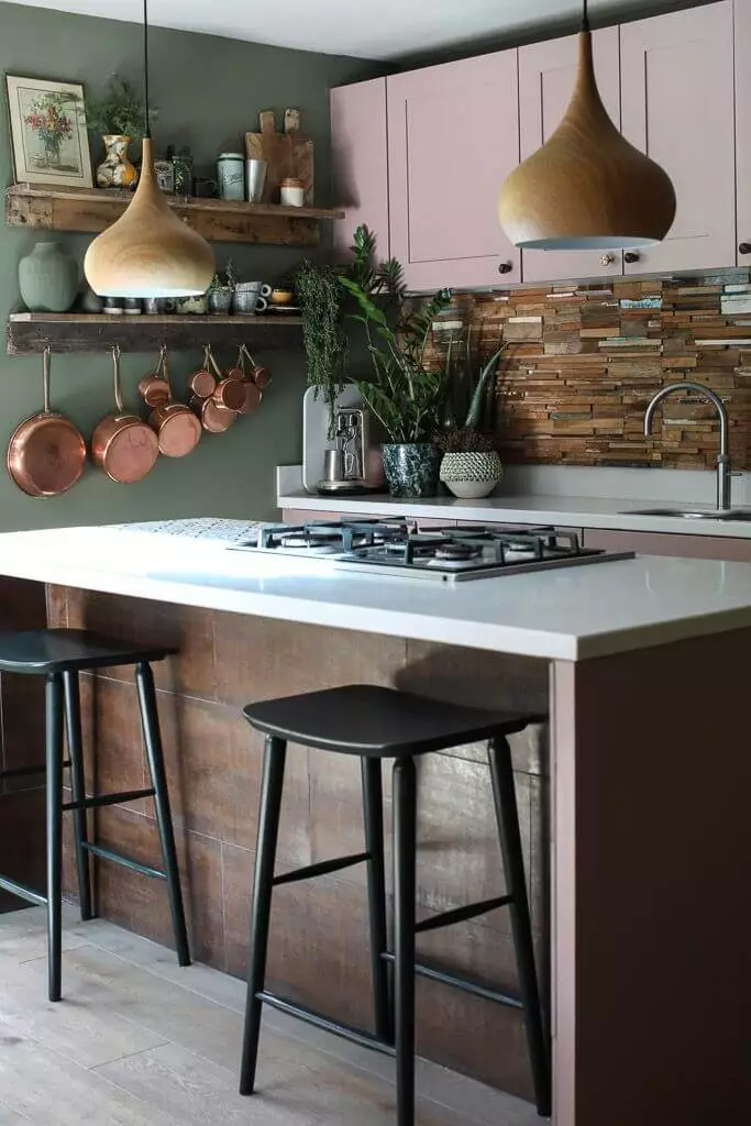
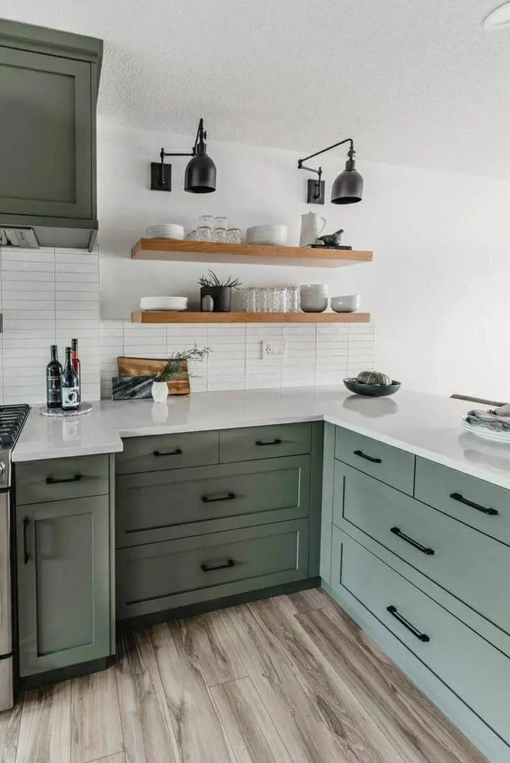
Kitchen
A dark green base is perfect for small modern kitchens, especially when combining Cushing Green with soft whites or creams and marble surfaces. It is also nice that you do not need many accessories for a complete interior: this shade is deep and self-sufficient and is an ornament in itself.
If you are a happy owner of a spacious kitchen, then, in this case, it is better to opt for kitchen cabinets of this color against a light background. In this case, they will become an expressive interior accent while retaining their practical function. Do not forget about the kitchen island – if you use this paint on its base, the result will not disappoint you.
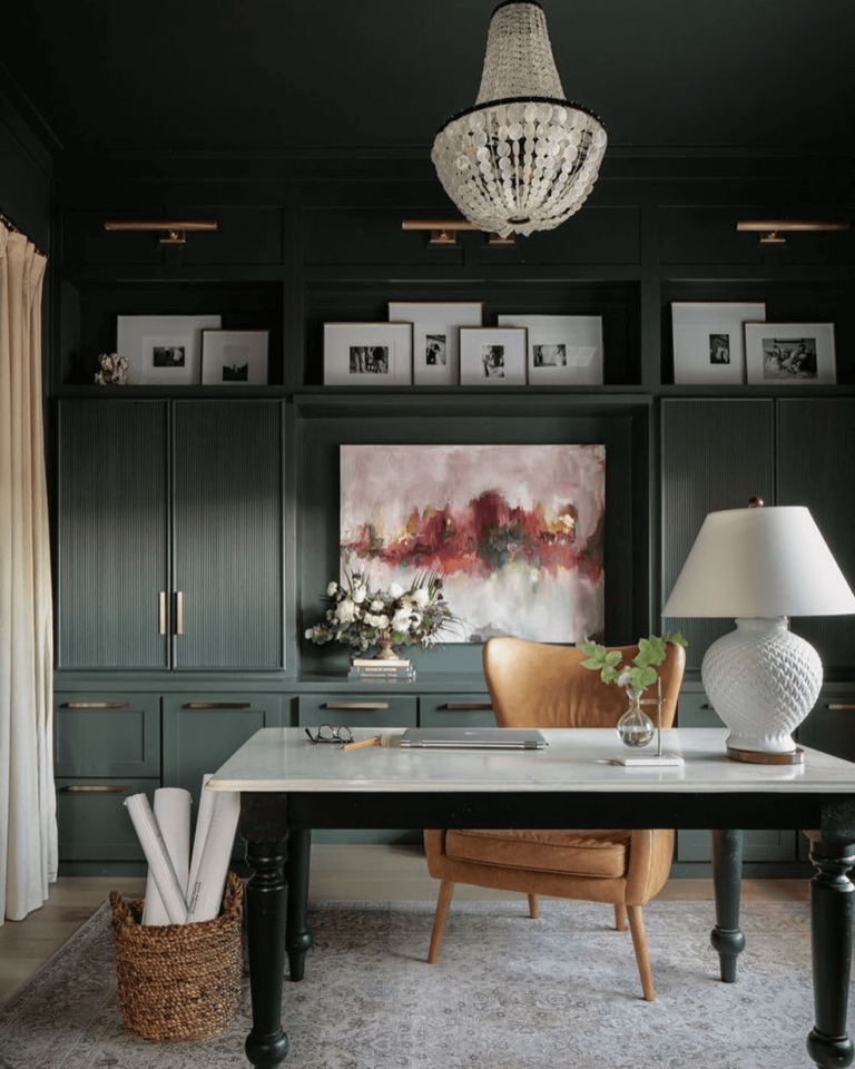
Home office
This shade from Benjamin Moore has proven to be equally friendly to both the classic and the modern home office. In the first case, follow the traditional path – with massive wooden furniture, elegant curtains, and beautiful crystal and white frosted glass lamps. Try a glass or chrome table, light plastic chairs or light leather chairs, and stylish fabric blinds on the windows in a modern office.

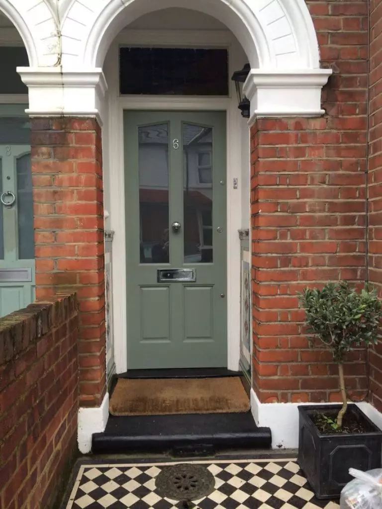
The use of Cushing Green for the house exterior
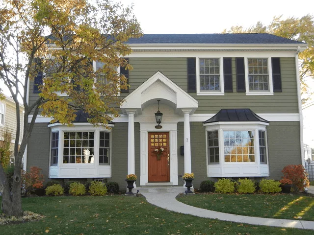
Suppose you are already considering the idea of painting your entire wood house in Cushing Green. In that case, we can confidently say that you are on the right track, as it will look cozy and natural, and the contrasting white trim will make its silhouette clear and harmonious.
For those who are not ready for drastic measures, you can consider this color for the front door to create an expressive accent and trendy design for the entrance group. Another life hack: Try Cushing Green for doors leading to your patio, and place chairs or benches in the same color next to it. Your guests and friends have never seen such a balanced space!


Benjamin Moore’s HC-125 Cushing Green is another excellent solution for those just discovering dark green shades and those who have already tried experimenting with them before. You can feel like a real creator, testing this paint in different rooms and not being afraid to make a mistake: colors such as Cushing Green are pretty friendly and straightforward, and therefore the result of your experiments will undoubtedly appeal to you.
