Dorian Gray SW 7017
Sherwin-WilliamsA trendy color that is a medium shade of gray leaning towards the dark category with a relatively neutral base, although not devoid of warm notes.
Dorian Gray (SW 7017): what color is, review, and use
Another color review, another shade of gray; when it seems that the list of gray shades cannot get any longer, we discover more and more unique variations. This article’s hue is not new but definitely one of the most popular gray paint colors. To your attention – Dorian Gray SW 7017 by Sherwin-Williams. This trendy color is a medium shade of gray leaning towards the dark category with a relatively neutral base, although not devoid of warm notes. Why is it so popular? Unlike the commonly used neutral grays, this one shows a greater intensity, adding depth in a discrete yet stylish way.
The SW 7017 is part of the Top 50 Colors collection, proving that we deal with a popular shade. Even the name itself cannot help but draw our attention. Why Dorian Gray? There is a connection between the deep thoughts that Oscar Wilde’s book embraces and the mesmerizing depth hidden behind the surface of the gray shade from Sherwin-Williams. Once you look at this paint color, you cannot simply take your eyes off, which was the case with Dorian himself, whose beauty hypnotized and inspired. Quite intriguing this far! Wait and see what else this color has in store!
Dorian Gray paint color features
Dorian Gray is indeed directed towards the dark shades. Still, its relatively neutral base and subtle scents of warmth are responsible for its impressive intensity. In contrast with other neutral shades of this kind, SW 7017 does not fade when used as a background but adds a bit of accent to the interior. The slightly dark notes of gray do not lead to a cold effect but rather ensure a balanced result, while the warm undertones keep any imposing feelings at bay. Some may regard this color as a greige, a mix of gray and beige. Still, Dorian Gray is nothing else but an exceptionally warm gray.
Dorian Gray: is it warm or cold?
You don’t have to be an expert in colors to notice that Dorian Gray is a warm paint color, which points to how visible this feature is. One should note that it may look like a combination of cool and warm notes on the sample. Nevertheless, once applied within the interior or exterior, it shows the prevalence of warm scents.
How does lighting affect Dorian Gray?
It is the same as with other shades, although with slight nuances. If we speak about north-facing rooms, undoubtedly, the gray notes prevail, and this shade of gray takes on a neutral appearance in the real sense of this word. Still, it does not look too cool since the warm undertones, although slightly noticeable, do not go anywhere. What about south-facing spaces? This shade leans a bit warmer, although staying true to its gray nature. The same cool or warm undertones in artificial lighting would have a similar effect on this paint color.
Dorian Gray LRV
The Light Reflectance Value of Dorian Gray is 39, which places this shade, on a scale from 0 to 100, in the category with medium tones that lean towards dark shades. If we were to translate this figure, we would refer to this shade of gray as quite able to reflect a particular amount of light. Still, its intensity absorbs most light, which stands behind the non-fading effect. It does not make the space feel visibly more spacious. If this is a priority, you should opt for an accent wall painted this way. Still, an all-gray room, particularly when considering this shade, will add drama to your space in the finest way.
Dorian Gray undertones
Besides the slight beige undertones responsible for the warm notes, Dorian Gray shows off a wide range of other undertones that reveal themselves in particular lighting conditions or under the influence of neighboring colors. Subtle purple and blue-green undertones are brought to the surface in specific circumstances. In ideal conditions, it may seem that Dorian Gray is a true gray, although the undertones are always there.
Similar colors
We were not surprised to find out that the SW 7017 paint color has many similar shades. Such a popular warm gray variation slightly more intense than expected cannot simply go unnoticed by paint manufacturers that came up with many alternatives close to the essence of this one. Let’s expand our horizon by finding out other shades that replicate a similar depth, each in a unique way!
Coordinating colors
Grays usually work with any shade due to their neutral base that is flexible and adapts to any situation in part. We have already stated that Dorian Gray is unusual, and its impressive depth requires particular companions. Colorists suggest pairing it with lighter gray variations or greige shades for a harmonious play between the undertones, true whites for the trim, and darker grays with green or blue undertones for a contrastive combination. Bolder colors should also not be avoided if making a statement is a priority. Let’s go through some of the best shades to consider!
Use of Dorian Gray in interior
Dorian Gray is a no-fail option for those looking for a neutral gray filled with more intense notes for an intriguing yet unobtrusive environment. One can use it in any room with any approach. Be it an all-gray makeover, an accent wall, or a piece of furniture. The most important thing is to consider the matching shades carefully, depending on what result you want: to emphasize the depth of the gray or use it as a background for bold accents. We will take you through a range of design solutions to inspire you.
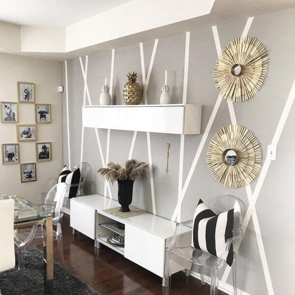
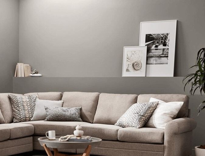
Living room
Consider Dorian Gray to paint the shiplap within a Modern Farmhouse interior, the wall paneling within a transitional design, or an accent wall for a contemporary approach to any style. To fully embrace modern values is enough to go for an all-gray living room with walls painted in this shade and white alongside darker grays for other elements that find themselves within the space. Quite a monochromatic still slightly contrastive environment like that will breathe fresh contemporary air into your interior.
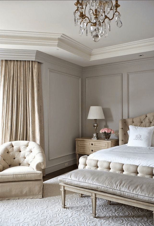
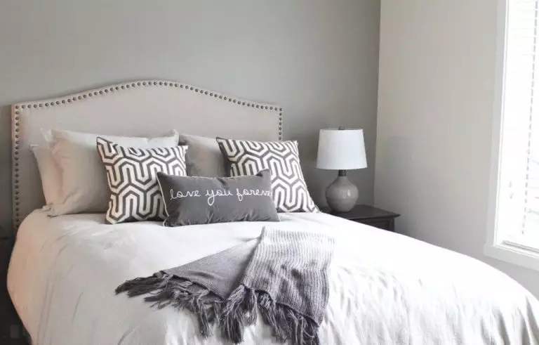
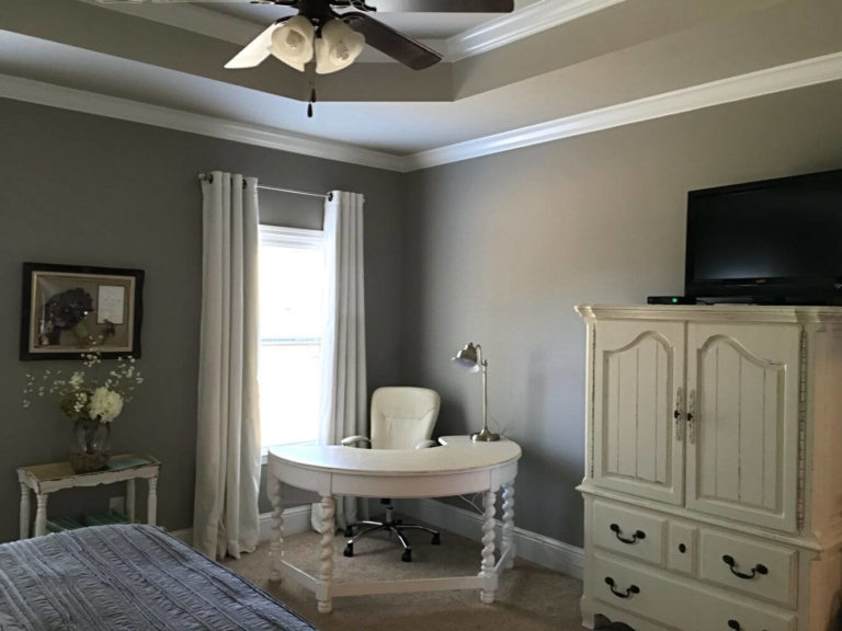
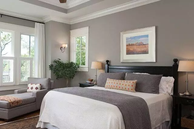
Bedroom
The same color combinations and approaches as in the living room go here. Additionally, you can consider natural wood for a splash of comfort and pots with indoor plants to enliven the space, both options being much appreciated in such spaces. Sticking to a monochromatic palette with different variations of gray, with Dorian Gray for the walls, will keep the environment calm and suitable for relaxation. However, we would like to draw your attention to one particular shade – beige, which can be considered for the textiles on a gray background for an extra touch of softness.
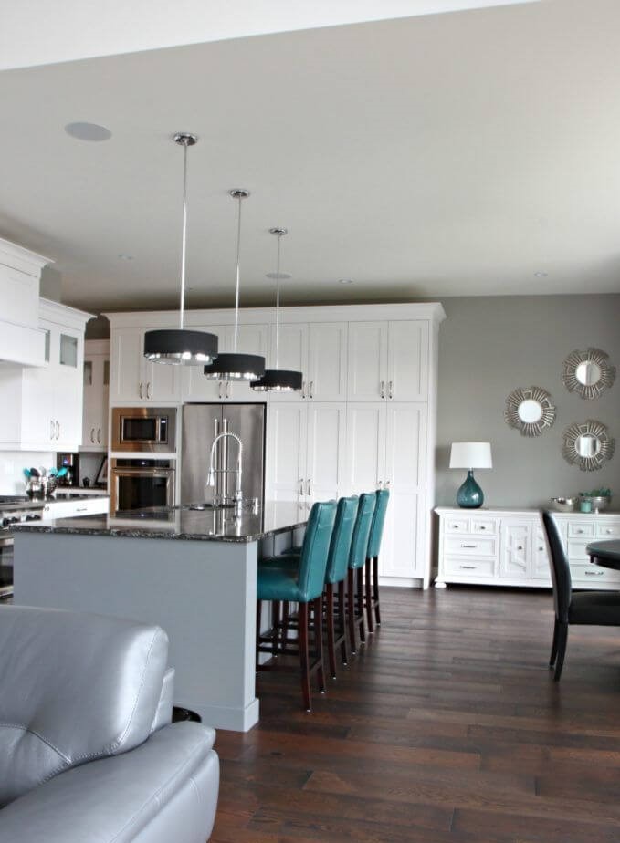
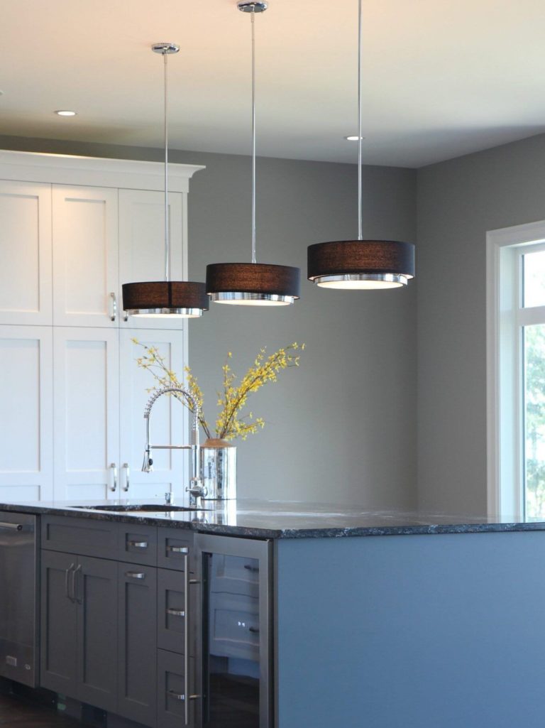
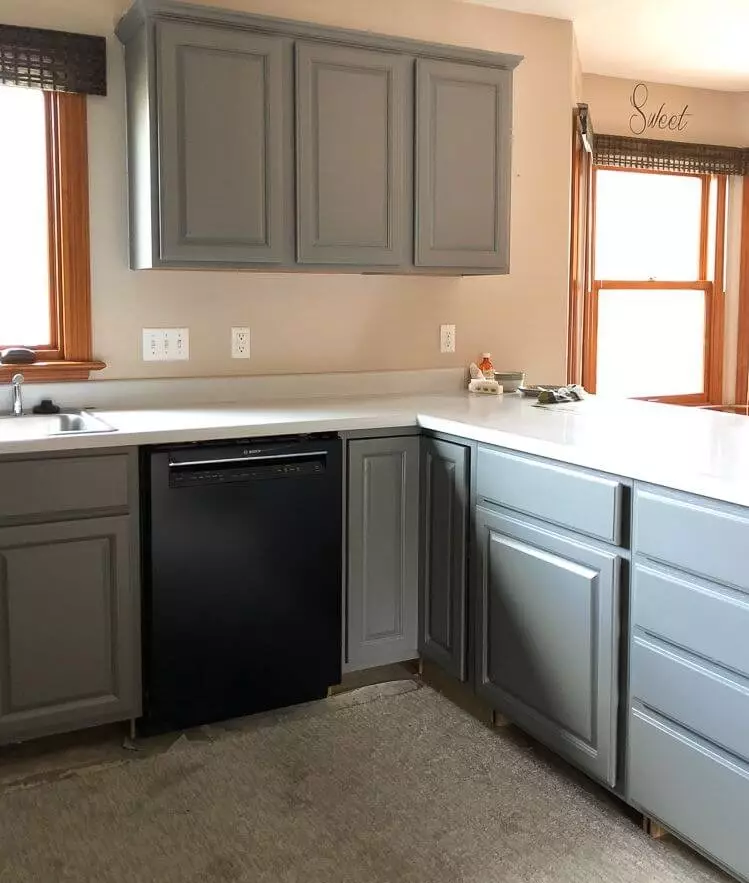
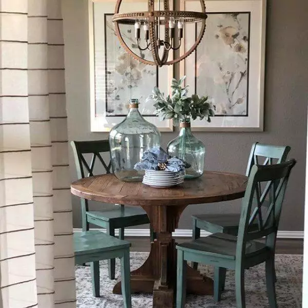
Kitchen and dining room
The irreplaceable mix of Dorian Gray, darker grays, and white goes on. However, SW 7017 can also be considered for the cabinets on a rather greige background. Still, any approach that involves this beautiful gray shade requires appropriate lighting so that the space does not feel draining. Experts suggest a no less impressive design solution: consider Dorian Gray for the walls, a large wooden table, and chairs painted in the cold gray-green Jasper Stone mentioned above. This way, eating your meal in such an environment will feel like spending a few minutes in the world of Oscar Wilde’s “Dorian Gray”.
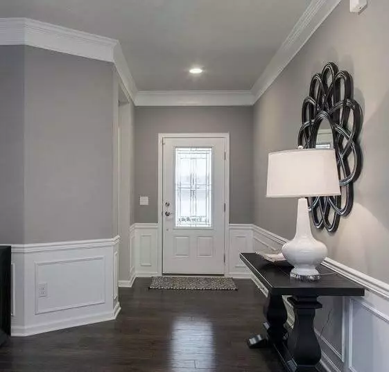
Hallway
Such a seemingly impartial gray can instantly feel welcoming if applied to the hallway and combined with its favorite companions. The combination acquires a familiar look and makes you want to return home as fast as possible. In this case, you can opt for dark wood for the floor for a functional approach, which looks no less stylish as a cool contrast for the warm notes of the stunning gray from Sherwin-Williams.
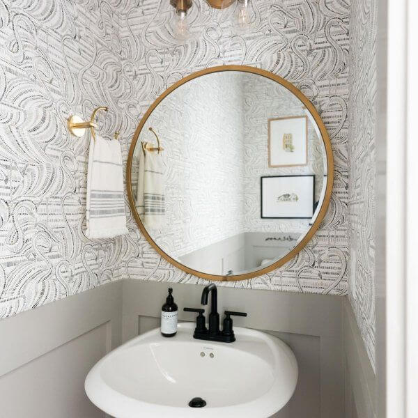
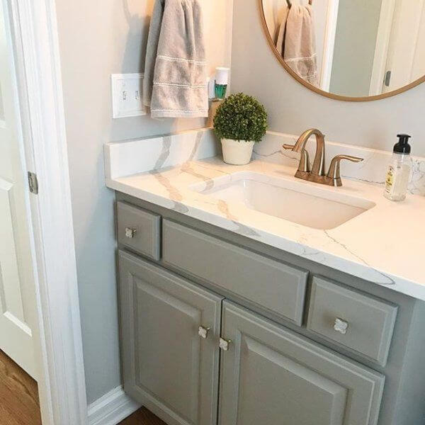
Bathroom
Things get a bit sophisticated. You can safely consider Dorian Gray for the background or cabinetry by combining it with lighter shades or sticking to an all-gray approach, from the walls to the cabinetry and flooring. The new element you can apply that emphasizes the intrigue is the brass hardware that adds finesse to a rather functional space. Among darker shades, black works no less effectively with Dorian Gray, and a black faucet on a gray background is another source of interest.
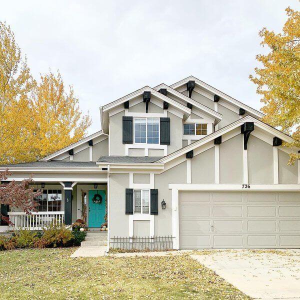
Use of Dorian Gray for house exterior
To our surprise, Dorian Gray looks completely different when used for the house exterior. It instantly becomes a light shade of gray with pleasant notes of softness and irreplaceable inviting effect. Its true companions stay the same. White or darker grays for the trim and front door. Add a few black accents, while white has to be preserved for an extra contemporary feel.
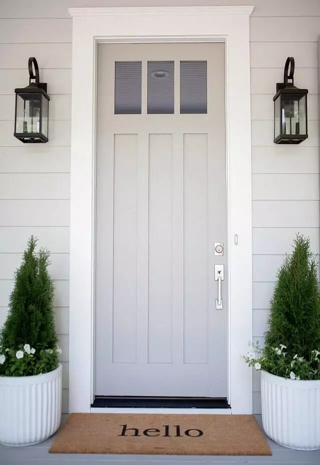
You can safely use Dorian Gray for the front door on a lighter gray background, ensuring a similar welcoming effect. Not too eye-catching yet definitely unusual, the beloved shade from Sherwin-Williams will surely add individuality.
The Dorian Gray SW 7017 paint color from Sherwin-Williams surprises with its neutrality and uniqueness at the same time. If a simple approach to design yet not devoid of personality is a priority, all you should do is opt for Dorian Gray and let it play its magic on your interior and exterior.
