Dover White SW 6385
Sherwin-WilliamsA timeless shade of warm white with a tint of yellow responsible for the soft creamy base.
Dover White (SW 6385): what color is, review, and use
White has always been a classic, and paint manufacturers have been constantly developing new variations for an original approach to this color. Luckily, most of these alternatives have become timeless shades of white that designers and homeowners simply fell in love with and are using in their interiors. This is what happened with one of the most popular shades of white – Dover White from Sherwin-Williams. This fabulous color was introduced a long time ago, but its unique features made it a go-to color, and it doesn’t cease to surprise us every time we refer to it.
SW 6385 is a warm shade of white with a subtle hint of yellow that offers this color a pleasant creamy appearance. Due to its popularity, it has been featured in several collections from Sherwin-Williams, among which ABC’s and 123’s, Acute Care Warm Foundations, Teen Space, Precious Baby, Living Well – Balance, Warm Whites, and Top 50 Colors. It shows how wide the range of opportunities covered by this shade is. The most interesting part is yet to come.
Dover White is inspired by the popular White Cliffs of Dover that find themselves in the southeastern part of England, and it seems that this shade does not only replicate their soft and outstanding color but also their grandeur. We are already astonished by how many heights this shade was able to reach. Still, there is a mystery behind such a lovely white, and we plan to reveal it. Let’s go through the most prominent aspects that define Dover White!
Dover White paint color features
Dover White is a timeless shade of warm white with a tint of yellow responsible for the soft creamy base. While staying true to the main peculiarities of a white shade, such as the brightening and expanding effect, this shade also brings an irreplaceable feel of warmth that a color of this kind would normally not be able to, but this is what keeps it original. What does this shade feel like? Well, the range of feelings that it radiates is wide, from a mesmerizing ocean breeze that brings limitless freshness and exceptionally calm notes that integrate comfort at its finest to an outstanding sense of familiarity that makes coziness a defining feature of the space. One should note that the clearly perceived creamy base of this shade can make us mistake it with Creamy SW 7012, another popular shade of warm white from Sherwin-Williams. Nevertheless, Dover White has a bit more of a yellow prevalence.
Dover White: is it warm or cold?
This hypnotizing shade of white is definitely a warm color, and the yellow undertones are there to prove it. There is no need to analyze it thoroughly when a single glance makes you feel embraced by a soft touch of warmth and delicate ease. Once again, the White Cliffs that stand behind this shade are responsible for the sense of safety this color replicates, which makes it feel even more approachable. At some level, you are confused about which of its features makes you so attracted to this color, but there is definitely a sense of calmness and harmony that only a warm shade like that can radiate.
How does lighting affect Dover White?
As usual, lighting is a key factor when it comes to the appearance of a color. Speaking particularly of Dover White, it is worth mentioning its chameleon features. A slight change in the lighting can transform this airy source of calmness into an actual source of warmth that surrounds you like a cocoon.
Let’s tackle it from a narrow perspective! In full daylight, Dover White displays its large range of undertones and blooms in its entire beauty, feeling like a fresh breath of air that invigorates and brings calmness at the same time. As we get to artificial lighting, it should be noted that this one adds a more perceived yellow tinge. A slightly warm artificial source of light is the right companion, and don’t worry; it will not make Dover White look too yellowish but rather set a particular kind of harmony.
Dover White LRV
Although Dover White is not a true shade of white but a warm variation, it is not that far from the category of indeed light colors. Its light reflectance value, which indicates how light or dark a color is, is a reliable explanation. Let’s get straight to it! The Dover White LRV is 83. Of course, the yellow undertones took a bit from its lightness, although the result is still a light shade that reflects great amounts of light and makes the room look spacious.
Dover White undertones
There is no need to refer again to the clearly perceived yellow undertones whose effect on the overall result has also been mentioned. Still, there is a hidden part about this color that is unnoticeable. Dover White is also penetrated by a few particles of gray, which are responsible for the slightly earthy notes traced to the White Cliffs. This is what offers this shade a particular sense of natural beauty.
Similar colors
Dover White is unique, and no other shade can replicate the entire range of feelings that this one radiates. Still, experts from various paint manufacturers, including the same Sherwin-Williams, developed an impressive number of similar colors due to the increasing popularity of warm white, which can serve as perfect alternatives to Dover White without risking their originality. Let’s take a look at some of them!
Coordinating colors
Despite its uniqueness, Dover White is not picky, pairing well with various shades, from nature-inspired shades of green, blue, and yellow to brighter accents, such as various shades of red and purple. One should consider particularly soothing variations of these shades. No less beautiful is the combination between this creamy white and gray. Luckily, all these colors can be found in the Sherwin-Williams palette. Let’s discover some of the most prominent shades in this sense!
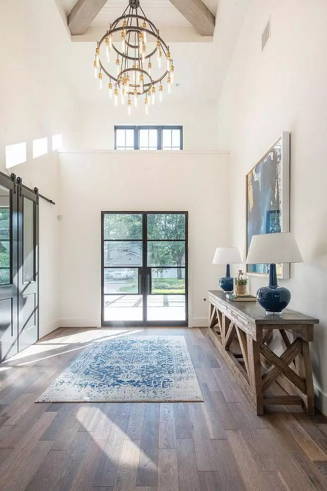
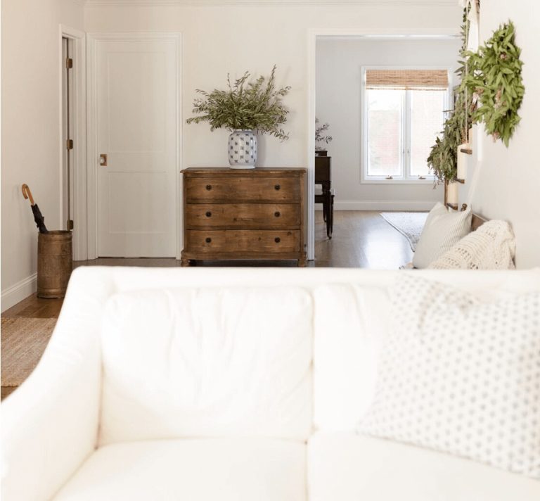
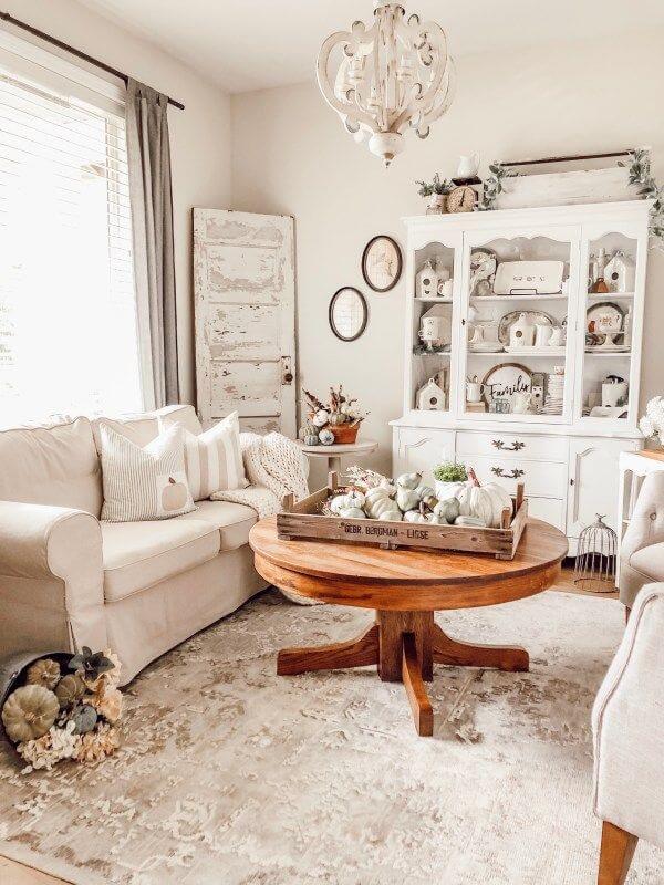
Use of Dover White in interior
This appealing shade of white with warm undertones is the true companion of traditional and transitional styles. Therefore, the cozy Farmhouse and elegant French country are the first to benefit from such a warm hug filled with notes of calmness and freedom. Nevertheless, the timeless Dover White is quite versatile and can adapt to other styles as well, being appropriate both for the walls and pieces of furniture, such as cabinets. No less impressive it looks when used to paint the trim, even on a lighter background, which adds a feel of elegant comfort to the most formal and overly simplified styles. Let’s scroll through the following design solutions and get inspired!
Farmhouse at all levels
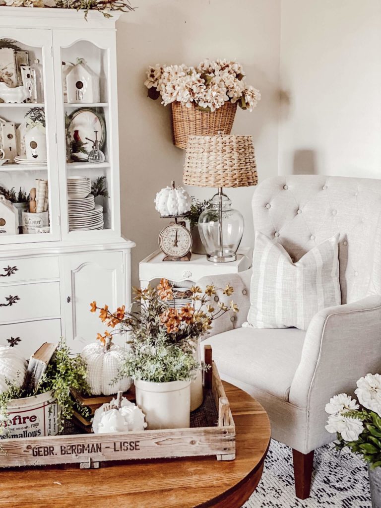
Since Dover White is a perfect reflection of coziness, it perfectly integrates into the style whose defining feature is the same concept. Paint the walls in this creamy shade and redefine the simplicity and rustic charm of your farmhouse interior; natural wood, soft textiles, a few splashes of warm shades, and all that on a creamy background. Furthermore, Dover White is quite capable of adapting old values to the contemporary approaches, thus, being perfect for a transition towards a Modern Farmhouse. Add a few modern units, such as pieces of furniture, stick to a more neutral color palette, and your interior will be a replication of coziness and style at the same time.
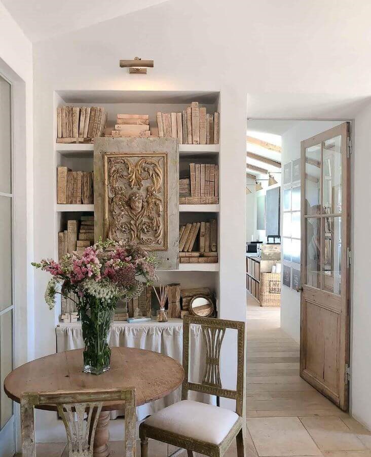
Provence finesse
Once surrounded by the exquisite French country flair, Dover White puts on its elegant veil and spreads notes of exceptional luxury all over the space. Consider the warm white shade for the walls and go on with the elements peculiar to this style, without forgetting the richness of textiles, elegant furniture, an earthy color palette, flower motifs, exquisite decor units, and flamboyant chandeliers. If it seems too extra, consider replacing particular elements with their more functional alternatives, preserving the distinctive shapes, colors, and patterns of this style. Either way, Dover White is more than happy to contribute in any case.
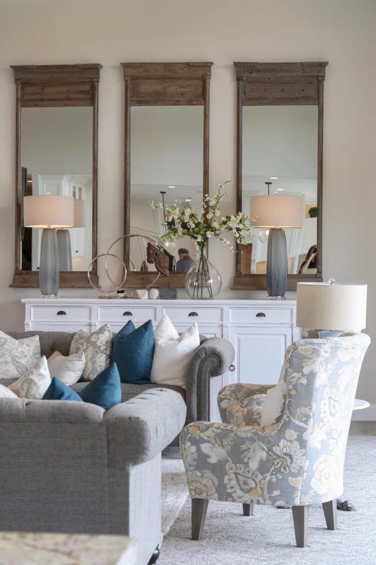
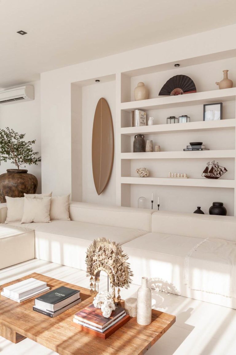
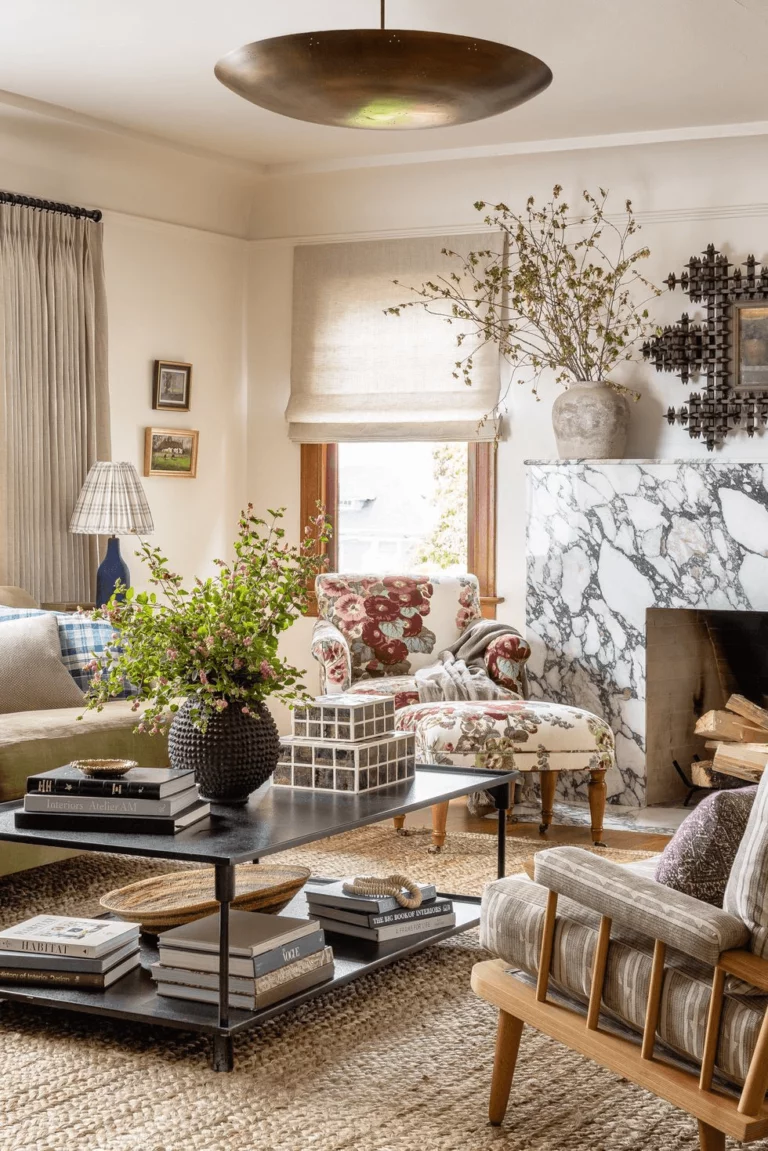
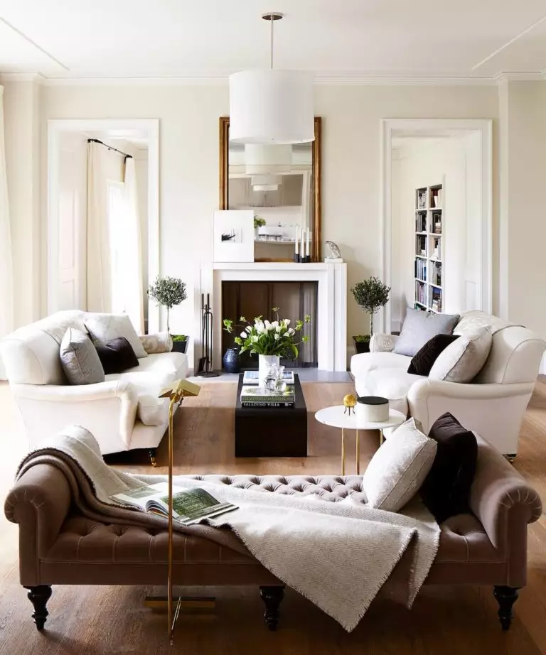
Living room
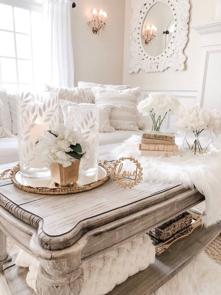
Dover White is a perfect alternative to the classic neutral colors that are used in contemporary interiors as a background for various styles. This way, you can put into practice your wildest design ideas and be sure that this warm shade of white will take care of the overall harmony in your living room. There is one thing this color has but other neutrals are devoid of; Dover White is impressively warm, and it is not just a slight hint of softness but an entire range of calming and cozy feelings. Today, almost any interior would benefit from a sense of peace, and Dover White is ready to provide it.
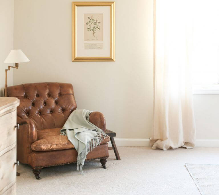
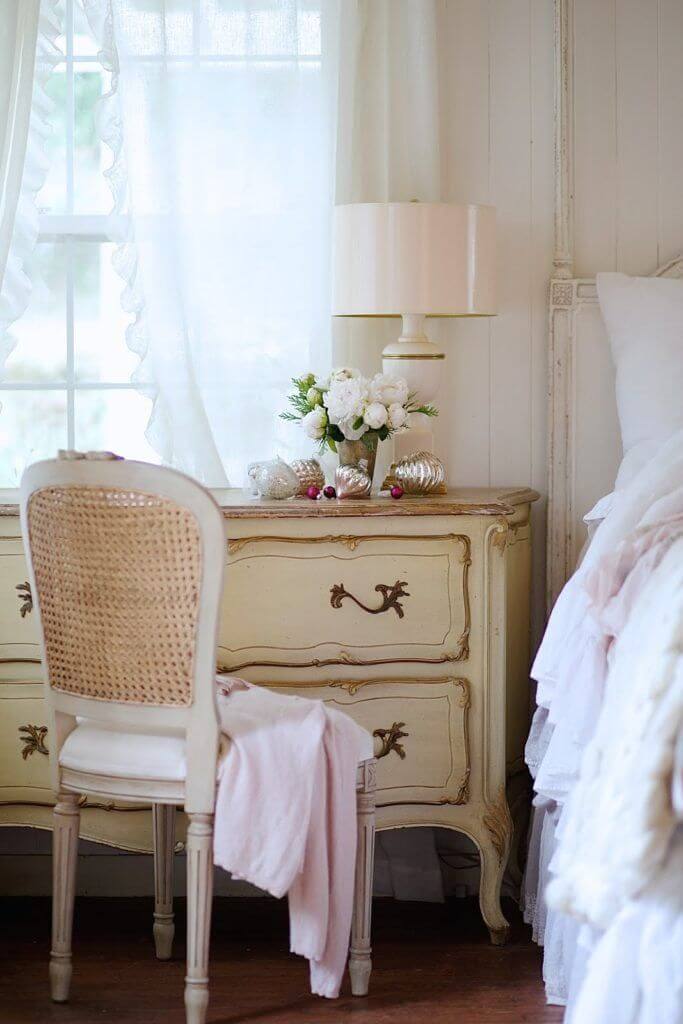
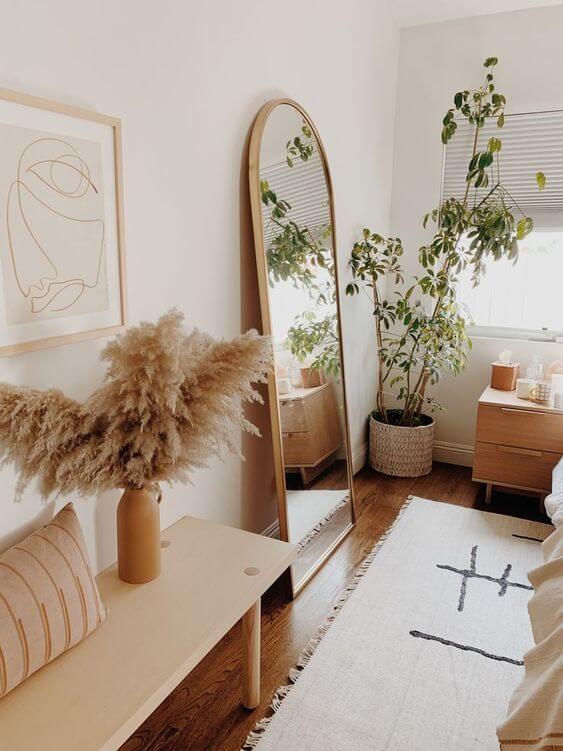
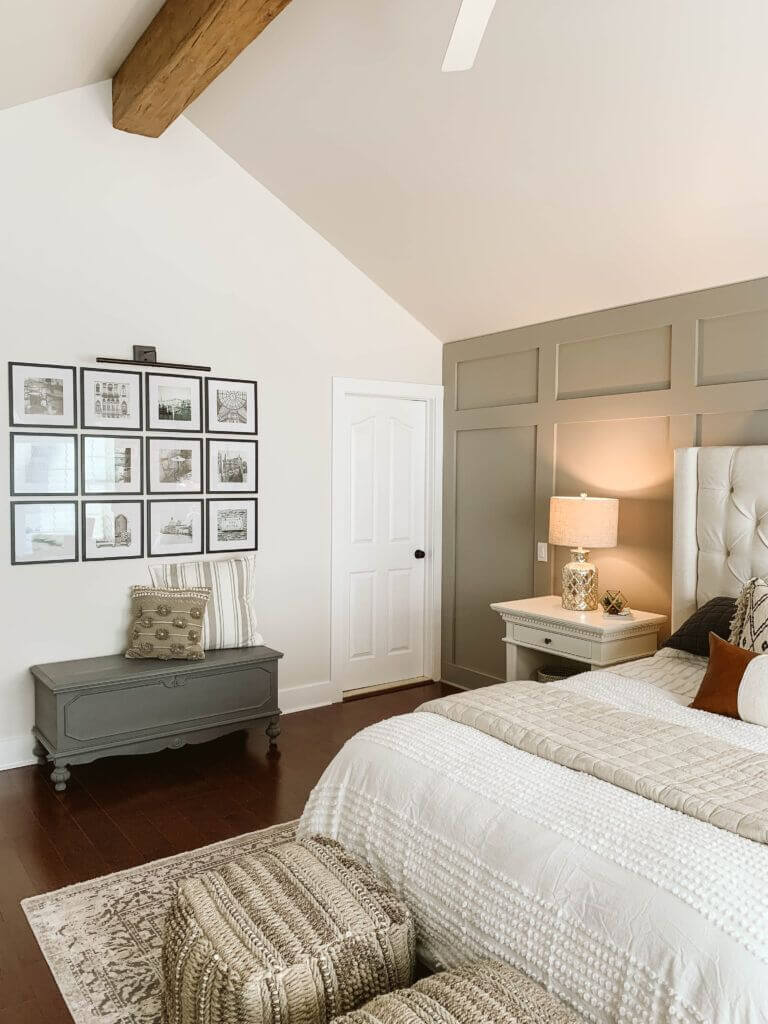
Bedroom
You can literally go with the style that feels closer to you, and Dover White will adapt to its peculiarities, but you should definitely opt for this calming and safety-inducing shade in such a personal space. Fill your evenings with exceptional warmth and enrich your mornings with a sleek sense of confidence by painting your bedroom walls in this shade. It is up to you which style direction to take. Nevertheless, experts suggest redefining a Shabby Chic bedroom with this beautiful shade of white that resonates with the notes of elegance peculiar to this style. Another option is to dilute the rich Boho texture with a splash of Dover White, whose yellow undertones harmonize perfectly with the defining-of-this-style earthy shades. And last but not least, go with a simple design, adding visual interest with a few splashes of pastels and a mesmerizing white backdrop.
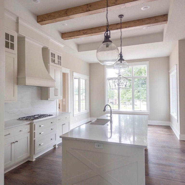
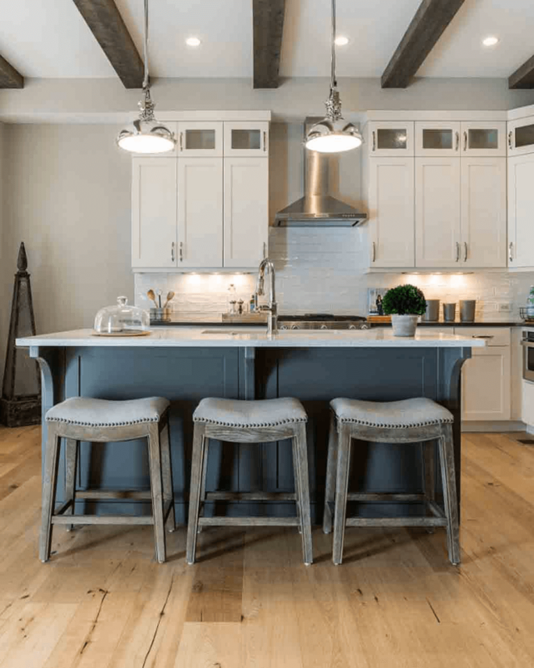
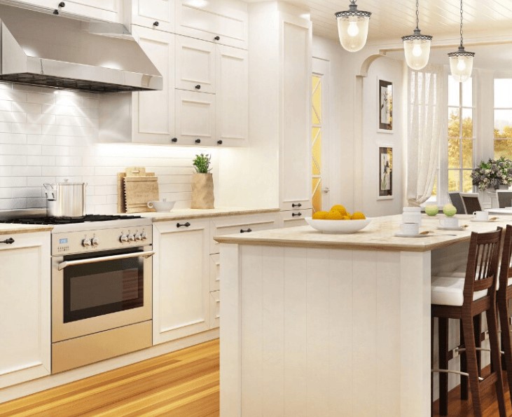
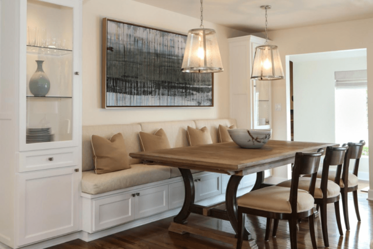
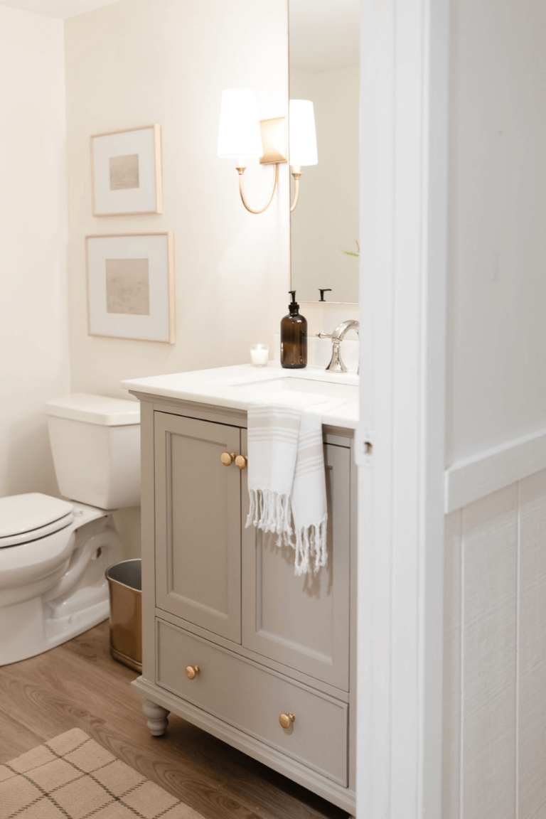
Kitchen and dining room
Dover White works very well for the background, even for slightly lighter elements, and you can safely use it to paint the walls in the kitchen and opt for crispy white cabinets. Nevertheless, designers suggest opting for kitchen cabinets painted in this shade and a splash of lighter shade for the backdrop. The soft undertones of Dover White will make this color bloom in its entire beauty and offer this space a fresh spring scent.
There is no doubt that Dover White will manage to impress you to the fullest when applied in the dining area. This way, a usual breakfast or dinner will transform into a real feast when surrounded by a seemingly neutral color that bears so many notes of flair.
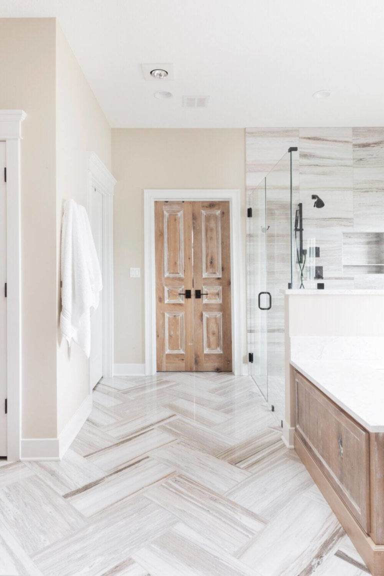
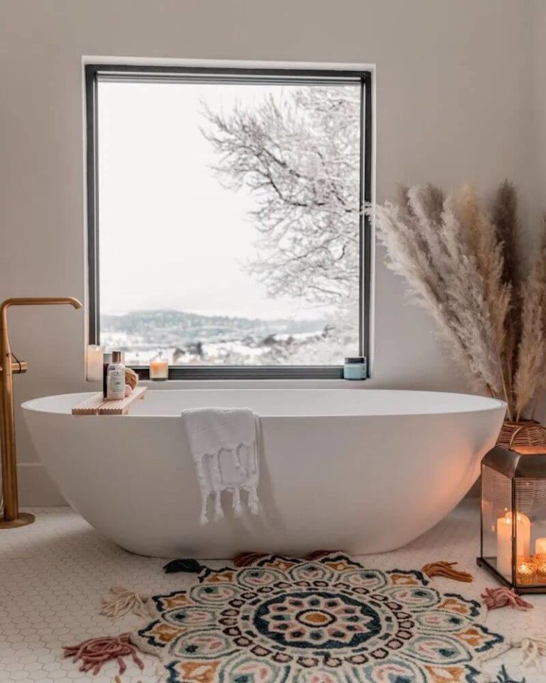
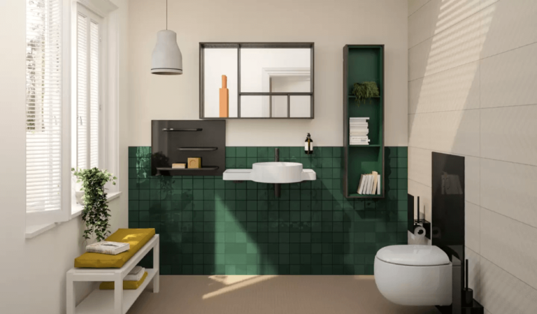
Bathroom
Do you think that such features as comfort and a pleasant sense of harmony are not that common for a space like a bathroom? Well, an appropriate play with colors will always keep you on the safe side. In this case, Dover White only can enrich this room with the earlier mentioned feelings. Apply this color to the bathroom walls, avoid any striking accents, unless these are a few brass units, and dilute the quite monochromatic palette with greenery. A serene state of calmness will instantly penetrate the space. You can also consider a few accent elements to add a bit of vibrance, although comfort will not leave the place at any cost once you apply this soft shade of white within this space.
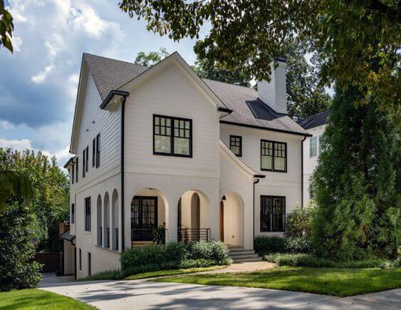
Use of Dover White for house exterior
While crispy white shades may seem too cool for the first impression on your house exterior and a true creamy shade may induce an overly inviting feel, Dover White is a perfect compromise between those two approaches. Sleek enough to preserve a stately look and soft enough to add a welcoming yet balanced feel. The yellowish undertones will simply not allow any fading effect but rather enhance the harmony between the house exterior and nature.
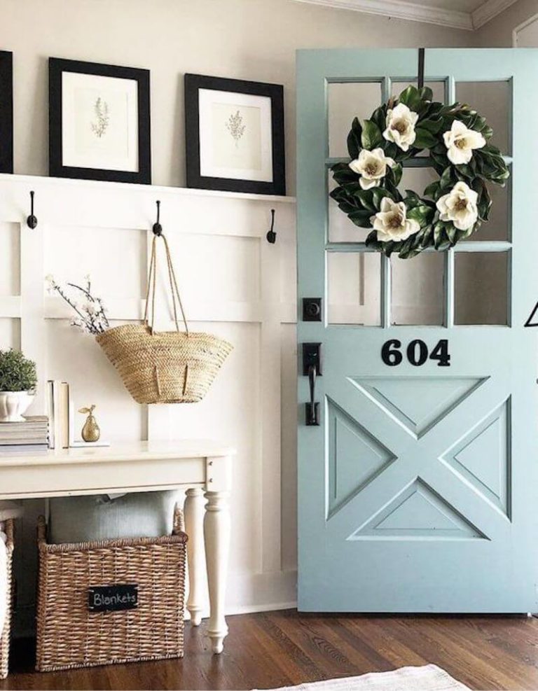
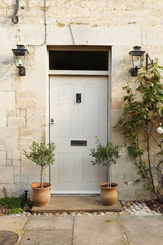
Quite neutral as it is, Dover White works no less perfect for the front door without requiring any particular background. Even a slightly darker or lighter variation of the same shade will serve as a true companion.
The Dover White (SW 6385) paint color from Sherwin-Williams has everything a homeowner could dream of: a touch of neutrality, exquisite flair, limitless softness, an irreplaceable stately feel, impressive versatility, and most of all – harmony, by which we mean harmony among its features, harmony within the interior and exterior, and harmony with oneself as we speak about the homeowner.
