Dragon Fruit SW 6855
Sherwin-WilliamsA fully saturated shade of radiant pink, the boldest in the new collection. A fruit color like this is always welcome in contemporary design.
Dragon Fruit (SW 6855): What Colors Is, Review, and Use
Bold, elegant, and not only for girls – pink is the “it” color of the season, as in previous years. Is it the Barbiecore trend or the need for more expression in color – we don’t know for sure. We know that the gorgeous pink Dragon Fruit from one of the designers’ favorite brands, Sherwin-Williams, will be in the spotlight this year. A great paint color that instantly steals the show on its own yet knows how to behave with other tones, this bright shade of pink is a real find for those who enjoy cheerful and energetic colors. Take a closer look at Dragon Fruit!
Dragon Fruit Paint Color Features
Like its namesake, Dragon Fruit renders the boldest shade of fruity pink, as juicy as the actual fruit color. To start with, you should know that pink was a luxe color in the past. Although it is more accessible now, it still has a standout tone. Even more, the Barbie trend has brought pink to unprecedented levels of popularity. Dragon Fruit from Sherwin-Williams is a fresher, more stately shade than the traditional pinks. It has more depth and personality. Designers have proved that pink is not only a feminine color. This shade, in particular, feels very warm and inviting. It will make a large room feel comfier and add a dash of energy to smaller spaces. There are no limits to using this paint color in interior and exterior design.
Dragon Fruit: Is It Warm or Cold?
Just imagine the dragon fruit pink. Is it cold? Of course, no. This pink hue cannot help but feel warm and welcoming. Its summertime warmth attracts and inspires. Still, we always check the facts. You probably know about the RGB value if you read other paint color reviews. This value shows the mix of red, green, and blue in a paint color. At Dragon Fruit, the red value firmly stands out. And guess what – it is responsible for the warm temperature. Now we know for sure Dragon Fruit is a warm paint color.
Interestingly, next in line is blue, which is responsible for the color’s depth. Yet, the small amount of blue doesn’t affect this paint color’s temperature.
How Does Lighting Affect Dragon Fruit?
No doubt, Dragon Fruit is an impressively bright pink. It stays the same in almost all lighting conditions. Still, exposure matters. Take, for instance, Dragon Fruit in a north-facing room. The cold, bluish natural light will cast a slightly washed-out layer on a pink-painted surface. However, a south-facing room painted in Dragon Fruit pink will show this paint color from the boldest perspective. You’ll see a bright reddish pink due to the natural yellow-orange light. Besides, a similar cherry pink resurfaces under the warm sun rays in the morning in an east-facing space and in the evening in rooms with west-facing windows.
It works similarly with artificial lighting. Expect a warm and saturated pink under warm artificial lighting and a bluish pink as you opt for colder light sources. The more bluish the light, the closer to violet Dragon Fruit feels. The golden mean is to consider neither too warm nor cold artificial light, and Dragon Fruit won’t be too catchy or too bluish.
Dragon Fruit LRV
The higher the Light Reflectance Value, the more light a paint color bounces back out of 100%. With an LRV of 23, Dragon Fruit is a medium tone. Although it reflects a particular amount of light, its pretty saturated character won’t allow a space, especially a small one, to feel well-lit if you use Dragon Fruit on all walls. An accent will do. Still, larger rooms welcome Dragon Fruit to be used as a primary color. All things considered, you better use a color sample before committing to this paint color.
Dragon Fruit Undertones
Two main undertones fight for the prevalence. Blue and red notes of color bounce this shade of pink from one interpretation to another. The warmer the light it receives, the closer to red it will feel. Conversely, cold light brings a bluish undertone. Thus, light temperature and exposure play a paramount role.
Similar Colors
Given the popularity of pink, we thought we would find more similar colors. It’s hard to repeat such a fabulous shade of radiant pink. That’s what makes Dragon Fruit unique. Still, we found a few close alternatives you should check out.
Coordinating Colors
You can use Dragon Fruit in combination with close pinks as part of a monochromatic palette. Those would be lighter or darker pinks. Yet, don’t forget to balance the picture with a perfect neutral. Slightly warm whites and off-whites will do. Try complementary colors from the other side of the color wheel for full contrast. A deep shade of navy blue or a bold aqua green sounds perfect. Stay on the safe side with the following expert matching colors:
Use of Dragon Fruit in Interior Design
If you’re not used to such bright pinks like Dragon Fruit, you’ll find this section helpful. It will reveal some of the best ways to style Dragon Fruit in interior design without risking the home’s aesthetics. The main goal is to enrich your abode with more optimism and joy, diluting the routine. We hope Dragon Fruit will convince you that bold colors are worth your attention this and the following seasons. Read on and get inspired!
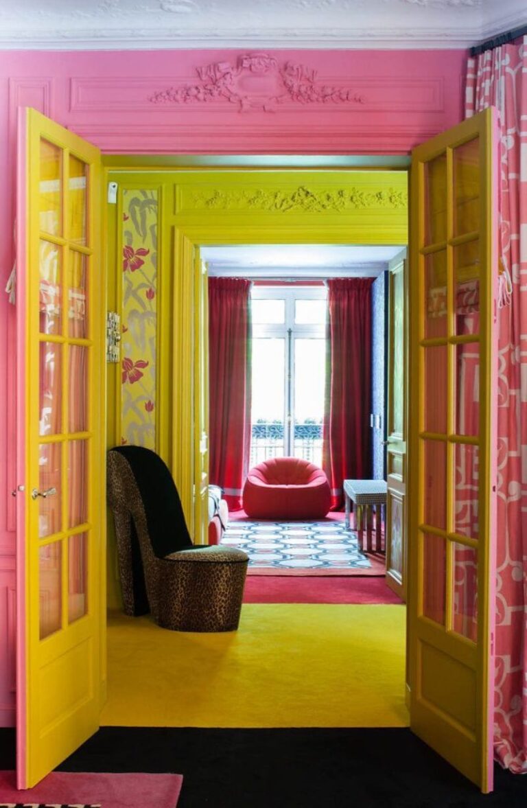
Eclectic Pink
Initially, the Poetry of Purples and Reds collection from Sherwin-Williams, bringing Dragon Fruit to our attention, was meant for maximalist interior design concepts. Slowly, those bold pops of color inspired colorful accents in contemporary design. The choice is yours, yet it would be a shame to speak about Dragon Fruit and avoid the Eclectic style. Leave your comfort zone and choose Dragon Fruit in a personalized redecoration, mixing bold colors, various textures, and, most importantly, different design styles.
An Eclectic interior doesn’t look chaotic and untasteful. On the contrary, interior designers create beautiful and well-balanced interiors that harmoniously pair various elements from contrasting styles that express your personality. Dragon Fruit perfectly suits such a color palette.
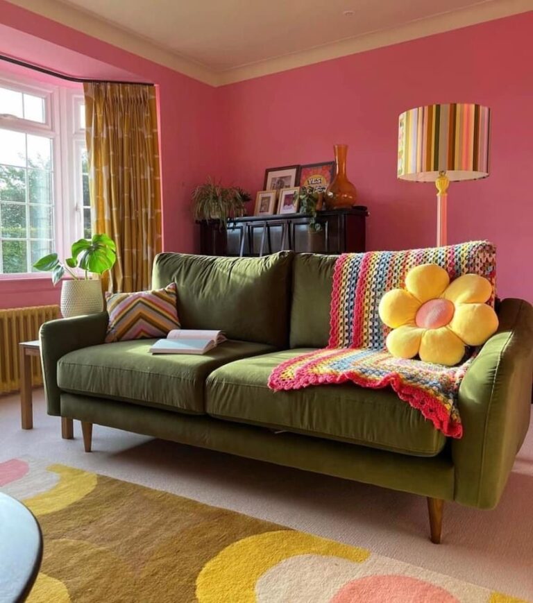
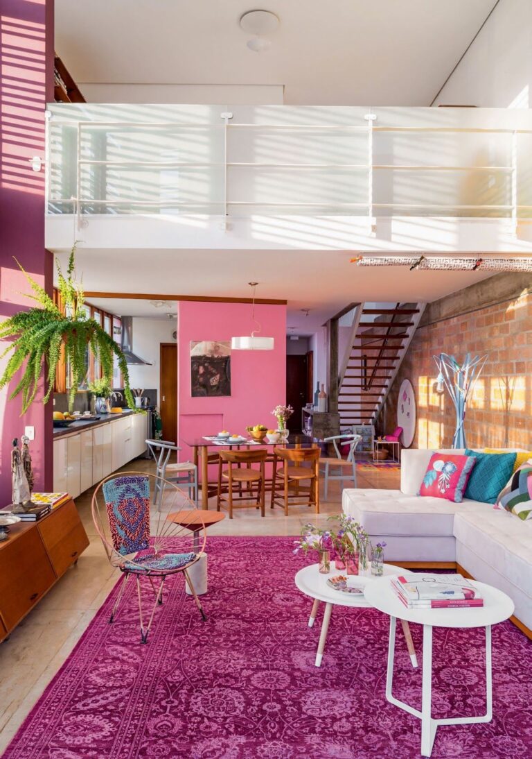
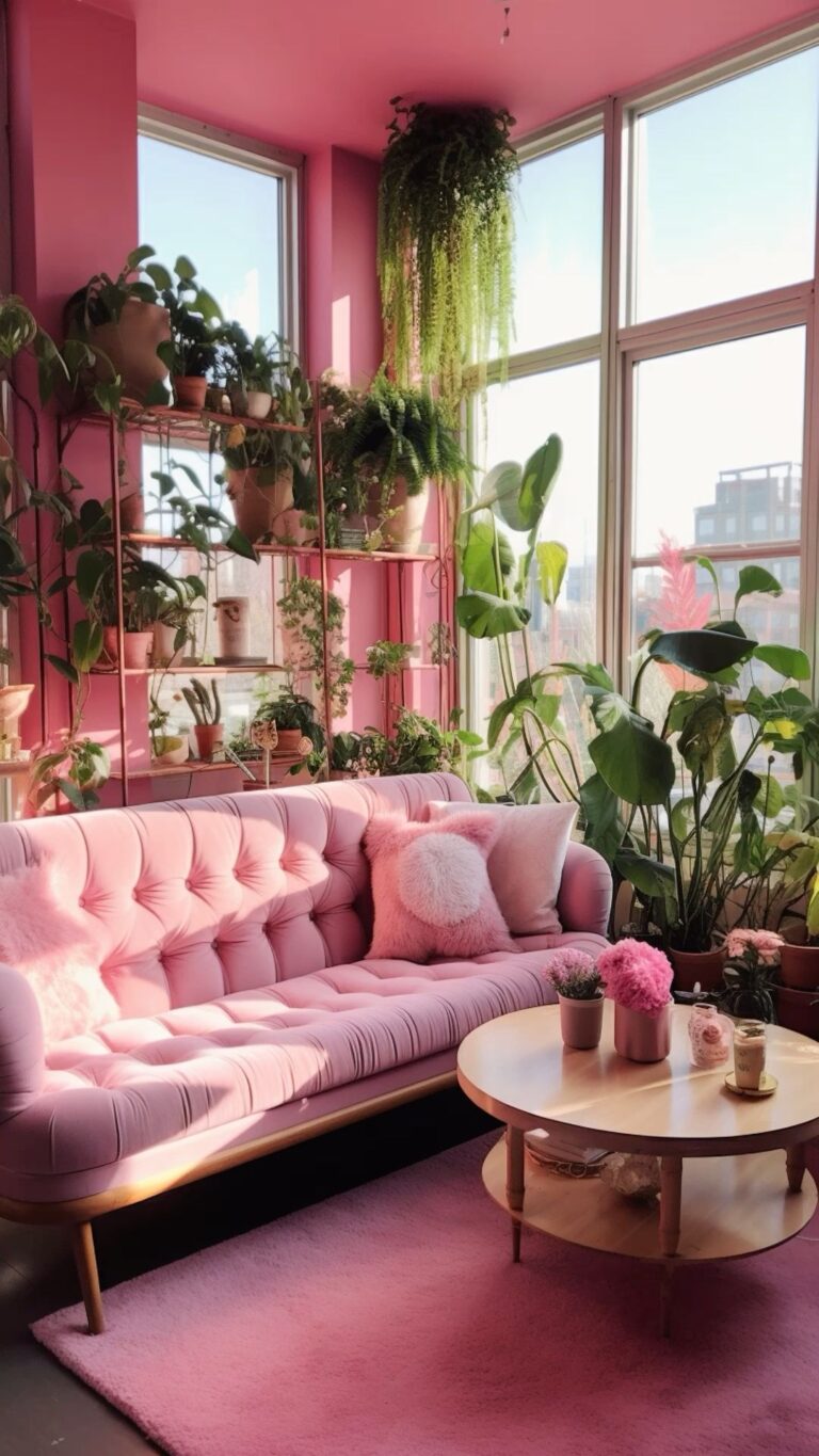
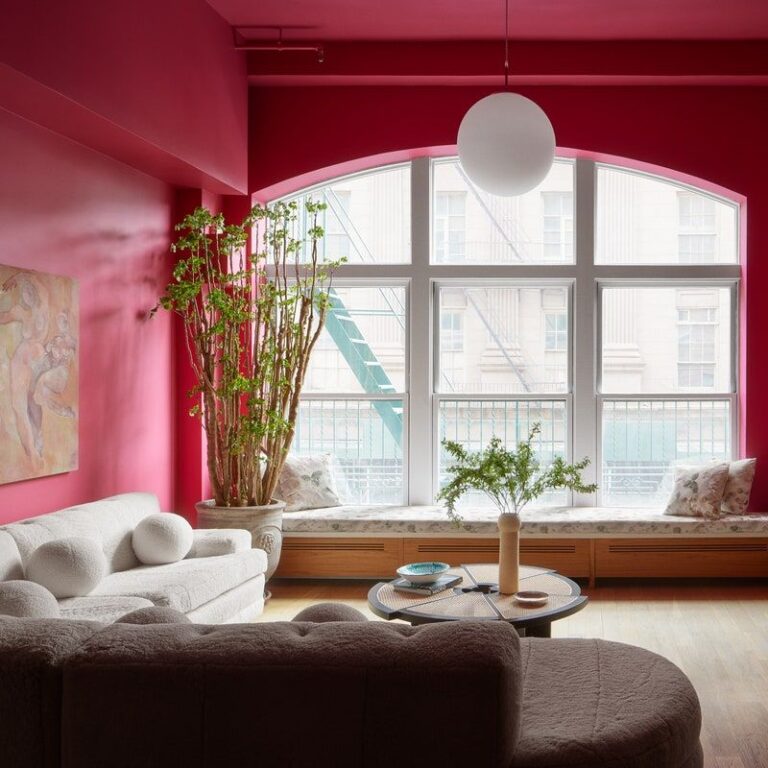
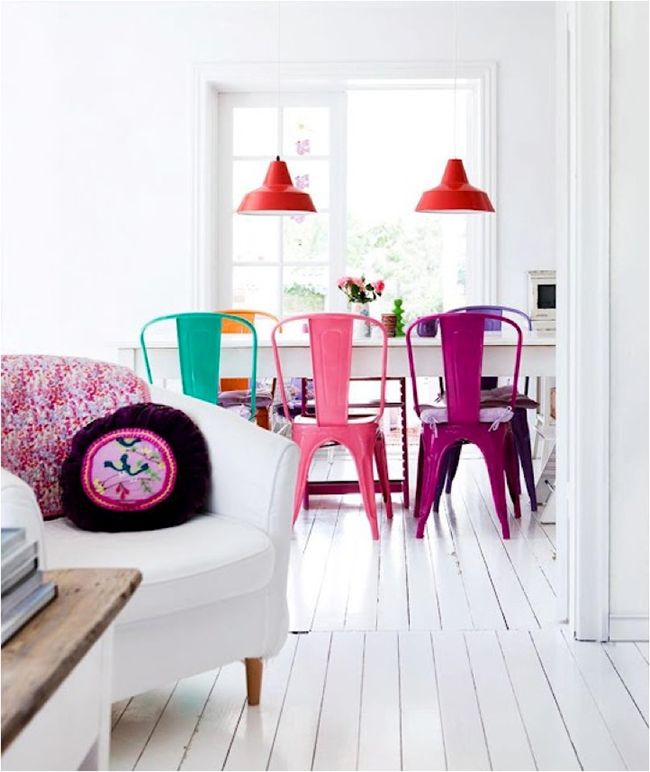
Living Room
If you spend most of your time in the living room or often invite friends over, you’ll love the optimistic effect of Dragon Fruit in your living room. Pink inspires one to take action, start a conversation, and express feelings more easily. If you are ready to take on the challenge, consider all walls painted in this dragon-fruit pink color. Or, go with tiny accents to make a statement, such as a pink coffee table, accent wall, or a pink chair. Experts also recommend decorating pink-painted walls with many indoor plants for a visually appealing accent.
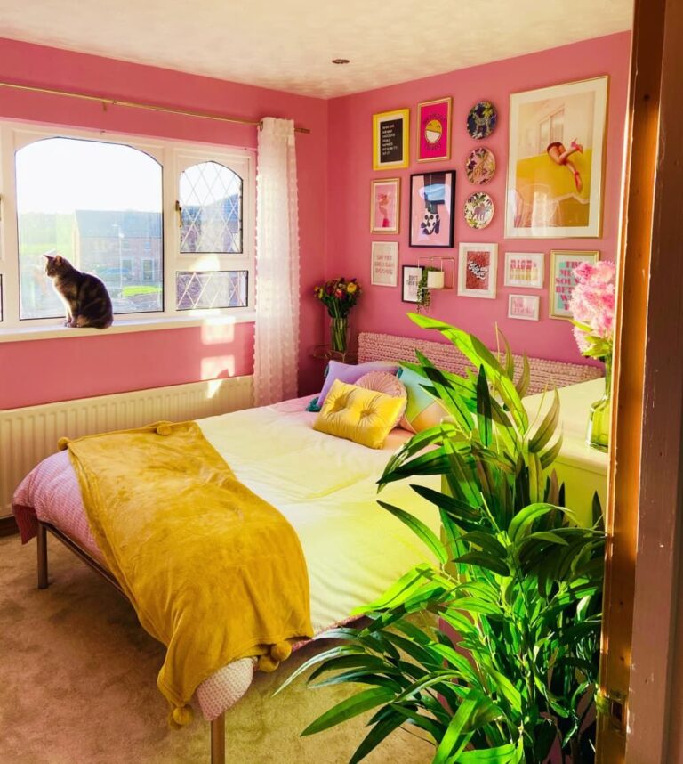
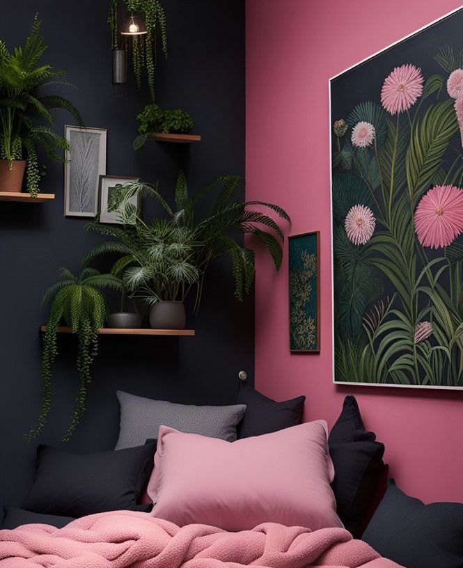
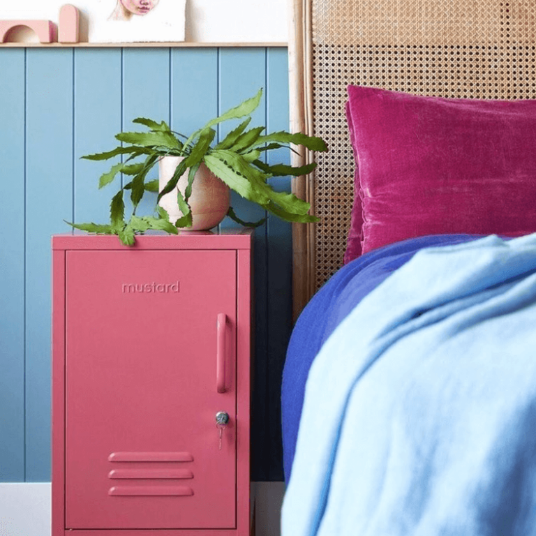
Bedroom
There are two ways to use Dragon Fruit in your bedroom. You either use it as a primary color or add it as an accent pink in an otherwise all-neutral color scheme. For the first, pick a similarly bold matching color for Dragon Fruit, say a solid black, and add a few pots with greenery. You’ll transform your bedroom into an intriguing and sophisticated space with a tropical twist – the mainstream of the season.
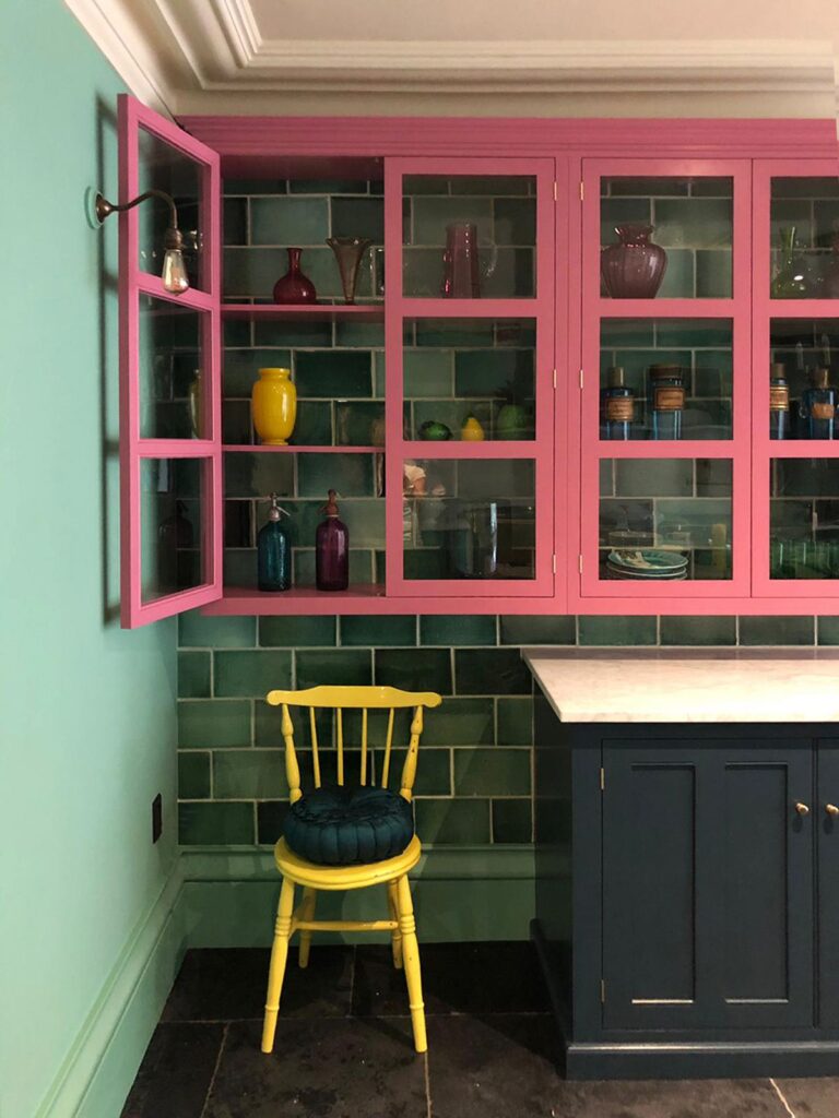
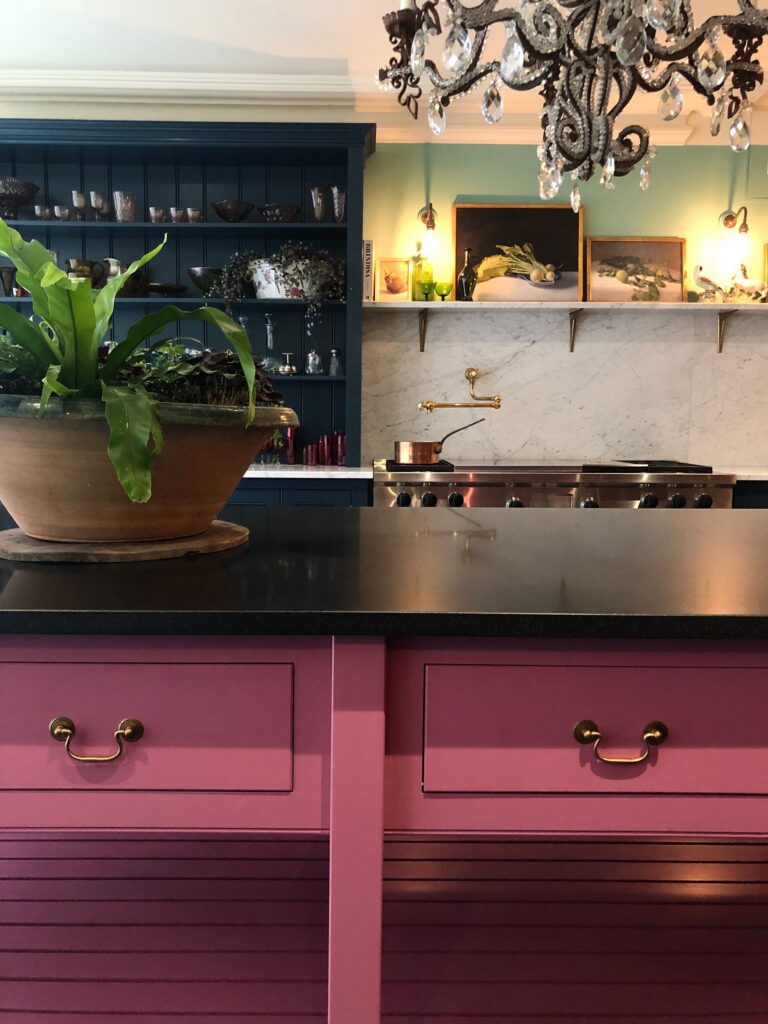
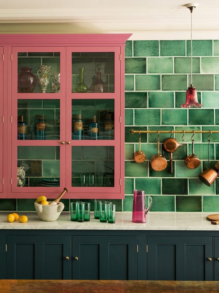
Kitchen
Dilute a deep-colored kitchen with a dash of a pinkish color or uplift an overly neutral cooking space with a trace of pink flavor. Dragon Fruit looks equally tasteful on modern and traditional cabinets paired with dark and light colors. However, an all-pink kitchen accessorized according to the design style sounds no less appropriate in a season dominated by bold colors.
Bathroom
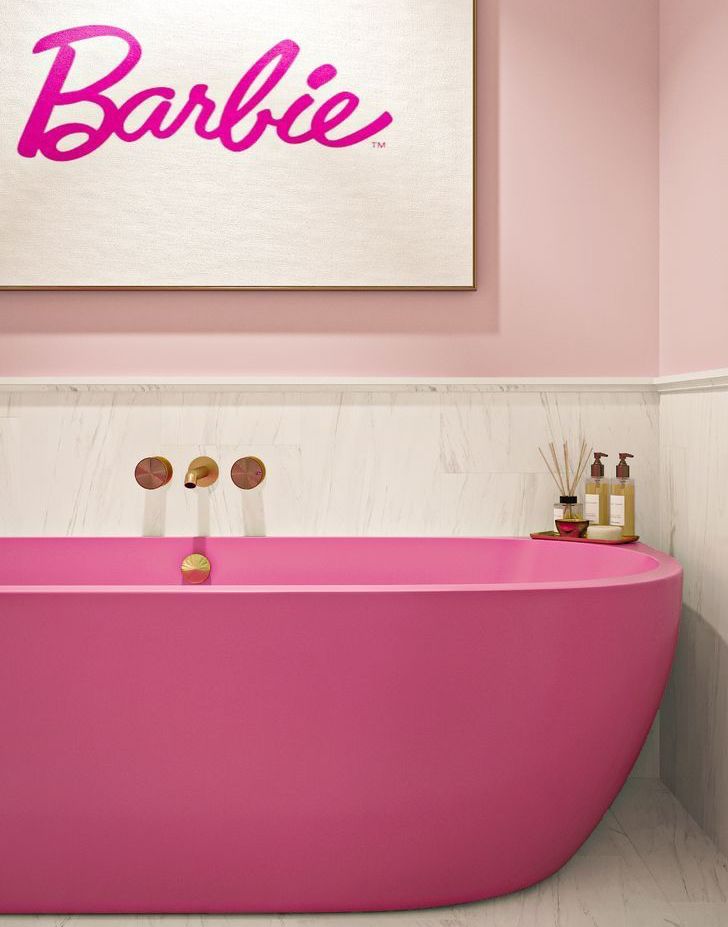
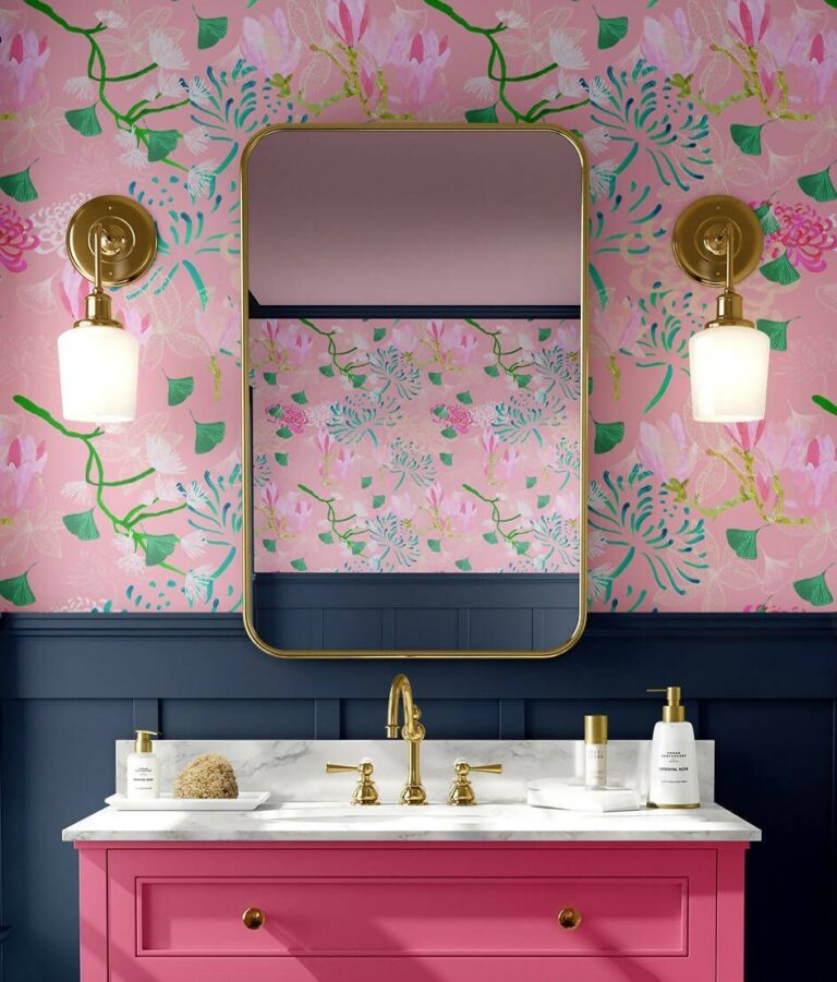
The first idea that comes to mind is a Barbie-inspired bathroom if you’re still in the mood for pink. The most amazing design concept is to opt for a pink-painted tub. However, we can also see Dragon Fruit in traditional bathrooms on vanities, paired with golden hardware and floral wallpaper – all this in combination with a dark, stately paint color like navy blue or black.
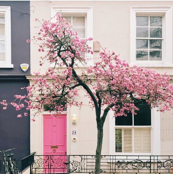
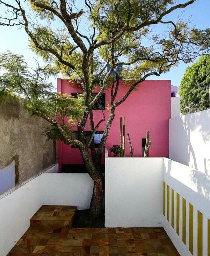
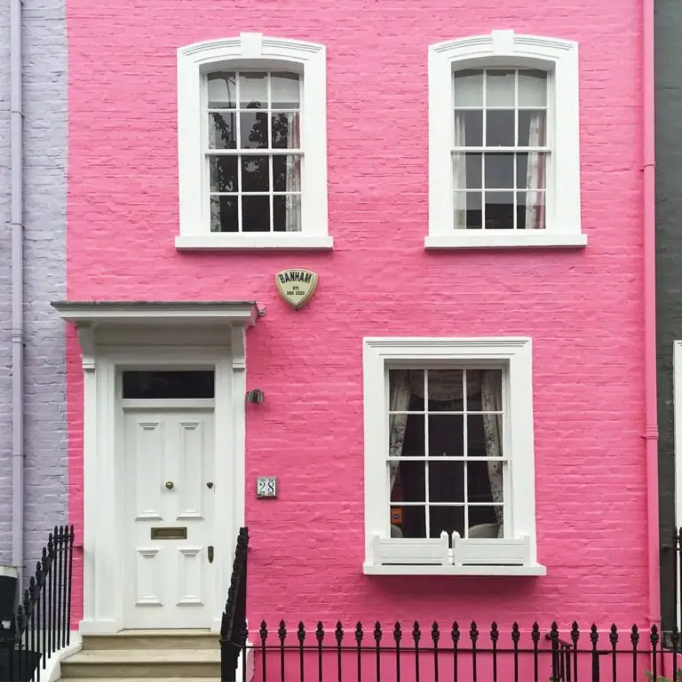
Use of Dragon Fruit for the House Exterior
A few years ago, such a bold color would seem too bright for exterior design. It looks no less different today than any neutral shade, though it draws more attention. If you’re willing to make a statement in your neighborhood, choose Dragon Fruit for the exterior walls, front door, or shutters. Interestingly, you can apply this floral pink to an ultra-modern or traditional brick house, and it will look perfect.
The Dragon Fruit SW 6855 paint color by Sherwin-Williams is one of the boldest and most optimistic shades in the 2024 collection. If you have wanted to decorate your interior or exterior design with a glowing and show-stealing color for a long time, this is your go-to statement pink. And remember, pink has no gender.
