Edgecomb Gray HC-173
Benjamin MooreThe HC-173 paint color pairs gray with beige exceptionally, showing slight creamy notes and staying true to its greige nature without revealing any additional scents.
Edgecomb Gray HC-173 (Benjamin Moore): what color is, review, and use
To your attention – one of the most popular greige shades, one of the best selling paint colors, and simply a lovely mix of freshness and softness – Edgecomb Gray HC-173, also known as Alaskan Skies and Baby Fawn, from Benjamin Moore. The go-to neutral is a perfect shade of greige, a combination of gray and beige, without any undertones. Besides being versatile, it is also part of the Historical Collection, embracing tradition and replicating it beautifully within modern interiors.
Besides its perfection, popularity, and exceptional flexibility, what stands behind this intriguing hue? Well, a whole scientific process stands behind any paint color, particularly in the case of special ones. Let’s go narrower and reveal the essence of this astonishing gray!
Edgecomb Gray paint color features
The HC-173 paint color pairs gray with beige exceptionally, showing slight creamy notes and staying true to its greige nature without revealing any additional scents. It may seem that Edgecomb Gray is actually a gray shade for some. Others may say it is nothing else but a beige paint color. What about us? We rely on facts. It is no secret that lighting fully influences the way a color appears, which is the case here (more on this later). Therefore, both statements are true. One more thing to state: this hue indeed replicates a perfect balance of invigoration and warmth for a personalized interior.
Edgecomb Gray: is it warm or cold?
Edgecomb Gray is considered to be a warm shade. Its slightly creamy base cannot go any other way but soften the space. There is no need to go long distances to prove it. Just compare a sample of HC-173 with a definitely cool gray, such as Light French Gray from Sherwin-Williams, and you will instantly notice what a warm color Edgecomb Gray is. What if we put its sample near a shade known for sure to be warm, such as Shaker Beige from Benjamin Moore? Edgecomb Gray will appear cooler. Still, the fabulous greige from BM is mostly regarded as a warm shade, and nothing can change that.
How does lighting affect Edgecomb Gray?
This paint color appears slightly more grayish when the space receives substantial daylight and more beige when artificial lighting enters the play. Still, exposure plays an essential role here. Edgecomb Gray takes on a slightly coolish appearance in spaces with north-facing windows, although not devoid of softness. At the same time, the southern exposure reveals its warm beige notes to the fullest. What about the east and west-facing rooms? It depends on how the sunlight penetrates the space, with a softer look under the warm sunrise or sunset light and a played-down effect when the shadows prevail.
Edgecomb Gray LRV
With a Light Reflectance Value of almost 63, Edgecomb Gray enters the middle tone group, slightly gravitating towards the light side. To make it clear – 100 stands for true shades of white. What does it say about the light reflection abilities? Well, they are still quite impressive for such an LRV. HC-173 can reflect considerable amounts of light. It is not as true about making the room look exceptionally spacious, which this paint color should give up on for its exquisite creamy base.
Edgecomb Gray undertones
In contrast with other greiges, Edgecomb Gray does not show striking undertones that would change its look. On the contrary, it replicates a beautiful connection between gray and beige that cannot be disturbed, making it a special shade of the kind, adding to its flexibility and adaptability to any style. No wonder we often hear the name of this paint color when tackling interior design subjects.
Similar colors
As unique as this color is, the mix of gray and beige is exceptionally popular. There is no chance we could go without finding at least a few shades that resonate with the essence of Edgecomb Gray, even almost reaching its level of perfection. Luckily, we can refer to other color brands as well, and this is the list of alternatives we came up with:
Coordinating colors
Edgecomb Gray is very versatile, while its neutrality is another reason to combine it with a wide range of colors, from the same neutrals to standout accents. Don’t hesitate to play with warm and cool undertones to achieve rather refreshing or soft interiors. There is something unusual about the way HC-173 collaborates with shades from almost any group, which is a reason to give it a try. Let’s discover the possible coordinating colors that would go great with the friendly gray from BM!
Use of Edgecomb Gray in interior
Considering that Edgecomb Gray is indeed versatile when it comes to which spaces or style it should be better integrated into, you can safely use it as a neutral background for any design approach. Therefore, we would like to draw your attention to how this paint color works within the interior so that you can see for yourself that Edgecomb Gray is one of a kind.
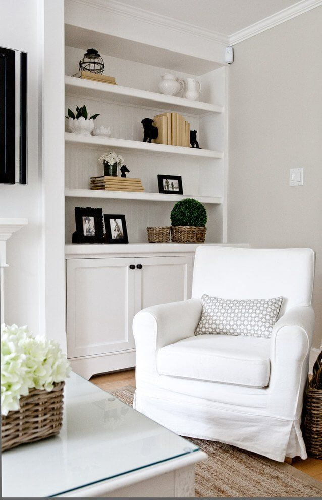
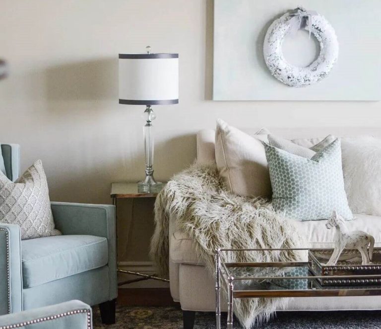
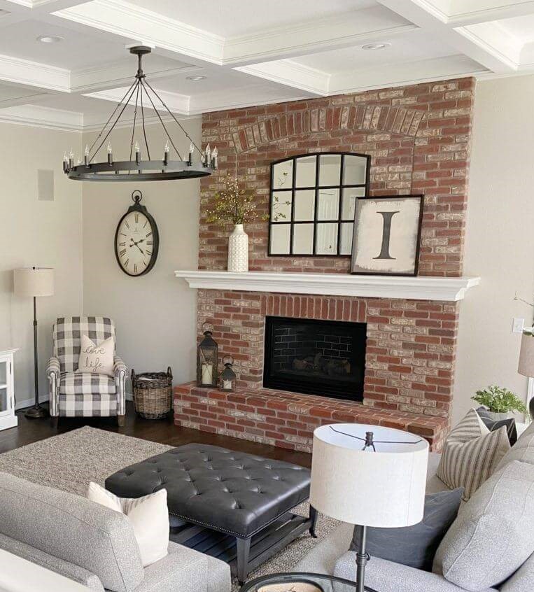
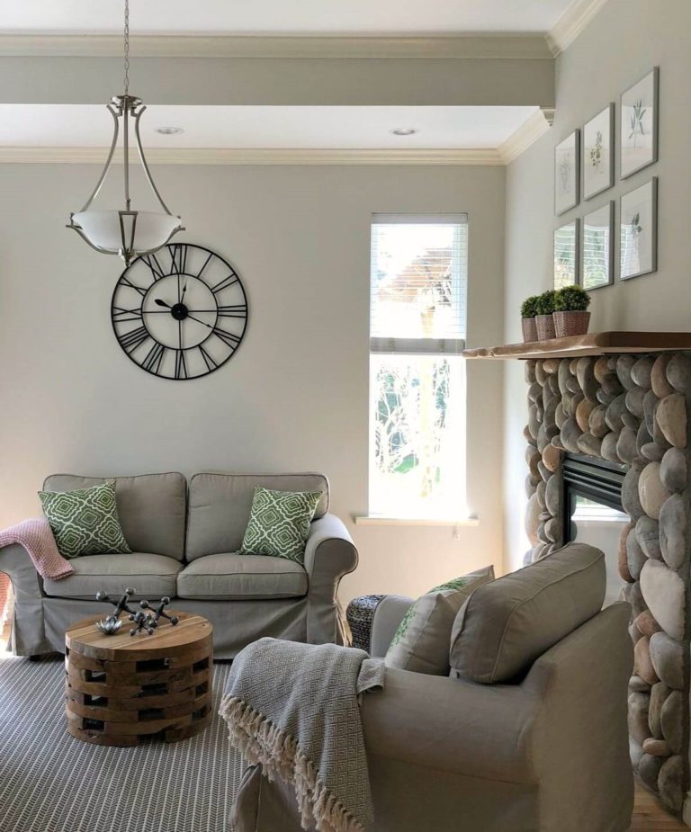
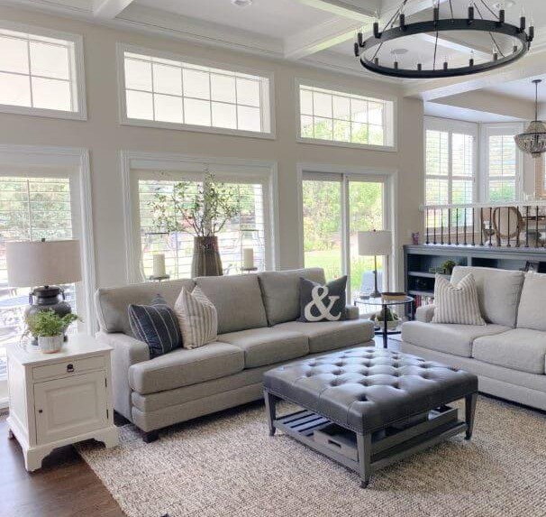
Living room
As the contemporary design rules suggest, stick to a rather monochromatic palette. Let the beautiful greige shade serve as a background and go on with lighter and darker shades that do not seem to be far from the inner beauty of Edgecomb Gray. Soft white and creamy beige for textiles are favorites in this context, while dark wood for the floor and brick elements are no less appropriate choices. This space will radiate softness, comfort, and a welcoming sense, which is undoubtedly what homeowners and designers strive for.
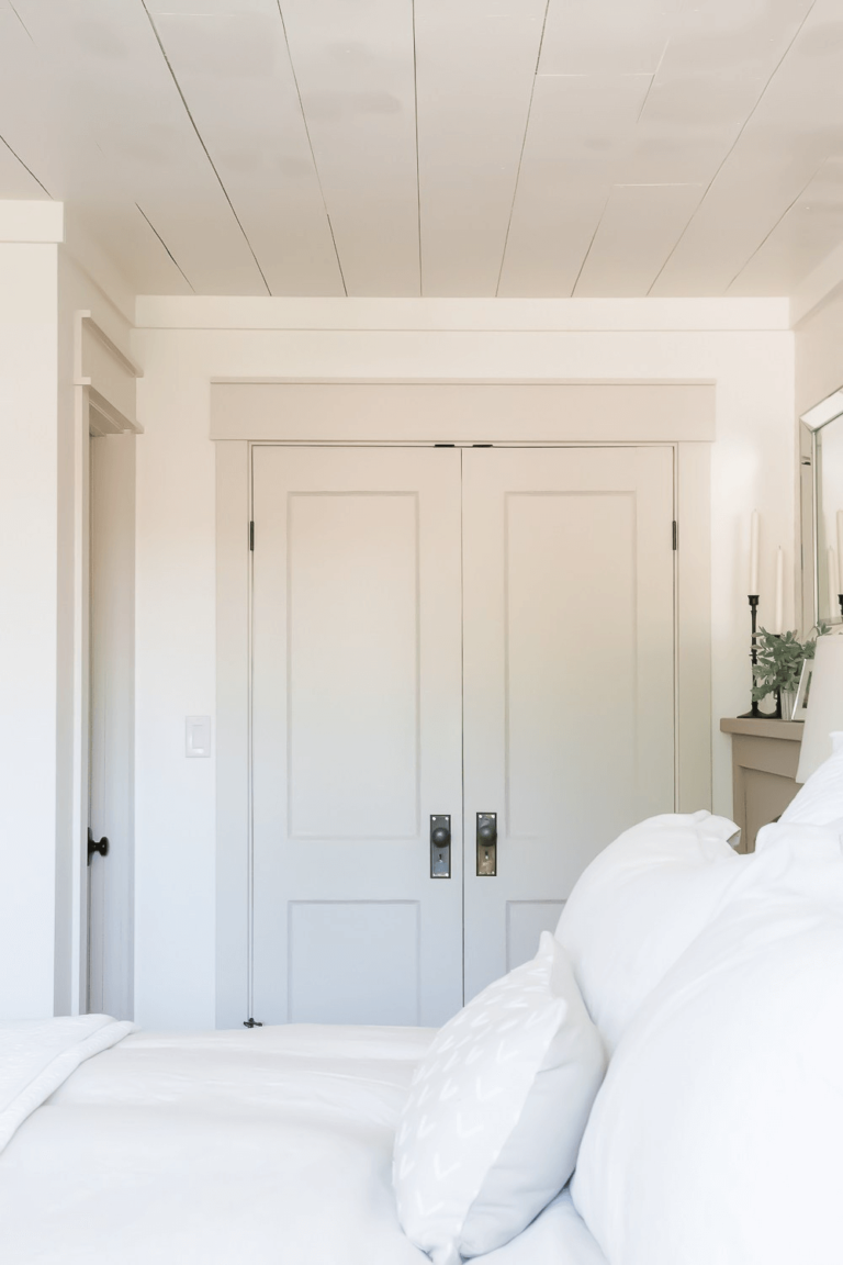
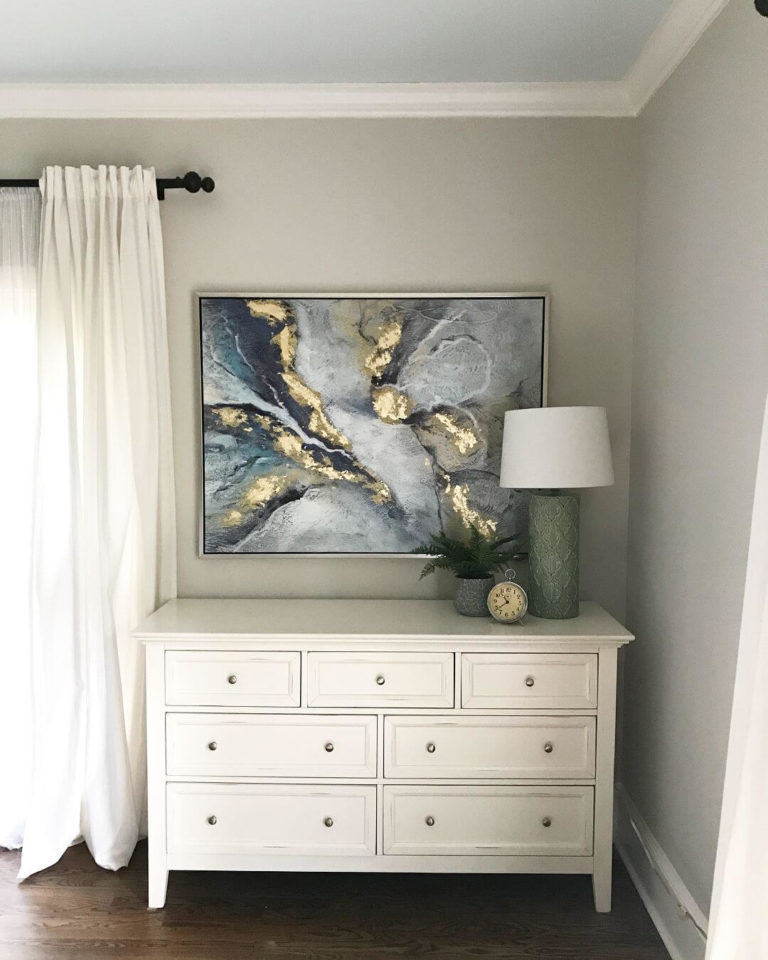
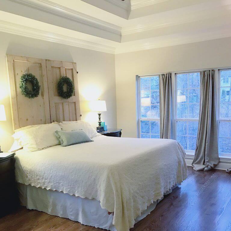
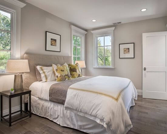
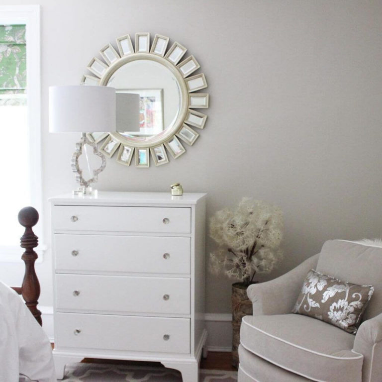
Bedroom
Look at how different appearances this fantastic paint color can take, depending on the lighting. Still, one thing all these looks have in common – they all thrive within a monochromatic interior. Therefore, we suggest you opt for other gray or beige and white variations for textiles, such as curtains and bedding, keeping it simple and comfortable and letting the softness reveal itself to the fullest. If it seems too soft for you, it would usually not; dilute the palette with an abstract painting on the wall. It has already been proven that falling asleep and waking up surrounded by such a splash of softness is an exquisite pleasure.
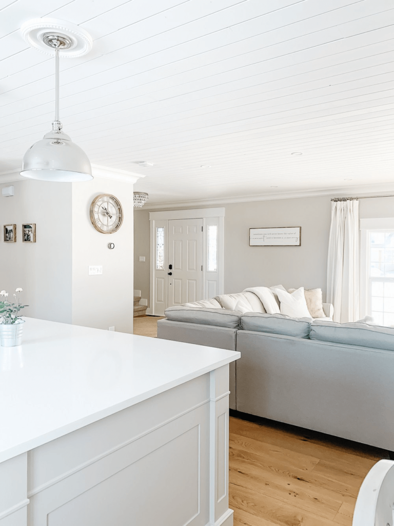
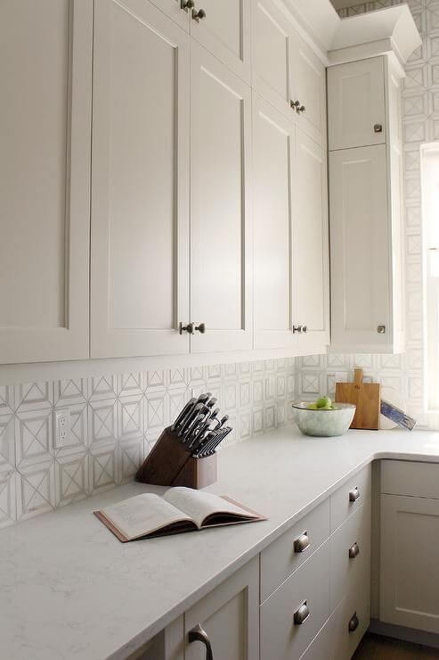
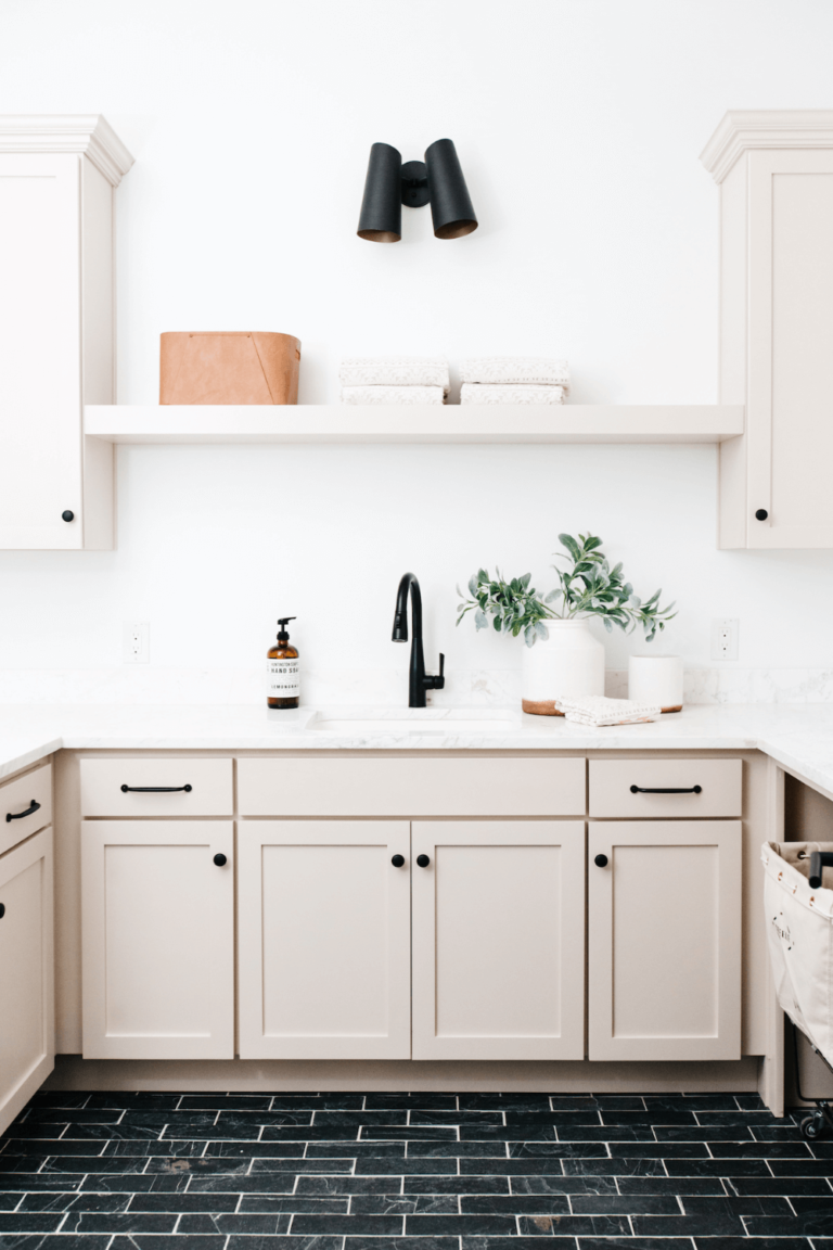
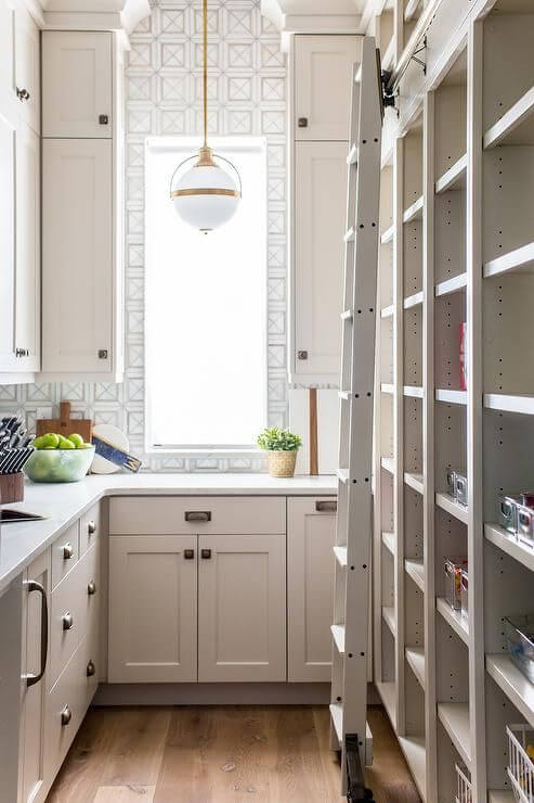
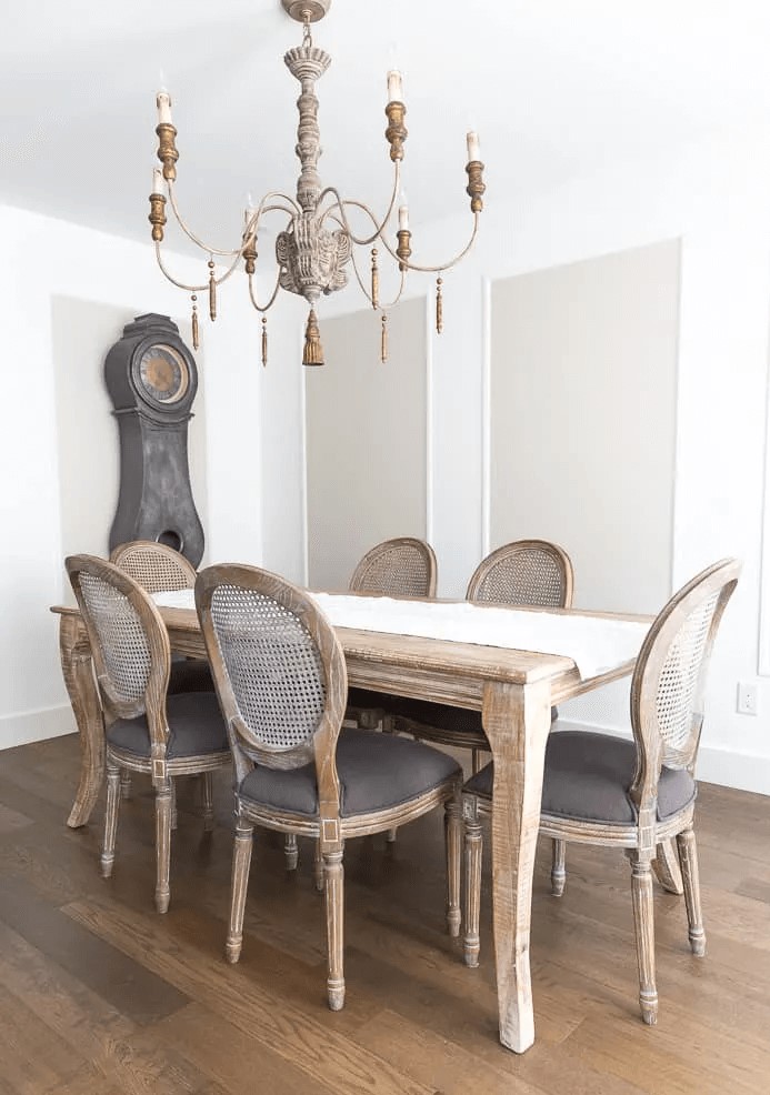
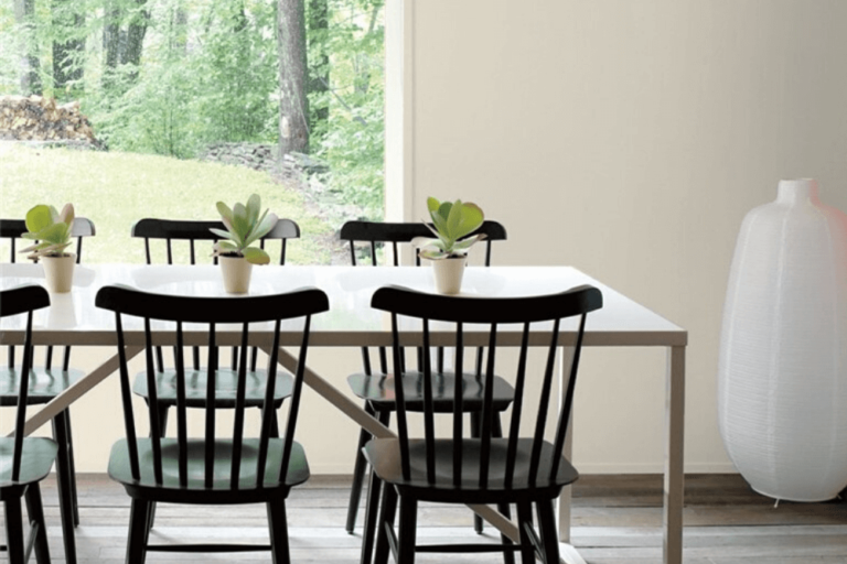
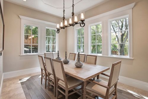
Kitchen and dining room
If you are searching for the perfect neutral for your kitchen cabinets, stop at Edgecomb Gray, which will add any features a homeowner would want – freshness, exquisite delicacy, style, functionality, and no less comfort. Luckily, this paint color works for traditional interiors with exceptional brass elements and modern ones combined with black accents. As for the dining area, a rather Rustic, Vintage, or Farmhouse approach seems better with neutral wood texture and exquisite pieces of decor.
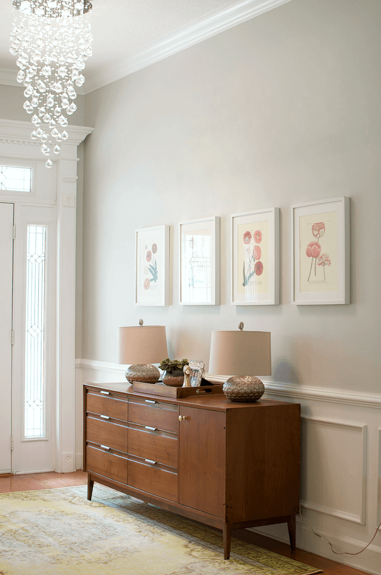
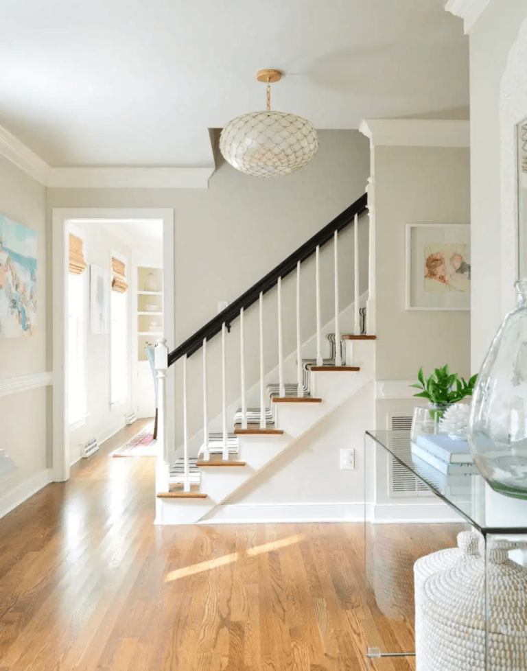
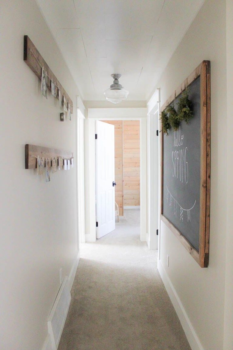
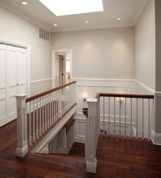
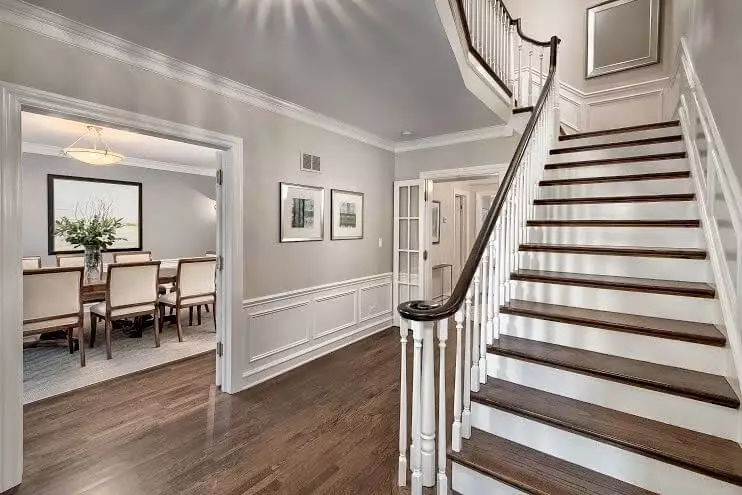
Hallway
HC-173 is the classic paint color you didn’t know you needed in the hallway that sets the entire mood for the rest of the house. Perfect when paired with wood of any kind, Edgecomb Gray reveals its defining features to the fullest and fills the space with such a welcoming sense that you simply don’t want to leave the house, all due to its feel of familiarity and eye-pleasing appearance.
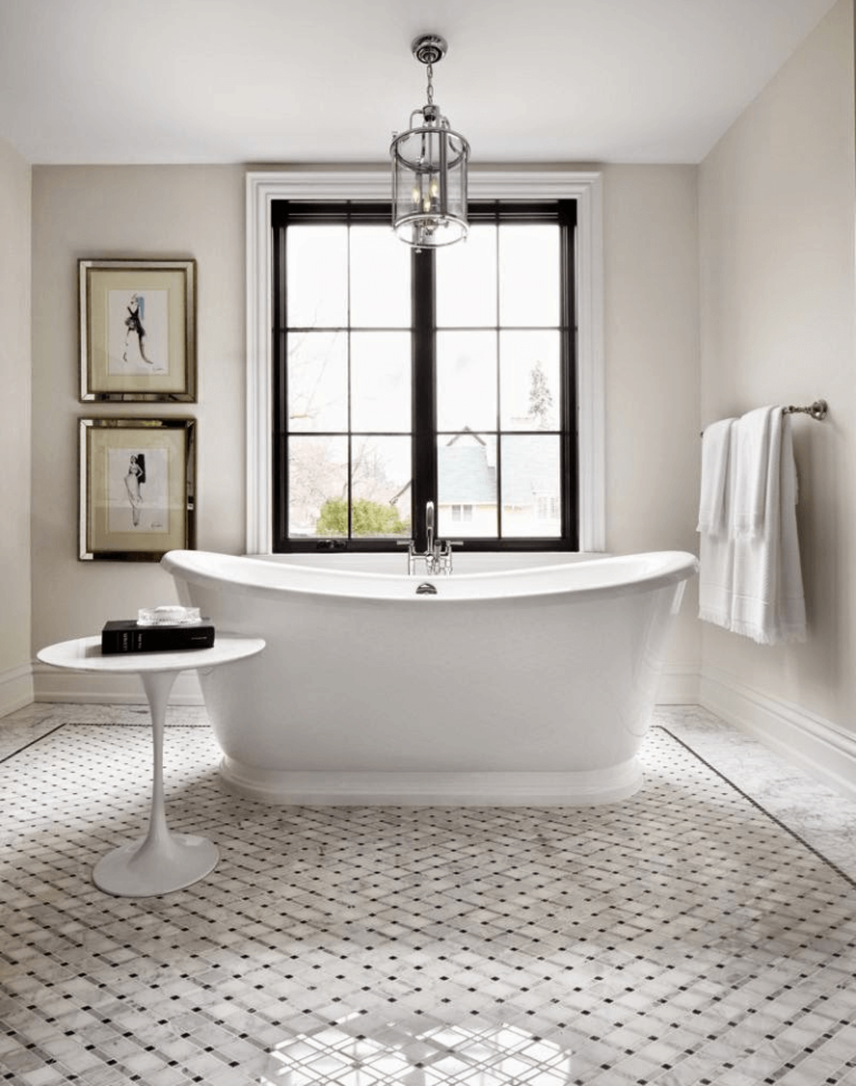
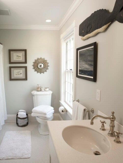
Bathroom
This standout splash of comfort and softness cannot be integrated any better than within a traditional interior. Limit yourself to a slightly monochromatic palette and let the creamy notes of Edgecomb Gray penetrate the space at their finest. A large bathtub seems like the perfect centerpiece, while a few accents replicating other styles are just the right complement, such as a stylish Art Deco mirror.
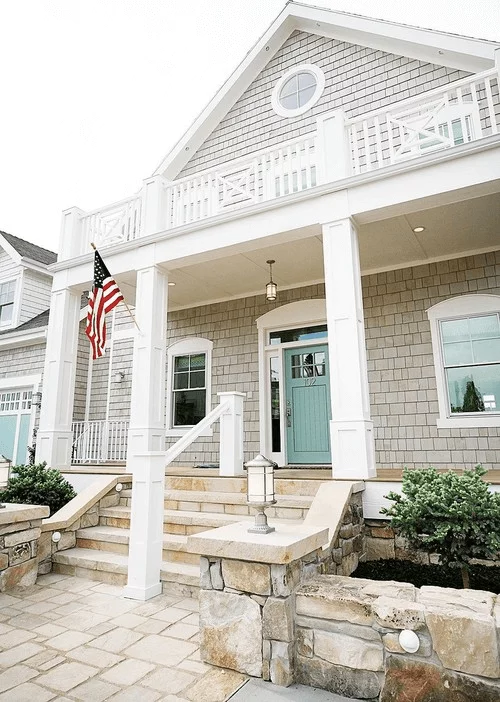
Use of Edgecomb Gray for house exterior
Edgecomb Gray is the perfect alternative to light or gray shades, with a much lighter appearance when applied to the exterior. Depending on the weather, it may seem more gray or beige. Still, one thing is known for sure – your house will acquire a timeless look that will make the pacers-by wonder which paint color you used. Elevate the exterior with white trim; even some black accents can be added, and enjoy the result.
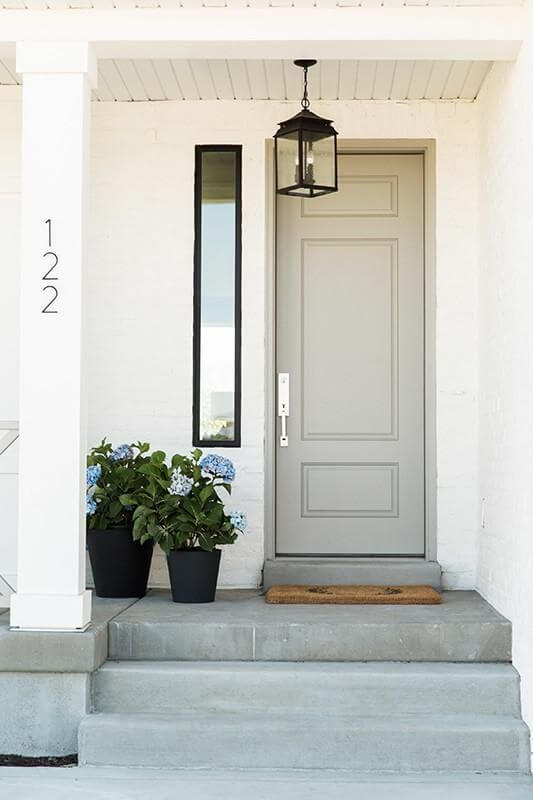
With such a perfect mix of gray and beige notes, HC-173 cannot simply go any other way but ideally work for the front door, particularly on a crisp white background so that the greige shade can reveal its inviting feature.
The Edgecomb Gray HC-173 paint color from Benjamin Moore is the no-fail option for any style and preference. There is no need to look any further for a perfect neutral since this one has everything and even more – an authentic feel of invigoration and calmness.
