Fawn Brindle SW 7640
Sherwin-WilliamsThe good old greige from SW with deep notes that may reveal a slight green hint is the perfect more intense alternative to the modern neutral paint colors.
Fawn Brindle (SW 7640): what color is, review, and use
Are you tired of the light grays that seem to look common? Undoubtedly, there are various representatives that astonish with their sense of beauty. Still, it feels like the contemporary interiors and exteriors require paint colors with more body and intensity alongside the need for comfort. This is when more intense gray shades come to the rescue, and despite the fact that we speak about the latest trends, today’s paint color is far from being new – the good old shade of medium-to-dark gray with calming warm notes and a slight hint of green from Sherwin-Williams is here again to impress you. To your attention: Fawn Brindle SW 7640. What makes this paint color hold a leading position among neutrals? Stay with us, and you will surely find out!
Fawn Brindle paint color features
Once you look at the sample, you see a medium-to-dark gray variation with a slight warm hint. The moment you apply it to a surface, this paint color appears greige, revealing a beautiful mix of gray and beige. That’s not all! The combination of intense gray with the warm beige notes leads to a subtle green appearance. Some would even say a few brown scents offer an impressive earthy base to this shade. The color itself can safely be called neutral and used accordingly, although such a rather dark shade would benefit from a great amount of light.
Fawn Brindle: is it warm or cold?
One does not have to think a lot before answering the question. Fawn Brindle is a 100% warm paint color. You can try and use it in rooms with cool northern exposure, and it will still preserve its warm base, even if slightly hidden. The same earthy notes that can be seen from a particular angle cannot go any other way but add to the warm sense of comfort.
How does lighting affect Fawn Brindle?
This is what we like about Fawn Brindle. It tries to stay true to its nature even under the influence of lighting, but we all know that lighting is the one that plays the last violin. For a start, let’s refer to rooms with northern exposure. In such conditions, the intense neutral looks right like on the sample, maybe reading a bit more gray, still preserving the warm notes. Just imagine the effect of southern exposure on this paint color! It reveals the whole range of warm notes to the fullest, but most importantly, without seeming too beige. One should note that the same goes for the exterior. As we said, this shade manages to preserve its sense of beauty regardless of external conditions.
Fawn Brindle LRV
We would not say we were surprised to find out that such an intense hue has an LRV of 36. We hope we did not confuse you. Light Reflectance Value determines to which category a paint color belongs. Is it dark, light, medium, or somewhere between two of the mentioned extremities? Considering that 0 stands for true black variations, 36 is surely about a shade that gravitates between the dark and medium sides. As for the ability to reflect light, it is not that advanced at Fawn Brindle. We would even say it rather absorbs than bounces the light back. Thus, we confidently advise you to use Fawn Brindle combined with an appropriate amount of light.
Fawn Brindle undertones
It seems that we have already covered this aspect. The intense gray base is penetrated by warm notes that may look like beige or brown, while the combination itself reads slightly green under the effect of light or particular neighboring colors. The more intense the paint color, the more expected the result is. Still, different conditions bring different effects.
Similar colors
It should not surprise you either that Fawn Brindle has lots of similar shades at SW and other paint manufacturers. Gray is too popular to have only a few representatives for each variation. Instead of generally speaking in this sense, let’s get to specific examples and prove our statement!
Coordinating colors
Let’s start with the trim! If you are looking for a perfect trim white to pair with this shade, avoid overly warm variations, although slightly warm shades are welcome. The best decision you can make is to opt for relatively neutral shades of white. Fawn Brindle is pretty deep, and its rich range of undertones opens a sea of partnering possibilities. Impressively, this intense gray likes to pair with even darker greiges or medium grays with blue or green undertones. That’s what a perfect mix of shades with Fawn Brindle as the leading one would look like. Still, you can pair it with other paint colors, ensuring they don’t suppress the depth of SW 7640. Let’s go through a few recommended representatives!
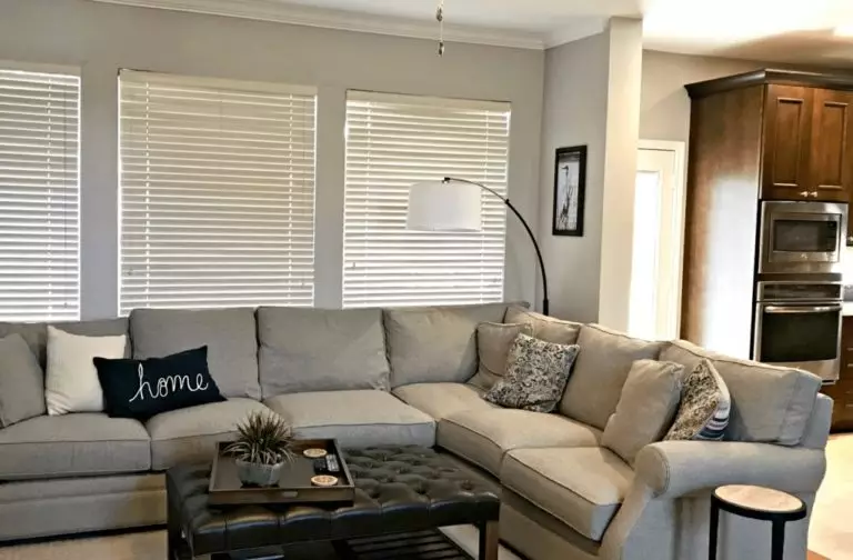
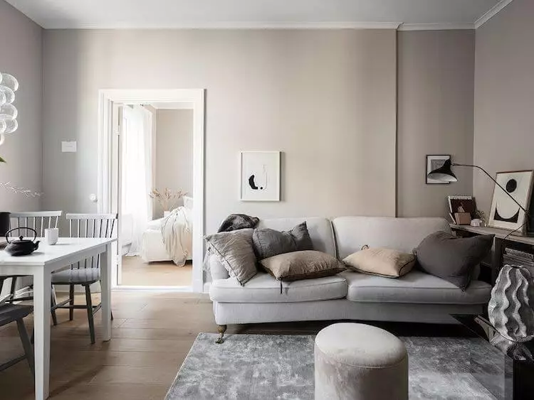
Use of Fawn Brindle in interior
You have to be careful with this paint color since a slight change in lighting conditions can lead to a rather draining result. Make sure that your room is bright enough, and go safely with any design approach, considering Fawn Brindle as a background or accent color. The thing is that the intense gray from SW is neutral and agrees with almost any collaboration. Furthermore, the warm notes bring the desired warm effect, while the almost unnoticeable green scent that flows through its veins adds an irreplaceable sense of individuality. How does it really work in the interior? Let’s take a look!
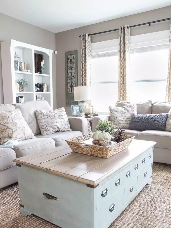
Bring intensity to Farmhouse
All neutrals that show an impressive number of warm notes are welcome in Farmhouse interiors. Particularly gray shades that can be successfully integrated into monochromatic and contrasting approaches, where the deep Fawn Brindle is among the first to consider. The irreplaceable wood in its natural texture, comfy textiles, and appealing decor units that induce coziness are the mandatory elements you should consider. As for Fawn Brindle, opt for walls painted this way or choose this shade for the trim or cabinetry on a light background.
Add depth to Scandi
The intense gray shades are a perfect match for the Scandi interiors, impressively replicating the cool Nordic weather. Make the most of this approach by adding a gray paint color that adds individuality through its astonishing pairing between gray and beige, which also brings comfort to the slightly simplified modern perspective on the Scandinavian style. Still, keep it sleek by combining the warm gray paint color with white and dark wood to preserve the contemporary look.
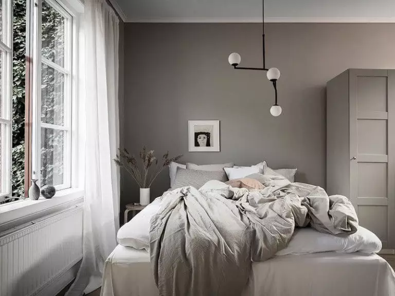
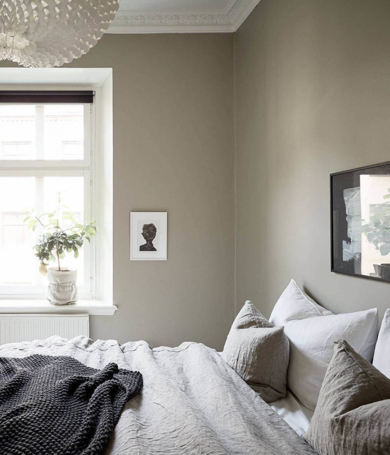
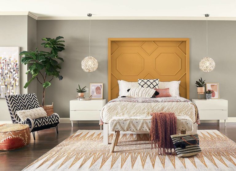
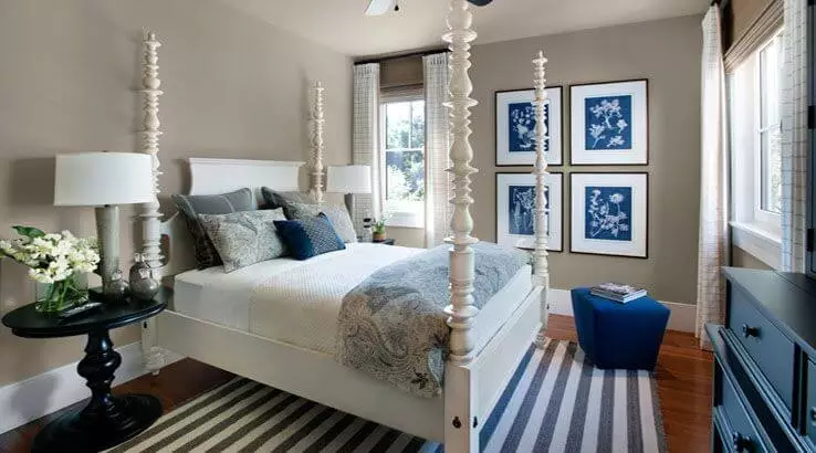
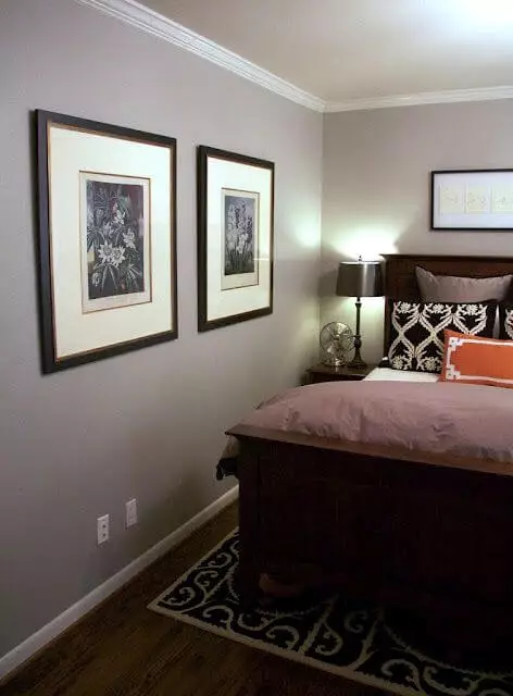
Bedroom
Do you know what is best about this paint color? Despite its intensified gray notes, which underline the personality of your bedroom, the warm gray serves as a perfect neutral to display your boldest design ideas. Whether you pick two or five colors, if you combine them appropriately, you can safely reveal your creativity on the friendly background that Fawn Brindle is happy to offer.
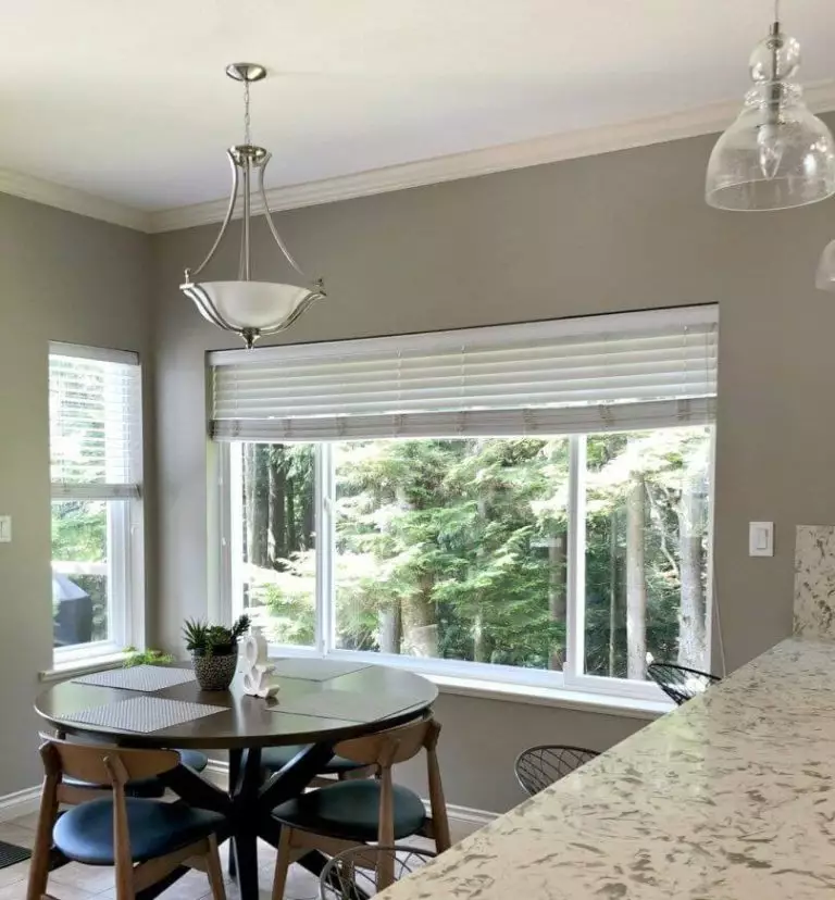
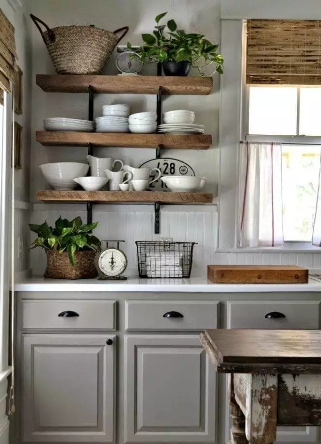
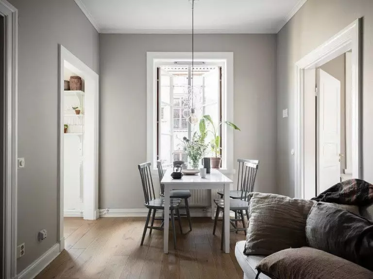
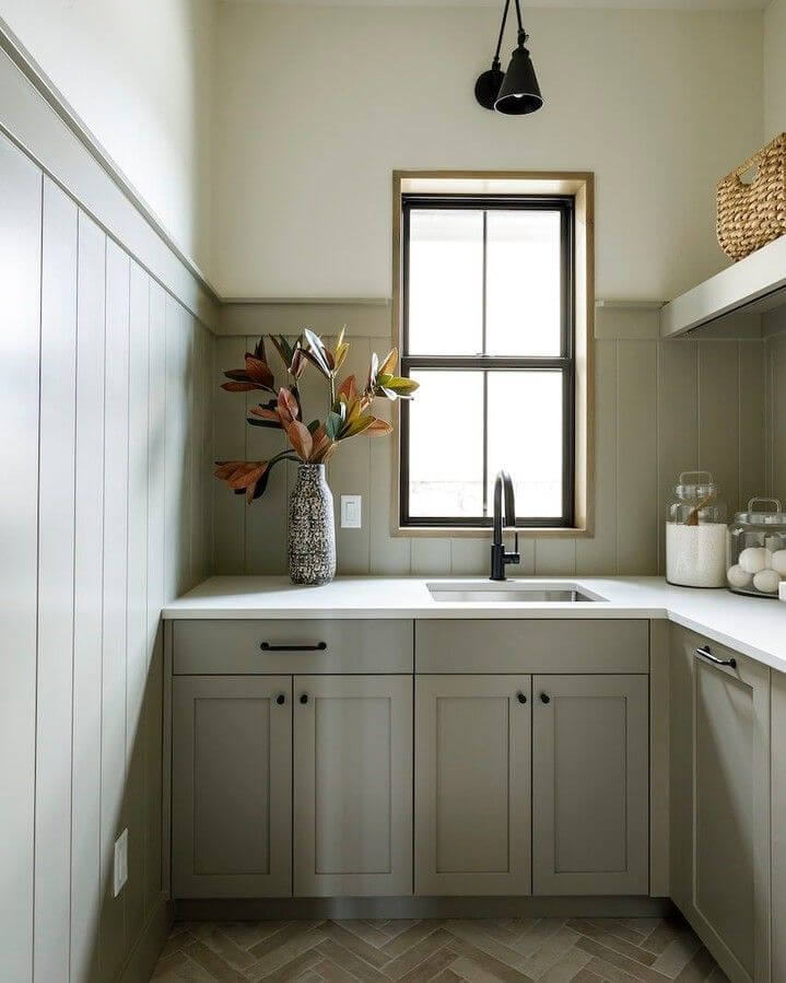
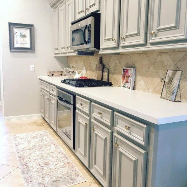
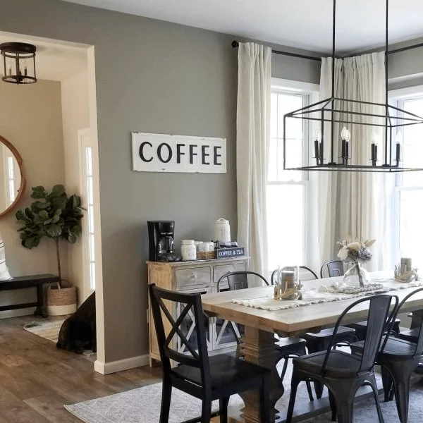
Kitchen and dining room
This is the space where Fawn Brindle looks better as an accent than a background, meaning that you should consider it for the cabinetry. Considering that this warm gray is a perfect addition to Farmhouse interiors, don’t hesitate to paint this way both the cabinets and shiplap if it is the case. Complete the result with brass or black hardware, depending on what you want to emphasize: the gray base or the beige notes.
The same traditional approach goes for the dining area with Fawn Brindle for the walls and a mix of black and wood for the furniture. Don’t forget the decor units that define this style that would perfectly stand out on this neutral backdrop.
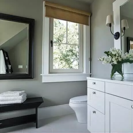
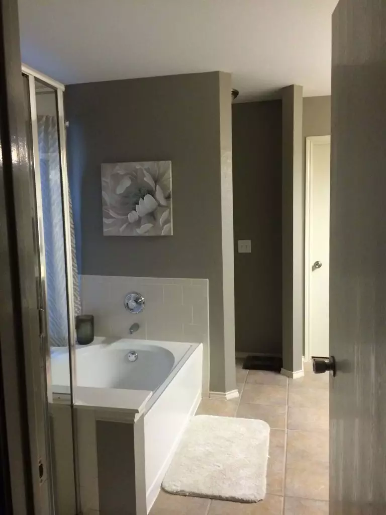
Bathroom
Just look at how different this color may appear under different lighting conditions. Bathrooms are usually not that lit, and it is quite risky to go with this paint color without an appropriate amount of light. You can either use it for the walls and add as many artificial light sources as possible if natural light does not penetrate the space enough or go with warm gray cabinetry on a light background.

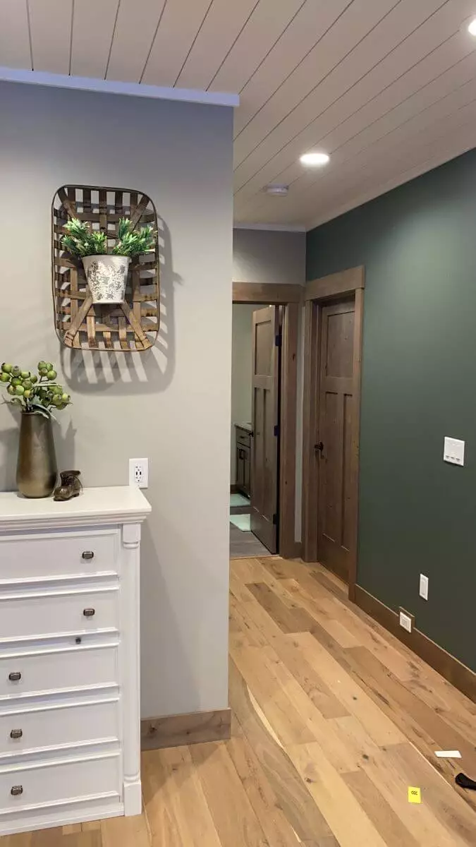
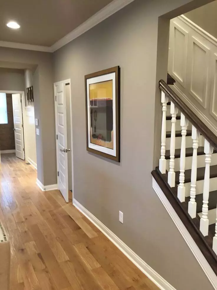
Hallway
It would be wrong to speak about such a welcoming color and skip the room that introduces your interior. Go without any doubt for the beautiful mix of deep greige notes in your hallway. Rest assured that multiple light sources will ensure the intense paint color does not overload the space. White and wood are the first companions you should refer to unless you already have a design idea in your mind.
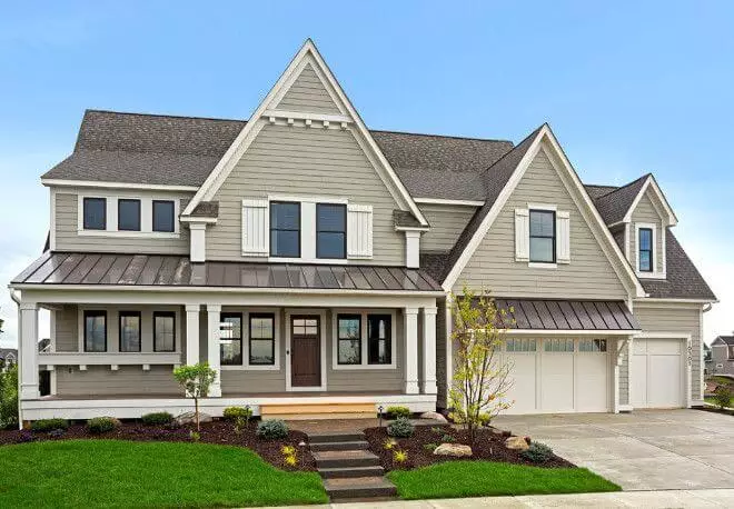
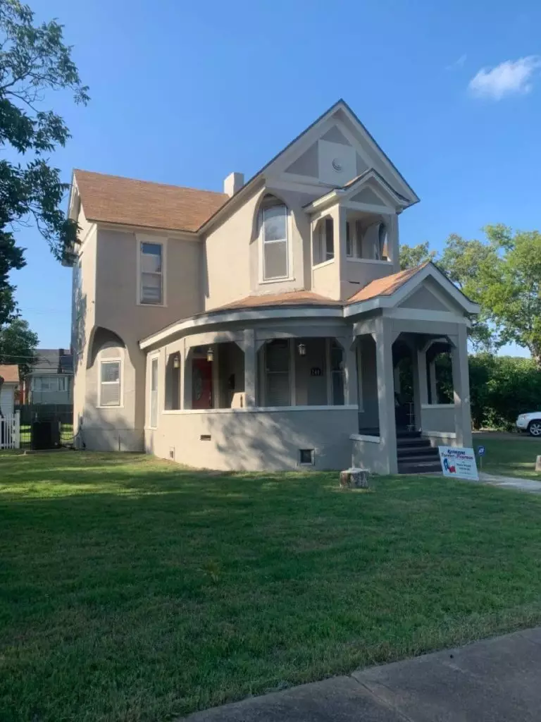
Use of Fawn Brindle for house exterior
Fawn Brindle is a favorite when it comes to the house exterior. The magic happens when this paint color interacts with natural light at different times of the day. Just take a look at the pictures, and you will get it. One should note that exposure plays an essential role in this sense. Still, SW 7640 is, first of all, a neutral and, secondly, a warm one, which makes a perfect exterior paint color that goes with everything and offers the desired welcoming effect. Don’t hesitate to paint the front door in this shade if you are looking for a deeper variation of greige.

The fawn Brindle SW 7640 paint color from Sherwin-Williams is a timeless shade of greige you cannot go wrong with in terms of style and comfort, which behaves equally successfully for the interior and exterior.
