Fleur de Sel SW 7666
Sherwin-WilliamsAn expert-pick white with the slightest green note that nods to the coastal lifestyle. This refreshing and calming neutral is a breath of fresh air for your home.
Fleur de Sel (SW 7666): What Color Is, Review, and Use
Despite the relevance and rising popularity of bright paint colors, one of the giant paint companies, Sherwin-Williams, included in its 2024 Colormix Forecast a selection of delicate tints – neutral shades meant for a minimalist statement. That’s an unexpected turn in the contemporary design world that celebrates Maximalism. Bold tones may be the trendiest, yet nobody canceled time-tested neutrals that will always be in trend. An expert pick, one of the finest whites, a Living Well collection representative, and one of the most endeared neutrals – Fleur de Sel is a pearl in the world of neutral paint colors. Find out why!
Fleur de Sel Paint Color Features
Although some see it as a gray tone, Fleur de Sel is off-white with the finest green undertone. Like its namesake, this paint color reveals the delicate crystal white similar to the thin crust of salt forming on the seawater surface. Fleur de Sel renders a solid coastal vibe due to its cool green notes. This fresh and discreet white hue is a real find for interior designers and homeowners who want a unique neutral that isn’t too dark or light. Fleur de Sel is the perfect balance between harmony and calmness. It is a flawless neutral with natural features that nod to the outdoors.
Fleur de Sel: Is It Warm or Cold?
There is a thin line between warm and cold in this unusual white tone. It all depends on lighting conditions. However, we would call it a balanced paint color. The RGB value may bring some clarity. In the mix of red, green, and blue used to create this paint color, we can notice that red and green stand out with a more or less equal amount, while blue slightly goes behind. The green undertone explains the large amount of green in its RGB. Since red stands for warmth – blue for coolness, and the values don’t differ much, Fleur de Sel is neither a warm nor cold shade, yet particular lighting can make it lean toward one side or another.
How Does Lighting Affect Fleur de Sel?
The most interesting phenomenon happens when different lighting hits this chameleon paint color. When the cold natural light floods a north-facing room, Fleur de Sel feels considerably cooler, resurfacing a subtle note of blue. The color seems less saturated. However, in a south-exposed space, this off-white turns into a soft and warm neutral whose green undertones almost radiate a note of yellow. The color seems bright and inviting. This happens especially when sun rays interact directly with a painted surface.
At night, when you can play with the artificial lighting temperature, you can create a warmer or cooler effect. Still, this off-white will feel heavier under the lack of natural light. The green undertones won’t go anywhere. Additionally, be aware of the surroundings. If your windows face the lawn or you have indoor plants, Fleur de Sel will reflect the green color in addition to its already present green undertone.
Fleur de Sel LRV
A neutral with a Light Reflectance Value higher than 80 can be safely called white. The ones with a lower LRV are off-whites, generally speaking. The higher the LRV, the more light the paint color reflects. Fleur de Sel bounces around 72% of the light it receives. It is truly proficient at making a space feel well-lit and large. That’s why designers love using it in small rooms. However, a spacious room painted the same feels no less stylish. Fleur de Sel knows how to add interest.
Fleur de Sel Undertones
Nothing new on the horizon. Fleur de Sel is a well-balanced white that harmoniously pairs freshness and serenity due to its green undertones. This sea-green note is surprisingly subtle, giving this color a soft character. You may also notice a light yellow-beige trace in south-facing rooms, all due to the warm natural light.
Similar Colors
Be sure that tens of white shades compete for the title of similar color to Fleur de Sel. We gathered the best. Use one of the following expert-choice substitutes if you need an exact match or a lighter or darker option.
Coordinating Colors
Looking for the best matching colors for this trendy white tone wasn’t hard. Interior designers have been using it for a long time. Here are the top choices of paint colors to pair with Fleur de Sel:
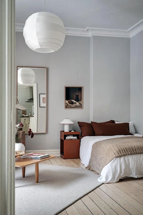
Use of Fleur de Sel in Interior Design
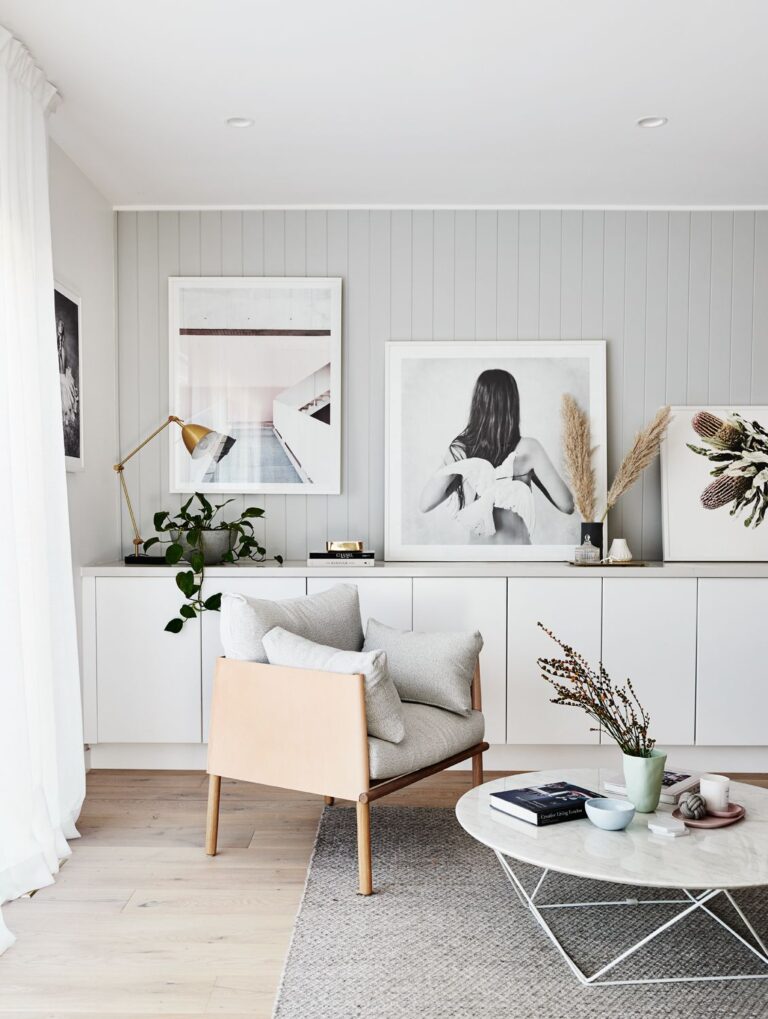
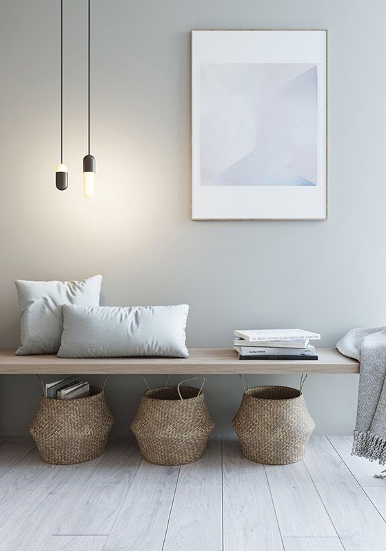
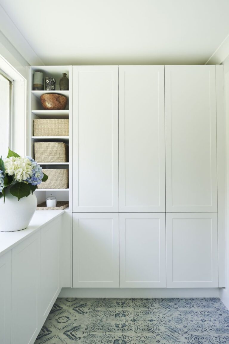
Most designers and decorators agree that this sea-salt white is the best option for a coastal interior. Still, this fresh and salty neutral can bring a coastal vibe to any other design style by using its cool and calm features. Of course, this paint color primarily works for walls, yet you can try it on the bathroom vanity or kitchen cabinets as well. Since Fleur de Sel is a trendy paint color, you can style it in many ways in your home. That’s why we gathered the best design options for this mainstream off-white. Read on!
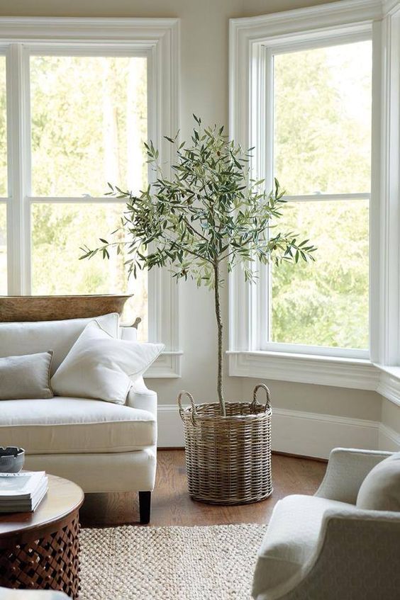
Modern Coastal
Today, the Coastal style is no longer about beach-themed decor. On the contrary, make it seamlessly part of your interior. With Fleur de Sel, you’ll bring the coastal vibe effortlessly. Use it on walls primarily. In addition, think of wood or rattan furniture combined with jute rugs and sisal decor. Deep blue accents, indoor plants, and an overall bright and airy color palette will lead to a modern coastal design.
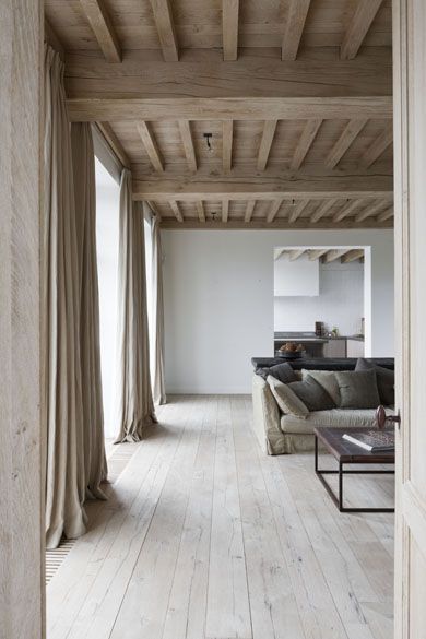
Modern Minimalism
In a world of rising maximalism, stay true to your taste and stick to Minimalism if that’s your favorite design style. However, bring a drop of nature and coastal beauty by replacing traditional neutrals with this green-biased one. You’ll enjoy the harmonious bond between Fleur de Sel and wooden furniture contrasted by indoor greenery. Like a breath of fresh air, your living room, bedroom, or kitchen will experience a surprisingly charming update.
Rustic Off-White
We all know that green and brown go hand in hand. Since modern rustic interiors require neutrals as well, Fleur de Sel will perfectly suit an updated rustic design. The green undertone in this coastal white will seamlessly connect with natural, raw textures found in Rustic. You’ll love the calm and authentic palette of a restrained countryside concept complemented by a green-pigmented white. You can also try it on walls in an urban, rustic-style interior with sleek and decluttered surfaces.
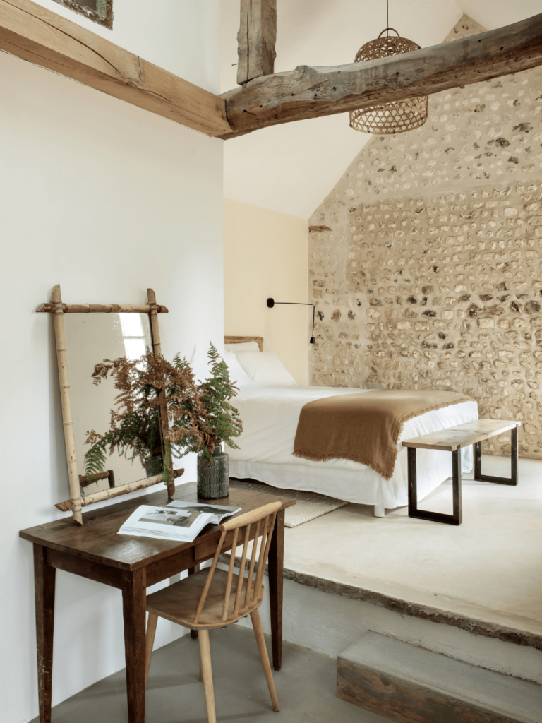
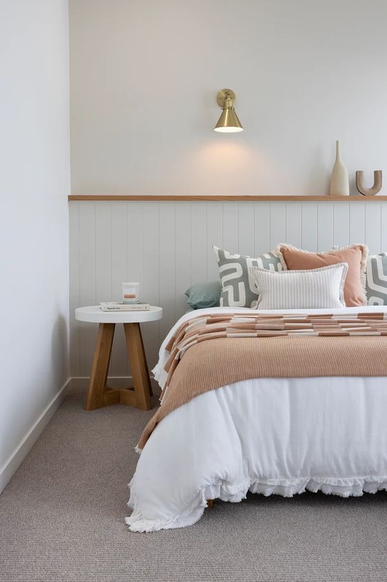
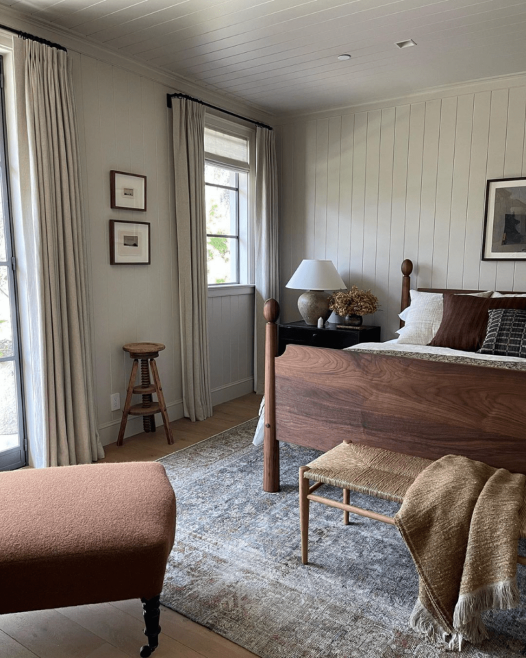
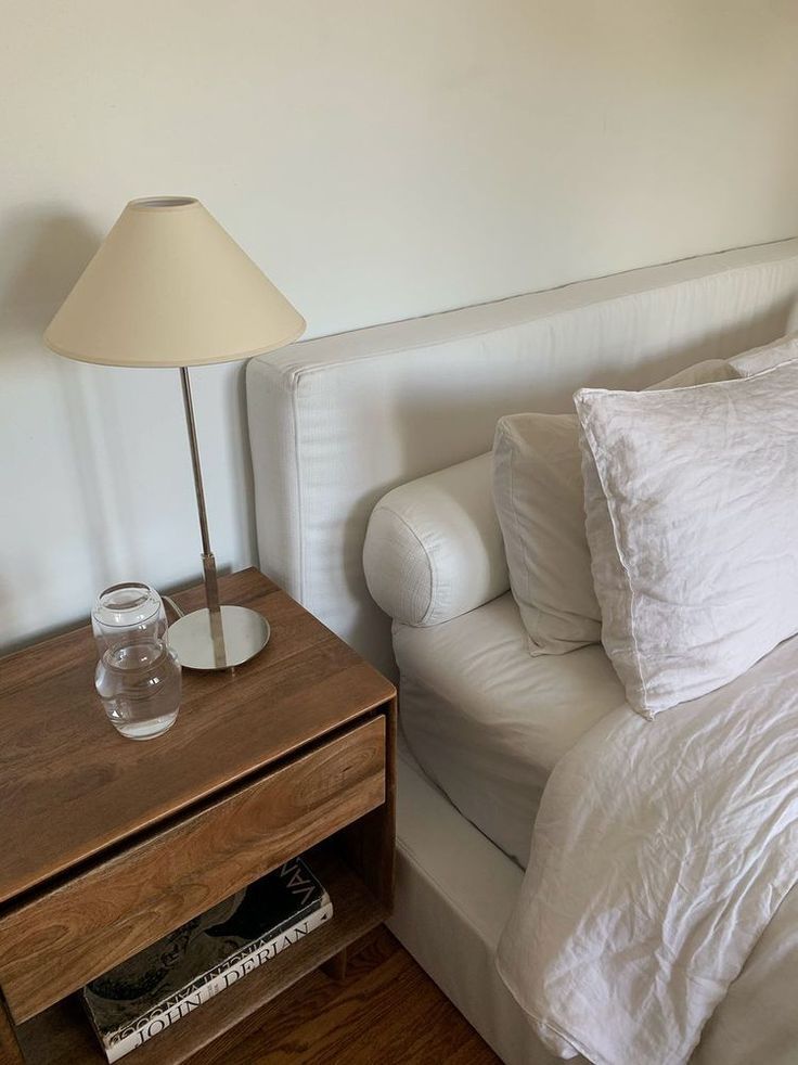
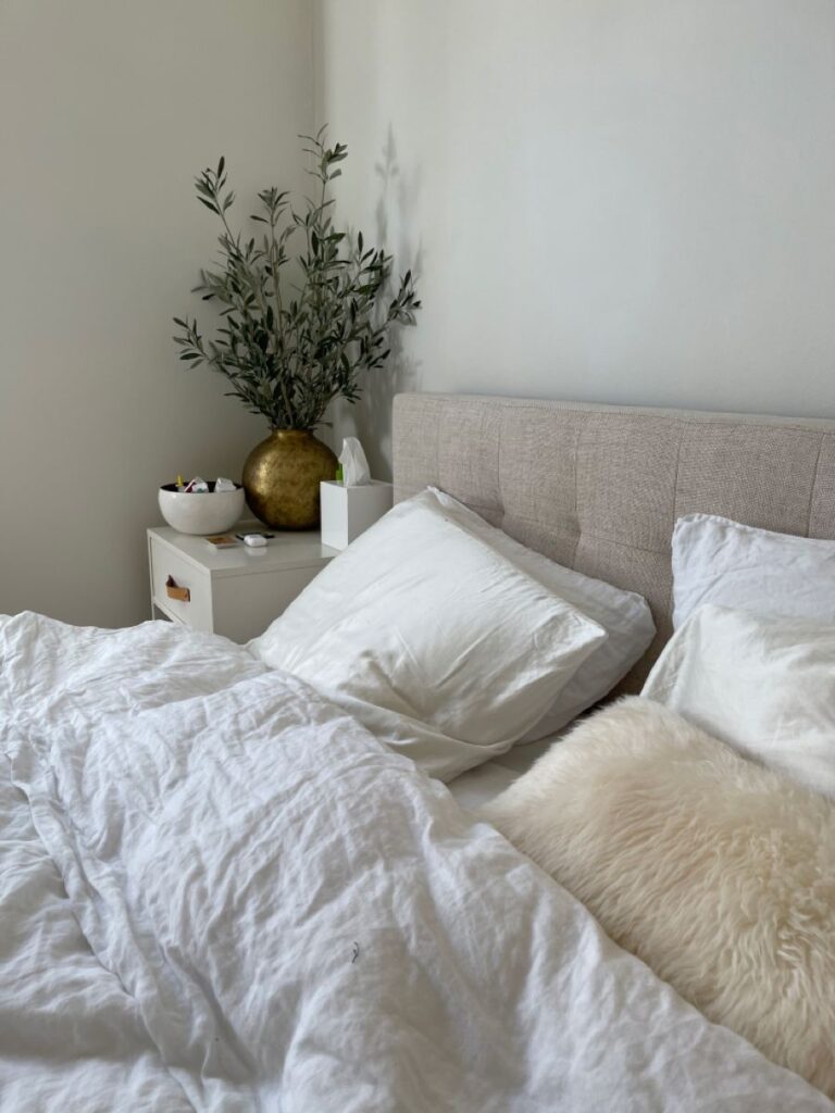
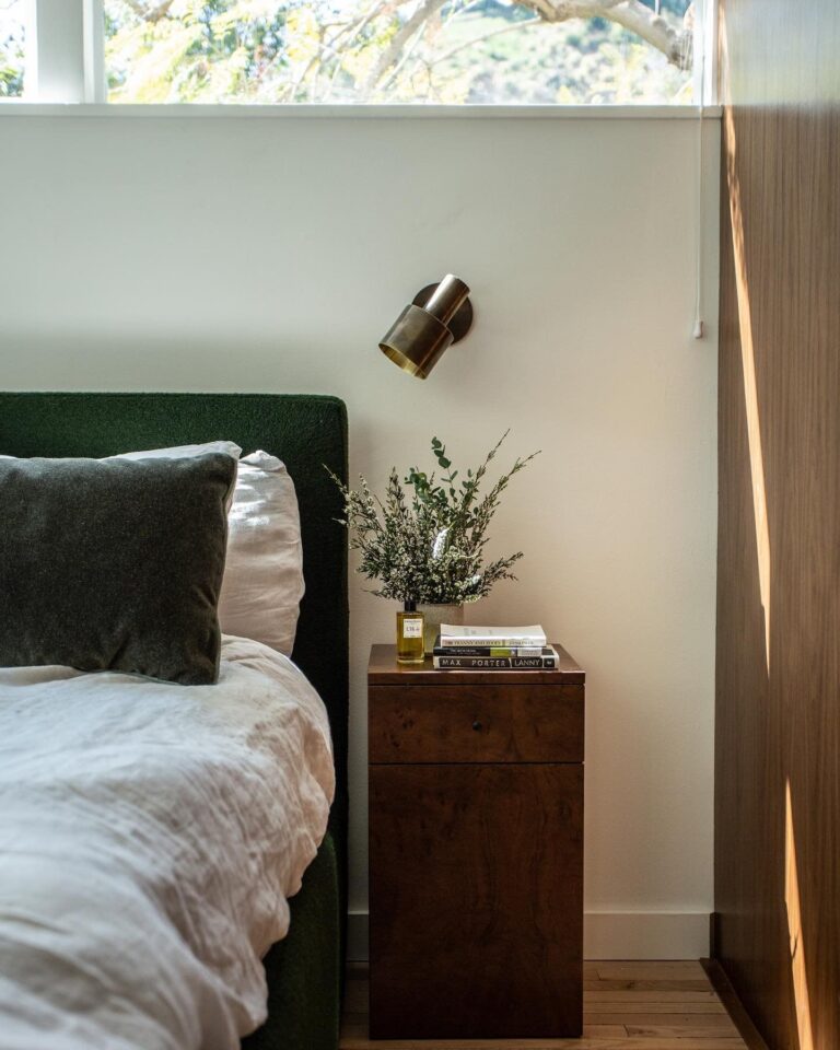
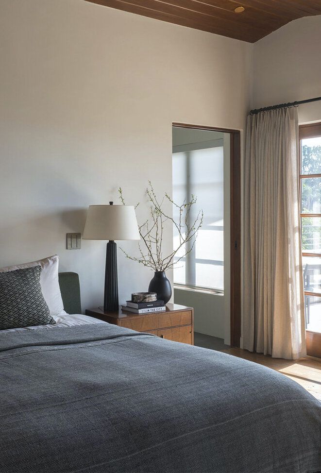
Bedroom
Does sophisticated simplicity sound like something you would want in your bedroom? Then Fleur de Sel is the perfect neutral for walls. At first, it seems like any other white. The more you look at it, the more you notice its delicate elegance. The best news is that this salty white works for any design style. Whether you go with a traditional, countryside-like bedroom or an ultra-modern minimalist interior, Fleur de Sel is at your disposal. Again, it best suits wooden furniture and flawlessly floods the space with light and freshness for a good rest after a long day.
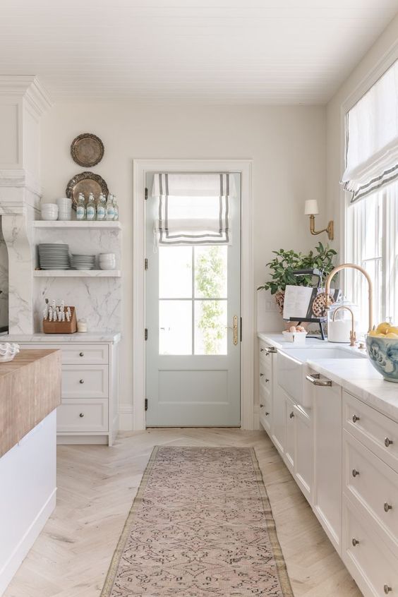
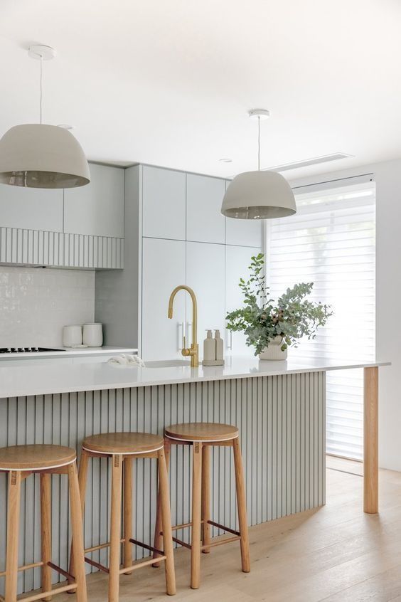
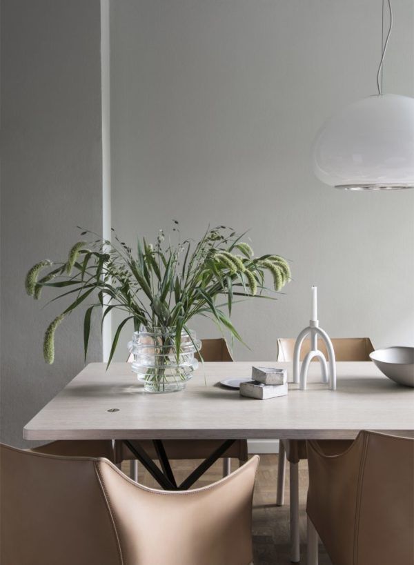
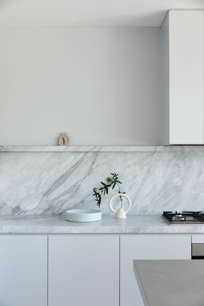
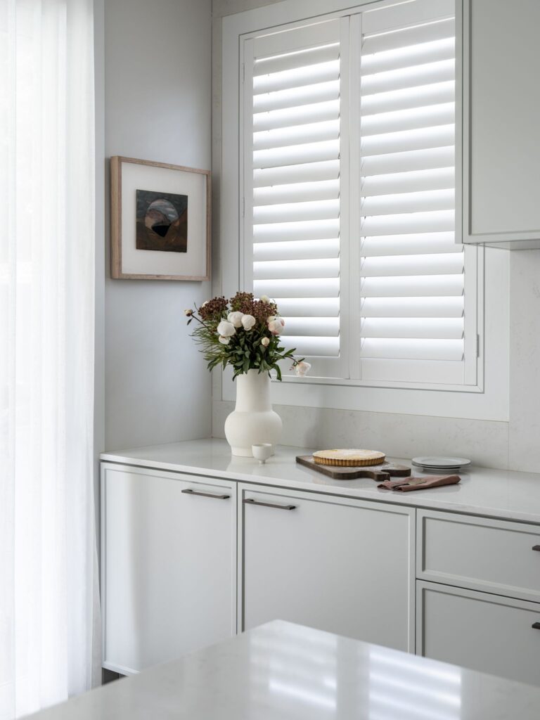
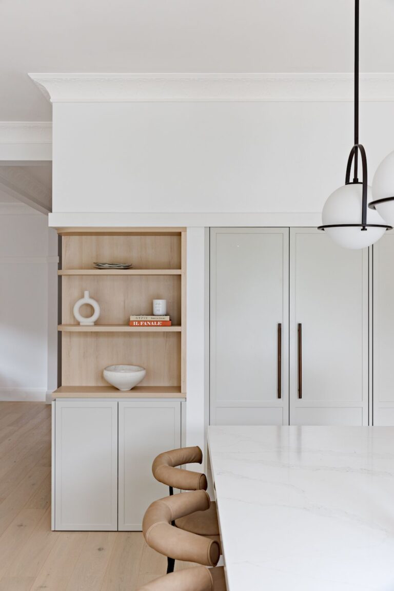
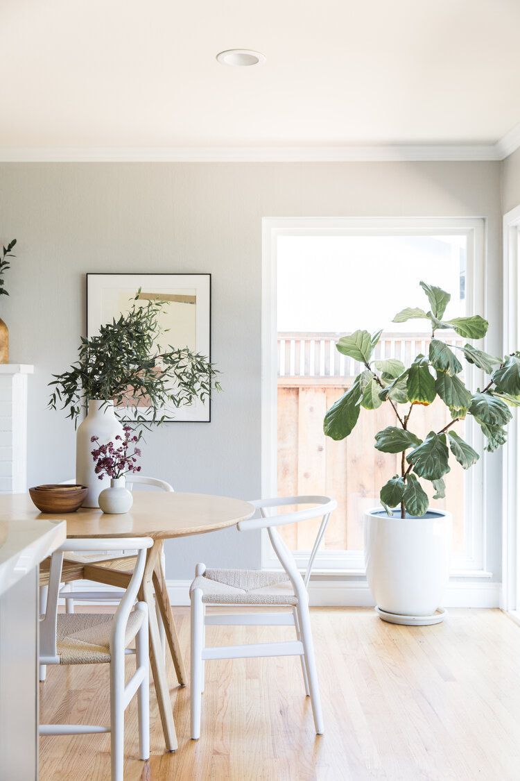
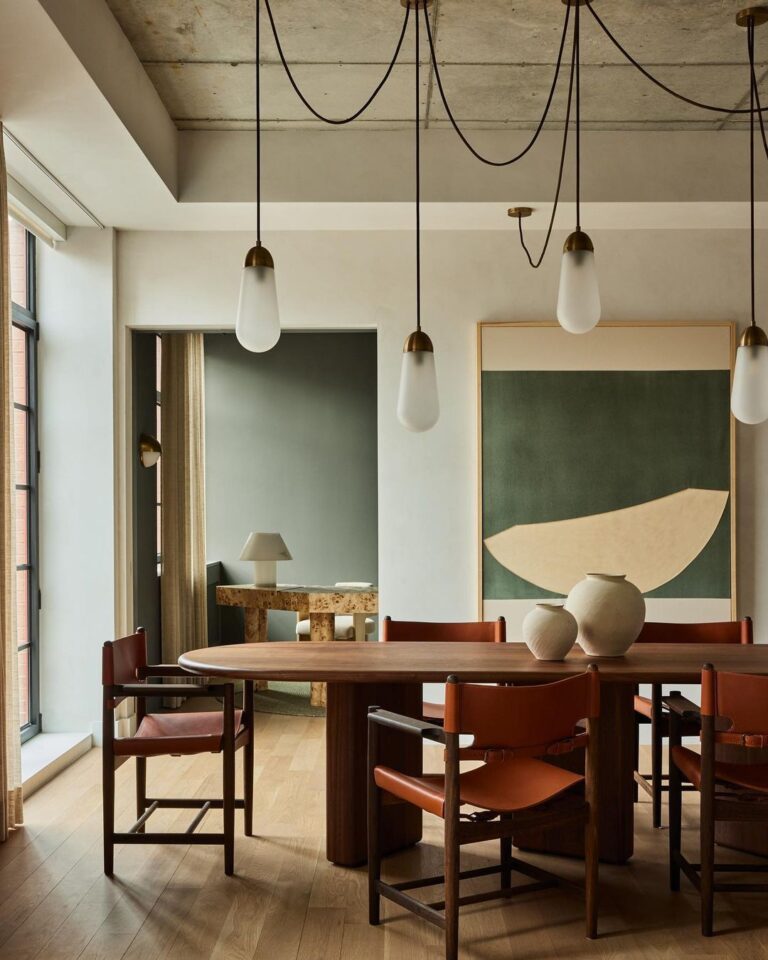
Kitchen and Dining Room
If your dream kitchen design is a light and airy space that doesn’t read too neutral and has a unique ambiance, you should absolutely try a green-white color palette. Use the trendy off-white from SW on walls or cabinets paired with other light tones. Simultaneously, you can benefit from the gorgeous blend of green undertones and wooden furniture in the dining room. You’ll love the result if you have a small room that wouldn’t mind a few more inches of visual space.
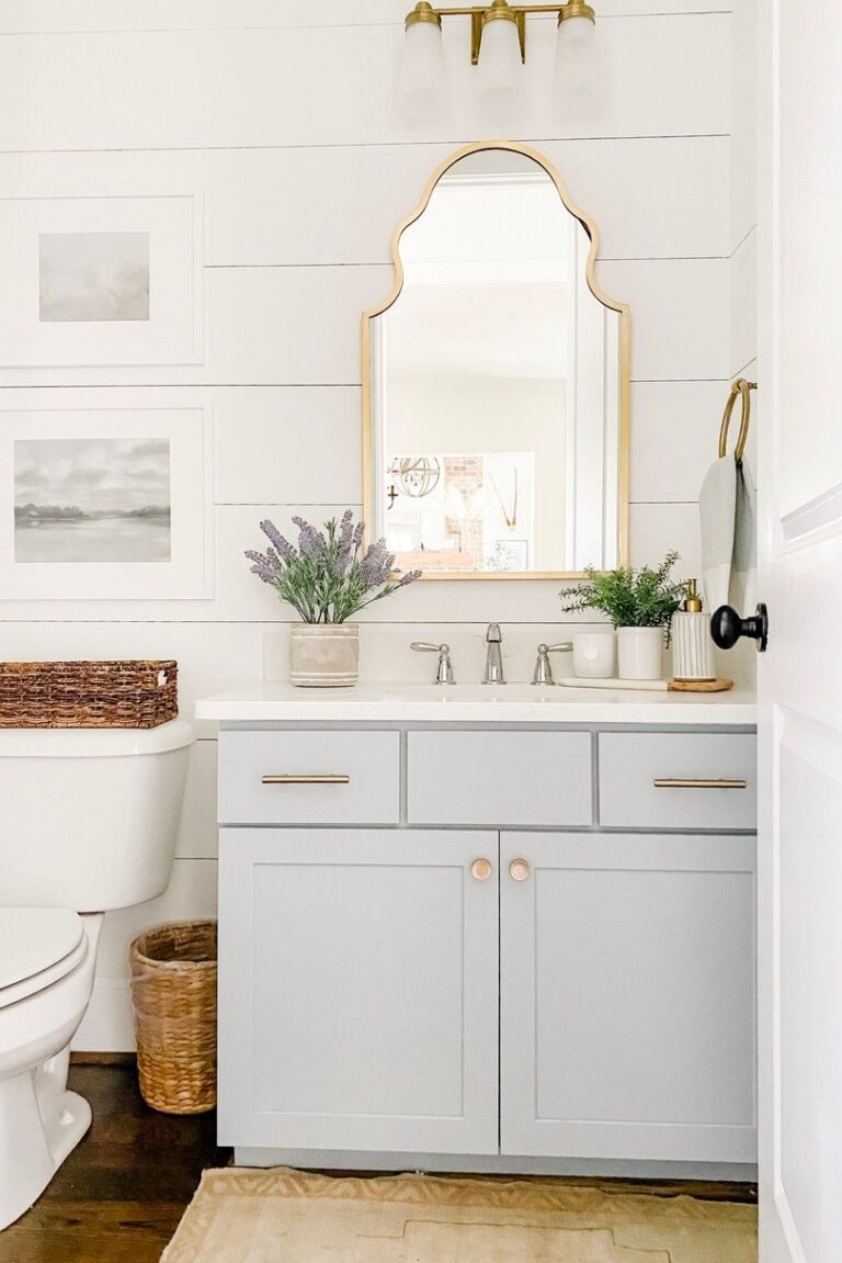
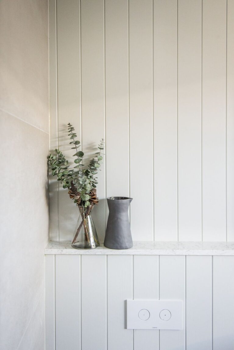
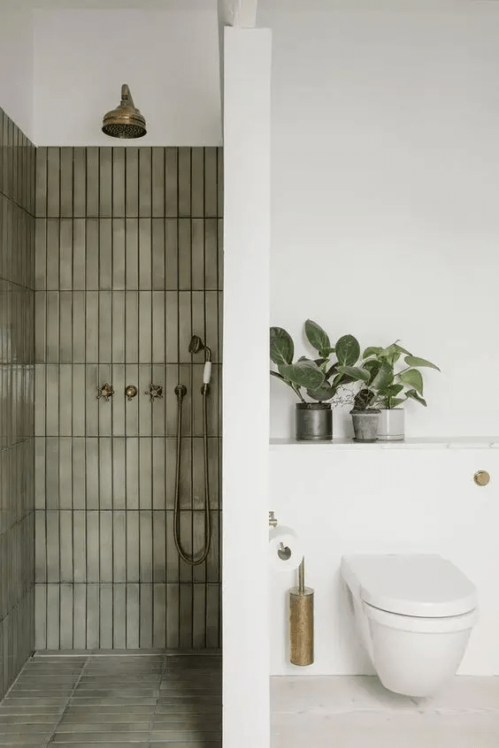
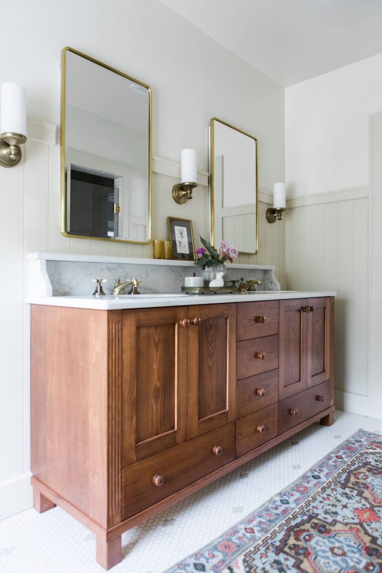
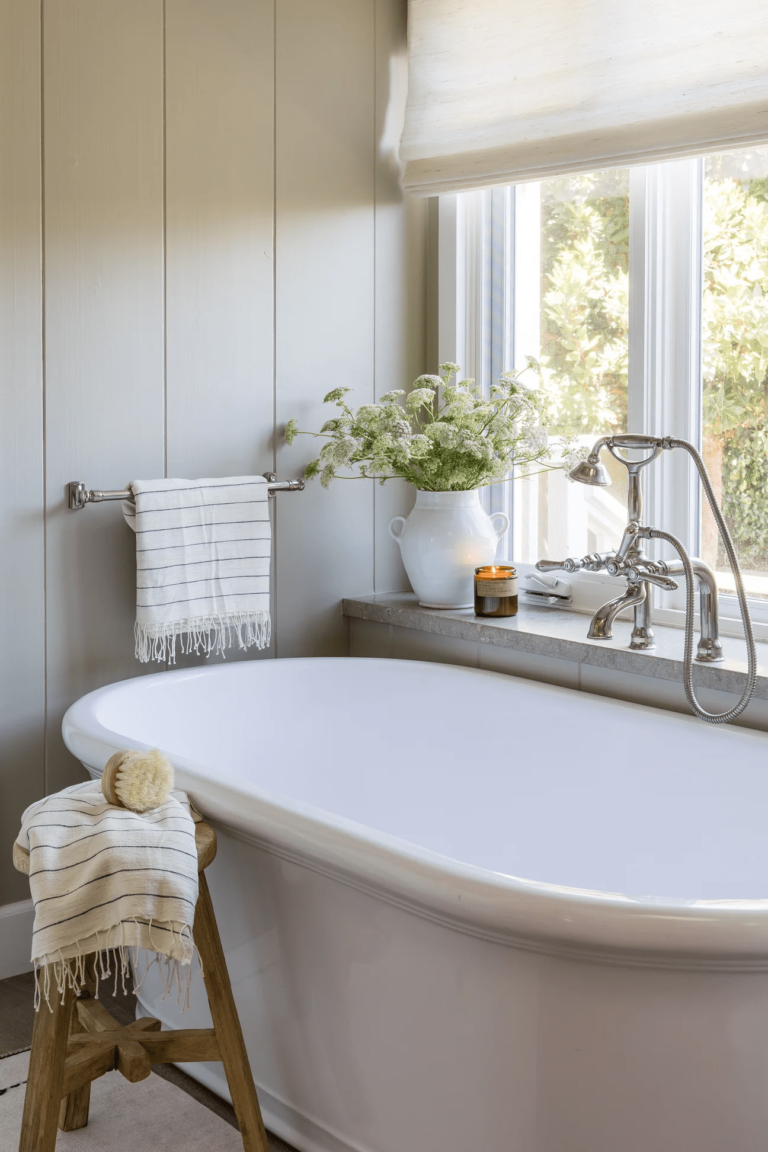
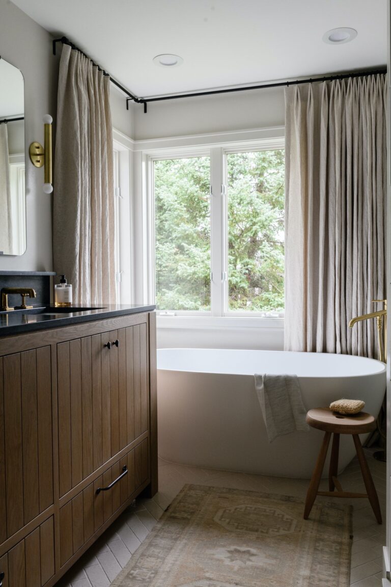
Bathroom
In the bathroom, experts recommend using Fleur de Sel on walls combined with emerald green tiles to achieve a modern look. For traditional interiors, paint wooden wall panels green-white and decorate with wooden furniture and metallic hardware with a vintage appeal. Enjoy the light and fresh effect, all due to this evergreen off-white.
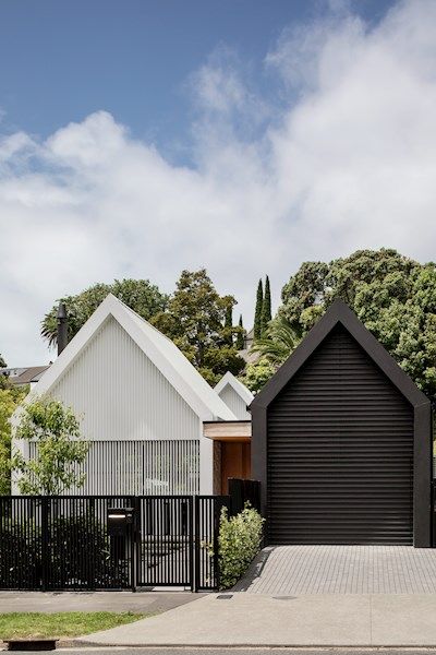
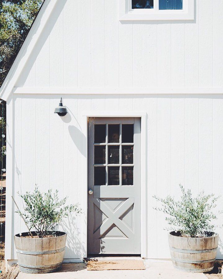
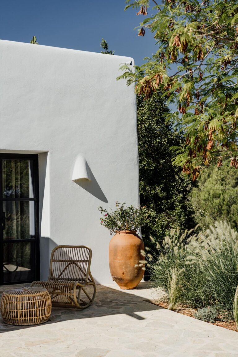
Use of Fleur de Sel for the House Exterior
Designers adore this paint color in exterior design. Surprisingly, it shares the same refreshing and calming feelings as it does in the interior. Whether you use this greenish off-white on the front door or exterior walls, you’ll love it. Rediscover off-white by applying this trendy neutral to a high-end modern exterior or a traditional brick house. Even more, white walls and a front door painted with Fleur de Sel is a no-fail option. Note that the surrounding greenery will get reflected by this bright white shade, and it may end up greener than you thought, yet still well-balanced.
Sherwin-Williams’ expert-pick off-white Fleur de Sel SW 7666 is a pearl among contemporary neutral paint colors. A delicate tint with harmonious green undertones inspired by the sea itself. Experience the coastal vibe or update any other design style with a breath of fresh, coastal air.
