Foothills SW 7514
Sherwin-WilliamsA formal gray-brown polished with summertime warmth, a great neutral paint color for interiors and exteriors that seek comfort, functionality, and security.
Foothills (SW 7514): What Color Is, Review, and Use
If you are interested in color trends, you have probably noticed the relevance of pottery shades in contemporary design. Luckily, one of the most beloved paint manufacturers, Sherwin-Williams, has a whole color collection of such hues. Today, we analyze a pretty dark paint color inspired by the coziness of clay shades. Foothills SW 7514 is the emerging neutral of the season. As fast as interior designers discovered it, they came up with lots of inspiration. First things first, what color is Foothills?
Foothills Paint Color Features
Rooted in the earthy color noticed in real-life foothills, the neutral brown-gray paint color resembles a dark yet delicate taupe shade. SW 7514 is a soothing neutral tone that relaxes due to its discreet and effortless appearance. The base brown particles of color radiate security and comfort, right like pottery barn shades usually do. And last but not least, designers have mentioned dark taupes several times over the past years, yet now they are more popular than ever, making us stick to the trendy feature.
Foothills: Is It Warm or Cold?
This paint color’s cozy, earthy scent proves Foothills is a warm brown-gray shade. It is calm and collected, going beyond simple comfort. You’ll surely connect with SW 7514 if you appreciate stability and rational decisions.
How Does Lighting Affect Foothills?
If you think Foothills will look in your interior the same as it seems on the color sample, you probably forget about light. Wait and see when different exposures play the trick on you. Stay on the safe side by understanding how it works.
In a room with north-facing windows, the cool natural light makes the paint color gray-biased, focusing on a relatively more gray appearance and resulting in a less warm taupe. Lucky you if the room you decide to paint with Foothills has southern exposure. The warm natural light will witness the warm brown notes at their best. Even if we speak about rooms with east or west-facing windows, you can achieve a similar effect when the sun rays directly hit a wall or furniture surface painted this way.
The lack of natural light during the night, even with artificial lighting at disposal, makes the earthy brown shade turn into a much darker taupe, this time brown-biased.
Foothills LRV
On a scale from 0 (black) to 100(white), Foothills has a Light Reflectance Value of 18, which from figures to plain words, stands for a medium-dark shade. As you might have guessed, SW 7514 is not a skillful color at reflecting light, and colorists kindly suggest using it in well-lit rooms, and those better be large spaces.
Foothills Undertones
For better or for worse, Foothills doesn’t want to show any undertones to the gray-brown base. It is a deep and muted paint color bouncing from brown to gray and back as it pleases in this top, or, should we say, taupe game of colors.
Similar Colors
Do you enjoy the company of the highly rational and conveniently neutral taupe from Sherwin-Williams? Especially for you, colorists from SW and other renowned brands selected a group of similar paint colors that resonate with the visual beauty and inner essence of Foothills:
Coordinating Colors
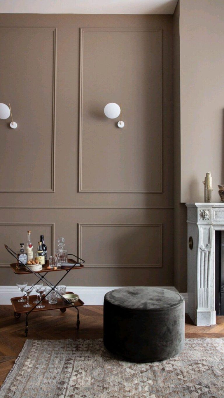
Be it a neutral paint color, Foothills is pretty dark, and most designers suggest two scenarios for the taupe shade. On the one hand, you can preserve the maturity and practicality of the subtle taupe by pairing it with lighter beiges, taupes, and greiges, which is the recipe for a monochromatic direction. Don’t forget the trim, where a soft white shade fits perfectly.
On the other hand, colorists from SW offer the color matching you can meet once in a lifetime – dark taupe and saturated blue, from the lightest sky blue to the darkest navy blue.
Use of Foothills in the Interior
Taupe is a great addition to modern interiors, while the gray-brown variation also successfully embraces traditionally decorated rooms. A cozy bedroom with gray-brown walls, an updated Victorian living room, or a thoughtfully colored kitchen; which of them appeals to your taste? Do you have a design option of your own? Don’t hesitate! Still, here are a few professional design solutions with the attractive and neutral Foothills.
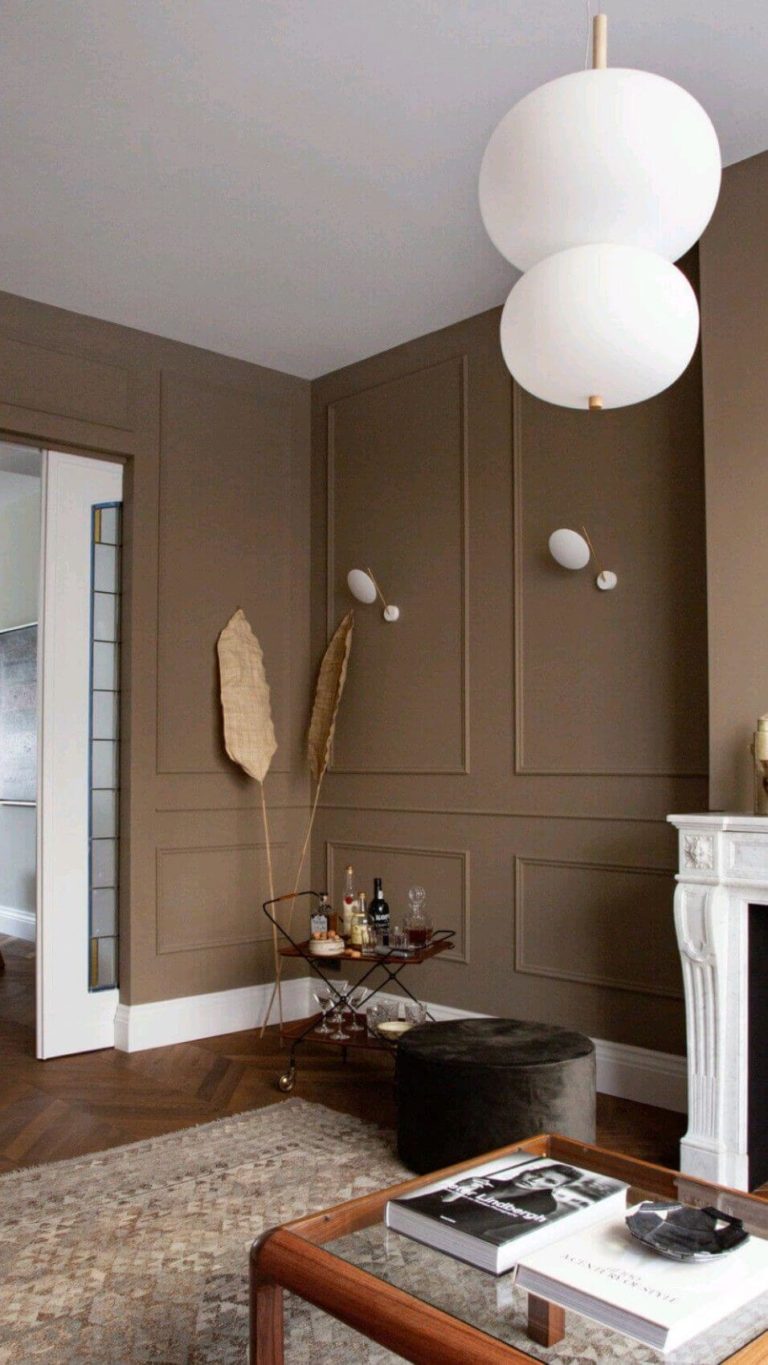
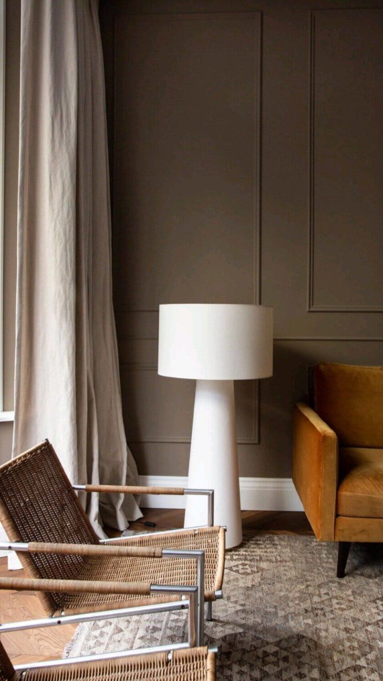
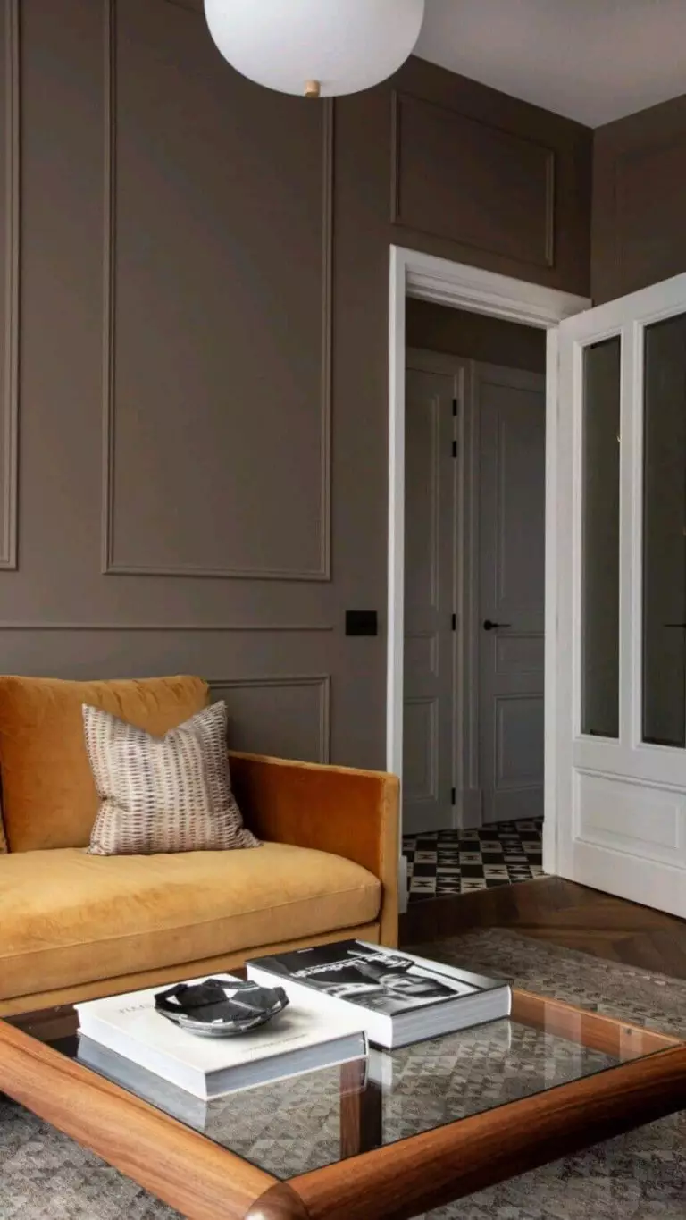
When Classic Meets Modern
Since Foothills is devoted to the old-time Classic style, designers couldn’t pass by the great mix between old and new. Reconsider a redecoration of your living room walls, opting for wall trim, and paint it taupe. As it follows, you can safely use the modern furniture you have. Quick tip: replace the old upholstery with brand-new one; bright colors are recommended. Don’t cover the parquet flooring much; stay within limits with decor. Make a statement with a sizable mushroom-shaped floor lamp.
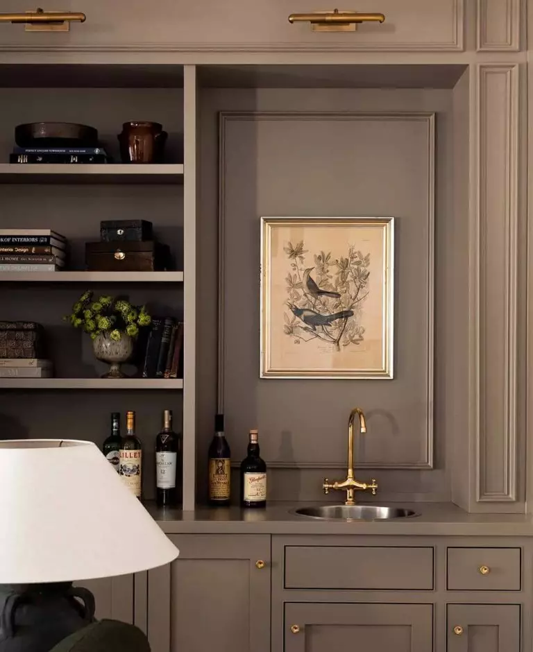
Gray-Brown and Gold
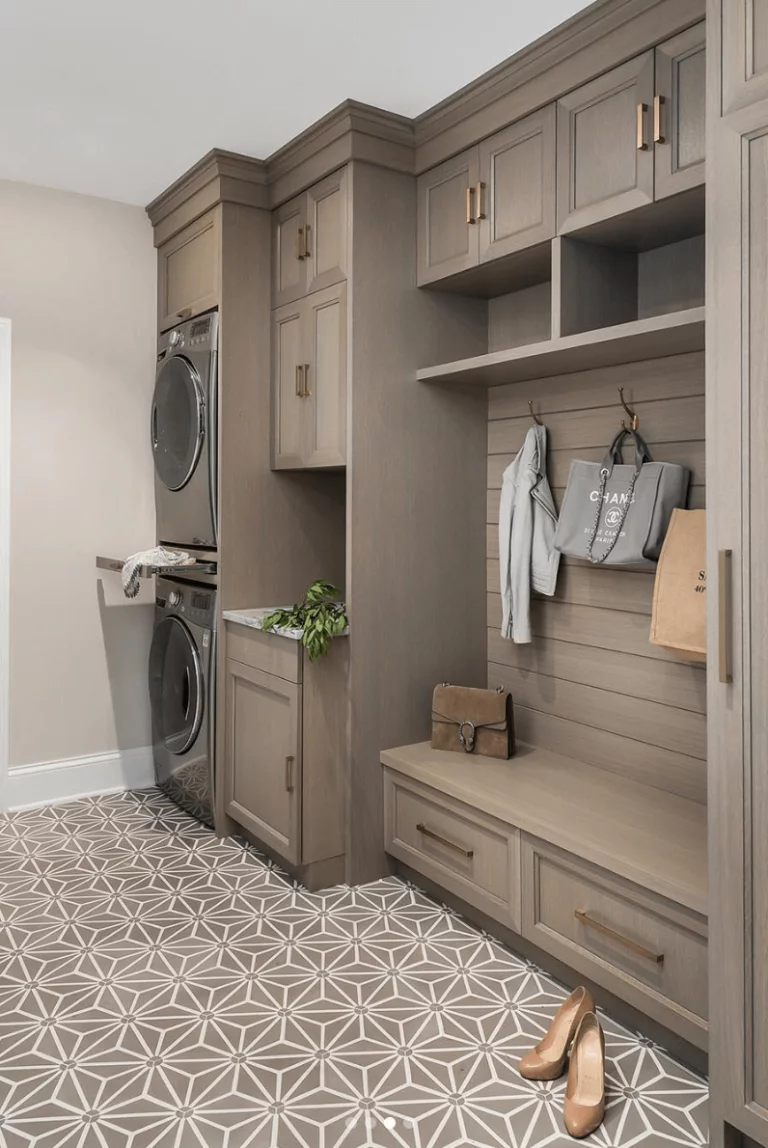
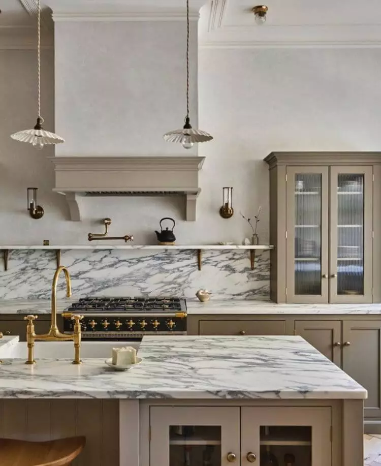
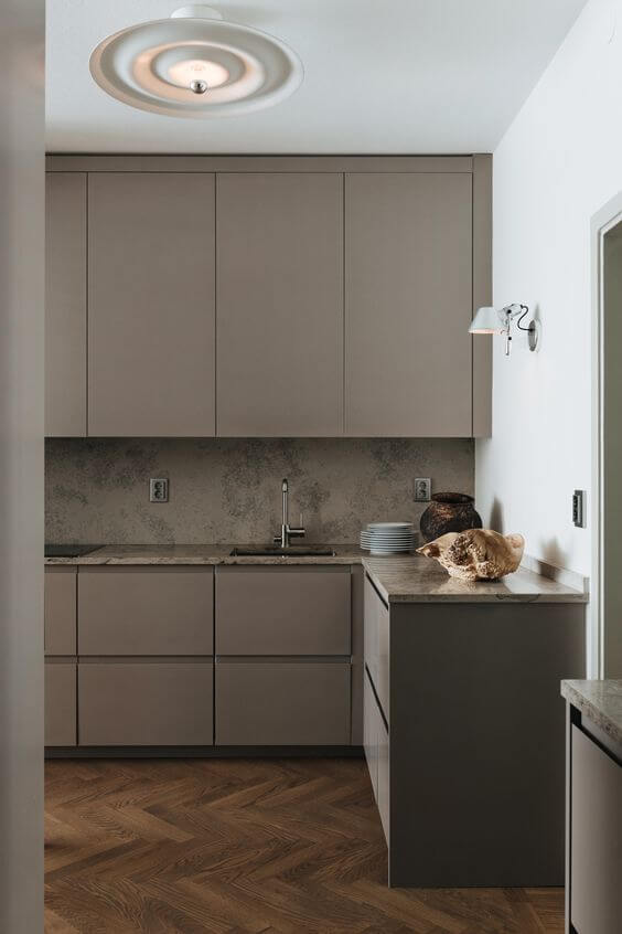
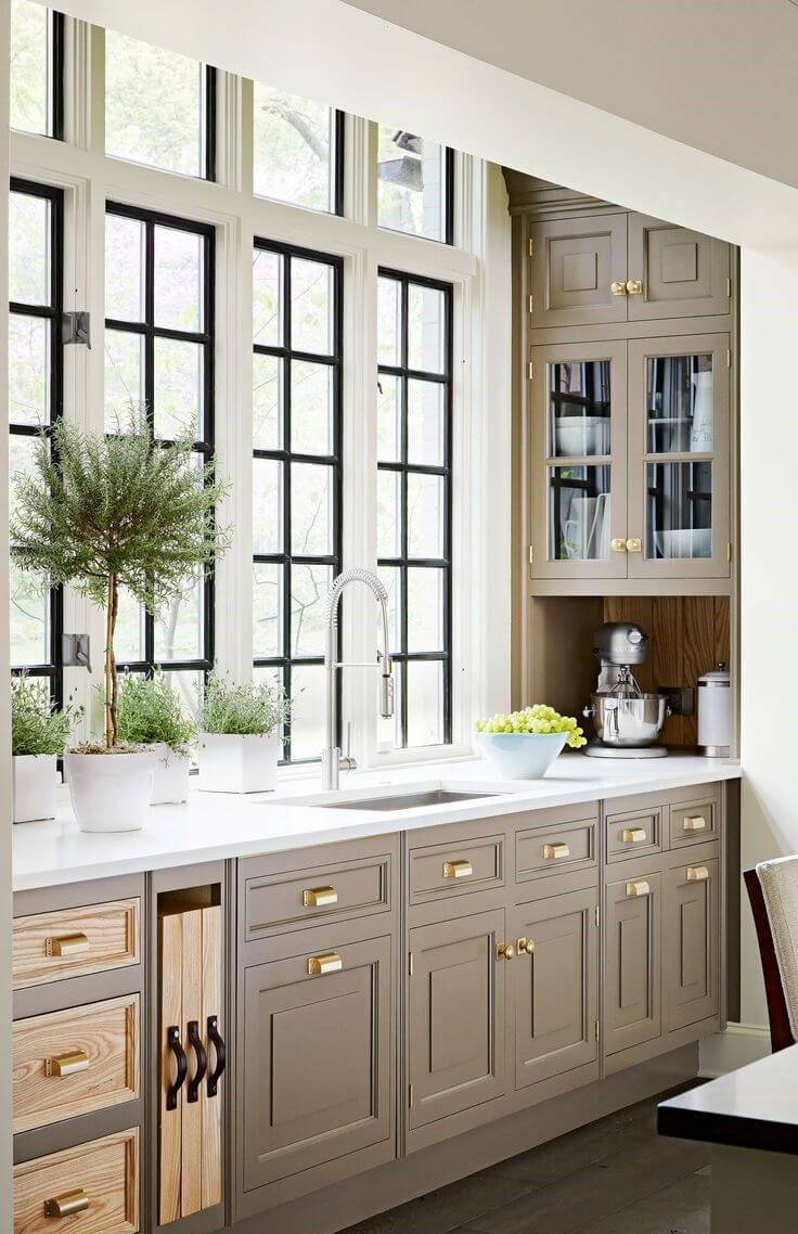
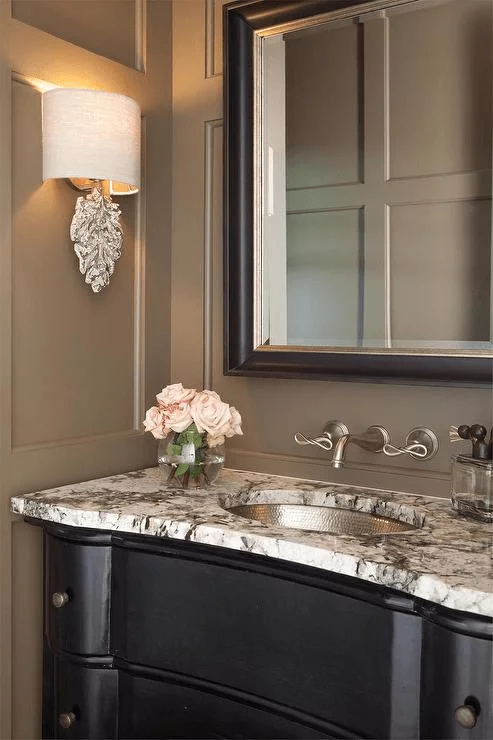
Try gray-brown accents if an all-taupe room seems too overwhelming for your comfort zone. Say, the kitchen cabinets, bathroom vanity, hallway closet, or living room bookcase. Paint them with Foothills and add the defining element – gold hardware. The favorites are brass and copper, and the design concept itself works better for traditional and vintage-like projects.
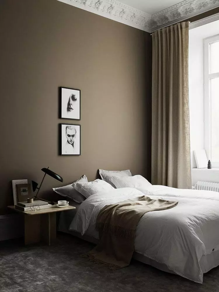
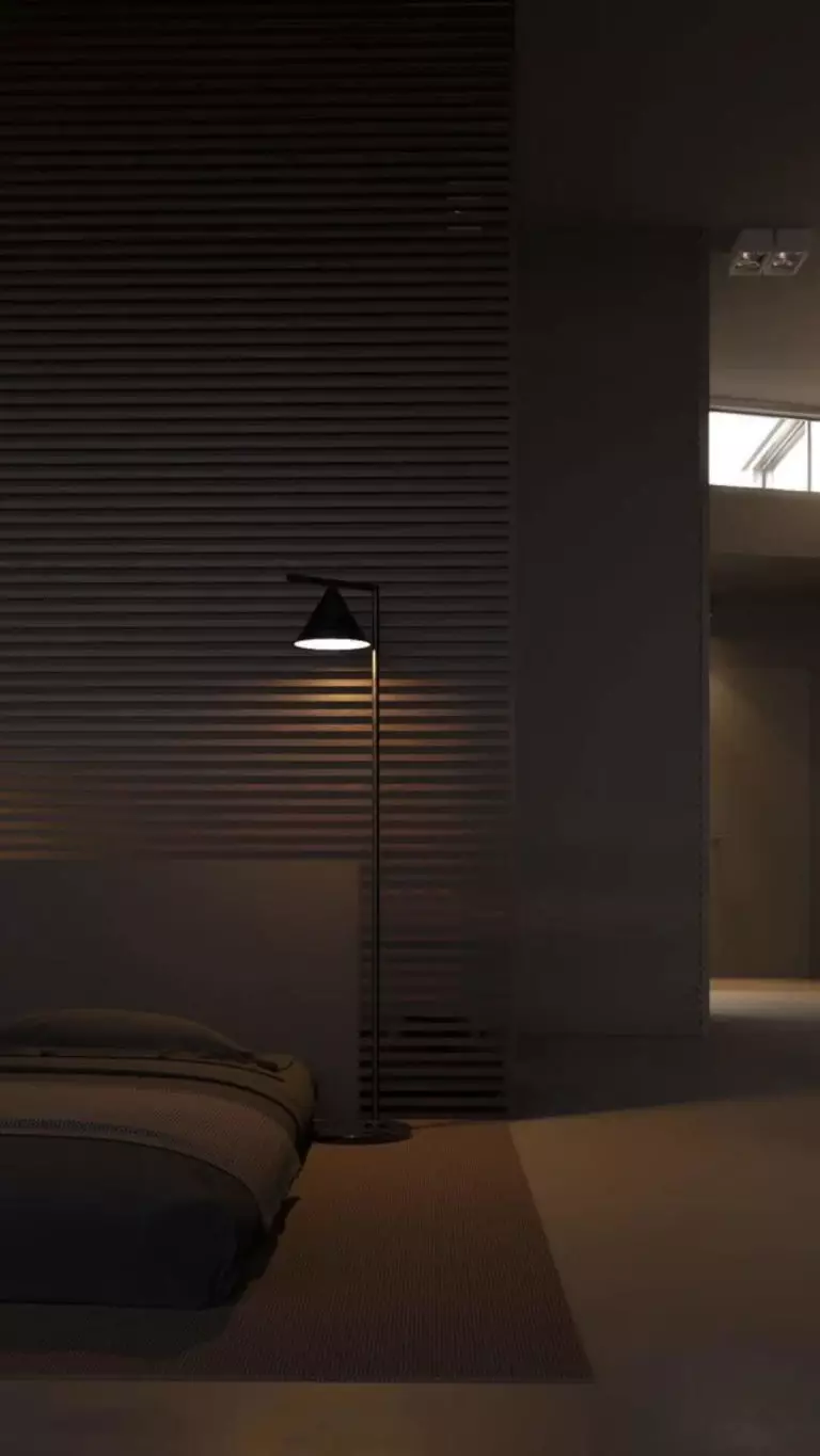
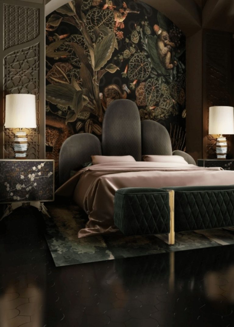
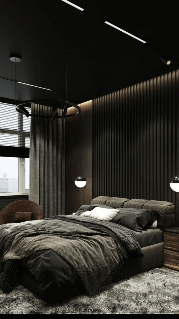
At Its Best in the Bedroom
Regardless of how dark Foothills is, experts regard it as one of the comfiest paint colors, and the best in terms of coziness goes primarily for the bedroom. Another important feature of this color is its flexible base that adapts to different styles. As of late, the brown color has been part of many Art Deco designs. Think of a roaring bedroom with taupe instead of black.
The Foothills paint has also been used in luxury bedroom designs due to its stately appearance. It is clear with exclusive design projects. Yet, the dark gray-brown works as a background color for minimalist sleeping spaces as well. Enjoy your safe and sound sleep surrounded by a color that teaches patience, inner peace, and relaxation.
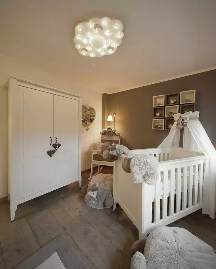
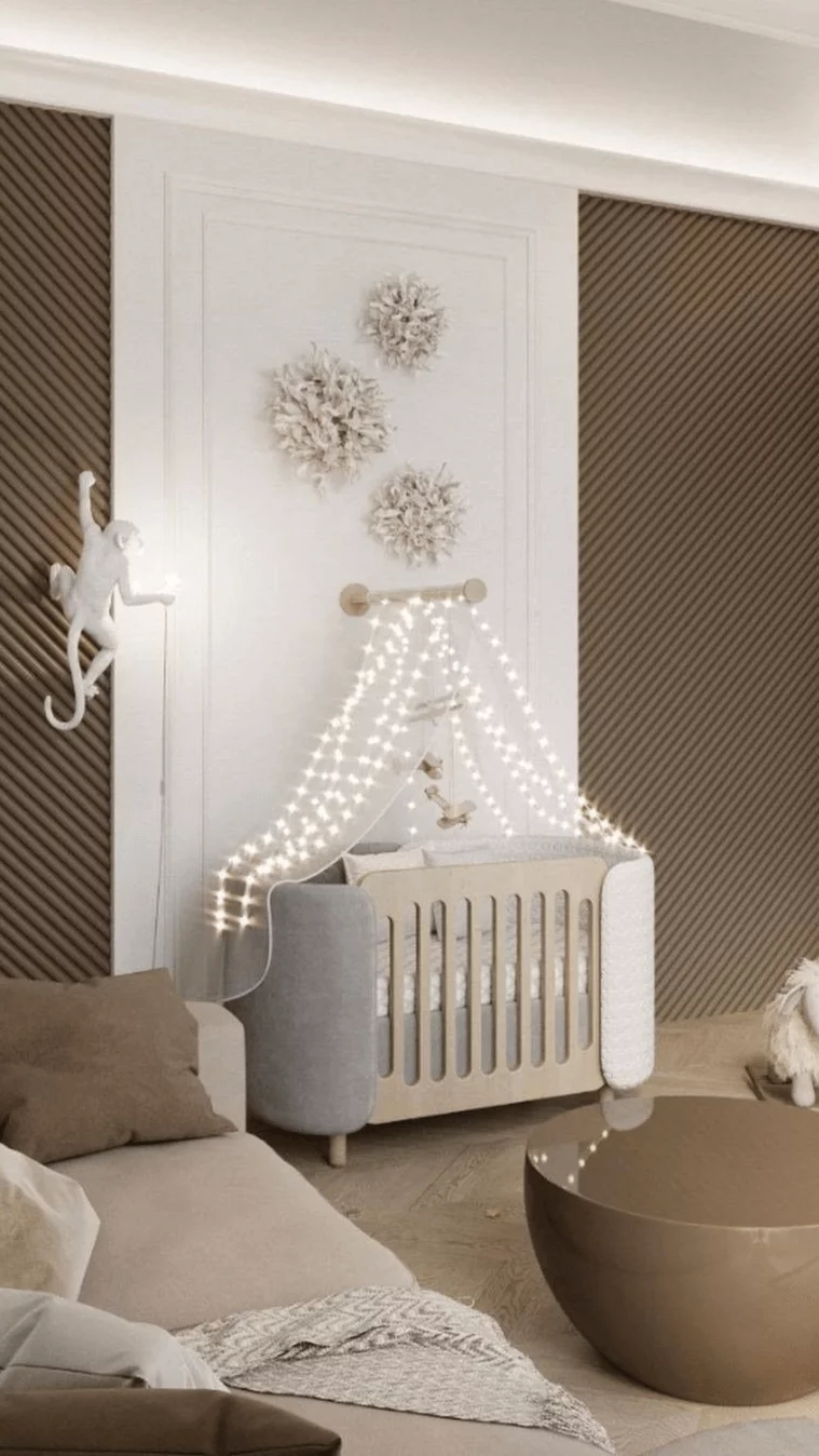
Neutrally Colored Nursery
Lately, the traditional blue or pink nurseries have switched to more neutral colors. Preference has been given to pastel shades. While creamy taupe is not very popular but moving in this direction, don’t miss the chance to be among the first to paint their nursery in taupe. A white-taupe color palette is recommended for a fully calm and peaceful ambiance. Particularly welcome is this color scheme for sleeping time, ensuring a sound sleep for your little ones.
Kitchen and Dining Room
The Foothills paint color appears very elegant when paired with white in the kitchen. So smooth and pleasant to the eye. Luckily, both traditional cabinets with gold hardware and modern cooking spaces with minimalist layouts work for the up-to-date neutral.
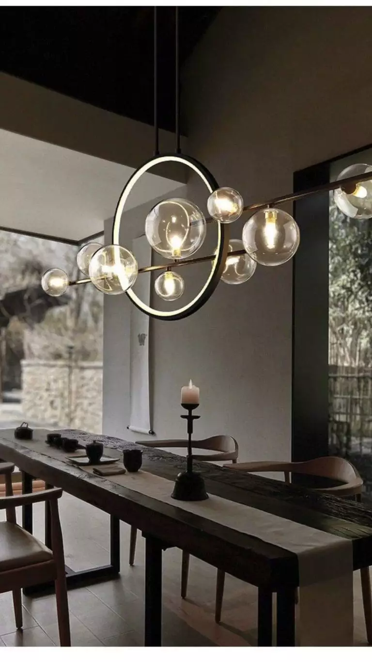
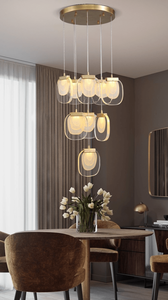
At the same time, in the dining room, taupe walls pair with dark wood furniture, and the mandatory accessory is a large chandelier above the dining table that steals the show. Such an ambiance suits perfectly formal dinners and gatherings.
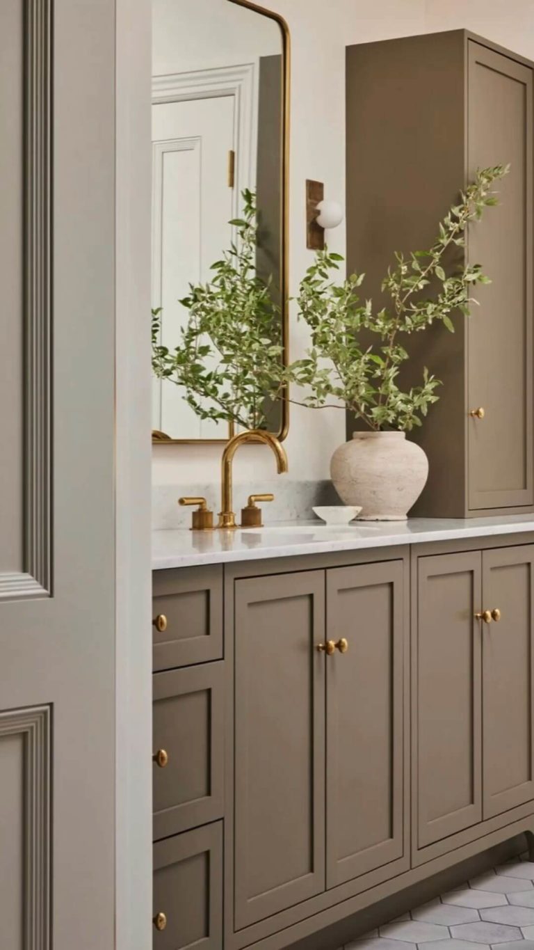
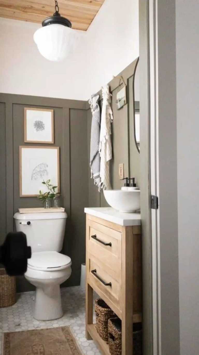
Bathroom
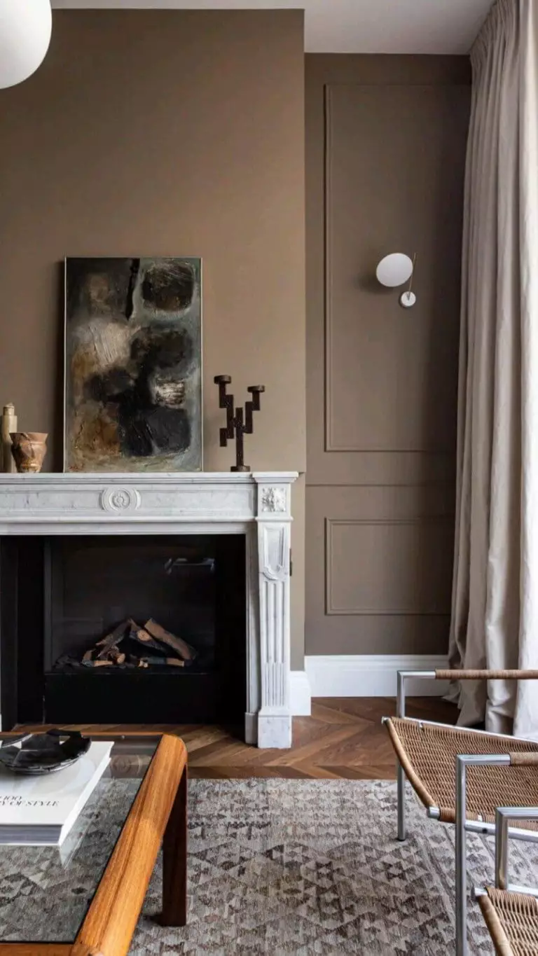
Professionals who have worked with Foothills in the bathroom state that the earthy brown-gray looks pretty on wall molding. Most designs include this shade in traditional and luxury styles. As for us, we are quite fond of how warm the bathroom becomes under this soft variation of clay.
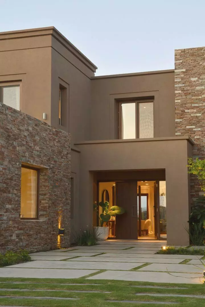
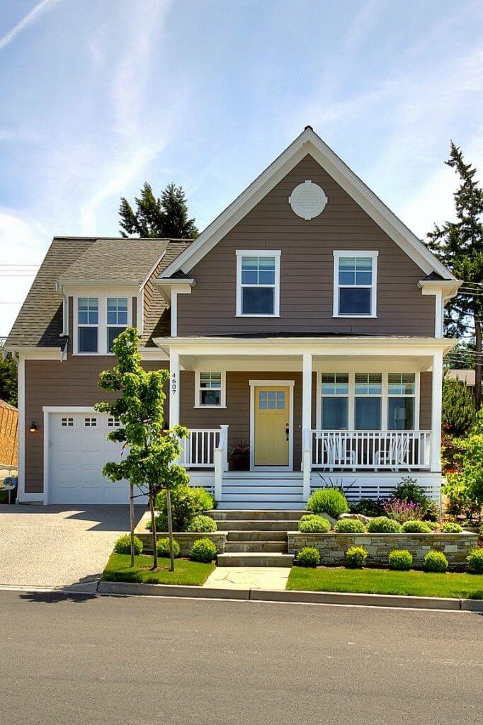
Use of Foothills for the Exterior
On the official Sherwin-Williams website, Foothills appears as a paint color for the interior and exterior. Therefore, you can use it for your exterior without hesitation. As part of the neutral group, SW 7514 knows how to behave on the house walls, creating a versatile look. This is why designers find it easy to work with gray-brown in exterior design. Experts mostly like the outcome of using Foothills in constantly warm locations where the slightly warm neutral turns into a delightful and welcoming color for your house.
The Foothills SW 7514 paint color by Sherwin-Williams is one of the newly designated trendy colors of the season, becoming a fresh tendency in the design world. Its defining features, timeless, versatile, inviting, noble, and secure, make it a promising paint color for new interior and exterior design ideas.
