Frosty White SW 6196
Sherwin-WilliamsA cool white with noticeable gray notes responsible for its crispy effect. It is indeed invigorating, breathing fresh mountain air into any style.
Frosty White (SW 6196): what color is, review, and use
White is a classic, and its belonging to contemporary trends cannot be denied. Paint manufacturers always develop new variations for this popular color, and each new option seems better than the previous one. Considering that designers suggest adding individuality to interiors, experts from renowned manufacturers try to come up with as original as possible paint colors. If you think that there is no way you can make a shade of white differ much from another shade alike, we hasten to convince you of the contrary, and the star of today’s article, Frosty White, is actual proof.
SW 6196 is indeed an interpretation of a frosty winter morning. When you look for a long time at a wall painted in this shade, you can hear the crispy sounds accompanying a stroll through the town covered by snow. Experts from Sherwin-Williams came up with a new shade of white that radiates new feelings and offers new design opportunities. This is only the beginning. This color has a lot in store for us. Let’s reveal its inner beauty!
Frosty White paint color features
SW 6196 is a cool white with noticeable gray notes responsible for its crispy effect. It is indeed invigorating, breathing fresh mountain air into any style. The gray undertones are so pronounced that one may think it is a gray shade, which makes this color this unique – the fact that you cannot figure it out. That’s not all! The gray scents are slightly muted, offering this shade a subtle pastel appearance. The result is a soft-at-the-touch but crispy-at-the-sound white. Do you wonder how it is possible to feel and hear a shade? Well, physically, it is not possible. It is rather the trick that this color plays on our imagination.
Frosty White: is it warm or cold?
One could suppose from the name that it is a cold shade. Indeed, Frosty White is cool enough, although the pastel gray undertones cannot allow us to call it cold. This shade finds itself at the border between cool and cold shades, and this is what makes it such an appealing color: at first glance, a simple shade of white, but the more you look at it, the softer it feels.
How does lighting affect Frosty White?
In the daylight, Frosty White sparkles like a snowy cover under the bright sun, by which we mean that it reveals its entire essence. The scenario changes entirely once an artificial source of light is considered. Cooler light undertones will bring intense yet cool notes of gray to the surface, while warmer light undertones will spread splashes of warm gray all over the space. Quite intriguing: a shade of white can easily be transformed into a cold gray hue or an impressively warm one. This proves one more time that lighting has a leading role in the way a color appears.
Frosty White LRV
You may probably think that a white shade should necessarily have a high LRV. It is rather true, but the newly developed hues slightly differ from what we usually think about white. Frosty White has an LRV of 72. If we were to transform this figure into words, it would sound like that: it can reflect large amounts of light and bring in an expanding effect. Such features as brightening the place and making it look spacious are defining for this shade of white. The figure is slightly lower than you might have expected, all due to the gray undertones, but the result does not disappoint in any sense.
Frosty White undertones
There is no need to repeat the information about its undertones, at least in detail. We will put it simply: Frosty White is penetrated by gray undertones accompanied by creamy scents responsible for the pastel effect. It may not seem that creamy on the sample, but once you put it into practice, you can notice how the color puts on its pastel mask.
Similar colors
As already said, paint manufacturers come up with lots of new inspiring shades of white, and those penetrated by gray are impressively popular. Therefore, you will find lots of similar shades both at Sherwin-Williams and outside its limits. Let’s discover some of them!
Coordinating colors
Regardless of the fact that Frosty White is neutral, it is not friendly with all shades. We would say it is rather picky and wants to play only with shades alike, these being other neutrals, from dark gray to pure white, and soothing shades of slightly bolder colors. Let’s take a narrow look!
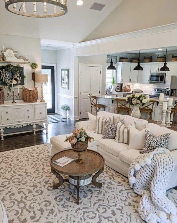
Use of Frosty White in interior
As with any shade of white, this one is no less versatile when it comes to integration into a particular style. It serves as a perfect background for your design ideas, adding a little bit of magic – a snowy flair. Let’s analyze some of the best design solutions!
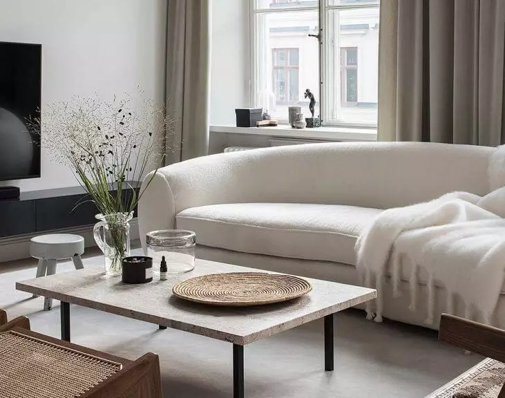
Nordic weather
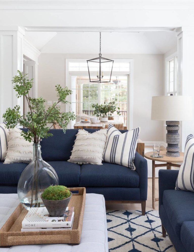
Frosty White perfectly replicates the cold-colored sky of the Nordic countries, which, of course, brings us to the beloved Scandi style. It would be a shame to consider this cool shade of neutral white and skip the style defined by the features of this color. Undoubtedly, white goes for the walls, while the rest of the scene looks the following way: a blend of textures and soft hues for both furnishing and decor, sleek furniture lines, and most of all – functionality at every glance. Additionally, don’t forget about a comfy rug neighboring the sofa and a few splashes of color to dilute the overall result. Put an accent on natural materials and ensure harmony with the outdoors. Do you wonder what the role of Frosty White is in this context? To bring all the elements together and relate them specifically to the Scandinavian lifestyle.

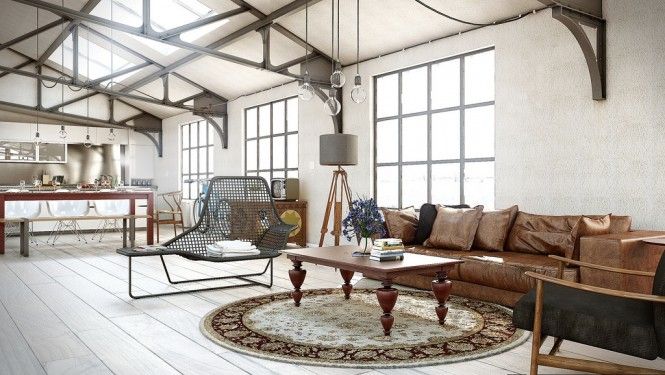
Raw finesse
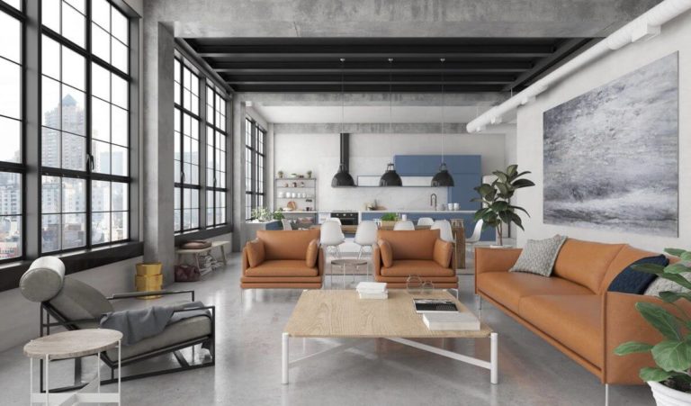
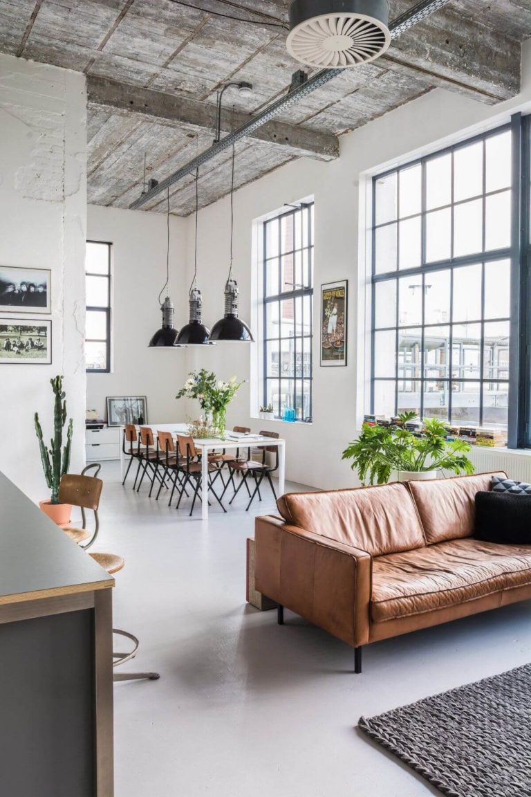
One of the most popular trends within interior design is to refer to industrial approaches, particularly for loft apartments that are at the peak of their popularity as well. The rich texture of raw surfaces benefits from a breath of fresh air, by which we mean a neighboring light color. To your surprise or not, Frosty White resonates perfectly with something raw in its natural beauty. Paint the walls in Frosty White. If possible, combine them with a brick accent wall. It would be better to use recycled or even vintage units and offer them a second chance within your interior. Don’t bother yourself to reach even surfaces. The more the texture is perceived, the greater the industrial effect. Consider a minimalist arrangement and leave the rest of the space to be penetrated by a sense of confidence that the already painted walls radiate.
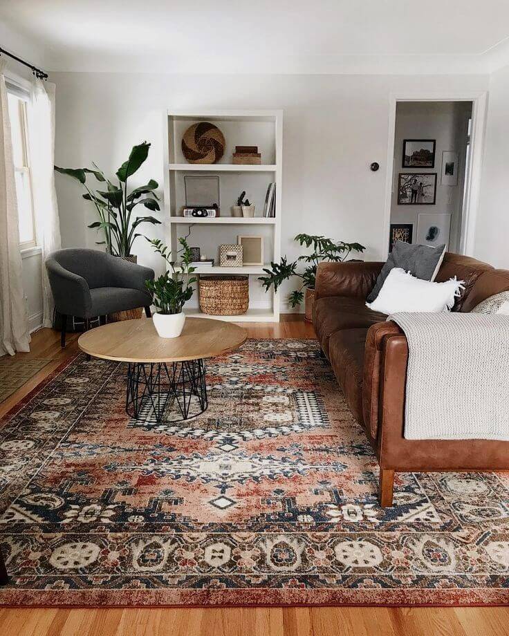
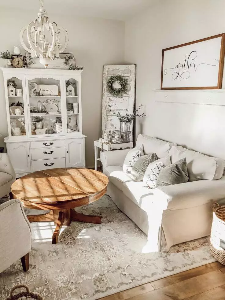
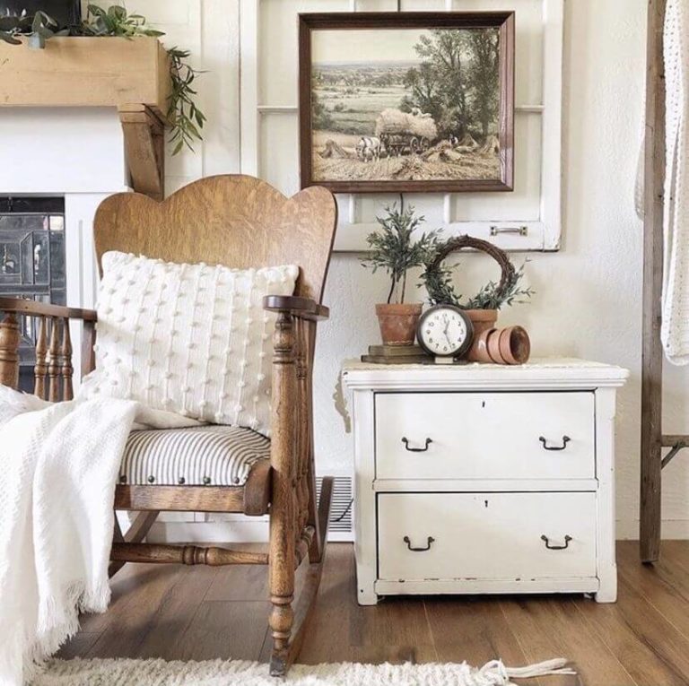
Exquisite Vintage
We were amazed to find out what a perfect backdrop Frosty White is for vintage units. Be it a piece of furniture, a decor unit, or any other element that is usually found at sales or inherited. Furthermore, you can breathe a new life into them by opting for light paint to cover them. Such elements simply cannot help but stand out on a neutral backdrop offered by Frosty White, the latter balancing the extra cozy effect achieved with a vintage approach. Such a combination will surely show off your exquisite taste and make a piece of art out of your interior.

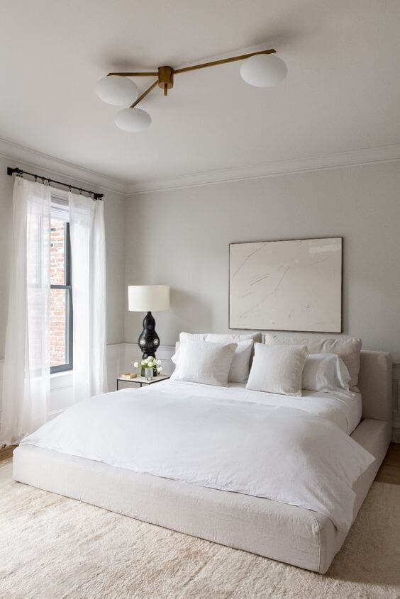
Bedroom
Frosty White is a find for those who want to go with an all-white bedroom. The slightly creamy and coolish walls painted in SW 6196 will contrast with a more neutral white used for other elements. The result is an airy feeling of ease. You feel like falling asleep in a comfy cocoon and waking up in a fresh setting. We suggest you not dilute this serenity with a new splash of color or texture. Nevertheless, designers advise you on considering at least a few elements of wood if you feel that the environment is rather coldish.
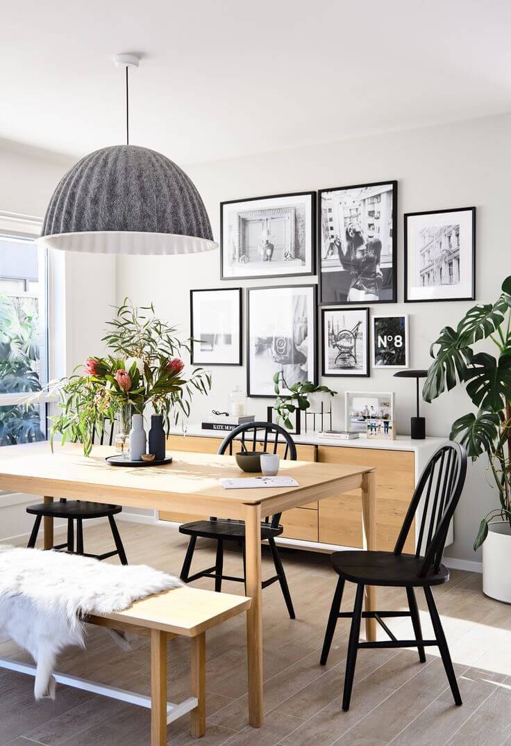
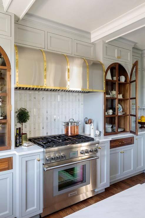
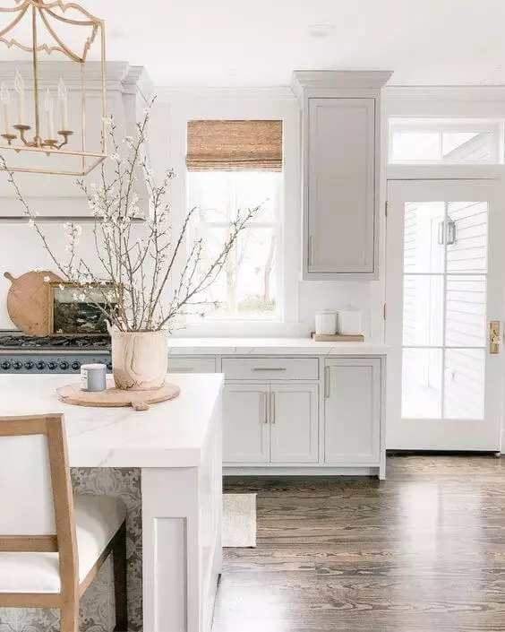
Kitchen and dining room
This is another opportunity for lovers of white to use this color to the fullest. White walls, white kitchen cabinets, even white backsplash if possible. The main thing is to play with various contrasts of white, where Frosty White works for the cabinets. A clean, sleek, and impressively serene environment is ensured. Now, it is time to add a little bit of individuality, which is possible with a few elements of brass.
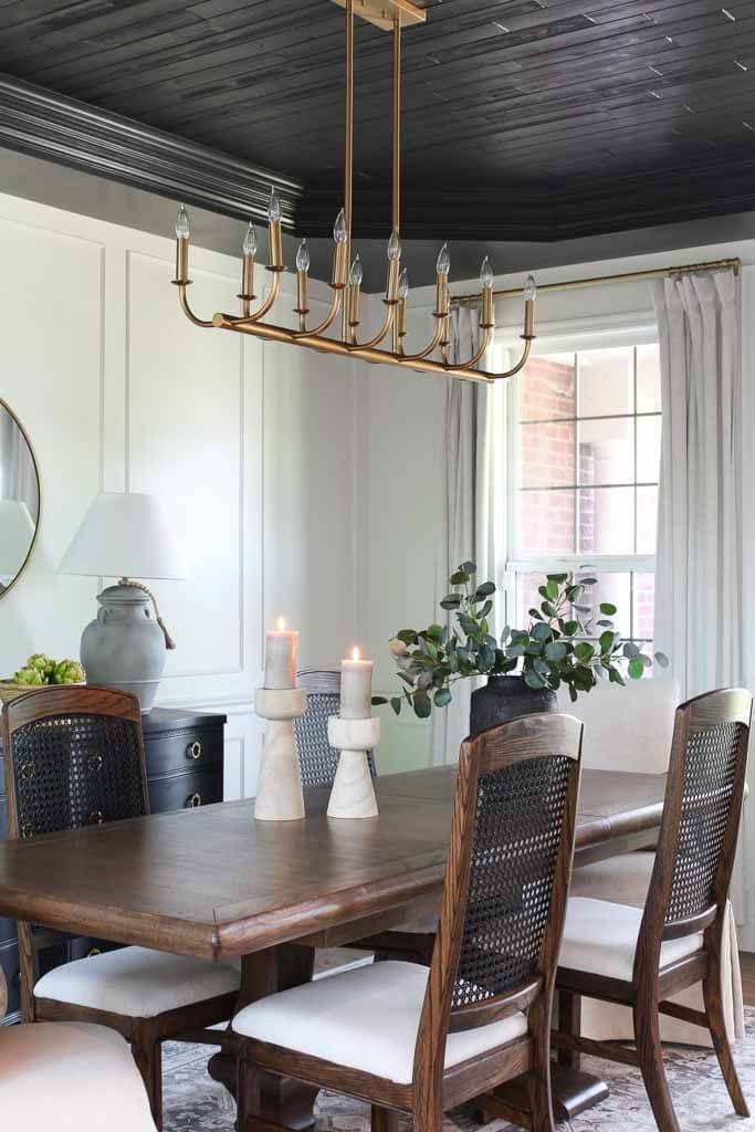
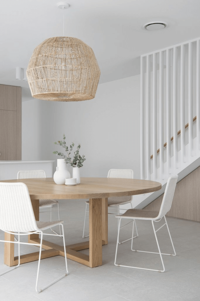
Once we reach the dining room, we cannot go any other way than paint the walls in Frosty White and accompany them with a large wooden table and seats alike. Preserve their natural look, which will balance the rather coolish background.
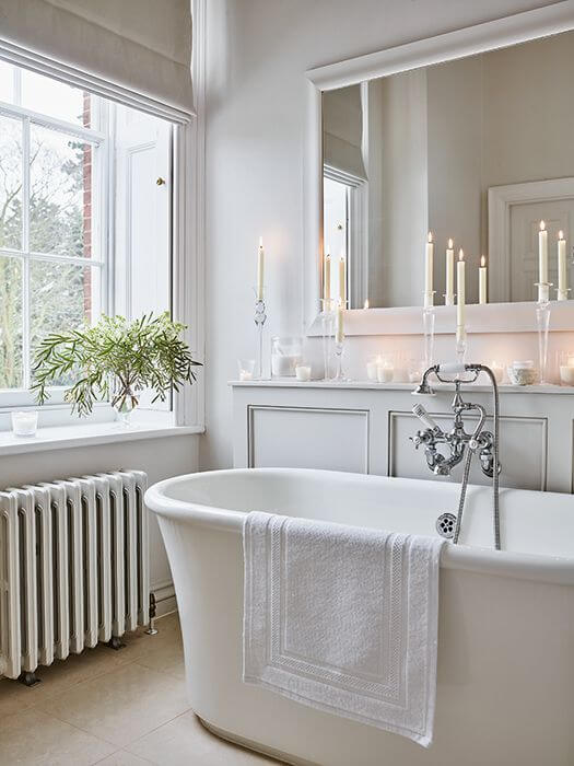
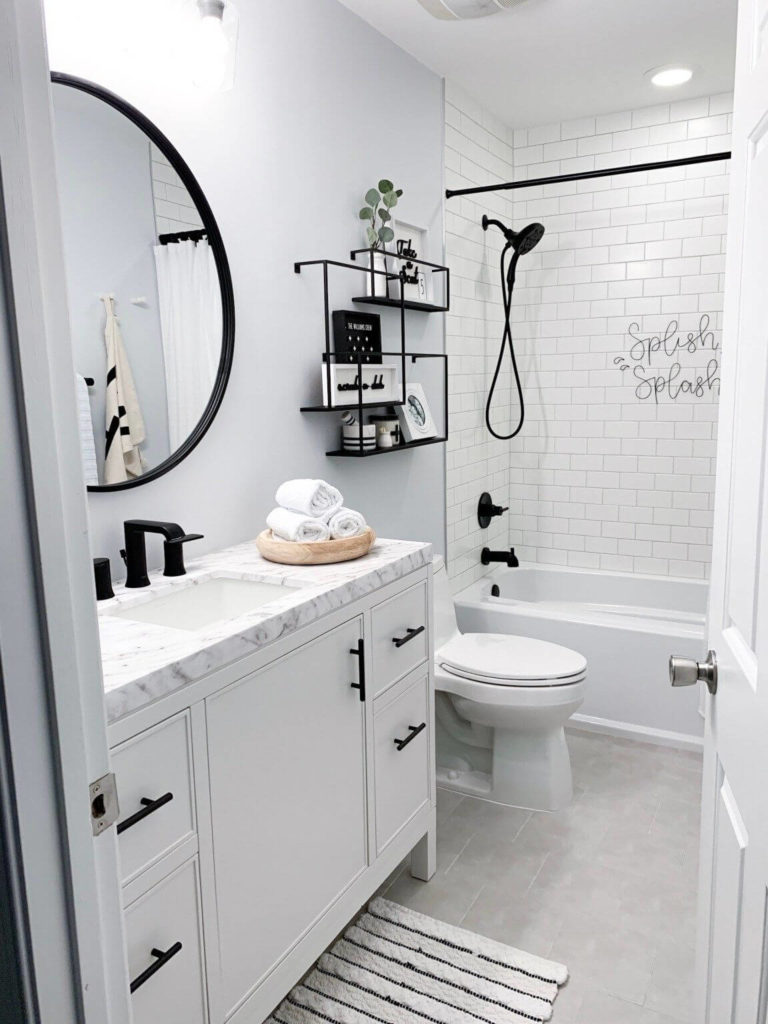
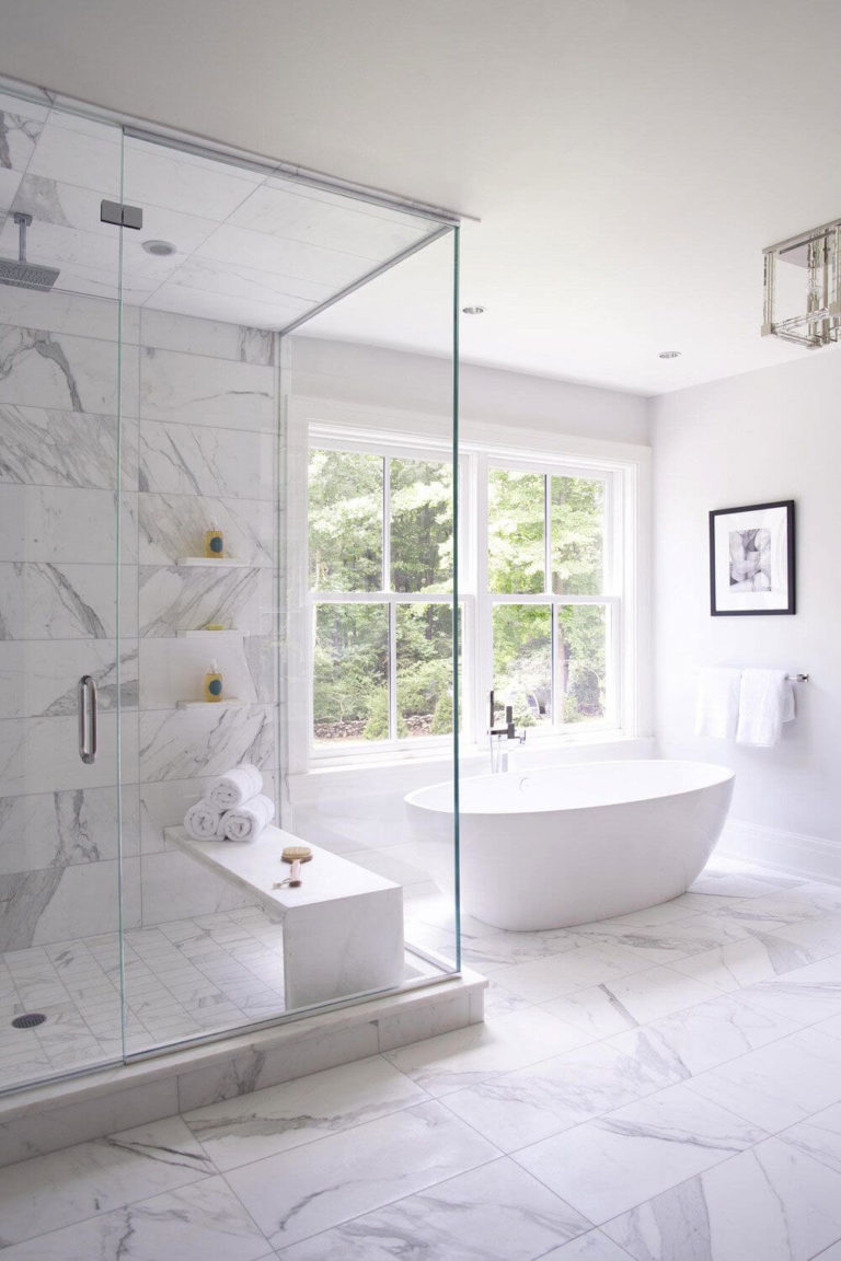
Bathroom
We will probably not surprise you by suggesting you opt for an all-white bathroom with walls painted in Frosty White. This space will look extremely spacious and light, but most of all, clean, fresh, and outstandingly unique. You can keep it this way or opt for copper hardware for a bit of visual interest, although such a decor is fully optional since the combination of various shades of white is enough to make an impressive statement.
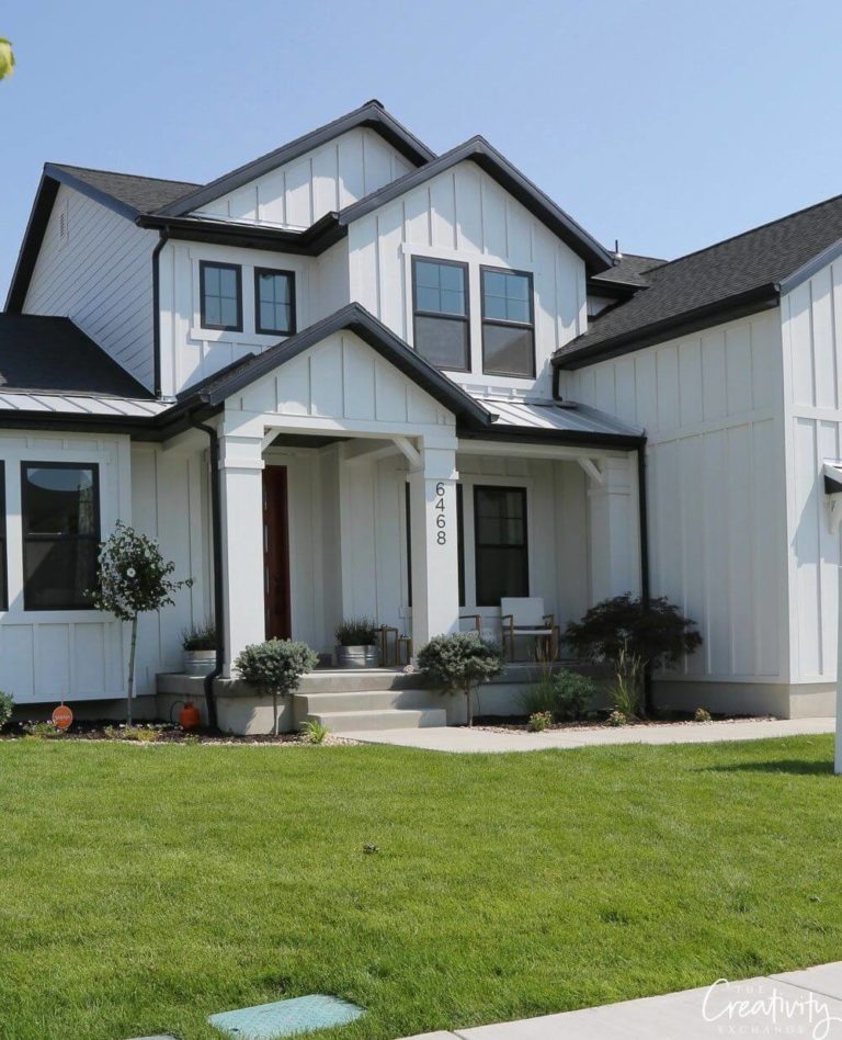
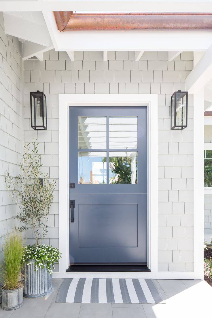
Use of Frosty White for house exterior
Frosty White is perfect for use on large surfaces where it can reveal its entire uniqueness. Therefore, it will look fabulous on the house walls, particularly if accompanied by contrastive colors for the front door and window frames, even if they are different shades of white. Generally, white works perfectly for the exterior and the overall result gets even better when a shade like that enters the game. We cannot say the same about choosing this color for the front door. It is simply too small for the grandeur of this shade.
The Frosty White SW 6196 paint color from Sherwin Williams is not just a shade of white but a mixture of softness, invigoration, hope, and serenity. Make these features define your interior with a simple splash of Frosty White.
