Gale Force SW 7605
Sherwin-WilliamsA modern navy blue tone, one of the top shades, with organic green undertones that render elegance, calmness, confidence, and originality all together.
Gale Force (SW 7605): What Color Is, Review, and Use
“One of the top navy blue shades.” “Part of designers’ favorite navy tones.” “Navy is the new black.” All this is about the timeless navy shade Gale Force from the giant paint company Sherwin-Williams. Navy blues have always been there – trendy. Now that dark shades, especially blues, are all the rage, using a stunning navy paint color has become a priority for interior designers. Gale Force meets all their expectations – it is fairly saturated, nods to nature, and bears the versatile quality that brings balance and statement if you know how to style it. We promise this is not just any navy blue. Explore its unique features and the many stylish ways of using it in your home.
Gale Force Paint Color Features
Let’s start with the name! It instantly gives a general idea of what a color Gale Force is. As strong and imposing as the gale, this deep blue hue renders an amalgam of feelings. You’re impressed by its depth, yet you find something soothing, if not secure, about this moody blue. Nonetheless, you cannot deny the sense of luxury and elegance this color bounces around. Moreover, Gale Force has a strong bond with nature due to its organic undertones that make this shade feel different from tens of other navy blues. You can use it as an accent, a primary color, or a contrastive match for colors from the other side of the color wheel. Gale Force is an exceptionally promising paint color.
Gale Force: Is It Warm or Cold?
We wouldn’t say Gale Force is cold, yet it definitely is cool. That’s what makes it feel so calm and stately. It perfectly stands out solely. However, let’s check its RGB value – the red, green, and blue mix used to create this color. Red – 53, Green – 69, Blue – 78. While blue prevails, we can safely state Gale Force is cool.
How Does Lighting Affect Gale Force?
Such a pretty dark paint color doesn’t usually get overly affected by lighting. Still, there are a few variations. If you use Gale Force in a north-facing space, you’ll witness how the cold natural light emphasizes the bluish note even more, making it feel cooler. The scenario doesn’t change much in a room with southern exposure, yet Gale Force still resurfaces a hidden earthy tinge when influenced by warm natural light. The same happens at sunrise in east-facing rooms and at sunset in west-exposed spaces.
When artificial light is the only source at night, Gale Force becomes even darker. That’s why proper lighting conditions are essential during the day and at night. Experts recommend this paint color for large rooms, in particular, even if you enjoy the moody palette of spaces predominated by dark colors.
Gale Force LRV
The higher the Light Reflectance Value, the brighter a color is and the more light it reflects, making the room feel spacious and well-lit. It’s absolutely not the case with this dark and deep navy. From 0 (black) to 100 (white), Gale Force reflects 6% of the light it receives. You can only imagine how dark it is. That’s what impressed us the most – a paint color with such a low LRV yet still so full of saturation and rich undertones.
Gale Force Undertones
This trendy navy shade is undeniably a blue paint color. Gray and green undertones define its unique features. While gray keeps it well-balanced, green lends it a natural effect, bringing it closer to the earth than the marine world. This new-generation navy blue reinvents designers’ love for navy.
Similar Colors
Finding the perfect substitute for such an original navy shade is impossible, yet meeting a few suitable alternatives along the way is surely possible. These are the expert-recommended substitutes you can safely use:
Coordinating Colors
Gale Force always likes to play the main character. So, its coordinating colors are primarily lighter and softer shades of neutrals or complementary colors. Pair it with taupes if you want to soften Gale Force’s power. Conversely, white shades will help this magical blue stand out. Among designers’ favorites are pastel blues, greens, browns, yellows, and clays.
Use of Gale Force in Interior Design
Interior designers know that navy blues are always welcome in interior design regardless of the design style. Make it an accent or the main character in the room – Gale Force knows its way around texture, color, and prints. It looks great around wood, indoor plants, or metallic accessories. Perfect for creating a moody color palette and unmatchable when it comes to adding interest to large rooms, Gale Force is the “it” color of the season.
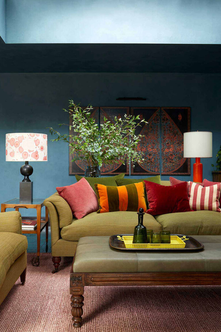
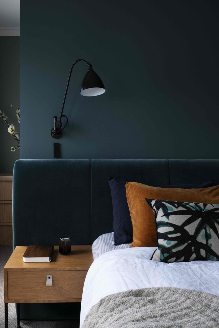
Moody Design Concept
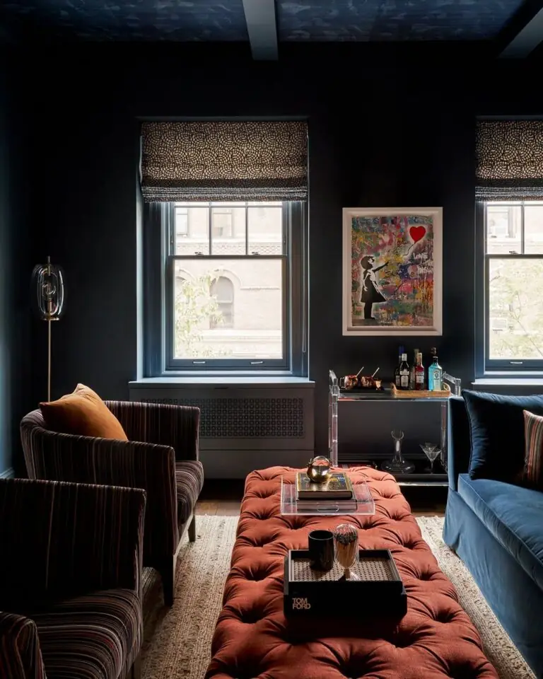
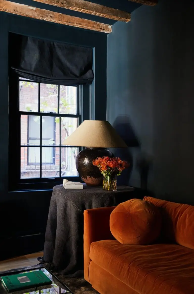
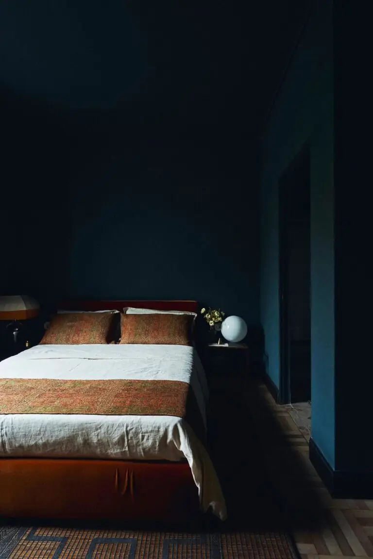
Gale Force is just the perfect option for a moody color scheme. A space with all the walls painted in this deep blue with occasional pops of contrastive color, such as an orange sofa, will add intrigue to your design. If you’re a fan of such design concepts, you’ll absolutely love the fancy and luxurious result. Additionally, think of painting the ceiling in a similar shade or white, depending on how much drama you want. Undoubtedly, such a dark color palette may seem too overwhelming, yet the connoisseurs of enigmatic yet expensive vibes will appreciate it.
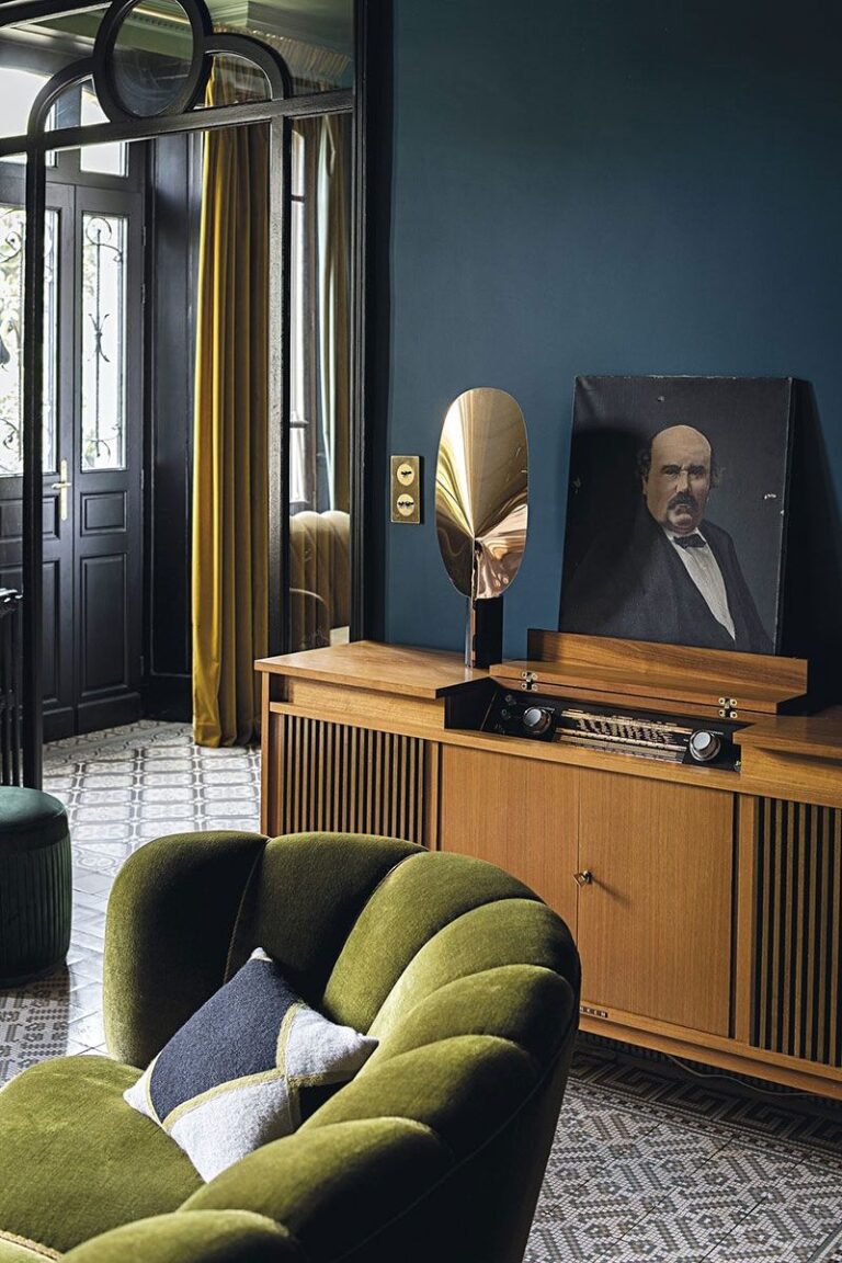
Classic Navy
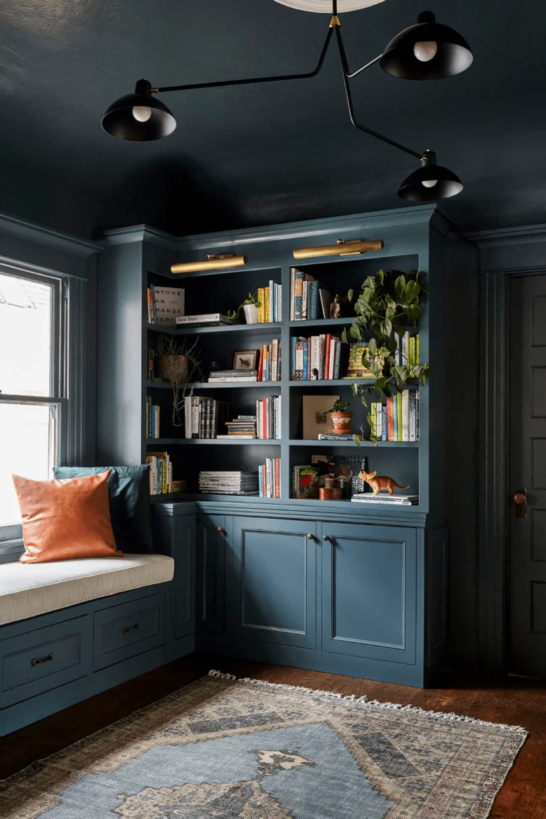
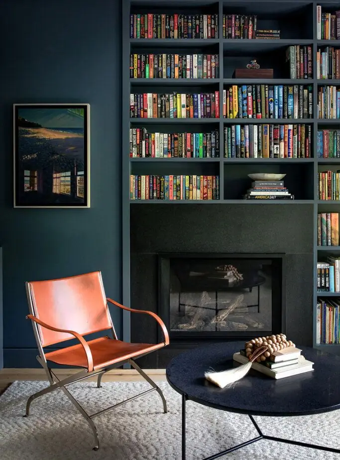
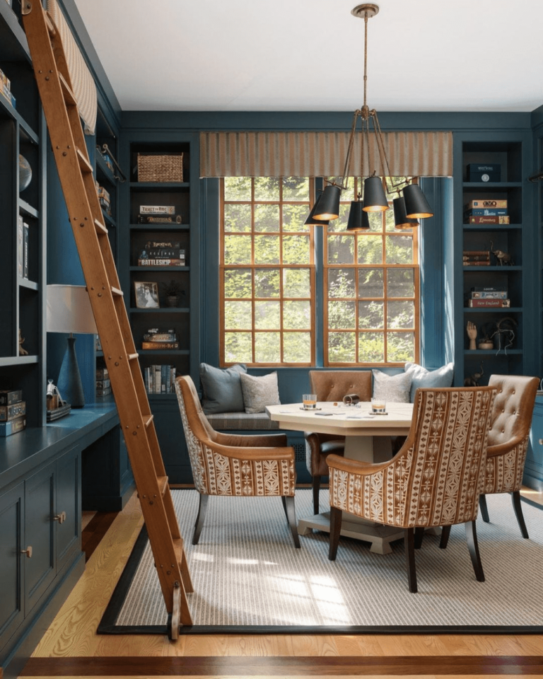
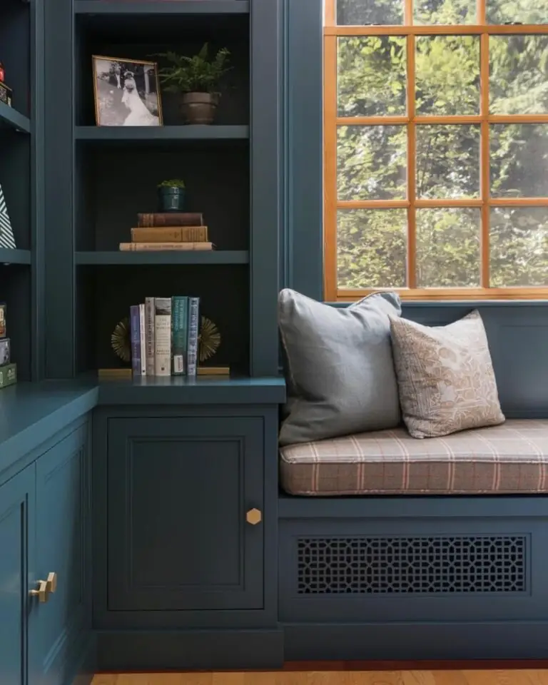
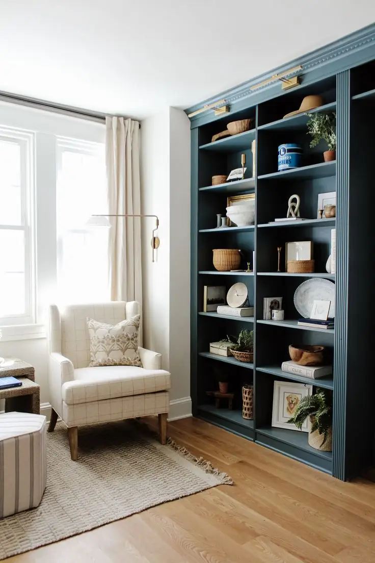
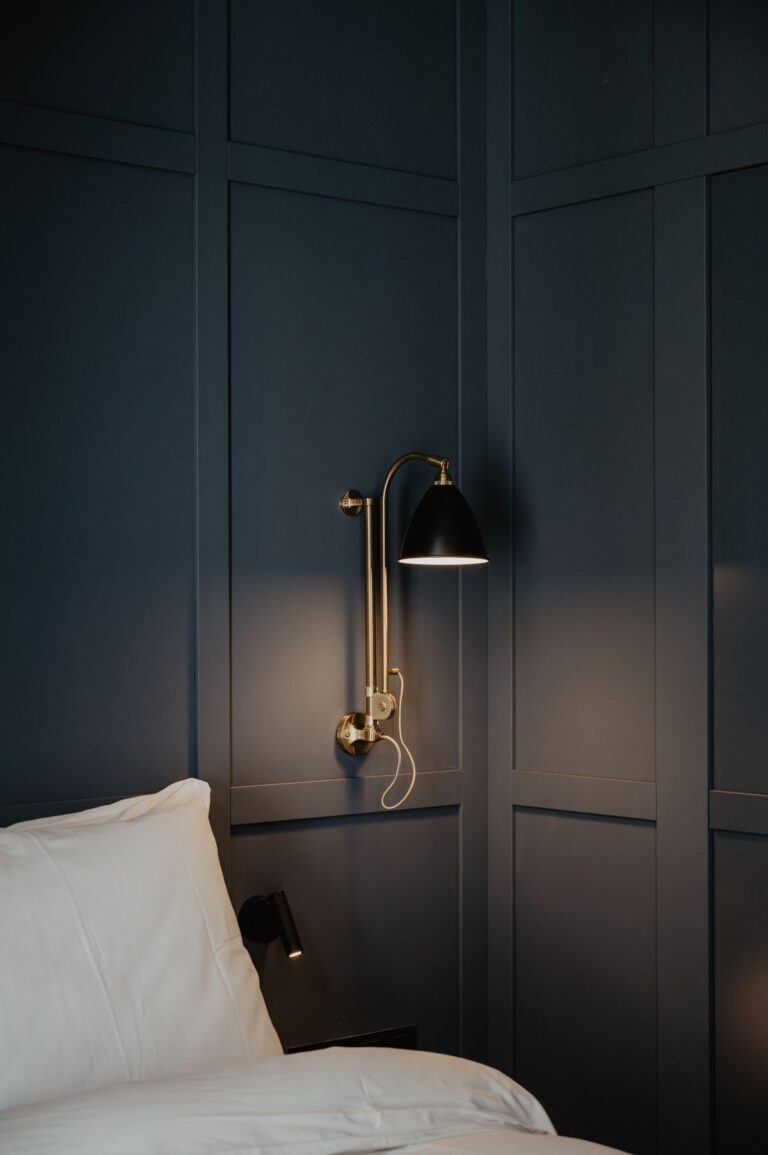
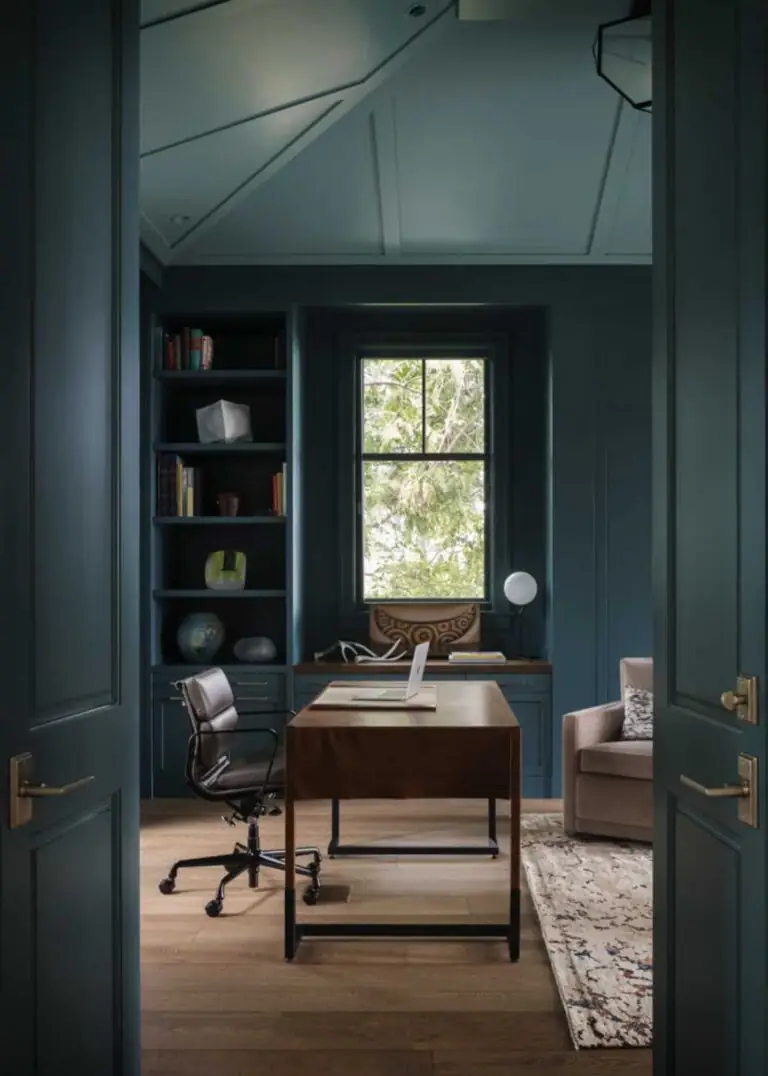
The forever abode of navy blue will always be the Classic style, whether modern or traditional. We can admire navy-colored wall panels or heavy, solid bookcases for hours. That’s why Gale Force is a go-to solution for Classic living rooms, bedrooms, and especially studies with massive bookshelves, wooden desks, and printed textiles. The weathered effect in Gale Force adds maturity to an otherwise traditional navy blue, which perfectly suits the timeless Classic design style.
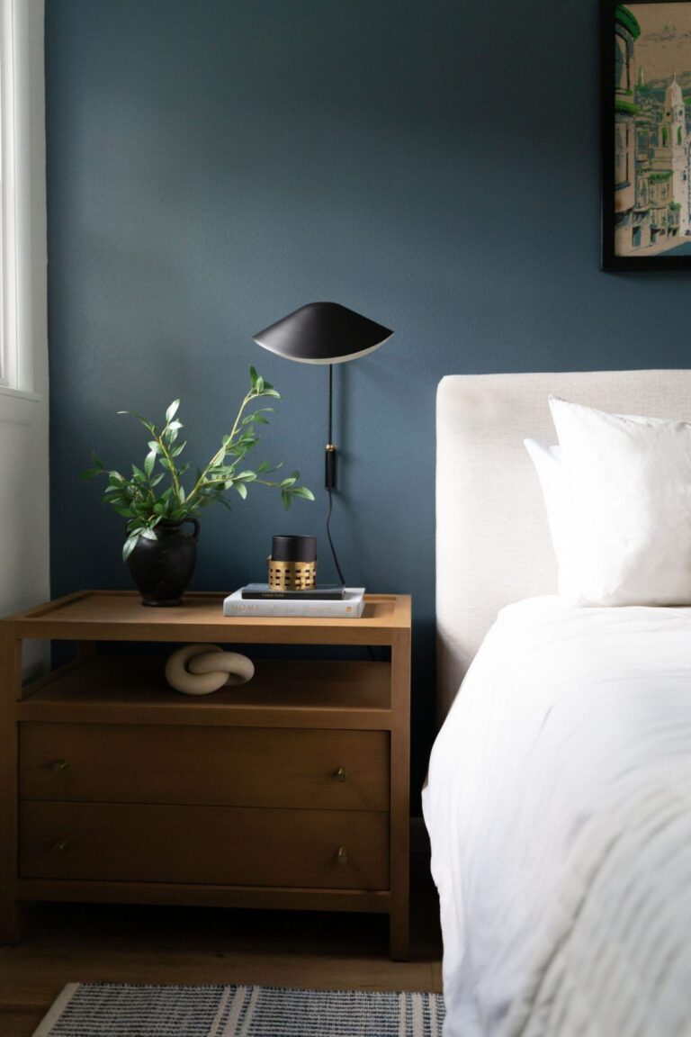
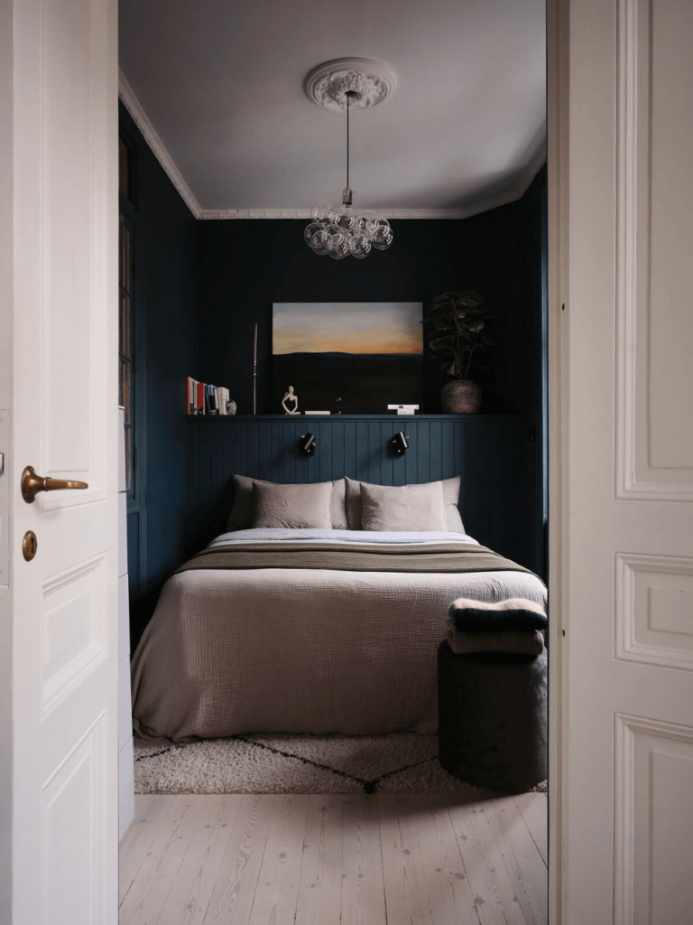
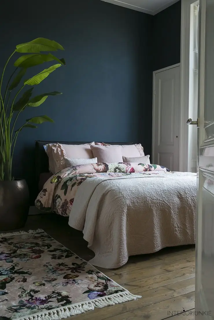
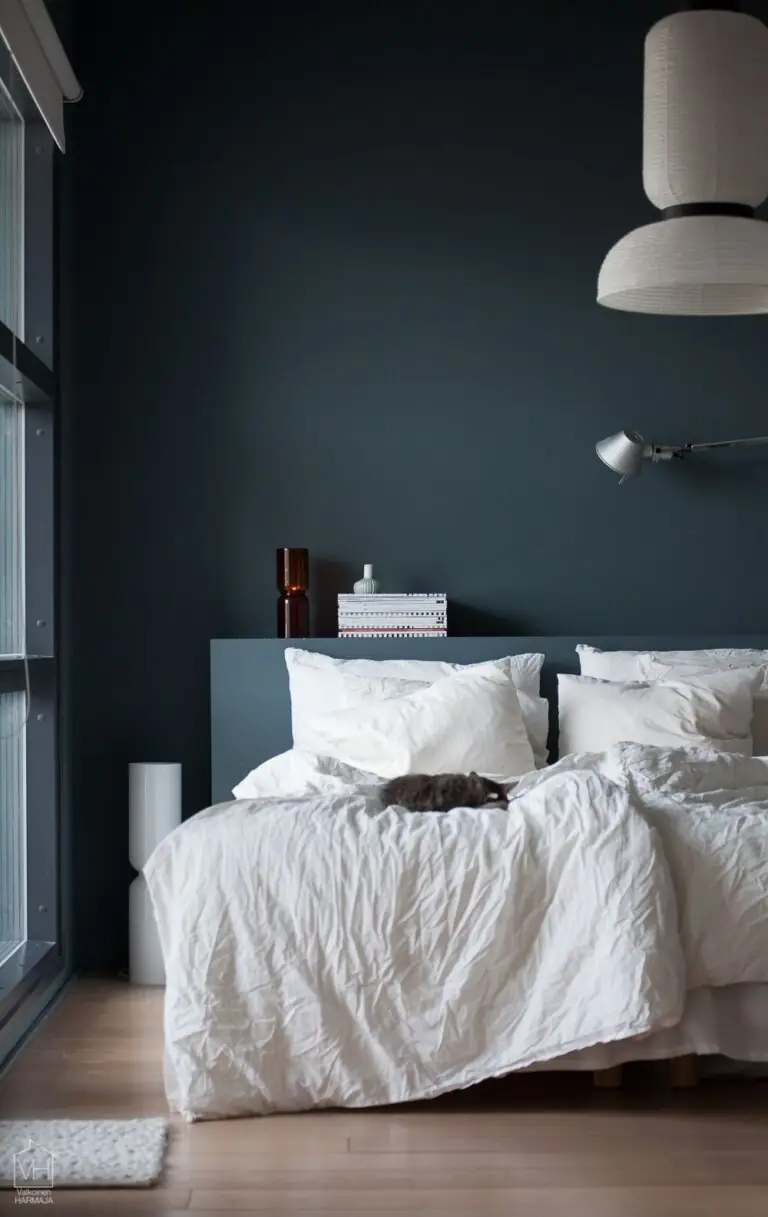
Bedroom
Contemporary designers are following the new trend of finding comfort in dark color schemes. Keep pace by painting your bedroom walls all navy blue. Mandatorily, choose light-colored bedding. It can be white for a formal contrast or creamy shades for a played-down and comfy ambiance. You’ll love the play of light on your navy blue walls, especially if decorated with paneling.
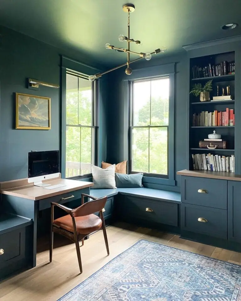
Home Office
Add more formality to your traditional study by painting walls and bookcases all together in dark blue. Next, go with wooden flooring and furniture. Light and soft neutrals for textiles will warm up the color code. Your noble home office will look like out of an authentic, quiet luxury home.
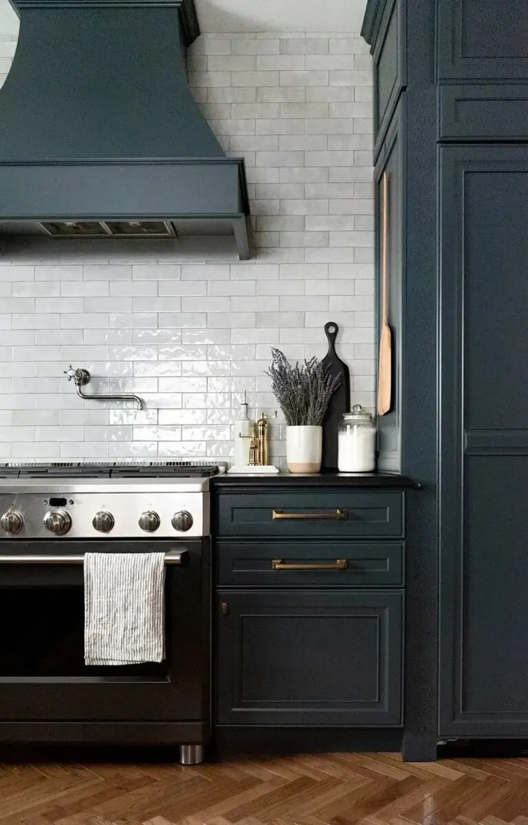
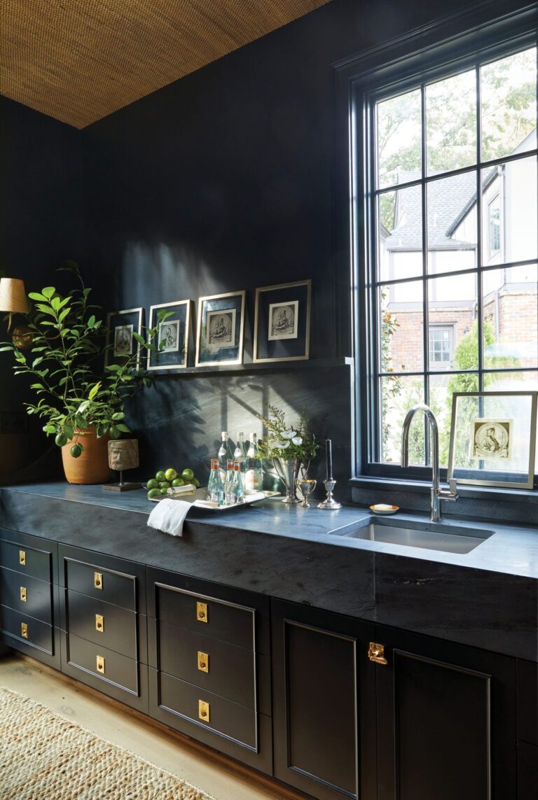
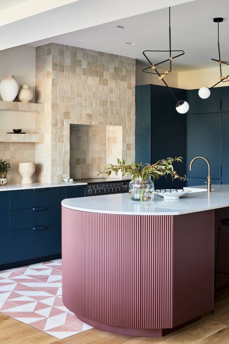
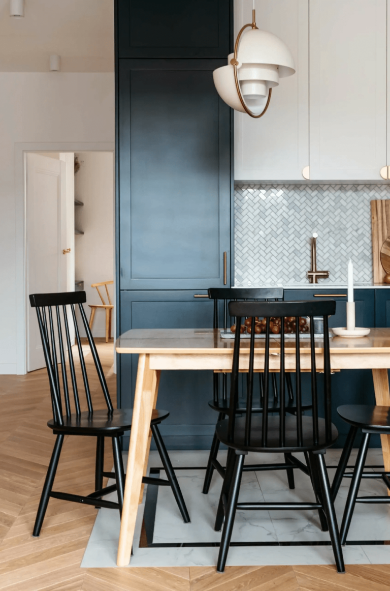
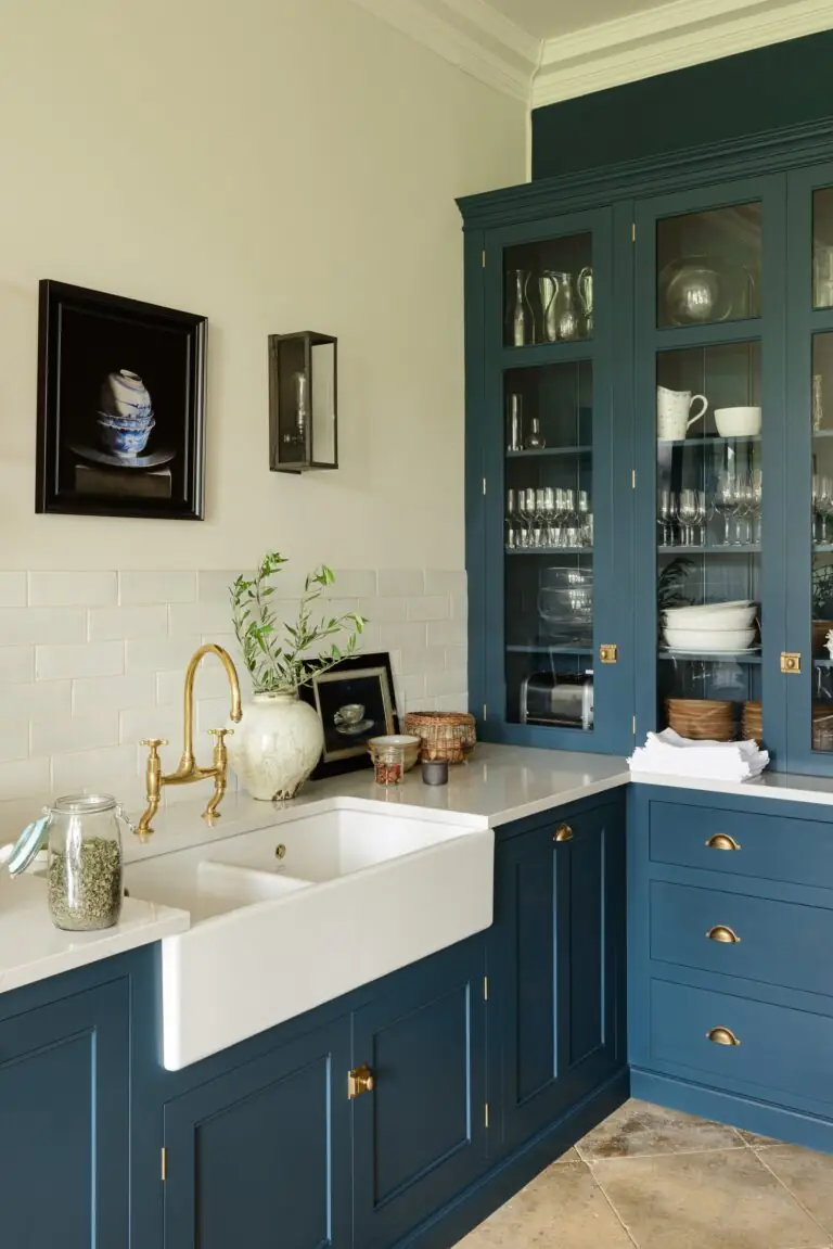
Kitchen
We all know navy is one of the trendiest kitchen paint colors. Wait and see the use of this unique navy blue that not all homeowners know about yet. It’s kind of a traditional marine blue, yet this subtle green undertone adds so much confidence to cabinets. Of course, you should use this paint color on furniture in a modern or traditional kitchen. It looks good with white or brighter shades. Experts also state that wooden tables and chairs look amazing on a blue background. Last but not least, marble, gold, and exposed glassware will simply glow in the company of Gale Force.
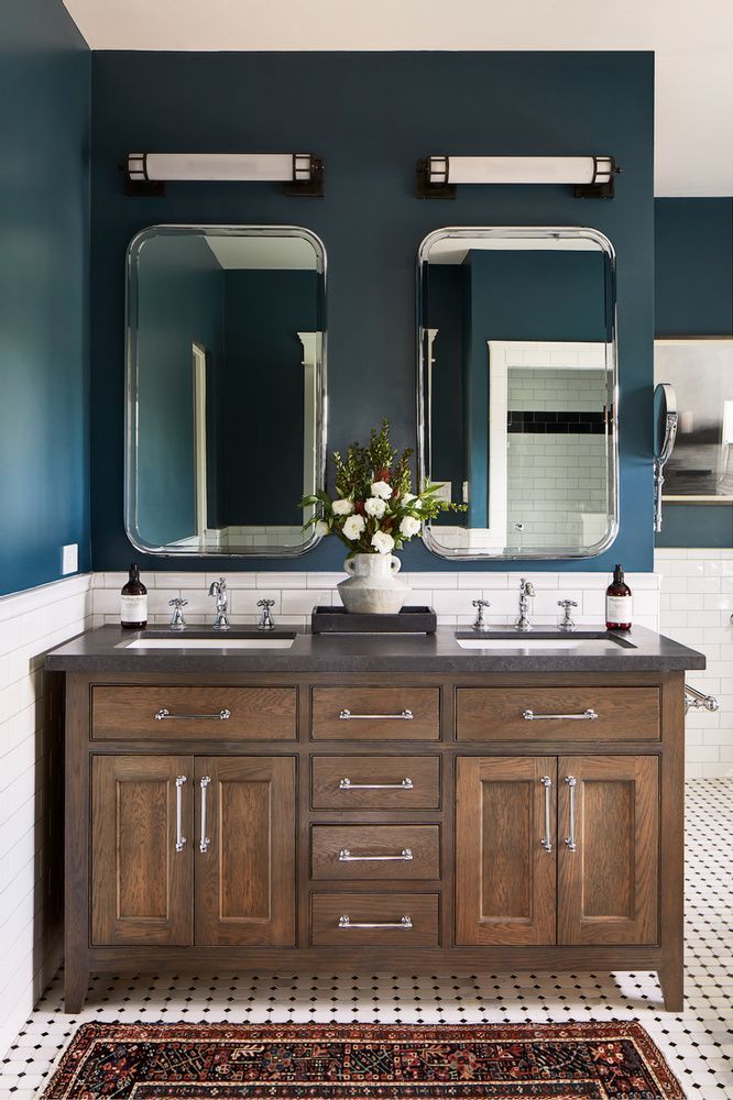
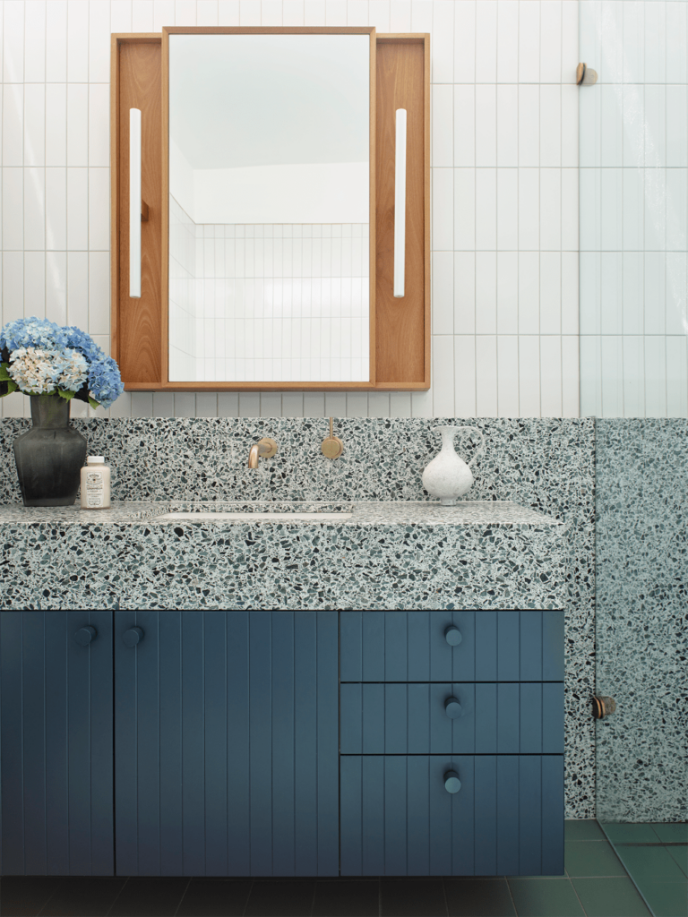
Bathroom
A green-pigmented navy blue in the bathroom? Why not, you may say. Designers, however, will say this is one of the best color options. You can use this updated navy to recreate a vintage bathroom design or to add a splash of color to a modern bathroom. Play with texture and metals.
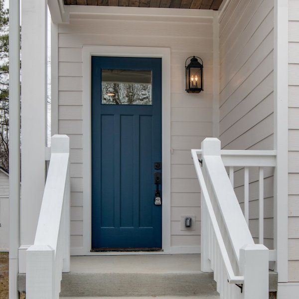
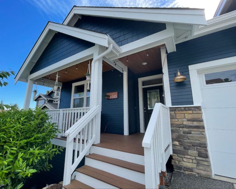
Use of Gale Force for the House Exterior
On Sherwin-Williams’ website, we can see that Gale Force is as good an exterior paint color as it is an interior one. You can use it on the front door, exterior walls, shutters, and even the garage door. Its low LRV preserves its saturation when bathed in direct natural light, and its green undertone perfectly blends with the natural surroundings.
Sherwin-Williams’ Gale Force SW 7605 paint color is one of the best navy blues you’ll ever see. This deep, organic, soothing, attractive, and powerful shade, as the name implies, is a skillful tool in the hands of a designer or homeowner. It is easy to work with, yet the result of using Gale Force in your home will leave you and your guests impressed.
