Heritage Red HC-181
Benjamin MooreA perfect mix of ruby red and crimson. While the first one is responsible for the impressively rich shade of red, the latter ensures the muted effect for a balanced result.
Heritage Red HC-181 (Benjamin Moore): what color is, review, and use
We have been avoiding the bold colors for a long time now, and it seems that they are ready to make an impressive comeback. At least, this is what the paint and coating manufacturer Benjamin Moore shows with its outstanding shade of red with as much an imposing name “Heritage Red”.
Refined, elegant, and full of vibrant notes, this timeless shade from Benjamin Moore is part of a wide palette under the Historic Color collection that includes 191 colors. The collection itself, which was revealed in 1976, was used to celebrate the US bicentennial. Therefore, all these colors, among which Heritage Red, are an interpretation of US history, national values, and mostly the historical landmarks. This is when a single color becomes a feeling. We see things differently, and we have our right for that, while established values last for years, and their unchanged status points out their belonging to traditions. There is much more history behind this red shade from Benjamin Moore and even more features to be discovered. We will take care particularly of the latter, which reflects tradition itself.
Heritage Red paint color features
Undoubtedly, the first thing that comes to mind when speaking about a red shade is a bright color with an eye-catching effect, and you will not be wrong in this case. Nevertheless, this one, in particular, has lots of mysteries. We are here to reveal them!
Heritage red from Benjamin Moore is a perfect mix of ruby red and crimson. While the first one is responsible for the impressively rich shade of red, the latter ensures the muted effect for a balanced result. One should note that this particular balance of contrasts offers Heritage Red an aged effect, pointing out its historical value. As we have said, you will not even notice how tradition will intervene in the most unexpected ways.
Heritage Red: is it warm or cold?
After discovering the deepest notes of this shade that are an interpretation of love, passion, and courage, one cannot fail but notice the warm feelings that this color radiates. Furthermore, the subtle muted effect stands behind calmness. All in all, everything points out the inviting effect that this shade has upon a space.
It is noteworthy that red can also look daring, and our shade is not an exception, although everything depends on balance. The golden mean in this respect is a clearly established border between such features as energy, stimulation, confidence and anger, aggression, danger. Red is still red, and nobody cancelled its main peculiarities.
How does lighting affect Heritage Red?
Undoubtedly, a bold color like that will shine at its finest when exposed to light, and what we mean by that is exposing its rich undertones. Unfortunately, there is no way back in this sense. Once the light penetrates this color, the latter does not allow its return at any cost. Lively and full of energy during the day, and a little bit muted and even enriched with new warm undertones due to artificial lighting, Heritage Red is all about new impressions.
Heritage Red LRV
With a light reflectance value of 8.36, we can state without doubt that Heritage Red belongs to dark colors. Don’t you dare associate this shade with such dark colors as black or dark brown; all we are trying to say is that this particular shade of red does not have an impressive ability of light reflectance if having one of this kind at all. Nevertheless, if you want to make it shine in all its beauty, an appropriate amount of light is required. Nothing compares with natural light, although lamps, chandeliers, or sconces will work as well.
Heritage Red undertones
This rich shade of red consists of warm brown undertones, dark pink notes, and a slight scent of gray that can be noticed in the muted effect. They are pretty far from each other on the color wheel, but we shall not consider them separately. The common result of their combination is the basis for the fantastic Heritage Red. However, it is the brown notes in particular that contribute to the warmth of this color. The more light penetrates its surface, the more visible the effect is.
Similar colors
We cannot doubt the uniqueness of this shade inspired by traditions. Still, there are colors whose similarity to Heritage Red is impressive. Of course, they don’t reflect similar feelings, but they have their own peculiarities that are no less inspiring. Furthermore, experts from both Benjamin Moore and other paint manufacturers are ready to impress you with astonishingly similar shades. Let’s discover them!
Coordinating colors
Heritage Red is bold enough to compete with bright colors, which means that it will not go hand in hand with shades alike. Nevertheless, its rich undertones will prevail in beauty and finesse when used with neutrals or soothing shades. Both cool and warm shades are to be considered. Let’s find out what experts from Benjamin Moore suggest in this sense!
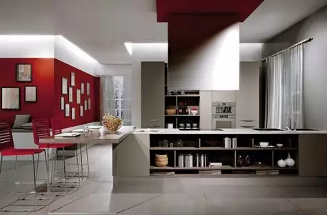
The use of Heritage Red in interior
You would not be wrong to think that the most appropriate element to consider this shade for is accents, such as an accent wall. Vibrant, enlivening, and stimulating; such a bold statement will surely take your interior to the next level. If you think that a contemporary setting would be spoiled by such bold accents, you miss the opportunity to experience a whole range of emotions that Heritage Red has in store for you.
Living room
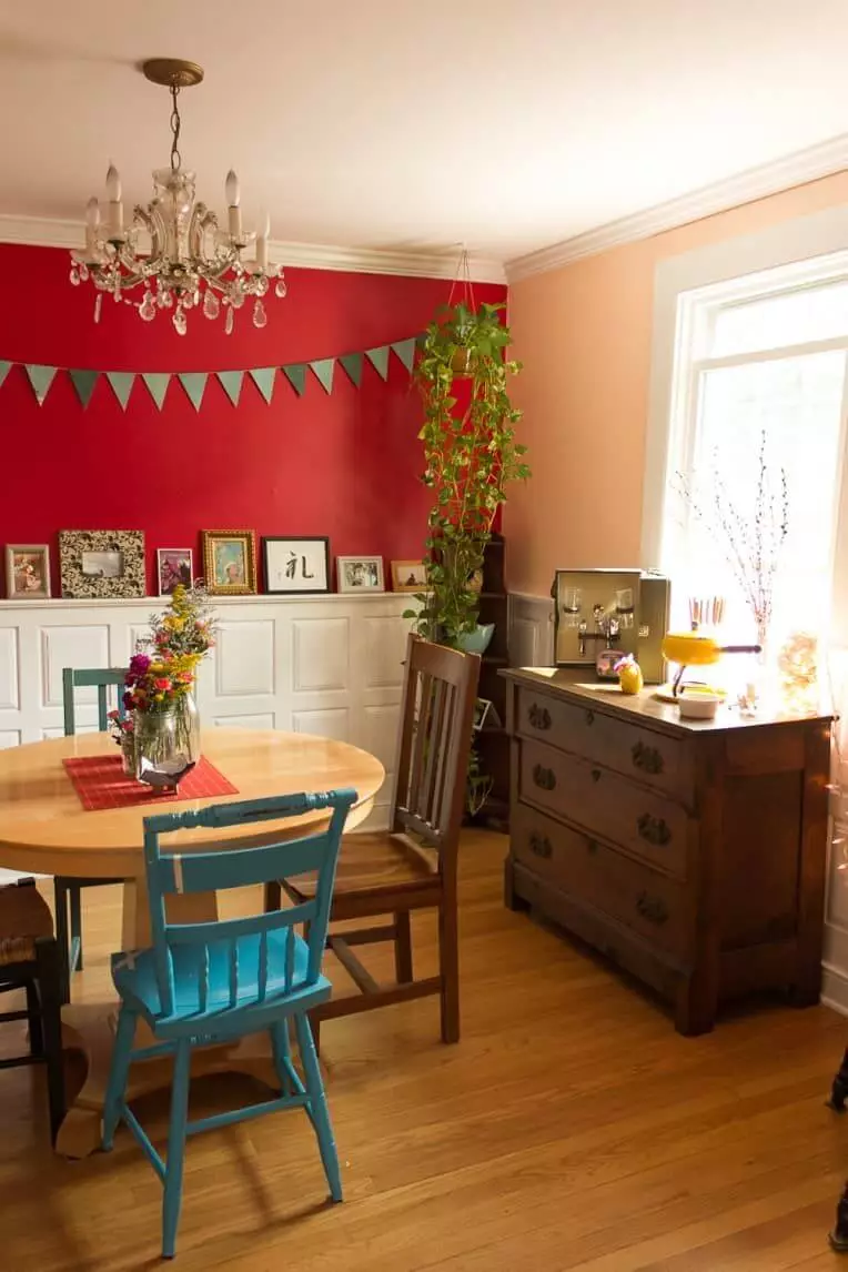
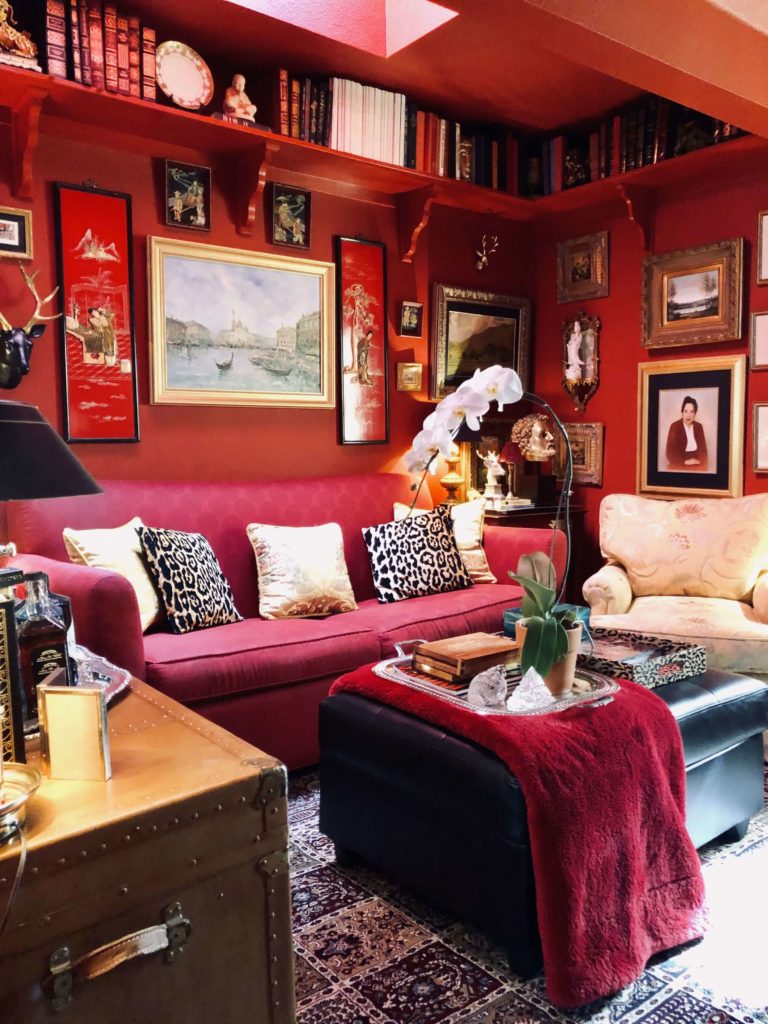
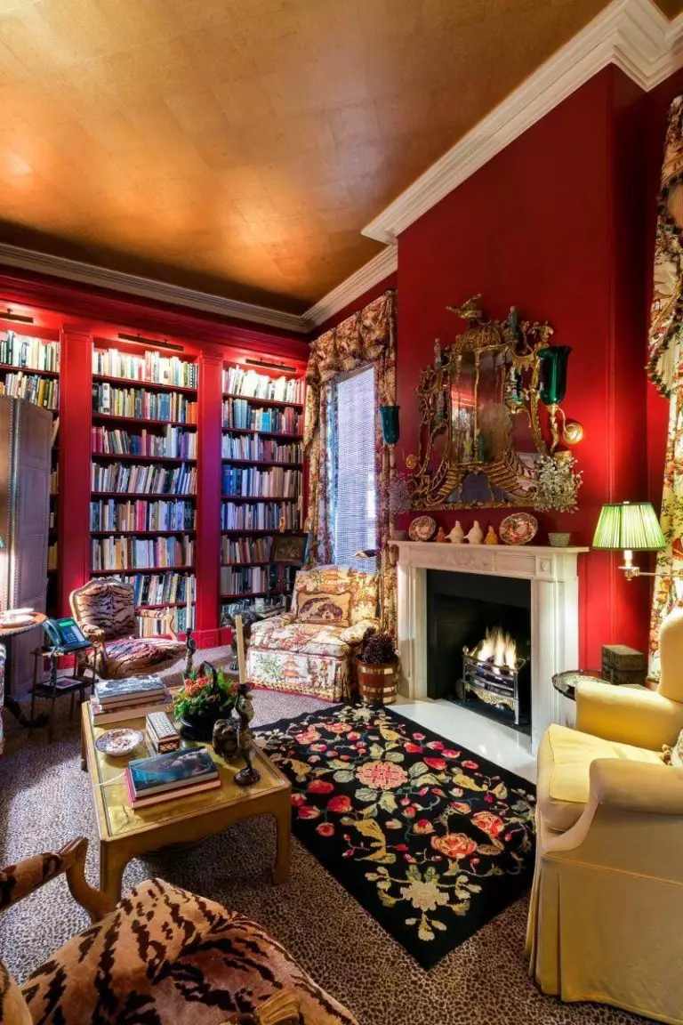
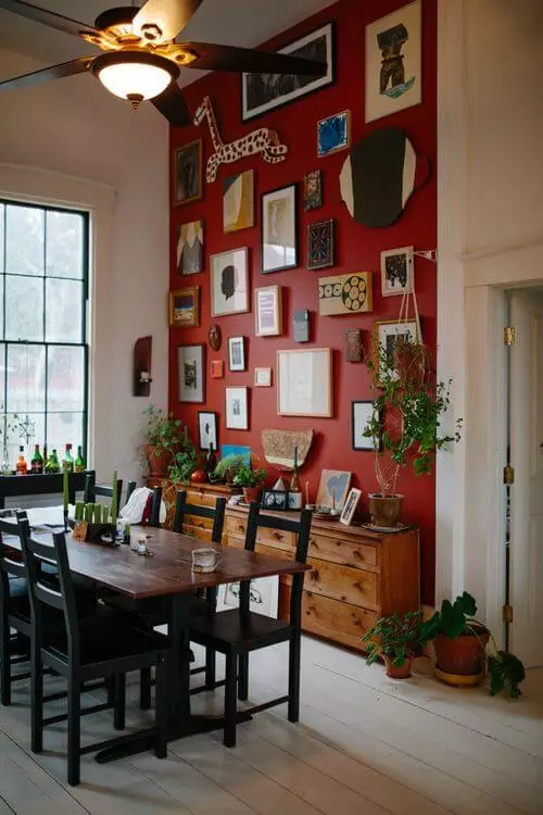
As bold as it sounds, a living room with walls covered entirely in red is quite a surprisingly comfy space, which makes you feel free to explore your dreams undisturbed by the rest of the world. A cozy evening while reading your favorite book, a pleasant dinner with your family; this is what a living room with walls painted in Heritage Red feels like. It should be noted that this shade will work at its fullest for living rooms that include a dining area. The impressive color from Benjamin Moore should be used particularly for the latter as an accent wall to underline it as a separate space. It is quite daring, not suitable for everybody, but take our word for it: nothing will make your living this inspiring and full of personality as Heritage Red can.
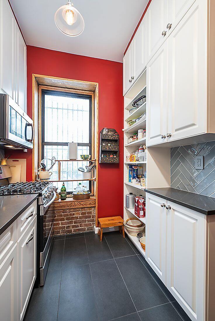
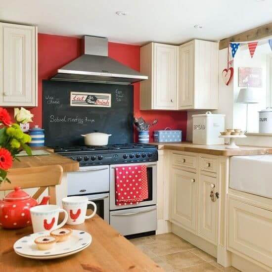
Kitchen
A kitchen will benefit from a red accent wall the same way the living does. Nevertheless, the walls covered entirely in red will not work in this case; it seems too extra for a cooking space. Contrastive cabinets in any of the colors mentioned earlier as coordinating for Heritage Red are perfect for a red accent. Still not ready for such a contrastive play with colors? Wood texture is at your disposal. Furthermore, it will bring the brown undertones of your accent wall to the surface as well as its defining feature – warmth.
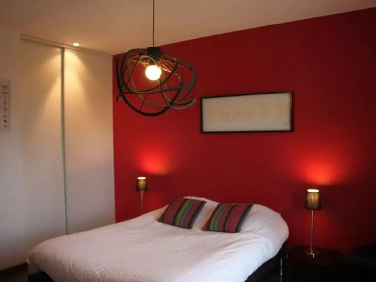
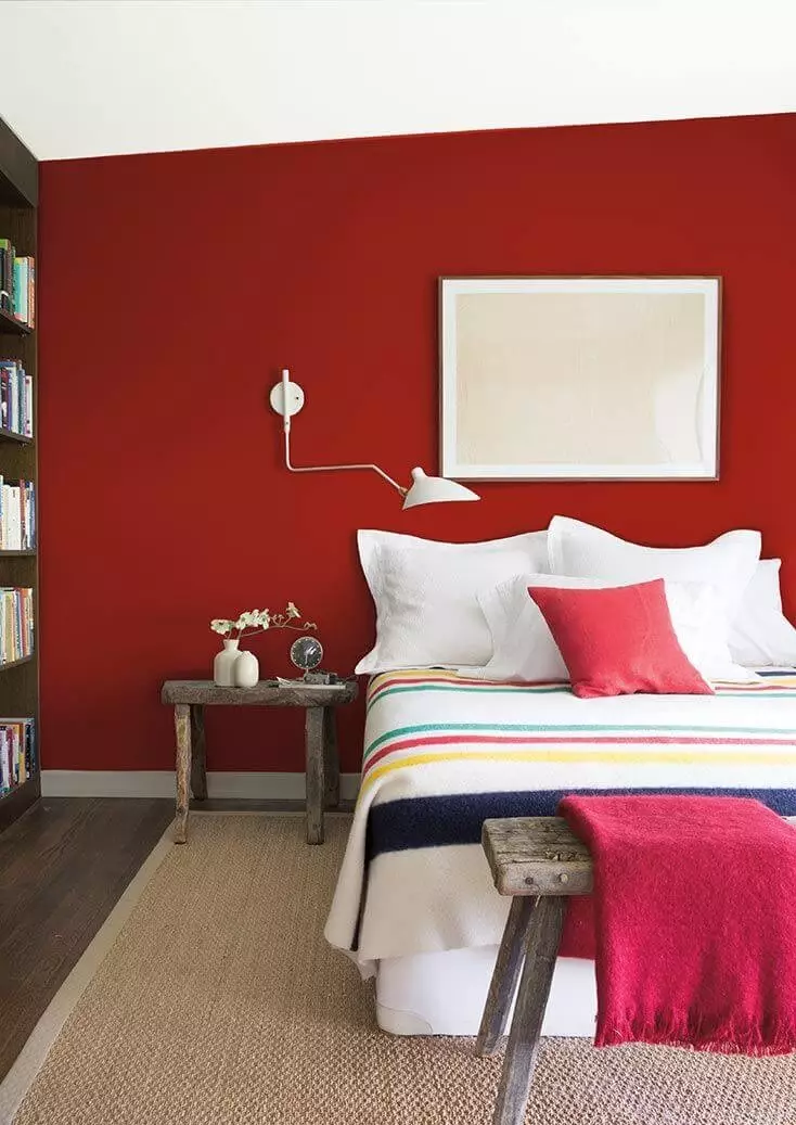
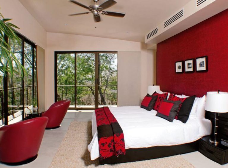
Bedroom
Are you planning a whole bedroom makeover? Are you looking for new ways to express your energetic personality? One bold decision, one bold step, and your personal space will shine in a new way. We refer again to a red accent wall. The muted notes of this shade will fit in perfectly in a place that requires calmness. Nevertheless, expect a wave of vibrance as well. A few pieces of furniture or textiles in the same shade and your accent wall will fit in as if it has always been part of this space. It feels like we have missed something. That’s right! Consider contrastive bedding to avoid the blurred effect.
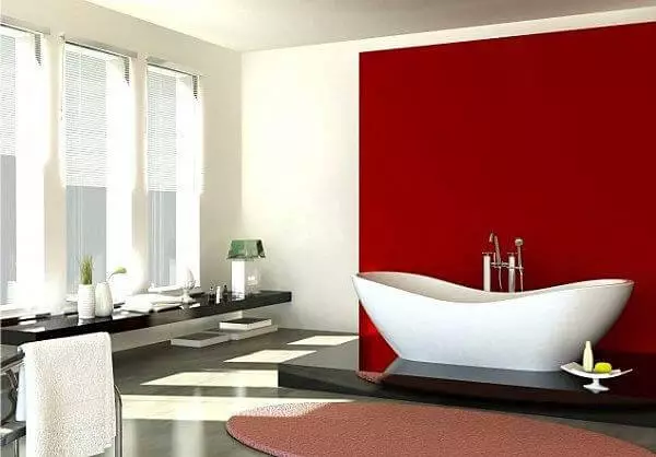
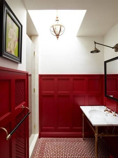
Bathroom
The further we reach, the more interesting it gets. Although it seems too contrastive and draining, we want to assure you that nothing like that can be associated with the classic white and red combination. How do we play appropriately with it? If you wonder where it will look better: in the neighborhood of the bathtub, above the sink, or paired with wood panelling, we are happy to announce that all these options are perfect. It is up to you which one fits your space.
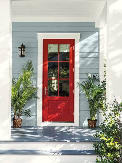
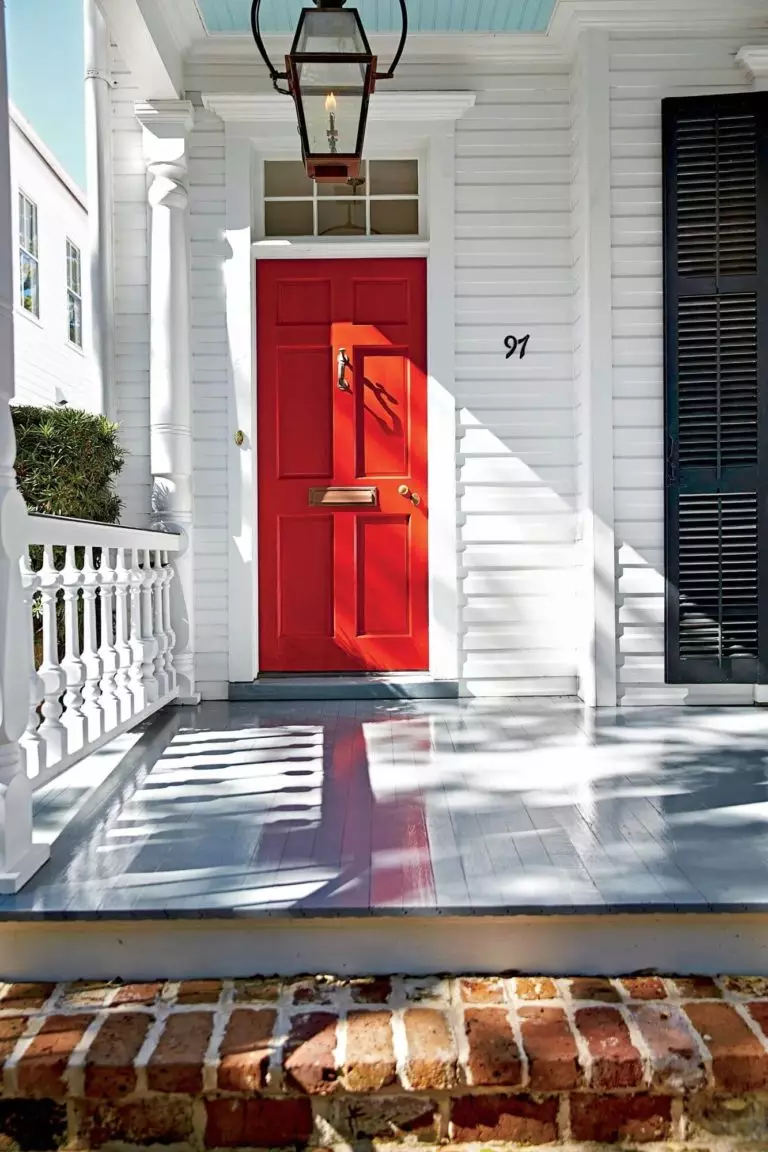
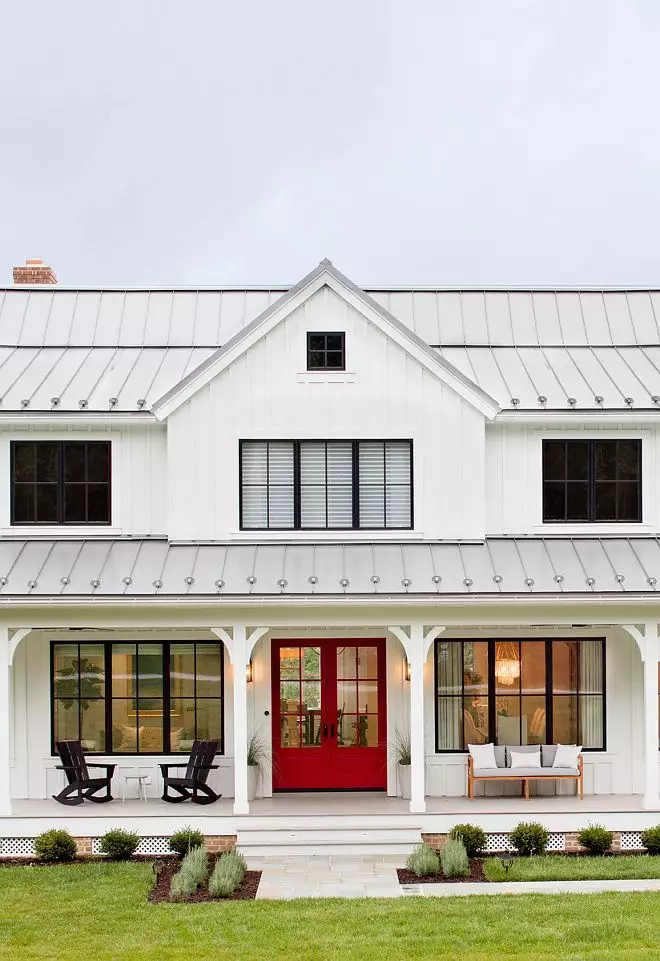
The use of Heritage Red for exterior
You will probably not be surprised to find out that a house painted entirely in Heritage Red is quite inappropriate. The beauty of bold colors itself consists of using those in small quantities, revealing their mystery slightly, and letting our imagination play the rest. This is why such a fabulous reddish accent will complement the house exterior at its finest if used for the front door. As regards the facade, there are plenty of neutrals that would be happy to pair with our unbeaten bold color.
The already beloved Heritage Red paint color from Benjamin Moore seems to be the next favorite shade of red for interior and exterior design. The reason is clear: it is a perfect combination of passion, stimulation, energy and calmness, comfort, and individuality; quite a personality we have here! Most importantly, these features can enter your house all at once, whether you opt for a traditional or contemporary setting.
