Illusive Green SW 9164
Sherwin-WilliamsThe SW 9164 paint color from Sherwin-Williams is a mix of green and gray, where the latter prevails. It is indeed a gray shade that makes the illusion of green.
Illusive Green (SW 9164): what color is, review, and use
Let’s get a bit of an earthy vibe with the newly discovered shade of gray-green from Sherwin-Williams – Illusive Green SW 9164. It looks like a shade of gray with a hint of green, not to our surprise. Still, part of the green family, this paint color reflects impeccable notes of naturalness in a relatively neutral way. Designers regard it as a perfect alternative to the usual gray shades for those who want a bit of vibrancy and connection with nature. It indeed caught our attention, and the results of our analysis are impressive, which we will happily share with you.
Illusive Green paint color features
The SW 9164 paint color from Sherwin-Williams is a mix of green and gray, where the latter prevails. No wonder why it was called Illusive Green. It is indeed a gray shade that makes the illusion of green. Nevertheless, the green notes are perceived and stand for the earthy effect. Although a medium-tone color, Illusive Green plays quite the trick on you under specific lighting, but later on this. If you wonder what it feels like, we hasten to convince you that this seemingly neutral shade refreshes the space in a way you can only feel in nature, such as a rainy summer day in the forest, when it feels cool and pleasant at the same time.
Illusive Green: is it warm or cold?
If you paid attention, we mentioned the word “cool” earlier, which can be confidently referred to in this sense. Illusive Green is a cool shade, and you can feel it as soon as you enter a room painted this way. Still, it would be too harsh to call such a beautiful shade cold. One should note that this paint color seems like freezing time and letting you enjoy the moment.
How does lighting affect Illusive Green?
As usual, we will refer to both sides of the coin. In north-facing rooms, Illusive Green reveals its coolest variation. It seems that the green notes fade into the void, and the shade itself appears to be gray only. Even a hint of blue may be perceived. On the other hand, in the west, east, and south-facing spaces, SW 9164 reveals its true green nature and may even seem warmer when bathed in the midday sun rays, which is also the case with warm artificial lighting that also intensifies the green notes. One more thing: in full daylight, Illusive Green looks very light and leans soothing gray, while a tiny shadow can make it appear very dark and imposing.
Illusive Green LRV
It is hard to believe that a color that can look relatively light under particular conditions has a Light Reflectance Value of 29, closer to dark shades. Furthermore, in a space fully bathed in daylight, this paint color reflects light impressively, making the room feel slightly more spacious. Still, the scenario changes entirely when such lighting conditions are not ensured, with Illusive Green taking on an accent appearance.
Illusive Green undertones
It is still not clear: is it a green shade with gray undertones or the opposite? Nevertheless, both green and gray are undoubtedly part of this shade, switching places according to specific conditions. This is the uniqueness of Illusive Green, which may seem a true gray, a very earthy green, or even replicate a slight bluish freshness. It sounds like this paint color is unpredictable, which may scare some homeowners. Still, it is more of an opportunity to adapt this shade to a wide range of design solutions.
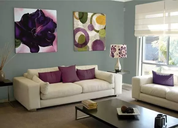
Similar colors
As with other gray variations, which we refer to since gray is more perceived at SW 9164, this paint color has many similarities with various shades at Sherwin-Williams and other popular color brands. What makes them differ slightly from each other is how the green notes reveal themselves. Let’s get to clear examples!
Coordinating colors
Firstly, we would like to draw your attention to the trim that would look perfect on a green-gray background if painted with a neutral shade of white. Next are the soothing variations of lighter shades to contrast with the accent green from SW. Still, this paint color is ready to collaborate with darker variations yet neutralized by a pale base to ensure that Illusive Green remains the main character. Let’s find out what experts from Sherwin-Williams have to offer!
Use of Illusive Green in interior
If Illusive Green had to pick two matching partners and keep them forever, it would be a white paint color and wood. This explains its appropriateness within Farmhouse interiors, particularly with a modern approach. Nevertheless, this gray-green is a new neutral, and, although a new kid on the block, it perfectly replaces the usual gray shades with a no less neutral splash that also brings something new – limitless naturalness. The last statement is a reliable reason to believe that Illusive Green fits a wide range of styles and suits almost any space within the interior. Let’s see how it works in actual settings!
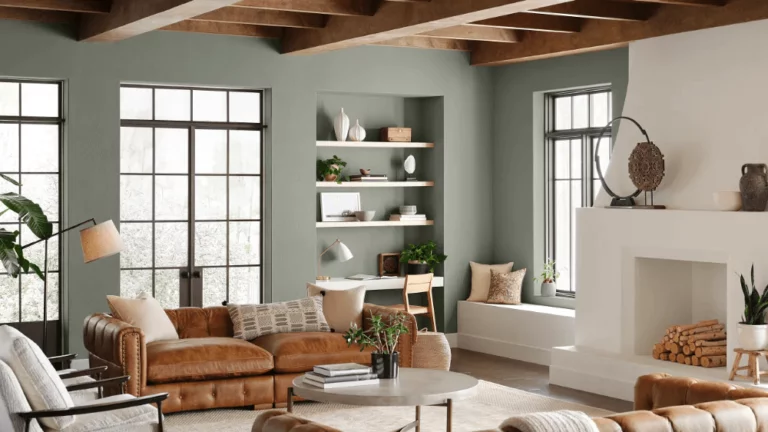
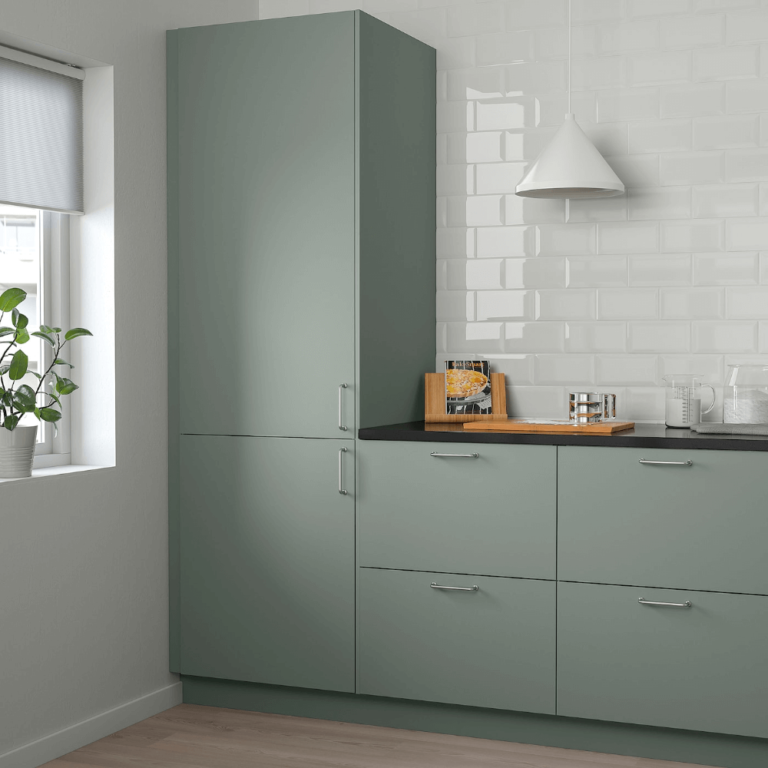
Redefined Modern Farmhouse
Is it possible to redefine a style that has already been adapted to modern values? The new neutral changes the perspective entirely, and you can adjust the style, which defines comfort itself, to contemporary design rules even more. Consider Illusive Green for the walls in the living, cabinets in the kitchen, and even an interior door in the bedroom. Accompany it with wood, particularly dark wood, and white for a sleek contemporary interior. The green notes and wood scents will harmonize for an impeccable connection with nature, which is a no less updated source of comfort.
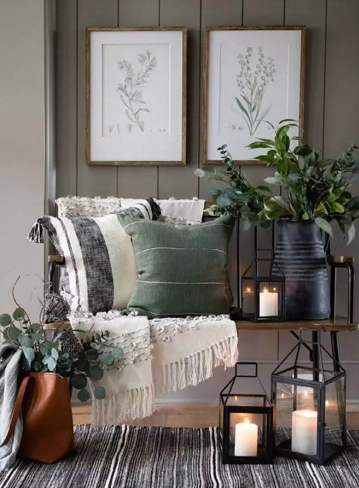
Living room
The new neutral is stunningly flexible and ready to implement your wildest design ideas. Don’t hesitate to experiment with it in the living room. For a start, consider a monochromatic palette and a functional layout with Illusive Green as an accent wall or base color. Do you fancy a splash of bold colors but are not sure how to neutralize them appropriately? The SW 9164 is at your disposal. You probably wonder why this color and not a usual shade of gray. Contemporary interiors require a bit of uniqueness that stands within limits, and the neutral Illusive Green with a fabulous natural note is a perfect choice.
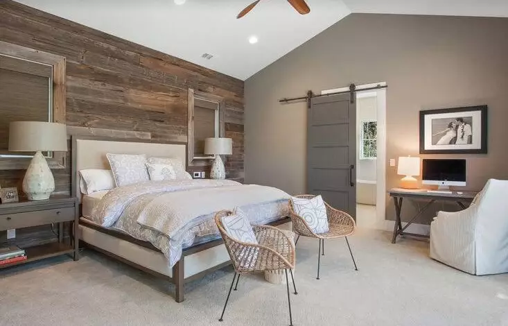
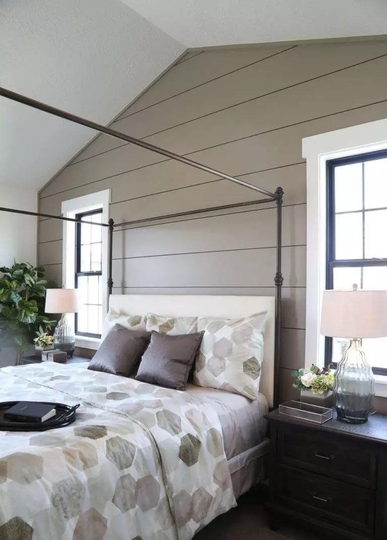
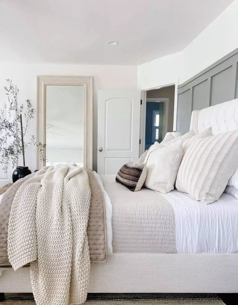
Bedroom
You can consider one of the following options involving Illusive Green as a background. Opt for an all-white bedroom, where the gray-green walls will ensure comfort at the appropriate level. If white seems too cool for your personal space, consider bolder yet soothing shades to let SW 9164 prevail. Don’t hesitate to add a few wood pieces of furniture for a new source of warmth. If you still go with a monochromatic palette, don’t forget about matching green textiles so that this space radiates harmony for a full connection with nature.
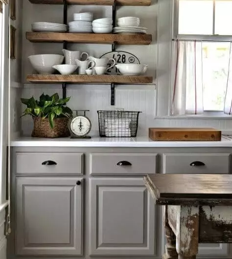
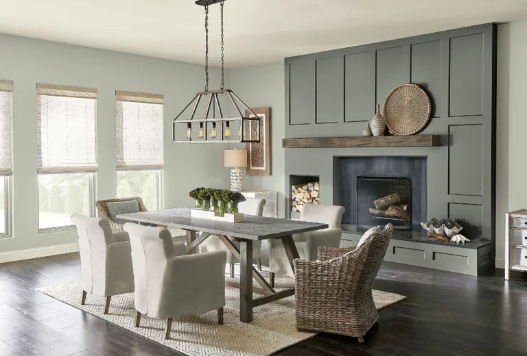
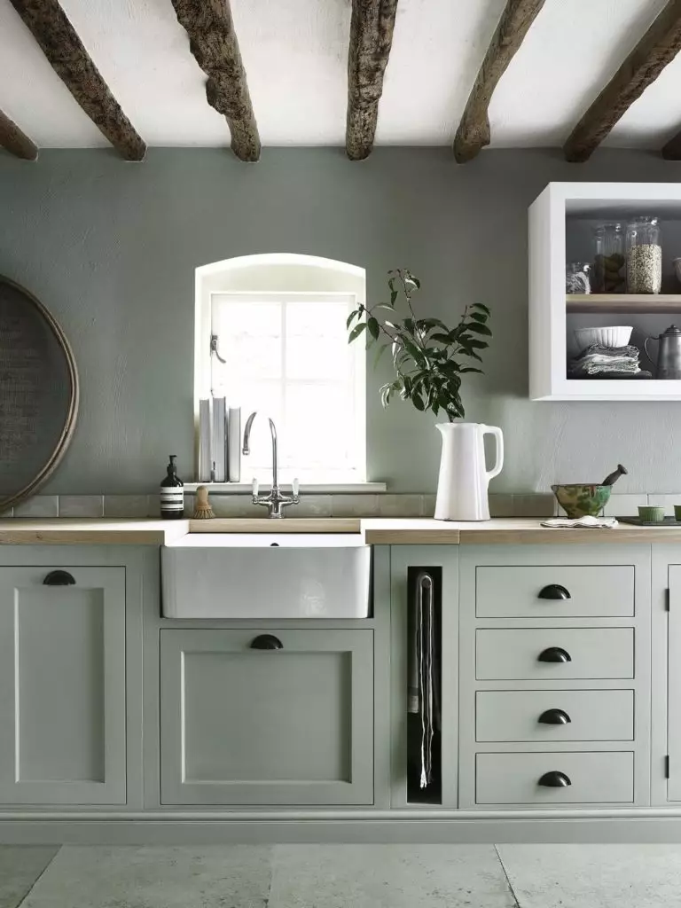
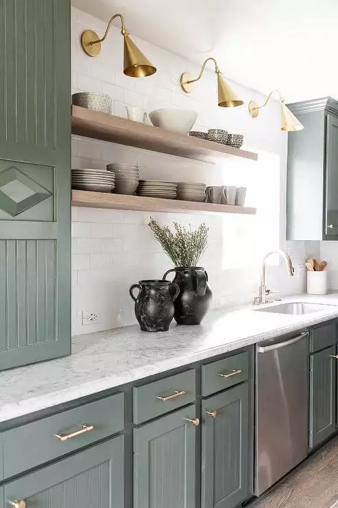
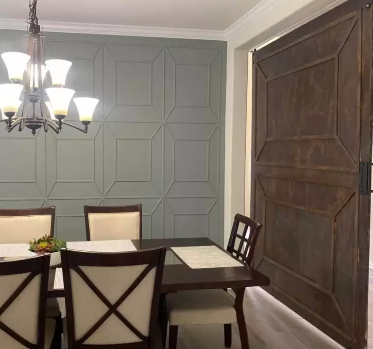
Kitchen and dining room
Illusive Green is sophisticated enough and requires nothing more than white as a companion to complete the design. Of course, we speak about cabinets painted in this fresh shade of gray-green. Add a pair of brass sconces, and you will instantly notice how the green notes become more perceived, and your kitchen acquires a more complex look.
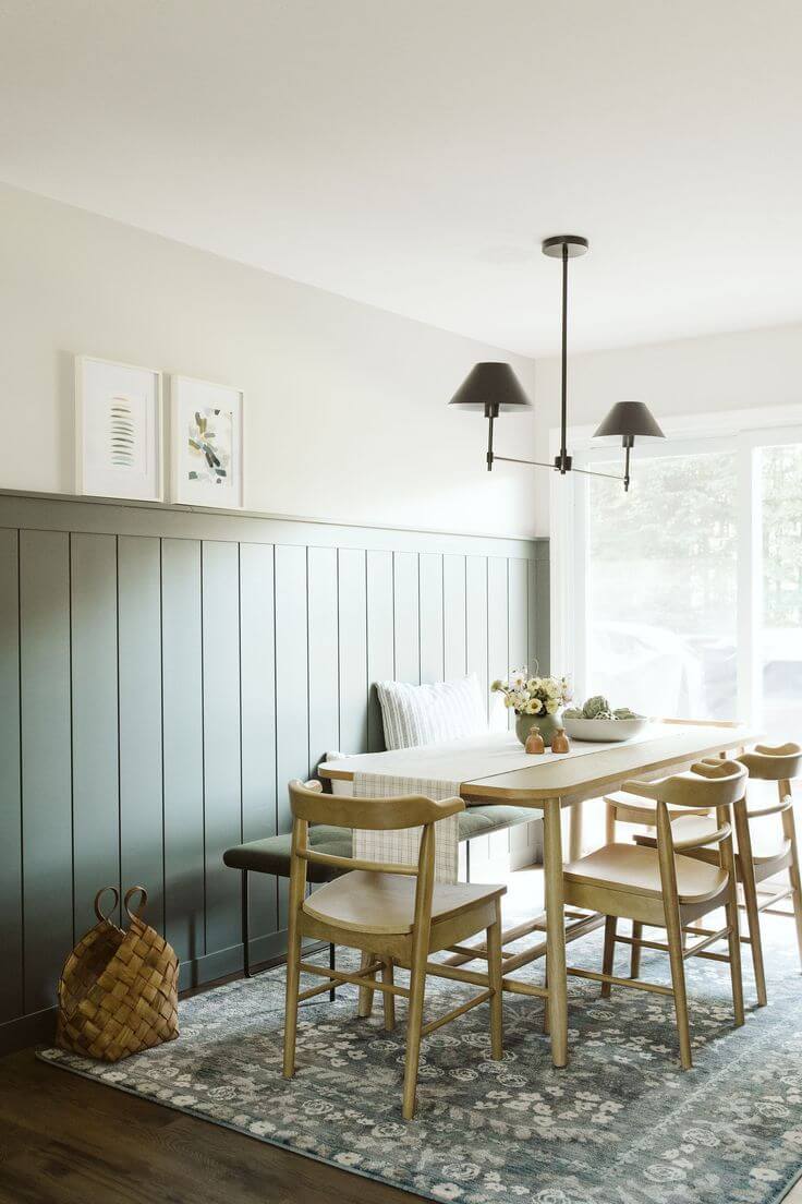
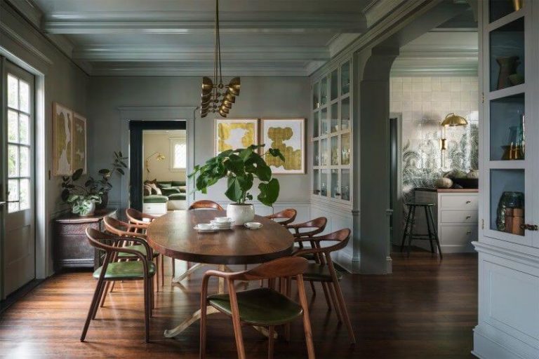
In the dining room, it is even simpler – SW 9164 for the walls, a minimum of decor, and particularly wood furniture with round edges to increase the sense of comfort slightly replicated by the gray-green background.
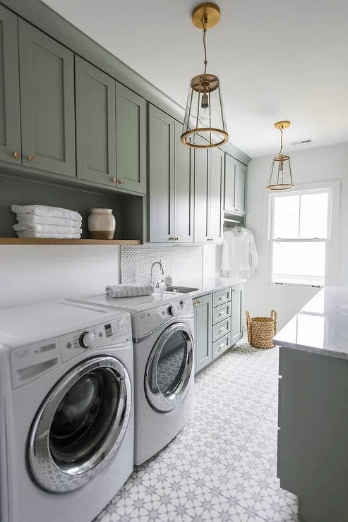
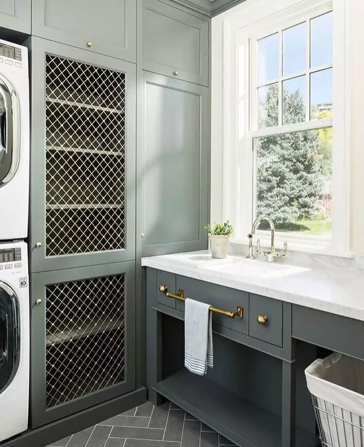
Laundry room
Lately, there has been increasing popularity of this paint color within the laundry room. Not far from the kitchen, this space implies a similar approach with Illusive Green for the cabinets, white for the walls, and brass, in this case, even steel, for the hardware. This way, this space will preserve its functionality and not be devoid of style, which should not be overlooked even within such rooms.
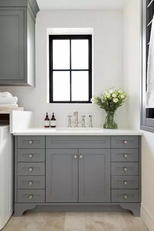
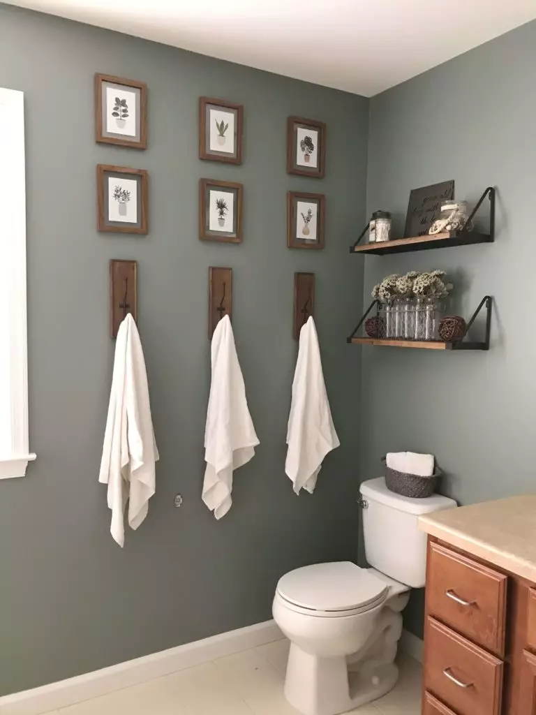
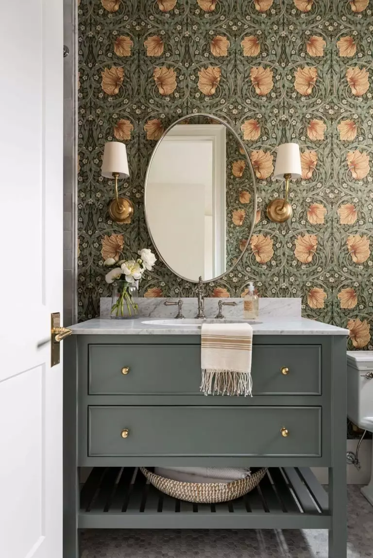
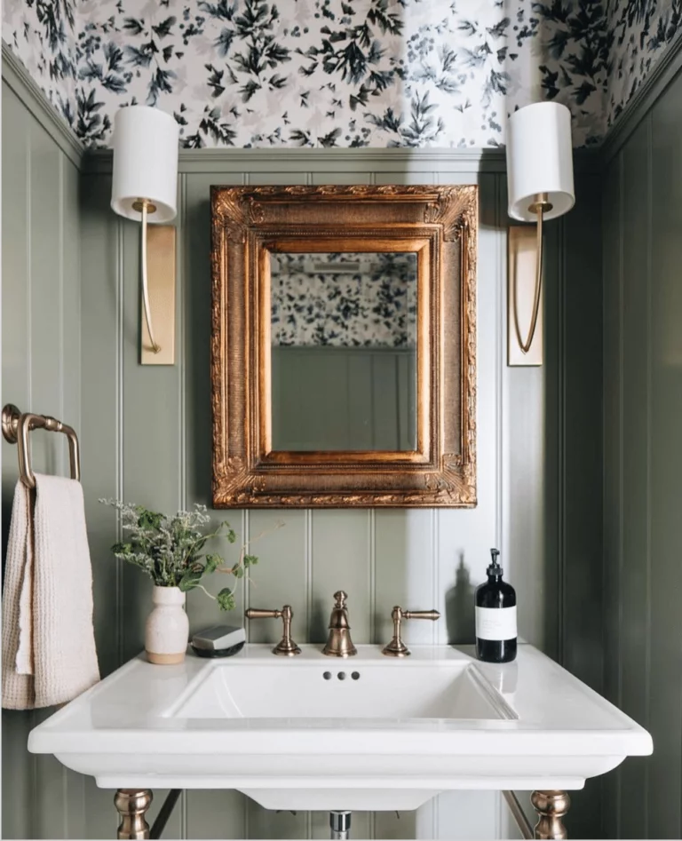
Bathroom
In this space, the neutral alternative behaves a bit differently. It seems rather deep due to the intense notes that reveal themselves within the bathroom. Designers suggest ensuring an appropriate amount of light to avoid any suppressing effect. Consider this paint color for the walls entirely or partially by painting the wall paneling or the cabinets.
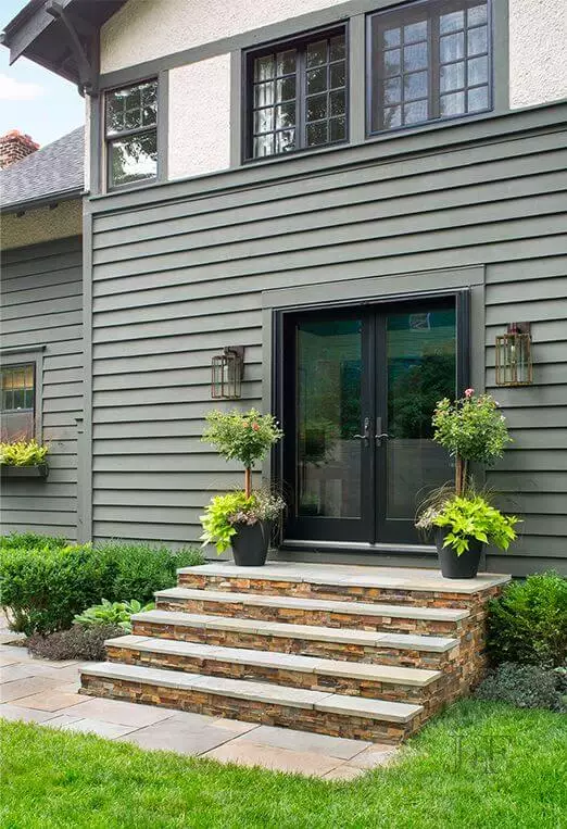
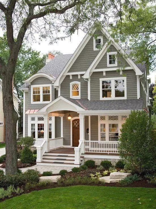
Use of Illusive Green for house exterior
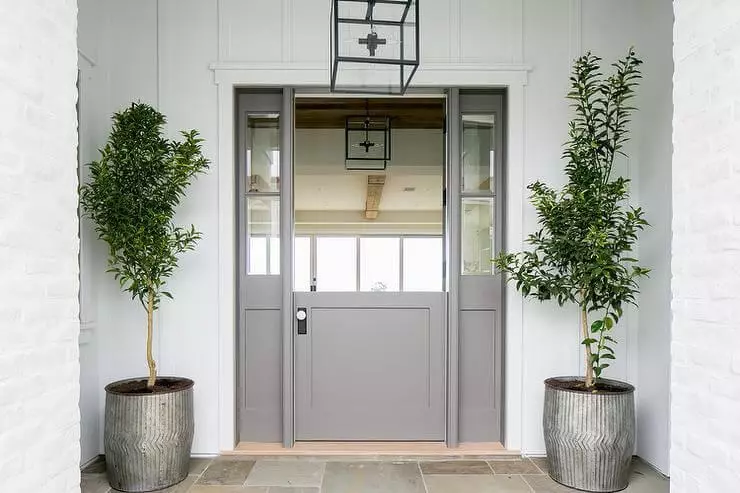
There are two prominent options you can consider in this sense. Paint the exterior walls in this shade and accompany them with black paint color for the front door and roof if your house is designed according to modern standards. For a rather traditional approach, pair the gray-green walls with white trim. You can opt for a smaller splash of this hue with a front door painted this way, considering a crispy white background. The unobtrusive mix of gray and green ensures the contemporary look of your house, while its rich notes perfectly resonate with the outdoor backdrop.
The Illusive Green SW 9164 paint color from Sherwin-Williams is a unique neutral. It will leave you confused at the beginning, inspired while working with it, and delighted with the result. If you got tired of the usual shades, but a bolder step is not an option for you, consider the irreplaceable splash of natural neutrality from Sherwin-Williams.
