Jacaranda SW 6802
Sherwin-WilliamsA tropical blue that reads bold, challenging, and creative. This unsual paint color is perfect for those who want to express their creativity through design.
Jacaranda (SW 6802): What Color Is, Review, and Use
It is time for blue! In its 2024 color palette, Sherwin-Williams has an entire collection dedicated to the trending greens and blues. Unlike the known-so-far neutral blues with a trace of gray or pastel blues, the giant brand puts new shades at our disposal, and the striking blue with a catchy name – Jacaranda is one of them. We analyzed this paint color in detail and borrowed the best ways to style Jacaranda from interior designers. Stay tuned!
Jacaranda Paint Color Features
Let’s start with the name! Jacaranda is a tropical American tree with purple flowers. How come this blue shade is related to a violet-blooming plant? Actually, the Jacaranda paint color is part of the Purple color family, and the story gets even more interesting. If you were to look at those tropical flowers closely, you would notice that some parts of them reveal this exact blue tone. A rather aqua-blue shade like this has enough boldness to act as an accent.
Blues have various meanings depending on shade. This one is undoubtedly the type of blue that resonates with creativity, optimism, and energy. There is something unusual and sophisticated about Jacaranda that will undeniably catch your eye as soon as you enter the room.
Jacaranda: Is It Warm or Cold?
Every paint color has an RGB value – the mix of red, green, and blue used to create the specific shade. No doubt, the blue amount, indicative of the cool temperature, prevails in this shade. Green follows suit. The last is red, responsible for warmth. With an increased amount of blue, Jacaranda firmly joins the group of cool paint colors. That’s what the facts say. Yet, you can notice the same when looking at Jacaranda with the naked eye.
How Does Lighting Affect Jacaranda?
What should you expect from Jacaranda at different times of the day and with various exposures? If you use this blue paint color in a north-facing room, the cold bluish light will cast a paler, cooler light on the bright blue shade. If you decide to paint the walls in a room with southern exposure, Jacaranda will read brighter under the effect of the yellow-orange natural light. A more saturated blue resurfaces in east-facing spaces from sunset till before noon and in west-exposed rooms from afternoon till sunset, under orange-red lighting conditions.
The same works with artificial light. The cooler the light, the more neutral the color will appear. As soon as you switch on warmer artificial lighting, Jacaranda turns into this bright, fully saturated paint color. Note that Jacaranda has a lot of pigment, and using it on all walls may feel overwhelming. Try experimenting with a color sample before committing.
Jacaranda LRV
From 0 (true blacks that absorb all light) to 100 (pure whites that reflect the light 100%), the Light Reflectance Value shows to which category Jacaranda belongs – dark, light, or middle tone. With an LRV of 30, this inspiring color variation is a solid mid-tone blue. It is pretty capable of bouncing light around. Still, using it in a larger room is a better idea.
Jacaranda Undertones
Since this tropical blue shade is considered part of the purple color family, it means Jacaranda has blue undertones. You cannot deny the blue pigment. Some even say there is a tiny hint of green in this vivid blue shade.
Similar Colors
At first, it seemed pretty hard to find alternatives to such a one-of-a-kind blue tone as Jacaranda. Yet, we managed to find a few substitutes – some lighter, others darker. You may like some of the following similar colors.
Coordinating Colors
All colorists and interior designers will tell you that Jacaranda’s complementary color, which finds itself on the other side of the color wheel – brown, is one of the best matching colors for this tropical blue tone. Next, think of earthy shades, clay variations, and charming tans. Consider off-whites and neutrals with green or blue undertones for less contrastive color palettes. Let’s see what experts recommend!
Use of Jacaranda in Interior Design
Some of you may find this exotic blue overly bold for your homes, while others may want to embrace this new color to the fullest. The truth is bright colors are the trendiest now, especially blues and greens. Keep pace and decorate your home with one of the best – Jacaranda from Sherwin-Williams. We’ll show you how to use this vivid blue stylishly in interior design.
When Traditional Blends with Color
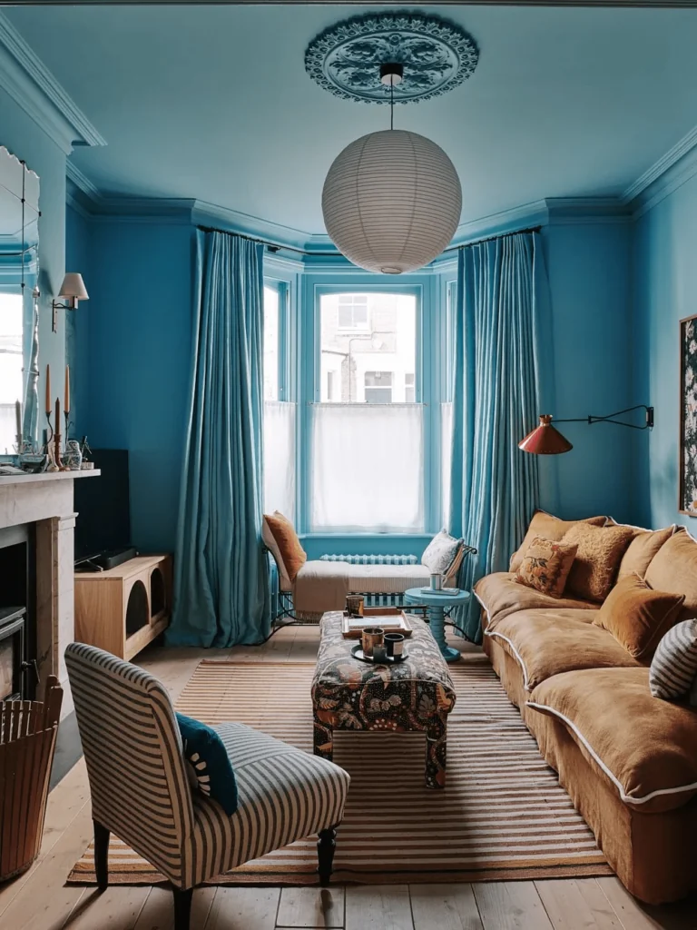
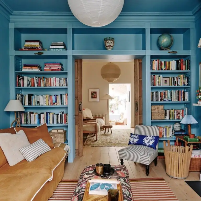
We aren’t used to seeing vivid colors in well-arranged traditional interiors that pay tribute to conservative design. Yet, here we are. The new design trends allow for more color combinations. Now, you can safely use Jacaranda in a traditional home and witness the contrast between a historical color palette and bright blue accents, enjoying the company of wooden furniture, vintage accessories, old-time prints, and weathered fabrics.
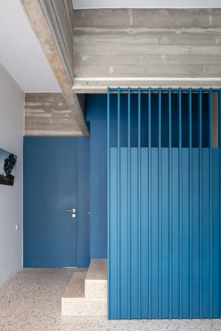
Add Blue to Modern
Interior designers are impressed by the effect of this positive, statement blue in contemporary interiors that follow the modern design rules. Since bold color mixes are all the rage, adding a pop of vivid blue to your color palette will spruce things up. A fresh coat of aqua blue is able to underline the architectural features of a sophisticated design or add visual appeal to a neutral background.
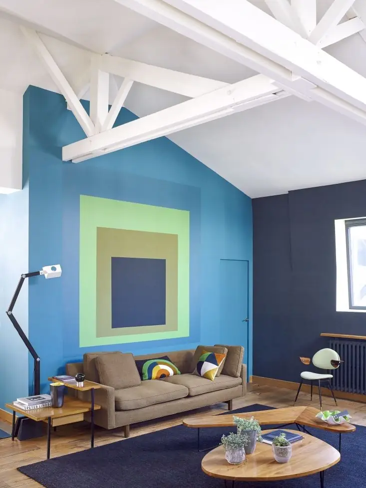
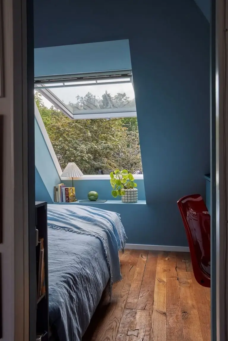
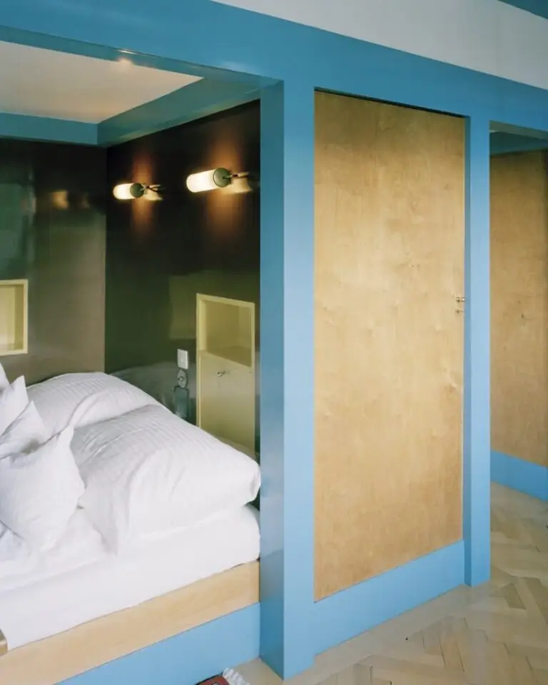
Bedroom
If you belong to the group of people who enjoy the company of eye-catching colors, you’ll most likely love Jacaranda in your bedroom. Undoubtedly, it may seem bold for a sleeping space, yet this room is more than this. You should feel a sense of belonging in your personal space. If surrounding yourself with creative colors like this resonates with your personality, don’t hesitate to add Jacaranda to all walls or separate accents.
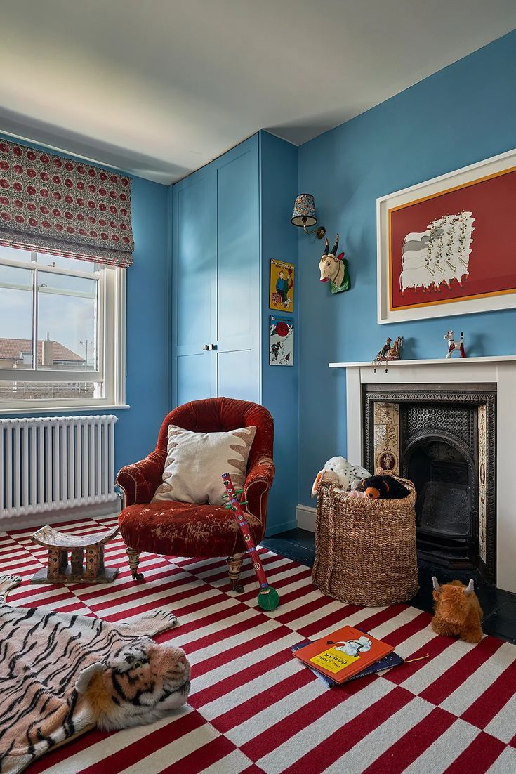
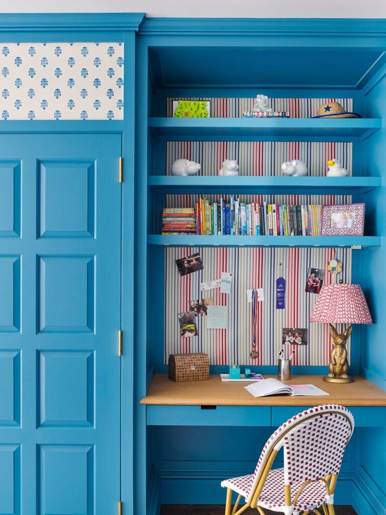
Kids’ Room
No other room works better for this energetic blue shade than the kids’ room. If you find Jacaranda too bold, you can always use it as an accent wall or for other statements. Either way, this radiant blue is a great source of creativity and visual interest. Pair it with soft off-whites, or think of a contrast with red.
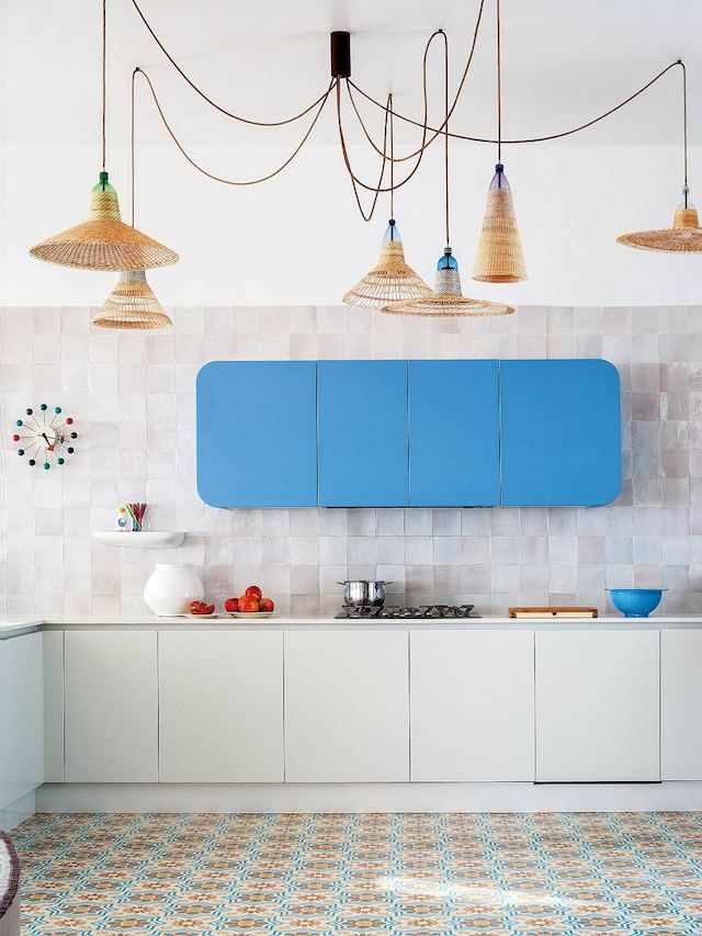
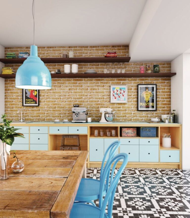
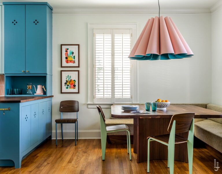
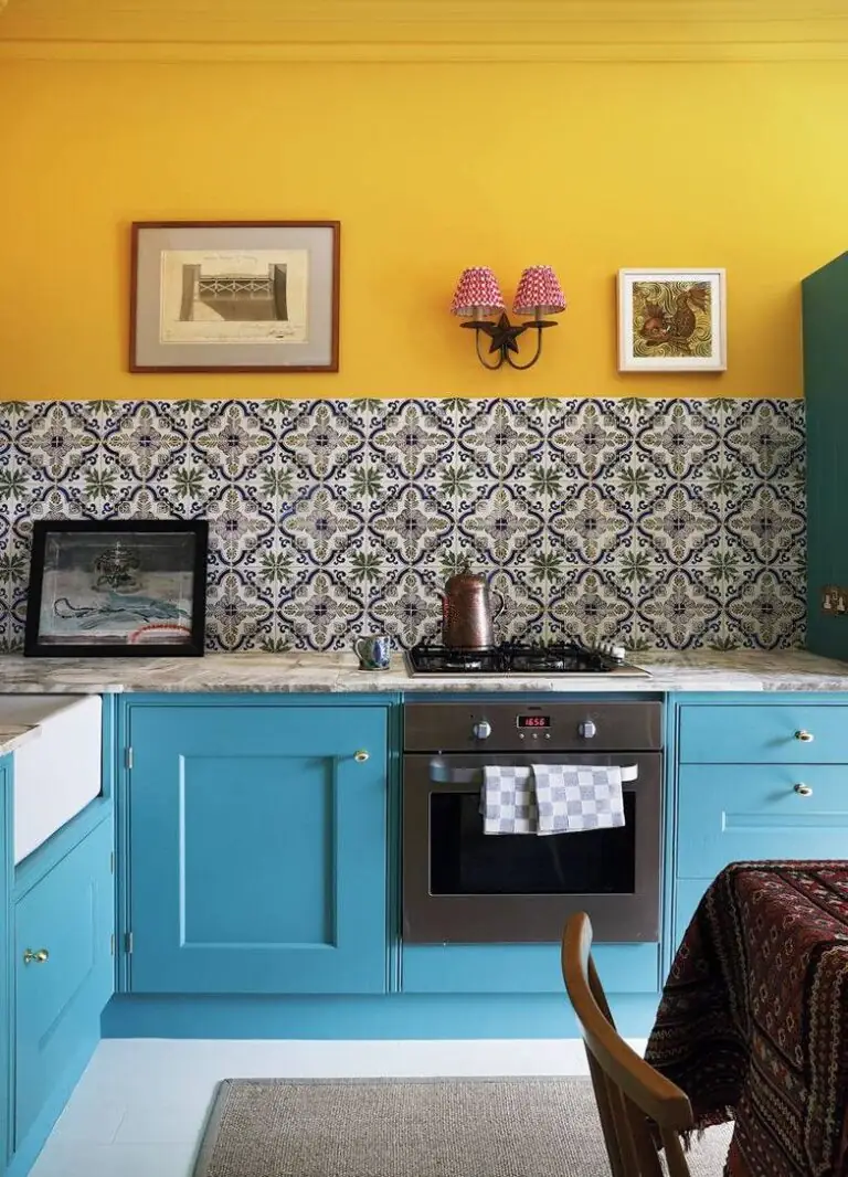
Kitchen
If you look closely, you can notice that Jacaranda bears a subtle retro vibe. That’s why interior designers see it suitable for cooking spaces designed in this style – with a nostalgic note for the good old days. It is usually applied to cabinets. Decorators also recommend considering it on chairs for a splash of color in neutrally colored kitchens.
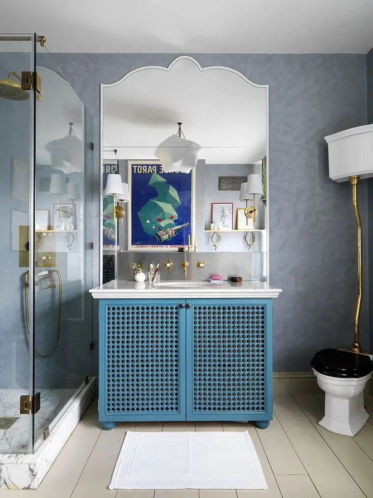
Bathroom
Any blue shade would look great in the bathroom, even as bold as this exotic blue. Try accents by painting the vanity cabinets, or go bigger by painting walls in Jacaranda. It is absolutely the color of bold and daring – a perfect color choice for exclusive design projects.
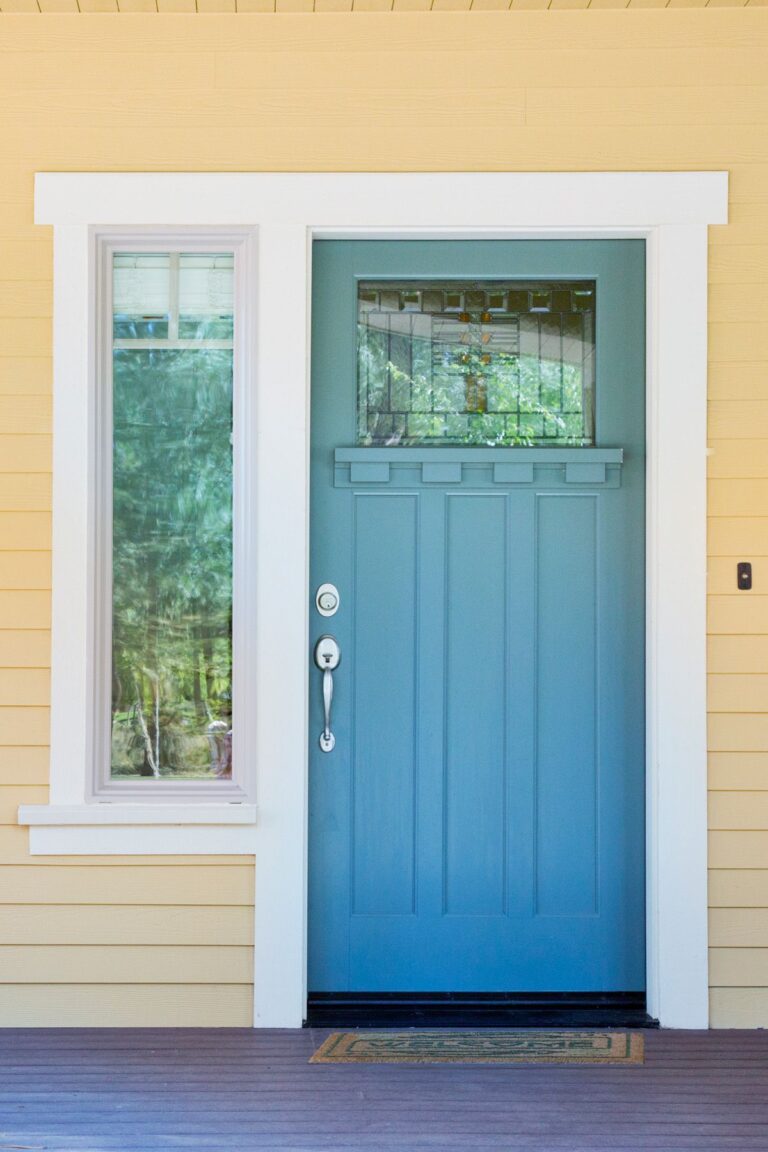
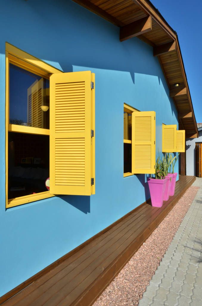
Use of Jacaranda for the House Exterior
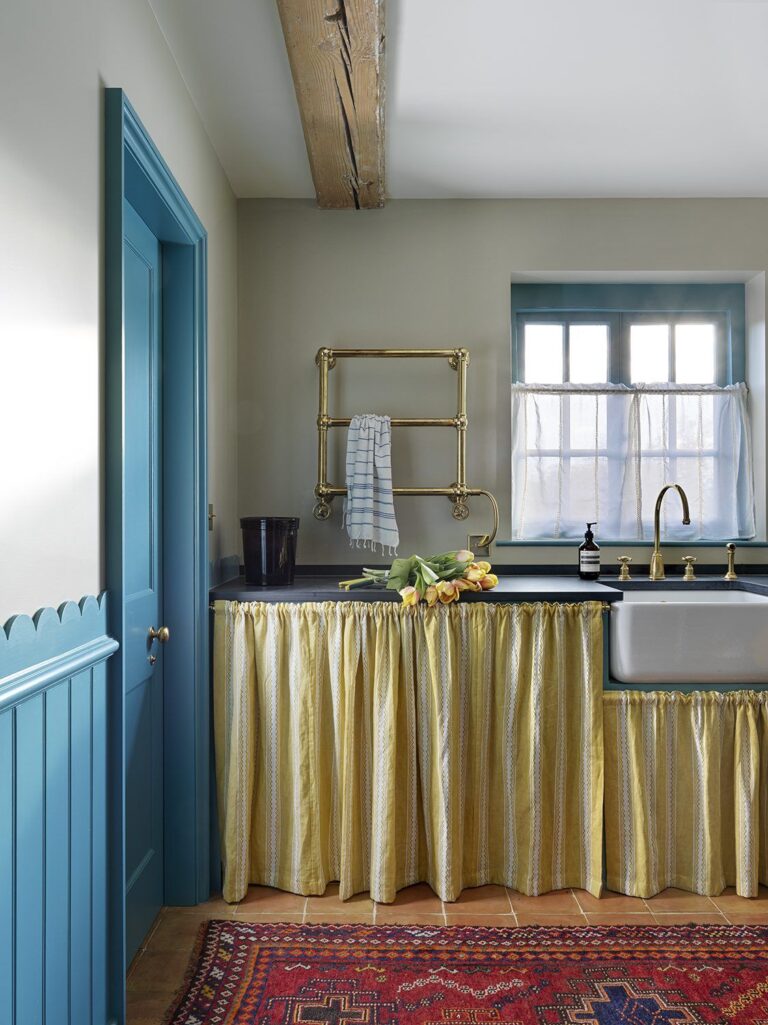
The specific beauty of Jacaranda is its immaculate and solid character that doesn’t change even when direct natural light hits. Interestingly, we’ve found it perfect as a front door paint color paired with yellowish exterior house walls. Conversely, bold blue walls and a yellow-colored front door also look great. If you make a statement, make it right – choose an equally bold pairing for Jacaranda.
The Jacaranda SW 6802 paint color by Sherwin-Williams perfectly combines a well-balanced color base with a positively bright blue pigment. Infuse more color into your home with one of the trendiest blue shades.
