Kale Green SW 6460
Sherwin-WilliamsA veggie blue-green paint color with a cool and deep color base, the green shade you see on the summertime forest greenery in the cool rain - fresh and restorative.
Kale Green (SW 6460): What Color Is, Review, and Use
Diving deep into our childhood memories, we see everything in natural and vibrant colors. At some level, decorating our interior or exterior design with such colors will bring just the right sense of home. Luckily, one of the greatest paint manufacturers, Sherwin-Williams, seems to read our minds and has the exact colors we dream about. If you are fond of leafy greens, such as the one you experience in a late summer forest bathed in warm rain, you will undoubtedly like the deep and cool Kale Green from SW.
Kale Green Paint Color Features
The name, at once, directs us to what this paint color looks like. The green leafy vegetable known as kale, a cousin of cabbage and broccoli, is the inspiration source for the intense and cool blue-green, as you can see in nature. Besides being a soft green, SW 6460 connects with the exterior world, feels safe, restores your energy, provides harmony, and, not least, balances your emotions.
Kale Green: Is It Warm or Cold?
Natural kale may be warm green where the leaves start from, yet the edges are pretty cool, and this feature passes to the paint color from SW. A refreshing blue trace adds this soothing and watery effect to the natural green as if the veggie color was diluted with a few drops of water.
How Does Lighting Affect Kale Green?
Kale Green is a mid-tone-to-dark paint color. Yet, given the soft veil, it gravitates from one color variation to another when interacting with different lightning. Still, you can always stay safe if you consider the specifics.
If you want to use Kale Green in a room with north-facing windows, expect a cooler and darker blue-green. Simultaneously, the same paint color will turn into a lighter and earthy blue-green in a south-facing room, preserving the original freshness. By the way, you will witness the same effect with eastern exposure in the morning and western exposure in the afternoon when the sunlight directly accesses a space painted this way.
Be ready for a more down-to-the-earth green that seems darker and more intense, yet as cool, when bathed in artificial lighting during the night. Ideally, Kale Green works for relatively large spaces or with sizable windows or many lighting fixtures.
Kale Green LRV
Another feature entirely dictated by lighting. Determining how much light a color reflects will tell you how light or dark this tone is. Or, shortly, use the Light Reflectance Value, LRV. Kale Green has a value of 13, and if 0 stands for true blacks, we can safely say that KG is a pretty dark paint color, theoretically. In practice, the invigorating blue hint makes this paint color a middle-tone shade of green.
Kale Green Undertones
If you look at the color for the first time, you may see it as a clean shade of green. What do we do with the cool effect? Try to look at Kale Green for a few more seconds, and you will notice the subtle blue undertones, rendering the resulting smooth and gentle green.
Similar Colors
In 2022, greens and blues were at the peak of popularity, and they also dominate the design world now with a promising potential for future seasons. To our surprise, there are no exact similar colors to Kale Green, which appears to be one of a kind, yet we found a few close shades at the same brand and other manufacturers. Take a look:
Coordinating Colors
If you want to underline the fresh undertones in Kale Green, think of light blue-scented neutrals. Still, colorists’ favorite is combining SW 6460 with warm shades to compensate for the lack of warm undertones. Light tans and beiges perfectly fill the space left by Kale Green with delicacy and fasten the sense of comfort and security. Colorists from SW offer the following unpretentious color matches:
Use of Kale Green in the Interior
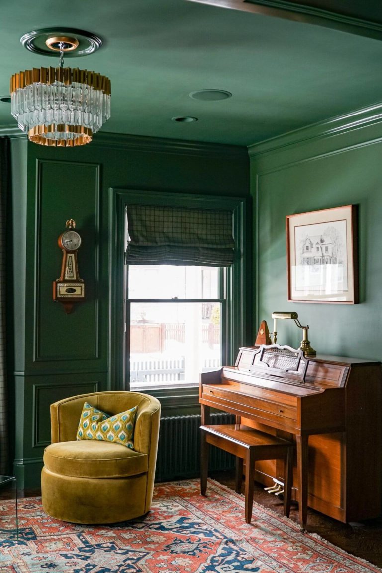
Designers say there is no way you can go wrong with a green shade in interior design. These are calming, dynamic, or neutral green variations. Yet, to our luck, Kale Green has them all – harmony, drama, and impartiality. Generally, SW 6460 works with most colors and suits almost every room. For a healthy, calm, and nature-inspired environment with a twist, don’t pass by the timeless blue-green from SW. In the meantime, we will give you a few design tips. Enjoy!
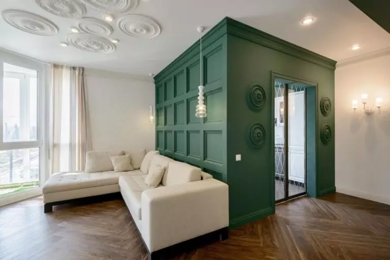
Green and White
Green has always been on good terms with light colors. The room instantly gets balanced, and green can reveal its magic on the neutral canvas. You will surely win with accents painted in Kale Green, a calm yet standout shade, on a white background. It doesn’t require much redecoration. Think of blue-green kitchen cabinets, an accent wall in the bedroom, vanity cabinets in the bathroom, or any accent in the lounge area. It would be a shame to have such a vibrant green shade at hand and not give it a try as an accent color.
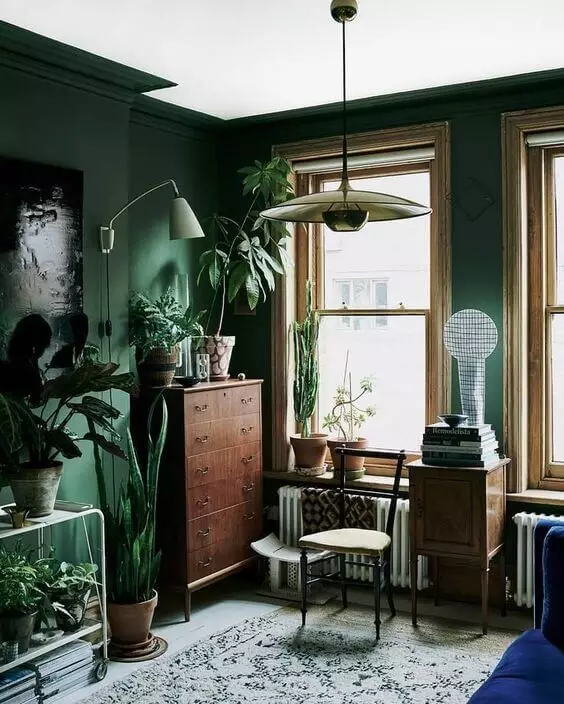
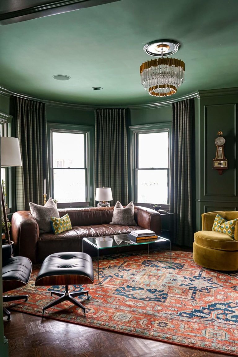
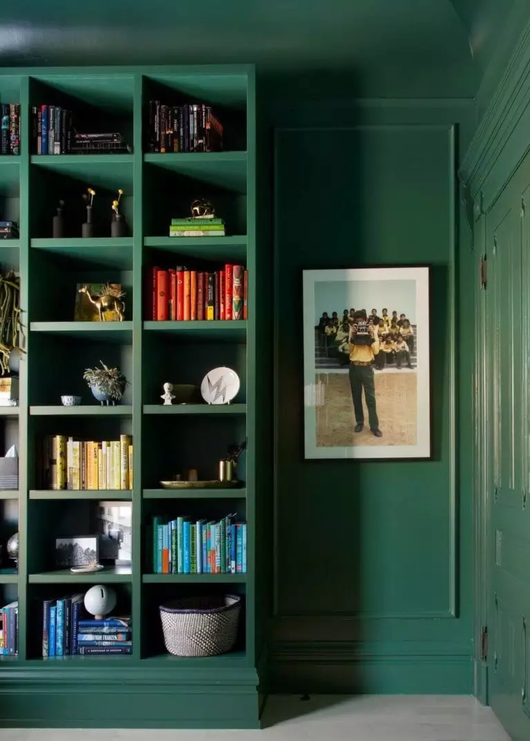
Traditional Living Room
Kale Green is part of the Origin color collection, a beautiful selection of bold and neutral shades inspired by our memories and hopes for a brighter future. It is a less expensive design idea that will cost nothing more than a few cans of Kale Green paint if you have a traditional living room. Redefine the design style with a gorgeous green color that resonates with the comfort found in this style.
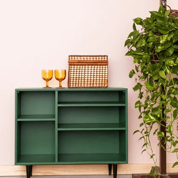
Leather furniture, wooden flooring, naturally textured bookcases, and a large colorful area rug with ethnic motifs will warm up the cool blue-green. By the way, the wood texture pairs very well with the leafy green from SW.
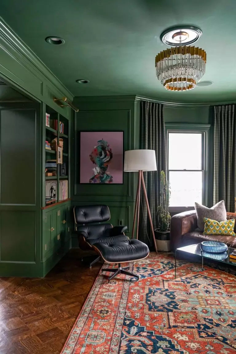
Modern or Mid-Century Modern
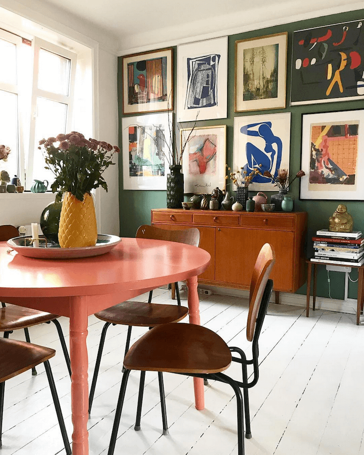
The aesthetically pleasing blue-green shade is the honorable representative of modern greens due to its soothing feature. And, since contemporary approaches to design, regardless of the style, require more original color palettes, you can combine Kale Green with brighter shades on a purely Modern or Mid-Century Modern palette. Decide on a personal touch, such as a customized gallery wall, a Vintage side table, or decorative antiques.
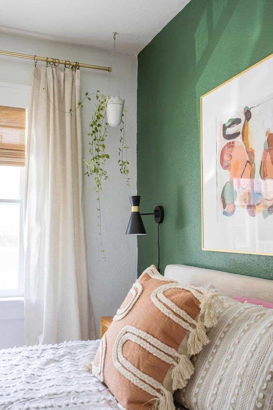
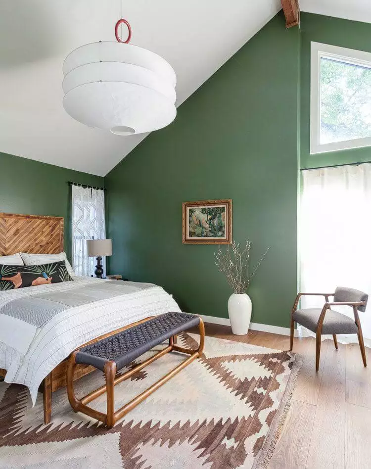
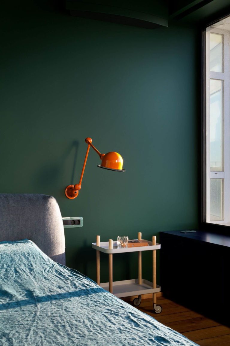
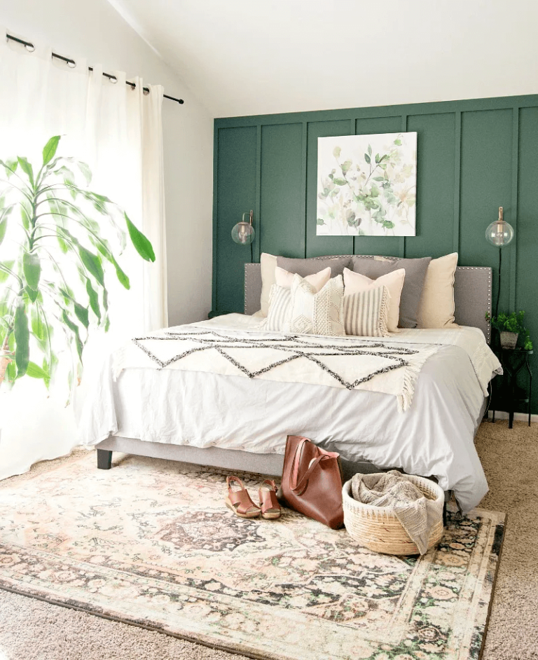
Bedroom
A green shade like this, which you can only experience in the outdoor world, feels at home in a space where you can feel your true self. The calm Kale Green will make an escape out of your bedroom, while the vegetable green base will recharge your batteries. Restore the authenticity of your bedroom with a green accent wall, or opt for an all-blue-green interior. Large beds with sizable headboards in contrastive colors, wooden nightstands, and brass wall sconces are the absolute must. Additionally, think of a Boho area rug with vintage patterns.
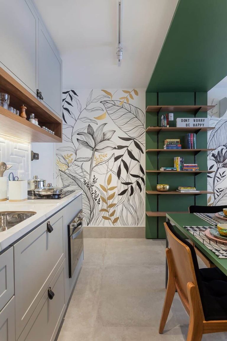
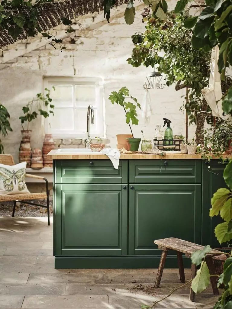
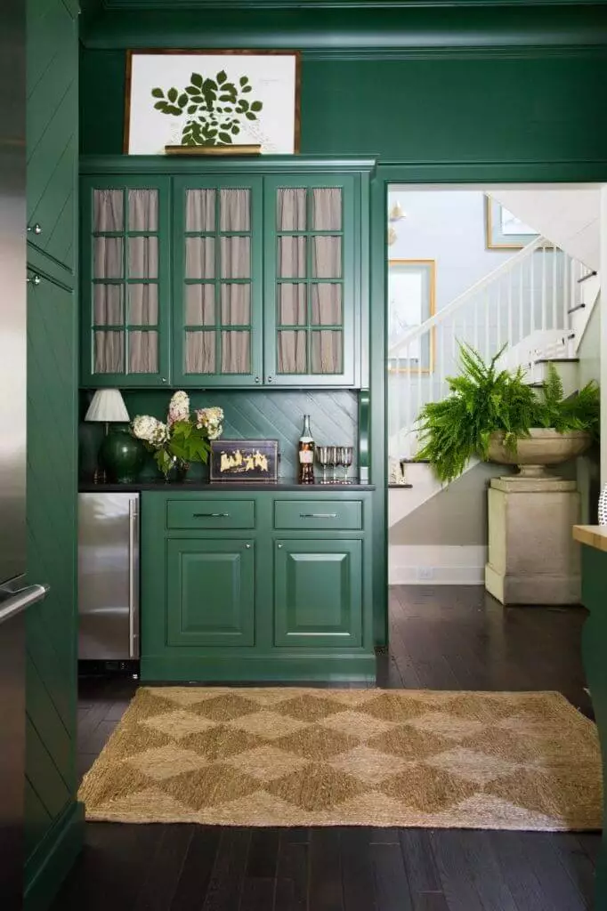
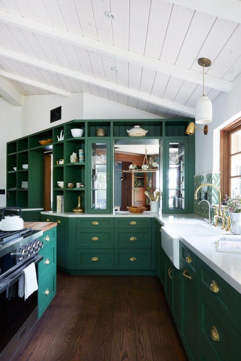
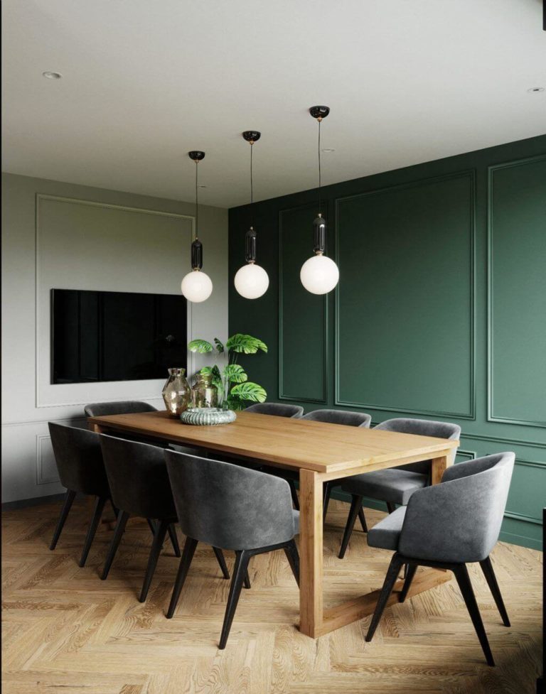
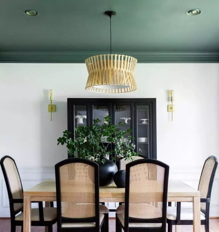
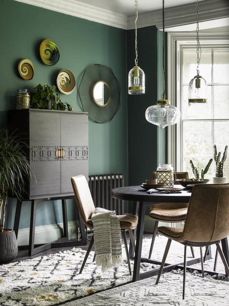
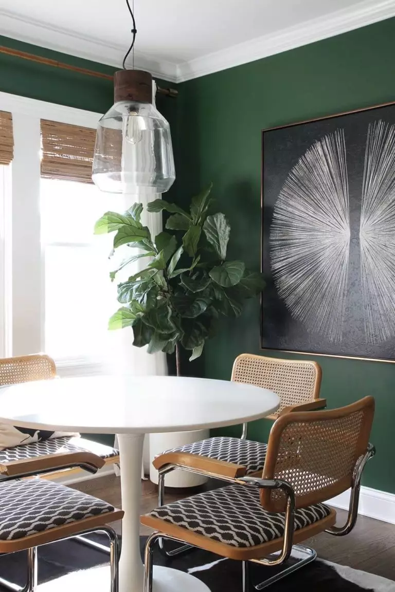
Kitchen and Dining Room
As hard as we tried to find more or less modern design concepts for kitchens with Kale Green on the horizon, we came to the idea that the blue-green shade holds too many memories and fits best traditional or transitional cooking spaces. If you wouldn’t like to change your kitchen cabinets, simply refresh them with SW 6460. Add brass hardware and change the decor.
In the dining room, the scenario gets more sophisticated. Kale Green agrees to collaborate with both modern and traditional design solutions. Natural wood and rattan furniture take the fore, live greeneries are much welcome, and both rectangular and round-shaped dining tables fit in. The decor will decide whether you take a modern or traditional direction.
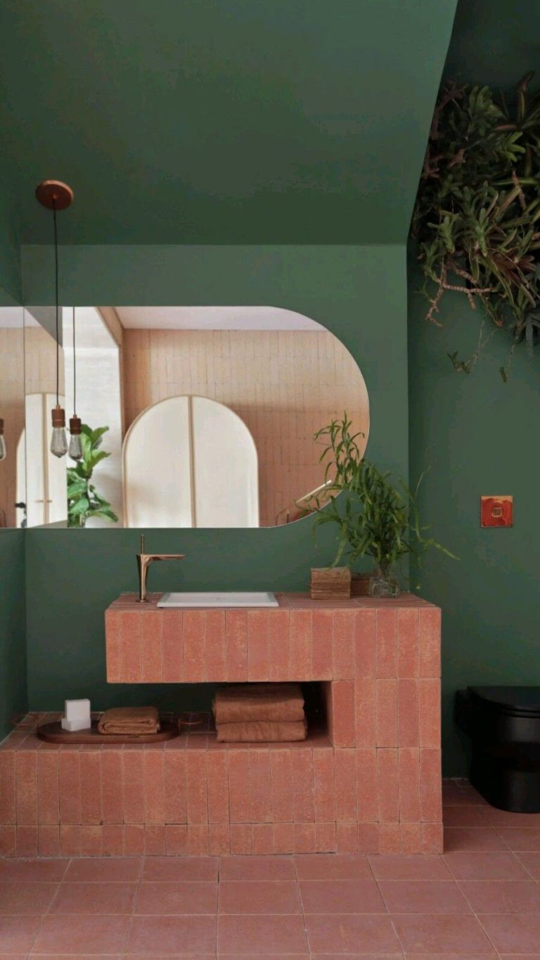
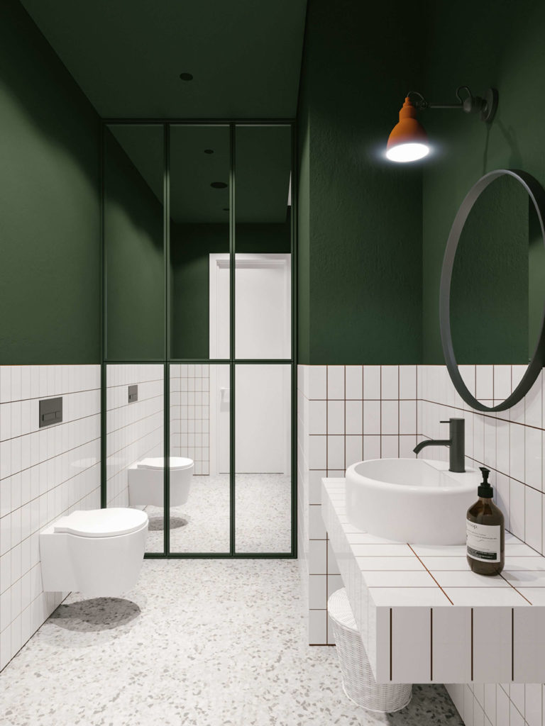
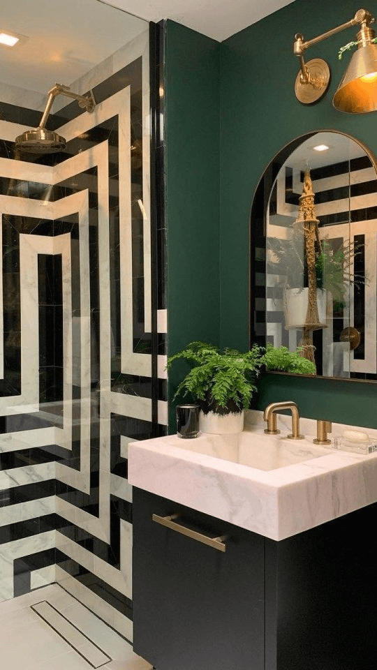
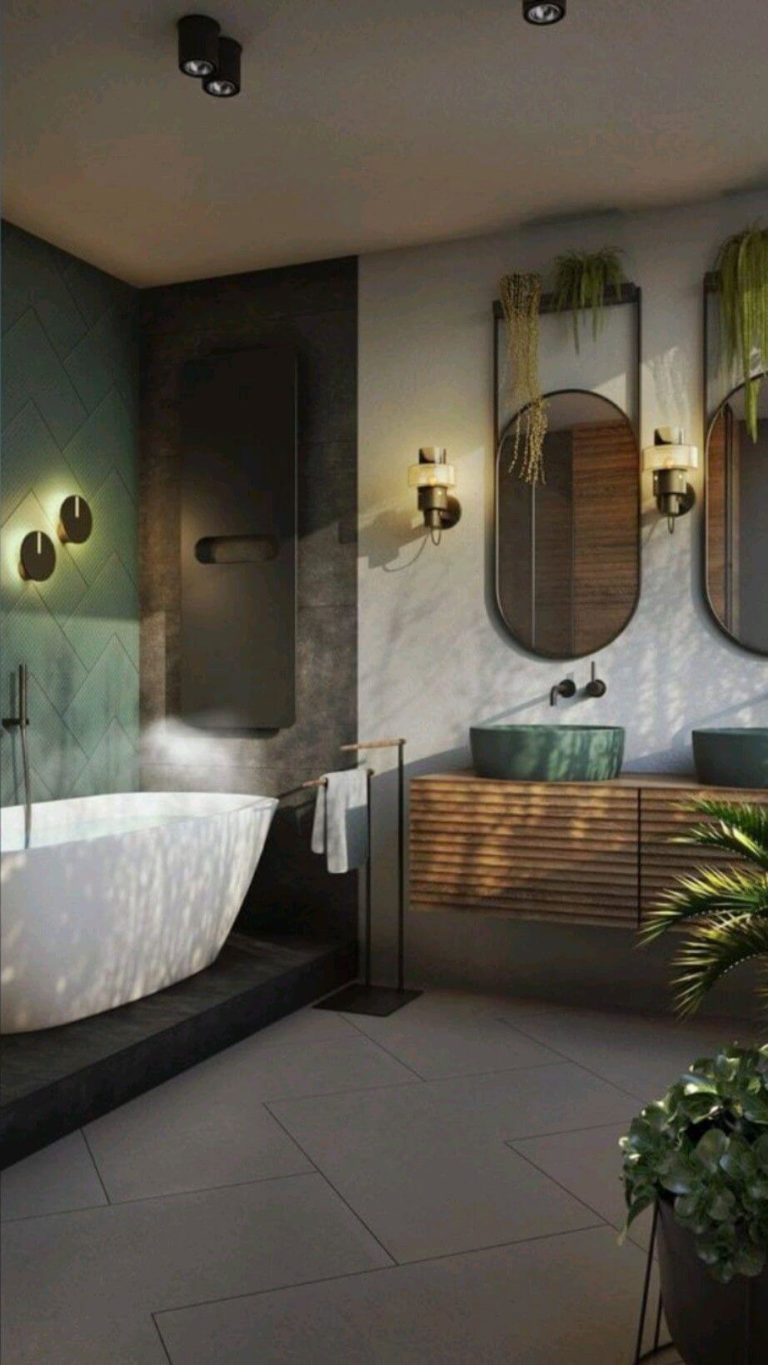
Bathroom
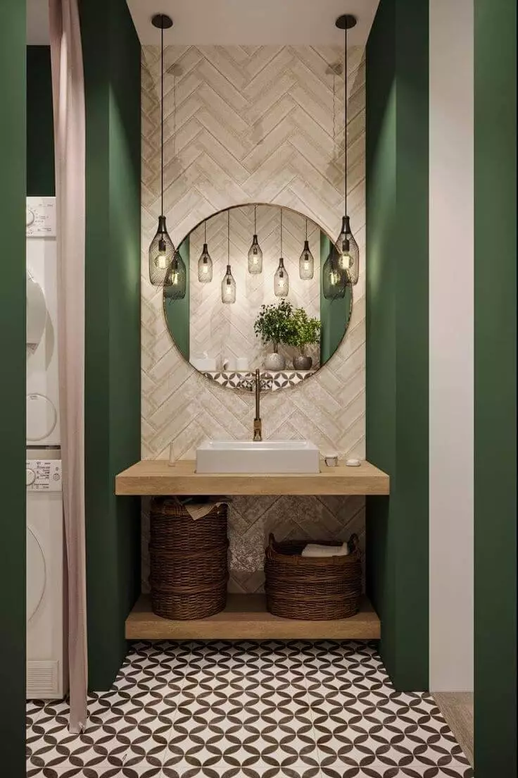
In such small and usually poorly lit spaces like bathrooms, Kale Green gives up on the blue undertones and acquires a relatively darker jungle green look. You can make the color feel softer by considering warm-temperature artificial lighting. Don’t worry about the design style. Modern, Traditional, and Transitional approaches work. You can enhance the existing design by opting for a green accent wall, vanity cabinets, or an all-green makeover.
Use of Kale Green for the Exterior
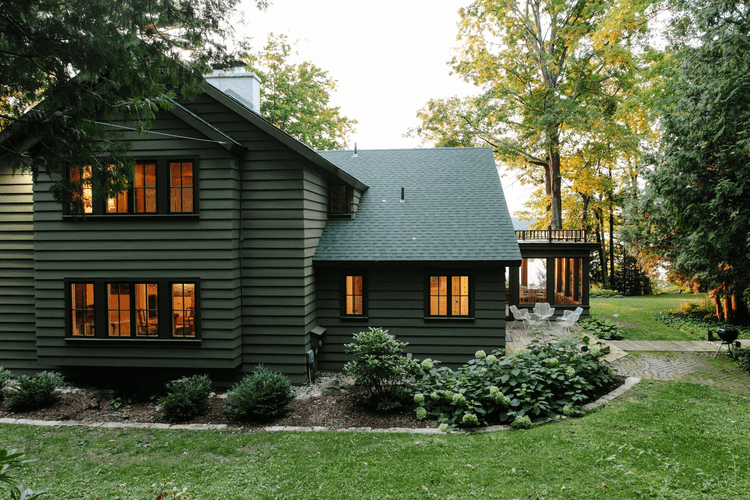
Kale Green is great for vacation cottage exterior walls. It perfectly integrates into the natural surroundings, especially in the woods. A traditional house with wooden walls is another design idea for a paint color that thrives when paired with raw materials, which is why natural wood will work for the trim and front door.
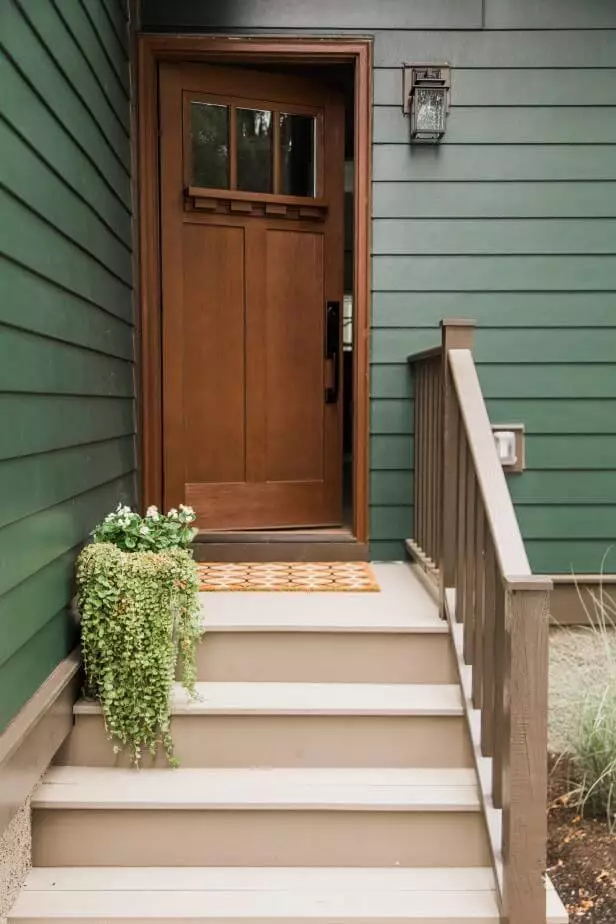
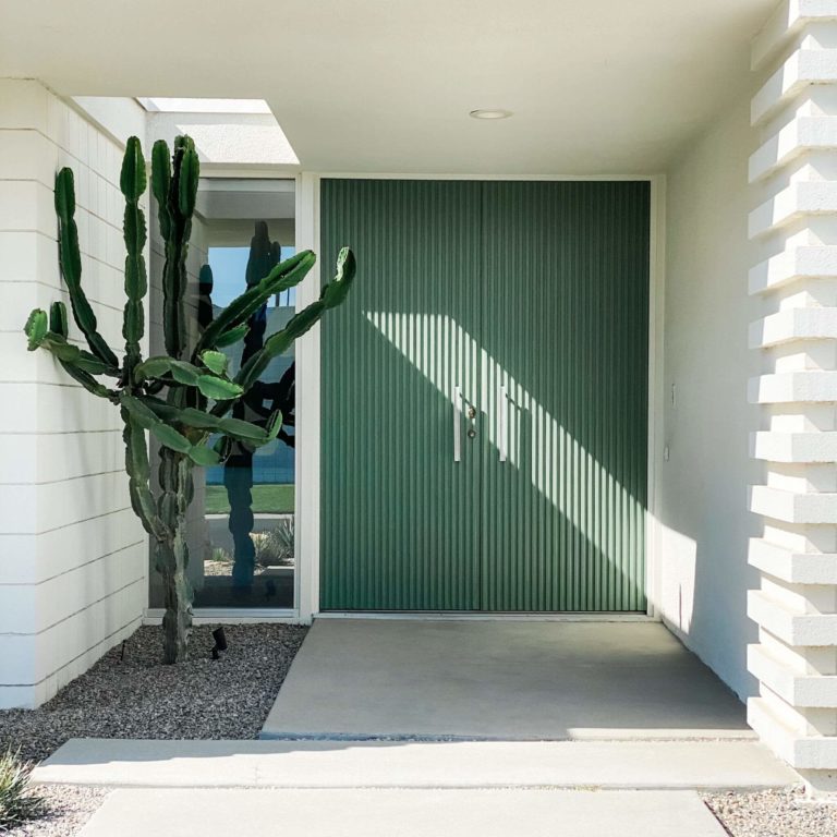
On the other hand, designers see Kale Green as an irreplaceable paint color for the front door of a modern exterior with white walls. The white color will emphasize the blue undertones and offer the blue-green shade an up-to-date teal-oriented appearance.
The Kale Green SW 6460 paint color by Sherwin-Williams is associated with the rich greeneries of the outside world. It affects the interior and exterior design by bringing freshness to traditional values, strength to endeavor new design concepts, calmness to restore your energy, and hope for better times.
