Kestrel White SW 7516
Sherwin-WilliamsA charmingly warm white with pink undertones inspired by pottery colors; first-class paint color for aesthetically pleasing interiors and exteriors.
Kestrel White (SW 7516): What Color Is, Review, and Use
In the Nexus Color Collection from the 2023 Colormix Forecast at Sherwin-Williams, which is more or less a selection of pottery paint colors associated with a strong sense of home, you can find one of the most unusual white shades that raises a lot of questions. Only one thing is clear so far. Kestrel White is a warm white paint color in high demand. How so? Let’s find out!
Kestrel White Paint Color Features
The first thing that catches our attention is the name. If the word is new to you, the kestrel is a small bird that hunts other birds and animals. What does it have to do with Sherwin-Williams’ paint color? To elaborate on our idea, a kestrel is the symbol of mind clearness, coherence of thoughts, and intellect. These features are instantly associated with the soft shade of white.
Regarding color, SW 7516 is part of the White Color Family. Still, some see it as a light beige with a tinge of gray or as taupe, and if it were the case, it would have been the lightest taupe ever. However, even the name hints that this is a white paint color, while the delicate undertones that read either beige, greige, or taupe add the ultimate note of intrigue.
Kestrel White: Is It Warm or Cold?
The dusty rose undertones with a romantic and nostalgic appearance found in this bright white paint cannot allow us to think of Kestrel White as cold. Maybe a single glance isn’t enough to spot the warm feature. Let’s take, for instance, Extra White SW 7006 – the truest white with no undertones from the same brand. In contrast with this pure shade of white, Kestrel White instantly reveals its true colors – nothing but a warm white.
How Does Lighting Affect Kestrel White?
Lighting can make a color feel and look entirely different depending on exposure and light temperature. Well, imagine a double effect for KW, aka Kestrel White, whose bright base cannot help but become a play zone for light particles.
If you have a bedroom or living room with north-facing windows, prepare to meet a less warm, yet not cold, shade of white whose gray undertone becomes more noticeable. A quick switch to the other side, and the neutral white turns into the most pleasant beige with warm pink undertones when bathed in the direct natural light of the southern exposure. Be ready to experience a similar effect in rooms with east-facing windows in the morning or west-facing windows in the afternoon.
The real magic happens at night when the lack of natural light explains why some interior designers regard this paint color as a taupe shade. The brown undertones appear as if out of nowhere. Kestrel White seems more profound yet as warm as we recognize it in natural light.
Kestrel White LRV
Kestrel White is very skillful at reflecting light. Still, this paint color is not as light as we might expect. With a Light Reflectance Value of 68, close to the group of middle tones, the warm shade of white has a rich selection of undertones that don’t allow it to be close to true whites. Nonetheless, you can safely use this paint color in smaller spaces yet ensure enough artificial light sources at night to preserve the resulting taupe as light as possible.
Kestrel White Undertones
We couldn’t wait to get to this part and make a statement that clarifies all variations of this color. The white paint color from SW is injected with pink undertones, which, at times, may seem the result of the gray and beige undertones playing with each other. Next are the brown undertones that pair with gray for a light taupe revealed under poorer light conditions.
Similar Colors
Suppose you are planning a makeover and the delightful white shade from SW conquers your taste, yet, for some reason or another, you need an alternative as close to SW 7516 as possible, warmer, cooler, or deeper. Luckily, there are plenty of such shades, and you don’t have to make any effort. The ready list of paint colors at your disposal:
Coordinating Colors
Since there is a taupe trace in Kestrel White, it instantly becomes a pretty stately paint color and requires similarly classy coordinating colors. Professionals from SW suggest lighter warm whites and pure taupe shades, medium or dark. Still, everybody’s favorite is blue, which is complementary to KW. Soft mid-tone blue or almost navy blue, even slightly giving a violet vibe; this contrast is an absolute must for contemporary design ideas with Kestrel White. These are the paint color matches from SW:
Use of Kestrel White in the Interior
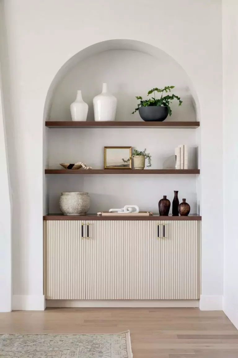
Generally, Kestrel White, as a white paint color, is great for any space in interior design due to its ability to make the room feel larger. Since this is a pottery barn white with warm pink undertones, you will find it convenient to choose it as an alternative to neutral shades. This light white shade makes an illusion of your favorite greiges, taupes, or clays. Let’s go through professional design suggestions that evolve around KW!
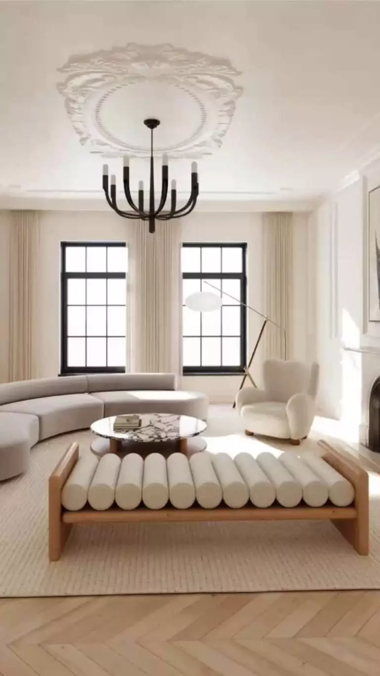
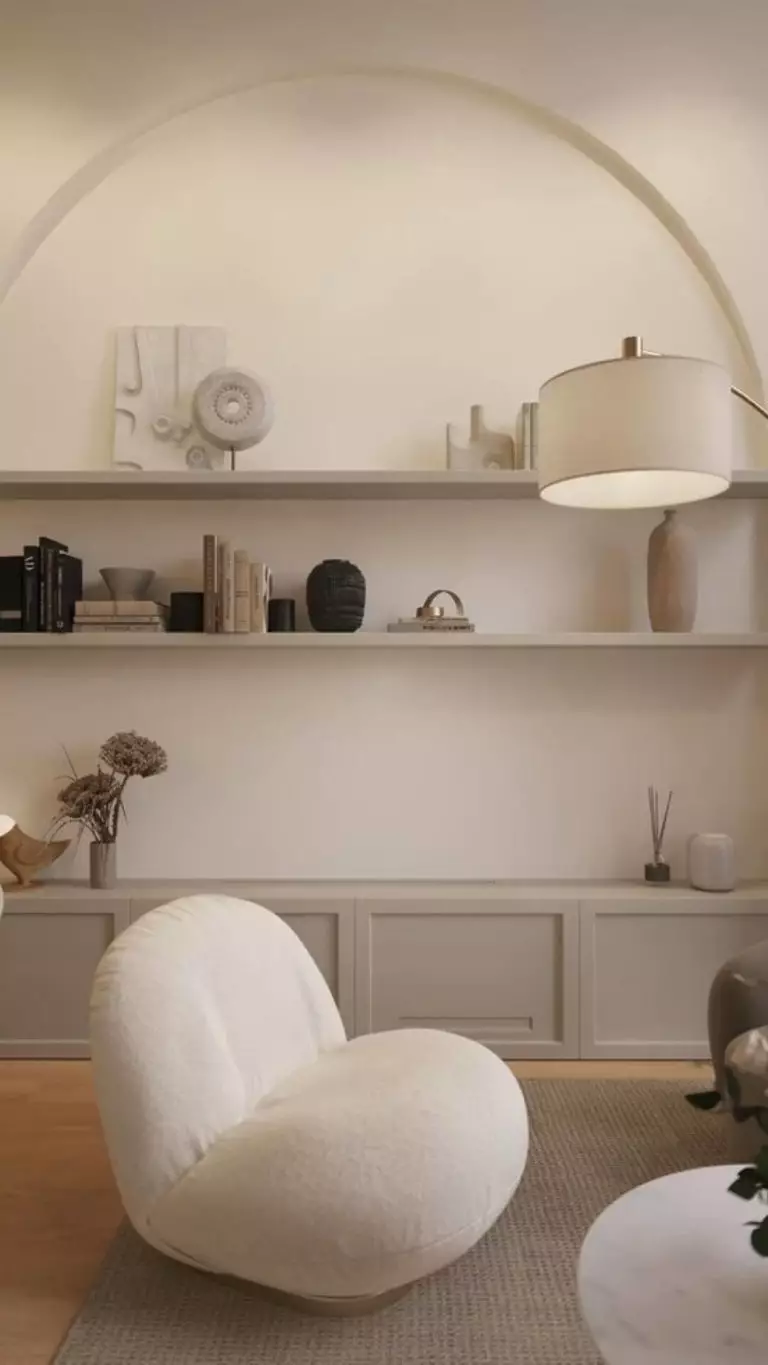
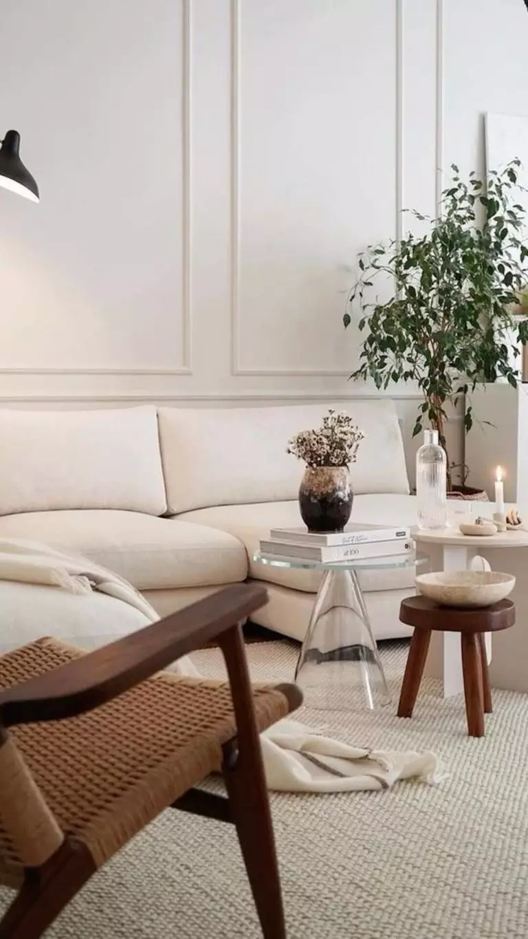
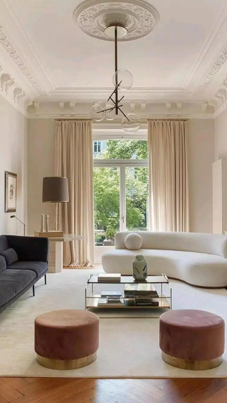
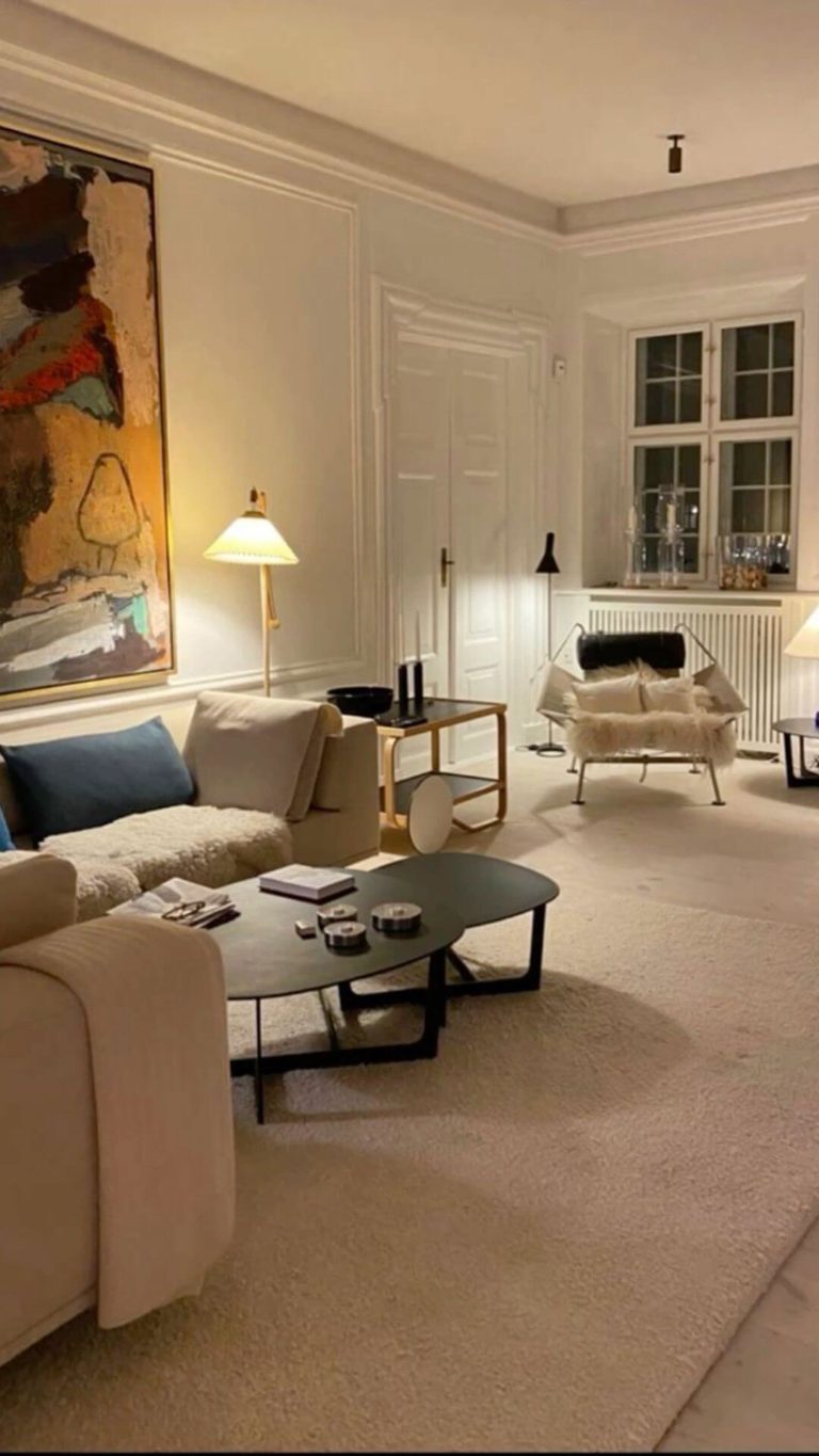
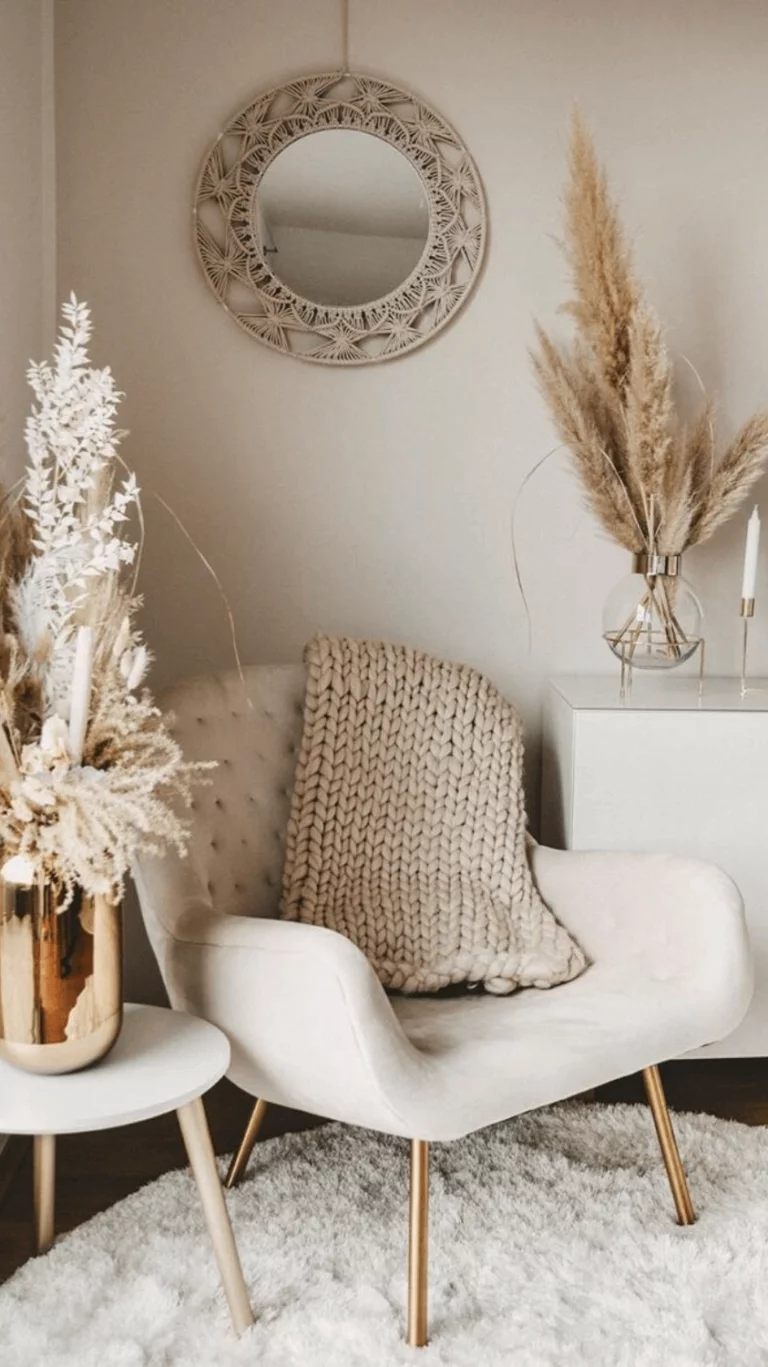
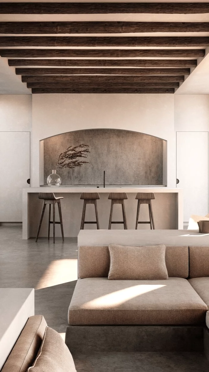
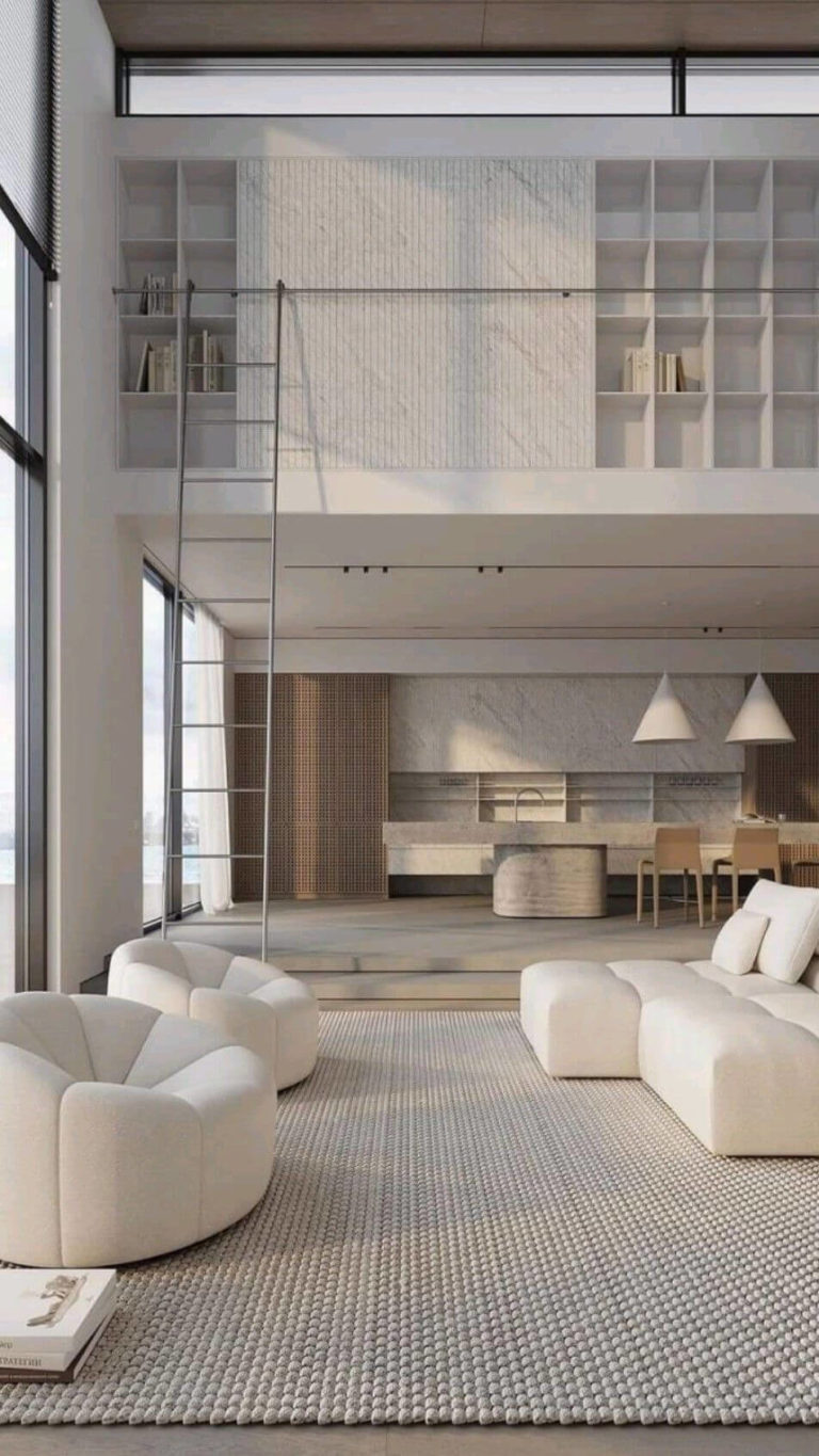
Modern Design: Light Pottery Color Palette
If you are impressed like us by the beauty of ultra-modern interiors with open-floor systems, large windows, functional layouts, and, more or less, monochromatic color schemes, Kestrel White can become your new base or accent color. The trendy paint color enlivens and brings charm to the peculiar-to-the-style elements with well-defined shapes, including the adorable accent chairs and sofas with round edges, Rustic tables of natural wood, and organic textiles in beige, taupe, and greige.
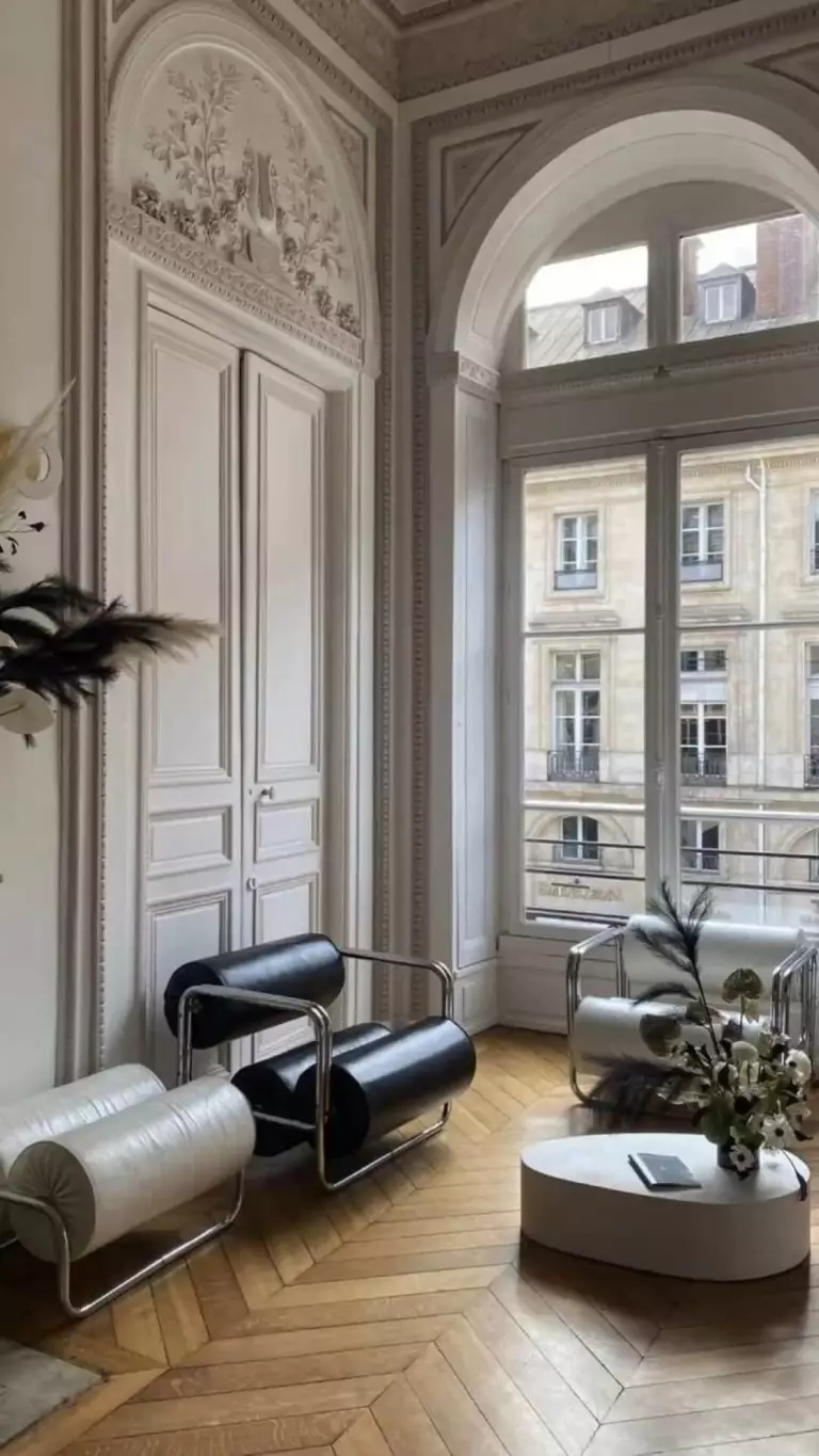
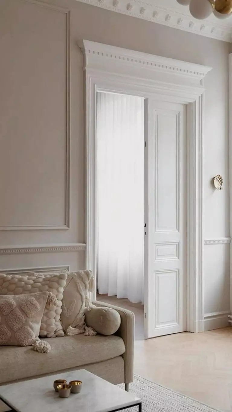
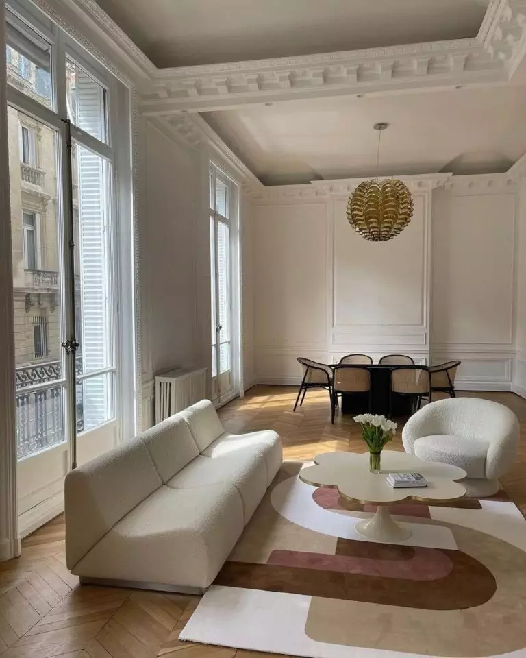
Parisian Dream Design
Have you always dreamt of Parisian aesthetics in your interior? Maybe now is the right moment to fulfill your dream. If by any chance you decide to redecorate your apartment in the timeless Parisian style, you should consider the pretty large expenses in case this is not an original and historic apartment in the center of Paris with large rooms, high ceilings, and tall windows. A more affordable solution would be to opt for partial redecoration with Parisian details.
The much more elegant and sophisticated Kestrel White will go for the walls decorated with boiserie and even the ceiling, particularly if reshaped with beautiful molding. The mandatory elements are marble texture, parquet floors, and functional furniture. The main design concept is the balanced blend of classical architectural features and antiques with modern furniture and, of course, lots of free space to let the room breathe.
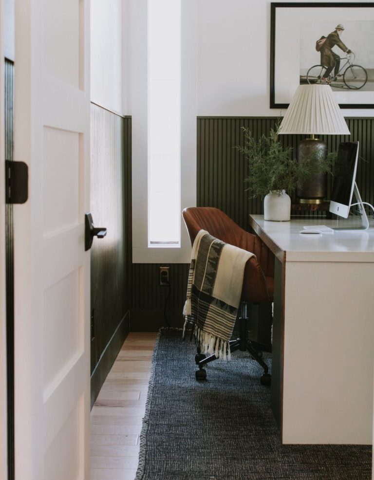
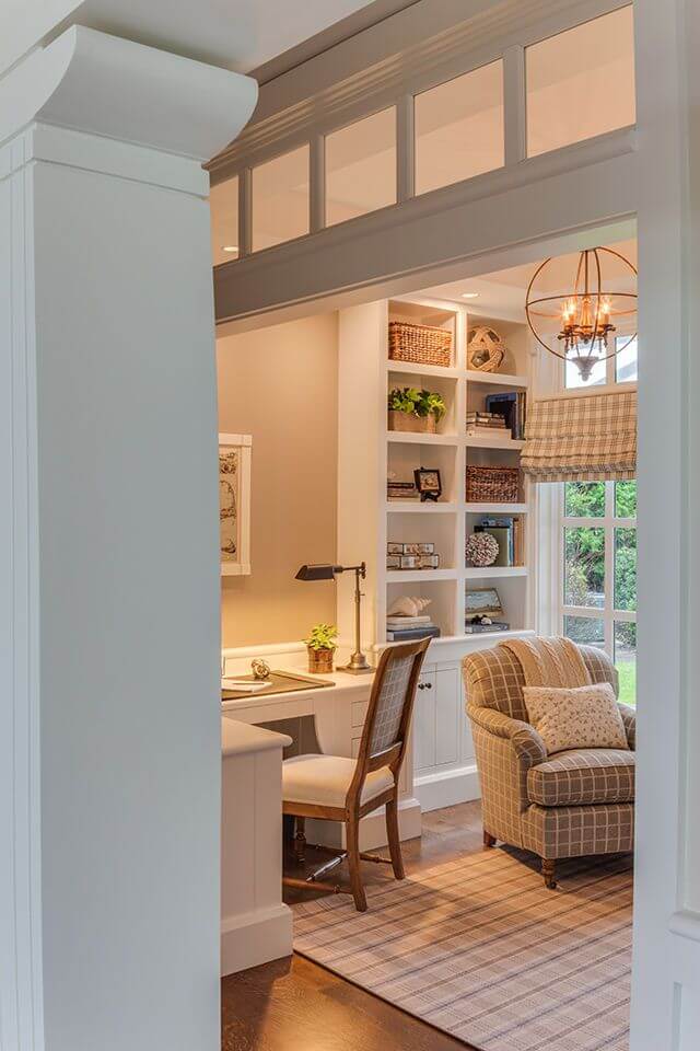
Home Office
Do you recall? A kestrel is the symbol of intellect and the movement of thoughts. A white paint color like this without disturbing undertones is a perfect background to run your thoughts on, mainly if you work remotely. Paint your home office walls in pinkish white and choose in favor of white, wood, or black furniture.
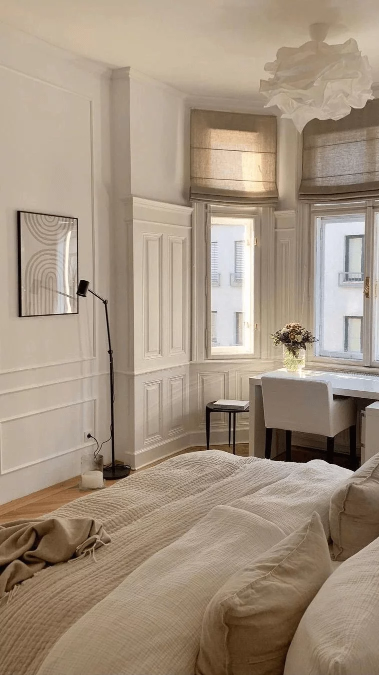
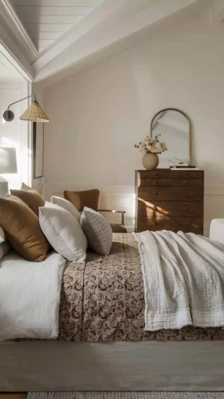
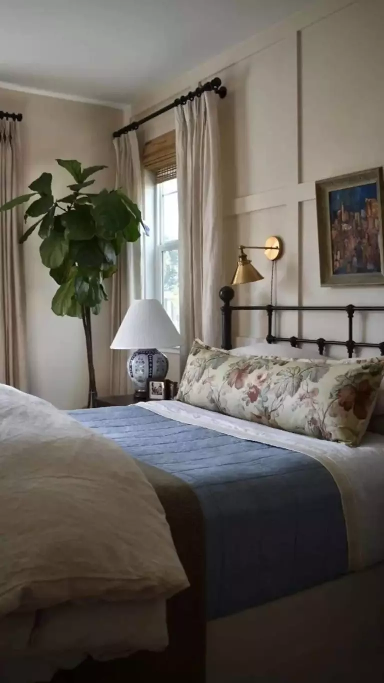
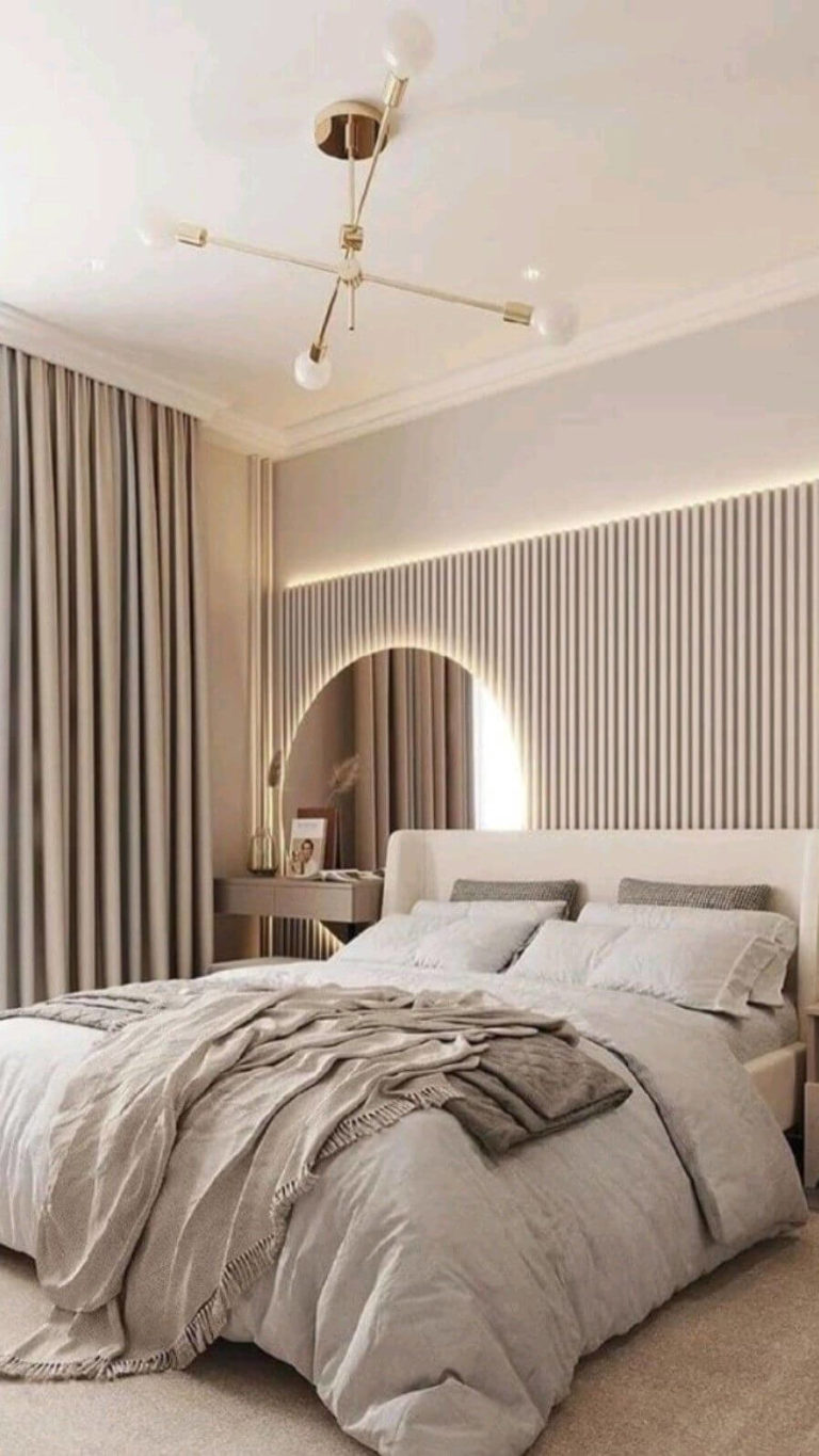
Cozy Bedroom
On the opposite side of a trendy design idea with fully dark paint colors in the bedroom is another important trend – the lightest ever paint colors; there is no in-between unless the chosen color is pastel. For light paint colors, professionals are all in for replacing the relatively outdated clean whites with chameleon whites that show different personalities under different conditions. The warm rose white from SW is excellent for the bedroom due to its implied easiness that helps you retreat and recharge for full peace of mind while staying in the bedroom.
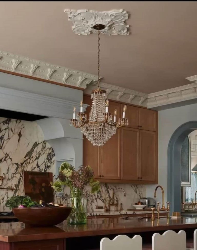
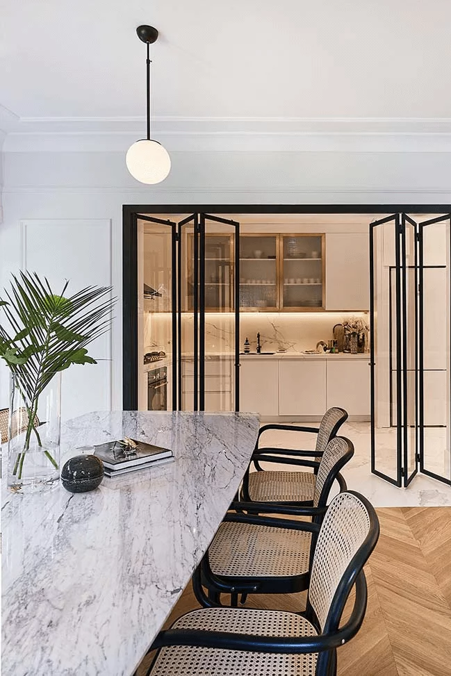
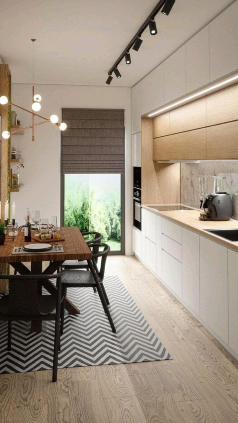
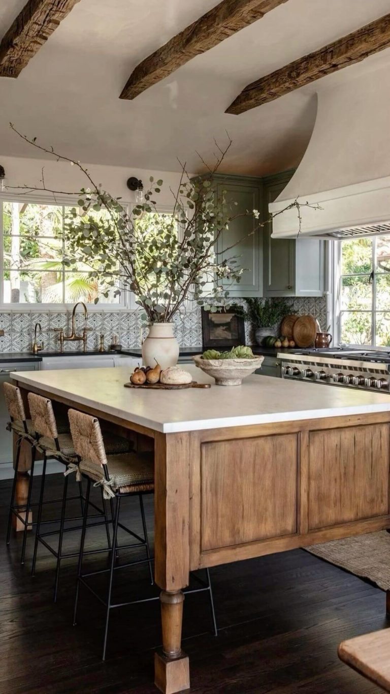
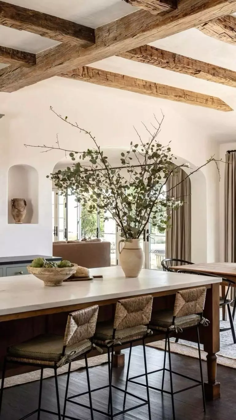
Kitchen and Dining Room
It is a surprise that such a gorgeous white paint color isn’t so popular in the kitchen, yet maybe it is for the best. The fewer people know, the more authentic it feels. The elegant white shade is recommended for open-floor kitchen and dining rooms. You can apply it to the walls or cabinets in the cooking space. In the dining area, it surely goes as a background color. Don’t introduce visually disturbing accents in modern interiors, yet allow yourself the liberty to redecorate with untreated wood in Rustic kitchens.
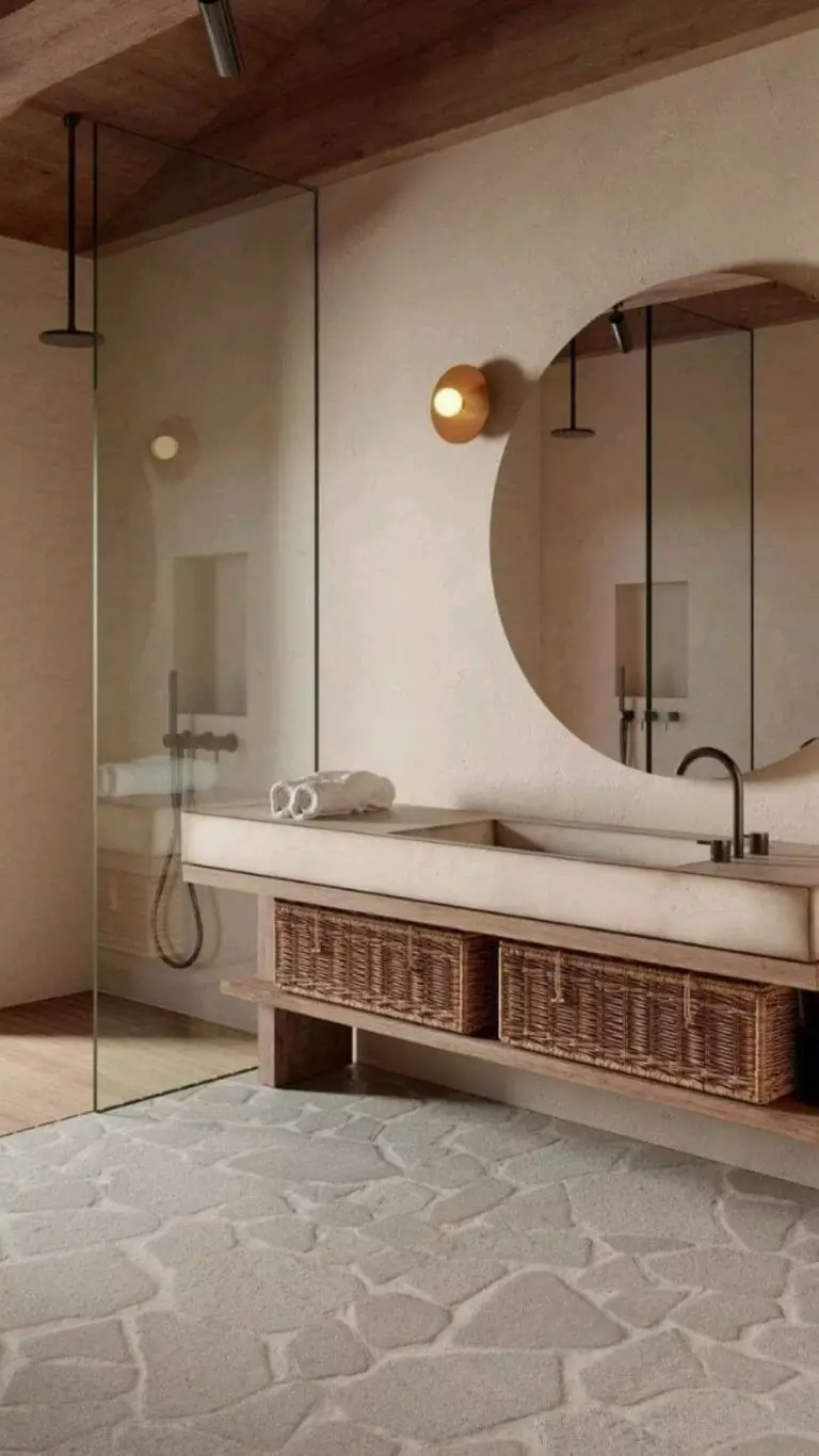
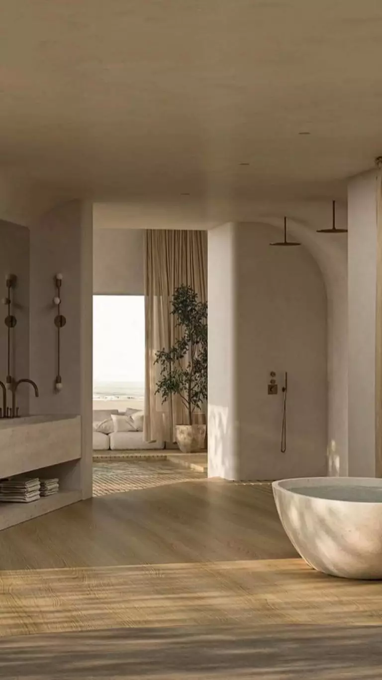
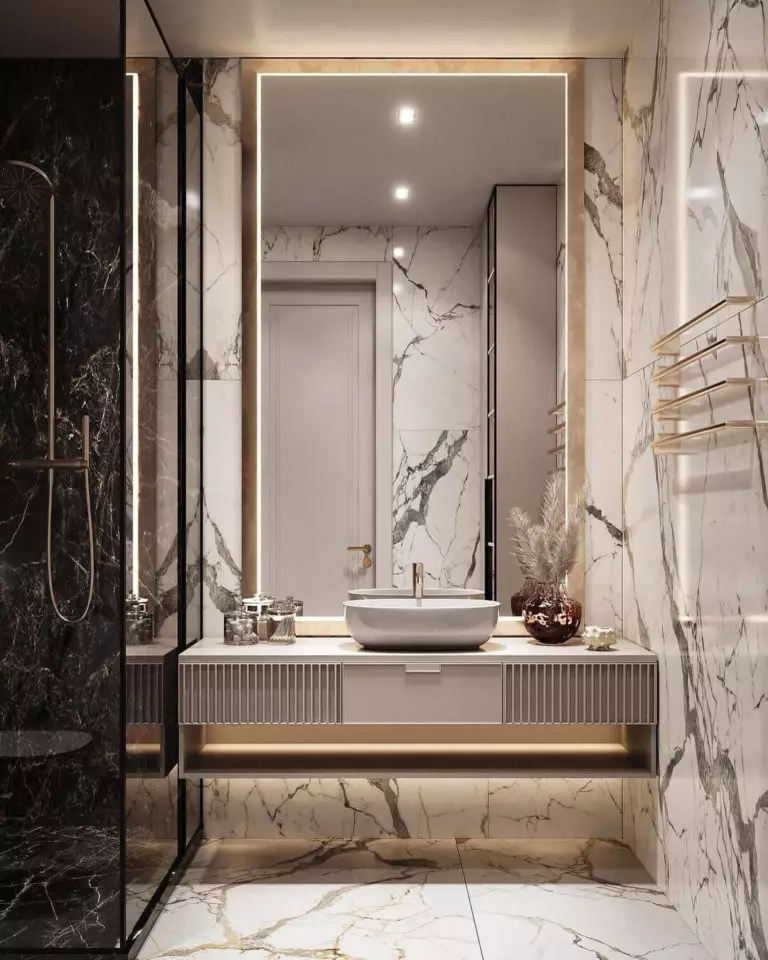
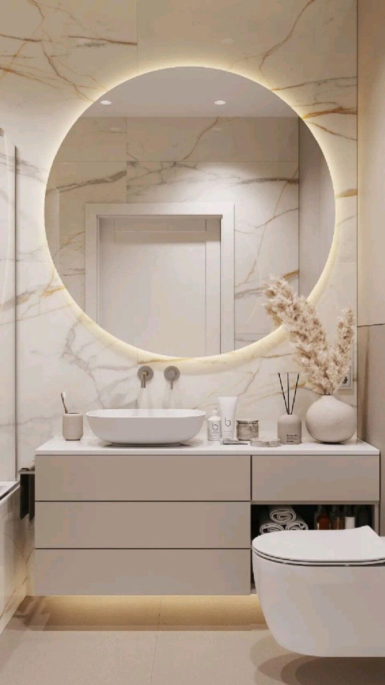
Bathroom
Designers find Kestrel White perfect for Spanish villa-like bathrooms with a monochromatic color palette, stone or terracotta flooring, and plenty of free space. Simultaneously, state-of-the-art bathrooms with modern designs, where KW has a place besides expensive stone texture, seem no less relevant.
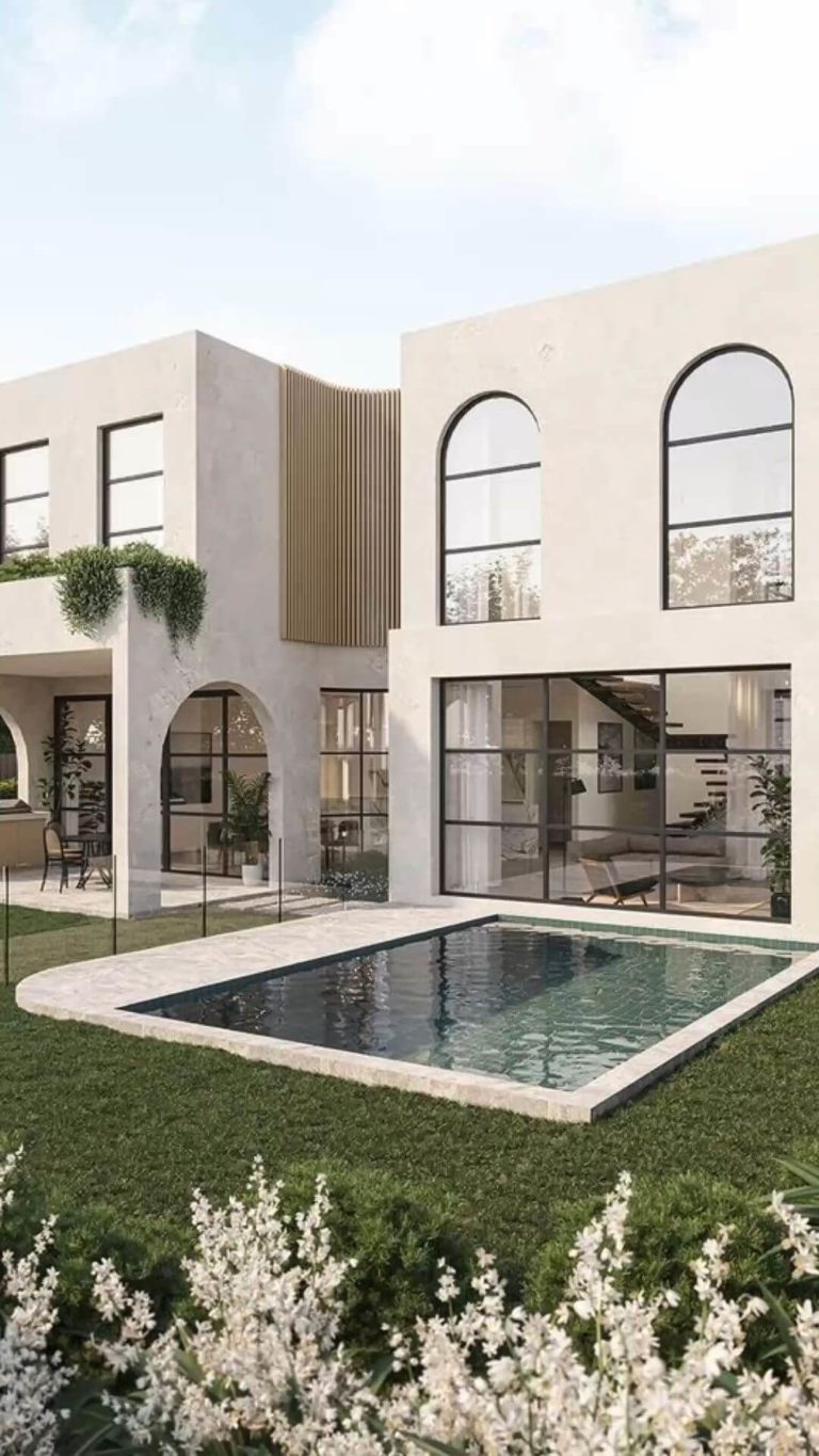
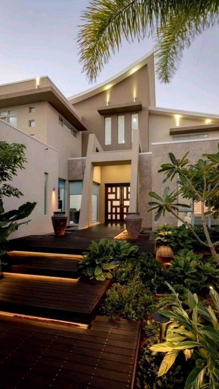
Use of Kestrel White for the Exterior
The nostalgic and, at the same time, romanticized rose white paint color suits well exterior architectural features. The color is more and more used for ultra-modern houses with intricate shapes. Mostly, Kestrel White works for locations with warm weather, where the pink undertones in KW thrive. With an appropriate-to-the-style exterior design and constant warm sunshine, you can successfully recreate a Spanish or Italian villa exterior, even if you are far away from your endeared vacation resort.
The Kestrel White SW 7516 paint color by Sherwin-Williams is your chance to embrace the historic design features and modern functionality all at once. The peaceful shade of warm white creates the perfect ambiance to unwind and relax while adapting to your idea of comfort at home.
