Lei Flower SW 6613
Sherwin-WilliamsA vibrant coral-orange that brings the comfort of terracotta shades, the freshness of juicy hues, and the calmness of pastel tones; all at once with one trendy color.
Lei Flower (SW 6613): What Color Is, Review, and Use
It is no secret for us and, probably for you too, that pottery collections of warm clay colors are one of the most prominent color trends in the contemporary design world. Pastel browns, bright oranges, earthy pinks, and many others are interior designers’ primary interest sources worldwide. In the whirlwind of calm, inviting, and thoughtful shades produced by the 2023 Nexus Collection at one of the most popular paint color giants, Sherwin-Williams, an unusual and promising hue shares its brightness with the entire color palette. The beautiful coral-orange Lei Flower is a perfect example of bold orange that can feel peaceful, secure, and recharging.
Lei Flower Paint Color Features
Step by step. Is Lei a type of flower? Actually not, but definitely related to flowers. A Lei is that garland of bright-colored flowers that one is given when arriving in Hawaii as a symbol of hospitality. You have probably seen this in movies or, better, experienced it yourself. While the SW 6613 is fully traced to the exotic color of a lei, it has more to share.
Lei Flower is a mid-tone orange with natural coral undertones. It may feel bright, yet not up to a disturbing level. The pleasant tone allures with its serenity and easiness. By the way, you can also find this shade in the Coastal Calm Color Collection. Besides all mentioned features, Lei Flower has the personality of the sweetest and softest clay color that hides a strong sense of security and well-being, the one you feel when being home.
Lei Flower: Is It Warm or Cold?
The coral-orange shade is one the warmest and most appealing shades of its kind. Even the cold natural lighting of the northern exposure or the cool artificial light cannot reduce its charming sense of induced comfort. These particular notes of warmth add the necessary level of brightness for Lei Flower to stand out from a group of pastel corals alike.
How Does Lighting Affect Lei Flower?
Lei Flower is a paint color for warm regions and rooms with southern exposure, where the direct sun rays bring out the best. The color feels the brightest it can and shares its self-expressive individuality with the space. One can ensure a similar effect in a room with east-facing windows in the morning and west-facing windows in the afternoon when the coral-orange shade collaborates closely with the sunlight.
On the other side, in rooms with northern exposure, Lei Flower may feel slightly less warm, even pastel and soothing, yet still warm, making it a great option for those who want to make a room penetrated by cold natural light feel sunkissed.
Artificial lighting at night makes the paint color look deeper and slightly muted, contrasting Lei Flower bathed in direct natural light. Still, nothing changes about its vibrant and lively undertones.
Lei Flower LRV
The Light Reflectance Value of Lei Flower is 30. What does this figure mean? On a scale from 0 (true blacks) to 100 (true shades of white), SW 6613 is a medium-to-dark paint color. Still, in reality, Lei Flower seems much lighter; it is a purely middle tone. 30 stands for its ability to reflect light, which it is skillful at to a certain level. Still, painting the walls this way in a small room with poor light conditions is the least you want to do.
Lei Flower Undertones
The trending orange paint color from SW has firmly pronounced coral undertones alongside a hidden trace of rose clay. Consequently, it renders more meanings: wild self-expression, earthy stability, marine world beauty, endless comfort, and thoughtful calmness.
Similar Colors
It’s impressive how different colorists perceive a paint color as such. Some see it as coral. Others regard it as a juicy fruit shade, associate it with wild flowers, or trace it to pottery art. With slight variations, professionals from SW and other renowned brands offer a wide variety of orange shades similar to Lei Flower:
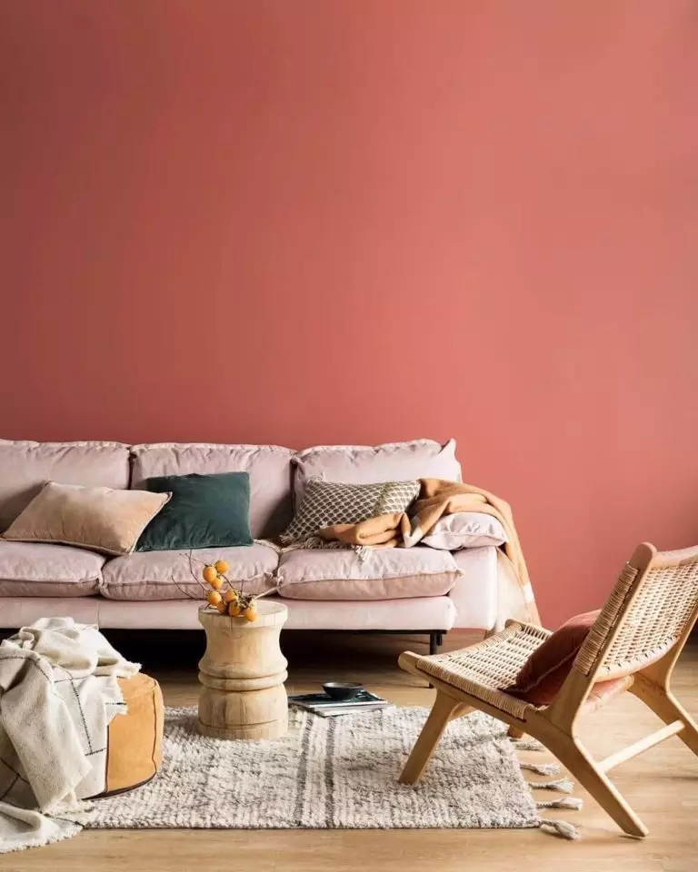
Coordinating Colors
Since this is a bright paint color, it requires muted and soothing neutrals to balance it. Still, you can play with undertones. Choosing a coordinating light and neutral color with coral traces results in a harmonious color combination. Organic greens, yellows, and blues work as well. If it is easier to choose a bright paint color, SW 6613 is relatively pretentious regarding neutrals. Check out the exact color matches from SW:
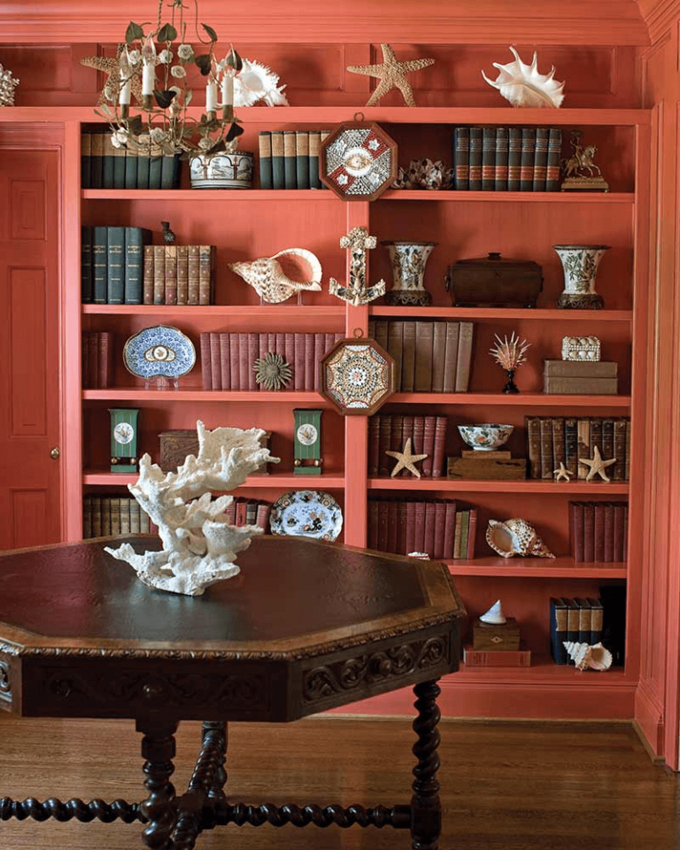
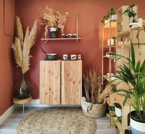
Use of Lei Flower in the Interior
Gravitating between pastel and bold, the coral-orange from SW is great for your house if you are looking for uplifting and rejuvenating colors to recharge your batteries and mood. Working as an accent and even base color, Lei Flower can become a pretty strong tool in the hands of a skillful designer. Closely related to the coastal vibe, rendering a vintage allure, and being a perfect solution for ultra-modern designs, SW 6613 is worth giving a thought.
Modern Colors
We love the new designer technique in interiors – considering more bright colors at once. Say, a stylish and colorful accent wall, a furniture centerpiece unit, or trim including the vivacious coral from SW in kitchens, bedrooms, living rooms, and bathrooms. Enjoy the beauty and energy of colors for a burst of positivity.
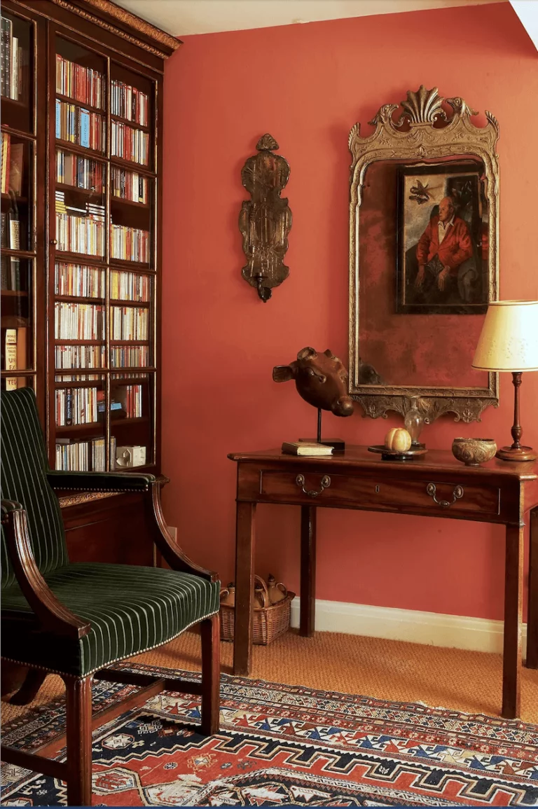
Flowerful Vintage
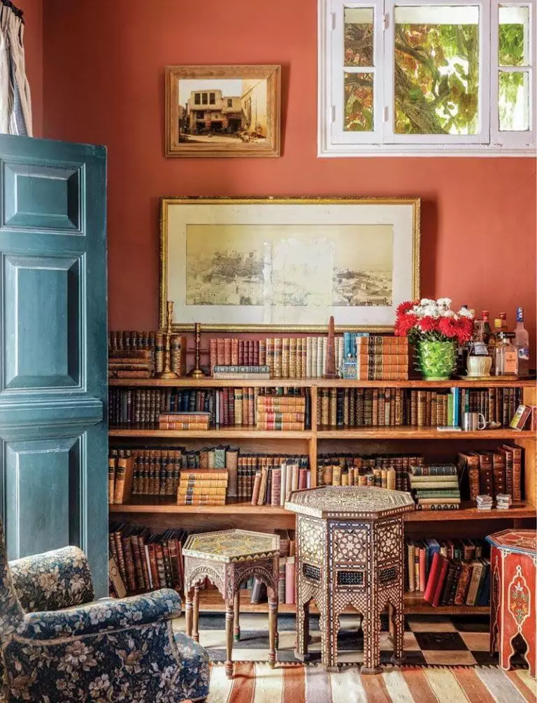
Add a blooming effect to the Vintage style with a new explosion of color. The coral-orange shade pairs well with beautifully carved wood furniture. Collectibles, distressed textures and colors, vintage textiles with ethnic motifs, and copper accents only beautify the intended old-time mood. The most excellent news is that pairing your beloved Vintage style, if it is the case, with a modern paint color like Lei Flower will bring an update to the unpopular opinion that old can also look new.
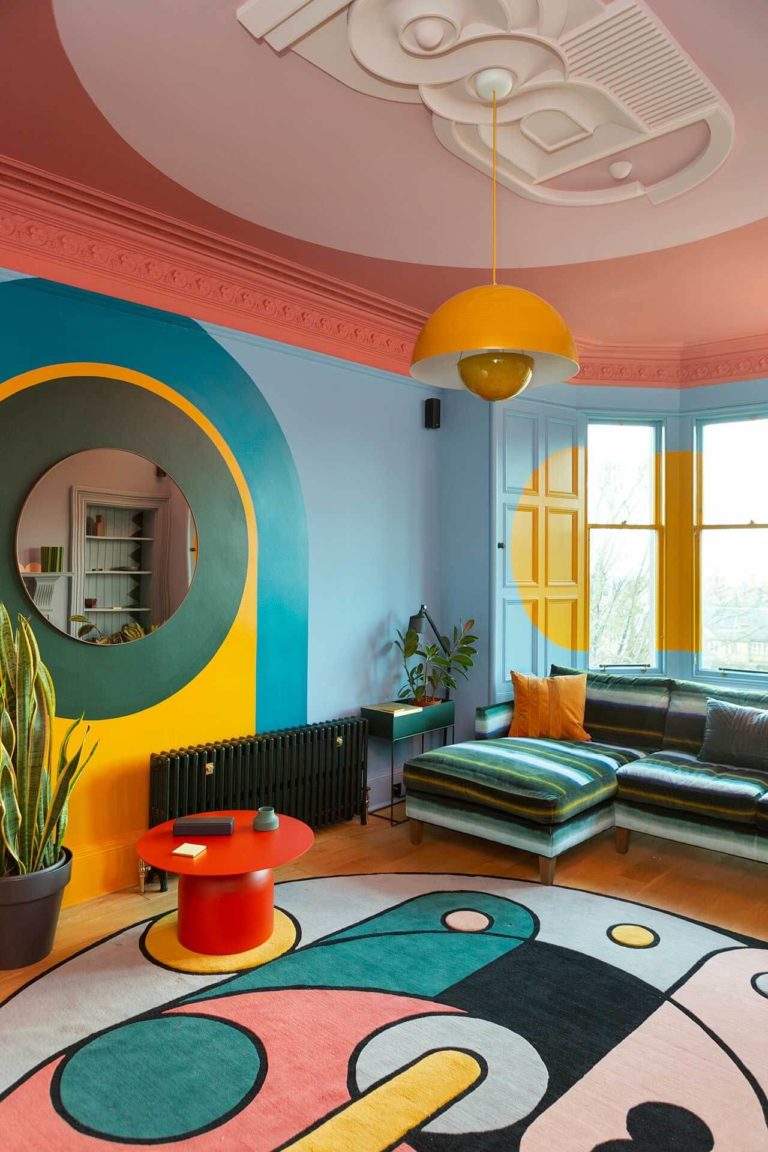
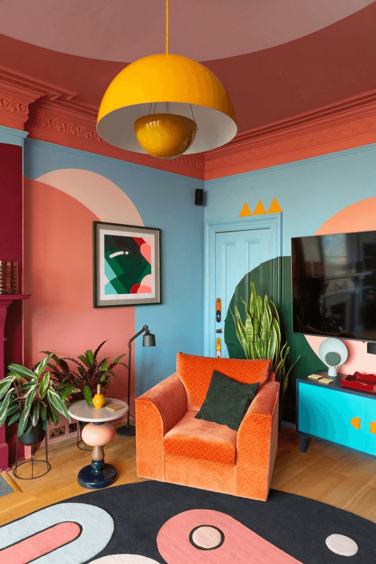
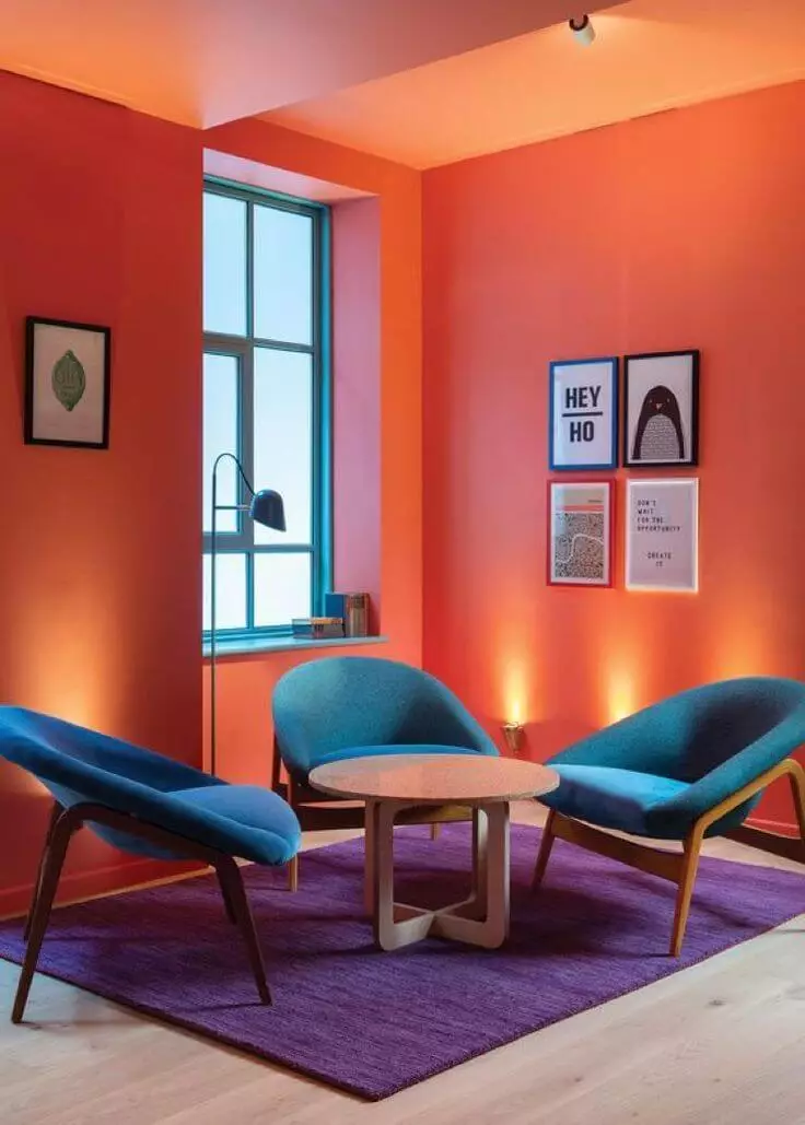
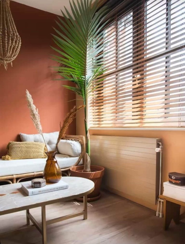
Lively Lounge Area All Year Round
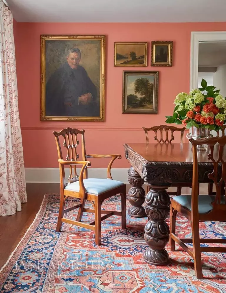
It is no coincidence that coral shades are regarded as some of the best choices for living rooms. They will keep your mood up during the cold season and recharge your emotional batteries at the beginning and end of the day. Lei Flower entertains and engages, encouraging conversation, which is best for you if you usually gather with your family or friends in the living room.
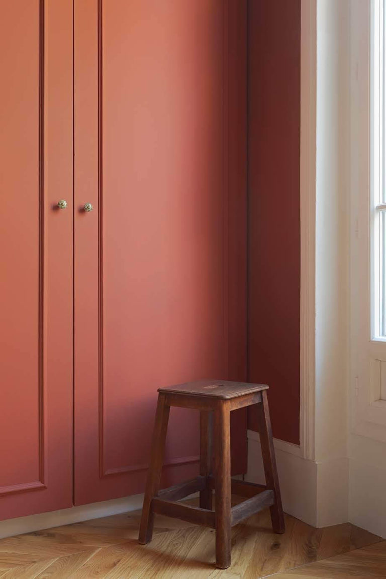
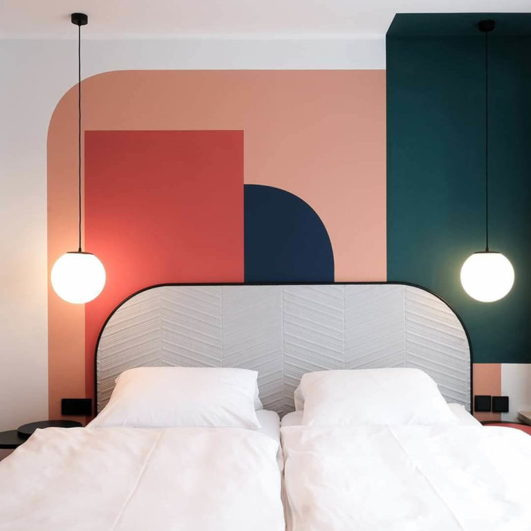
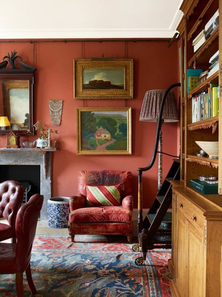
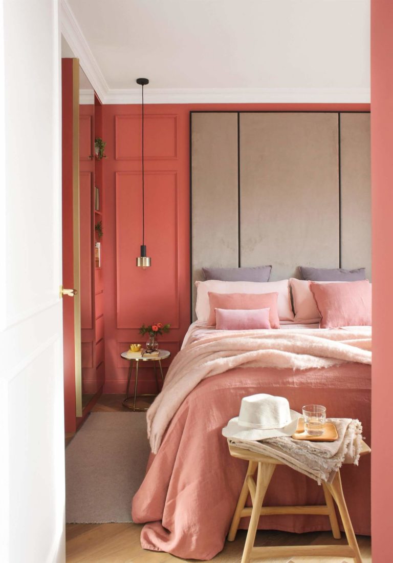
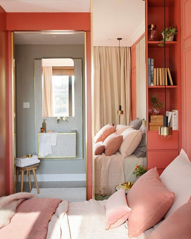
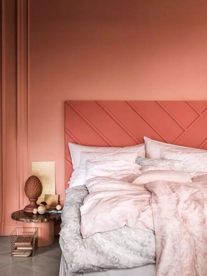
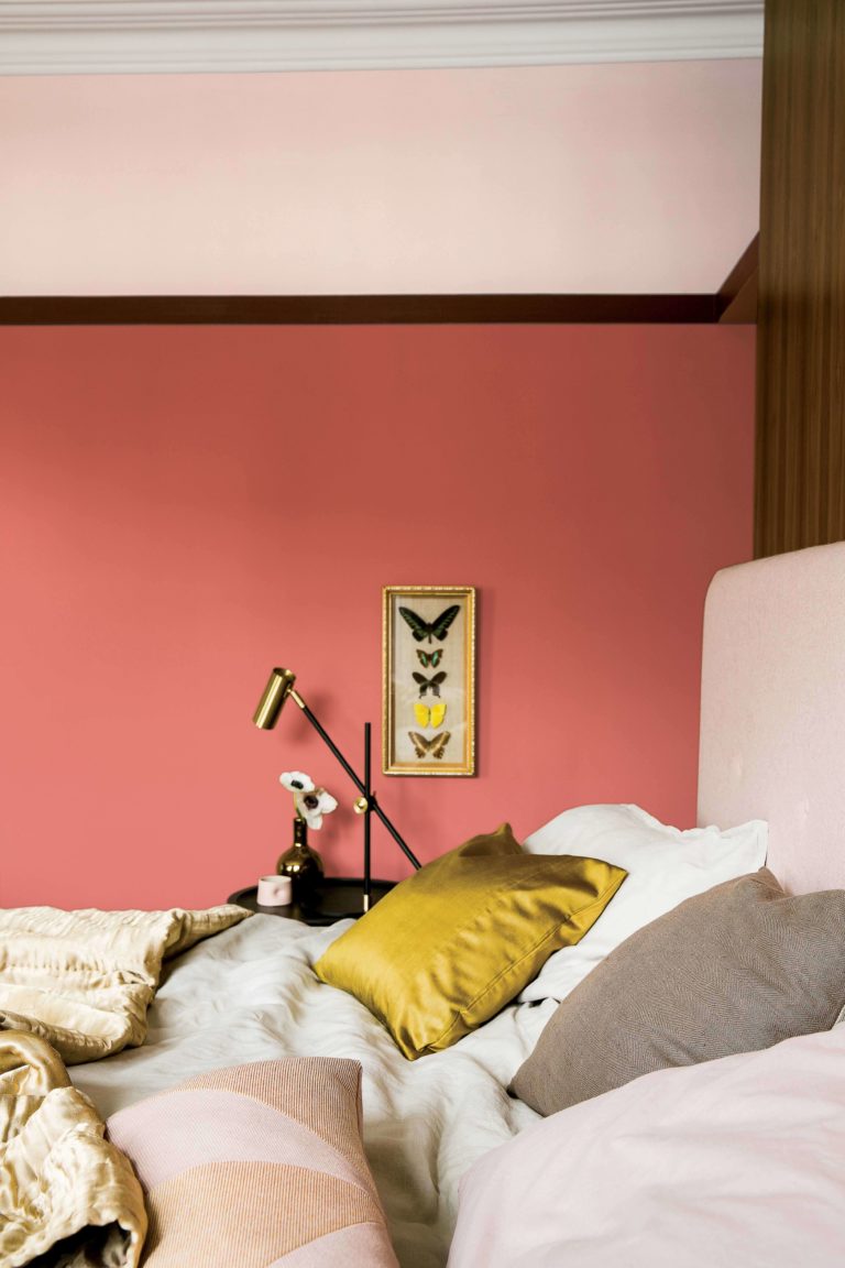
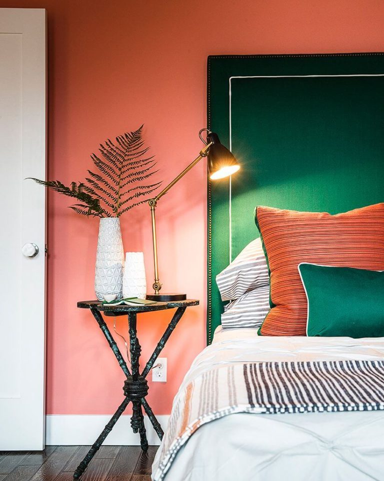
Rose Terracotta Sleeping Space
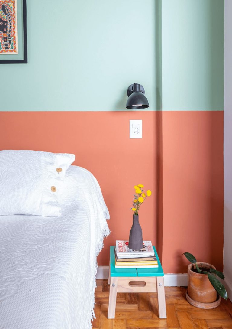
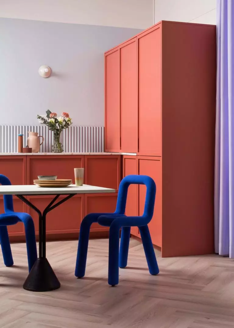
Since there is a subtle borderline between the coral-orange and rose clay shades, pretty close to terracotta, Lei Flower is associated with the comfort of earthy hues and suits bedrooms astonishingly well. Usually, the orange paint color goes for the walls, while the pairing colors may include white, gray, black, and contrastive bold shades, such as green, yellow, and our favorite – blue.
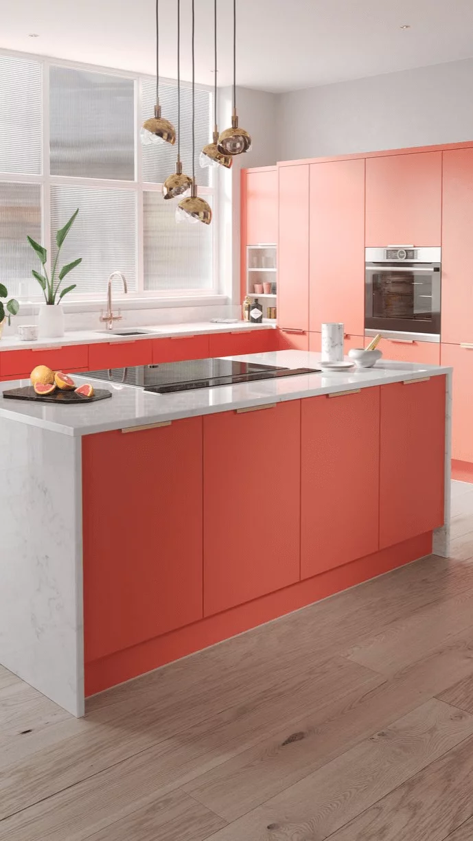
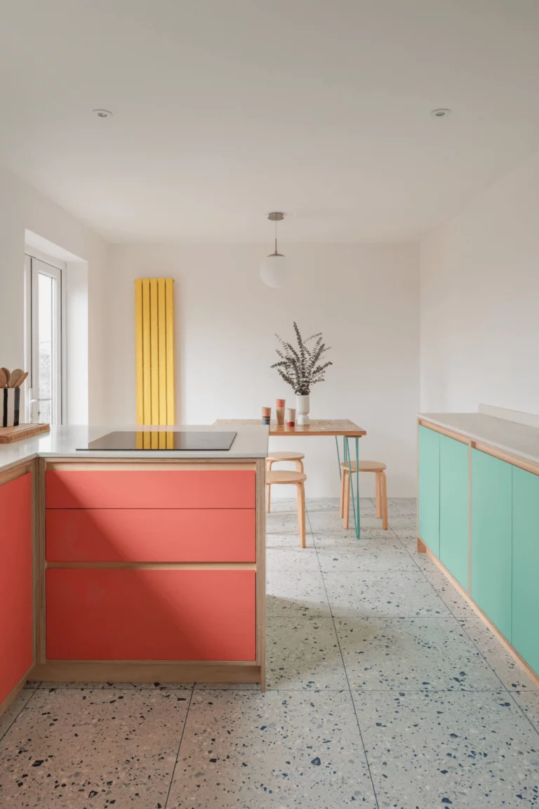
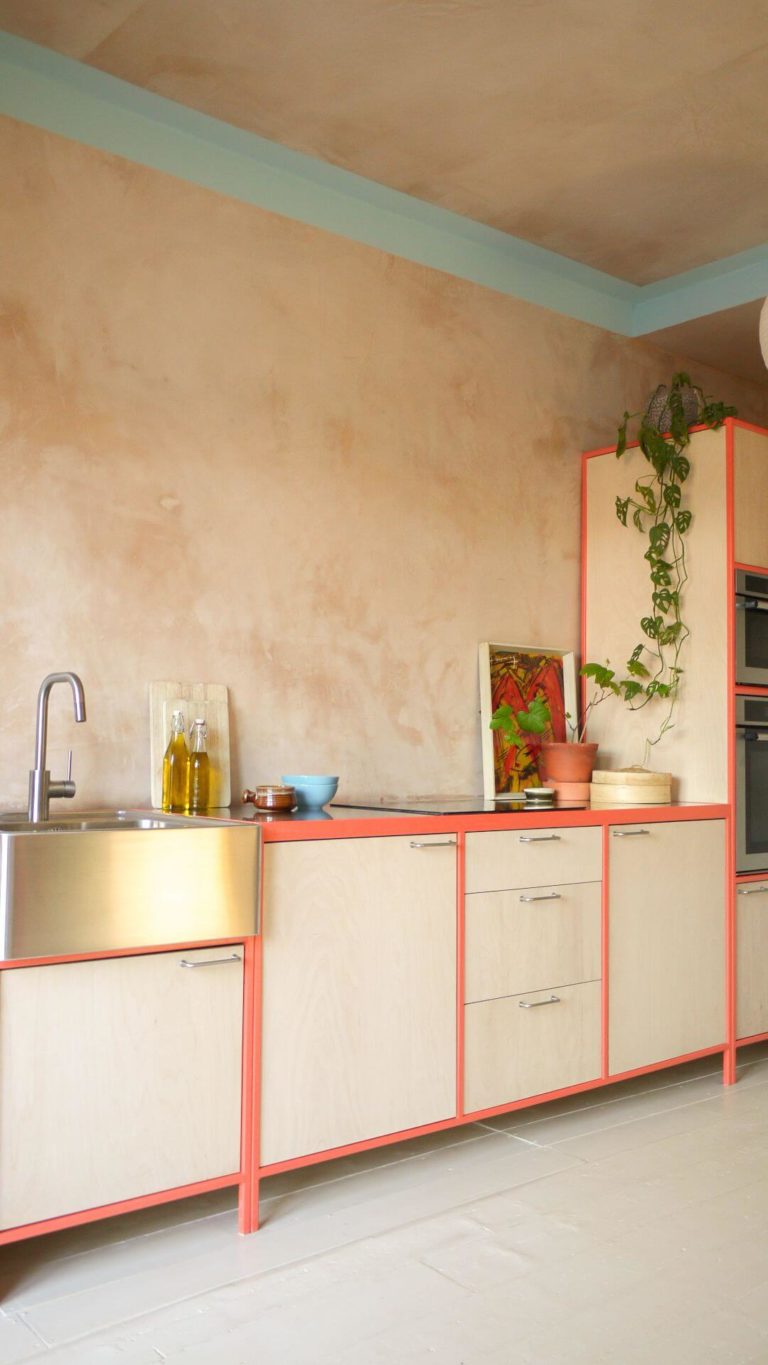
Blush Pink Kitchen
If you have always dreamt of a unique kitchen, not like the others, standing out from the crowd, and with a personal mark, now is your moment. Besides, since Lei Flower is prone to seem relatively pastel in particular conditions, you won’t find it difficult to adapt the color to future design trends. The energetic coral shade pairs with white in timeless modern interiors, organic shades of green or yellow for Rustic kitchens, and, of course, blue for high-end contemporary designs.
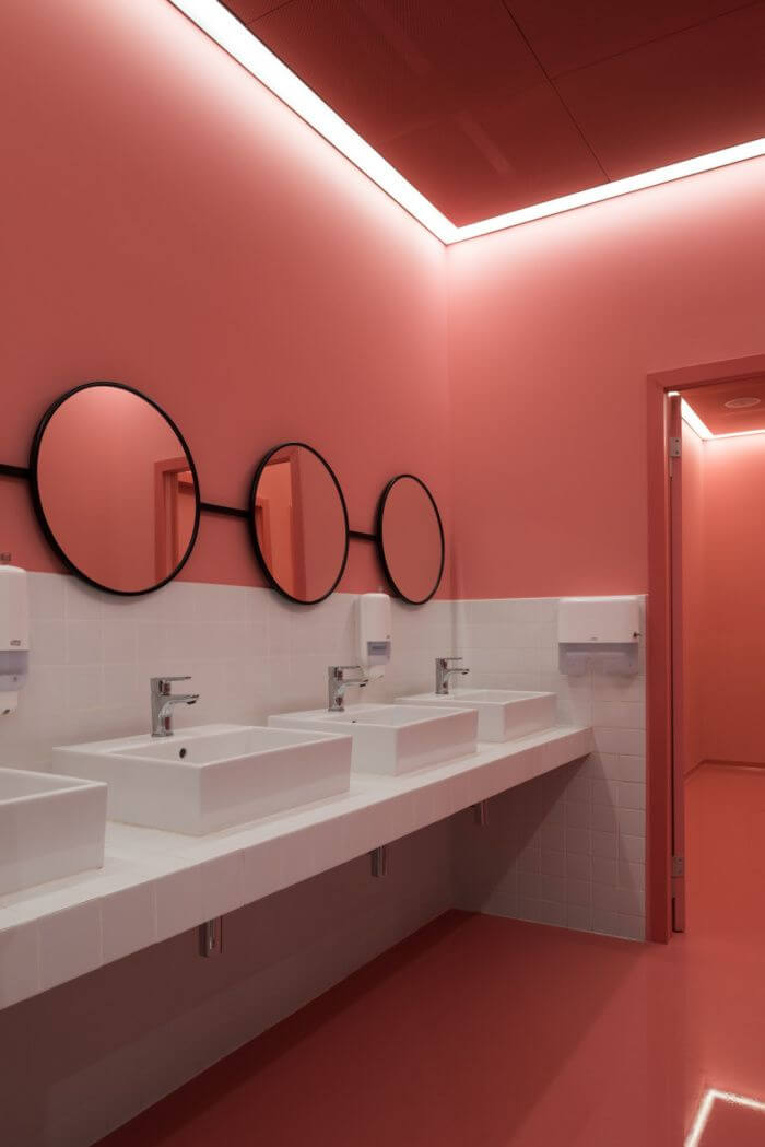
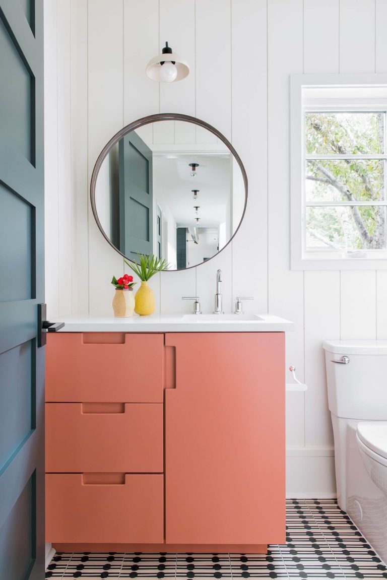
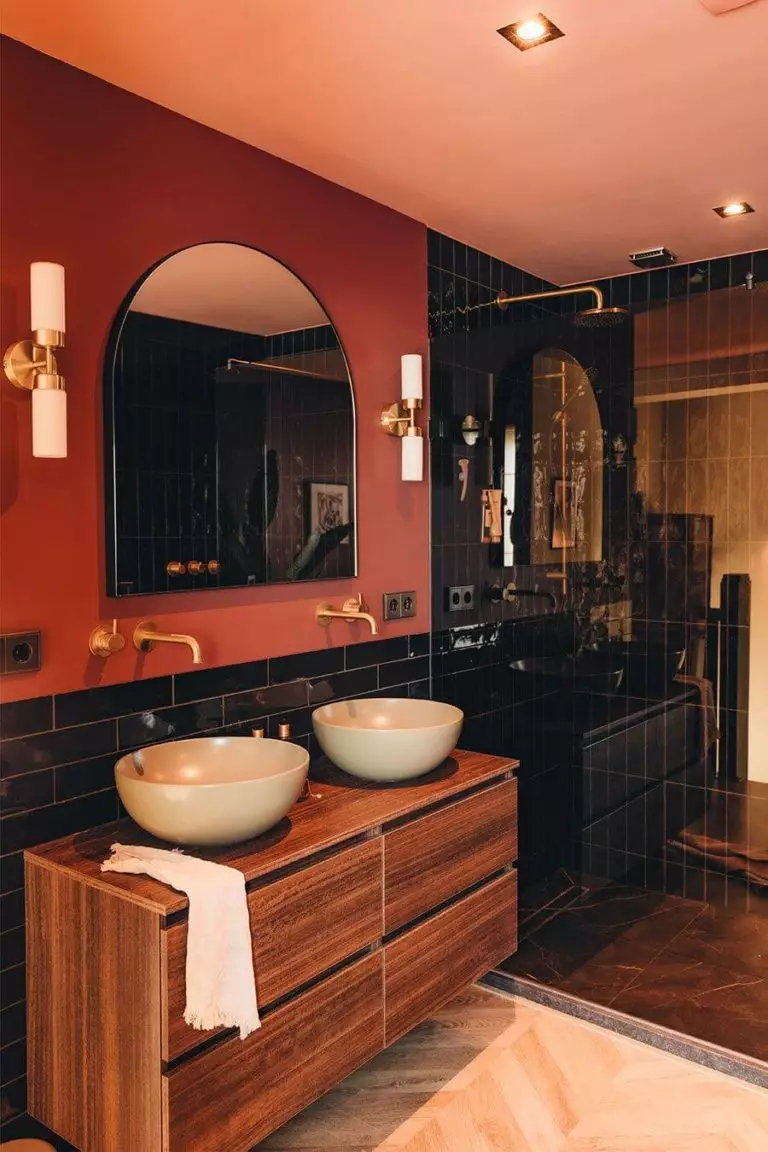
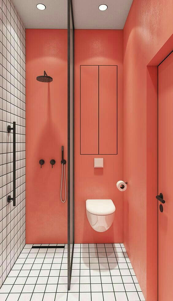
Coral Bathroom
Like the popular colors in the bathroom, blue and green, coral is an endeared paint color. If you live in a cold location, you will enjoy the warmth and mood-uplifting marine shade of coral-orange. Pairing with most neutrals, Lei Flower can be used to repaint the walls or make the vanity cabinet become the main accent.
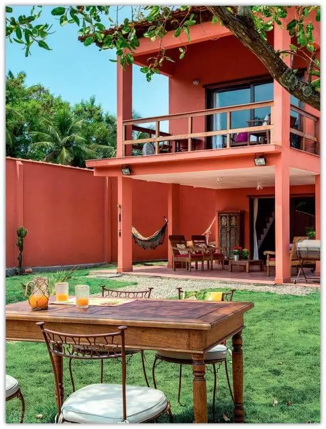
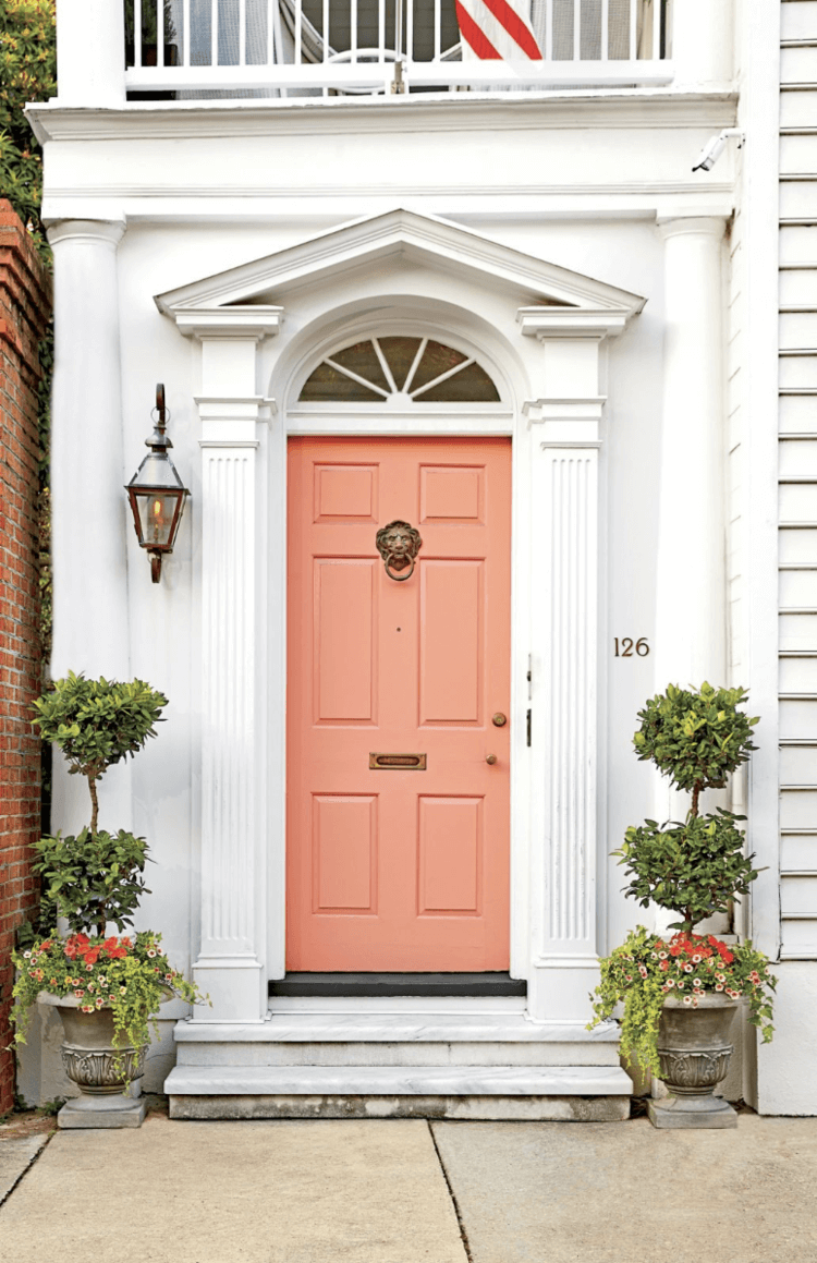
Use of Lei Flower for the Exterior
Lei Flower is highly associated with Spanish villa exteriors due to its resemblance to terracotta. When directly sunbathed, SW 6613 feels very warm and proves its trace to the group of orange colors. This is a bright paint color that won’t get faded over time. You can safely choose this shade of coral for the exterior house walls with white trim or for the front door, mandatorily paired with white walls. Don’t be afraid to experiment with this versatile pop of endeavor and expression.
The Lei Flower SW 6613 paint color by Sherwin-Williams is a wild coral shade with terracotta undertones that has it all – courage, self-expression, energy, calmness, comfort, and versatility, which is not that common among bright paint colors. Don’t sleep on the in-a-class-of-its-own coral.
