Likeable Sand SW 6058
Sherwin-WilliamsA warm dessert pink resonating with the nostalgic effect of a vintage dusty rose; smoky gray-pink and peachy pink under the same color code to suit any taste.
Likeable Sand (SW 6058): What Color Is, Review, and Use
Bearing in mind the concept of caring for yourself and your dear ones, experts from one of the top paint manufacturers, Sherwin-Williams, decided to create a color that looks and feels like well-being. The mid-tone pinkish sand shade with a pastel variation of dusty rose, so calming and refreshing simultaneously, is a slightly romantic paint color with feminine energy.
We met it earlier when SW 6058 was part of the 2020 Heart Collection. Now it stars in the 2023 Colormix Forecast through the Nexus Collection – a potter’s color palette of organic clays, down-to-the-earth browns, brilliant whites, and desert sands. What else to expect from the sunbathed sandy shade Likeable Sand?
Likeable Sand Paint Color Features
The organic desert paint color is actually part of the Red color family. It explains the emphasized pink base. As they say, the desert is endless and so is Likeable Sand – a timeless paint color. The pretty muted effect makes it a competitive shade among colors that help restore your energy in an environment of calmness and nourishment.
On the other side of the coin, it is a relatively sophisticated hue. Some regard it as vintage due to the dusty effect. Others associate it with a pottery barn palette due to the resemblance to a very soft clay shade. And last but not least, Likeable Sand is seen as a modern color that reminds us of home.
Likeable Sand: Is It Warm or Cold?
Make a guess! A sunbathed dessert shade with pink undertones: does it seem cold? Definitely not. Likeable Sand is a great representative of the warm color category. Surrounded by this shade, you feel covered by a veil of comfort, empathy, understanding, love, and nurture.
How Does Lighting Affect Likeable Sand?
That’s a surprise! In a room with south-facing windows, where the sun rays have direct access to color, SW 6058 turns into a very soft and warm peachy pink shade. It appears Likeable Sand has hidden yellow particles of sand, which are indeed not found in a space with northern exposure, where the cool natural light brings out the dusty effect. By the way, if you have an east or west-facing living room, bedroom, kitchen, or dining room, you can also enjoy the delightful and warm peach at particular times of the day when the color gets sunbathed by the morning or afternoon sun.
With the lack of natural light, Likeable Sand shows more body and seems deeper. Now, we can distinguish a more intense pastel gray-pink that preserves its warmth due to artificial lighting.
Likeable Sand LRV
As with any other paint color, we can find out how dark or light it is with the help of the Light Reflectance value, which shows how much light a color reflects. The LRV of LS is 50 – a perfect middle tone. It unfolds a well-defined warm pink shade that skillfully reflects light and can be successfully used as a base color, even in smaller spaces with poorer light conditions.
Likeable Sand Undertones
The main color that catches our attention is pink. Then, we slowly turn to other visible colors, such as gray and yellow-beige. We would even say there is a hint of clay, a very soothing earthy note.
Similar Colors
We won’t lie. There are not many sandy pink colors with a selection of undertones as at Likeable Sand. Yet, we identified a few similar paint colors at SW and other brands. Meet the prominent representatives of the group:
Coordinating Colors
Colorists from SW direct their attention to a rather monochromatic palette with Likeable Sand. We saw it and we loved it; what about you? Look at the following color matchings suggested by professionals (more inspiration you can find in the section that comes after).
Use of Likeable Sand in the Interior
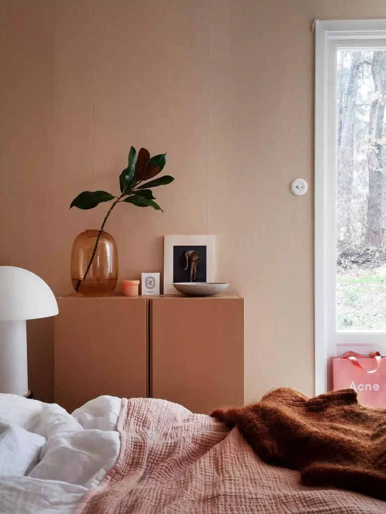
As already stated, the pastel pink from SW has more feminine energy and can look dusty or warm, depending on how and where you apply it. Generally, it can be used in any room of the house, particular attention being paid to the relevance of such a comfort-inducing color in the bedroom. Vintage interiors with romantic motifs are beloved spaces for Likeable Sand, while modern designs show as much appreciation for the warm shade of pink.
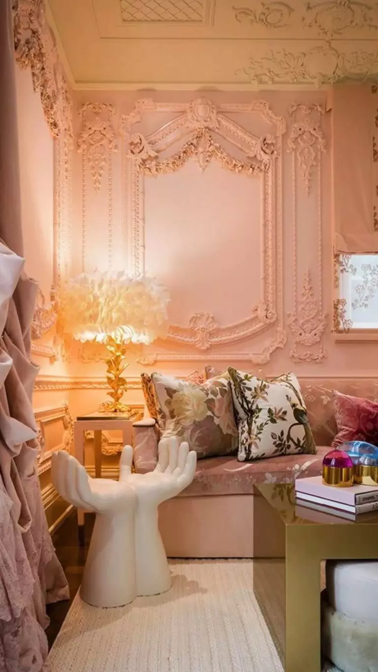
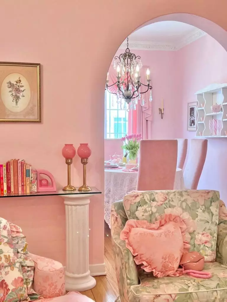
Romantic Style
If we were to look at the nostalgic personality of LS, we would instantly notice its belonging to the Romantic style that relies primarily on feminine accents, including curves, metallic details, classic wall and ceiling decoration, and irreplaceable floral motifs. It is not necessarily a Vintage Romantic with carved furniture and wall trim. This color also works for a Modern Romantic interior, such as a Scandinavian Romantic bedroom.
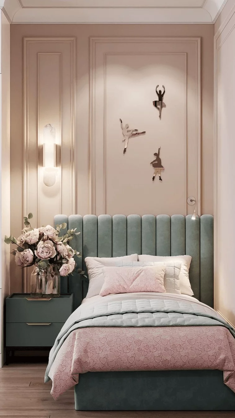
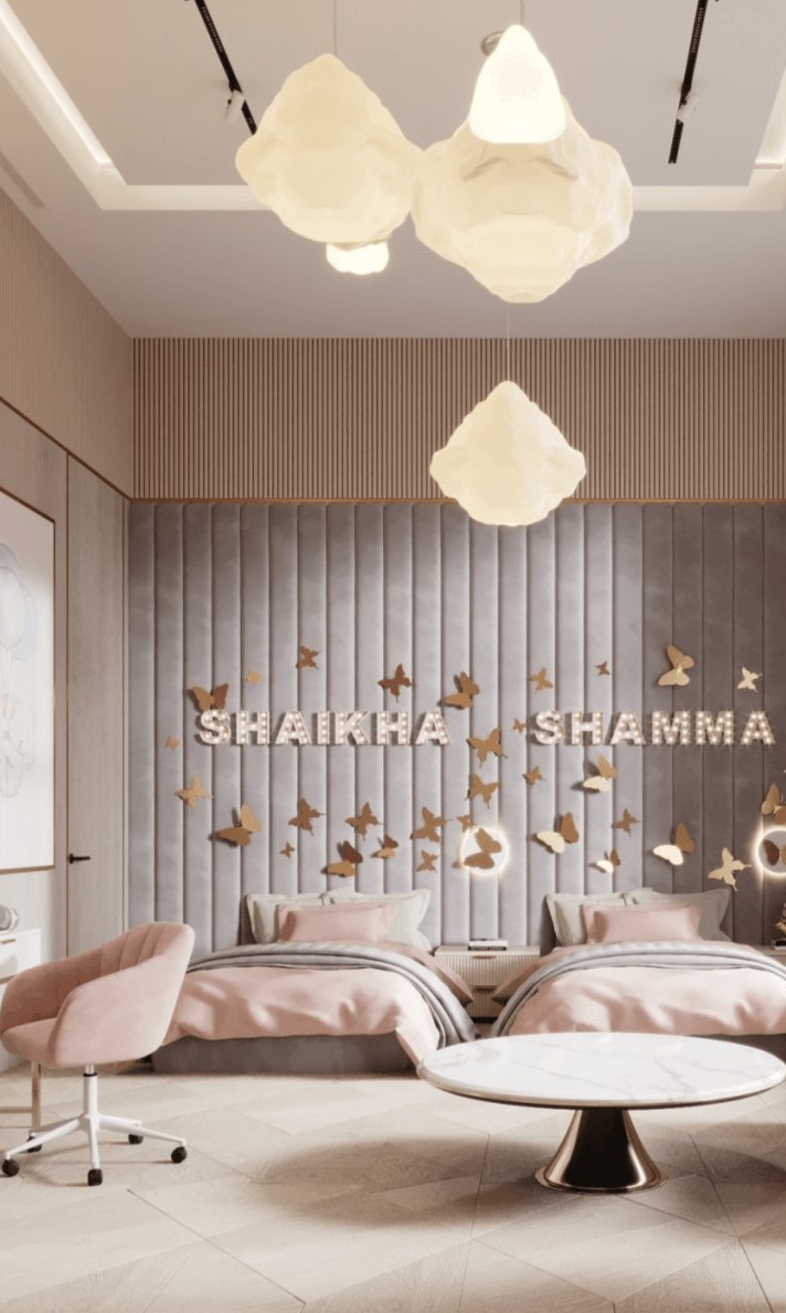
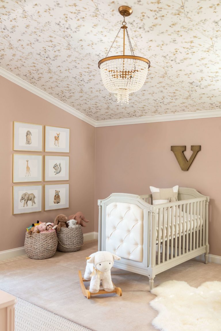
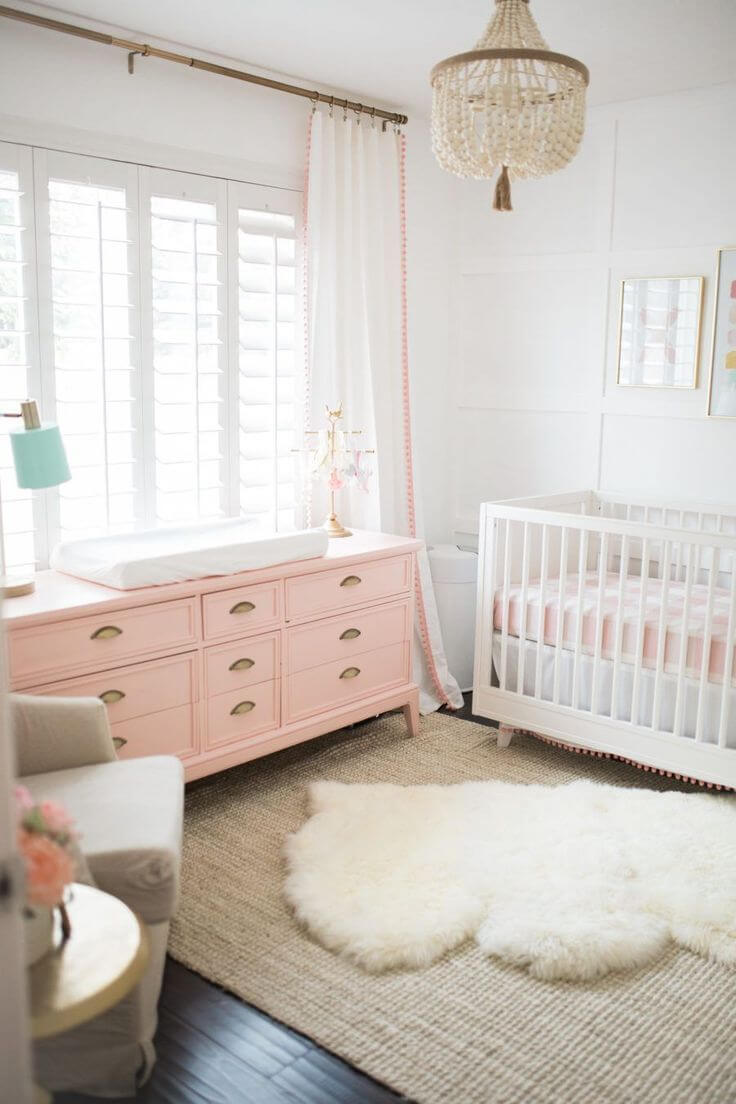
Girl’s Room
The soft pink color looks amazing in a girl’s nursery or bedroom. In contrast to the classic pinks, this one is much more pleasant to the eye; we would say even more stylish. In combination with white, Likeable Sand thrives and radiates coziness. If you want to set a more exciting environment for your children, consider bright-colored textiles, such as green, yellow, or crimson curtains, accent chairs, or bed headboards.
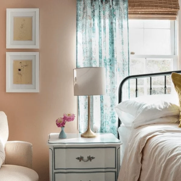
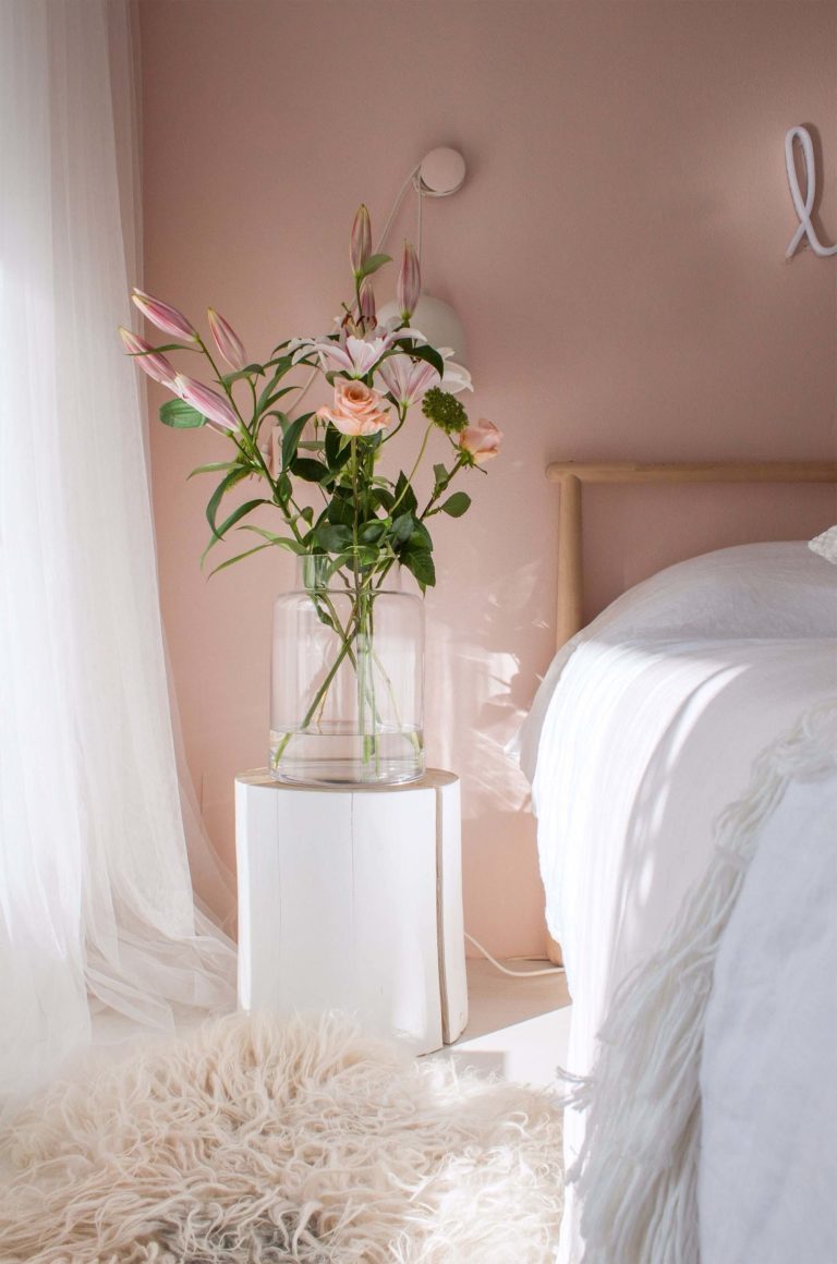
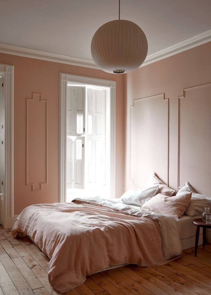
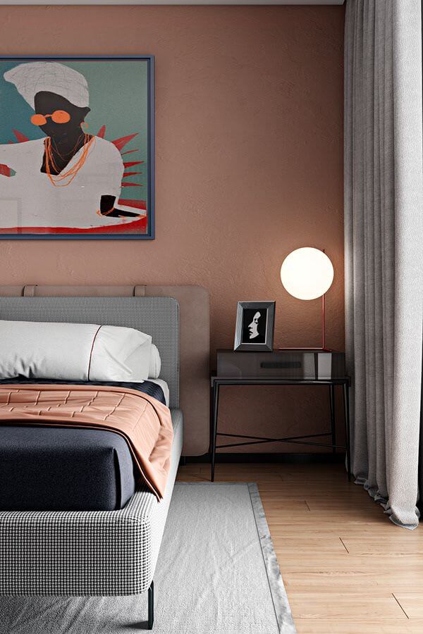
Bedroom
If you need to underline the feminine energy in your bedroom, opt for walls painted with LS. Besides its delicate and feather-light personality, SW 6058 suits sleeping spaces primarily because of its relaxing and calming skills. Favoring the Rustic, Modern, and Traditional styles, the sandy pink connects with nature, makes you forget about daily worries, and takes you on an adventure of relaxation. You wouldn’t probably mind such a pleasant end of the day when you reach your bedroom.
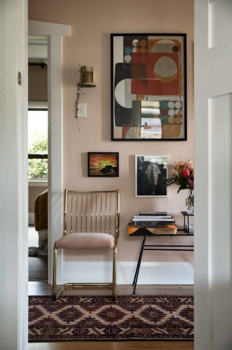
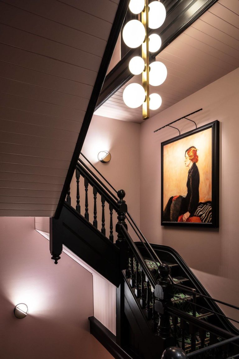
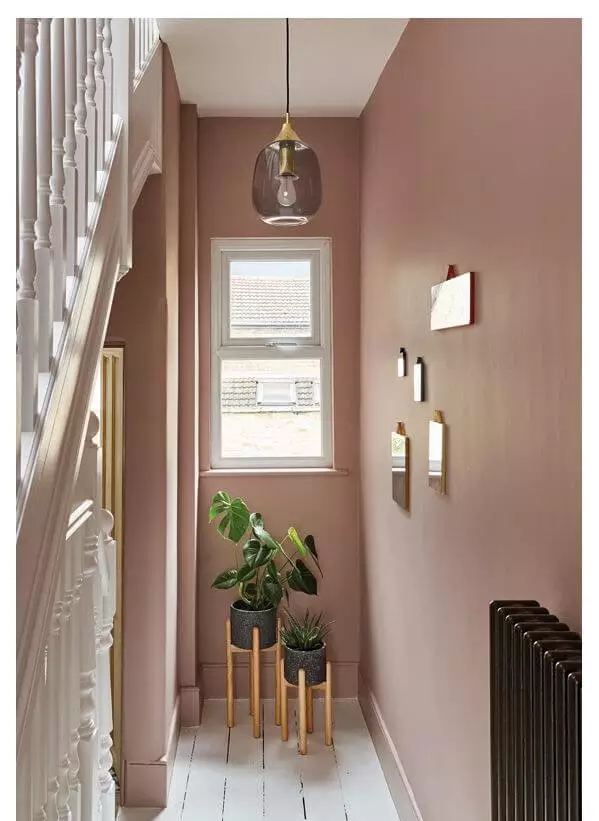
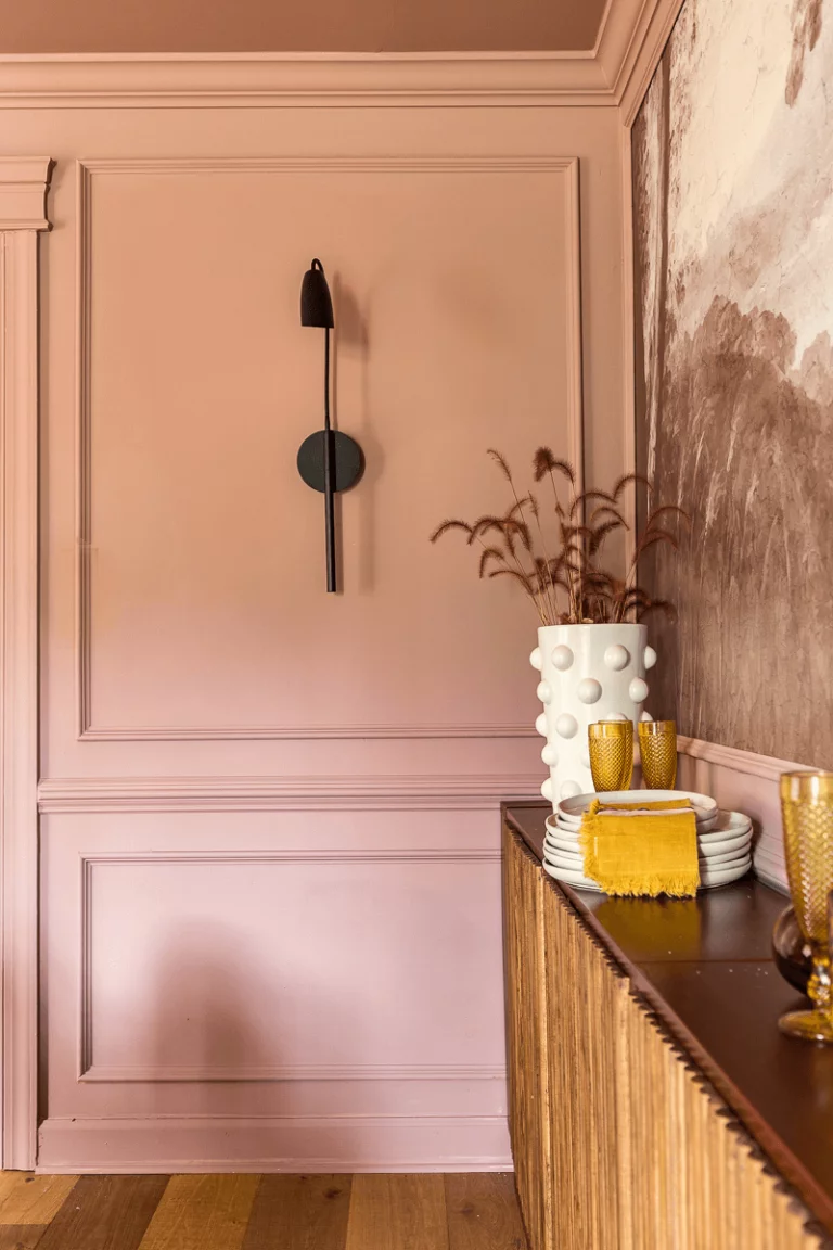
Hallway
Designers have been paying more attention to this space since many homeowners need to pay more attention to this part of interior design. Don’t ruin a well-designed house interior by skipping the hallway. A great design idea is to reconsider the wall color. Replace the faded neutrals with gorgeous pastels full of expression, such as the warm desert pink from SW that will bring more effervescence and interest. Additionally, put your mark on design with gold accents, gallery walls, or black contrast.
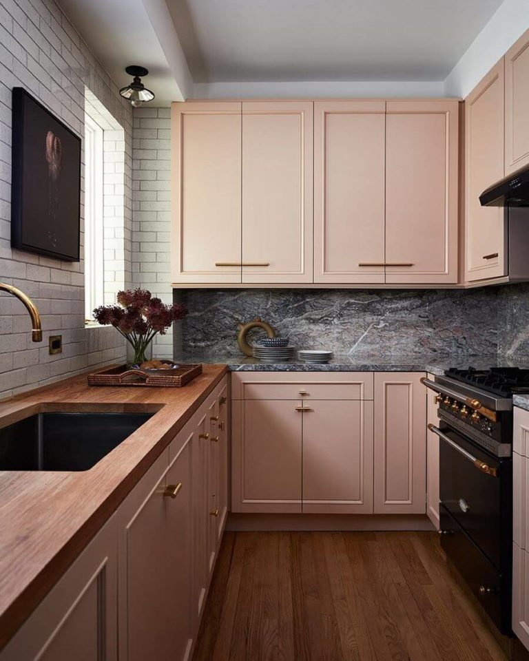
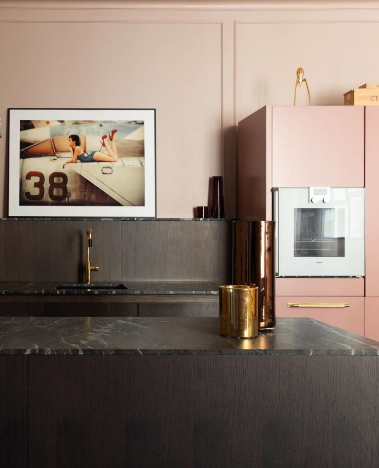
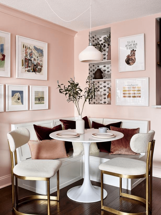
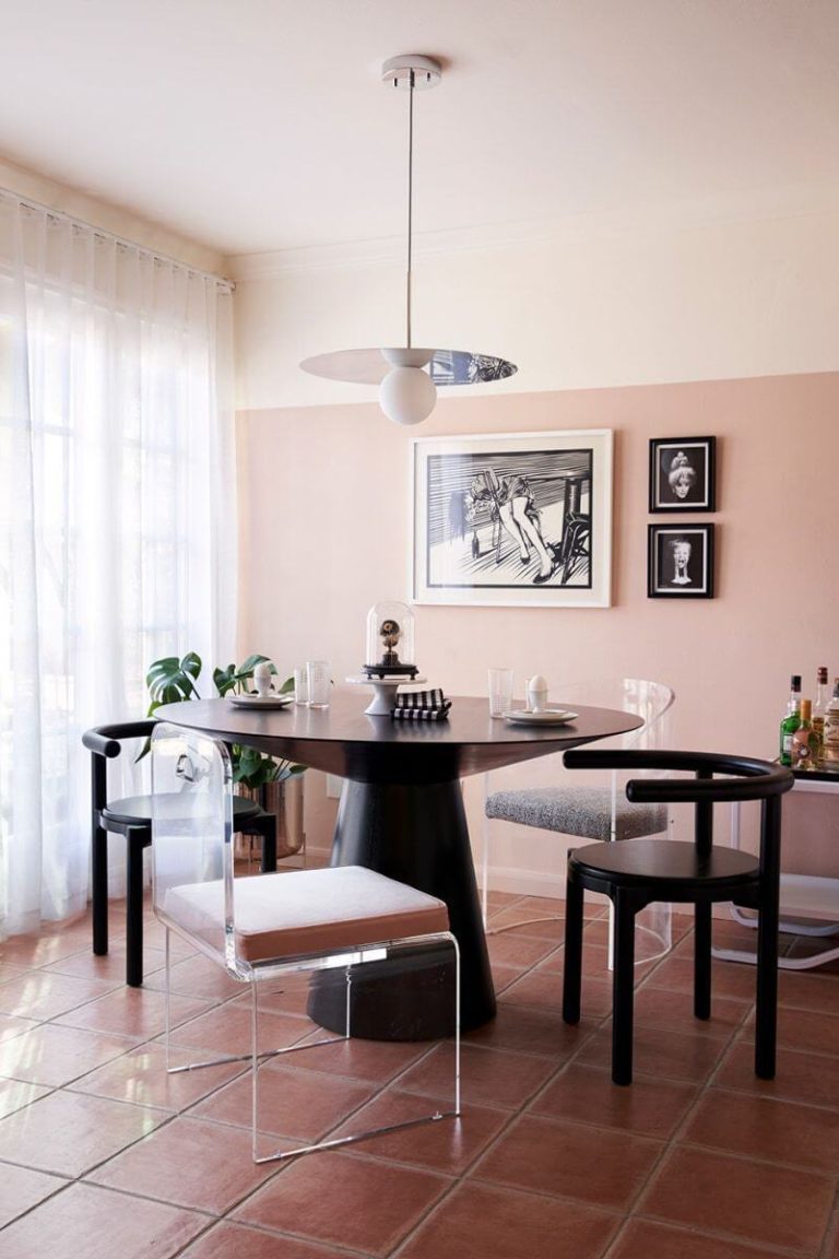
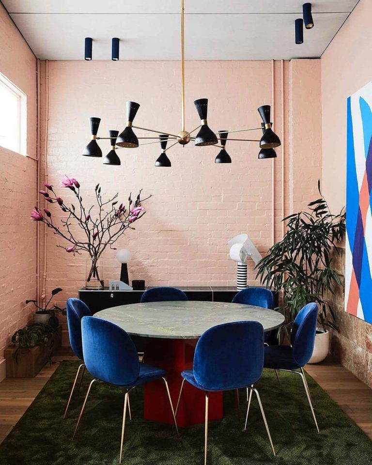
Kitchen and Dining Room
Interior designers consider Likable Sand appropriate for a full pink kitchen. Even the backsplash should be the same color, say, richly-grained pink marble. For more balanced effects, consider contrastive backsplashes and countertops. Experts give preference to gray marble. The dusty pink looks equally well on kitchen cabinets and walls, with black-colored cabinets for the latter.
The sunset pink is very engaging and entertaining. A dining room with pink walls feels most welcome to guests. Opt for bright textiles, metallic accents, or personalized decor to underline the specific mood around the dining table.
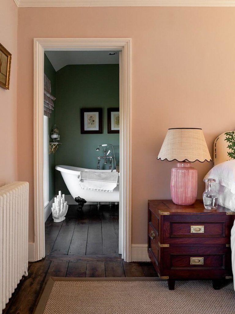
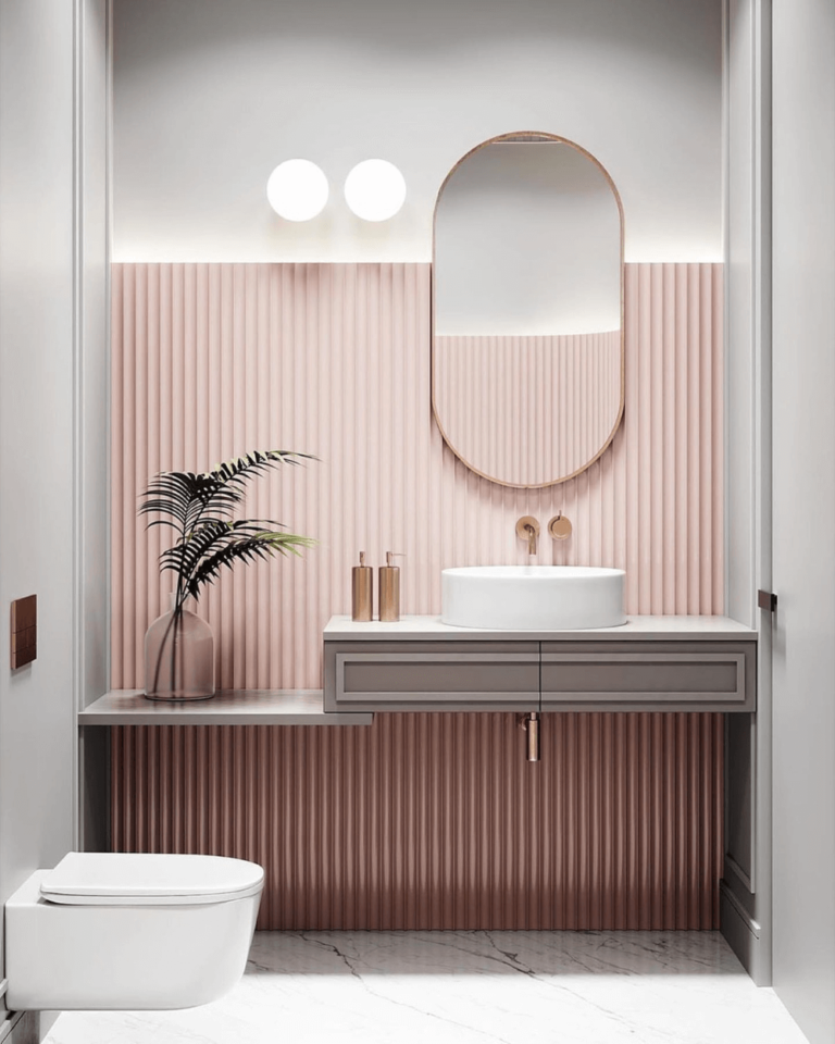
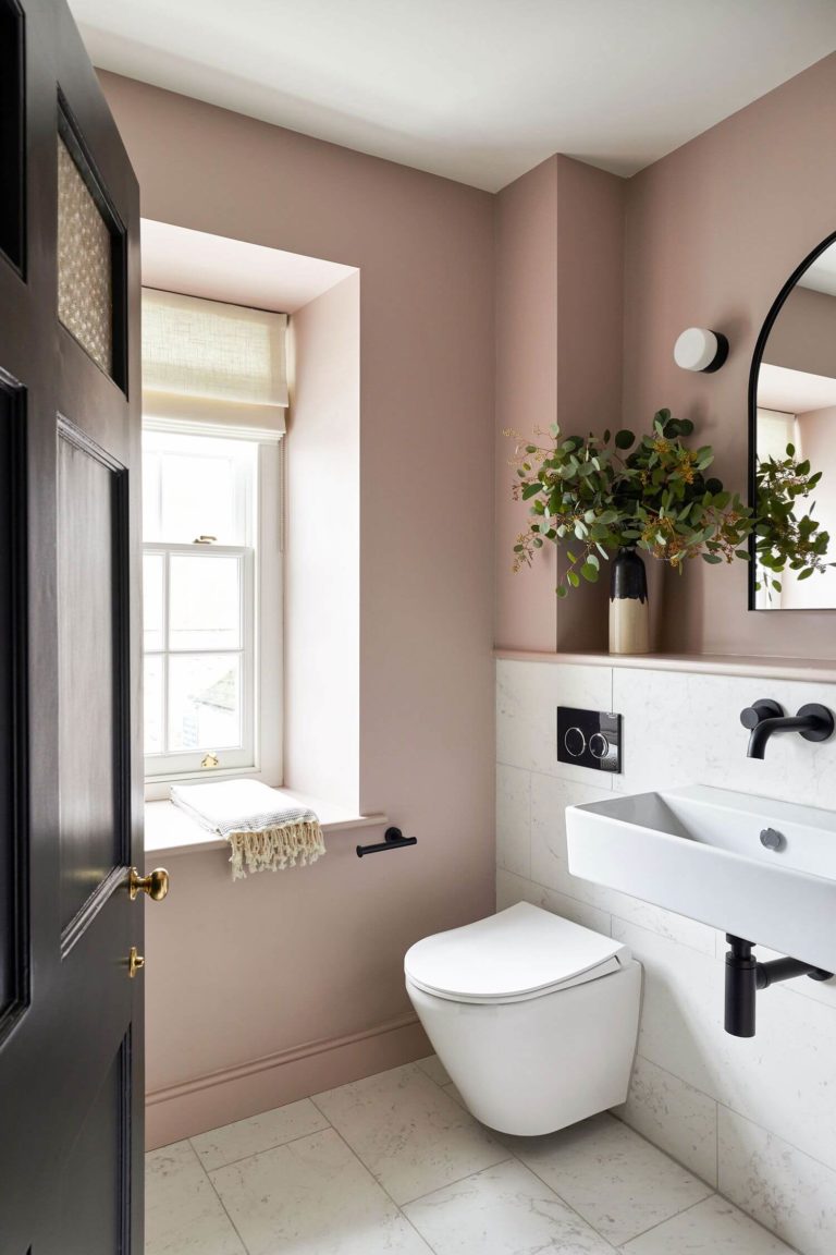
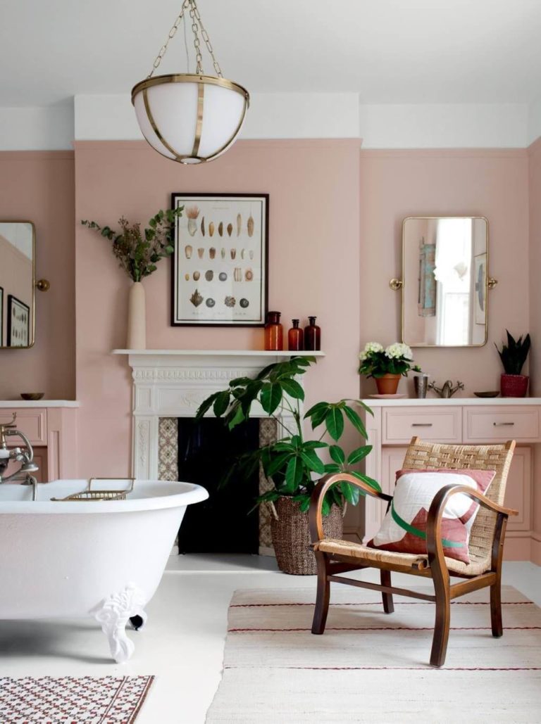
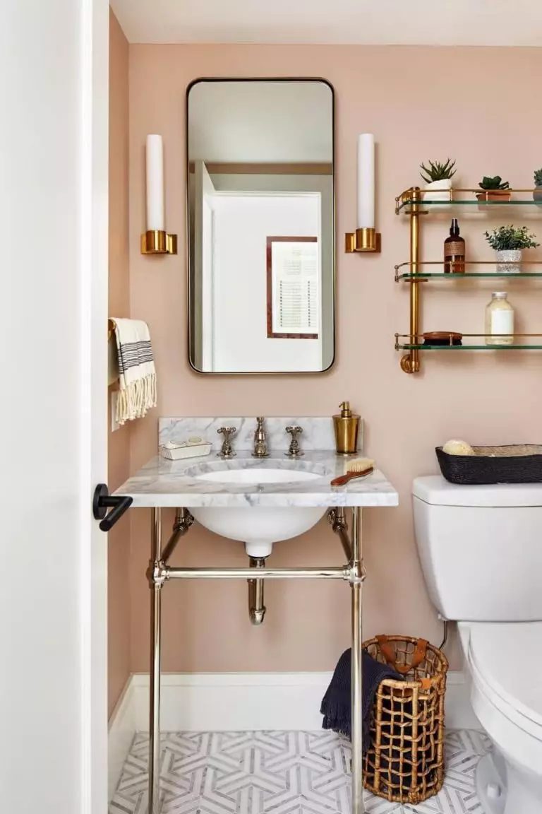
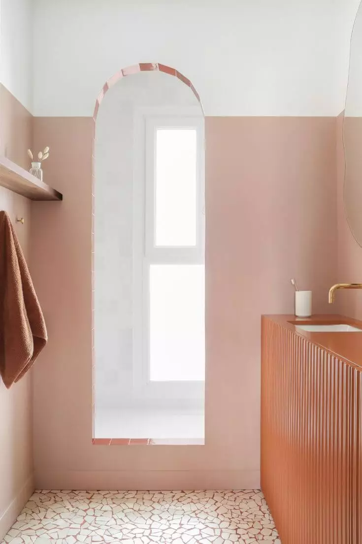
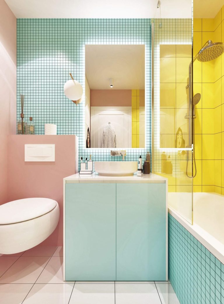
Bathroom
As a sand color, the unpretentiously warm pink from SW pairs very well with everything water-related. You will benefit the most from Likeable Sand if you live in a country with constant cold weather. The warm rose color will make the space feel cozier. The visual factor plays a significant role. Still, the peachy pink color will come to the fore in a location with warm weather only. A bathroom colored pink and white with black or gold hardware is a classic. You can still use the dusty pink paint in Vintage or modern bathrooms.
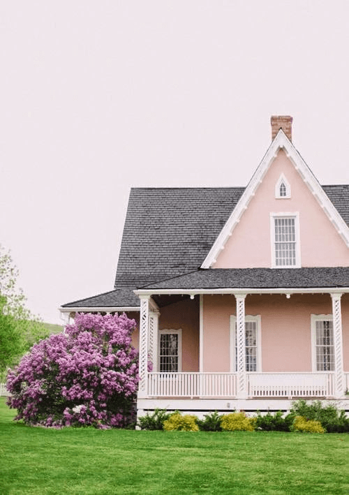
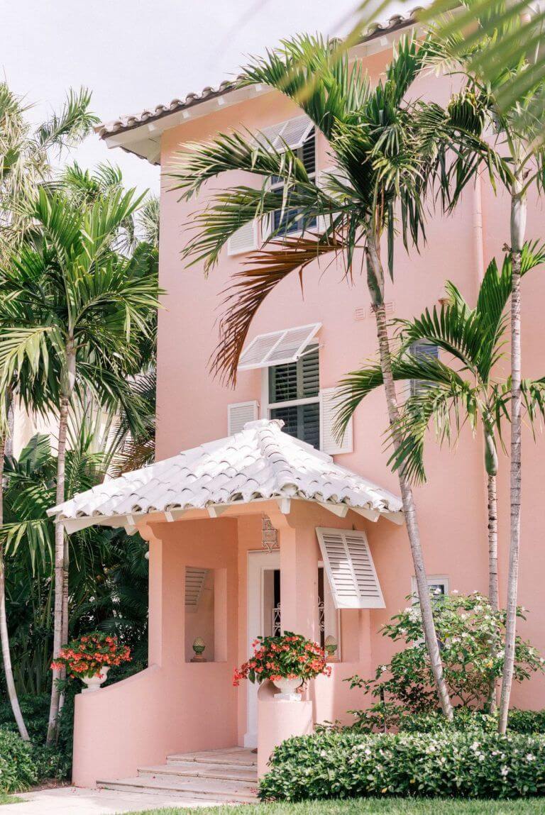
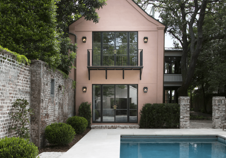
Use of Likeable Sand for the Exterior
Due to its slightly muted effect and pastel appearance, Likeable Sand won’t disappoint you if you decide to use this paint for the house exterior. Add white for the trim, and enjoy the new color that adds interest to the exterior walls, not because of its brightness but rather its stately and authentic look. Note that LS appears lighter and more neutral on the exterior if you live in a northern country and brighter in a southern location.
The Likeable Sand SW 6058 paint color by Sherwin-Williams is the soft mineral pink camouflaged in dusty gray and diluted with warm beige – the perfect mid-tone pastel to enrich your life with more positive energy and create a luminous and thoughtful environment in your house.
