Mindful Gray SW 7016
Sherwin-WilliamsThe perfect gray from SW is actually a greige, a blend of gray and slight notes of beige, which stands behind its warm feature.
Mindful Gray (SW 7016): what color is, review, and use
Picking the right paint color, making sure it suits your style and works well with other shades found in the room, and getting used to it on a personal level is quite hard work. We usually do not look for easy ways, but this is the moment we should refer to one: neutrals are a go-to category of paint colors that will make this process much easier, particularly speaking of grays, which are versatile, go with any style, and adapt to your design solutions. What if we said that things could get even better? You will surely be on the safe side with a balanced shade of gray like Mindful Gray SW 7016 from Sherwin-Williams.
The perfect gray from SW is actually a greige, a blend of gray and slight notes of beige, which stands behind its warm feature. Mindful Gray is a middle tone paint color, meaning it is neither too dark nor too light, although gravitating towards the latter. Furthermore, it does not show eye-catching undertones, making it a neutralized shade. It is indeed a very popular color at this manufacturer, being part of the Top 50 Colors collection. There is more to it than a simple greige shade. Designers and homeowners simply continue to fall in love with this paint color. Let’s find out why!
Mindful Gray paint color features
The fabulous gray from the renowned color brand is a seemingly ordinary shade of warm gray. The more you look at it, the more charmed you become. There is something graceful about the well-balanced gray base and not too imposing beige scents. These are not the only color notes this paint color is hiding (more on this later). A space painted this way does not feel draining since we speak about a mid-tone color. Instead, it seems balanced, soft, calming, inspiring, peaceful, even refreshing. That’s right! They all belong to Mindful Gray.
Mindful Gray: is it warm or cold?
Undoubtedly, Mindful Gray is warm. Still, a slight invigorating hint keeps this paint color balanced. Therefore, it does not seem too warm but rather soft, pleasing to the eye, close to the soul, and adaptable to any design direction. This slight coolish scent hidden behind the gorgeous greige is by no means a reason to call it cold.
How does lighting affect Mindful Gray?
Even a shade that stays true to its inner beauty cannot skip the lighting part. Remember one thing: light is always the one to say the last word. Let’s take it little by little. In north-facing spaces, Mindful Gray reads slightly cool. This is when we will reveal a secret. The SW 7016 has tiny particles of blue in it, which appear in these particular conditions. On the other hand, in rooms with south-facing windows, the standout greige brings the entire range of notes to the surface with the soft scents as the leading. What about east and west-facing spaces? The warm undertones of this color will reveal themselves differently depending on how the sunlight penetrates the room, reading sometimes warmer, other times cooler.
Mindful Gray LRV
The Light Reflectance Value, which shows how light or dark a color is by its ability to reflect the light, is 48 for Mindful Gray. It stands almost in the middle, slightly gravitating towards the light side. In plain words, SW 7016 is quite able to reflect particular amounts of light, even making the room feel slightly more spacious. The pretty intense gray base and no less striking beige notes are there to keep it impartial.
Mindful Gray undertones
We got to the most interesting part. What makes Mindful Gray feel the way it feels? It is already clear that this paint color is diluted with a few particles of beige, which makes it a greige. Still, there is a tiny blue/green hint revealing itself unusually. You probably wonder why we said that Mindful Gray does not have any striking undertones when it clearly has a few. Well, their small quantity is not there to change the true greige nature of this shade but rather to balance it. The blue/green scents keep this hue from getting too warm, while the beige notes make sure that this shade does not feel too chilly.
Similar colors
As usual, you will not get disappointed when it comes to similar colors to a representative from the gray family, even if we speak about greige. Both Sherwin-Williams and other manufacturers are happy to share with us their alternatives. Let’s discover some of them!
Coordinating colors
The range of possibilities is wide. As for the beginning, you can think of the same gray family. You cannot go wrong with neutrals close to Mindful Gray for a monochromatic palette or bolder ones for an accent. Whites look no less impressive when paired with this greige for a surprisingly soft effect. If we tackle accents one more time, you can safely go with bolder options, such as brown or navy variations. Don’t forget about beige that would perfectly resonate with the warm undertones of this paint color. Let’s go through some examples!
Use of Mindful Gray in interior
Mindful Gray is a no-fail option for any style, color combinations, and preference. As neutral as it is, SW 7016 surely hits differently when paired with colors that resonate with its undertones or contrast them exquisitely. Undoubtedly, this greige works within any room, bringing this modern feel of balance and harmony. Let’s see how it works for any space in part!
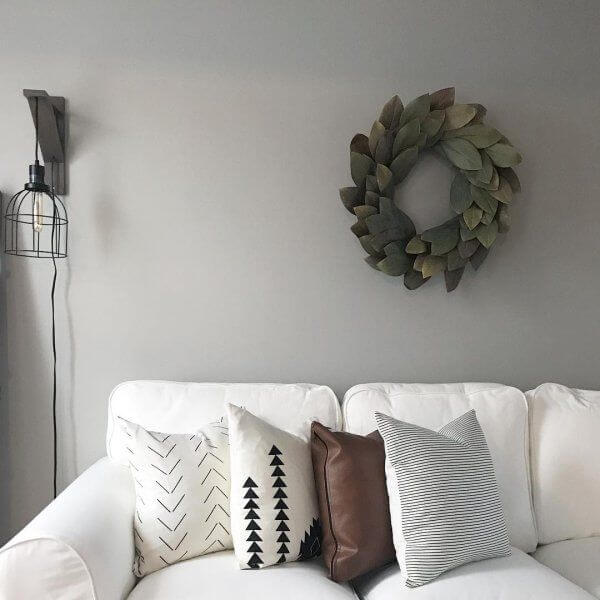
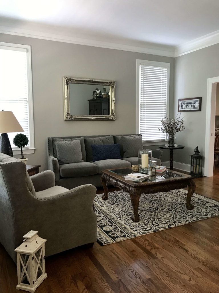
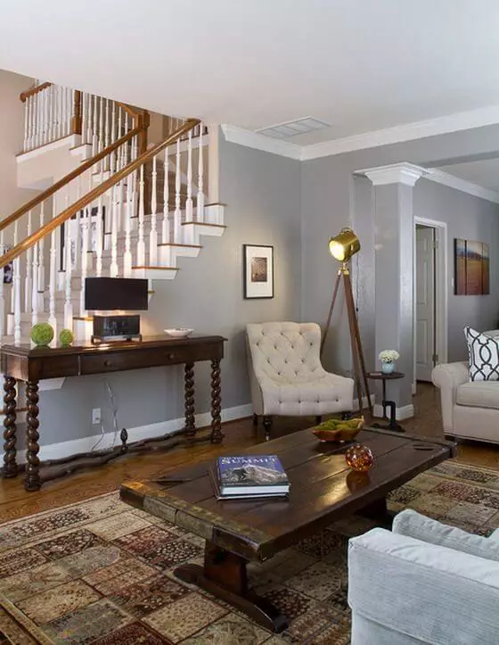
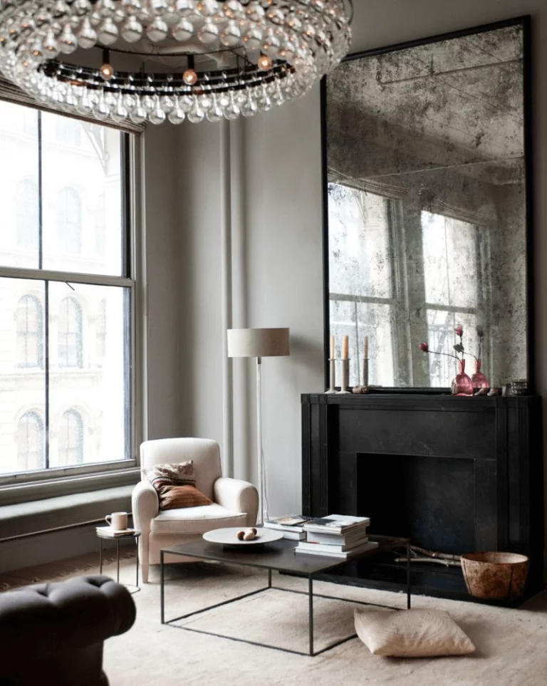
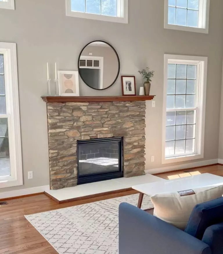
Living room
Regardless of how many accents there are to display on this neutral background, Mindful Gray likes to serve as the paint color for the walls and be paired with dark wood or white. Be it a Classical, Neoclassical, Farmhouse, or Rustic interior. It adapts to every style in part and brings a unique sense of comfort and contemporary air that makes you feel part of a modern space, surrounded by familiar shades for a personalized sense of coziness.
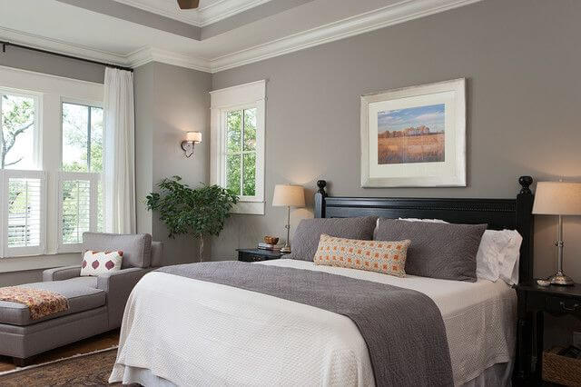
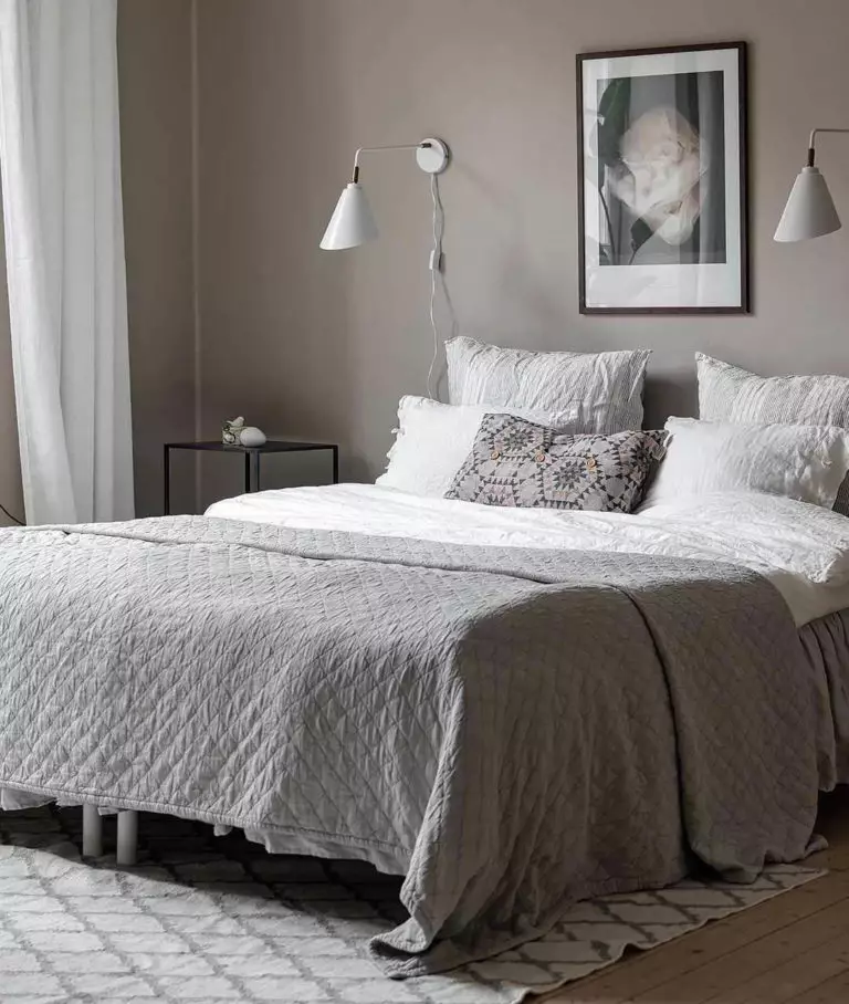
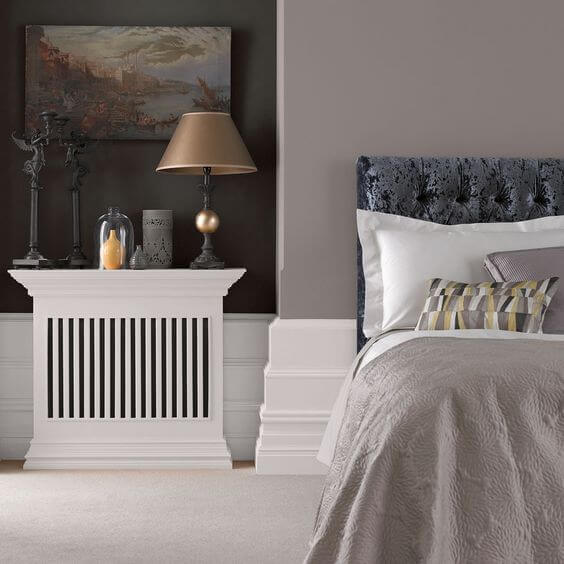
Bedroom
We cannot give up on the perfect combination of Mindful Gray with other gray variations, whites, and wood. When applied in such a personal space, this mix feels particularly pleasing and close to the heart. Go with all shades together, consider SW 7016 as a background, which will not feel imposing, or consider complementing the greige walls with white and gray bedding, accompanied by wood accents for the furniture. Additionally, add a few sources of greenery to dilute the neutral palette a bit.
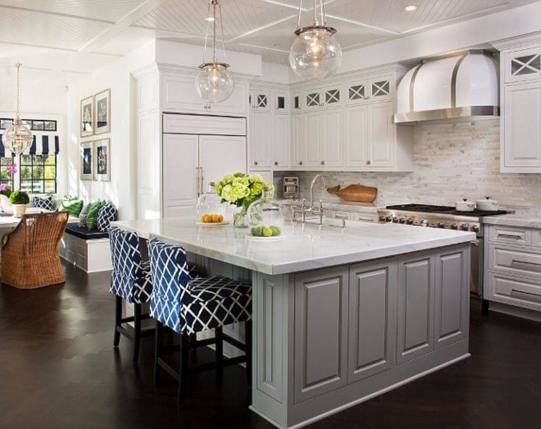
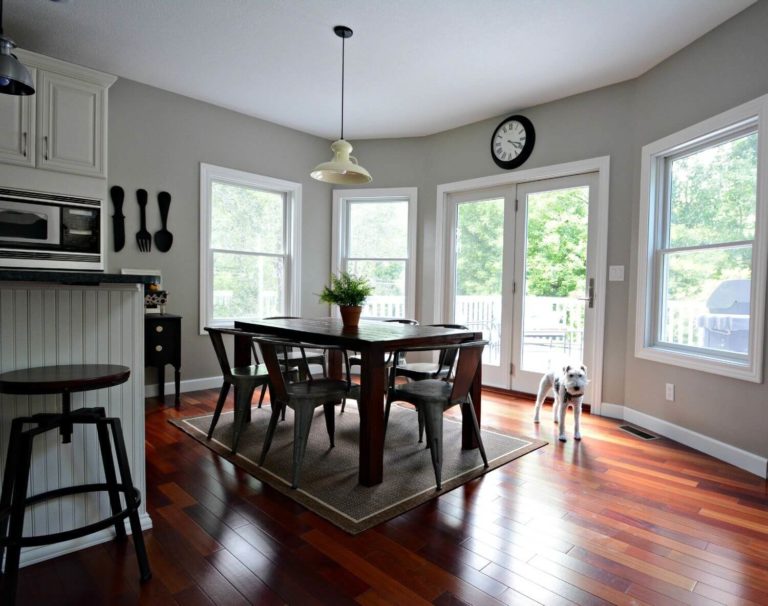
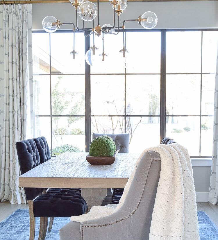
Kitchen and dining room
Mindful Gray works very well for the furniture, and we suggest painting the kitchen cabinets in greige on a white background. Nevertheless, you can also go with an island painted this way and white for the rest of the cabinets. Regardless of how versatile this gray shade is, nothing will beat its integration within a Farmhouse interior. This is also true about the dining space, where Mindful Gray harmonizes with the dark wood furniture for an extra feeling of comfort. Still, you can also opt for a light wood table, upholstered chairs, an extravagant chandelier, and your dining area will acquire a contemporary look.

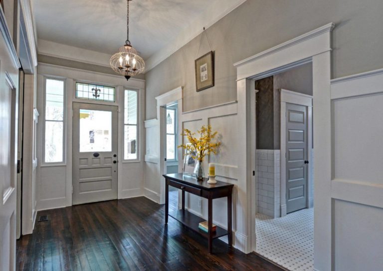
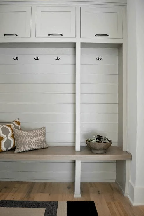
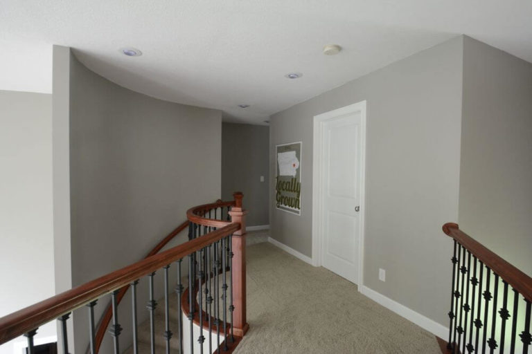
Hallway
Mindful Gray can acquire a pretty welcoming appearance when applied in the hallway. Be it the wall or a built-in piece of furniture. The go-to companions – dark wood and white are there to complete the design. Designers suggest that a Vintage piece in dark wood would look exquisitely on a greige background underlined with white trim for a stylish touch within an exceptionally inviting space.
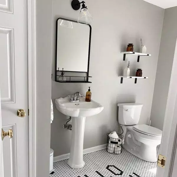
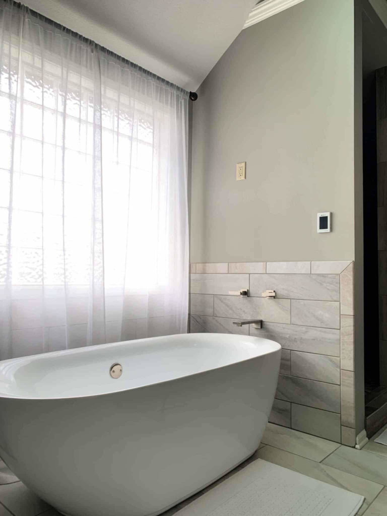
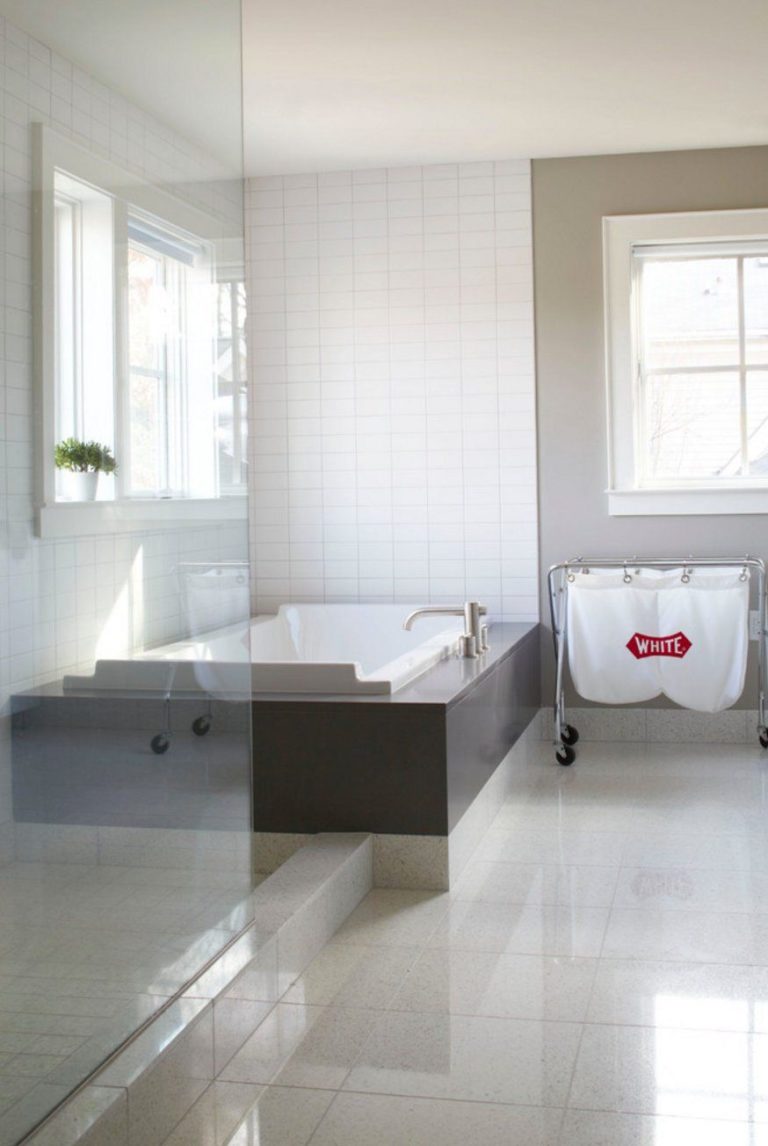
Bathroom
You probably want to benefit from this neutral and display the boldest accents. Still, designers suggest sticking to a functional approach, even in terms of color. Go with Mindful Gray for the walls, and pair them with white tiles. The other bathroom belongings should also be white. The furthest you could go is considering black hardware to dilute the palette. No additional details, no other splashes of color – just a sleek, almost monochromatic interior, where SW 7016 will take care of comfort, style, and originality.
Use of Mindful Gray for house exterior
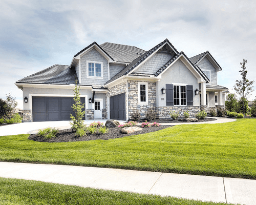
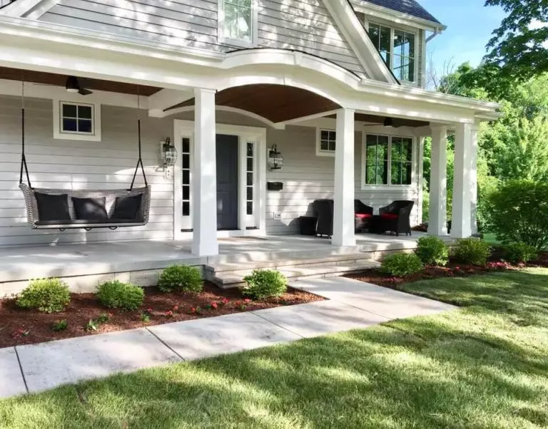
Mindful Gray is the perfect option for those looking for a neutral paint color for the exterior, devoid of striking undertones yet full of confidence. Consider this shade for the exterior walls and pair them with white trim for a stately look that will stand out through its timeless appearance.
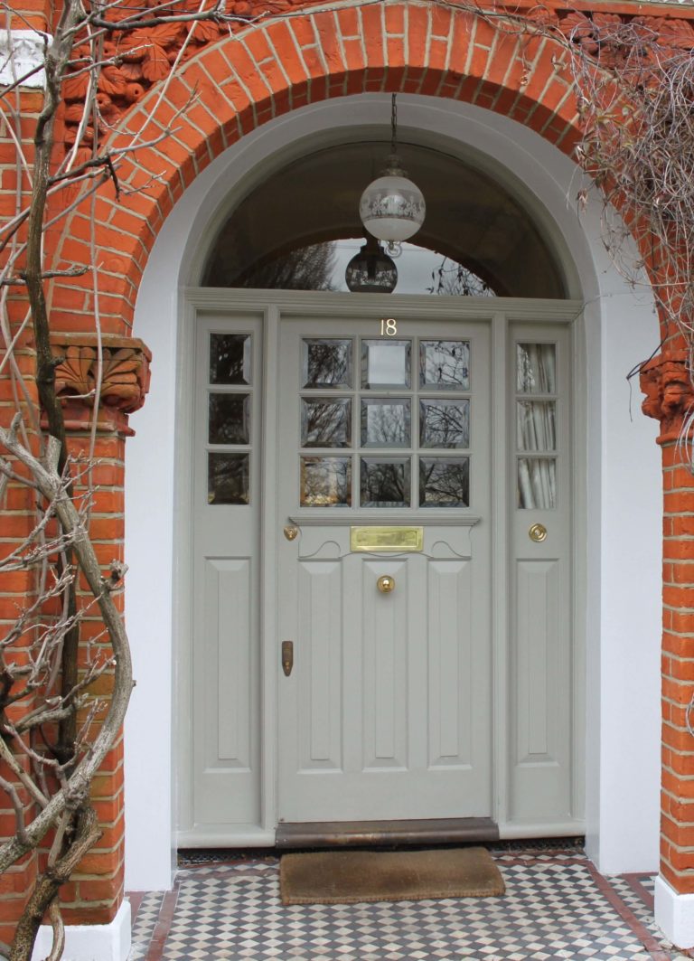
The scenario changes when you apply this paint color to the front door, which requires a competitive companion, and red brick is what fits the warm greige to the fullest. Your exterior will surely feel unique and inspiring.
The Mindful Gray SW 7016 paint color from Sherwin-Williams is a real find for greige connoisseurs. Sleek, balanced, flexible, and no less unique, this paint color will enrich your exterior and interior with everything a homeowner needs – comfort, style, and individuality.
