An imposing dark shade from the blue family with playful gray and green undertones that meets the aesthetical standards of the design styles that thrive when deep-colored.
Mount Etna (SW 7625): What Color Is, Review, and Use
Dark blue shades still have their say in contemporary selections of trendy paint colors. A prominent representative is the ashy blue Mount Etna, part of the Biome color palette in Sherwin-Williams’s Colormix forecast. The paint was named after one of the most active volcanoes, which is located in Italy. Is this why SW 7625 is an ashy shade of blue? Why blue, then? For a start, the Mount Etna paint color is more than blue. Discover the new blue color and its potential in design with our review.
Mount Etna Paint Color Features
As part of the Biome color selection, this paint color celebrates the beauty of everything nature provides and the harmony we can ensure by choosing in favor of organic shades. Although a very dark tone, SW 7625 meets such standards. To our surprise, Mount Etna is blue, green, and gray combined in the same paint can. Compared to the popular navy blue Naval SW 6244, a close dark blue by the same manufacturer, Mount Etna shows the additional green traces that would otherwise go unnoticed.
Mount Etna: Is It Warm or Cold?
The timeless paint color that stands out with a very dark composition is a rather slate blue shade, and a color like this roars “cold”, which is particularly true if we speak about rooms with northern exposure, but later on this. Mount Etna is the stark and unconditional color we are not afraid to call cold; only direct sunlight can bring the slightest tinge of softness to this shade.
How Does Lighting Affect Mount Etna?
Since ME is very intense and operates with such strong tones as dark blue, deep green, and slate gray, it is hard to influence it, even when lighting is in charge. In rooms with north-facing windows, this paint color allows the cold gray notes to take the lead. Frankly speaking, it is not advisable to use this shade in spaces with northern exposure, particularly if this is a small room or poorly lit space.
SW 7625 doesn’t change considerably on the other side of the house, where southern exposure reigns. The color may appear slightly soft, yet it prefers to stay cool. The same goes for rooms with east-facing windows in the morning and west-facing spaces in the afternoon. As for artificial lighting, it can bring those hidden green undertones to the surface. Simultaneously, poor light conditions may lead to a switch from dark blue to black.
Mount Etna LRV
To distinguish the ability of one color to reflect the light and determine how dark or light the particular shade is, colorists operate with such a term as Light Reflectance Value. On a scale from 0 to 100, i.e., from true black to true white, Mount Etna has an LRV of 6 – very close to black. It almost doesn’t bounce light back at all, and it either requires an appropriate amount of natural or artificial light or is recommended to be used as an accent primarily.
Mount Etna Undertones
At first glance, one would say Mount Etna is a very dark blue. We have already proven that one of the newest trendy colors at Sherwin-Williams has more to it than blue, which is slate gray and tricky green undertones.
Similar Colors
In case your next makeover requires an alternative to Mount Etna or a slightly darker or lighter version, you can always refer to this list of the most important representatives in terms of similar colors.
Coordinating Colors
Colorists from Sherwin-Williams are pretty sure about matching the dark blue paint color and white – the unforgettable classic. For monochromatic interiors, light blue colors are suggested, particularly gray-blue. Last but not least, taupe and tan are the best shades you can think of for a harmonious combination with Mount Etna.
Use of Mount Etna in the Interior
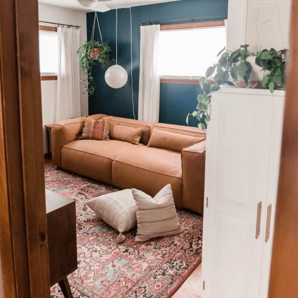
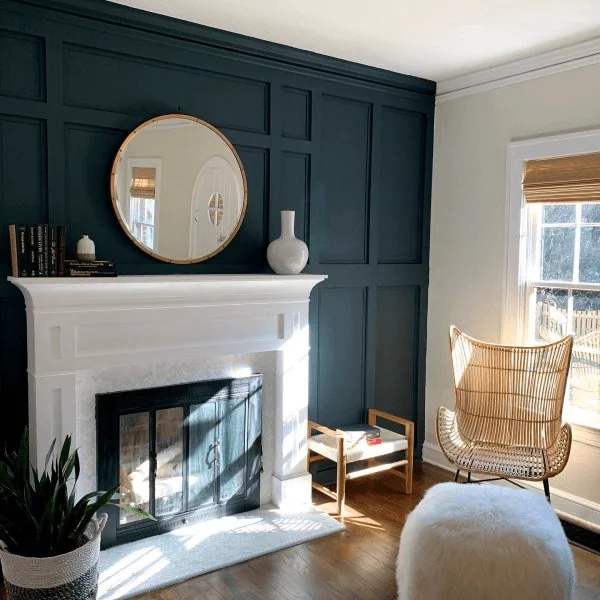
If this paint color lacked green undertones and looked like a clean dark blue, almost black, it would not seem as organic in interiors. Additionally, this allows for fully covering the walls in the dark paint, besides the perfect integration of this shade as an accent color. There is something unusual about this enigmatic blue, making it the best choice for sophisticated design projects.
Dark Blue and Warm Colors
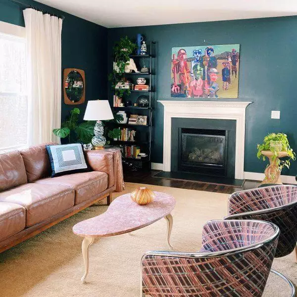
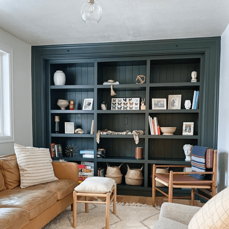
Painting all walls dark blue or playing with a brush polished with Mount Etna on a bookcase in the friendly companion of white trim may result in an overly formal interior for some tastes. The easy solution designers apply – introducing warm shades of color. Those are primarily natural wood furniture, light brown leather sofas, and gold decor. For more contrast, think of a bright-colored area rug with ethnic motifs.
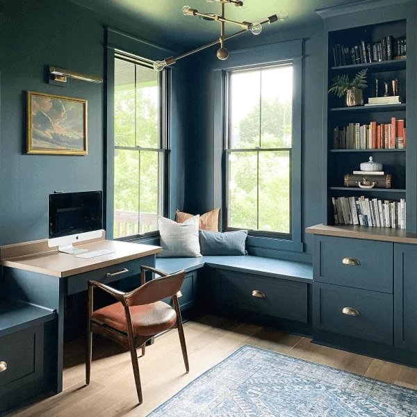
Aristocratic Home Office
Mount Etna, impressively dark and attractive as it is, fits workspaces decorated in the Old School style with built-in bookcases, leather seats, natural wood surfaces, brass accents, and inspiring landscape paintings on the wall. What about the dark green-blue? Consider it for the walls and furnishing all at once. Ensure an ambiance on its own in a space where you feel the aesthetics in the air and bring your work process to the next level.
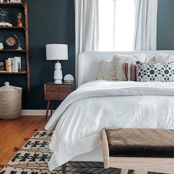
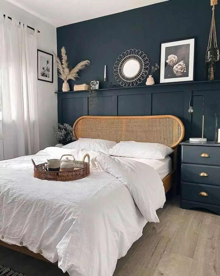
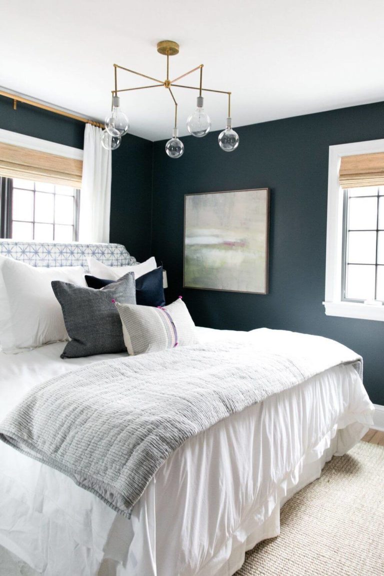
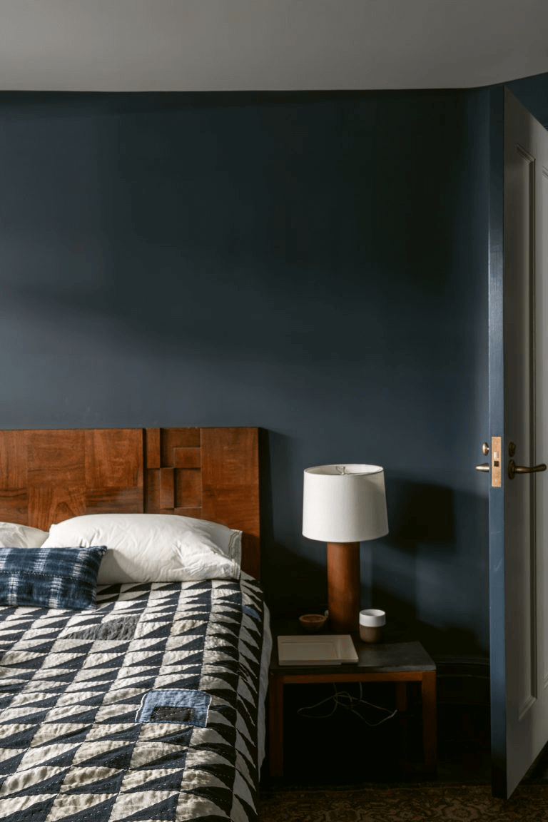
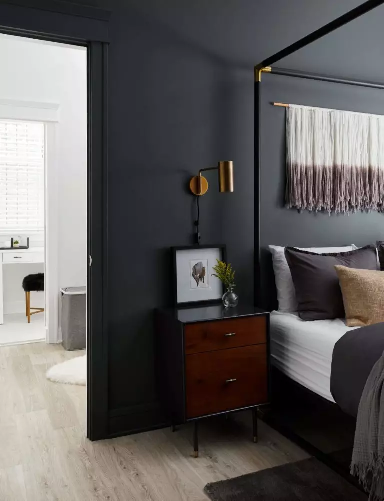
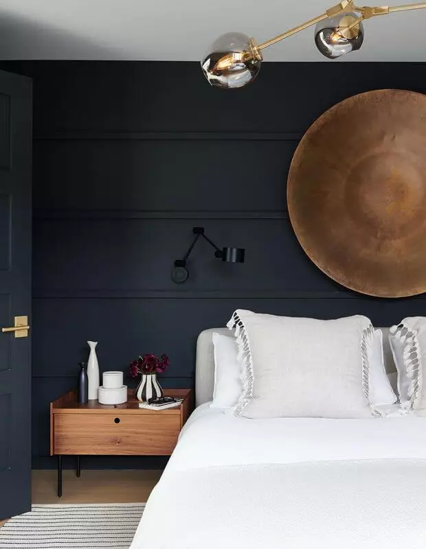
A Dark Shade for Your Bedroom
Some people fall asleep easier if the room is fully dark. Blackout curtains are not enough. Dark-painted walls are what you need if you are one of those. Instead of black, which may not look relevant to some, opt for a more unusual color, such as gray-blue with green undertones that keep pace with the latest color trends. It works harmoniously with untreated wood furnishing, accepts bright accents, such as a yellow velvet accent chair, and requires white bedding and curtains that look astonishing on the dark backdrop.
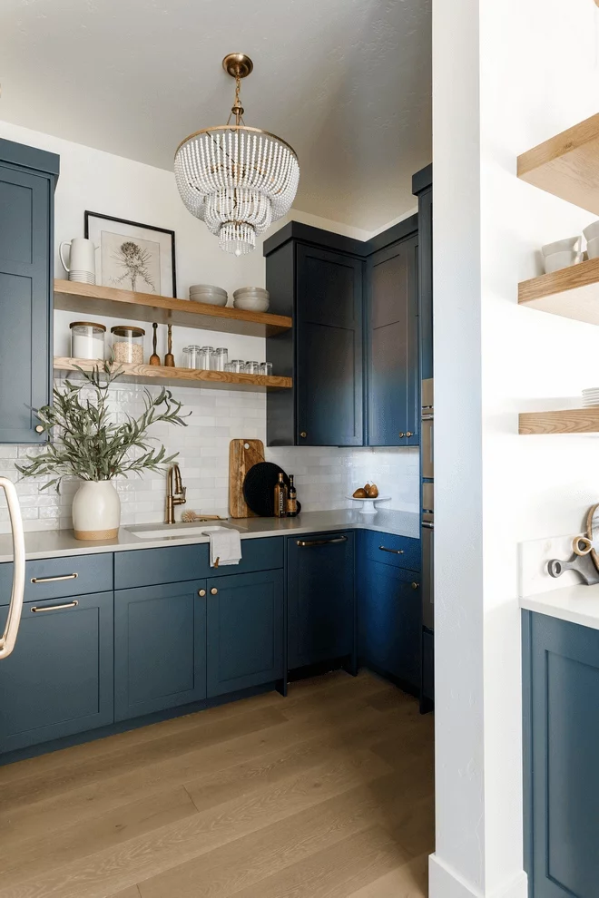
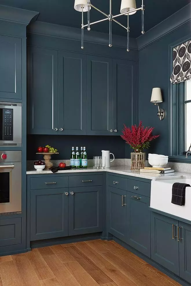
Dark-Painted Kitchen
If you appropriately choose the dark shade and combine it with the best colors and textures, you can make the most of a dark-colored kitchen concept, particularly with such a stately shade as Mount Etna at your convenient disposal.
Designers suggest two design solutions – a Modern Farmhouse kitchen with dark blue cabinets, a white background, open wood shelves, gold hardware, and of course, a centerpiece chandelier.
For those who stick to the silver side, professionals offer a full-night-blue cooking space, except for the metal handles, lighting fixture, and countertop; there should be at least a bit of contrast. And don’t forget to refresh your kitchen with bright-colored flowers since too much dark blue is not an all-time mood. You can as well adjust the color code to your mood with any other colorful accent, say, a maximalist painting on the wall.
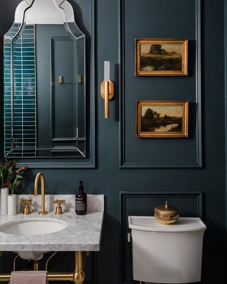
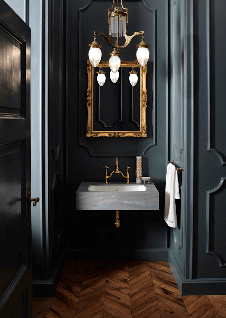
Royal Green-Blue Bathroom
When researching the use of green-blue in interior design, we could not help but notice how successful the bathroom design projects are if we refer to the Classic style with dark blue shades as base colors. Classic wall trims together with walls fully painted in Mount Etna, gorgeous floating sinks of expensive stone, gold hardware, and brass-finished wall sconces and ceiling fixtures. With such a fantastic paint color as the main highlight of the room, your bathroom will not dare resonate with the past only; it will bring classy values to timeless standards.
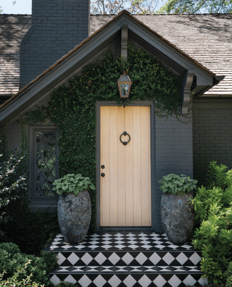
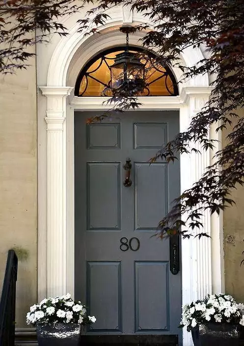
Use of Mount Etna for the Exterior
Generally speaking, you can use the dark-like-the-night blue paint color for any house exterior regardless of style since the color works successfully for most design directions. Still, designers pay utmost attention to brick walls painted dark green-blue.
Do you fancy a head-turner accent? Paint the front door with the new designers’ favorite dark hue, yet make sure the walls are light-colored. A no-fail choice is natural stone walls.
The Mount Etna SW 7625 paint color by Sherwin-Williams is a dreamy dark shade close to black, and all the mystery begins with its gray-green undertones on the deep blue base. Dramatic and authentic interiors, classy design projects, and timeless exteriors all get reinvented when the intense greenish blue is on board.
