A white shade with clear gray-blue notes that feels like the fresh mountain air - crispy, bold, and inspiring.
Mountain Air (SW 6224): what color is, review, and use
When it seems that all designers speak about is warm, paint colors that add comfort to interiors and exteriors, a few cool shades still manage to stand out and keep pace with the latest trends. One paint color of this kind is the impressively crispy and invigorating Mountain Air SW 6224 from Sherwin-Williams. Why this shade in particular? It is all due to its fascinating pairing between a cool base and exceptionally soothing surface that feels refreshing and calming simultaneously.
As the name implies, this white shade with clear gray-blue notes feels like the fresh mountain air – crispy, bold, and inspiring. Despite its relatively cold appearance, among other color collections, Mountain Air is also part of the Soft and Sheer collection, which proves that even a cool paint color can feel soft – the result of a thorough work with tones. Let’s discover what stands behind such a contrastive mix of feelings, which is nothing else but an exquisite shade of crispy white!
Mountain Air paint color features
SW 6224 replicates a white variation with soft blue notes and crispy gray scents. Still, when put into practice, it may seem a rather very light blue shade with cool gray notes and a standout soothing cover. A similar effect is felt in a space painted this way – a sense of ease and calmness spreads all over the room. It may feel pretty inspiring for some, while others would appreciate it as exceptionally calming, offering you space to dive deep into your thoughts.
Mountain Air: is it warm or cold?
We cannot help but notice the fabulous feel of softness this shade radiates. Still, one cannot doubt that Mountain Air is a cool shade and by no means cold. Of course, a bold hint of freshness penetrates the space when SW 6224 enters the game, although its soothing surface cannot simply allow us to skip the soft feature that belongs to this paint color. Of course, lighting plays a great deal in this sense, but facts are facts – Mountain Air is a soft gray-blue variation of crispy white.
How does lighting affect Mountain Air?
Considering that Mountain Air is already a cool paint color, the north exposure surely brings its coldest variation to the surface, leading to an almost chilly, even unwelcome effect. On the other hand, in south-facing spaces, the warm undertones of the natural light pair perfectly with the cool base of this color, leading to a harmonious result. Still, you can always play with artificial lighting by choosing its undertones and achieving the desired result.
Mountain Air LRV
A bit confused by these letters? Let’s make it clear! LRV stands for the Light Reflectance Value and determines how light or dark a color is on a scale from 0 to 100. One should note that 100 stands for true shades of white, and considering that Mountain Air has an LRV of 73, we can safely state that it is a light color. Although not as proficient as true shades of white when it comes to light reflection, SW 6224 is still very skilled in this sense, making the room feel light, airy, and spacious.
Mountain Air undertones
It has been already revealed that this airy shade of white is penetrated by gray-blue notes that stand behind its both crispy and soft effect, featuring a cool base and an exceptionally smooth surface. The perfect balance between the fresh blue undertones and the soothing gray ones are the main components of the recipe that resulted in a beautiful shade of white that inspires with its bluish hint and sets a peaceful environment with its grayish scents.
Similar colors
The range of light blue shades with crispy notes and pastel surface, which Mountain Air mostly looks like, is pretty wide. If you are looking for alternatives or fancy a rather lighter or more intense shade than SW 6224 that does not go far from the inner beauty of the latter, we suggest you pay attention to what other options there are. Let’s go beyond the set borders and look at what Sherwin-Williams and other brands have to offer!
Coordinating colors
Firstly, crispier or softer shades closer to the true white category should be considered, such as for the trim. Next come dark shades of blue for accents to harmonize with the bluish notes of Mountain Air. This paint color also works well with cool grays and sage greens. It depends on what palette you go with. Is it a monochromatic or contrasting one? Let’s go through a few representatives for each case!
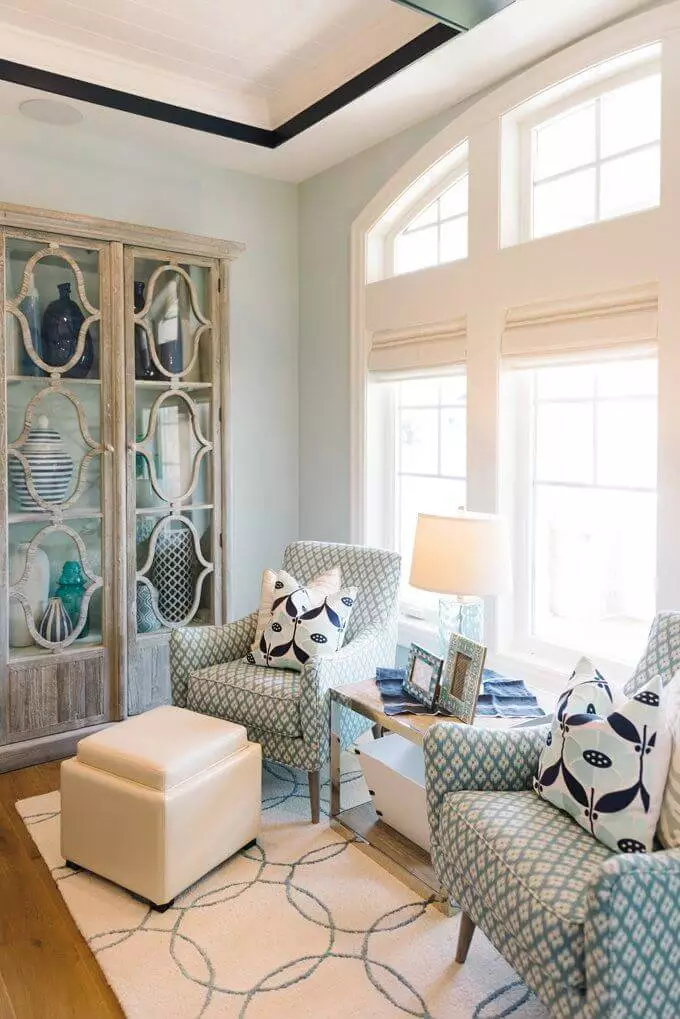
Use of Mountain Air in interior
This neutral yet slightly eye-catching paint color can be used in any room, going with almost any style if a modern approach is considered. Ideally, it is perfect for Coastal interiors, although accents from other styles would look no less impressive on such a background. The most important thing is to properly choose the lighting and neighboring colors so that Morning Air can reveal its inner beauty to the fullest. Let’s see what designers suggest regarding the integration of this paint color into the interior!
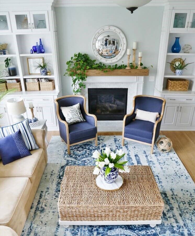
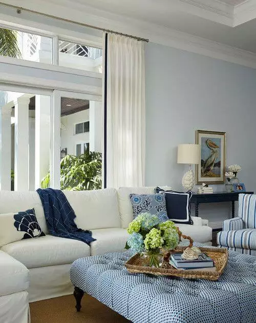
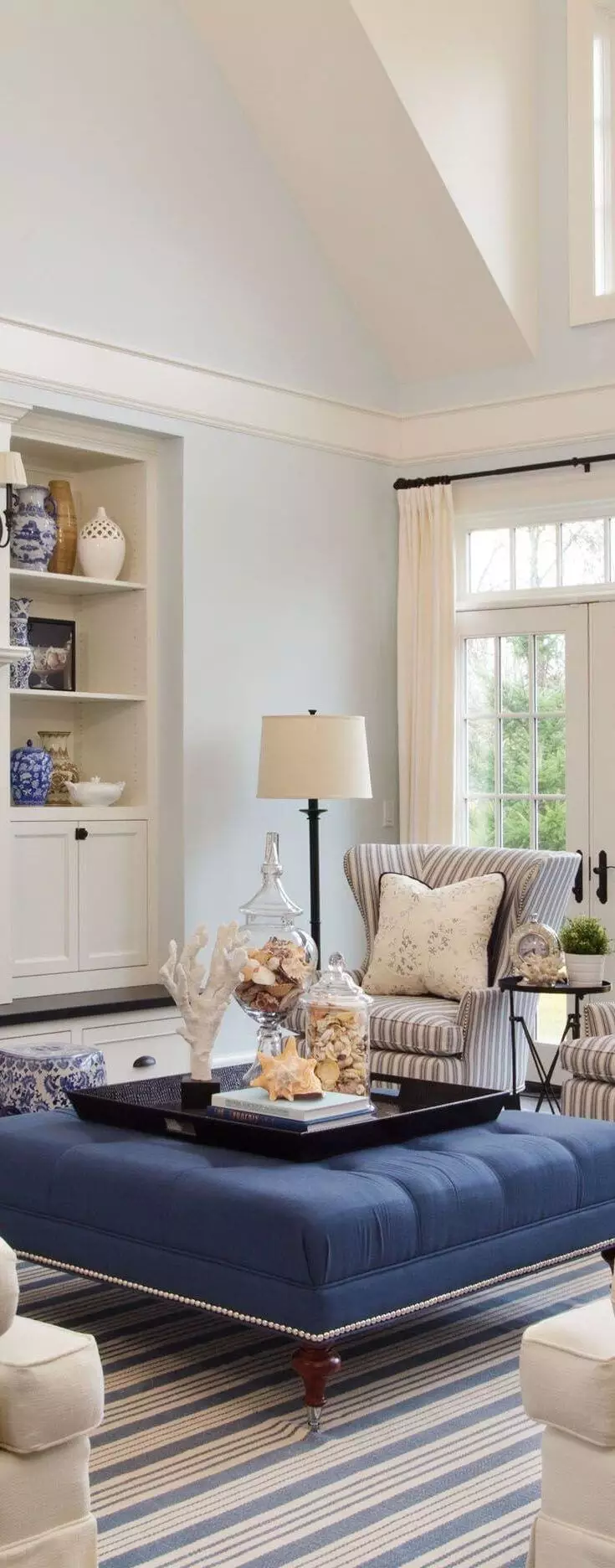
Updated Coastal
We cannot think of any other style that this color would match better than Coastal, and designers are of the same opinion. They suggest going with a monochromatic palette by using Mountain Air as a background and displaying accents of similar inner beauty, such as other variations of white or blue that feel close to SW 6224. Still, a bit of texture, such as light wood and rattan, is welcome to bring comfort to the space. Don’t hesitate to add a few light beige elements. A perfect option would be to apply the latter to textiles. The overall combination of blue, beige, white, wood or rattan, and even a few navy blue accents will bring your interior to a new coastal level.
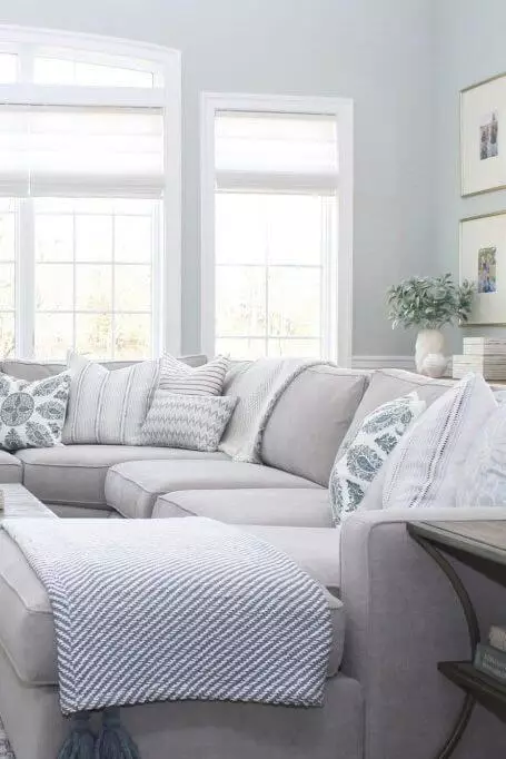
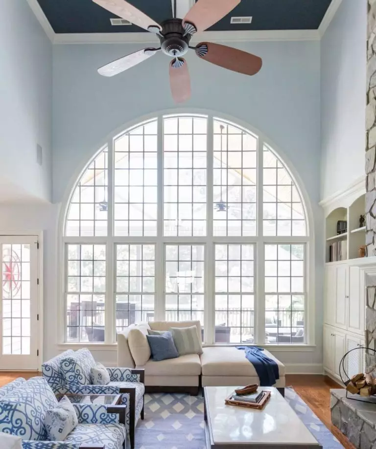
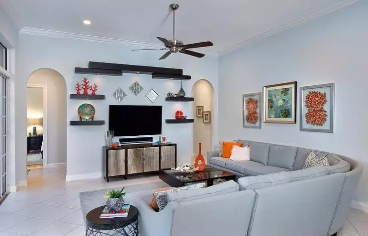
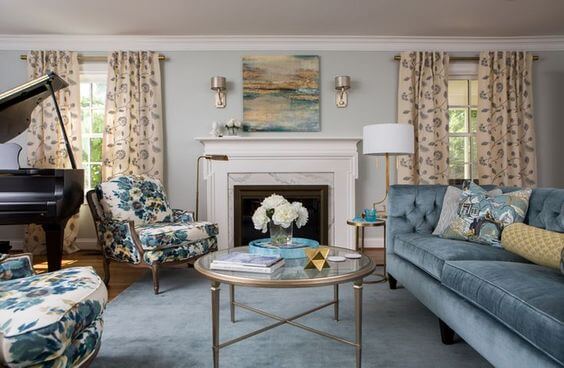
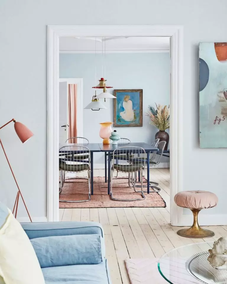
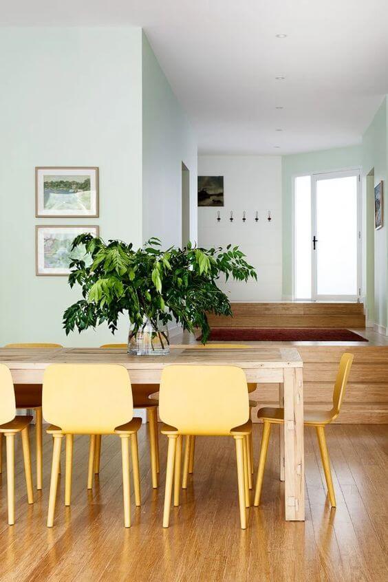
Living room
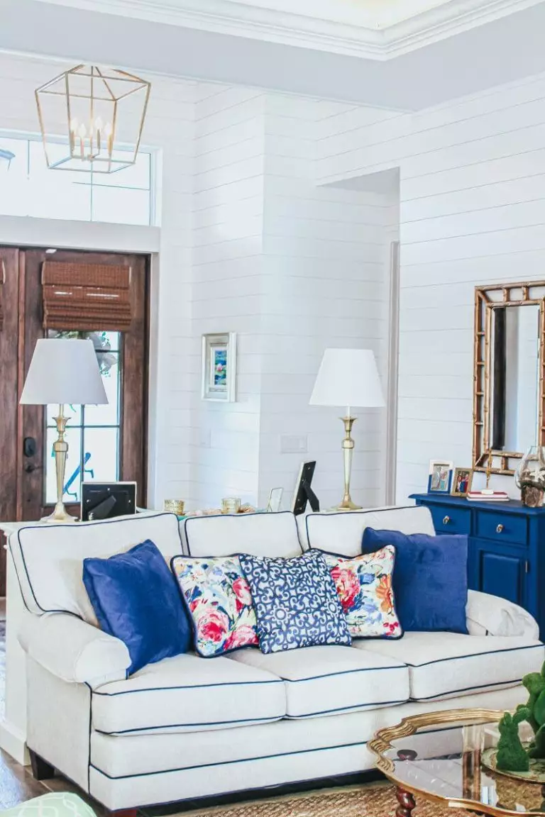
Regardless of the style, SW 6224 is a fabulous background to display any accent on. Mountain Air will perfectly balance the environment from the simplest approach with a monochromatic palette to the boldest design solutions. The living room seems like the perfect space to experiment with different styles. Don’t hesitate to stay low-key with a blue and white interior for a modern approach or go extra with vibrant pieces of furniture for a Retro statement, old-time units for a Vintage accent, lot of wood and textiles for Farmhouse comfort, or black elements for a contrastive pairing that replicates a sleek sense of contemporaneity. The list can go on and on. It is up to you what combination works for your interior.
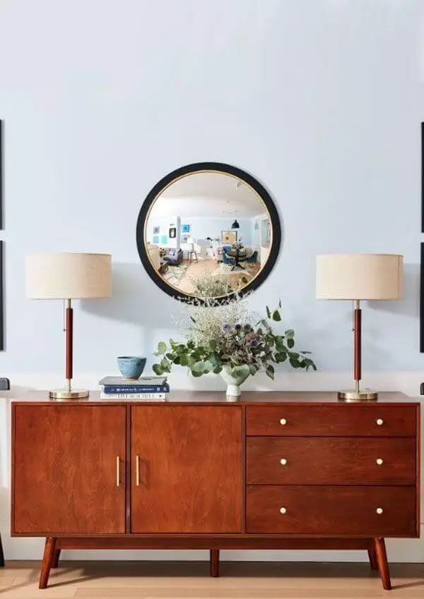
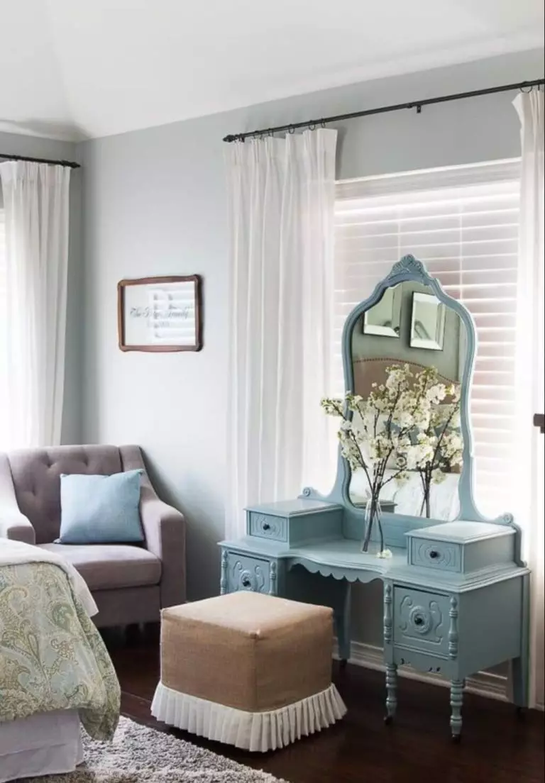
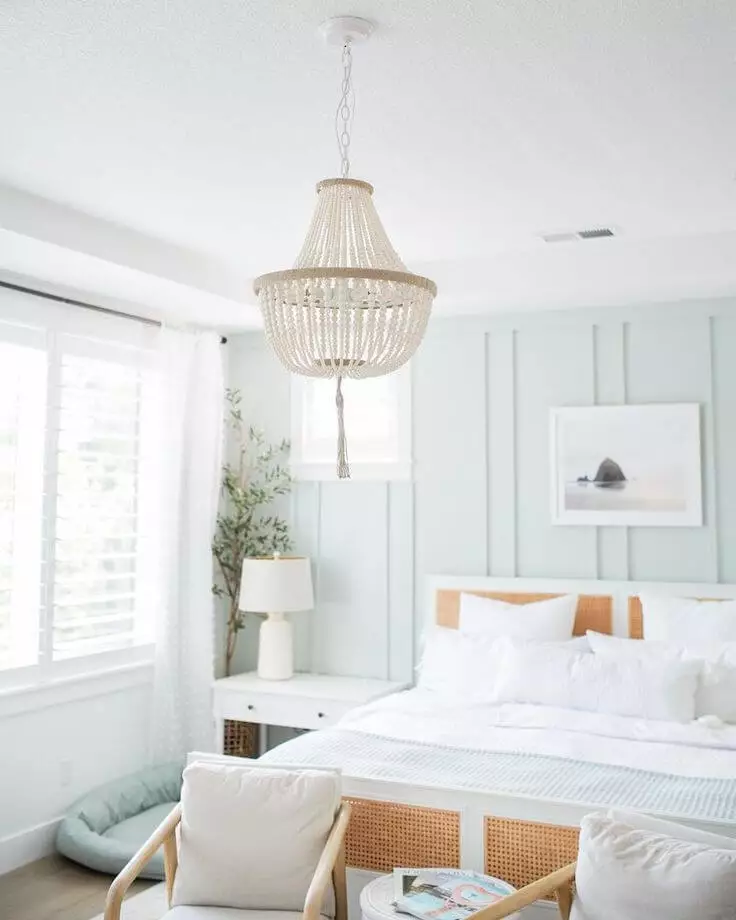
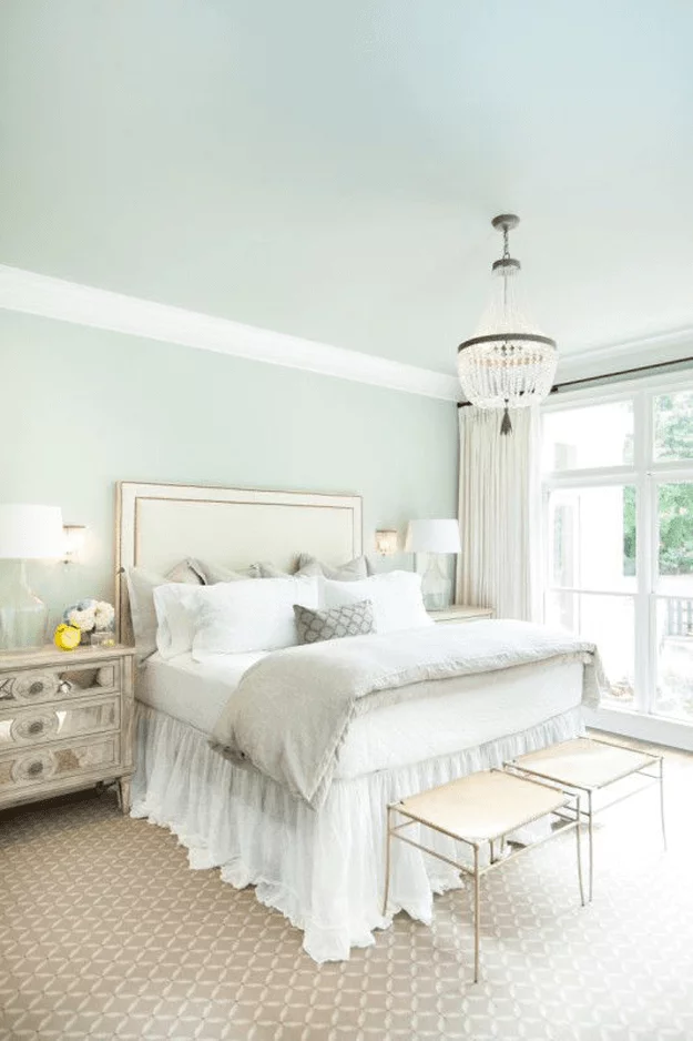
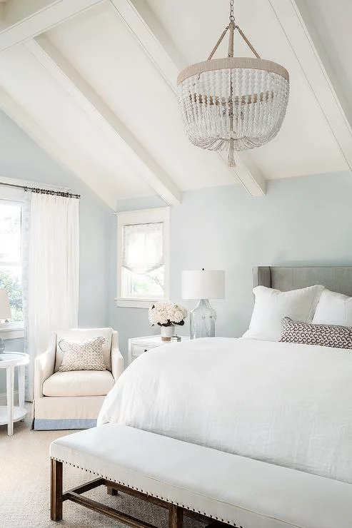
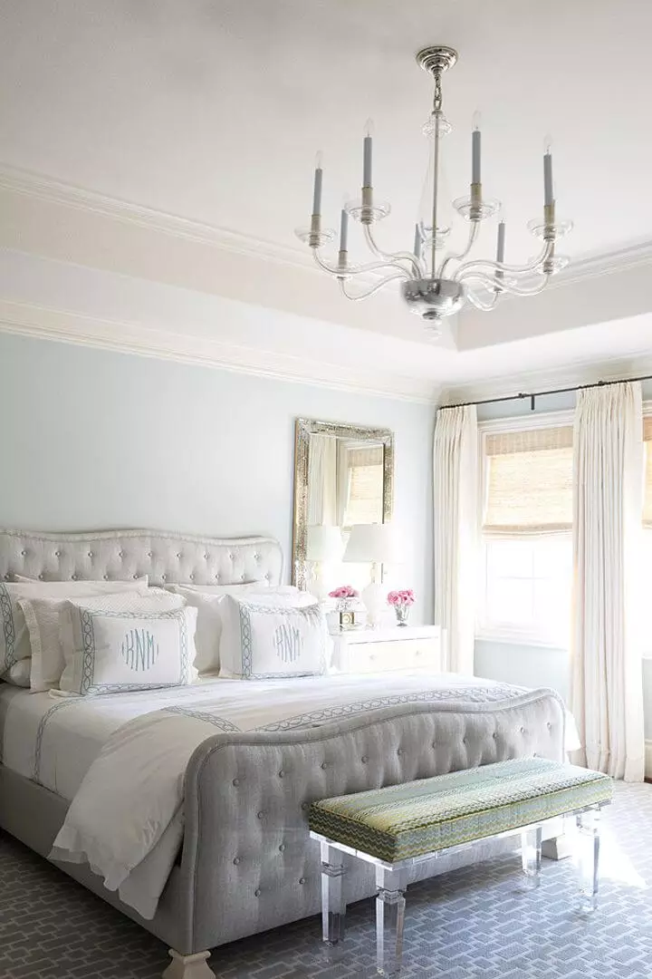
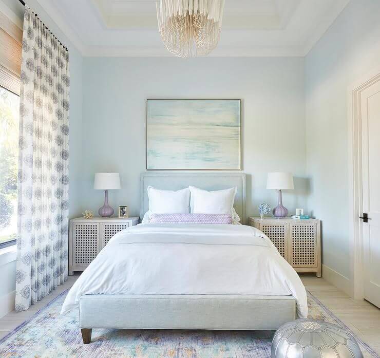
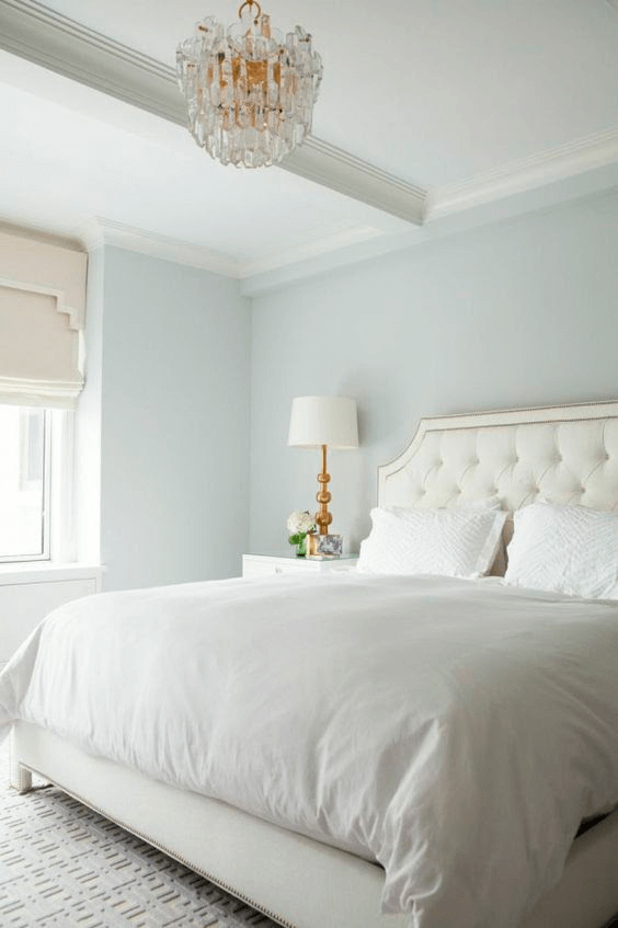
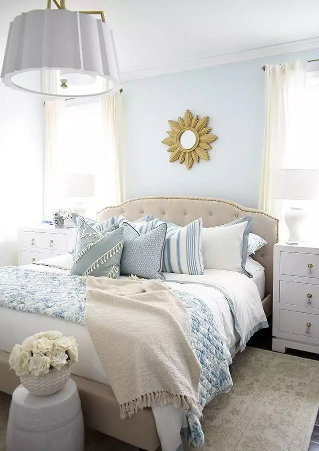
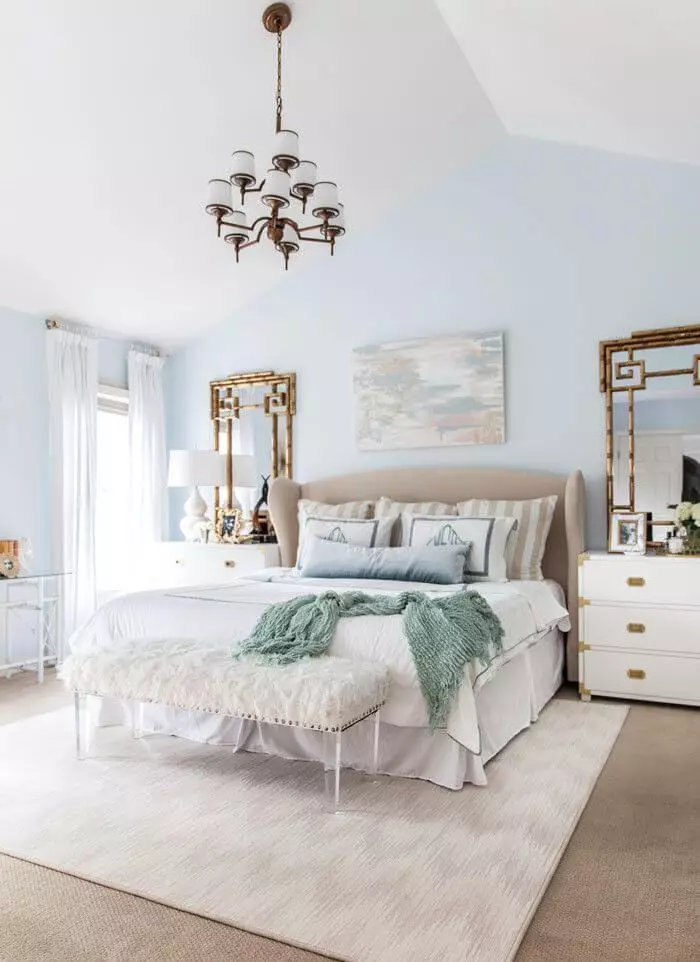
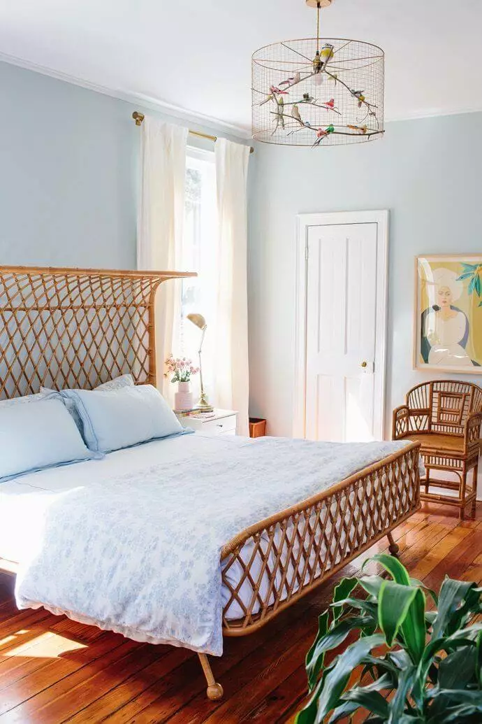
Bedroom
Experts hasten to convince us that a monochromatic interior with Mountain Air as a backdrop is one of the best options. We tend to agree with them and encourage you to let the beautiful white with soft notes reveal its beauty to the fullest while being paired with other neutrals for an unobtrusive approach to a contemporary design that feels stylish and comfortable. Still, a few exceptions are allowed. You can either combine the bluish-white with wood for a contrasting mix of feelings to balance the look or opt for smaller metal accents to make a statement, such as an Art Deco one with a gorgeous sunflower mirror.
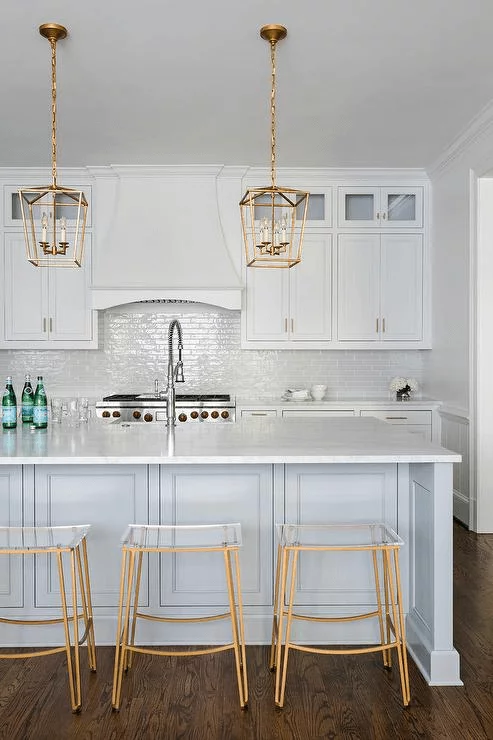
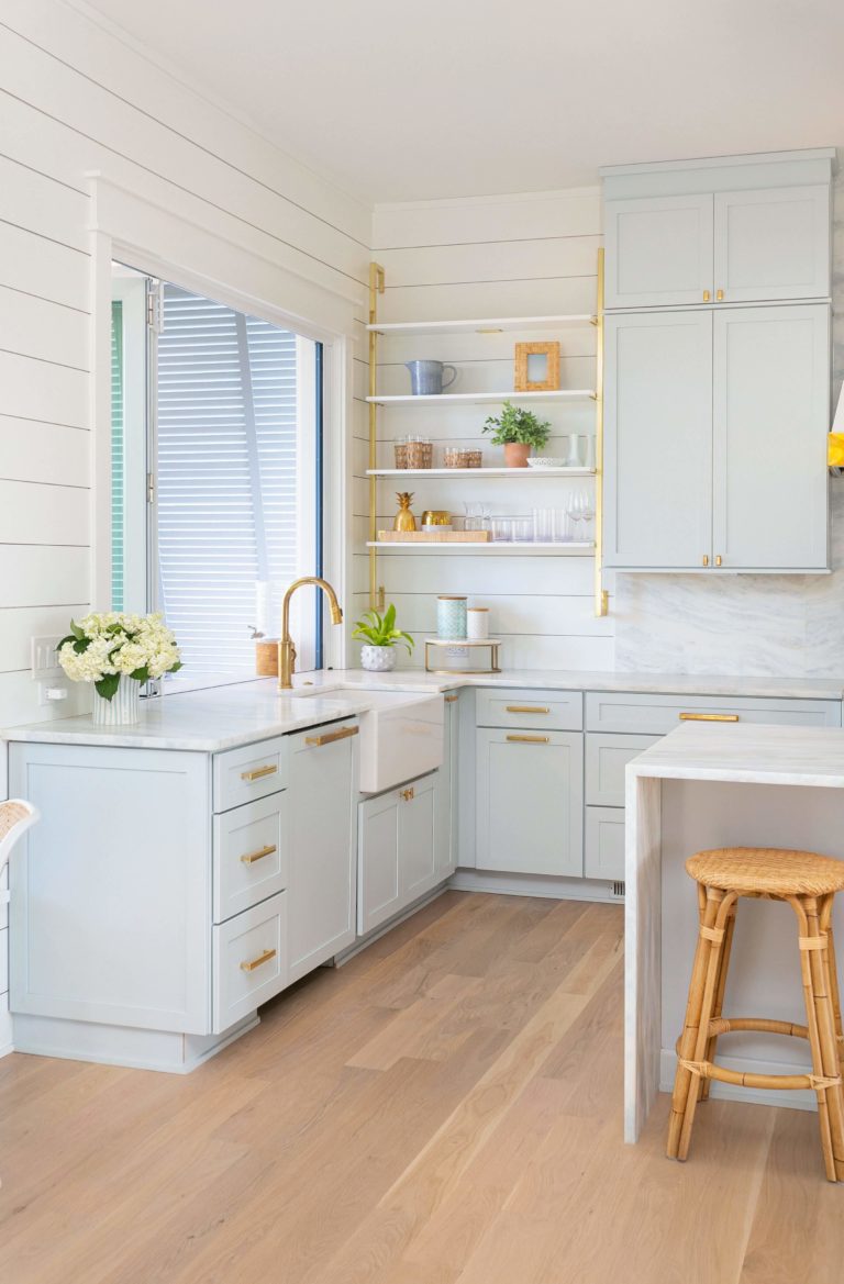
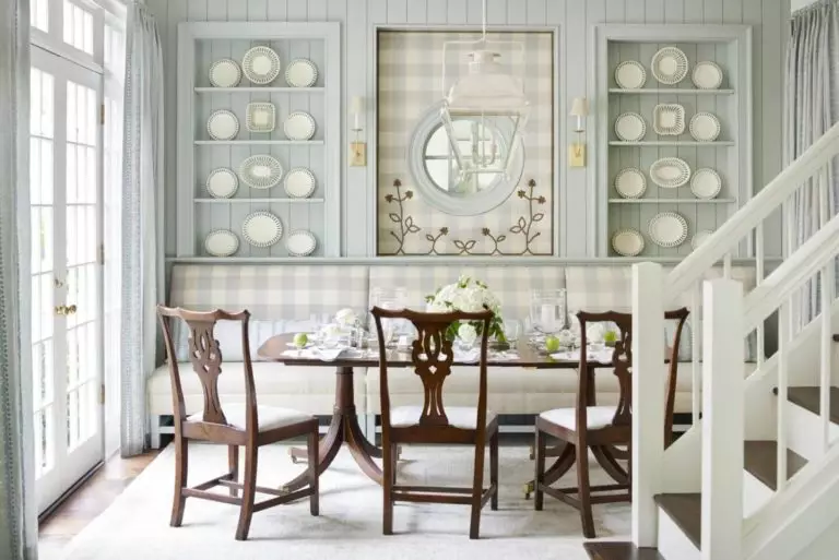
Kitchen and dining room
Consider Mountain Air for the walls or kitchen cabinets, combining them with white and brass for an interior you have never seen before. The light shades will refresh the space while the metallic elements dilute the palette slightly. Additionally, consider marble or wood to add textured comfort to this rather crispy environment. As regards the style, go with Farmhouse, Traditional, Modern, or any other approach that feels close to you.
As we enter the dining area, we are happy to state that SW 6224 is ready to collaborate with any design solution, serving as a perfect neutral background while preserving the delicate sense of flair.
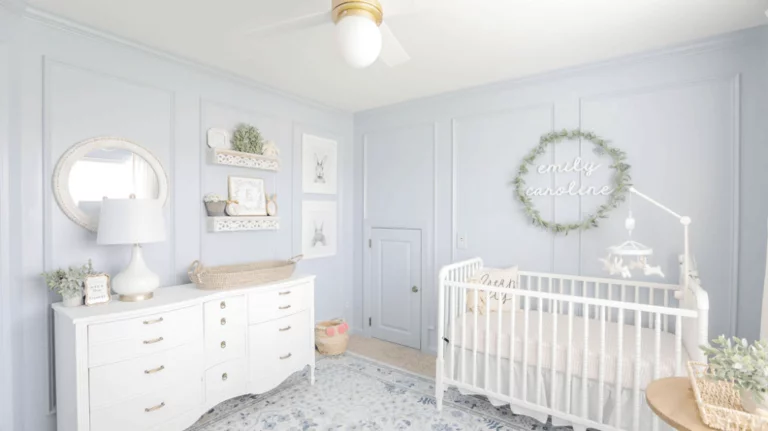
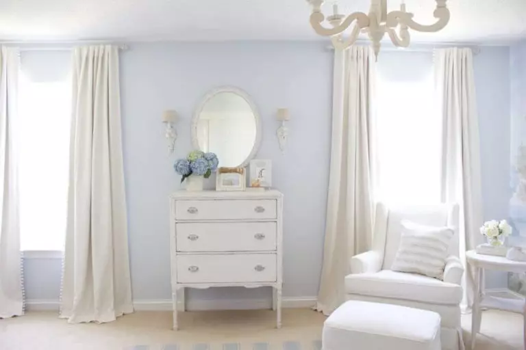
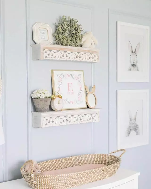
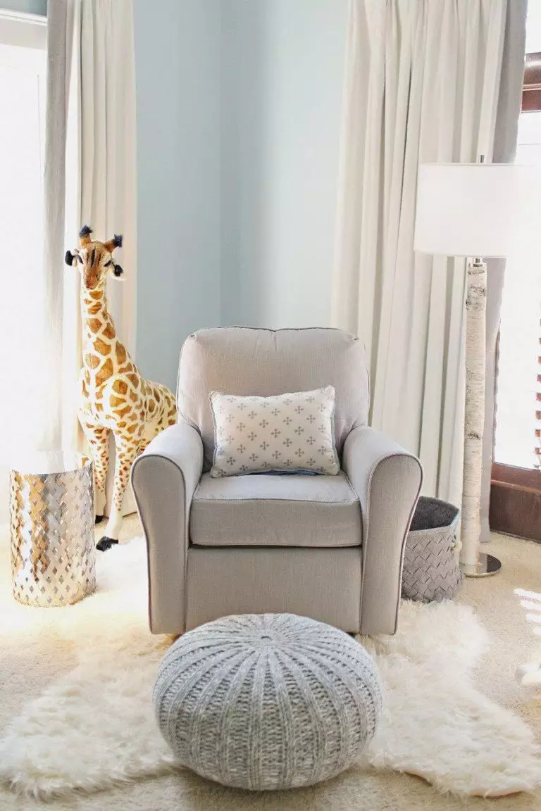
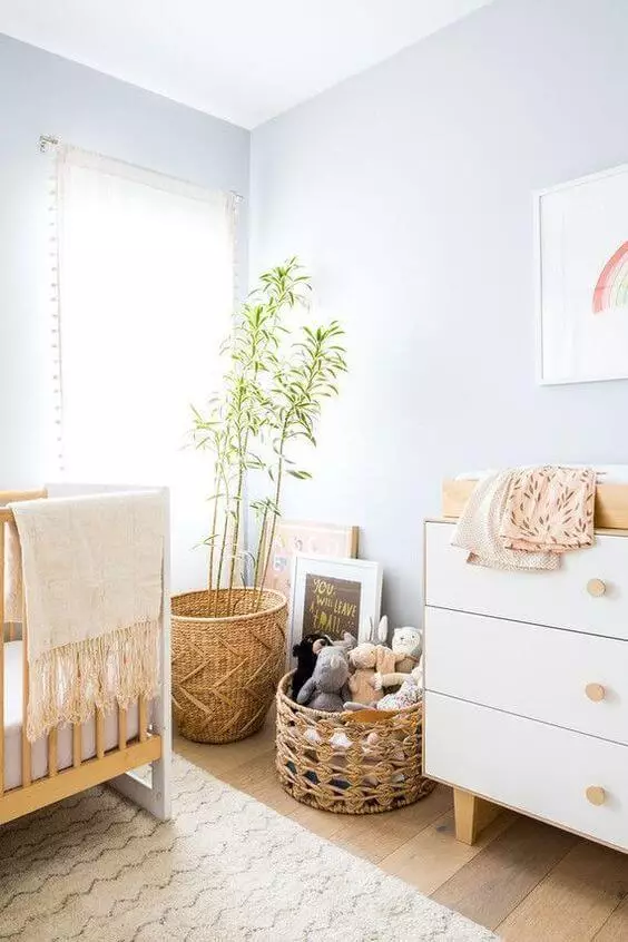
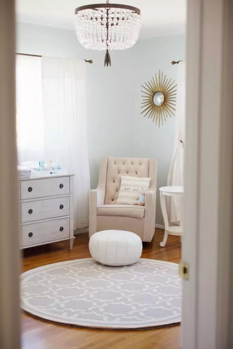
Nursery
SW 6224 can reveal an impressive amount of softness when used appropriately. It is a go-to option for the nursery, where, together with crispy white, it sets a pleasant environment that feels calming, clean, and appealing to the eye. The comforting shade of white enriched with a bit of vibrance will ensure your child’s safe and sound sleep. Furthermore, the soothing feature of this paint color makes it an all-time background for future design solutions.
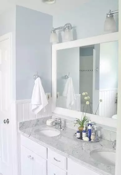
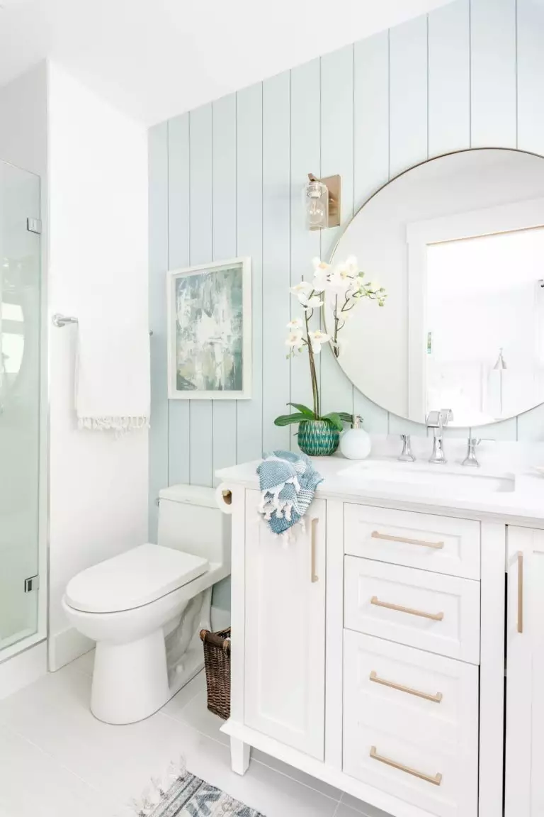
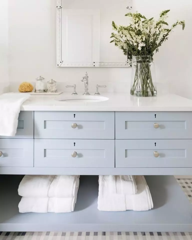
Bathroom
Can we speak about a crispy white with bluish scents and skip the bathroom? By no means can we do such a thing. Whether you paint the walls or cabinets this way, the true companion is undoubtedly a crisp shade of white devoid of undertones, accompanied by silverish hardware to enhance freshness. You can still opt for brass and even consider wall paneling painted in SW 6242 for a relatively more comfortable setting.
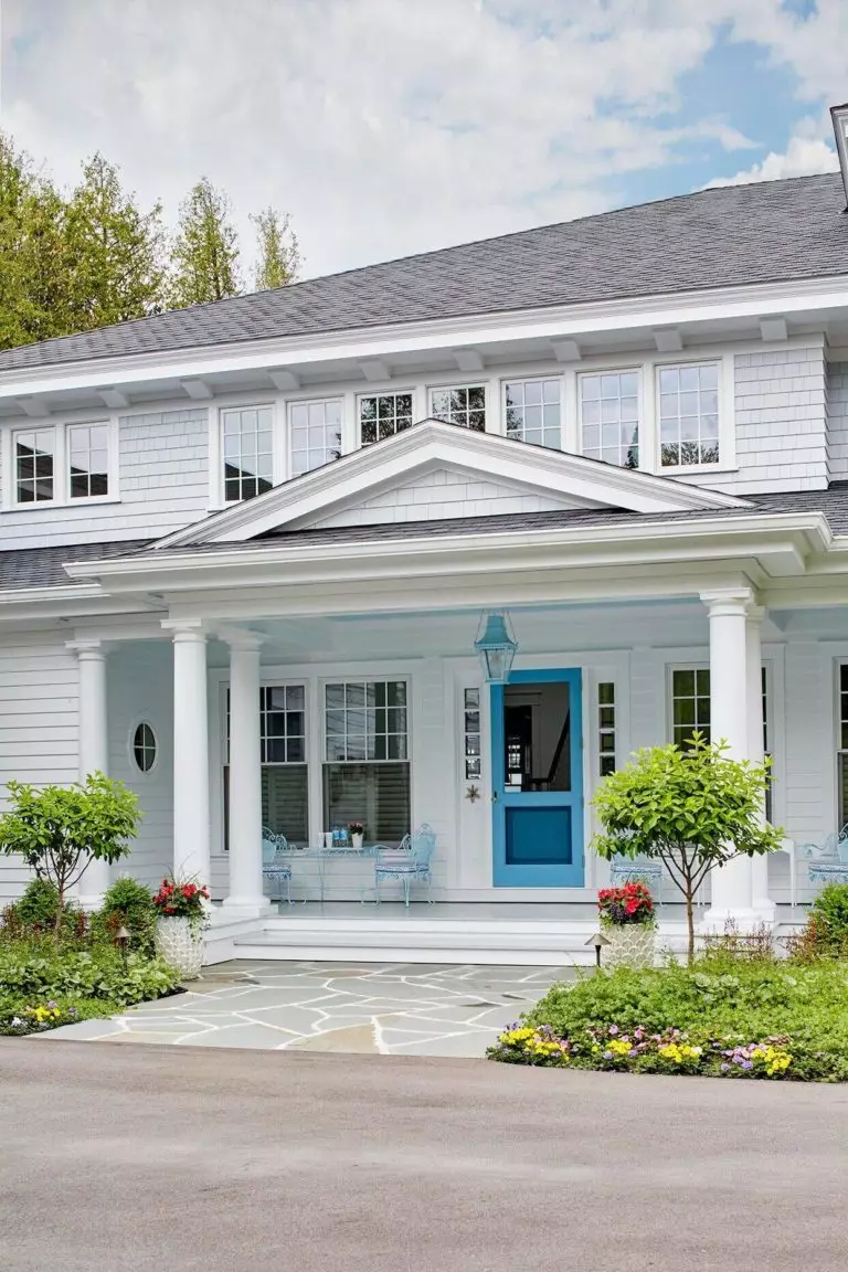
Use of Mountain Air for house exterior
When applied to the exterior, Mountain Air seems more of a white shade, combining perfectly with dark gray for a stately house that replicates confidence at its finest. At first glance, it feels like a simple neutral shade for the exterior. Once you pay closer attention, you feel the irreplaceable sense of finesse and comfort this paint color radiates. If you want to expose the slightly vibrant base of SW 6224 as seen on the sample, consider it for the front door on a white background and let the slightly contrastive pairing play its magic.
The Mountain Air SW 6224 paint color from Sherwin-Williams is the crispy shade of white with an unforgettable soft appearance that you should definitely give a try if the commonly used warm neutrals seem too usual for you, while a balanced combination of freshness and calmness would not spoil your interior and exterior.
