Oyster White SW 7637
Sherwin-WilliamsA chameleon off-white with subtle green-beige undertones that make it a versatile and favorite neutral in the interior and exterior design.
Oyster White (SW 7637): What Color Is, Review, and Use
One of the finest whites at the top paint brand Sherwin-Williams and simply a lovely neutral paint color with a great story to tell, Oyster White is the main character of this paint color review. This white shade is quite controversial regarding which category it belongs to and how we should interpret it. Long story short, let’s rediscover this popular white tone from all perspectives!
Oyster White Paint Color Features
While some see it as white, others regard it as off-white. Some homeowners and decorators also see it as cream, beige, gray, or greige. The play of undertones does the trick. Still, Oyster White is a calm off-white that renders a neutral yet soft effect. Colorists from Sherwin-Williams claim that Oyster White delivers a delightful, floating glow in any space it is being used. It is the perfect neutral if you’re looking for a less bright and more calming white shade. Although this expert-pick white seems much brighter when bathed in direct natural light, it tends to show more body when shadowed. Overall, you’ll love this unusual white tone’s delicate and airy feel.
Oyster White: Is It Warm or Cold?
Even though Oyster White has so many interpretations, it still proves to be a pretty warm and soft white shade. Since everybody sees this color differently, it would be fair to make some statements based on facts. So, every paint color has an RGB value – the color mix of red, green, and blue to create the color itself. At Oyster White, we don’t fail to read the prevalence of the red value, which is responsible for the warm temperature. It proves again that Oyster White is a relatively warm paint color. Interestingly, the next after red is green, which plays an essential role in this color’s undertones, but later on this.
How Does Lighting Affect Oyster White?
The more natural light a surface painted with Oyster White receives, the brighter it seems, slightly losing its rich group of undertones. However, exposure has its say in this respect. You should know that using this white shade in a north-facing room will bring the neutral gray undertones to the surface, slightly washing out this color’s softness. Use the same shade in a room with south-facing windows, and it instantly turns into a warm off-white. Moreover, where the direct sun rays hit, this color literally glows, revealing a subtle gold-yellow note. The real magic happens at night when artificial lighting ensures Oyster White resurfaces as a cozy tan or greige paint color, surrounding the space like a safe cocoon. All you’ll want to do is take your favorite book or put a movie on and enjoy the secure and comfy ambiance under the ambient light of a table lamp or wall sconces.
Oyster White LRV
First, the Light Reflectance Value indicates how light or dark a paint color is based on how much light it bounces around. Out of all 100% possible, with an LRV of 72, Oyster White reflects 72% of the light it receives. Most bright whites have an LRV above 80. So, Oyster White slightly falls into the group of off-whites. No doubt, it is a pro at making a room feel spacious and well-lit. Yet, the slightest shadow reveals its off-white character. To make sure you’re on the safe side, experiment with a color sample before committing.
Oyster White Undertones
The most interesting part. Why is this versatile white the way it is? Traditionally, colorists call such colors – chameleon. Under particular lighting conditions, it takes on different appearances. Oyster White shows off a more noticeable note of beige and a dash of gray that, together with beige, reads greige. And last but not least, a subtle pop of green. The latter tends to resurface under the effect of outdoor or indoor greenery.
Similar Colors
After a decade of trending neutral paint colors, it would be a shame not to find at least a few similar colors to this versatile off-white from Sherwin-Williams. Check out the expert-pick alternatives:
Coordinating Colors
Oyster White is a favorite among lighter and darker grays and beiges. Its green undertones also make it a perfect matching color for greens and blues. Next in line come black and almost-black paint colors. Not least, pay attention to complementary shades, which stand on the other side of the color wheel. For contrast, consider terracotta shades that harmoniously stand out on the soft off-white background. Sherwin-Williams’ colorists recommend the following no-fail coordinating colors:
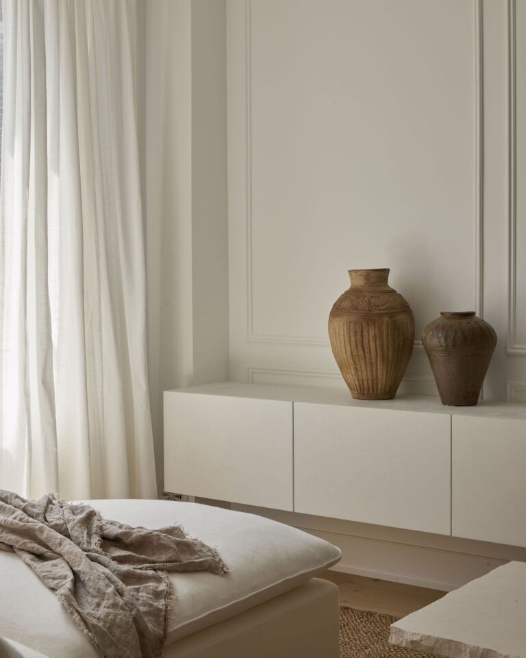
Use of Oyster White in Interior Design
Oyster White is one of the most versatile neutrals. That’s why decorators simply love to work with this shade in interior design. It integrates into almost all design styles and easily blends with many color palettes. You can use it in your living room, bedroom, kitchen, dining room, bathroom, hallway, home office, nursery, and literally any space in your home. Moreover, Oyster White knows its way around a design concept, being ready to act as a backdrop or accent color. We’ve gathered the best design ideas with this trendy off-white as follows.
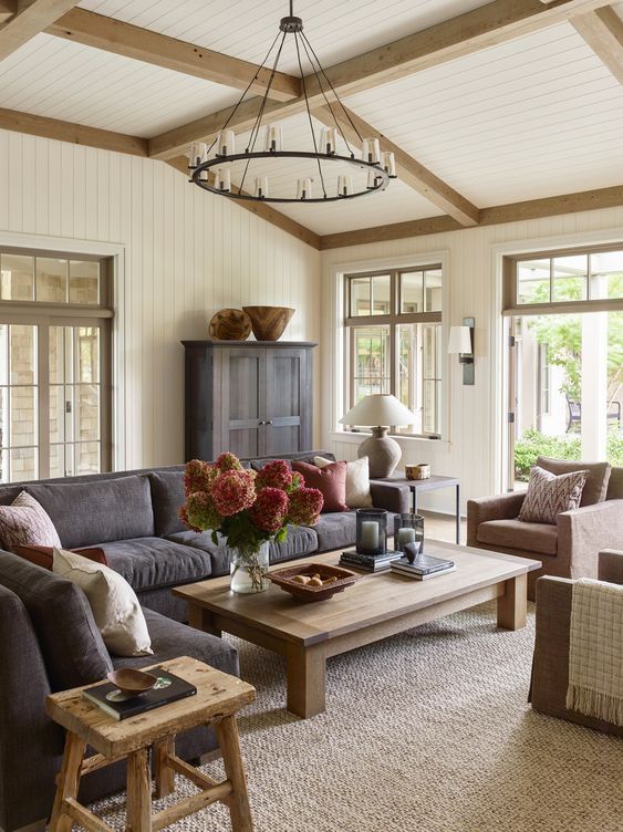
Farmhouse Off-White
Oyster White is part of Sherwin-Williams’ Living Well Collection. Undeniably, it perfectly suits comfort-directed design styles. Additionally, the weathered effect in Oyster White makes it a great match for wooden beams, raw stone surfaces, and rich textured textiles. Use it as a primary color on plain walls or paneling to deliver the best background for the relaxed and cozy Farmhouse color palette.

Warm Minimalism
Despite Maximalism having a moment in contemporary design, Minimalism is undoubtedly a timeless design style. If discreet color palettes, sleek silhouettes, and restrained decor are your go-to options, don’t hesitate. All we recommend is a trendy neutral to develop the overly simple palette. Oyster White is balanced yet brings a dash of green-beige color that will warm up the sleek and undisturbed layout. Use it as a primary color in any room instead of crisp white.

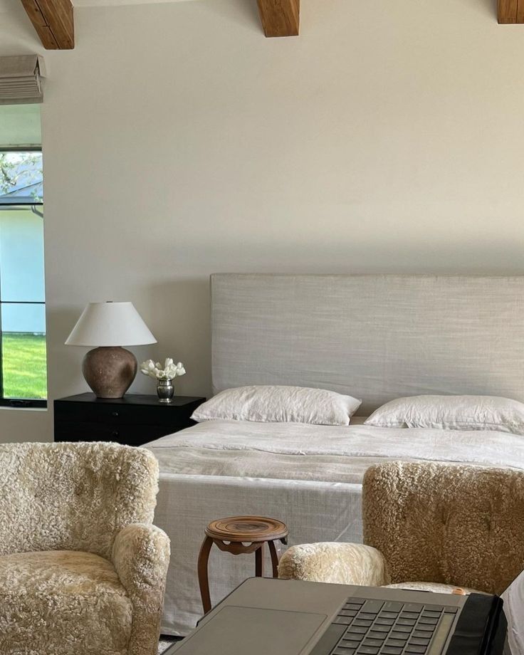
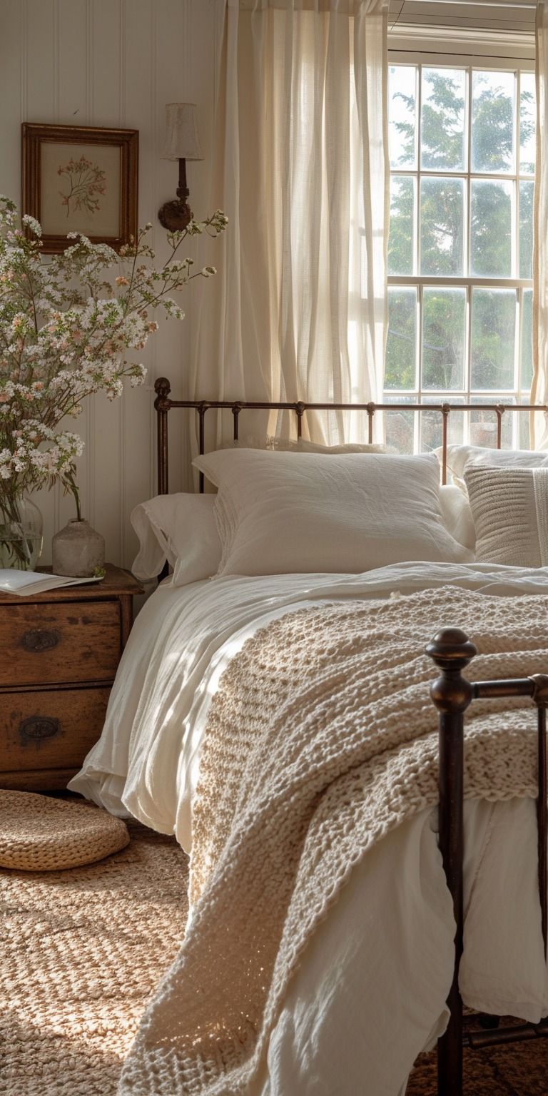
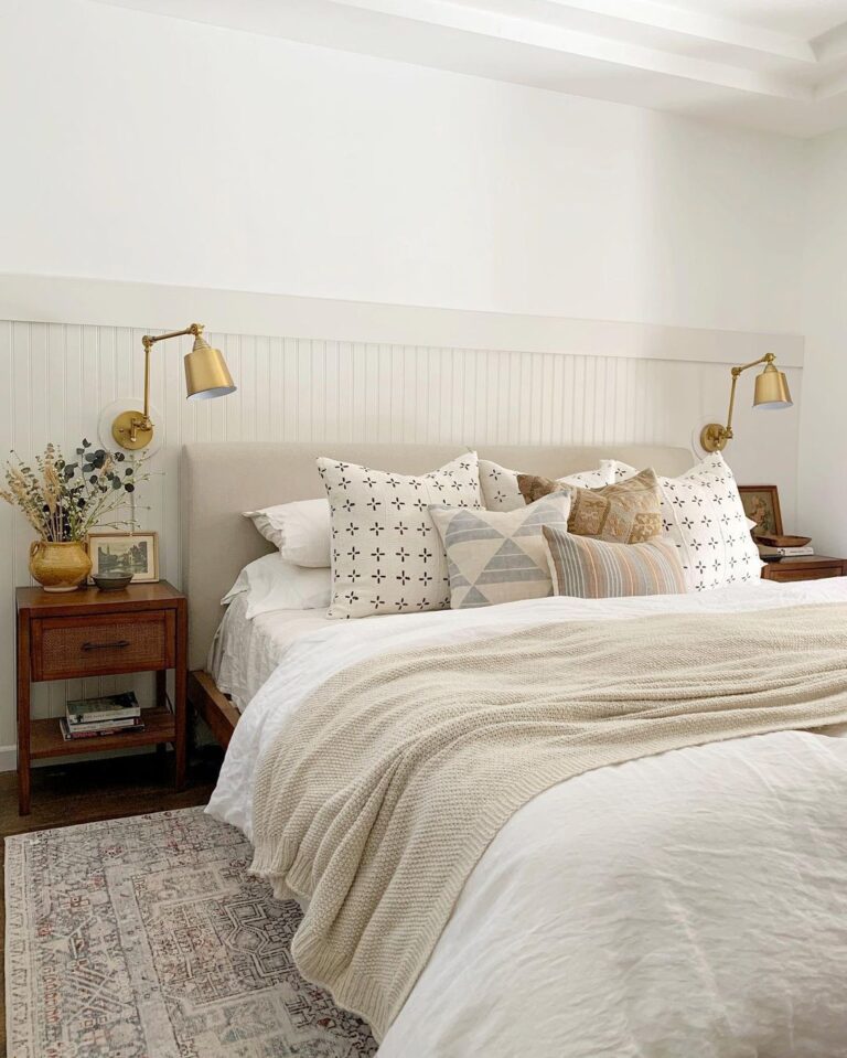
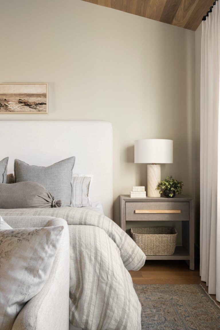
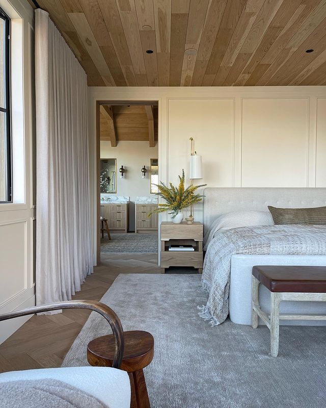
Bedroom
No doubt, Oyster White is a perfect color choice for any style, yet nothing compares to an off-white bedroom decorated with natural texture and cozy textiles. Recreate this cocoon effect by painting all walls off-white, decorating the room with soft-colored textiles, and adding occasional pops of indoor greenery. You’ll especially love this color in the morning or evening golden hour when the direct sun rays resurface a subtle golden veil over Oyster White.

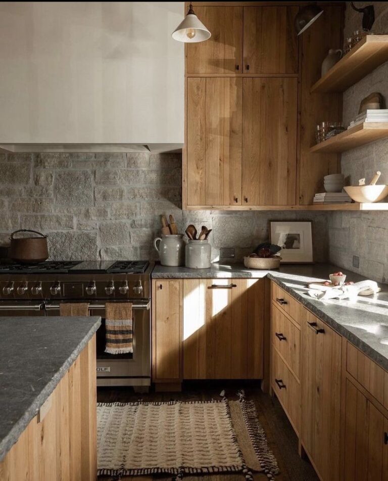
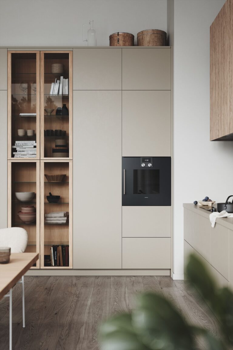
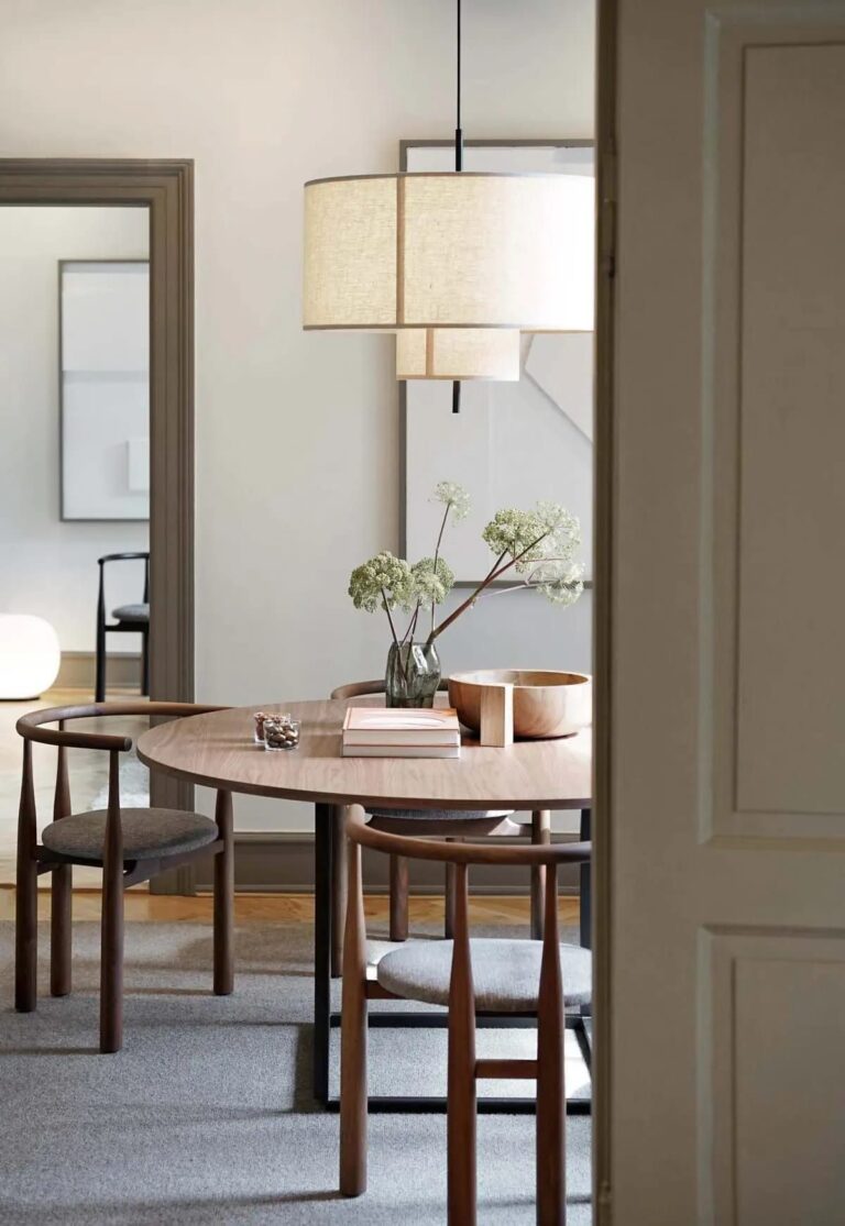
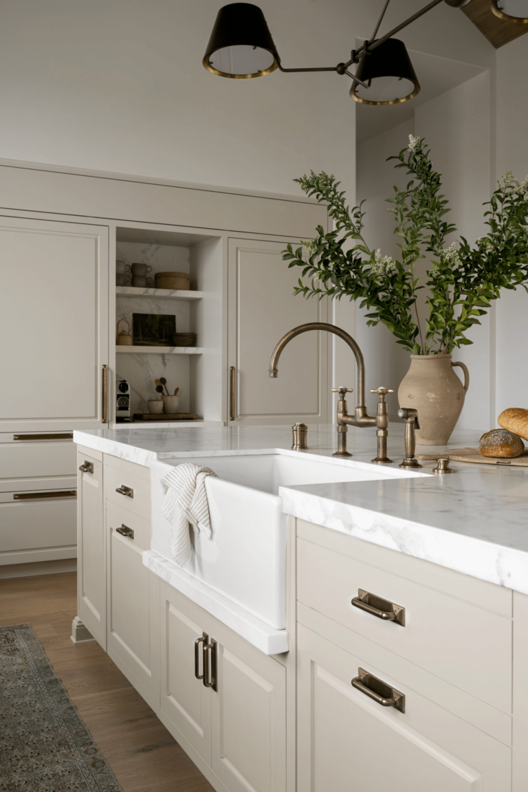
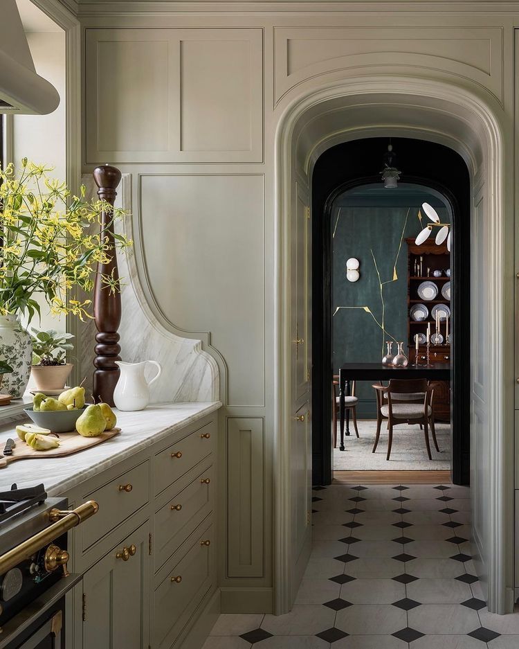
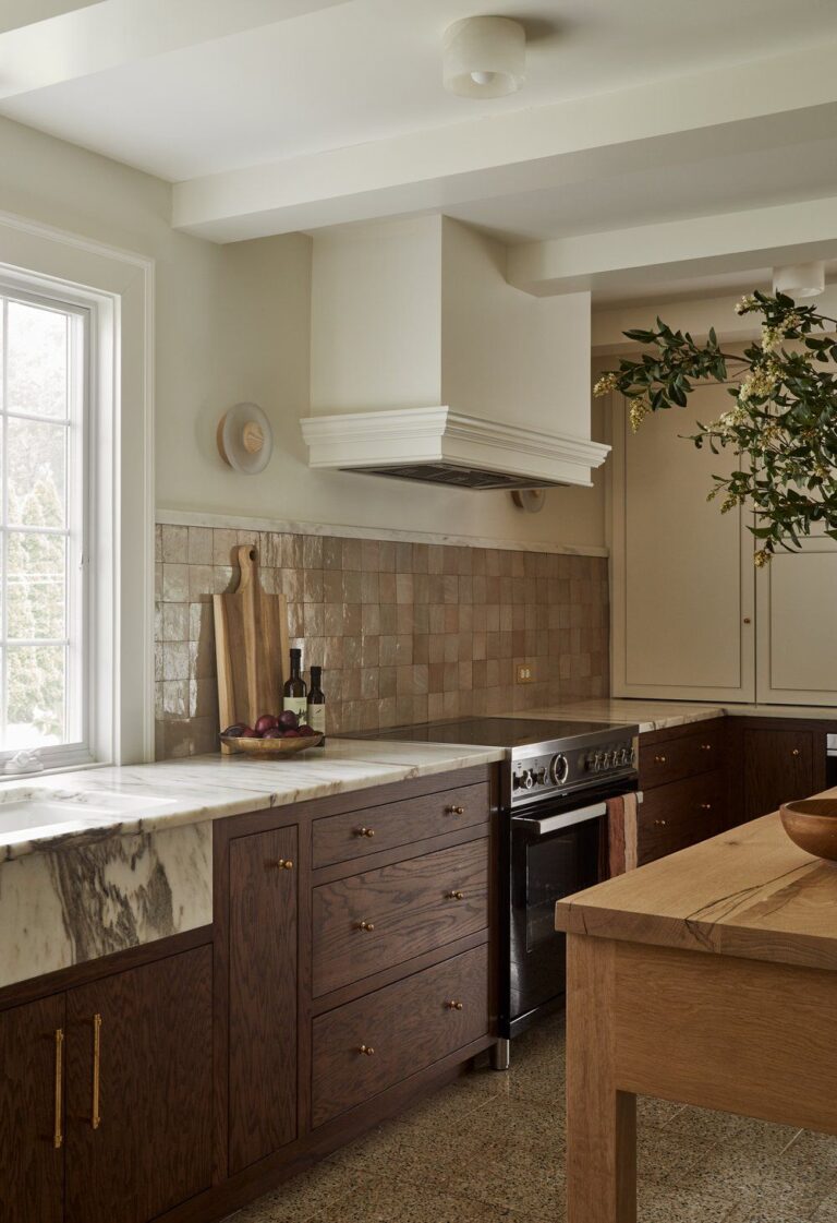
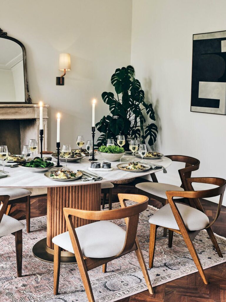
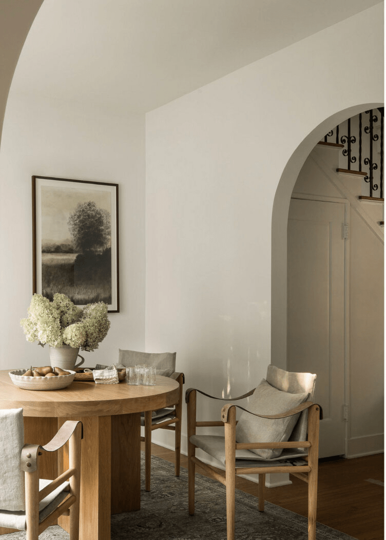
Kitchen and Dining Room
The quiet luxury concept, known as Old Money, is mainstream. Oyster White seems to be the perfect color for a restrained yet luxurious interior, especially in the kitchen. You can use it on walls or cabinets, paired with expensive-looking marble countertops and backsplashes, in the company of metallic hardware with a historic tint. Don’t over-accessorize the space. The rich texture and sumptuous color palette will speak for this luxe design style.
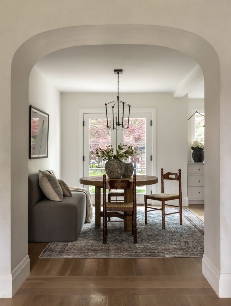
As for the dining space, Oyster White is one of the best wall paint colors. While staying relaxed and calm, it manages to render a strong sense of comfort. You’ll always feel comfortable surrounded by this off-white. In addition, add a few touches of texture, such as wood, rattan, stone, jute, and organic fabrics.

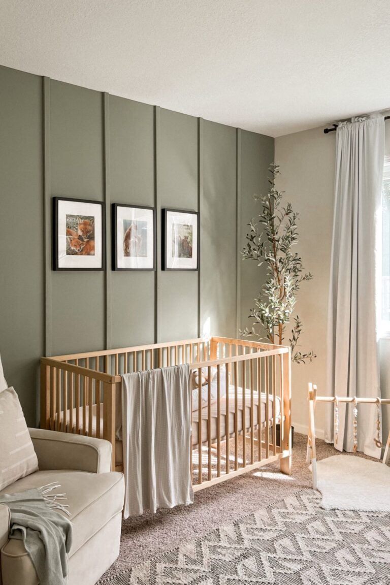
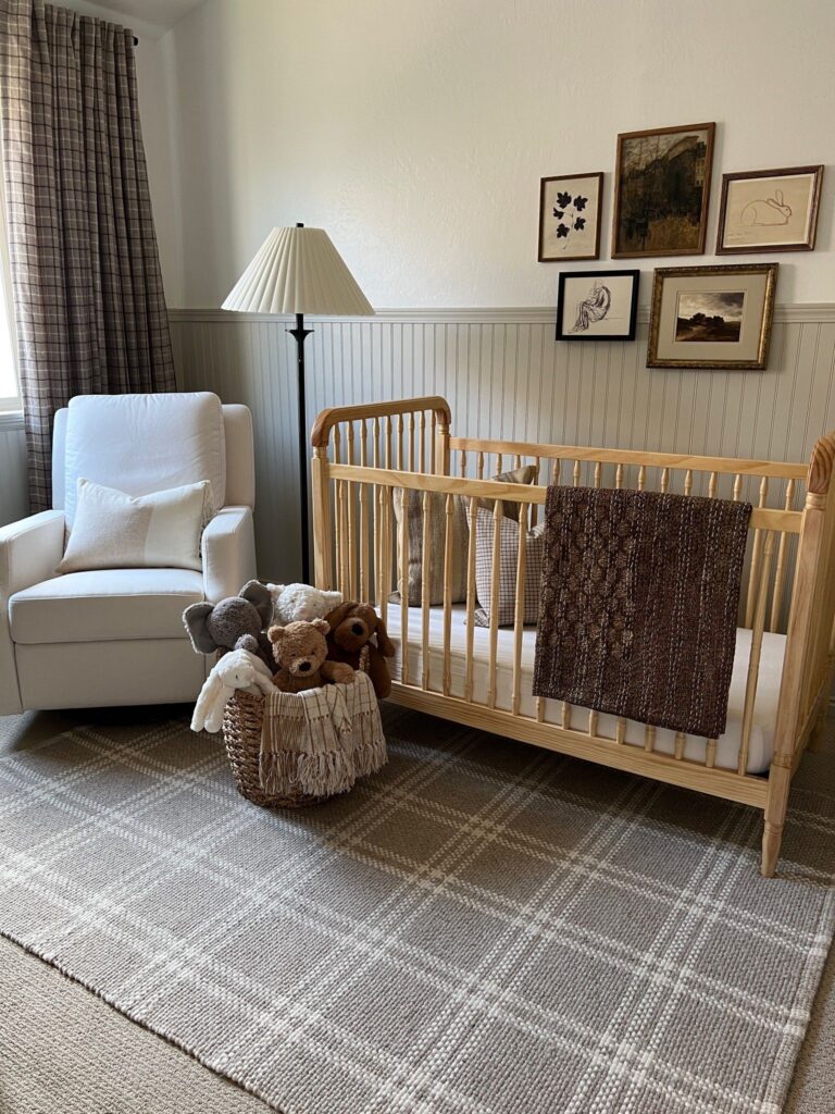
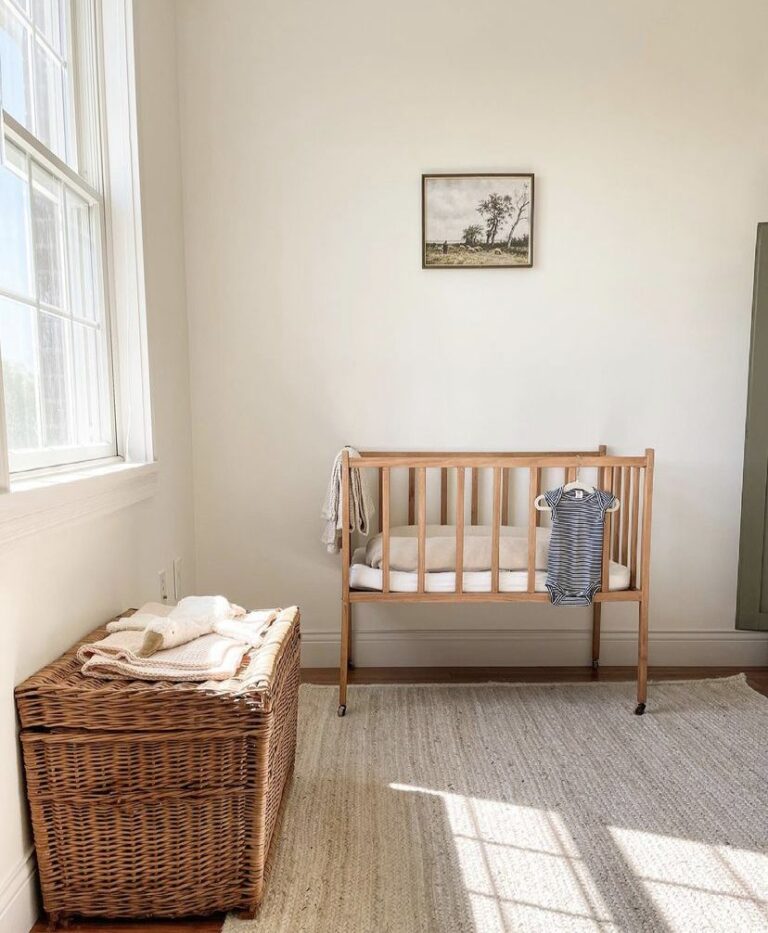
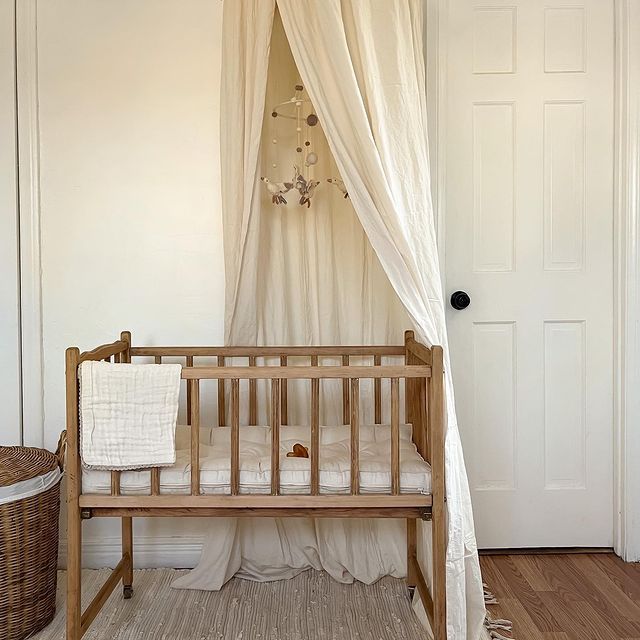
Nursery
Your nursery will surely benefit from a drop of well-balanced yet soft off-white. Whether you choose it as a primary color or pair it with an accent shade, such as its favorite green, you won’t regret it. Keep the color palette pastel or contrast it with wooden furniture. Additionally, you should know that Oyster White will adapt, in the future, to any room renovations.
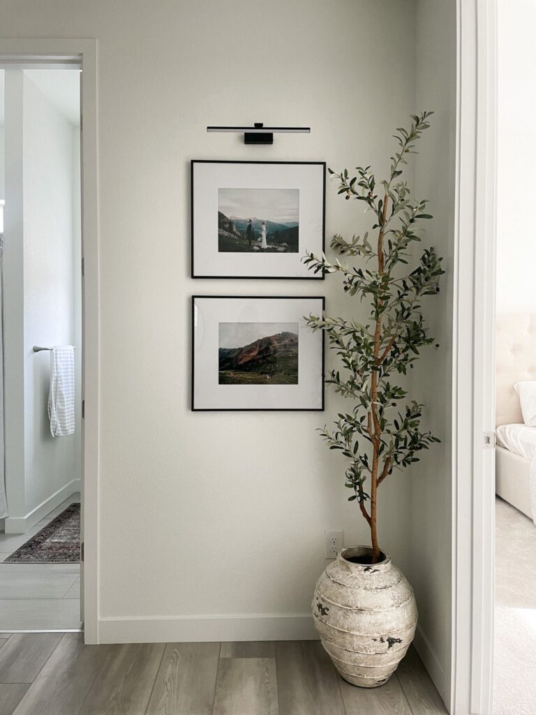
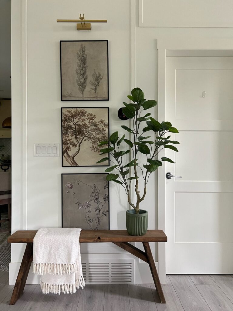
Hallway
If you cannot decide on the hallway paint color, look no further than Oyster White. This versatile white shade will work for modern and traditional design styles. Paint all walls off-white and decorate the neutral canvas with aesthetical side tables, wall art, and accessories. Even more, choose this white for the entryway and make a welcoming statement.
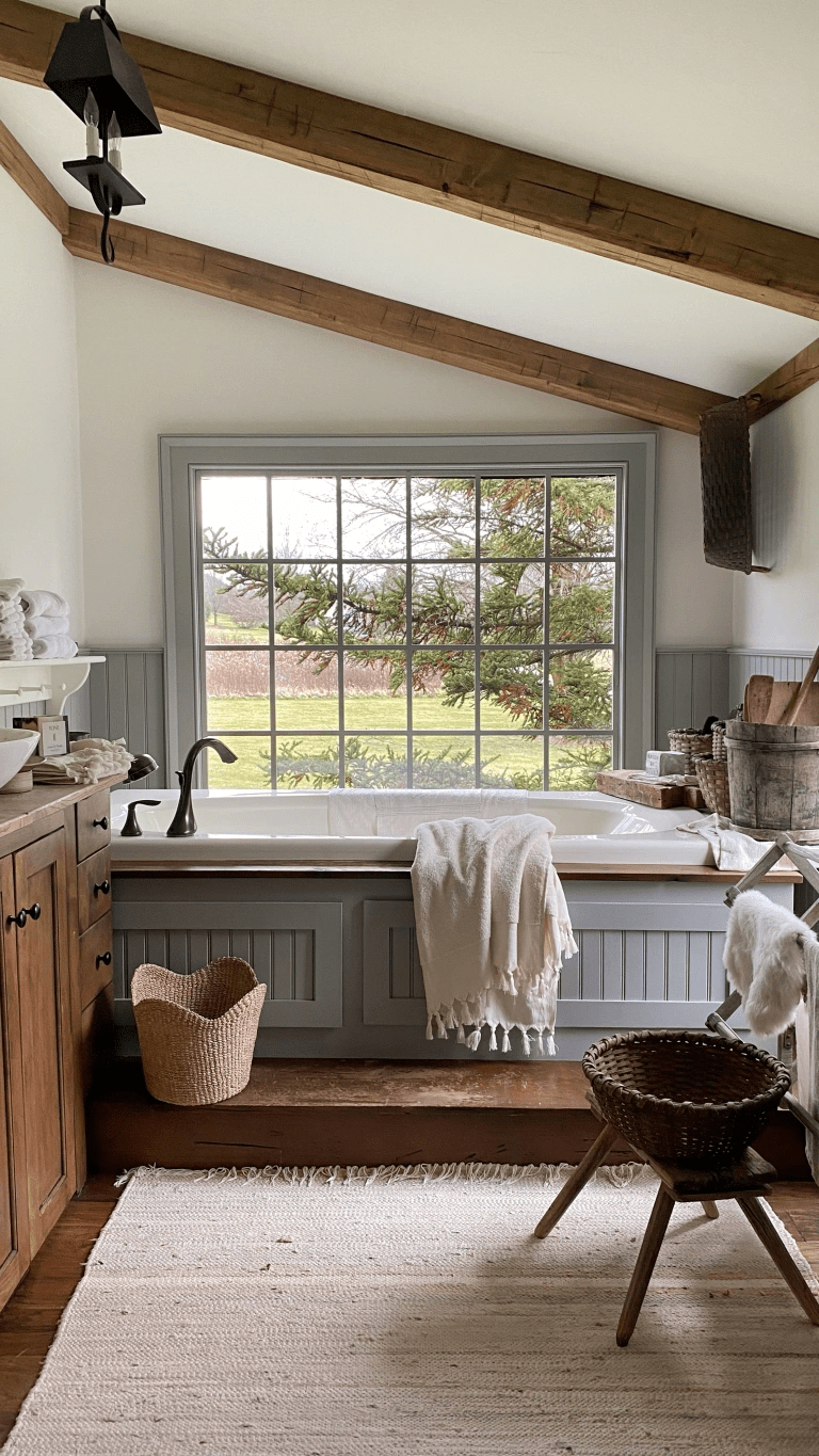
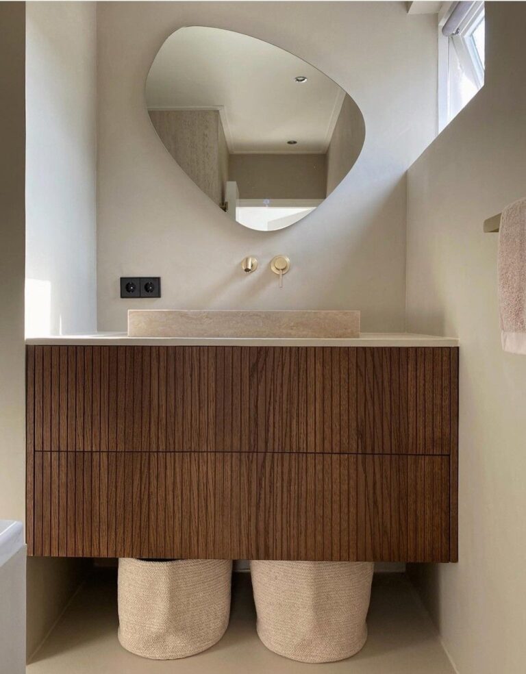
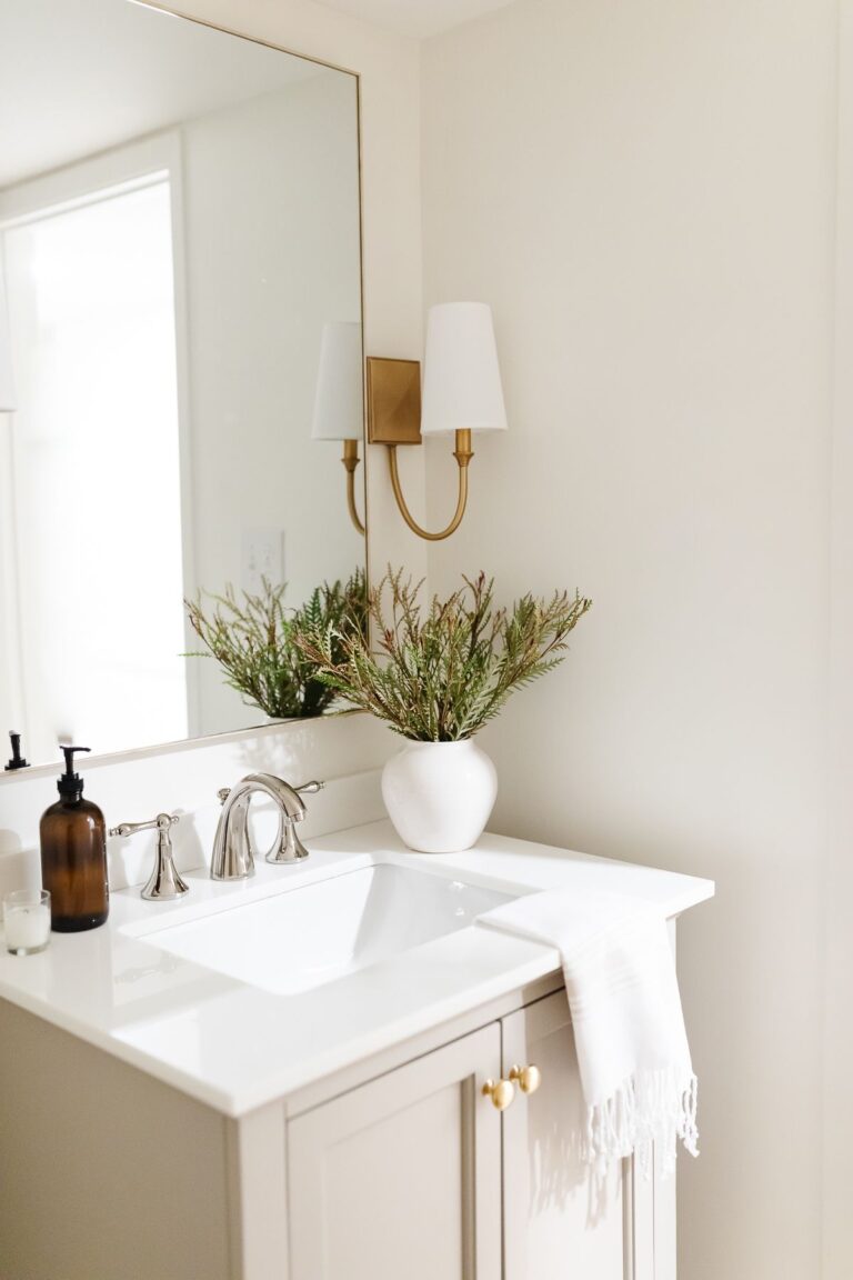
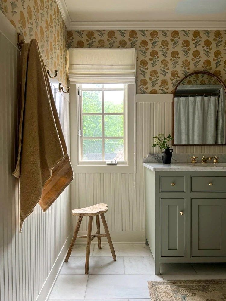
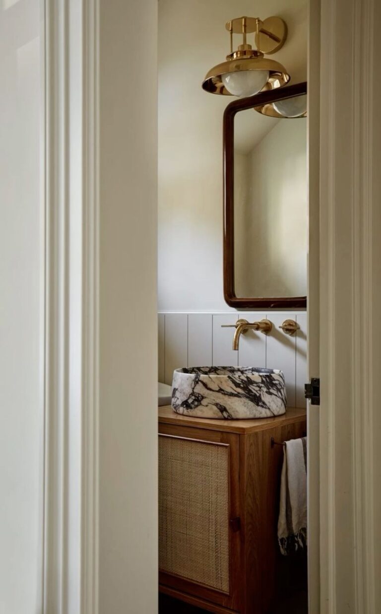
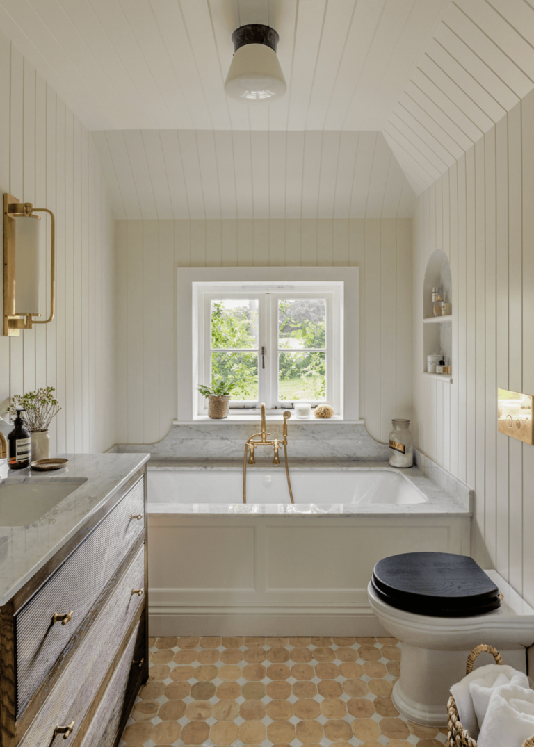
Bathroom
Despite how versatile Oyster White is, it is undoubtedly the color option for a bathroom with a historic appeal, slightly worn-out surfaces, and a weathered color palette. This delicate off-white will play the role of the primary color. You’ll fall in love with how many transformations this paint color takes on over the day.
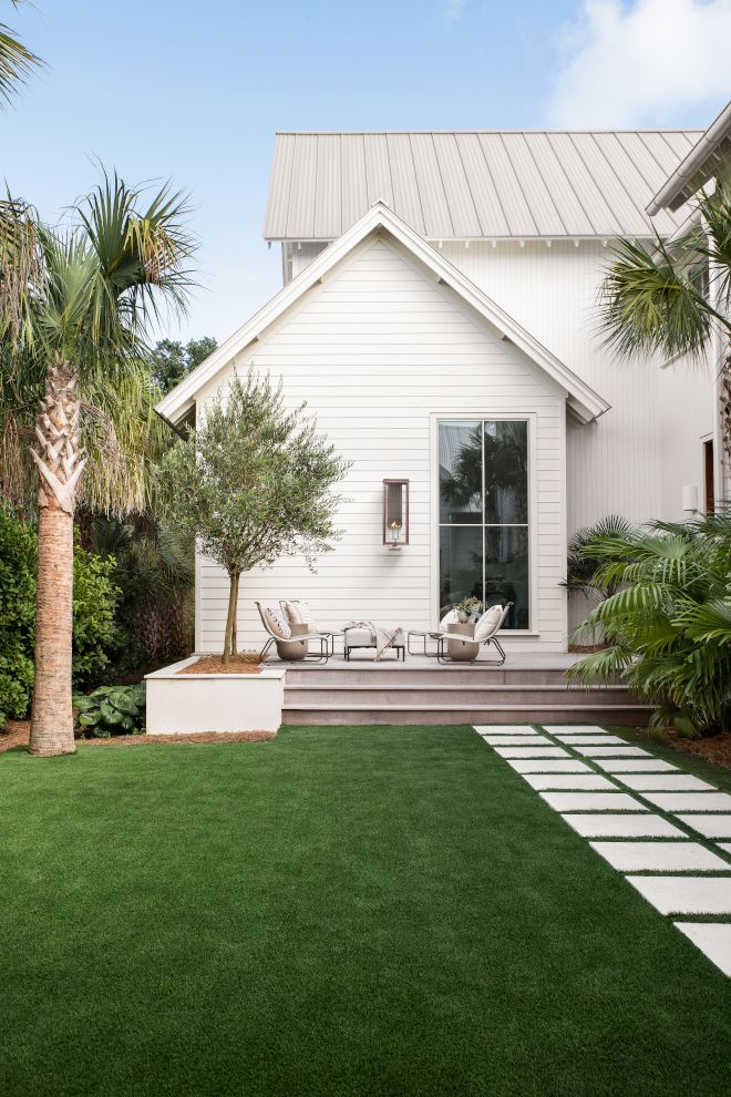
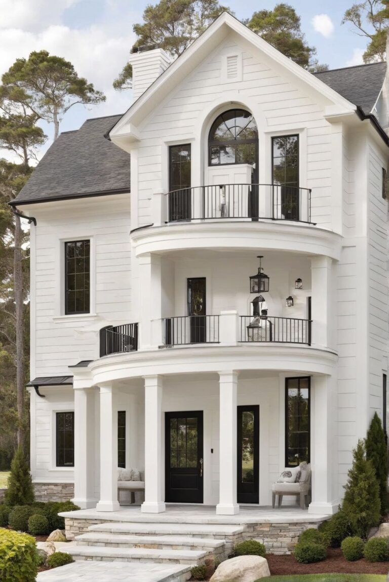
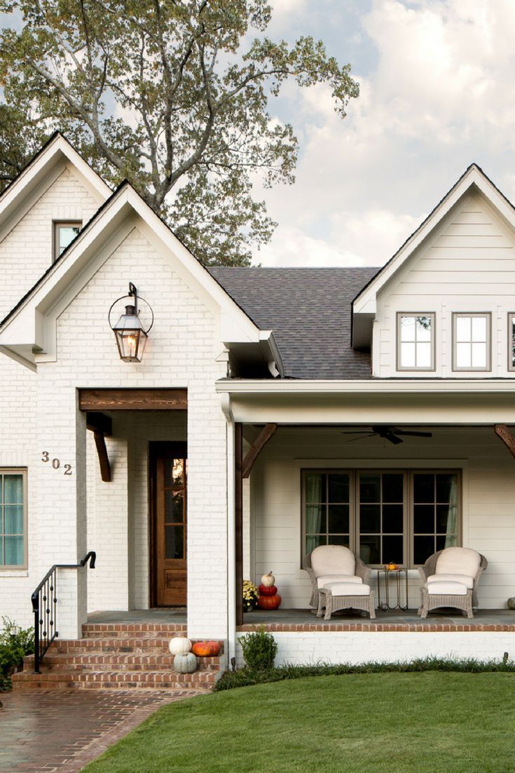
Use of Oyster White for the House Exterior
According to designers and colorists, Oyster White is one of the best white exterior paint colors. Not too bright nor too gray or beige, this off-white is a perfect option for modern and traditional exterior house walls. Experts draw our attention to the fact that Oyster White seems slightly brighter when bathed in direct natural light than on the color sample. Yet, the slightest shadow allows it to show its additional notes of color. Also, be aware that the surrounding greenery may cast a more noticeable green trace on Oyster White. If you want a crisp white look, you won’t achieve it with Oyster White. However, if you fancy a stately and inviting white with a historic twist, SW 7637 is your best option.

The Oyster White SW 7637 paint color by Sherwin-Williams is on the designers’ top list of neutral paint colors. It gathers so much balance and comfort under the same off-white veil that you won’t stop admiring it. Your interior and exterior design is safe with a professional neutral shade like this.
