Pale Oak OC-20
Benjamin MooreThe fabulous shade from BM is a greige, or, as others call it, taupe, which cannot help but delight with its fantastic composition.
Pale Oak OC-20 (Benjamin Moore): what color is, review, and use
The popular category of greiges amazes year after year, and designers cannot simply give up on it. Well, who would give up on shades that combine so perfectly gray and beige, replicating the symbiosis between softness and freshness? Today, we will tackle a paint color of this kind and not a simple one. Pale Oak OC-20 from Benjamin Moore is not often referred to yet used for the interior and exterior designs at an unprecedented level. This mysterious color impresses designers and homeowners all over the world. What hides behind this unreachable hue?
The OC-20 paint color from the renowned manufacturer is a balance of gray and beige, reminiscent of the graceful white oak, which is both naturally beautiful and impressively elegant. It is regarded by many as a perfect greige and no.1-paint color for neutral backgrounds, sophisticated trim, or pieces of furniture enriched with texture. This is Pale Oak at first glance. Wait and see what it reveals under our thorough analysis!
Pale Oak paint color features
The fabulous shade from BM is a greige, or, as others call it, taupe, which cannot help but delight with its fantastic composition. A bit gray, a bit beige, with a slight hint of warmth yet not devoid of this subtle sense of cool restraint. As Arianna Cesa, the associate manager of color marketing and development of this paint brand, stated, Pale Oak is “a delicate balance between warm and cool, bringing endless adaptability to any space.” What about the way this paint color feels? Well, there is no place for other feelings but a refined sense of tranquility, ease, at some point – escape, and, not least, elegance. It depends on which style direction you take, and this shade adapts to particular conditions.
Pale Oak: is it warm or cold?
That’s right! Pale Oak is most of all a balance between the two extremities, although it is penetrated by a more visible hint of warmth, which keeps the cold notes at bay. Still, the cool scents contribute to the balance intended initially. Why warm and not cool? It is time to reveal a secret. This beautiful greige is diluted with a tiny particle of yellow that stands behind the slightly warmer effect.
How does lighting affect Pale Oak?
As with other neutrals, this one seems specifically light under the influence of full daylight, while a slight shadow or artificial lighting reveals its rich collection of undertones. Still, this shade has more in store. In a space that receives a large amount of daylight, particularly in the north-facing ones, Pale Oak reads off-white and can easily be mistaken with a shade of this kind. At the same time, south-facing spaces make this color bring its entire range of beige notes to the surface, leading to a welcoming and warm sense of safety. Still, the popular LED lights can fully reveal the gray notes. Quite a chameleon we have here, and we have not told you yet that this greige tends to reflect the neighboring colors, taking on different appearances.
Pale Oak LRV
With an LRV (Light Reflectance Value) of almost 70 (69.89 on the official website), Pale Oak enters the medium tone category of shades, gravitating towards the light side. The gray and beige notes absorb a particular amount of light without bouncing it back. Still, the combination as a whole reflects high amounts of light, and the space seems to expand its borders. Particularly in north-facing rooms, when Pale Oak appears as an off-white, the interior feels extremely light and spacious in full daylight.
Pale Oak undertones
We already mentioned the slight yellow notes responsible for the warm features of this shade. Still, there are also other undertones to be discovered. A small amount of purple-pink undertones hidden under its surface penetrate it in particular surroundings. Therefore, if you are looking for a neutral greige with a slight hint of warmth, but other undertones are not beneficial to you, experiment with a sample of this color in your interior and notice how it behaves.
Similar colors
The list of greiges is so long that you cannot simply go through it and not find at least a few shades similar to Pale Oak. Some of them are impressively identical, although there is a unique feature for every shade in part – the way they behave in real settings. Let’s find out the alternatives that BM and other paint brands have in store!
Coordinating colors
The unique greige from BM is quite versatile, combining well with a wide range of shades. Still, it has its preferences. Among the favorites of this color are true whites that go well for the trim and keep Pale Oak from seeming too warm. The list also contains other shades of greige for a harmonious contrast. We cannot skip the accent shades of blue and green. Every style implies a particular approach to finding the matching colors for Pale Oak. Let’s scroll through some of the most prominent companions!
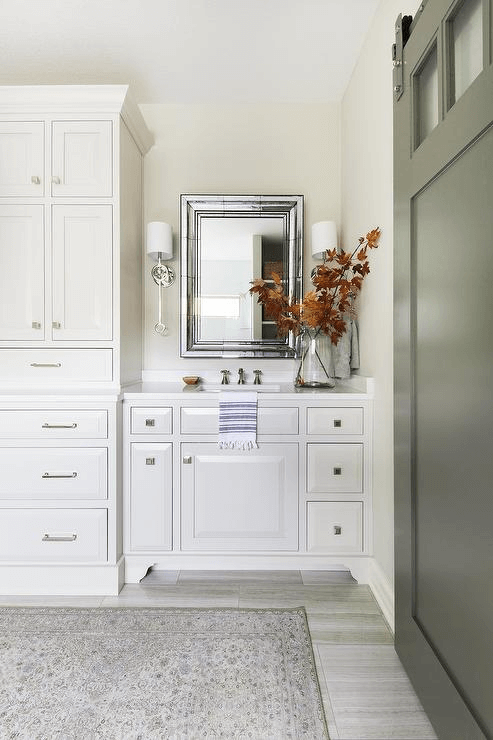
Use of Pale Oak in interior
Pale Oak brings charm to any space, suiting both functional and elegant styles since it is quite versatile. This neutral shade reveals particular undertones to match every case in part, from walls to trim and cabinetry. Among the best approaches for this color are: Modern, Traditional, Transitional, Country, Scandinavian. We will try to give you an insight into what it looks like within particular styles by referring to specific spaces.
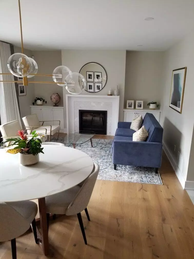
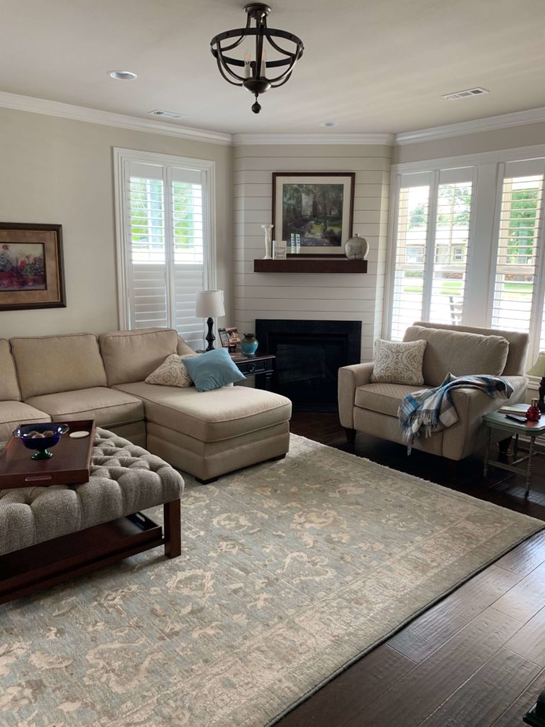
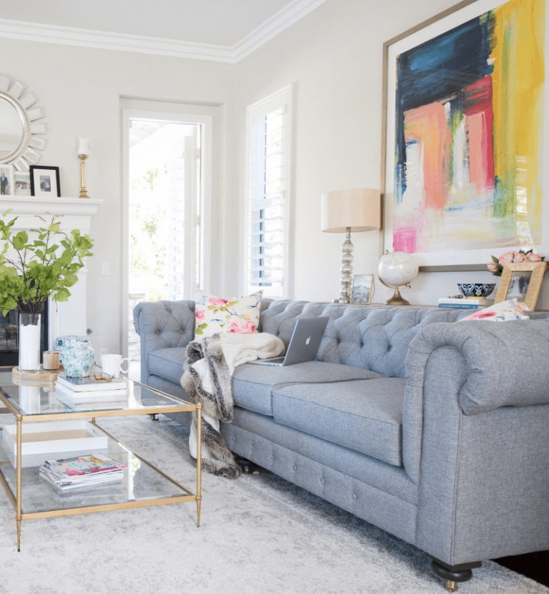
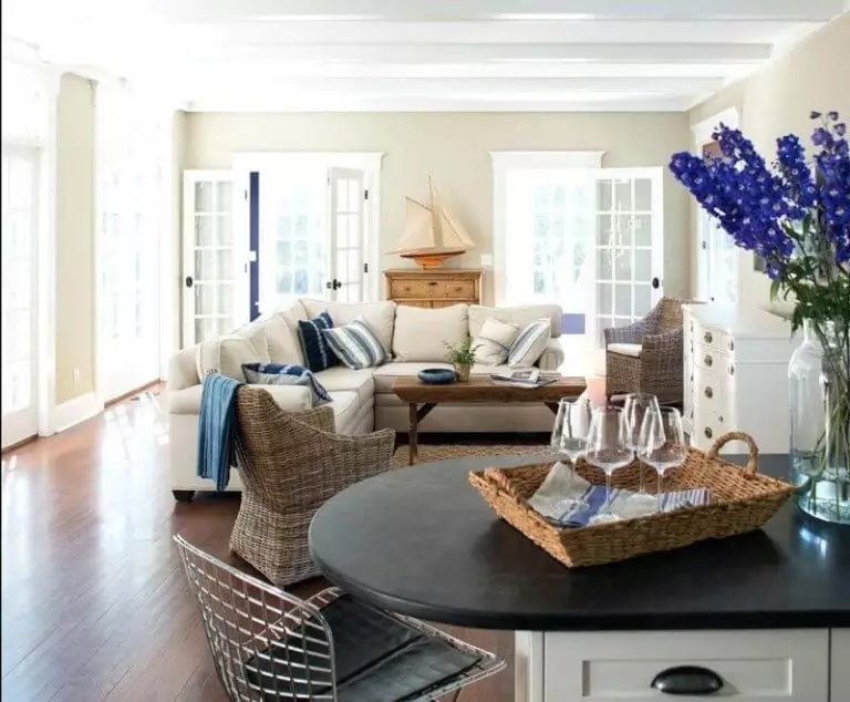
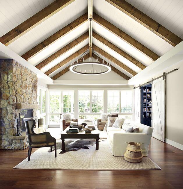
Living room
Firstly, look at the pictures and follow how this color changes within particular conditions. You have probably noticed that this color adapts impressively well to each style in part. The living room is where you can play with various approaches. Do you fancy an elegant escape from the outside world? Bring the country fairytale into your interior with unique furniture, extravagant decor, and a rather pastel palette. Not sure which direction to go, traditional or modern? Compromise with a transitional approach with elements from both styles. Functionality and comfort are priorities? Stick to a minimalist design with soft textiles and a nature-inspired palette. It should be noted that each approach in part implies the use of Pale Oak as a background, which every style can reveal its beauty on.
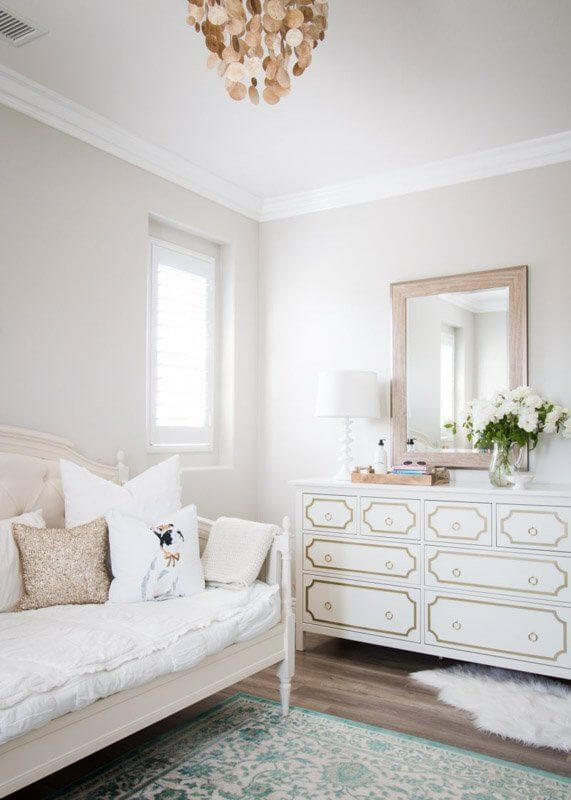
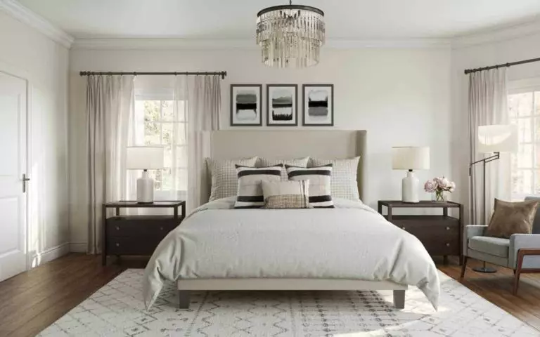
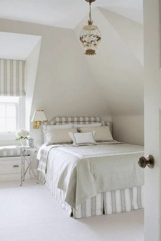
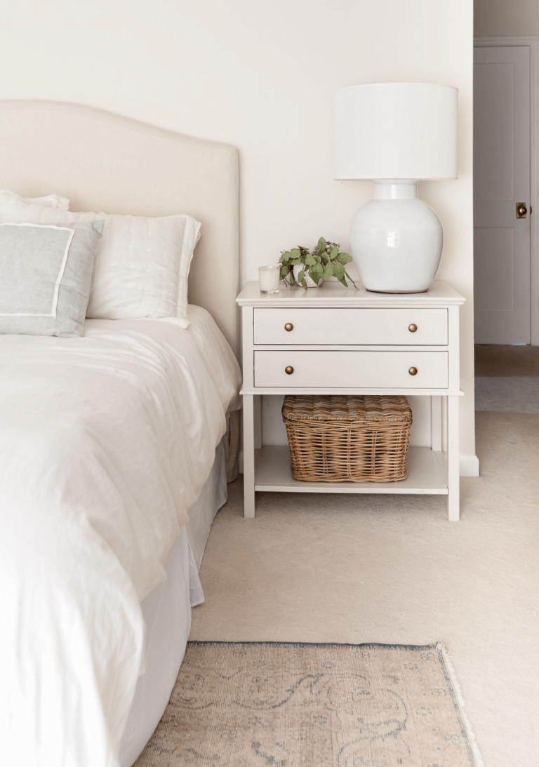
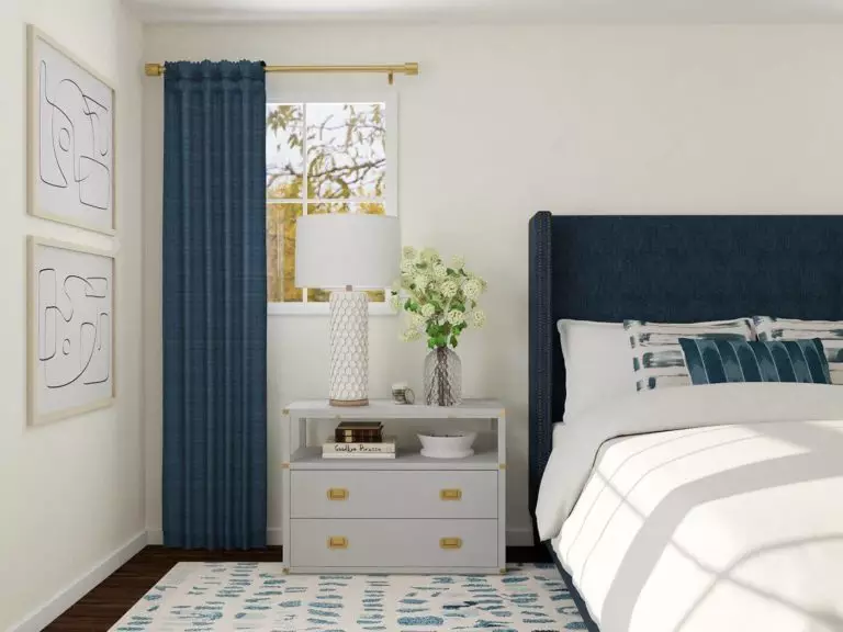
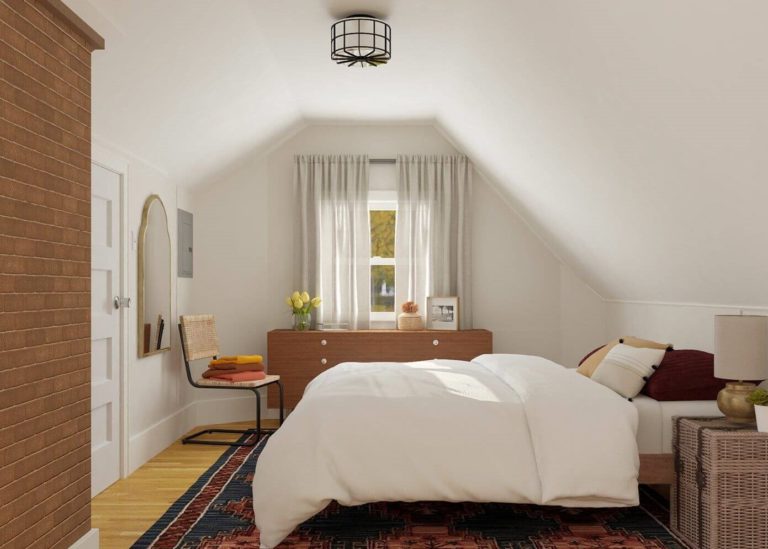
Bedroom
You have even more freedom within this space since it is all about your personality. From going with a particular style to opting for an eclectic combination, don’t hesitate to integrate your wildest design ideas, although sticking to specific rules. Consider Pale Oak for the walls and other elements on its background, such as dark wood furniture for a traditional approach and light wood pieces of the kind to ensure contemporaneity with pastel pink textiles for an extra feel of softness. For lovers of minimalism, a monochromatic palette would work best. You can go as far as painting both the walls and nightstands in OC-20, accompanying them with elements of similar greige variations. The refined sense of safety and relaxation that the beautiful greige ensures brings all these approaches together.
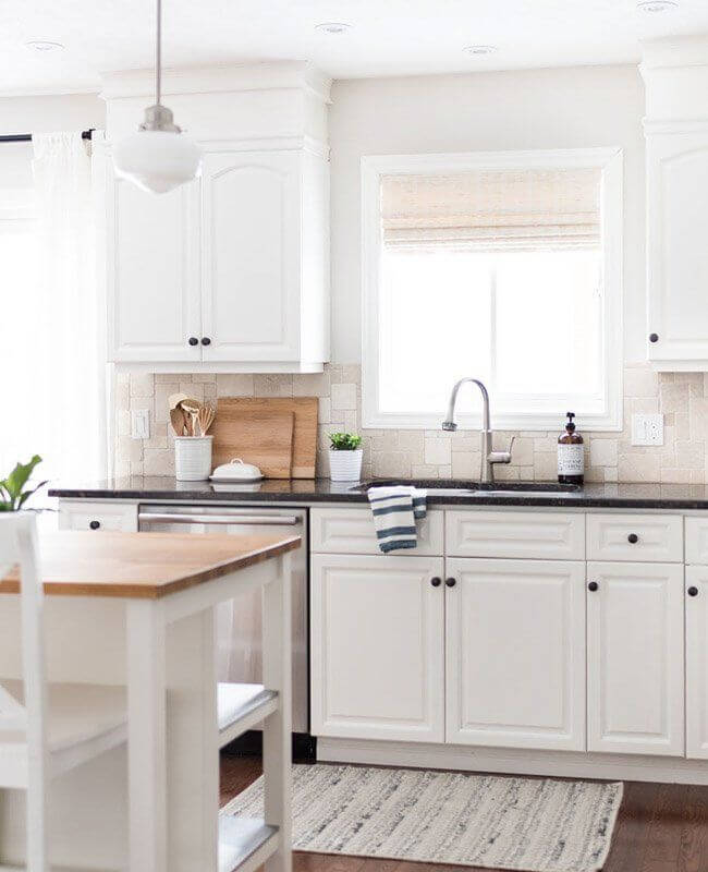
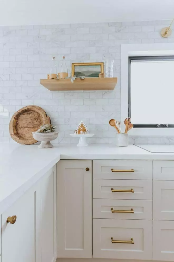
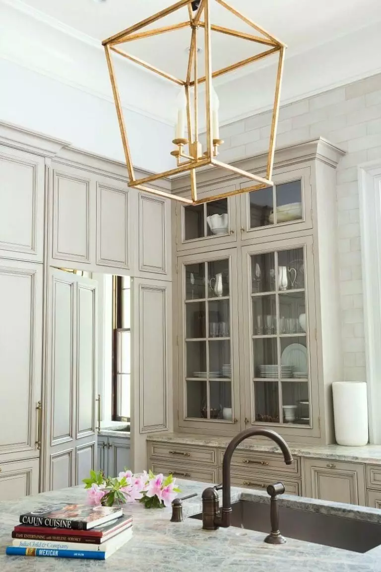
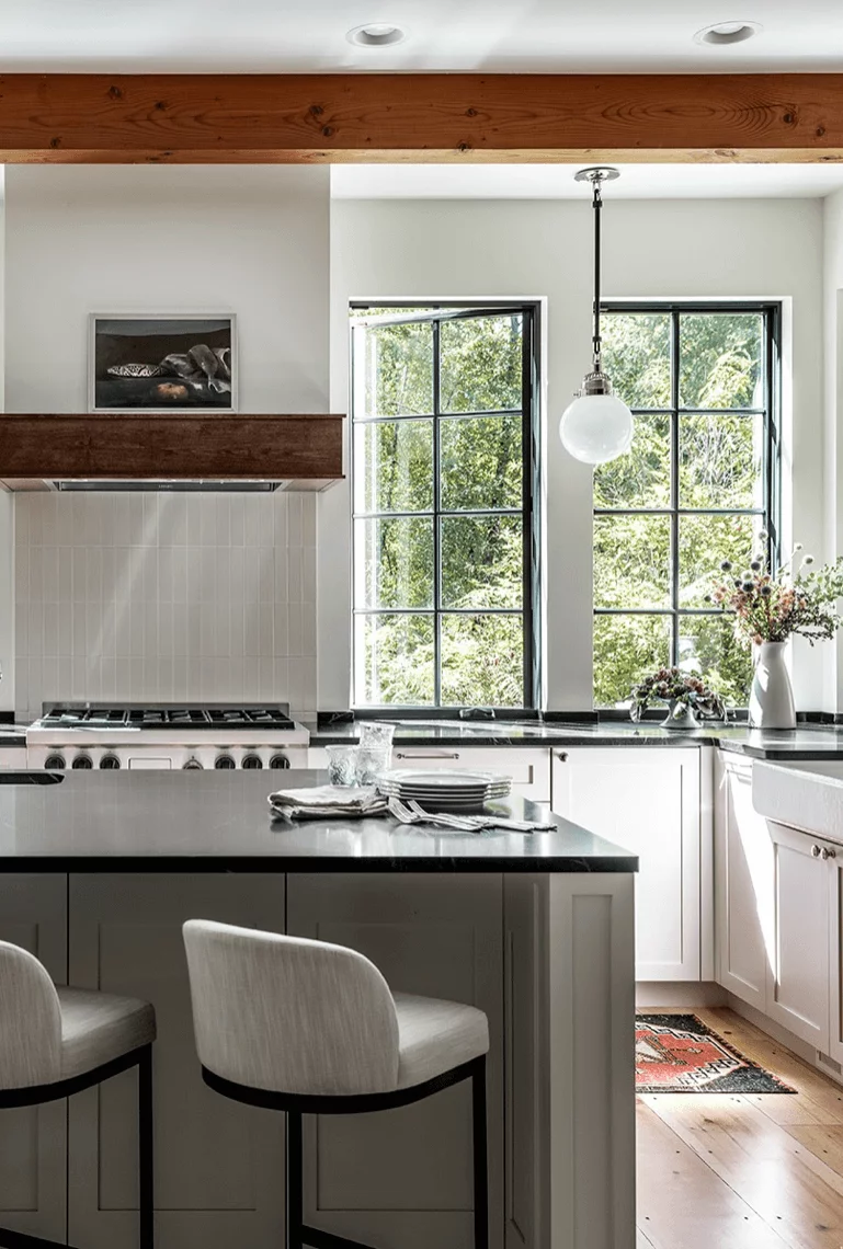
Kitchen and dining room
Pale Oak is usually applied within traditional or transitional kitchens with beautiful cabinetry painted this way or white cabinets on a background in OC-20; brass hardware, a few wood elements, and your kitchen is ready, with a few additional units for each style in part. Still, a modern kitchen with greige cabinets, a monochromatic color palette, and the lack of details is a no less impressive approach.
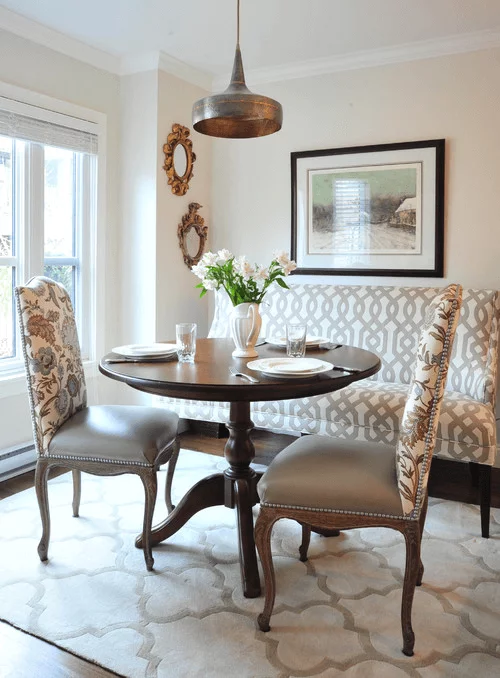
When it comes to the dining room, the same styles go here. Still, Pale Oak is applied only to the walls, accompanied by wooden furniture and a rather formal environment slightly softened by the appealing shade of greige.
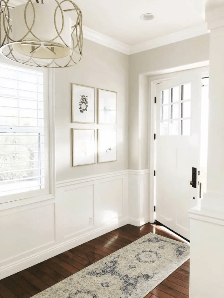
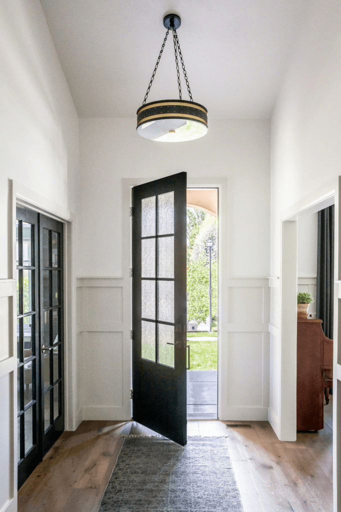
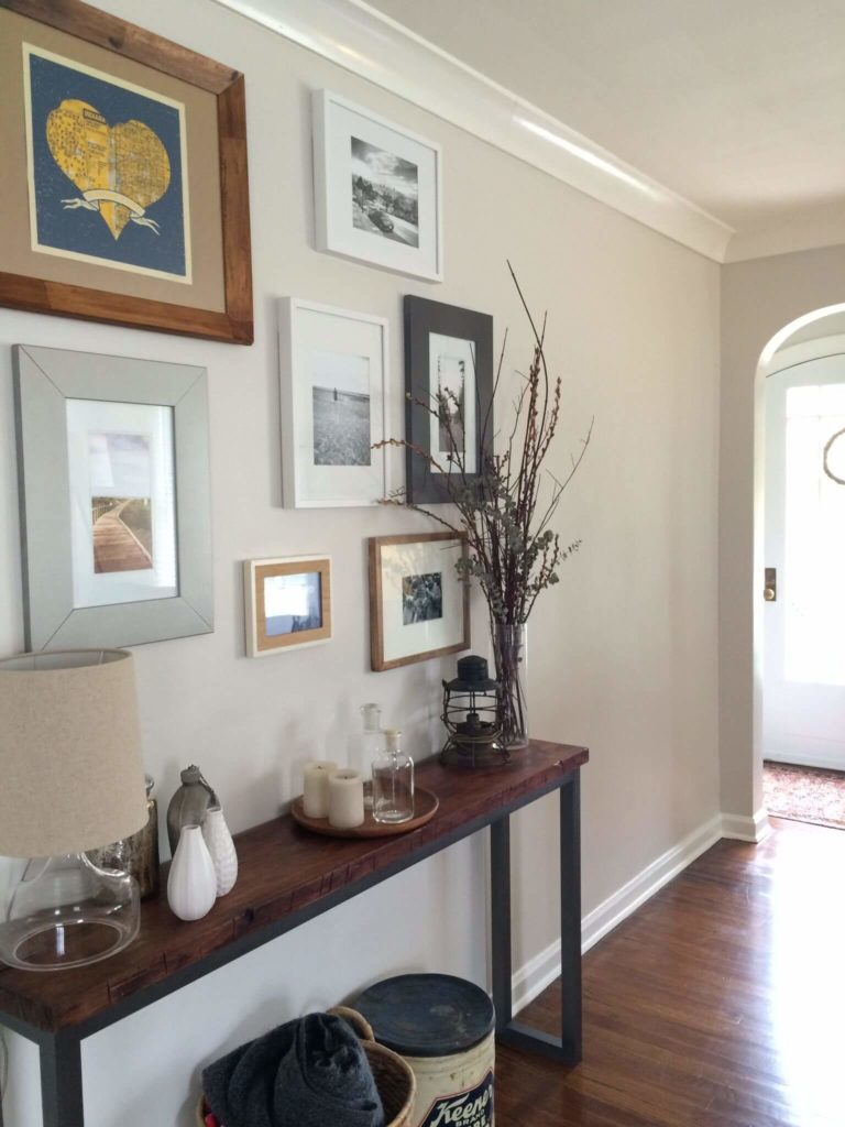
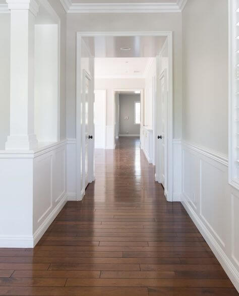
Hallway
Pale Oak acquires an incredible welcoming effect that makes you return home as fast as possible, making it a perfect paint color for the hallway. Furthermore, it sets a stylish introduction to your interior due to the graceful notes of finesse that hide behind its surface. The true companions for OC-20 within this space are white and wood with a rather minimalist design and a few striking units here and there for an extra touch of elegance. One should note that Pale Oak is perfect for painting the walls entirely or applying it to wood paneling paired with a white background.
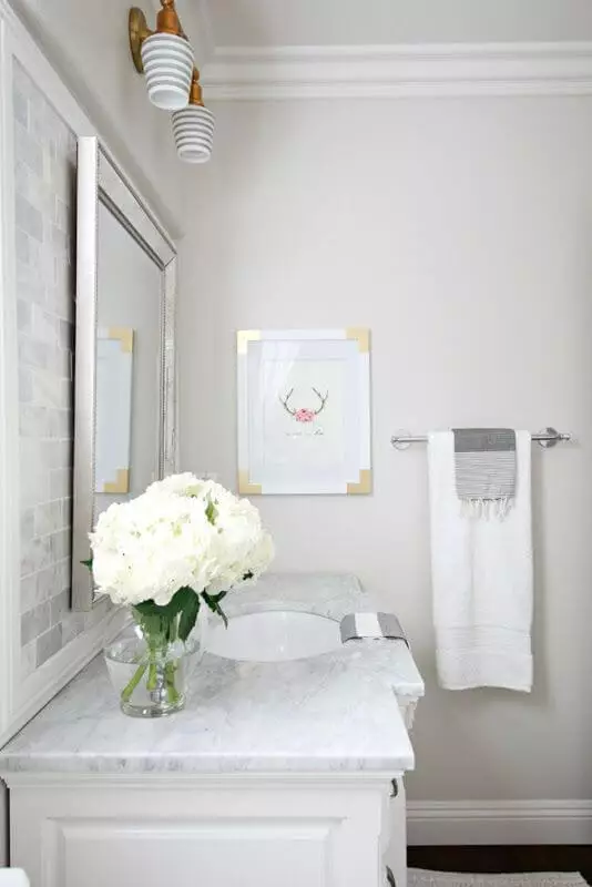
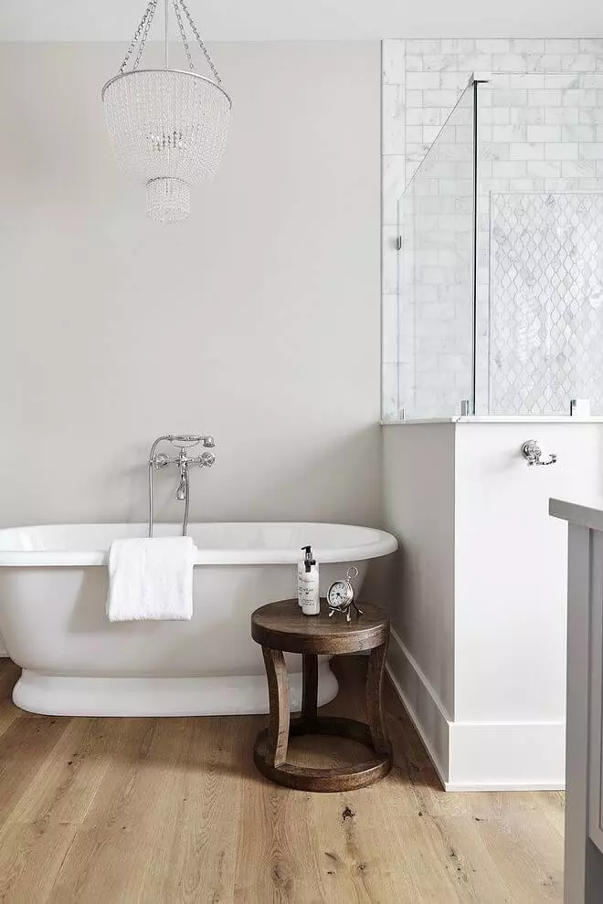
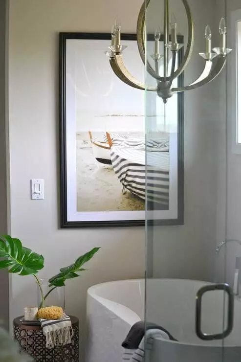
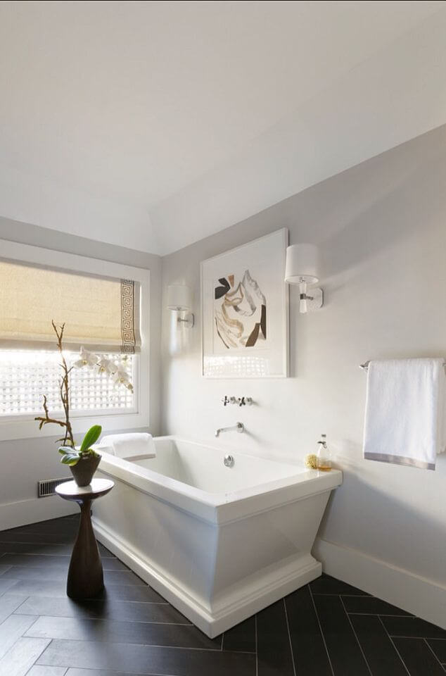
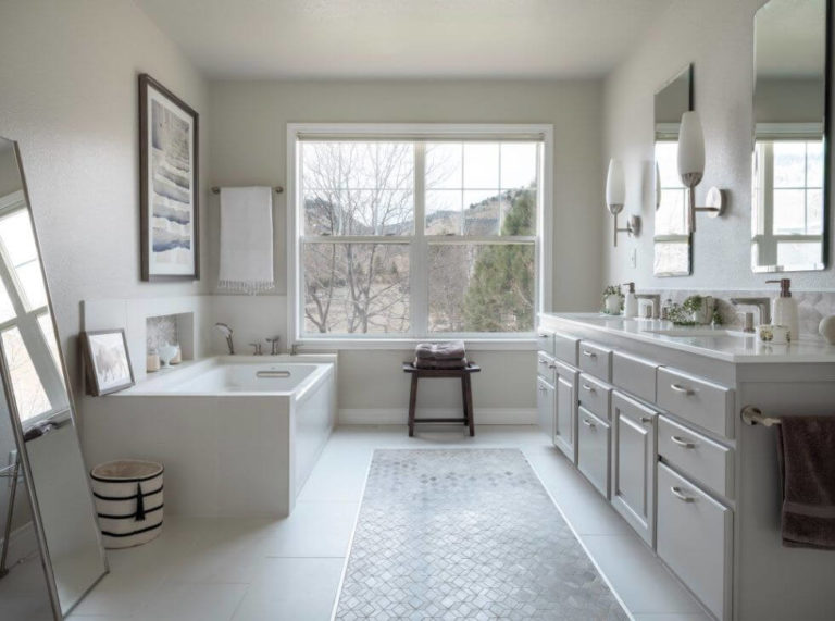
Bathroom
This space requires an individual approach. Consider a monochromatic palette with Pale Oak as a background, white and other neutrals for the cabinetry and other elements. Stick to a rather pastel interior with calm shades that offer the OC-20 the possibility of acting as the star of this space and revealing its soft notes. Consider a pot with greenery to naturally dilute the palette for an additional touch of uniqueness.
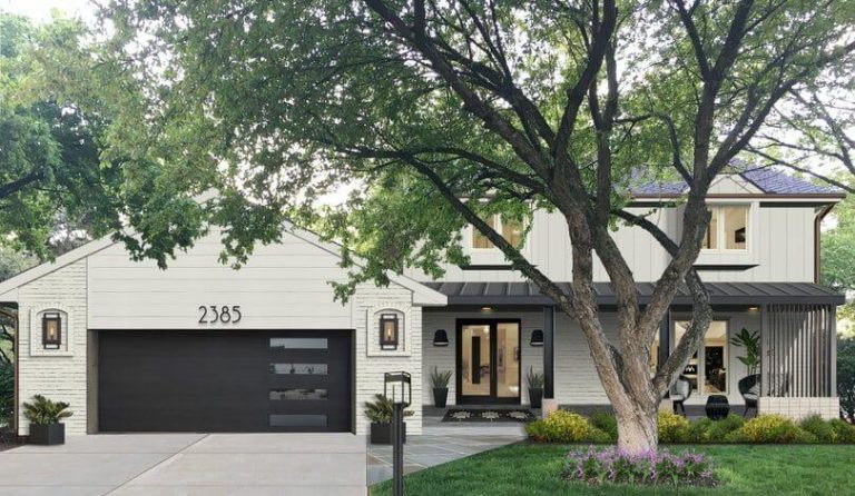
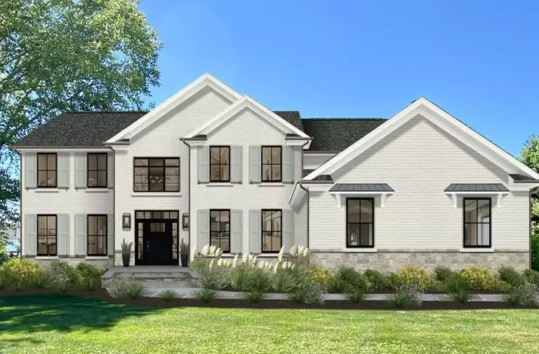
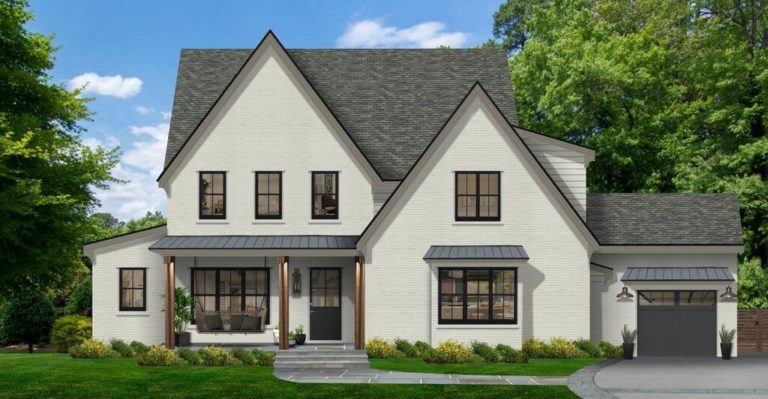
Use of Pale Oak for house exterior
The inviting effect of Pale Oak extends to the house exterior with a soft and refreshed appearance you have never expected. A traditional house with wooden walls or a modern one with brick walls would benefit from this greige shade to the fullest. Consider black for the window frames and gray for the roof to redefine the house borders and enjoy the result.
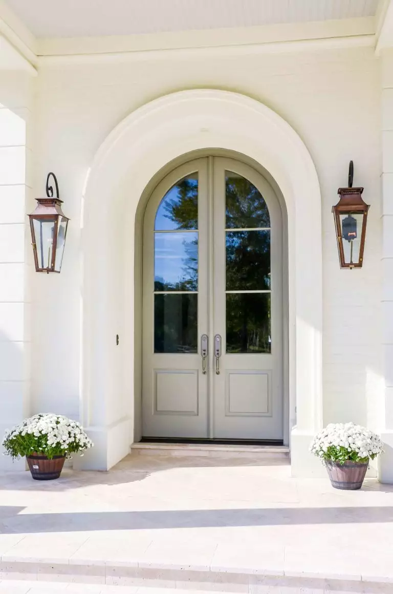
Pale Oak is a win-win option for contemporary exteriors when it comes to the front door, considering a crispy white background. Such a pearl that shines particularly beautiful on sunny days will surely not go unnoticed, pointing at the trendy look of the house and the homeowner’s design skills.
The Pale Oak OC-20 paint color from Benjamin Moore is a no-fail option for greige lovers. Still, one should be very careful with this shade that likes to play the trick on its users with hidden undertones. Nevertheless, this is a tiny nuance besides the unprecedented flexibility of this paint color that will stay true to you regardless of what design approach you decide to apply.
