A pale variation of blue with soothing notes. It is neither too bright nor neutral but rather a cool shade with a clear touch of softness.
Peaceful Blue (Behr S470-3): what color is, review, and use
We have referred in our articles this far to various shades of blue, but nothing beats the one we have prepared for you today. Peaceful Blue from Behr is a real find for pastel lovers. Would you like to know what it feels like? Imagine the early morning sky when the stars already miss the moon, when it seems like the time has stopped and a state of serenity surrounds the world. In such moments, you forget about everything and embrace the whole range of emotions that such scenery radiates. You feel at peace with yourself and in harmony with nature. No wonder peace is found in the name of this color.
Peaceful Blue is a special color that covers a whole range of emotions, from calmness to reflection. This is just a first impression but quite a fabulous one. Wait and see what this color reveals within a thorough analysis, which we already did and are ready to present the results. What makes this color replicate such strong feelings? Let’s find out!
Peaceful Blue paint color features
We cannot keep it a secret any longer. We fell in love with this mesmerizing shade. Peaceful Blue is that color you cannot simply underlook. You see it once and cannot help but return to it more impressed than you had been. The Behr’s shade of blue is a pale variation with soothing notes. It is neither too bright nor neutral but rather a cool shade with a clear touch of softness. It is not so often that we can witness the presence of this color in nature, only at particular times that are indeed special as the color itself. This is what makes us fall in love with its originality.
Peaceful Blue: is it warm or cold?
Undoubtedly, a touch of this color will invite a feeling of fresh ease into your interior, but this does not give us the right to call it cold. Peaceful Blue is rather cool with an appealing soft effect that hypnotizes with its particles of calmness and harmony. It is not warm either, although the pleasant scents are so appealing that you feel safe and at ease within a space painted in this shade.
How does lighting affect Peaceful Blue?
The more light it receives, the more this shade can reveal its entire range of features: invigorating and stimulating, calming and relaxing, hopeful and safe, all together. One should note that such feelings do not flow all by themselves but in harmony with each other. Of course, such an effect is the consequence of a large amount of light, particularly natural light. What happens when artificial lighting enters the play? Peaceful Blue puts on its softest mask and attracts you even more. A cloudy cover during the day and a safety barrier at night. Either way, you feel nothing but at peace surrounded by this shade.
Peaceful Blue LRV
We were indeed surprised to find out that Peaceful Blue has a rather low LRV for the color it appears to be. Let’s get to it right away! The LRV reflectance value of this shade is 44. Of course, it reflects relatively large amounts of light, although being less successful when it comes to expanding the space borders, which is not at all a drawback but rather an explanation of why it feels so safe when surrounded by this color. Its ability to set particular limits serves as an escape from the outside world, offering you space to feel inner peace.
Peaceful Blue undertones
Peaceful Blue is devoid of any undertones. It is a pure shade of blue that differs from other blue variations due to its pastel surface and outstanding soothing notes. Is it the color intensity or the particles of calmness responsible for the peace that this shade radiates, or is it a combination of those two? Experts find it hard to explain. Nevertheless, Peaceful Blue is surely unique, and the fact that it is hard to figure it out offers you the freedom to come up with your own perception.
Similar colors
There is no other color that as perfectly replicates the entire range of features covered by Peaceful Blue, although similar shades can be found both at Behr and other paint manufacturers, and some of them are almost identical. It should be noted that those are no less impressive. Let’s get straight to the point!
Coordinating colors
Peaceful Blue does not cease to impress us. Apparently, it is quite friendly towards bright shades, their soothing variations, and even a few neutrals. It seems this shade is not picky but rather ready to collaborate with various types of colors. Experts from Dulux prepared an entire list of colors that work with Peaceful Blue. Let’s take a closer look!
Use of Peaceful Blue in interior
Such a unique color is meant for indeed original design projects. Regardless of the style, it works perfectly as paint for the walls or particular pieces of furniture. If you wonder what this originality consists of, it is the presence itself of this color. There is actually one style it suits in particular, which shall be discussed as follows, referring to other design solutions as well.
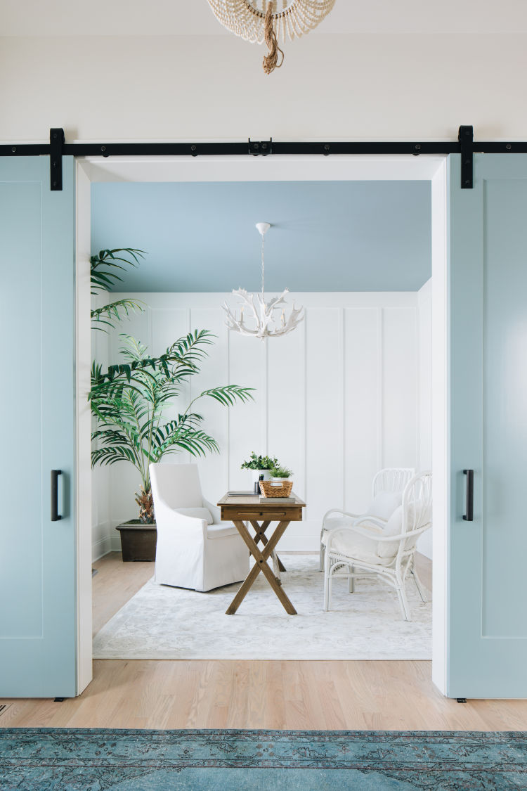
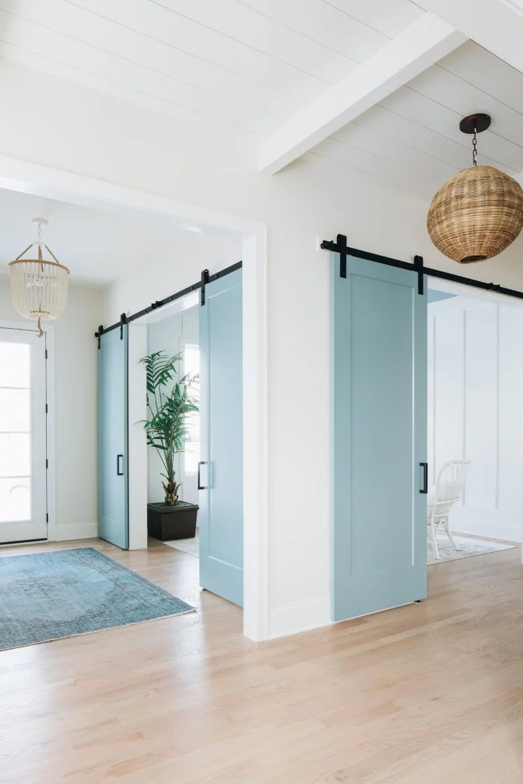
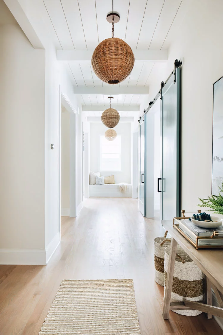
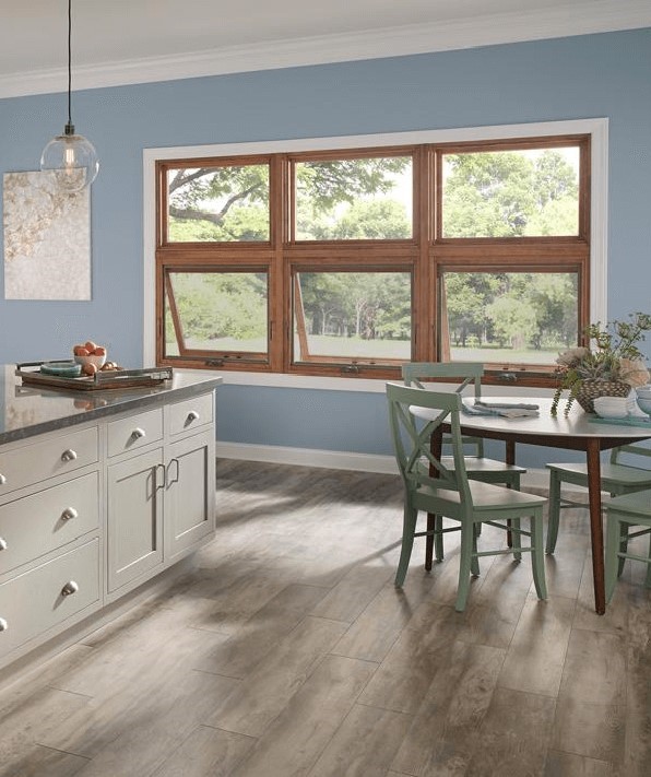
Coastal perfection
It seems like Peaceful Blue is meant to be integrated into a Coastal-style interior. Such fresh and perfectly resembling the ocean breeze that it could not have fit any other style better. We suggest a modern approach by considering large amounts of white paint and a few splashes of Peaceful Blue accompanied by nature-inspired materials. Use this color to paint the ceiling, a large door, an accent wall, even the chairs or the open shelves in the kitchen. Even a small splash of this shade can add the right amount of peace and serenity a contemporary setting would benefit from.
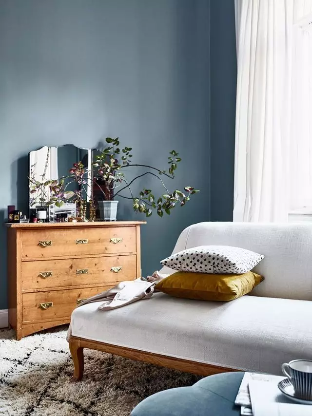
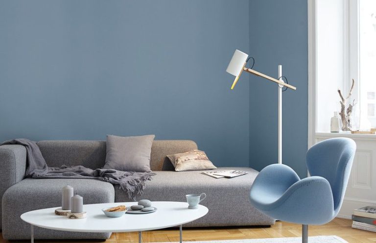
Living room
Use Peaceful Blue to the fullest and paint the walls entirely in this shade. Add a few wood elements, be it dark or light wood. Don’t forget about a few splashes of greenery, and your contemporary living with a feel of uniqueness is ready. Such a background is soothing enough to emphasize particular textures and bold enough to add individuality. It seems that this shade is all about balance, which leads to harmony, and undoubtedly, to peace.
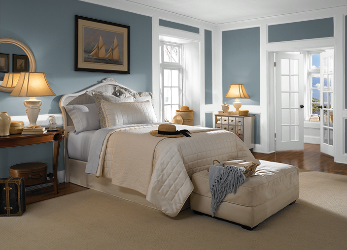
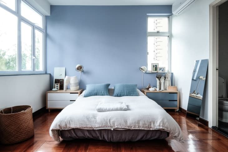
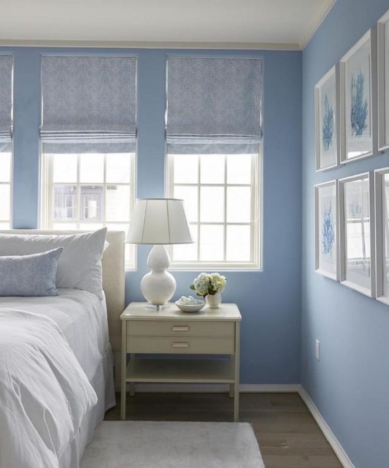
Bedroom
Peace is undoubtedly a feature you would want to be part of your bedroom. Luckily, Peaceful Blue is full of peace and ready to share it with you. Don’t limit yourself in this sense, and opt for an entire makeover by painting the walls in this shade. Dark wood or white shades for the furniture, a few vintage units, a luxurious chandelier, and your bedroom will radiate the royal finesse. In a room decorated this way, you feel at peace with your thoughts, although surrounded by limitless elegance. This is one way to apply Peaceful Blue in the bedroom. One should note that this shade would go with any other style as long as the contrasts are balanced, and Peaceful Blue can also serve as an accent.
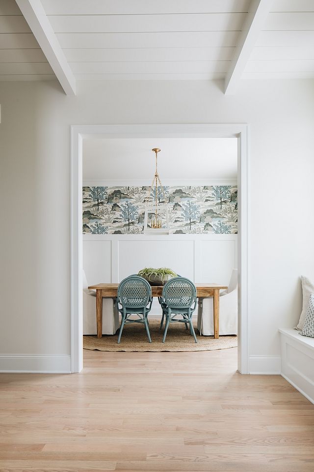
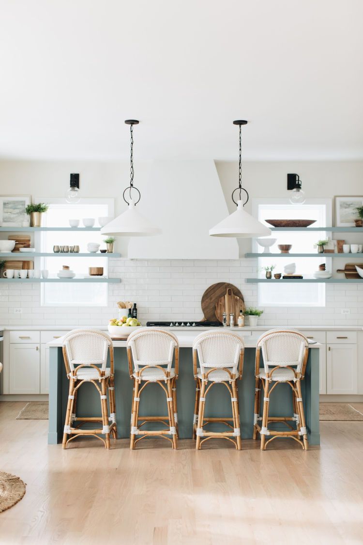
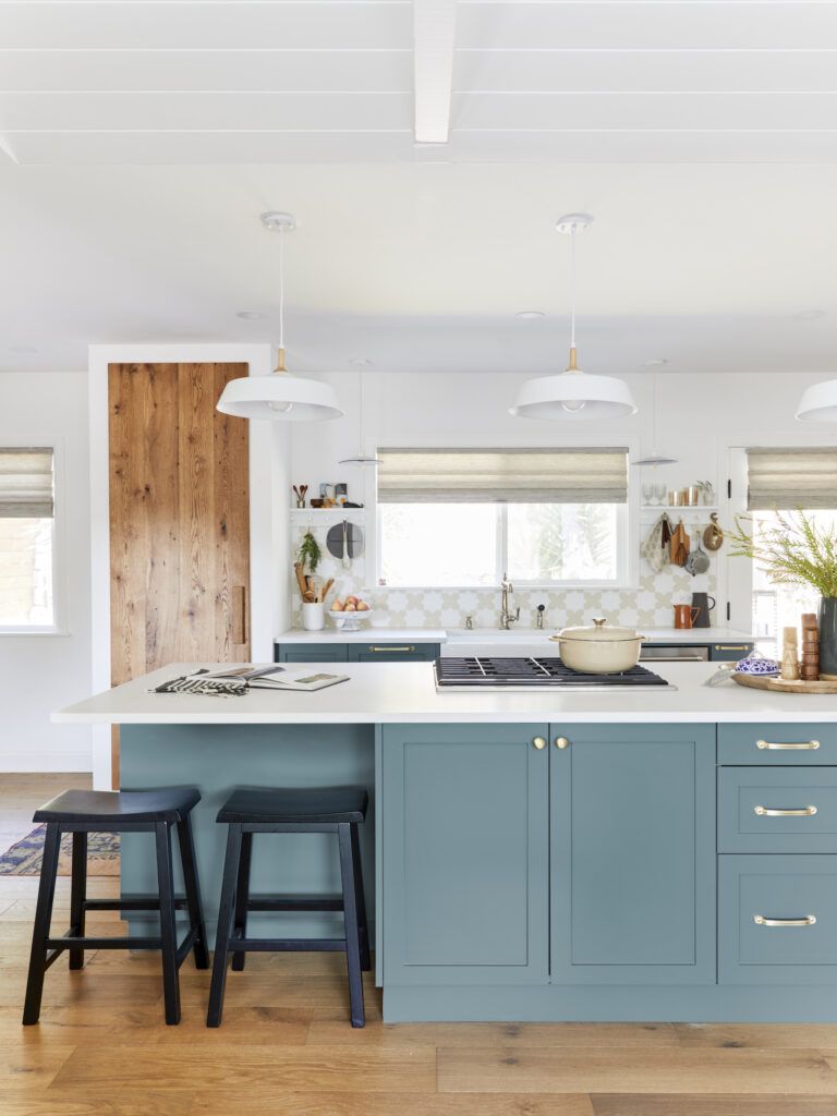
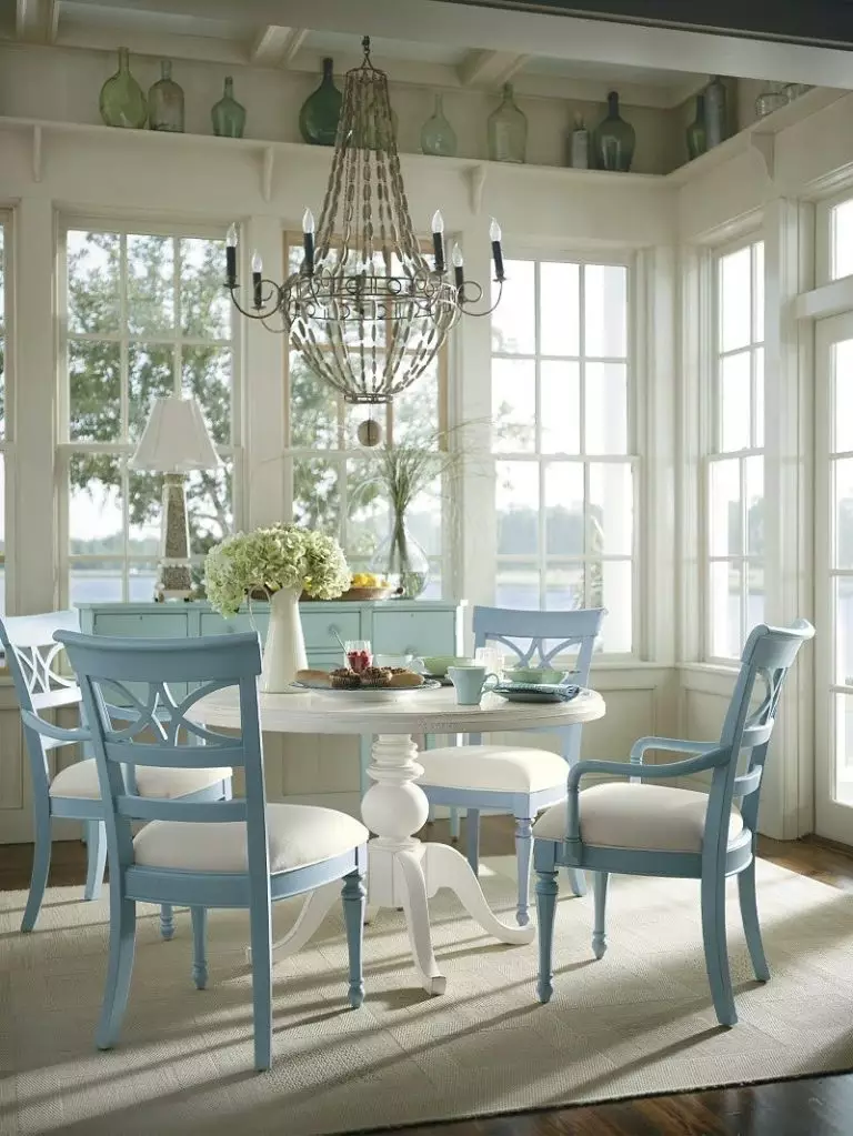
Kitchen and dining room
Embrace tradition or stick to contemporary functionality and decorate your kitchen in the most outstanding way by using Peaceful Blue. Start with the walls and accompany them with clean white cabinets. Are you ready to go bolder? Consider this beautiful shade for the cabinets and pair them with white and wood textures. It is not too eye-catching but definitely a color worth giving a try for an exquisite statement.
It gets more interesting as we reach the dining room. Besides painting the wall in this shade, we suggest you paint the chairs and accompany them with a round white table and a flamboyant chandelier above – there are no other words to describe this better than “piece of art”.
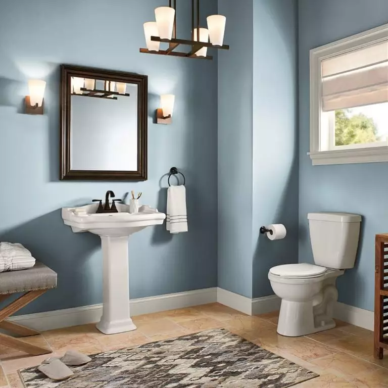
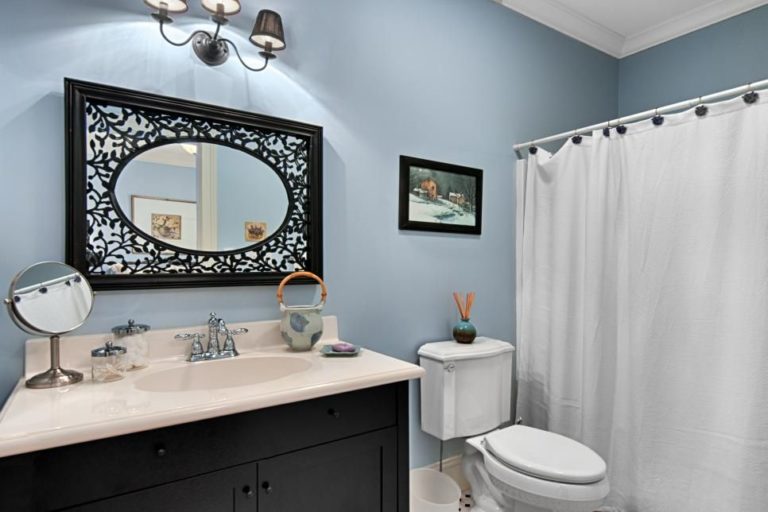
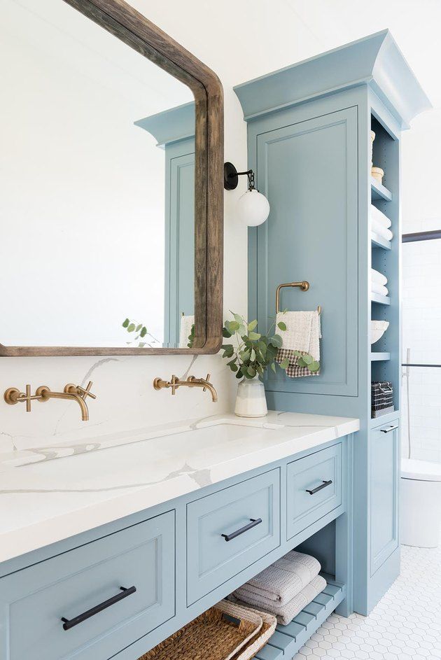
Bathroom
Like any other shade of this kind, Peaceful Blue fits perfectly a space defined by water. Nevertheless, this shade has a bit more to offer. Use it to paint the walls or the cabinets, combine it with wood and white paint, and you will notice how your bathroom will slightly redefine itself. Besides a strong sense of calmness, this color brings elegance as well. Add a few touches of brass, and this space will be an actual reflection of luxurious flair.
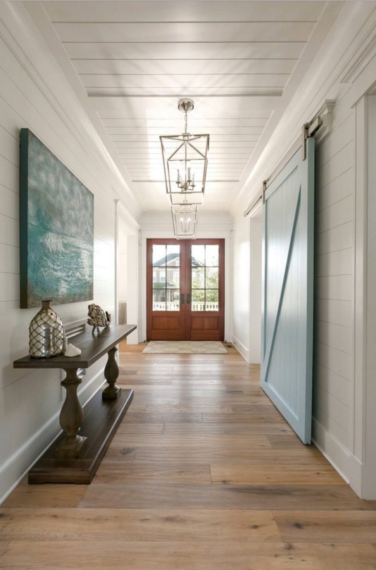
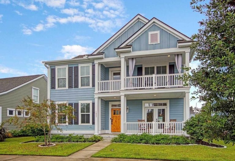
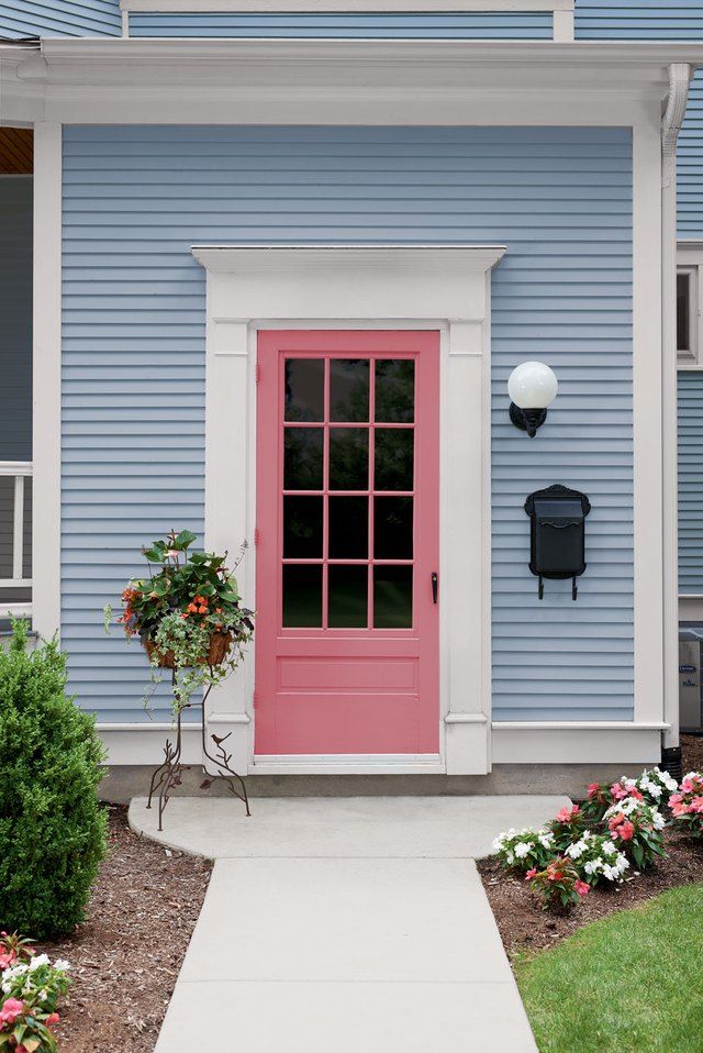
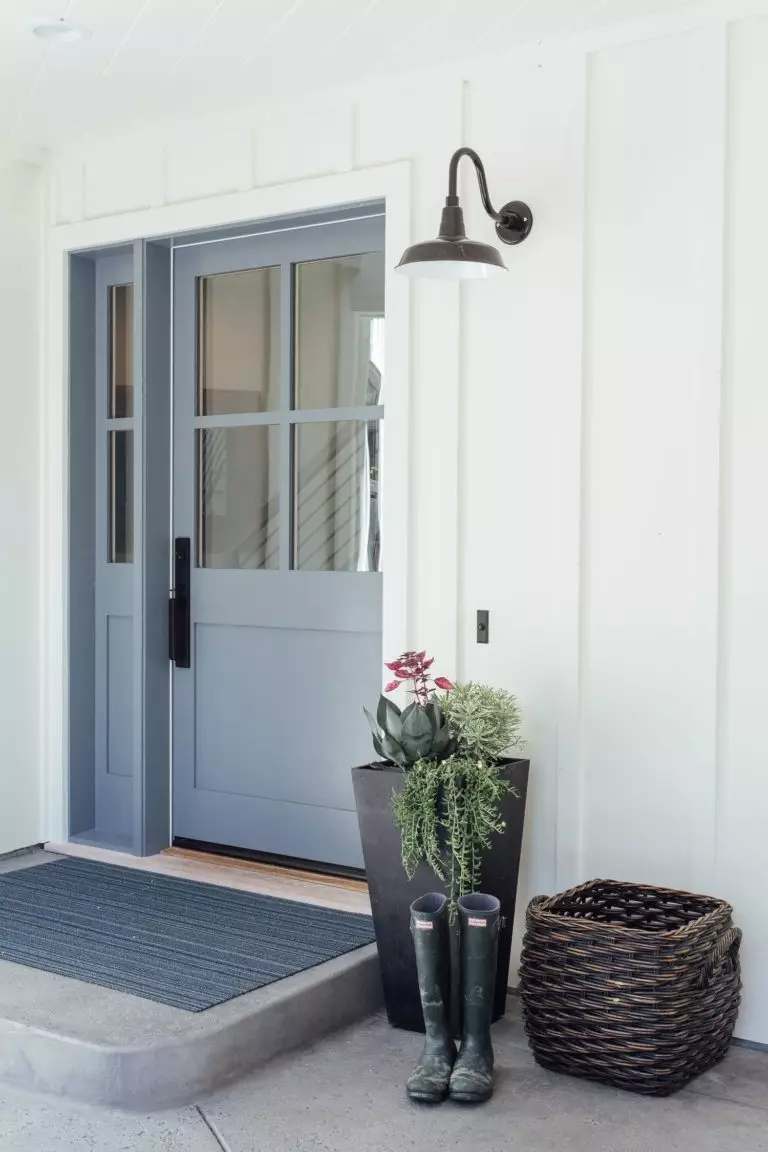
Use of Peaceful Blue for house exterior
Luckily, Peaceful Blue is one of these colors that perfectly work both for the house walls and front door. Consider contrastive companions for both cases to ensure a balanced result. Here is an idea for lovers of bold approaches: opt for a pastel pink front door on the pale blue background. This is when we discover the last feature of this interesting color: it can offer your house a rather stately look, which serves as a perfect introduction to a no less impressive interior.
The Peaceful Blue paint color from Behr is what designers had dreamt of for a long time: a rather neutral color with hidden bright undertones that serves both as a perfect background and accent; extremely versatile and impressively unique.
