Pediment SW 7634
Sherwin-WilliamsA classy bright white resembling a very light and warm greige shade with blue-violet undertones; a trendy canvas paint color for creative approaches to design.
Pediment (SW 7634): What Color Is, Review, and Use
Today, we still care about well-being in our houses and look for the best version of comfort. We are looking for paint colors that wrap up our interiors with a feel of a home where we can thrive and regenerate our emotions. Not sure if you are acquainted with it, but the timeless white paint color Pediment from the giant paint manufacturer Sherwin-Williams, a very shy and less known tone, is that sophisticated neutral that goes with everything, celebrates the comfort of being home, and not least, is currently part of the trending color selection Lore in the 2023 Colormix Forecast. How does this neutral shade manage to stand out with such intense competition from the new-design-age bright colors? Let’s do a little research!
Pediment Paint Color Features
Why Pediment? The answer is easy. In classical architecture peculiar to Ancient Greek and Latin cultures, the pediment refers to the triangular front part of the roof, usually decorated with classical architectural features. The paint color SW 7634 is associated with the color of that building part, offering the shade a unique heritage meaning.
While this paint color enters the trends as a bright white hue, some regard it as greige (gray and beige), and not without reason. What’s the secret, then? On the sample, Pediment looks indeed white. As fast as you apply it to a wall, it reveals those stately gray notes and warm beige traces. It is not such a bad outcome since greige, maybe with not such a great impact on design as the previous years, is still in trend, and its flexibility will never disappoint.
Pediment: Is It Warm or Cold?
What a tricky shade of white! So neutral on the color sample and, simultaneously, so warm when put into practice. Under warm natural light, yellow may replace the beige undertones. The coldest light temperature would not be able to deprive Pediment of its welcoming warmth.
How Does Lighting Affect Pediment?
If you have a room with northern exposure, the cold natural light will bring that touch of gray to the surface of this white shade, making it even feel somehow bluish. Be ready for a similar result in spaces with east-facing windows in the evening and west-facing windows in the morning, when the sun rays cannot directly reach the color.
A fast switch to the other side of the house, and your perception of Pediment changes entirely. The warm natural light reveals some purple-beige undertones in this shade that allure with their softness. You can witness a similar effect in a room with eastern exposure in the morning and western exposure in the afternoon when the space gets bathed in direct sunlight.
We have reached artificial lighting. It highly relies on light temperature, yet we can firmly claim that Pediment becomes a pleasant shade of muted and pale gray.
Pediment LRV
The tricky white shade has a Light Reflectance Value of 61, according to the official website of Sherwin-Williams. That is something in the middle on a scale from 0 to 100. Note that 100 stands for true white shades. We wouldn’t say our bright white from SW is very close to its color family representatives. This explains why it appears to be greige. There are more colors implied besides white. Find them as follows.
Pediment Undertones
Nothing could predict such a complex personality for a simple white shade. Yet, the versatility of this paint color under different lighting conditions shows the richness of undertones. Get ready to meet the blue undertones and delightful hints of violet, even pink, that simultaneously make this color feel rejuvenating and classy.
Similar Colors
We know it is white paint color. Still, its resemblance to greige allows us to call it this way. You won’t believe how many greige variations there are. No wonder we found plenty of paint colors similar to Pediment. Discover the color options from Sherwin-Williams and other top brands that work as alternatives to SW 7634.
Coordinating Colors
The friendly Pediment is a great companion for deeper grays, even pretty dark ones, when you put the accent on monochromatic palettes. On the other hand, rich blue-grays, blues, and greens feel like perfect contrasts. You can even give a pale and light blue shade a thought. By the way, grays can be successfully replaced by mauves. Don’t forget about an appropriate color for the trim, and cool white is excellent for the warm SW 7634. Get the exact color matches from the same brand:
Use of Pediment in the Interior
The new design age encourages the unrestricted use of beloved personal colors and favorite design techniques. That’s why Pediment, with its versatile neutrality, serves as a canvas for customized design solutions. Besides, regardless of the coordinating colors and chosen design style, this bright white from SW stands true to its classical roots while allowing you to get creative.
New-Era Rustic Design
Bringing the outdoors indoors is the designers’ favorite technique in the new season. What style is more skillful in this respect than the charming Rustic? The updated Rustic preserves the aged and organic look, bringing casualness to the color palette. This is when the warm Pediment takes the scene for a smooth transition from rough and, at some level, distressed to neutral and neat.
Consider jute, sisal, wood, wicker, and organic linen or cotton for furnishing; everything is natural. Combining the light greige from SW and organic textures can successfully result in a Coastal or Tuscan variation of the Rustic style.
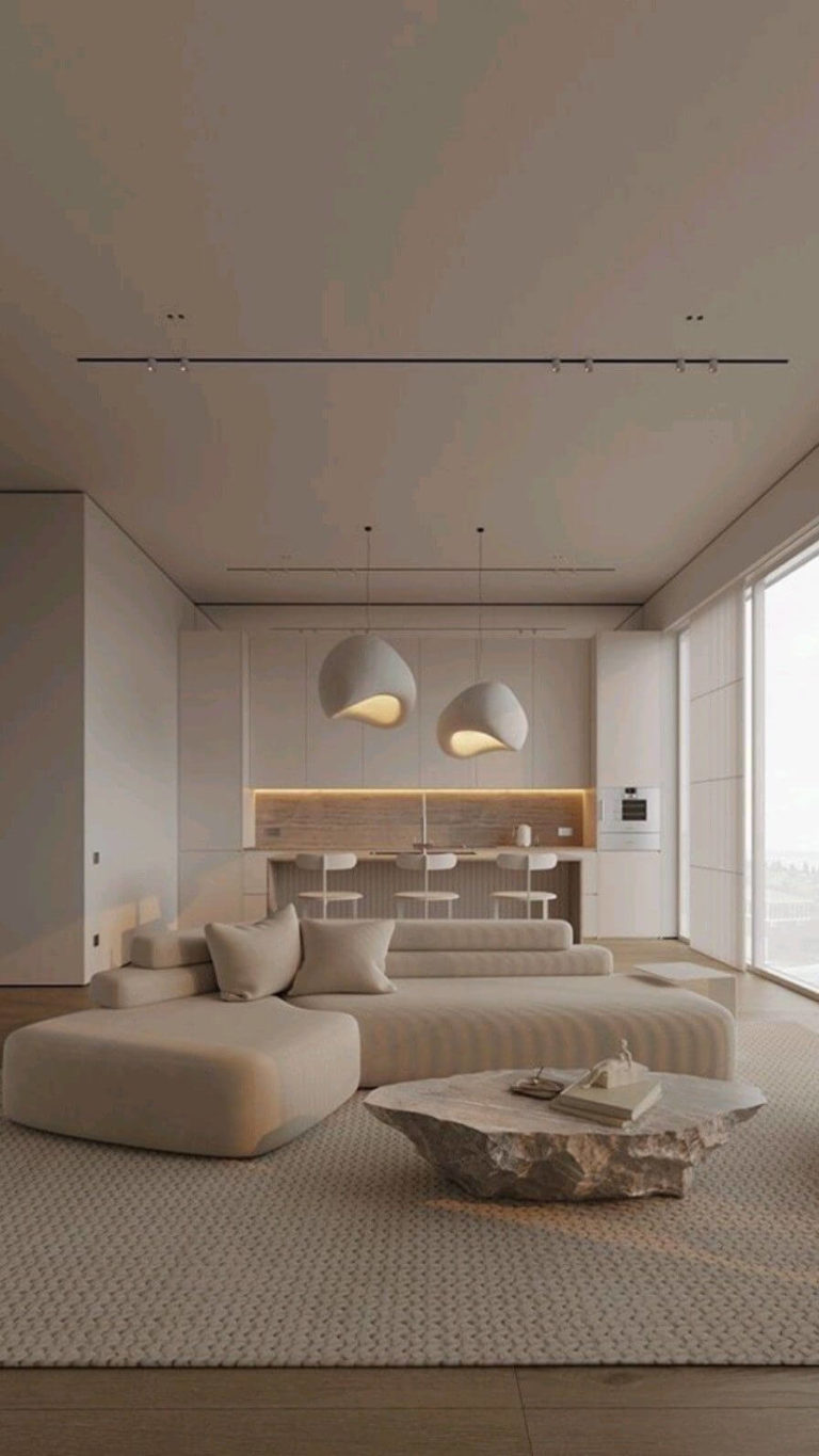
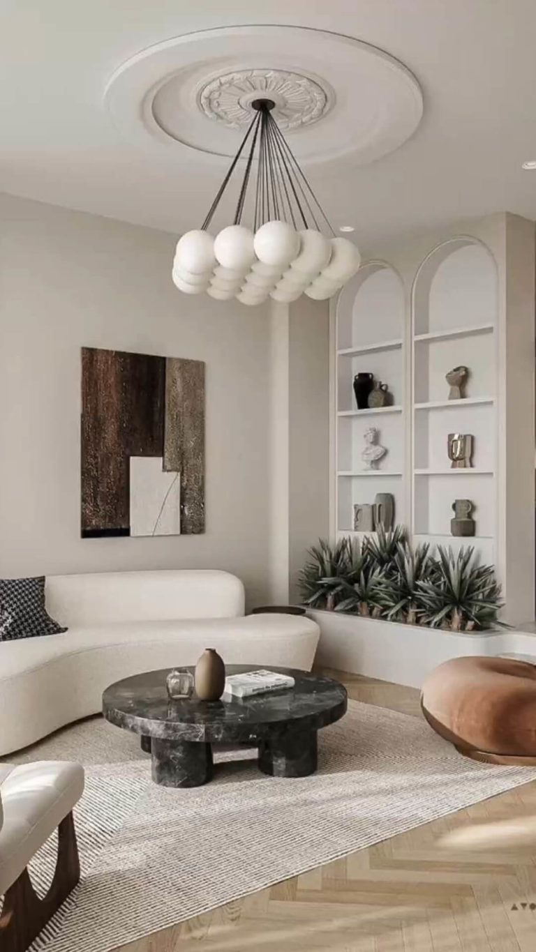
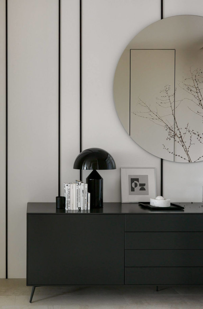
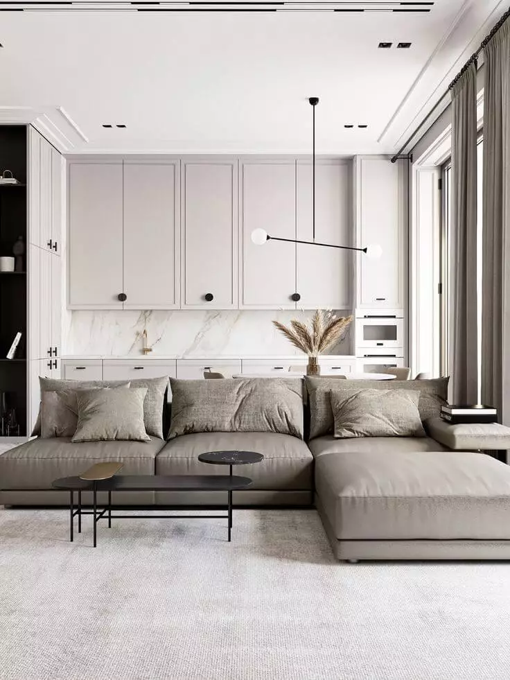
Organic White in Modern Design
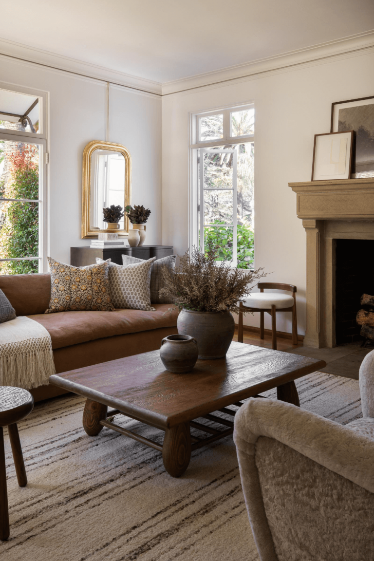
The mainstream of the season is high-ceiling and open-space interiors with a thoughtful and undisturbing color scheme, where Pediment fits as the base color. The furniture implies low-platform beds and sofas, boucle accent chairs, curved shapes, natural materials, and ergonomic styles. The accent can go as far as black or natural wood contrasts on a neutral color palette. Large centerpiece chandeliers are the absolute must, while sizable windows and lots of natural light are an undeniable feature of this type of modern bedroom, living room, kitchen, and dining room.
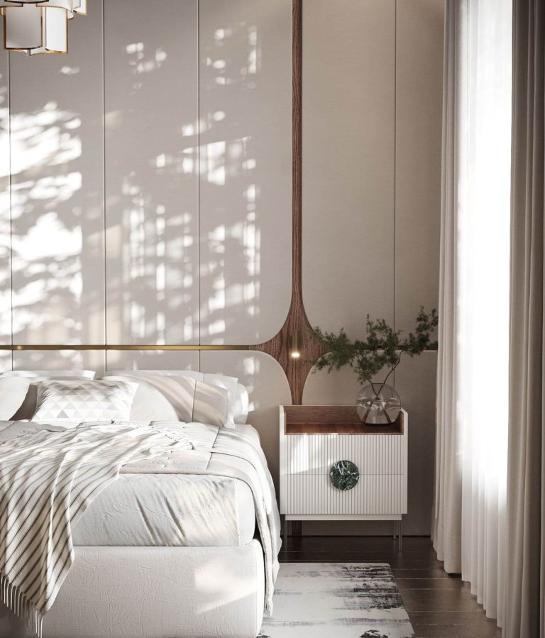
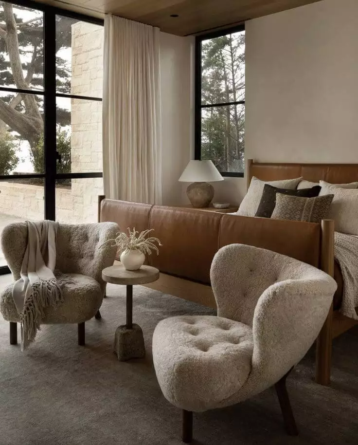
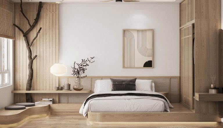
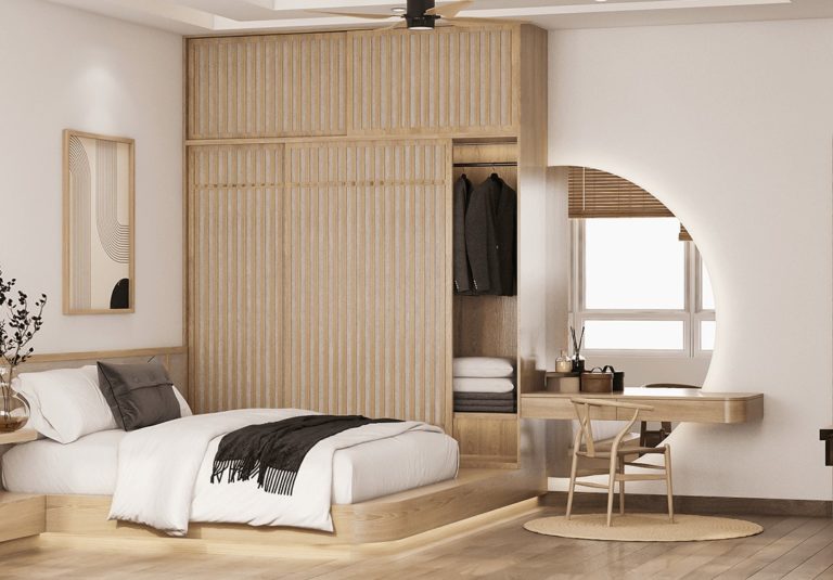
Japandi Bedroom
The minimalist design choices bring together Scandinavian functionality and Japanese aesthetics, and such a comfort-inducing and neutral shade like the warm white from SW feels more than welcome to take over the space. A bedroom designed in the Japandi style will inspire you at every glance and provide you with the sought-after feel of personal space. Preserve the color palette neutral, use natural texture, opt for modern furniture with a sleek design, and decorate the room with Japanese motifs, known for their ability to shape the aesthetics.
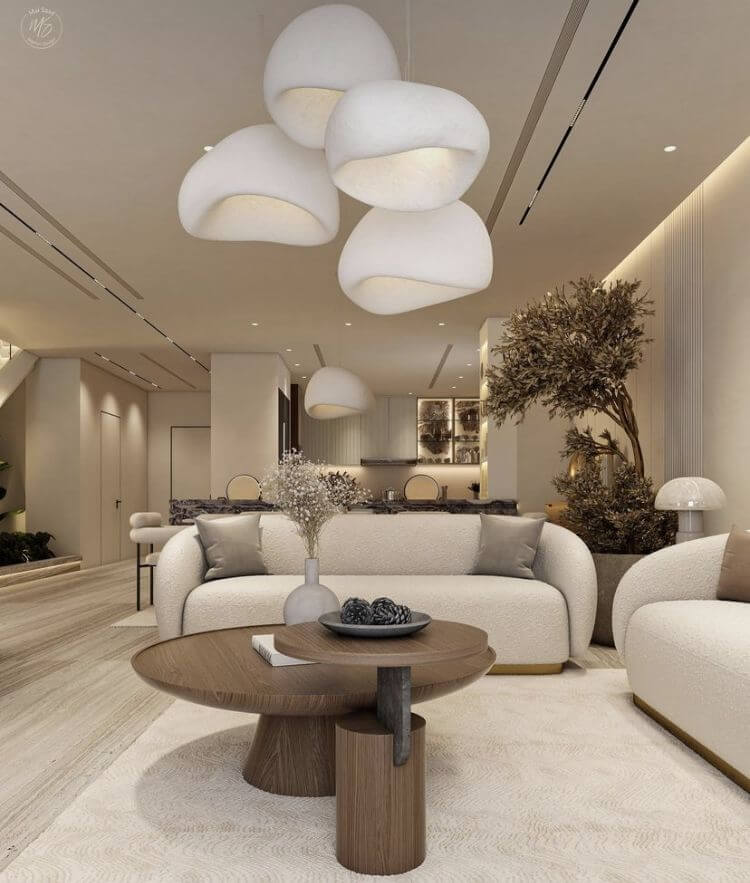
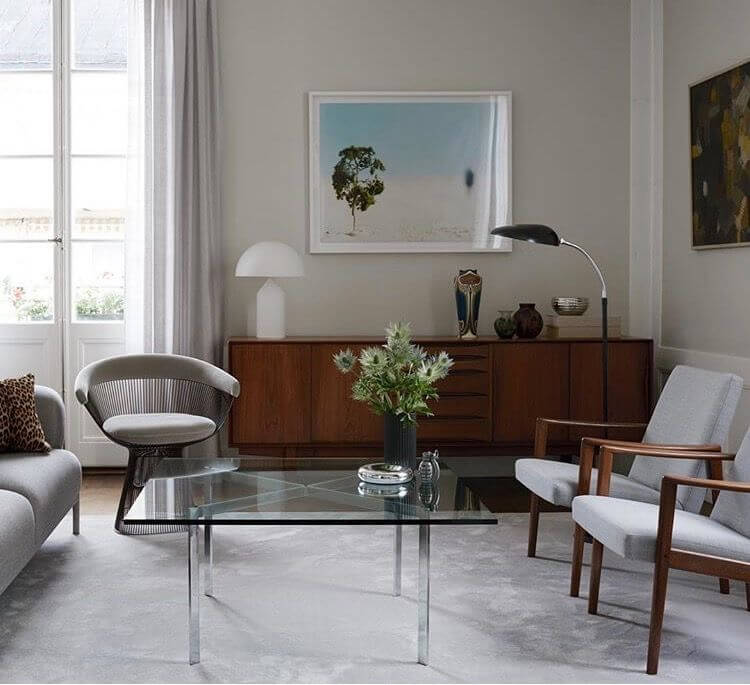
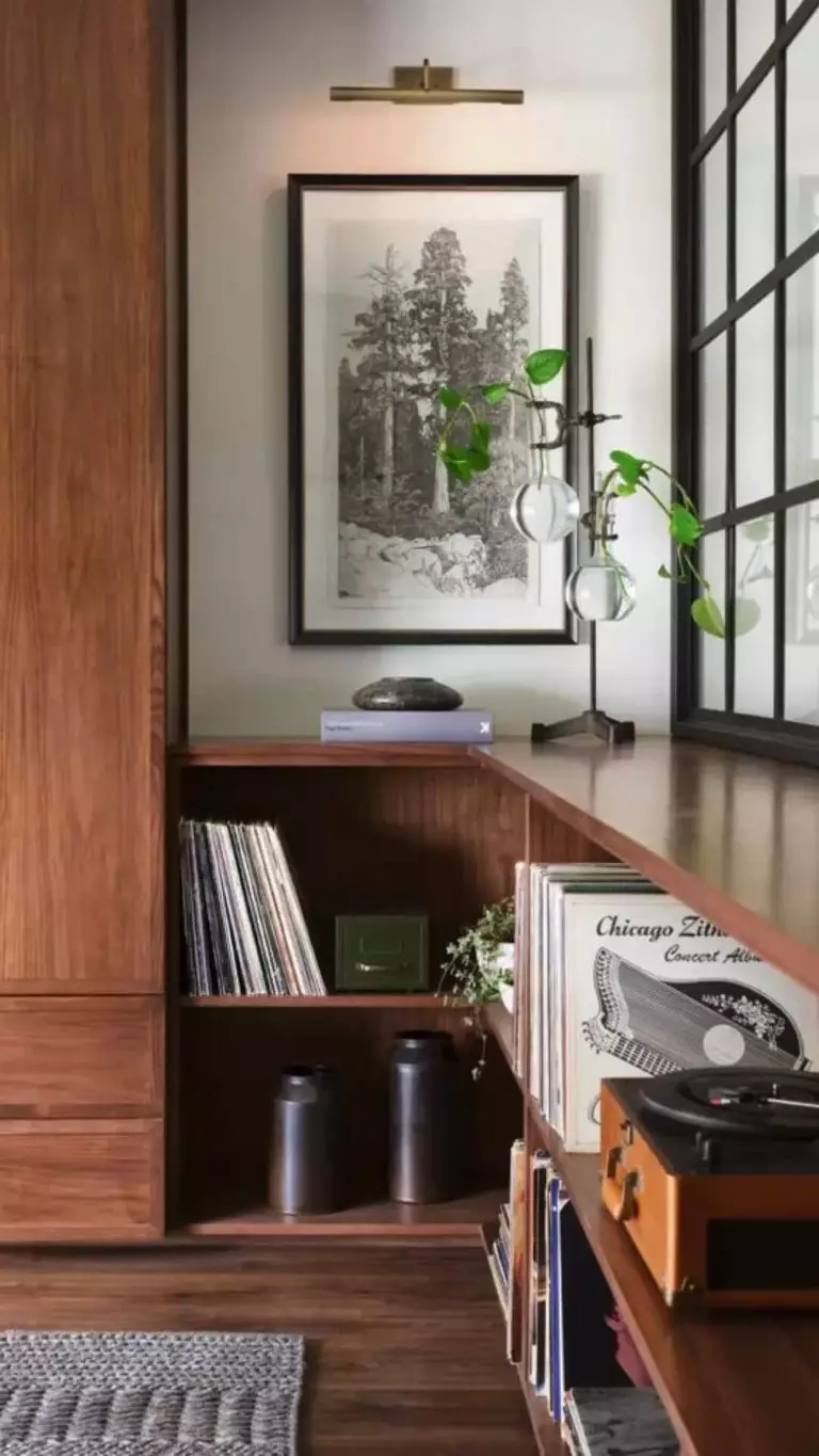
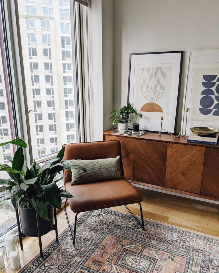
Mid-Century Modern Living Room
The popular design style from the early 1900s is one of the top designer choices in contemporary interiors. Pediment is definitely a base paint color for walls, while complimentary muted tones, sleek lines, well-defined forms, and naturally textured surfaces complete the design concept. Besides the suitability within the style, the delicate shade of white from SW is perfect for spaces where you gather with your family due to its irresistible engaging abilities.
Bear in mind the exclusive impact on the aesthetics of the renowned Mid-Century Modern wood side tables, particularly when decorated with the expert choice mushroom table lamps.
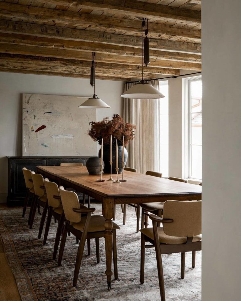
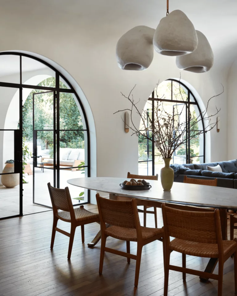
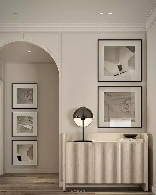
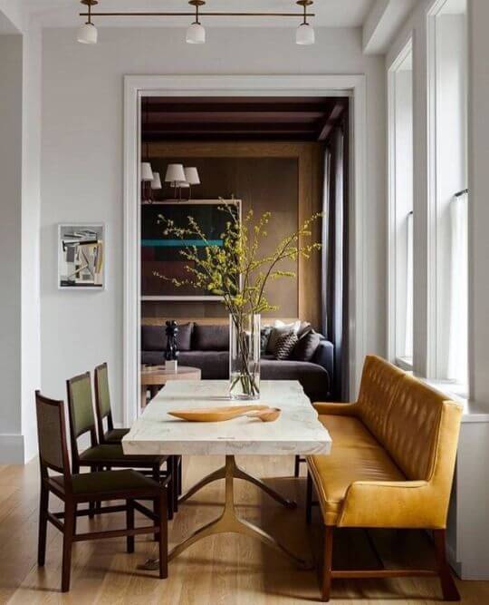
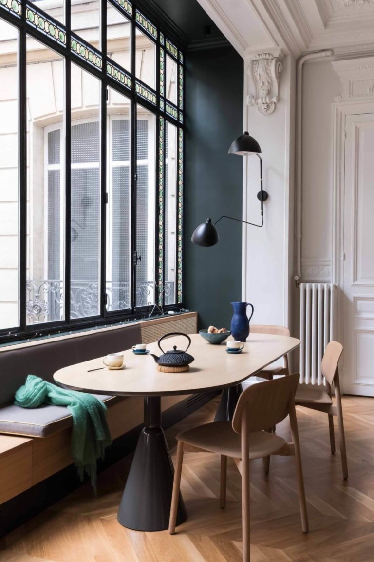
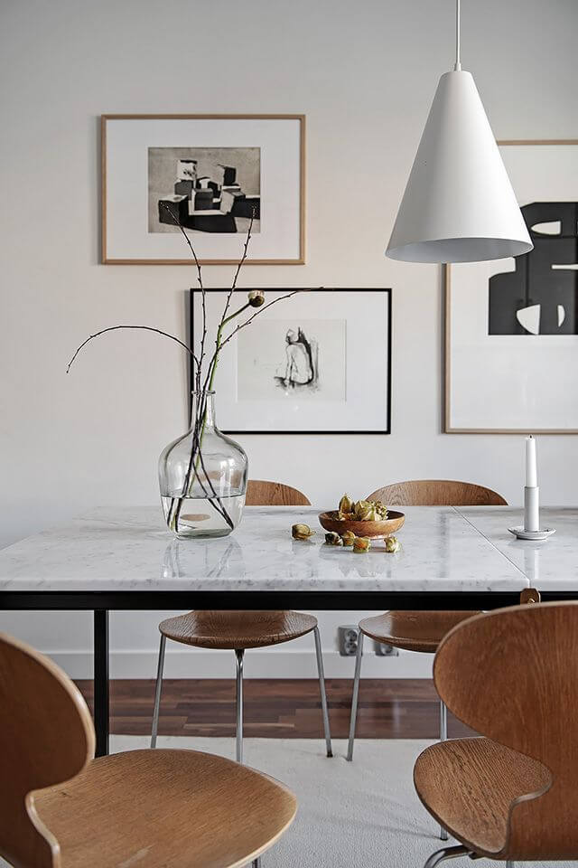
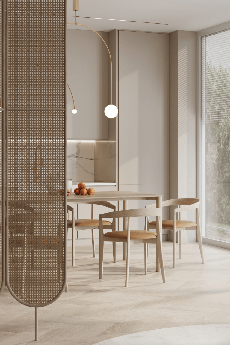
Stately Dining Room
The dining area is not just a space for taking your meal. You can enhance your interior’s appeal by paying as much attention to this zone in the house as to other rooms, such as the living or bedroom. Although neutral, Pediment may become pretty entertaining if paired with the right accents. As usual, the white paint color from SW goes for the walls, while natural wood, black accents, or bright-upholstered furniture offer shape and color to the neutral canvas.
The designers’ favorite is a quality imitation of a Parisian apartment with classical wall molding. No need to ask why. The origin of the paint color’s name explains why the light greige shade likes the classical architectural features so much.
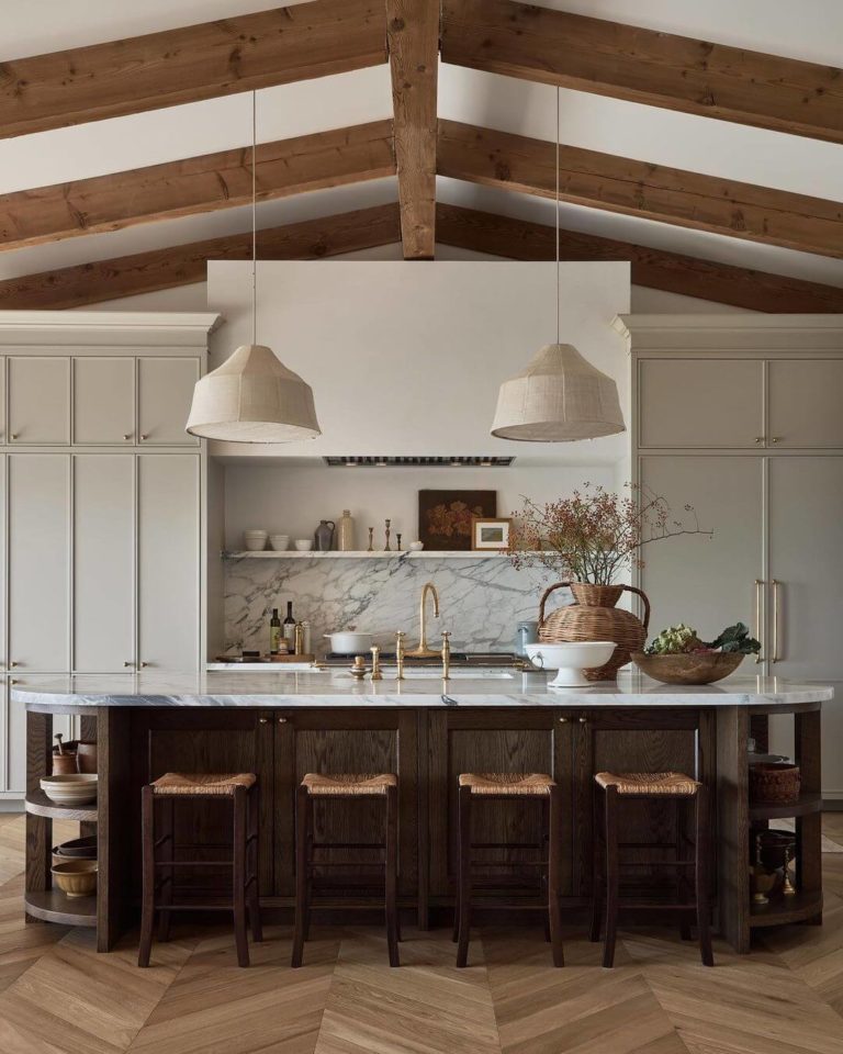
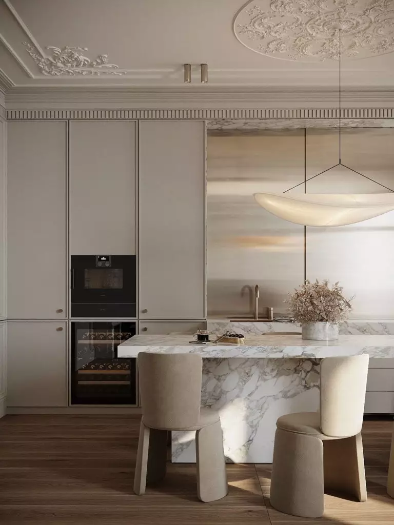
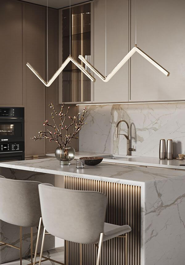
State-of-the-Art White Kitchen
For the past few years, kitchens have seen many changes in design, relying more on sleek lines and creative color palettes. One of the emerging styles is the undisputable minimalist kitchen with decluttered horizontal surfaces, sizable features, and an open-floor system. White rules in this regard, and professionals recommend replacing classy white shades devoid of undertones with something more authentic. Well, a white paint color that seems greige, having additional blue and purple notes, is pretty complex and exciting.
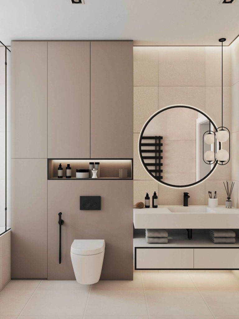
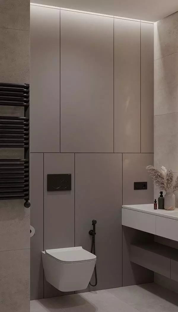
Pure and Clean Bathroom
While other trendy colors imply luxury decoration when applied to the bathroom, despite being a perfect background for any accents, Pediment stays true to its calm nature. If you have dreamt of a warm and formal ambiance in your bathroom, pick SW 7634 as a base color. Since this space usually has no access to natural light, the color shows more intensity and adds interest to a seemingly only functional room.
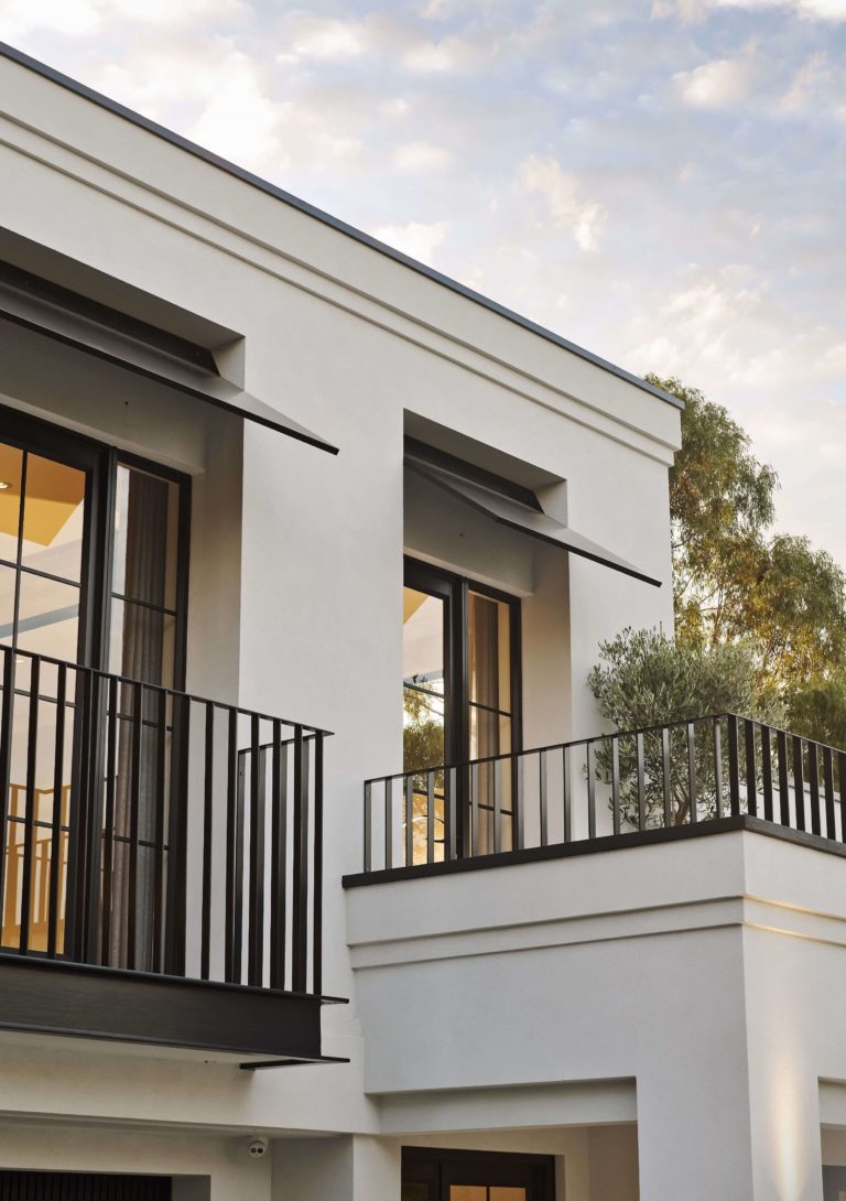
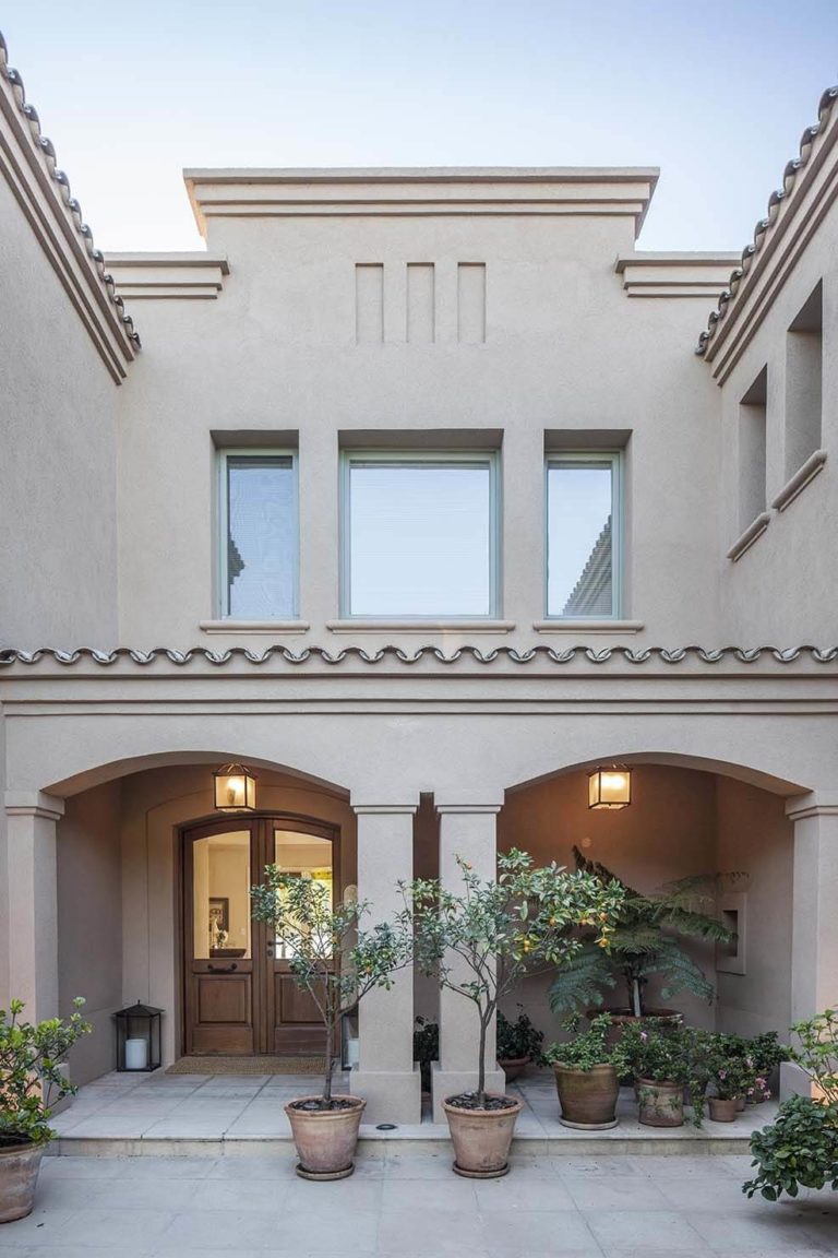
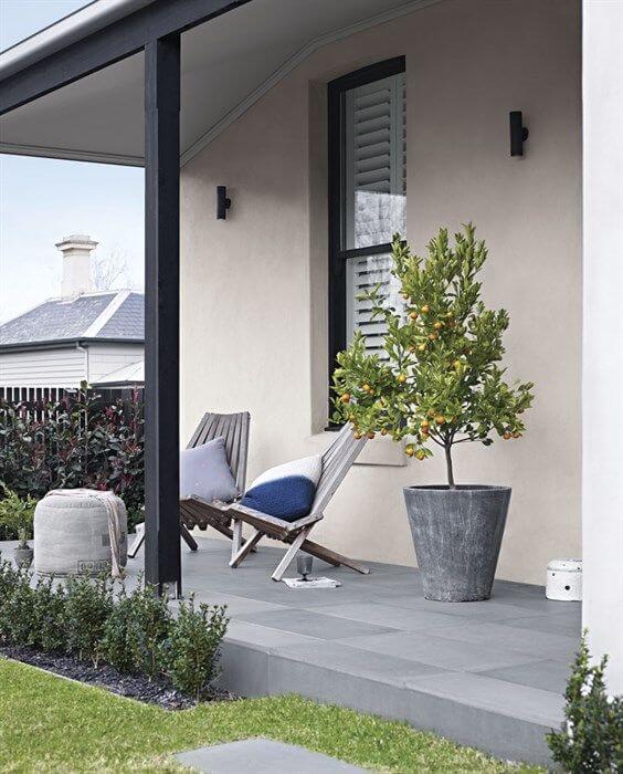
Use of Pediment for the Exterior
Designers have separated into two categories: those who encourage using Pediment for the exterior house walls and those who don’t like this paint color for the exterior, despite its success in the interior. They claim that the visible violet undertone that turns into pink under warm natural light is not such a desirable result. At the end of the day, you are the one to decide since it is mostly a matter of taste.
Consider that the location, weather conditions, and natural light temperature influence a lot the way Pediment reveals on the exterior walls.
The Pediment SW 7634 paint color by Sherwin-Williams is an emerging neutral white that behaves like a greige chameleon color. Get inspiration from the classic and use the trendy shade to develop personalized design projects. As they say, your favorite neutral canvas is at your disposal.
