A cheerful lavender-scented purple; one of the trendiest paint colors this season and a competitive lilac tone for exclusive and standard design projects inside and out.
Perplexed (Dulux): What Color Is, Review, and Use
Purple is making a grand comeback in the new design era we are firmly entering right now. According to the prominent trendsetter WGSN in collaboration with Coloro, Digital Lavender is the color of the year. Expect a lot of purples, especially lavender, in the new season.
We weren’t surprised to find a lavender hue at one of the most beloved brands, Dulux. In its trendy color palette, namely the Revive collection, you can witness the tender and stimulating character of Perplexed, a light purple shade with a caring, tranquil, and hopeful personality. Professionals claim it to be the “it” color of the upcoming design trends and a constant guest of new design projects. Still, why this purple, and how to apply it to your next makeover? All answers are below.
Perplexed Paint Color Features
Despite its name, Perplexed – puzzled, lack of certainty, this paint color is a well-defined mid-tone purple with more or less close interpretations. Colorists from Dulux regard it as a muted lilac. Simultaneously, we can see a soft lavender tone. The trendy purple shade stimulates creativity, adds cheerfulness, induces optimism, ensures calmness, and shows care.
The Perplexed paint color mainly associates with intuitive, compassionate, creative, and imaginative people. Taking after its source of inspiration – the lavender plant, Perplexed shares the same healing properties. Painting a room this way ensures a relaxing, meditative, and pure ambiance. Additionally, it feels impressively cheerful and contented. It all depends on how you use it in interior and exterior design.
Perplexed: Is It Warm or Cold?
A very tight competition exists between the Red and Blue concentrations in this color’s RGB value (Red, Green, Blue). However, Perplexed manages to stand out as a slightly warm paint color. No wonder we associate it with a warm spring day full of joy and new beginnings.
How Does Lighting Affect Perplexed?
Before applying it to a surface, you should always consider how a particular color reveals itself under different lighting. For instance, Perplexed shows a lighter and warmer lavender purple tone under the warm sun kisses in a south-facing room. Luckily, you can achieve the same effect in a space with east-facing windows in the morning and west-facing windows in the afternoon.
Perplexed astonishes us with a considerably more intense yet similarly cheerful purple shade if you use it in a room penetrated by cold natural light. Expect a darker lavender tone at night when the lack of natural light reduces this color’s sparkle.
Perplexed LRV
Although pretty bright, Perplexed is a medium tone with a Light Reflectance Value of 51. The golden mean, as they say. This lavender shade is intense enough to stand out and balanced enough not to overpower other colors in a space. A value of 51 stands for a color that professionally reflects light and can be easily used in a room with limited access to natural light; yet, don’t overrate this feature.
Perplexed Undertones
Perplexed is a pure lavender tone. There is not a single undertone we can stick to. Of course, you can notice warmer, cooler, lighter, or darker variations under different conditions, yet it has nothing to do with additional color fragrances. It is all due to lighting.
Similar Colors
Celebrating the popularity of purple tones, we want to draw your attention to some gorgeous violet shades, which you can easily use as alternatives to Dulux’s emerging Perplexed paint color.
Coordinating Colors
Colorists from Dulux advise pairing Perplexed with crisp whites or dark and intriguing purples as the most popular color solutions. Get the precise matches:
Use of Perplexed in Interior Design
Purple is considered a royal color. Light purples, such as Perplexed, offer a calmer luxury feel. Since this shade is slightly bright, there are plenty of design ideas it can be applied to. As designers say, sometimes a successful purple paint color is all you need to reshape your house’s interior mood. Some of the following expert-choice design ideas may draw your eye.
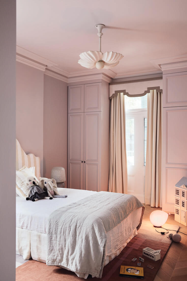
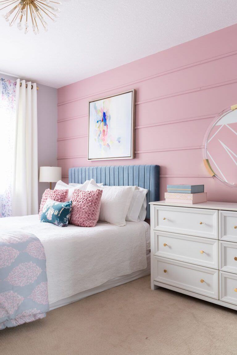
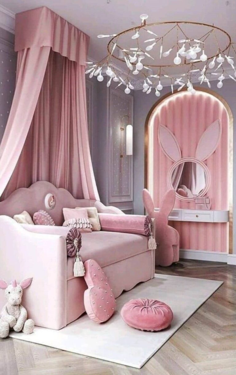
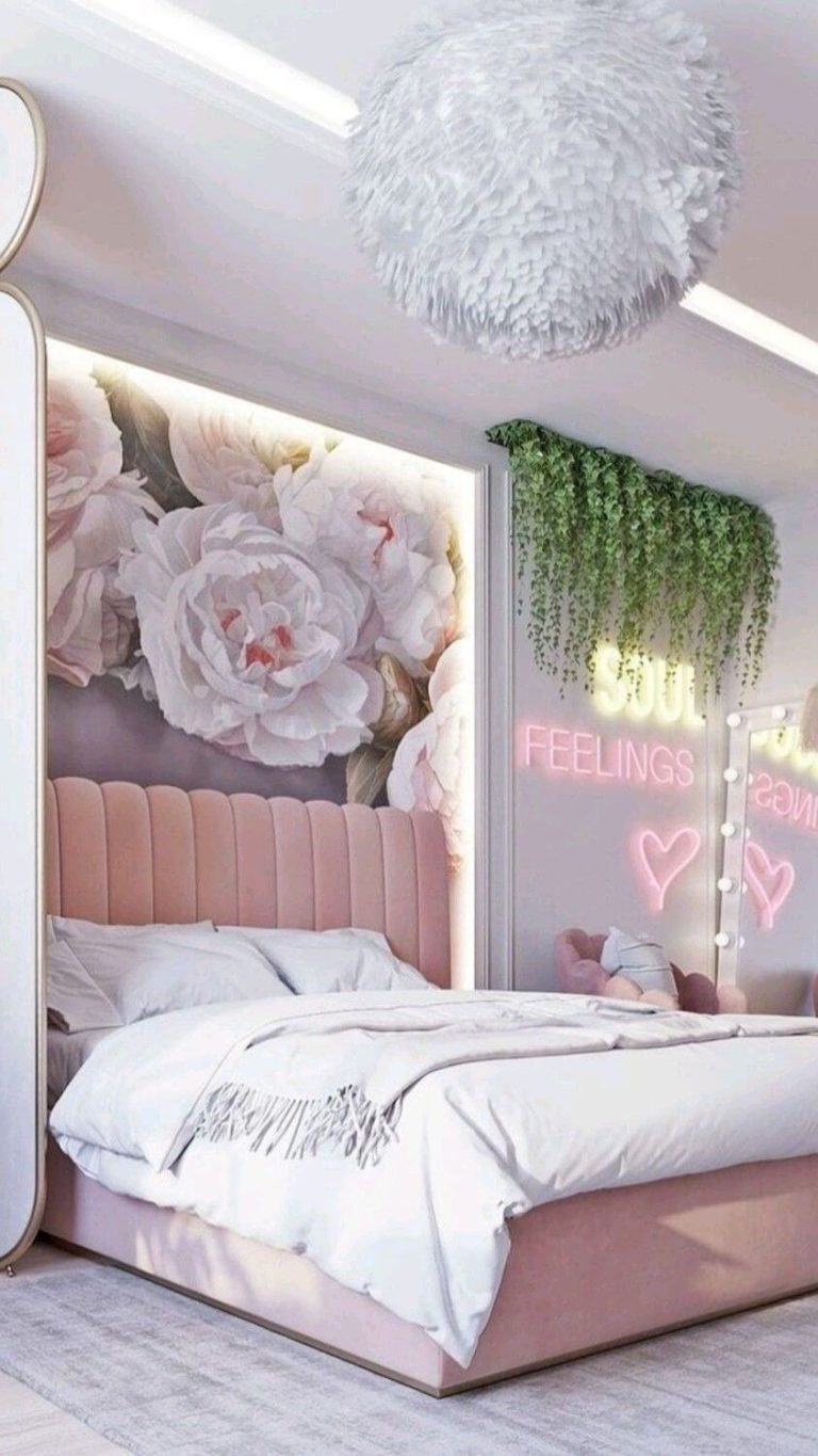
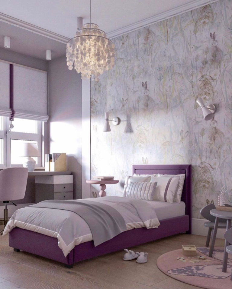
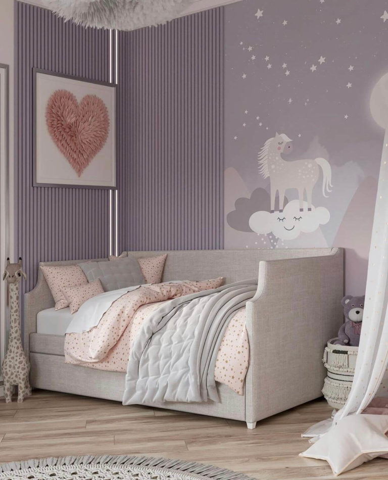
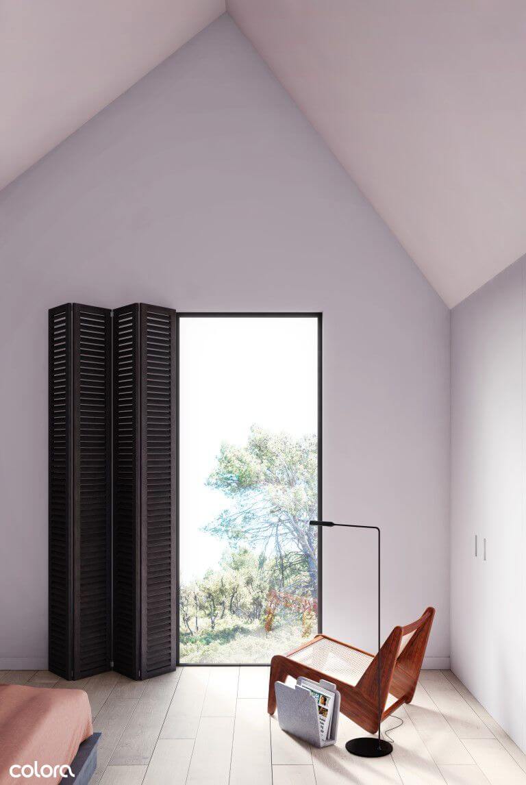
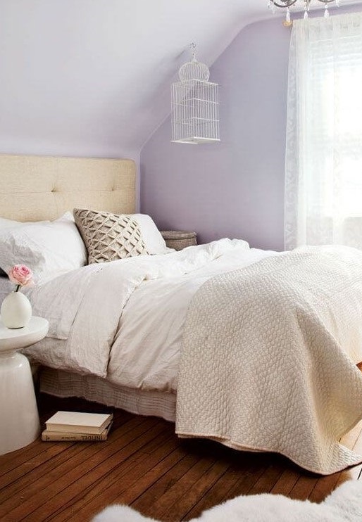
Girls Bedroom
The pastel purple Perplexed renders feminine energy and stands out as a top color choice for a girl’s bedroom. Besides being on trend, you’ll never get tired of its imposingly calm and relaxing features. Use it on walls or furniture and pair it with neutrals or close pinks to let Perplexed steal the show. It is a great color option for Princess-themed bedrooms or Modern spaces.
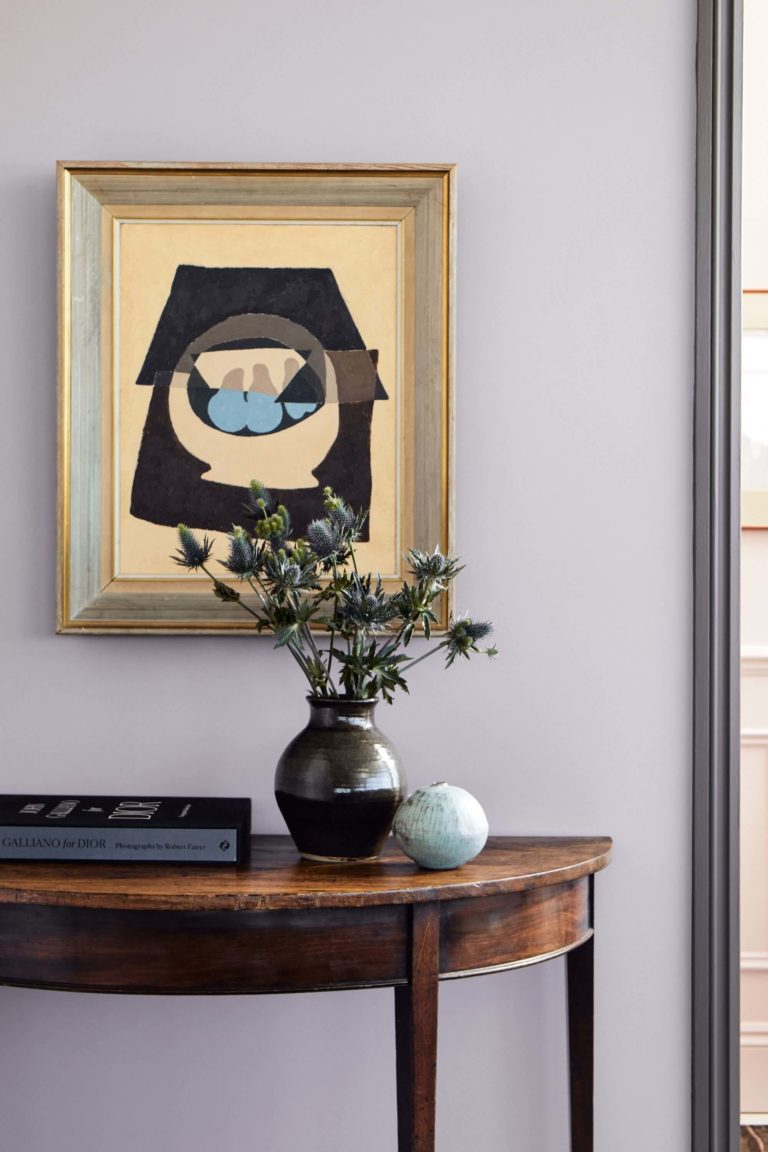
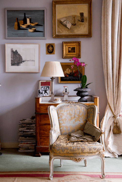
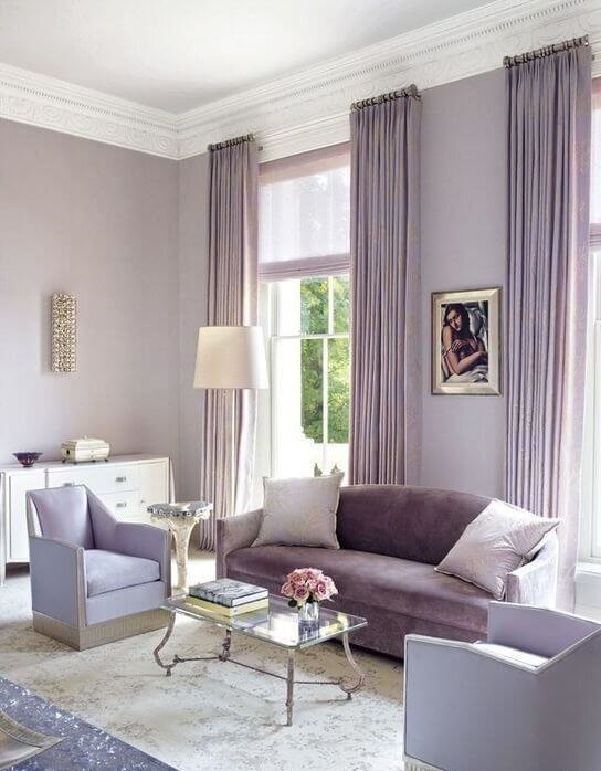
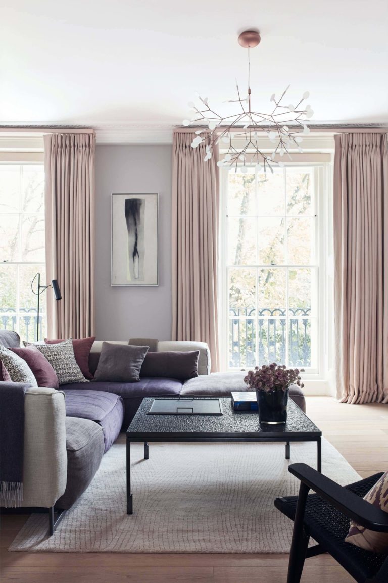
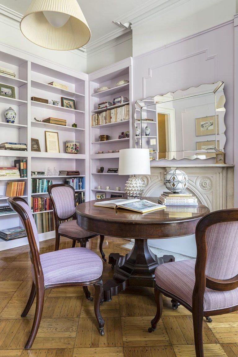
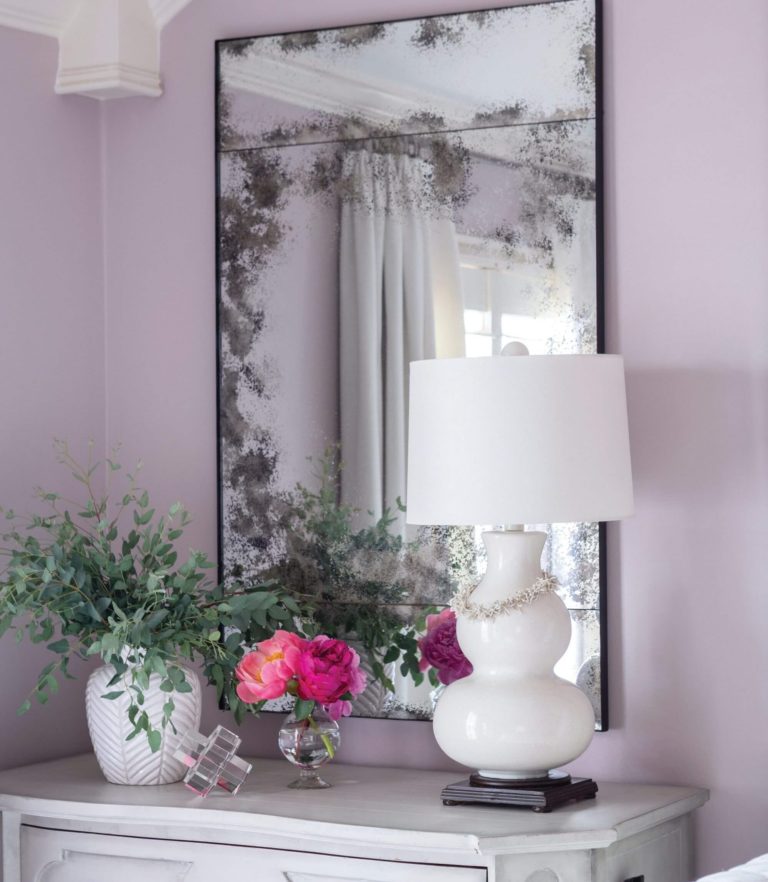
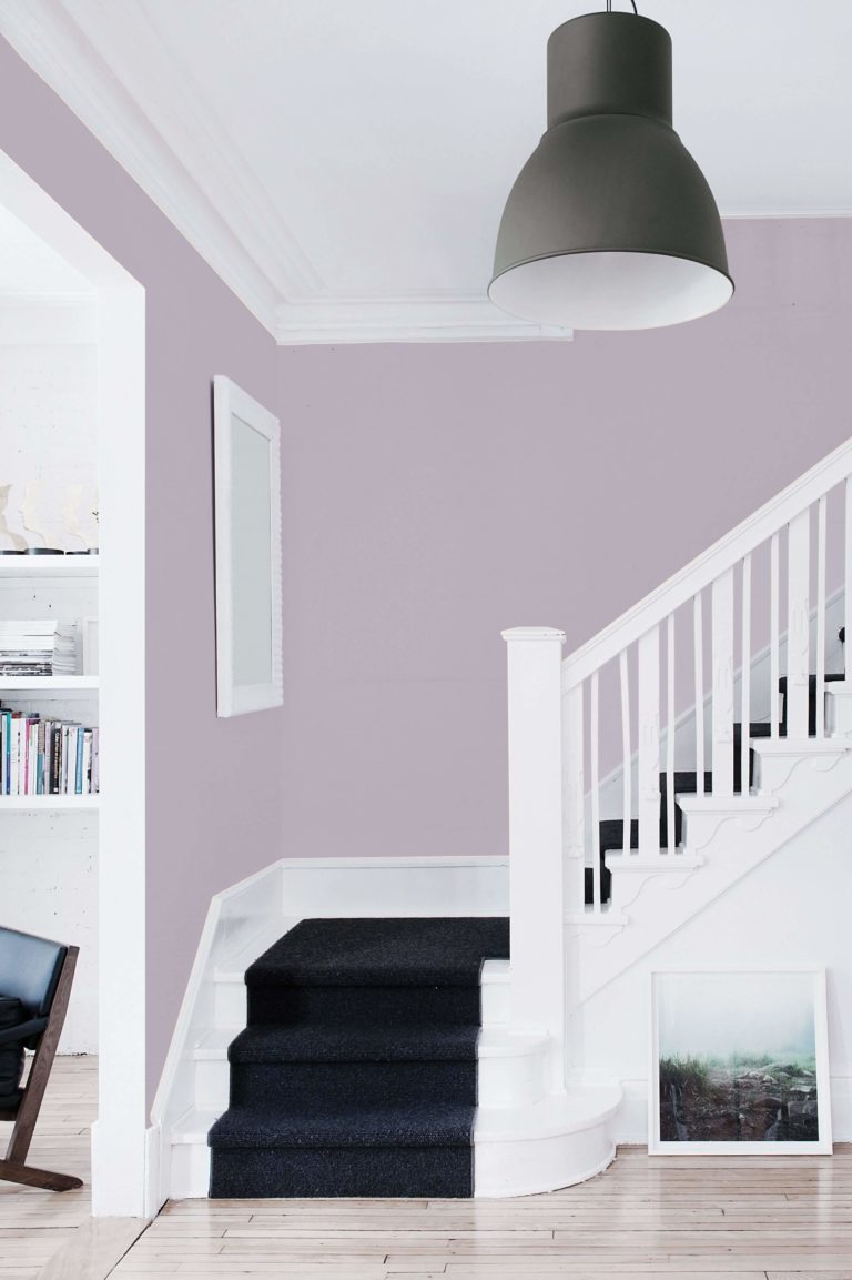
Exclusive Lilac Living Design
Purple is the new neutral. Use it instead of white, gray, and beige. Display beautiful design style accents on the lilac background in your personalized living room. You’ll always feel relaxed and energetic after spending a few minutes in a room painted this color. Additionally, think of “out-of-the-box” ideas, such as a deliciously colored family room roaring ‘80s, a Classic space with carved wood furniture sharing Vintage luxe, or a strictly monochromatic palette with Perplexed as the primary color.
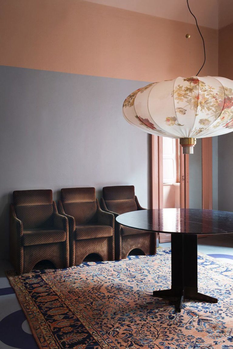
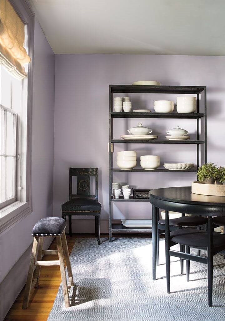
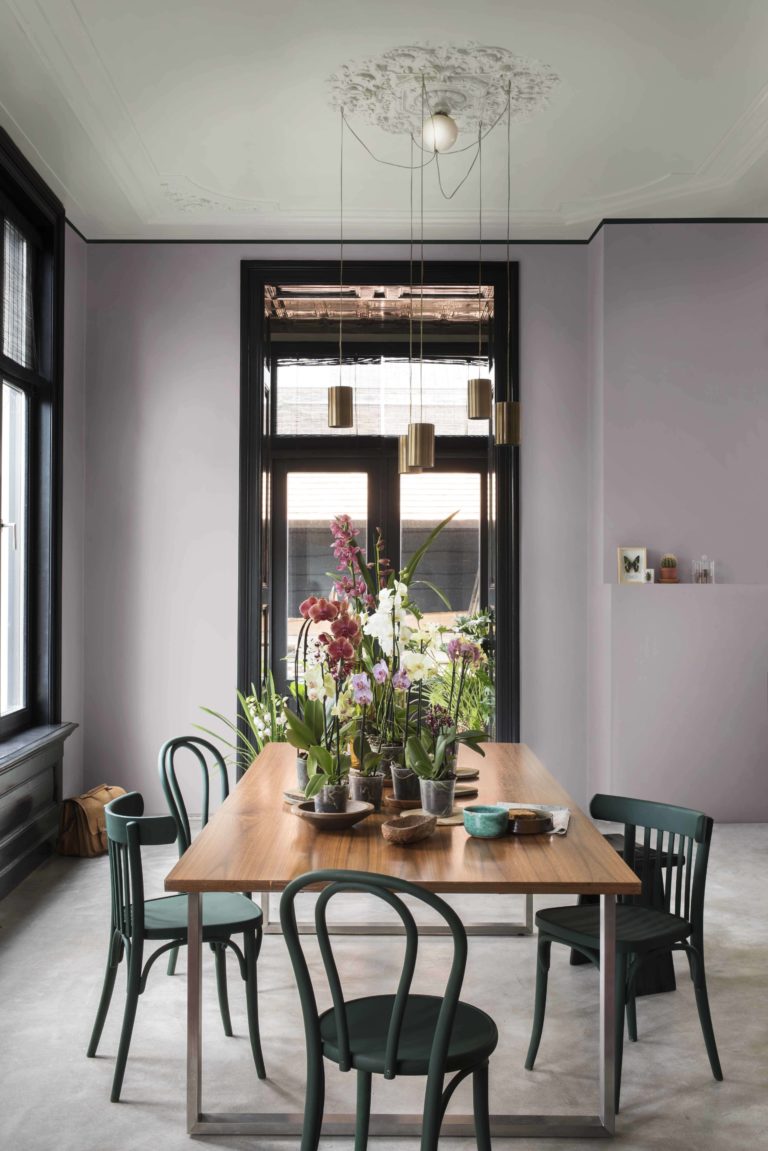
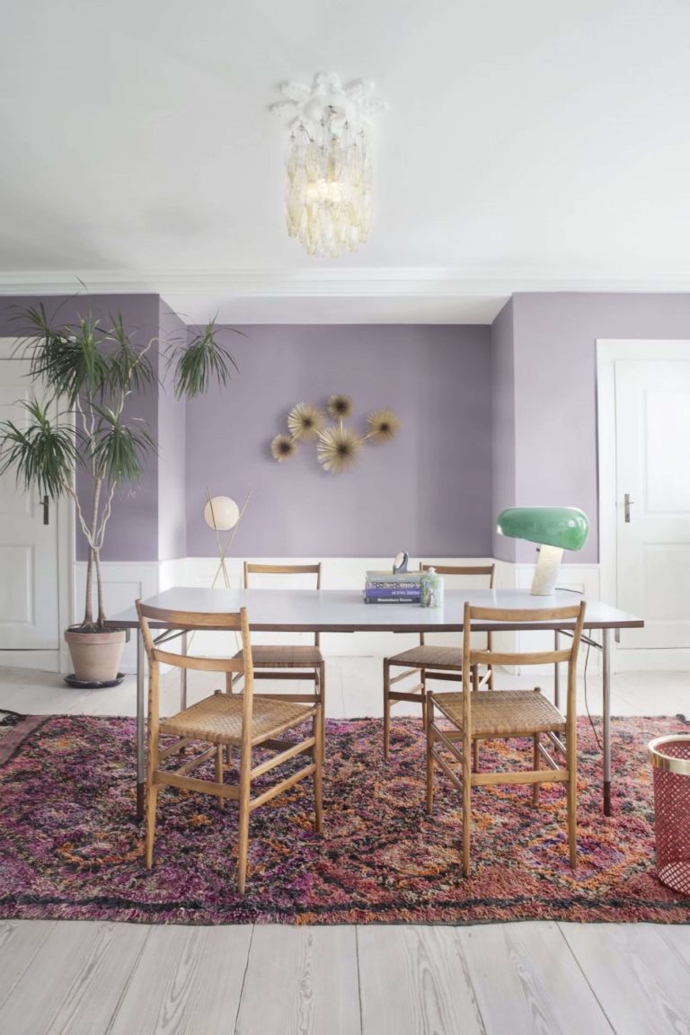
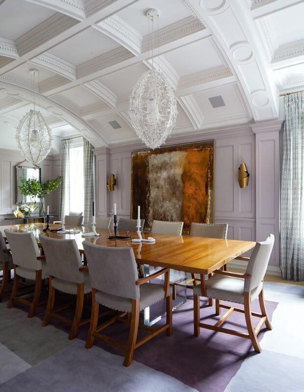
Refined Dining Room
Perplexed is one of the best colors for the dining area. Professionals strongly encourage using the lavender-dusted paint color to keep worries at bay and connect to the moment when taking your meal in the company of your family or friends. Experts state that black-painted furniture looks great on a purple background. Simultaneously, we’ve seen many projects with palace-inspired furniture paired with lilac walls.
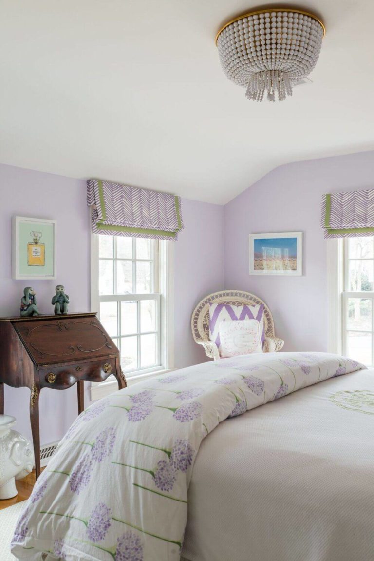
Lavender Bedroom
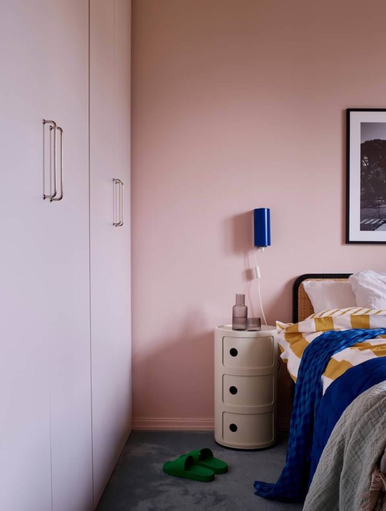
On Dulux’s website, you can find out that colorists recommend this color for the bedroom primarily. One of the reasons is its versatility. Perplexed pairs with white, black, wood, and pink mainly, creating different mood boards with each color in part. Generally, you can enjoy this luxury paint color’s freshness and inviting appeal in your sleeping space all year long.
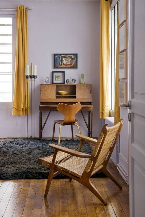
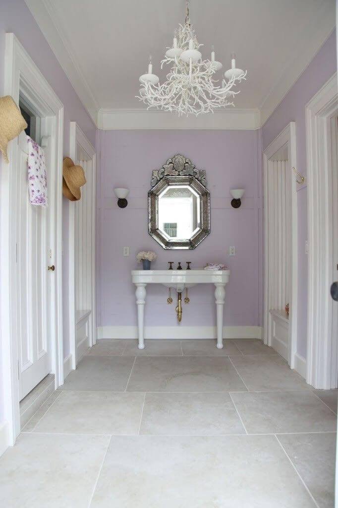
Violet Hallway
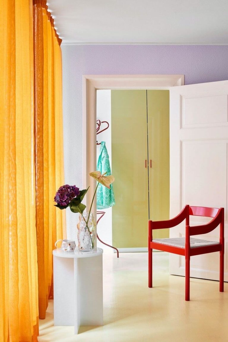
Working with the latest color trends, we came across the idea that lavender is the new top color of the season and acts like a transition from the previously trendy neutrals to currently popular bright pops of sparkling colors. It works the same in interior design, like a transition from a room to another, from a style to another, and from a color palette to another. They all point at painting the hallway in the welcoming Perplexed paint color.
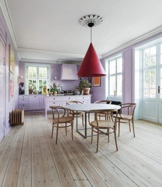
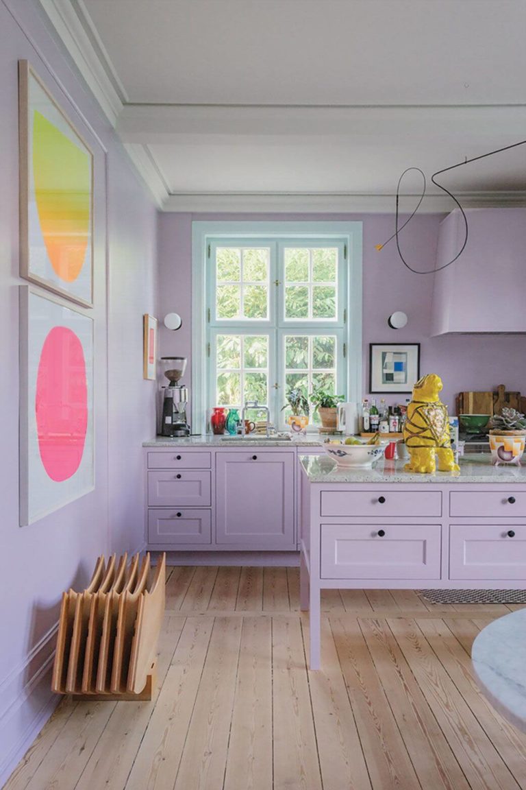
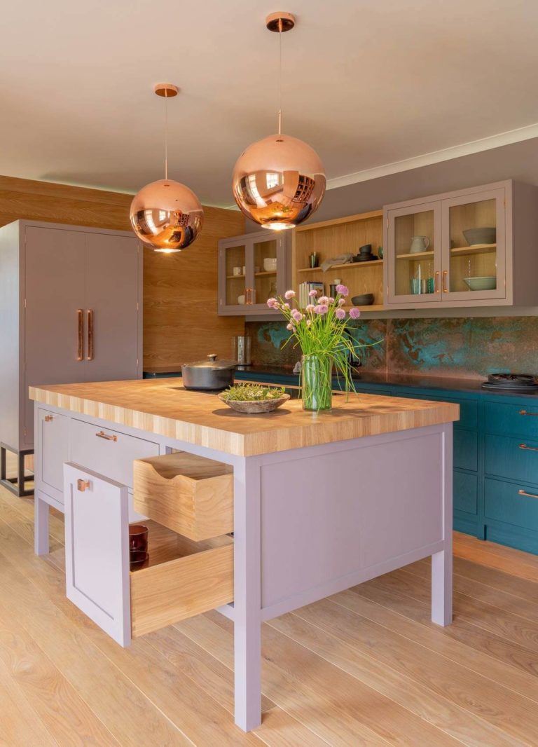
Colorful Kitchen
Try the up-to-the-minute trend with Modern Eclectic kitchens painted with revived bright colors from the second half of the last century. Enliven and give new meaning to your cooking space by decorating the cabinets or walls with Perplexed paint. You’ll instantly feel a wave of happiness and joy when entering a room painted with this color.
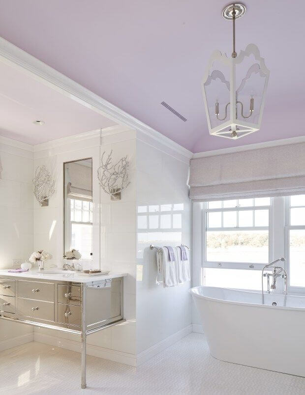
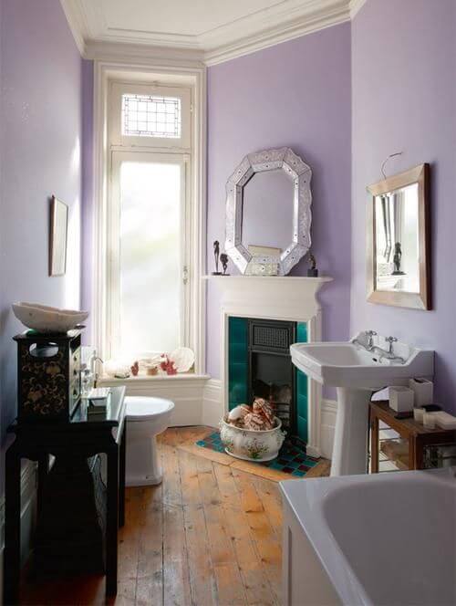
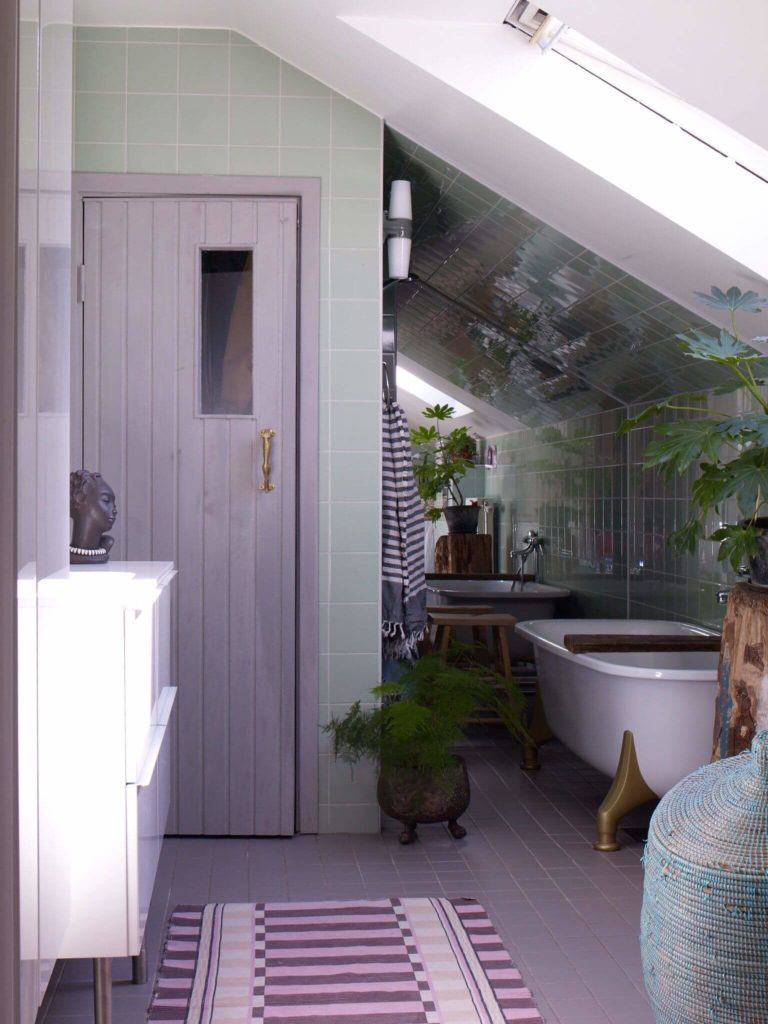
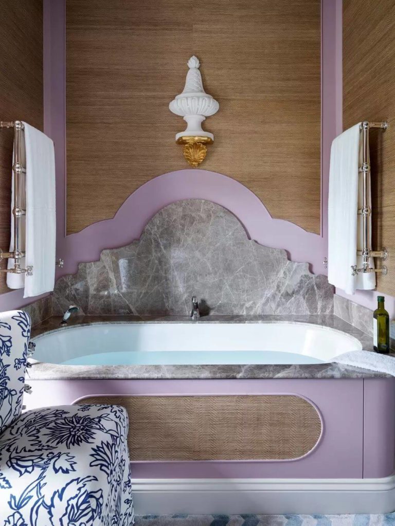
Spa Bathroom
As already stated, this lavender shade has relaxing and healing properties. Staying for long in a room painted this way enhances your mood, makes you live in the moment, and keeps your mind focused on relaxation. You can choose from various available design styles that work with Perplexed – Vintage, Modern, Eco, Maximalist, and Rustic, among the first.
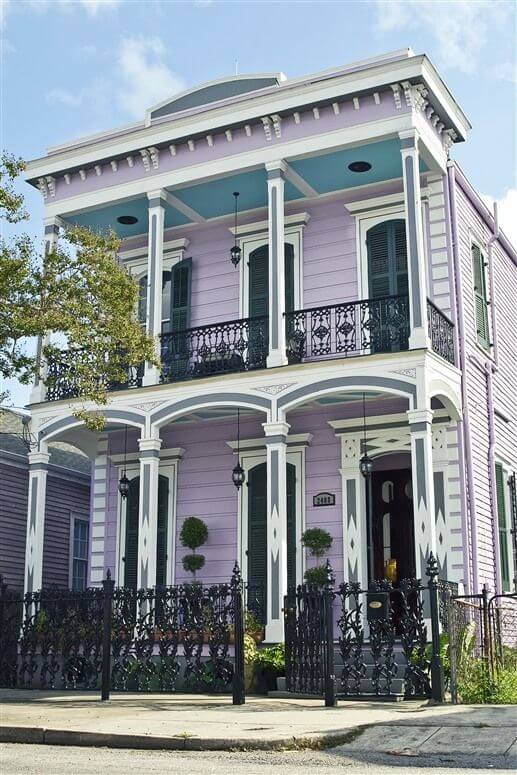
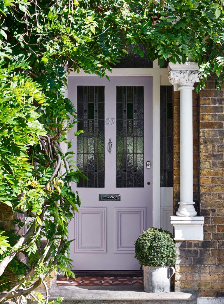
Use of Perplexed for House Exterior
We can visibly notice the move towards more colorful exterior designs. It is not about showing off but rather revealing your true colors in the most obvious way possible. Following this trend, we encourage you to paint your exterior house walls lilac with Perplexed. Get a taste of the summertime mood all year round and enjoy it to the fullest.
Decorate the violet walls with white or black trim, or consider a violet front door with brick walls. Both options are immaculate.
Dulux’s Perplexed touch of lavender fragrance is one of the trendiest colors in the new season. If you haven’t decided yet on the paint color for your next makeover, direct all your attention to this magical and incredibly flexible lilac tone.
