Pewter Green SW 6208
Sherwin-WilliamsA dark gray-green with a muted base inspired by nature itself, prevailing over paint color trends and successfully bringing the outdoors indoors.
Pewter Green (SW 6208): what color is, review, and use
Let’s go back in time with the color of the month of December in 2020 at Sherwin-Williams – Pewter Green SW 6208! When it seems that medium and light neutrals prevail over the color trends, a tiny splash of moody, even dark, green appears that feels no less neutral yet definitely goes beyond limits. And you know what? From 2020 till now, Pewter Green remains to be a go-to paint color for designers that simply cannot imagine an interior or exterior without this nature-inspired shade.
Analyzing this paint color made us run from one discovery to another, simply overwhelmed by how fascinating a shade of green can be. The range of features that make this color variation stand out is so wide that a single article would not be enough to cover it. Still, we did our best and would like to shortly but smartly reveal each finding to you.
Pewter Green paint color features
If you look at this paint color for the first time, it may seem dark gray with the slightest touch of green. Give it another look, and you will instantly perceive it as indeed dark green; we would even say pine green, diluted with a few gray drops. What’s more, this shade can even give a subtle olive-green vibe, gravitating towards the green rather than the brown side. SW 6208 has this irreplaceable sense of softness, unlike other dark paint colors.
All in all, Pewter Green is traced back to nature, where it borrows its serenity, calmness, authenticity, and timeless effect from. When applied to a space, it brings the peace one needs in the morning, the harmony one needs during the day, and the calmness one needs at night.
Pewter Green: is it warm or cold?
A dark shade penetrated by gray notes must feel rather cold, and it is partially true about Green Pewter. Still, a slight trace of yellow seems to go through it, which entirely changes how we perceive this paint color. At some level, it is a balance, not only speaking about the temperature of this paint color but also the feelings it radiates – a nature-inspired balance of color variations and natural senses of beauty.
How does lighting affect Pewter Green?
Do you know why Pewter Green seems sage sometimes, olive green at other times, and even dark gray in most cases? It all depends on the lighting. Let’s dive deeper! SW 6208 reveals a muted gray base with courageous green particles trying to penetrate the surface in spaces with northern exposure. On the other hand, it feels exceptionally warm in south-facing spaces, showcasing the olive version. A combination of the two can be noticed under eastern or western exposures when you see it right like on the sample – a dark gray-green, not devoid of a few yellow notes, yet revealing a rather neutral base.
Pewter Green LRV
SW 6208 is a dark paint color yet not too dark of a shade since particular lighting conditions can make it feel considerably lighter than on the sample. Considering that 0 stands for true blacks and Pewter Green has a Light Reflectance Value of 12, it proves our words. Gravitating towards the dark side, this gray-green reveals an accent color slightly balanced yet not devoid of intensity.
The LRV has more to say! With a value of 12, this paint color absorbs almost the whole amount of light, bouncing back the tiniest part, which varies in different lighting conditions. We suggest ensuring that your space receives an appropriate amount of light if you plan on using this gorgeous shade of green.
Pewter Green undertones
This versatile shade can show so many versions that it seems to be a different paint color each time. Still, it is all the undertones. Generally speaking, Pewter Green is a dark green shade with prevailing gray undertones and slight yellow notes that appear in each variation of this paint color yet under different ratios depending on external factors.
Similar colors
Color brands are now developing many variations of dark green since the nature-inspired color with a moody effect and intense base is quite a trend now. No wonder there are so many options of the kind, and undoubtedly, an impressive number of shades are similar to the natural beauty that hides behind the neutral Green Pewter. Let’s go through the palettes of Sherwin-Williams and other manufacturers to discover the alternatives!
Coordinating colors
For a start, we would like to mention the complementary colors that are across the color wheel from SW 6208, which, in this case, are part of the purple family. Therefore, a bright lilac shade would perfectly contrast Pewter Green, although a more neutral shade would serve as a standout companion for a soothing combination. Not to our surprise, the dark green pairs nicely with white shades. Don’t overlook the effect of light green variations on the gray-green. Also, take a look at warmer shades that coordinate particularly well with the slightly cool green paint color. Consider the following companions as perfect color matches:
Use of Pewter Green in the interior
Pewter Green is neutral. Pewter Green is nature-inspired. Pewter Green is authentic. It seems this paint color prevails from all perspectives, which makes it a versatile option for any style, a timeless base for any room, and a standout accent that will stay trendy for years to come. Once you see such a statement shade, you cannot wait but apply it to your interior. Let’s see how you can make the most of it!
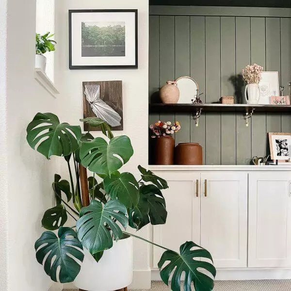
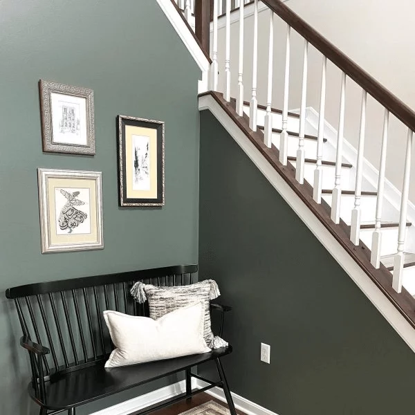
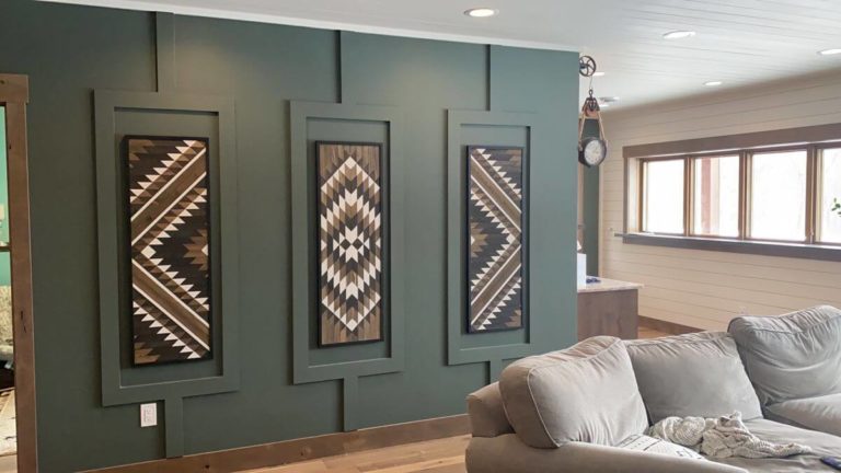
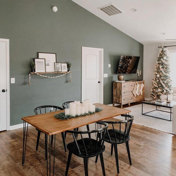
An accent shade for a statement
It would be a shame to find such a striking yet balanced shade and not give it a try as an accent in your interior. The range of solutions is so wide that it would definitely meet any expectations. Consider the following design options: a green accent wall, be it a simple one or covered with wood paneling, a half green – half white accent wall; a green statement piece of furniture, green lower cabinets in the kitchen, or any other element that you find appropriate. The main rule is to opt for a white background to let the statement shade play its role.
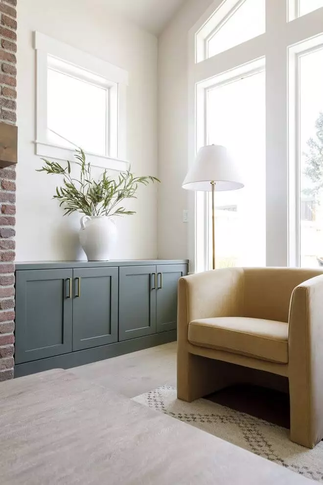
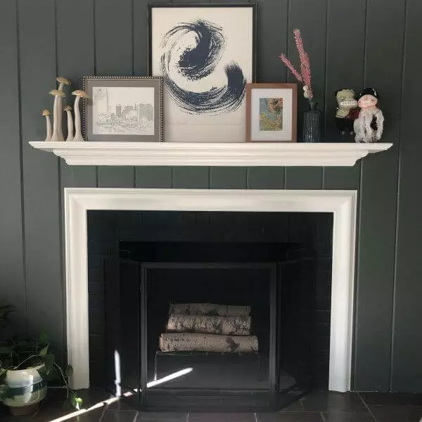
Living room
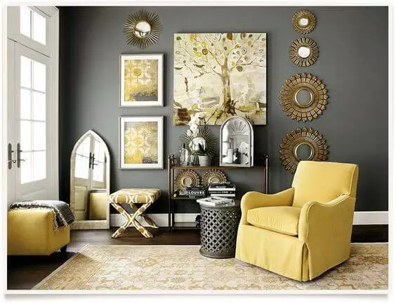
Considering that the grayish-green with slight notes of warmth works well with white, lighter or darker greens, and warm shades, we suggest you opt for such pairings in the living area with any approach you want. Whether you go with an accent wall or entirely paint the space in the moody gray, a competitive contrast will balance the color palette.
It is all clear with white and slightly darker or lighter green variations. What about the warm ones? From the most balanced beige to the boldest yellow, enrich the space with the wanted sense of contrast. For instance, you can opt for a dark green-based Neoclassic background and dilute it with a bold yellow armchair for a Retro statement.
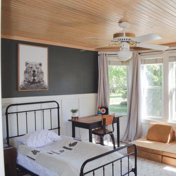
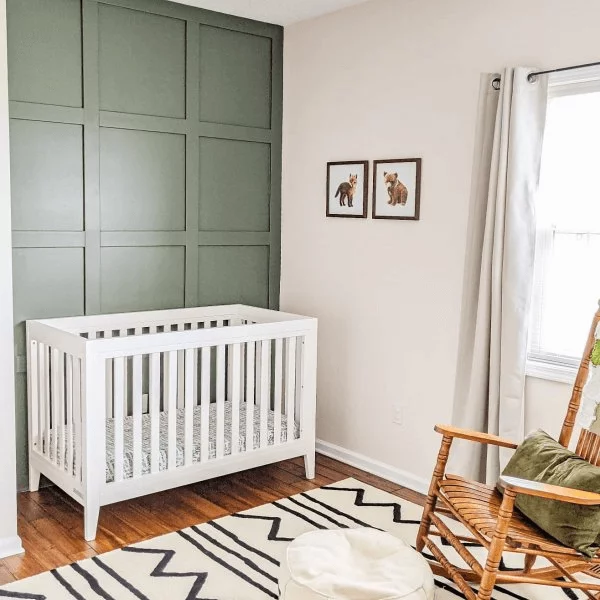
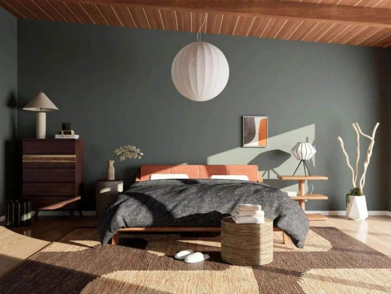
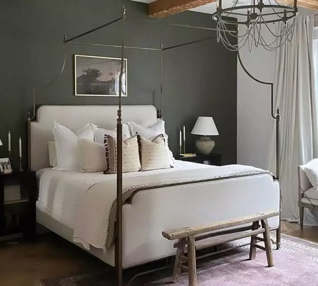
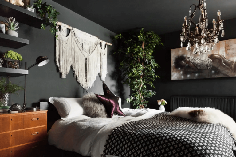
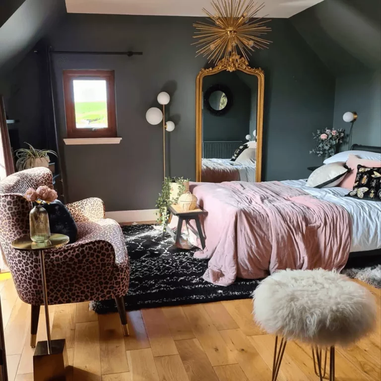
Bedroom
Regardless of the amount of dark green you will use, the room will be filled with a moody sense of calmness. The further you go with this paint color, the more uniqueness you achieve. You can even opt for an all gray-green bedroom, although a few lighter and warmer splashes are required, such as wood.
Another way to add new sparkles to the space is considering gold details that reveal their beauty even on a dark background. Do you want to keep it modern? Opt for lighter variations of pastel, such as soothing pink bedding.
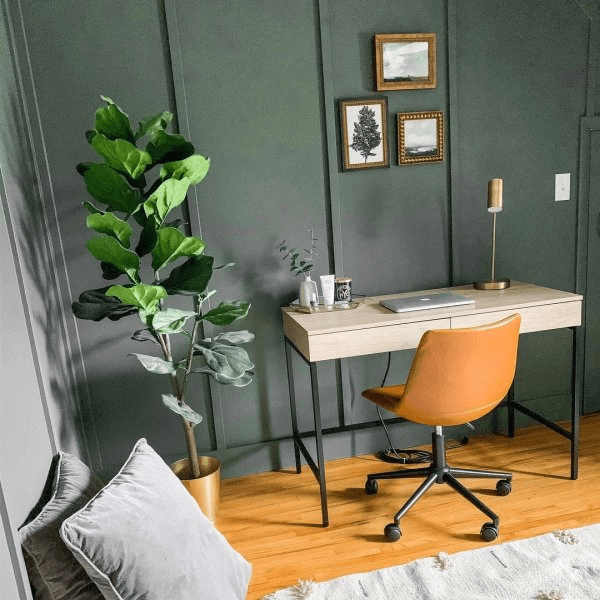
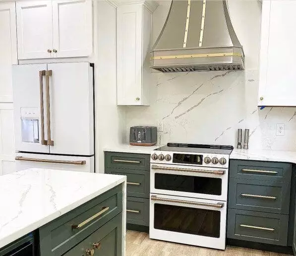
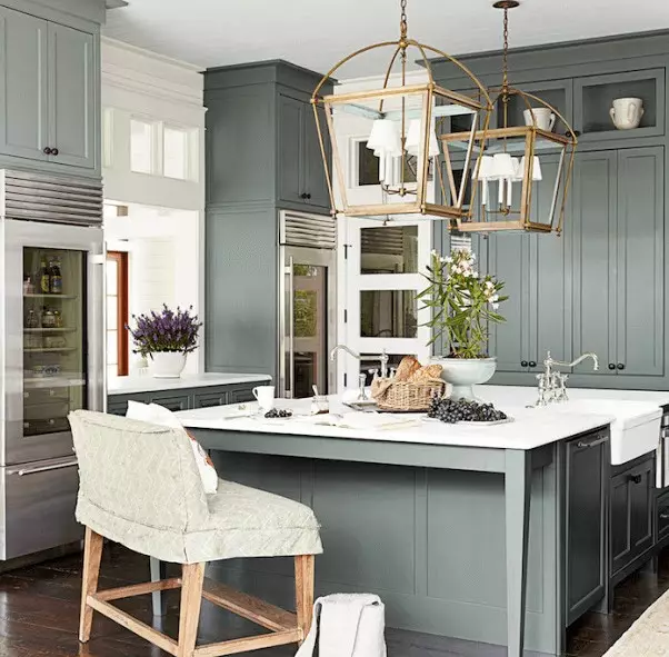
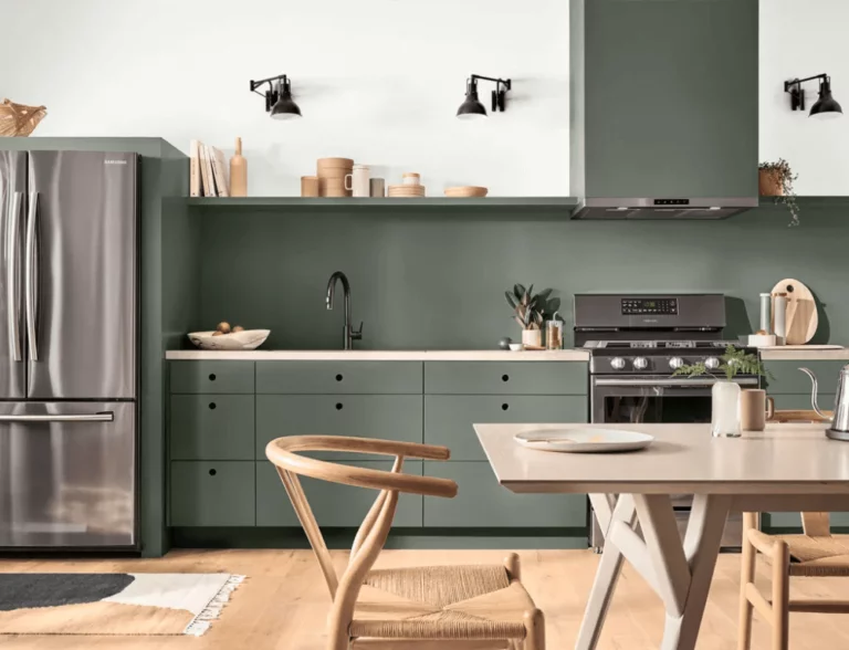
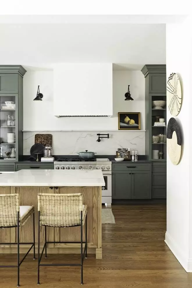
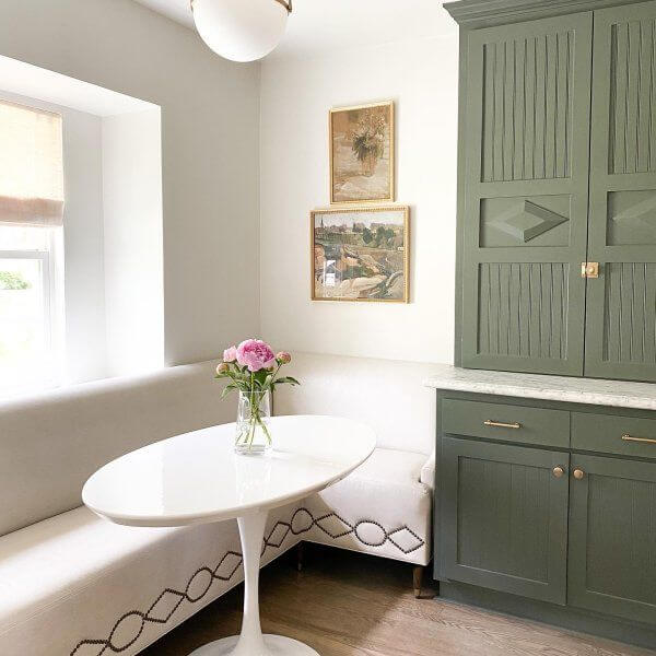
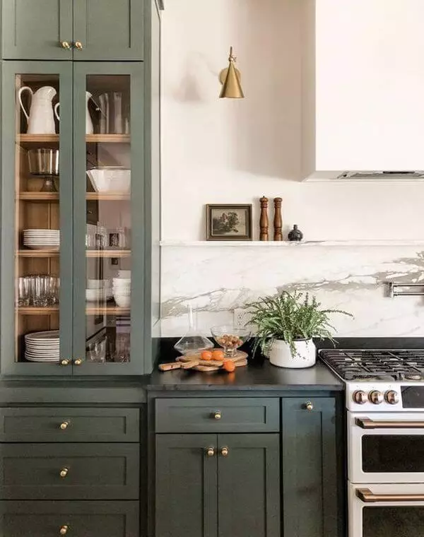
Kitchen and dining room
Base color in the dining space and cabinet paint color in the kitchen. One thing is clear – Pewter Green plays nice with light wood accents, black details, gold or silver hardware, and sometimes even marble texture. Depending on what effect you want to set – to warm up the dark color or preserve its formality, you opt for the appropriate combination, which is not that hard to spot what accent goes for what result.
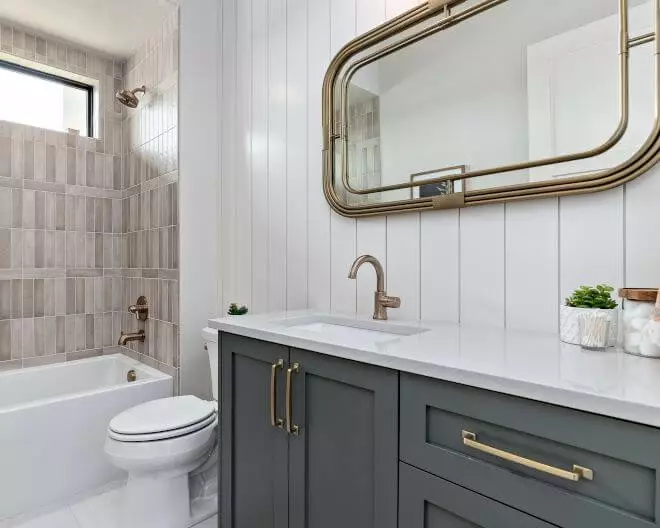
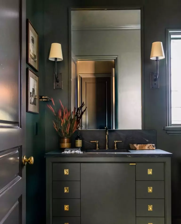
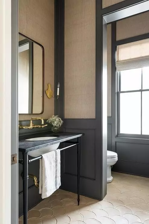
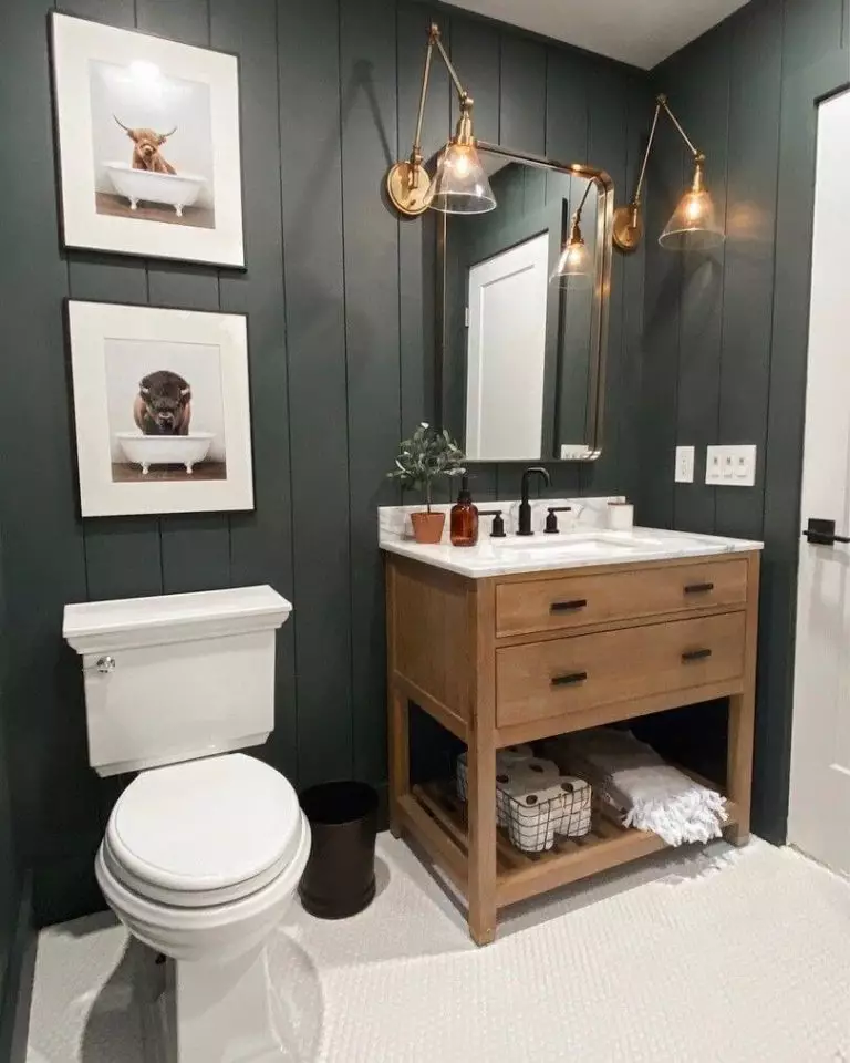
Bathroom
The timeless shade of green is a no-fail solution for any modern interior. Still, we cannot find the right words to describe this paint color’s impressive effect on vintage bathrooms. The moody shade perfectly pairs with brass hardware, and together they fully embrace the old values. At the same time, an all-dark-green bathroom seems no less original, although it requires a considerable amount of light, yet it should not be too bright to preserve the dramatic sense of style.
Use of Pewter Green for the exterior
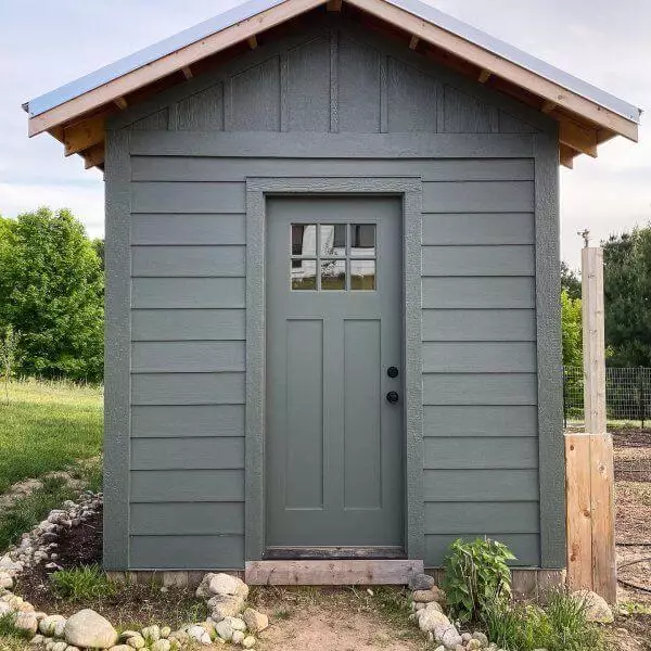
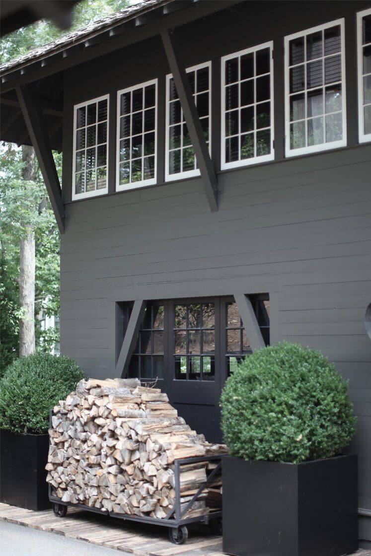
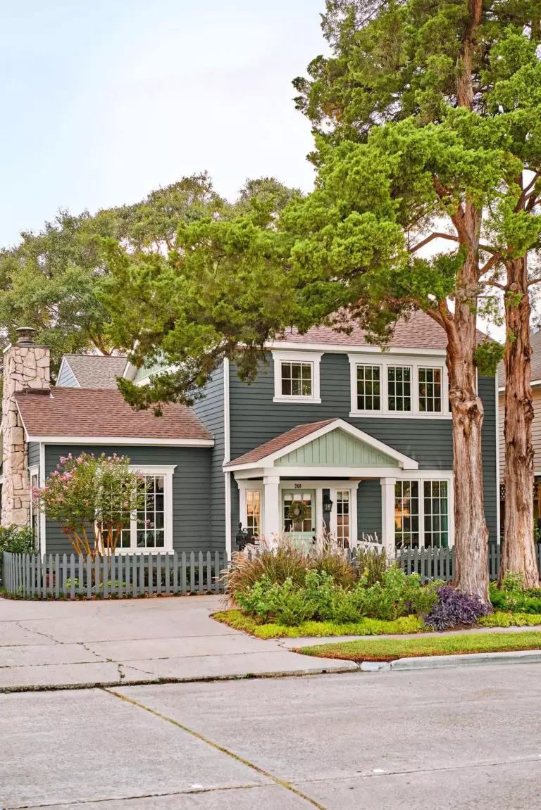
We would like to start with the fact that SW 6208 is gaining more popularity in exterior design. Considering that Pewter Green borrowed its beauty from nature, its true companion is wood. You can safely apply this paint color to any exterior structure of wood. When it comes to house exteriors, the grayish-green partners perfectly with black and white for a stately appearance or warmer shades for an inviting feel.
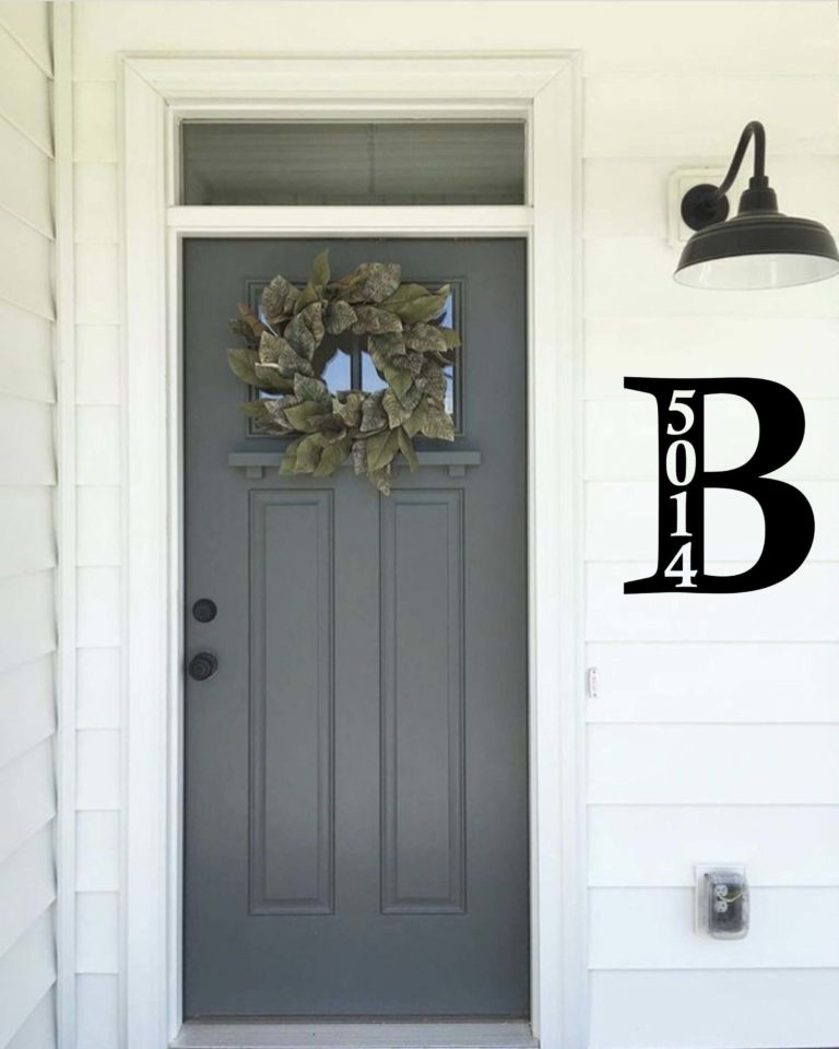
Although Pewter Green looks lighter when applied to the exterior, if an all-gray-green solution seems too much to you, don’t go further than the front door. Your exterior will surely reach a new level with such a splash of individuality on a white background.
The Pewter Green SW 6208 is the designers’ favorite accent that brings together simplicity, naturalness, serenity, and authenticity; sounds promising, doesn’t it? Next time you look for an accent paint color, don’t hesitate to consider the nature-inspired gray-green that you cannot go wrong with.
