Pink Bliss 2093-70
Benjamin MooreA light shade of pink with a slight creamy base, devoid of any striking undertones, that feels invigorating and calming simultaneously.
Pink Bliss 2093-70 (Benjamin Moore): what color is, review, and use
In the range of neutral colors, the most delicate shade of light pink stands out with its endless sense of softness that one cannot help but admire continuously. We can hardly believe it is regarded as neutral when such a blooming pinkish shade reveals itself. One of the best-selling colors, a prominent representative of its kind, and a fascinating source of inspiration, Pink Bliss 2093-70 from Benjamin Moore is a pure reflection of softness that you have never seen before.
What stands behind such a precious paint color that is becoming a favorite for many designers and hypnotizing homeowners with its refinement? Scientifically speaking, there is always the work with different tones. Therefore, relying on facts, we will reveal the inner beauty of this shade and dive into its essence. Are you joining us?
Pink Bliss paint color features
The splash of elegant simplicity and mesmerizing delicacy that colorists from BM came up with is a light shade of pink with a slight creamy base, devoid of any striking undertones, that feels invigorating and calming simultaneously. Is that even possible? Well, particularly when put into practice, Pink Bliss appears like an off-white shade with pink undertones, which stands behind a rather refreshing base penetrated by appealing pinkish notes. According to the manufacturer’s official site, Pink Bliss is “a soft shade of pink as sheer and delicate as the finest chiffon.” This says everything and even brings the nature of this color to the surface.
Pink Bliss: is it warm or cold?
The popular shade of pink is definitely warm, and the soft pinkish base, together with the creamy notes, are there to prove it. A single glance at this paint color will make you fall in love with it, and you know why? It is all due to the warm scents that seem exceptionally inviting, calming, and peaceful. As warm as they are, one cannot help but notice the balance, which the light base of this shade uses to play down the warmth a bit, resulting in the perfect paint color we can now enjoy.
How does lighting affect Pink Bliss?
Pink Bliss is quite light itself, which means that lighting influences it a lot. Let’s see what the effect is from various perspectives! The first sun rays wake up the coolest variation of Pink Bliss, revealing a soft shade of white with slightly perceived pinkish notes and a creamy base. As the sun prevails over the room, this beautiful shade shows its true pink nature in full bloom with an impressively soft appearance. Consider a cloudy day, and this paint color instantly transforms into a crispy shade of white with very subtle creamy notes that you can barely notice any pink in it. Once artificial lighting enters the play, this color reaches an off-white look with slightly visible pinkish scents and a well-perceived creamy base.
What a tricky paint color, and we have not tackled the room exposure yet! Pink Bliss is penetrated by coolish notes yet not devoid of its creamy scents in north-facing spaces. On the other hand, the east, west, and particularly soft-facing rooms bring the warmest variation to the surface. As many appearances as this paint color may take on, one thing remains unchanged – its creamy base, responsible for the limitless softness.
Pink Bliss LRV
Considering that particular conditions can make this paint color seem an off-white shade, it is surely very light, and facts speak for it. The Light Reflectance Value of Pink Bliss is 81.58, which is pretty close to 100, the latter standing for true shades of white. Therefore, the pink color from BM shares a few abilities with white, which are to reflect substantial amounts of light and make the room look spacious. Of course, Pink Bliss does not prevail in this field the way white does, although it proves to be very skilled.
Pink Bliss undertones
Although not showing any eye-catching undertones, the blooming replication of softness from BM is penetrated by creamy scents, which stand behind its warmth, softness, and exceptionally attractive look. It is impressive how well this feature hides under particular conditions yet still is part of this paint color. It makes the latter seem soft even under the coolest lighting.
Similar colors
To our surprise, quite an imposing number of pink shades show a sense of softness similar to Pink Bliss, yet each stays unique. It does not make the blooming paint color from BM less original but rather offers new alternatives to the popular splash of limitless flair. We are happy to show you what other brands have in store.
Coordinating colors
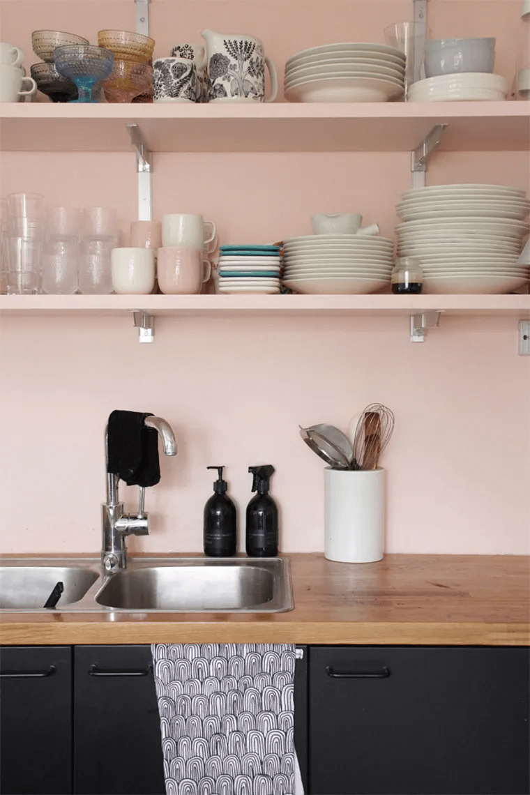
Although seeming neutral, the vibrant pink notes of Pink Bliss make this paint color a perfect match for other neutrals. One can consider shades of this kind devoid of undertones or go with slightly lighter variations of the same shade for a monochromatic interior. At the same time, the paint colors that reveal particular scents will enliven the space together with the pink variation from BM. If you fancy a contrast, you don’t have to go very far but opt for a dark gray shade to balance the environment beautifully. Luckily, experts from this color brand offer a range of options you can go for. Stick to it for a no-fail result!
Use of Pink Bliss in interior
As with any other neutral, Pink Bliss can be safely used within any space, although its vibrant pink notes are quite a bold step. Still, the soft sense of calmness this shade radiates cannot be replaced. As for the style, it would work for modern approaches to design solutions that involve a relatively neutral palette, while the soft notes of Pink Bliss would warm up the space and make it feel comfortable, which, by the way, is a feature worth looking for in contemporary interiors. Let’s see how Pink Bliss works within the interior!
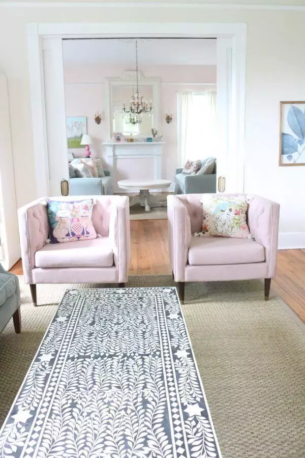
Living room
A pink-based neutral is not necessarily a paint color for bold accents. You can safely use it for the walls and enrich your space with notes of pleasing vibrance, slightly balanced and not at all striking. Furthermore, designers have been integrating neutrals with undertones of the kind lately for a new sparkle and a modern approach to styles. You can either keep it simple and complement your slightly pinkish walls with white accents for a contemporary feel of comfort or adapt this paint color to the most unusual styles in this sense. You will definitely make a statement with a Neoclassical living room with pinkish scented walls.
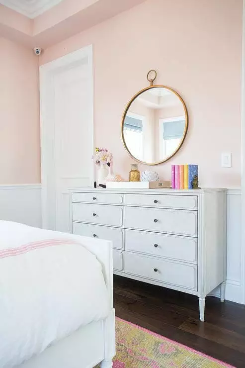
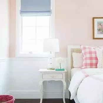
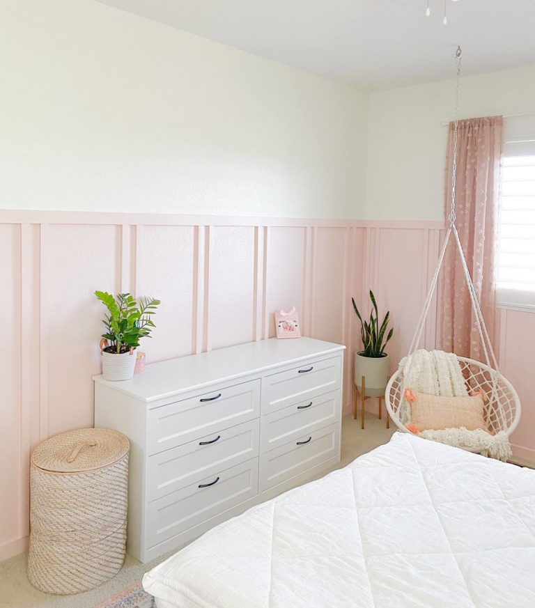
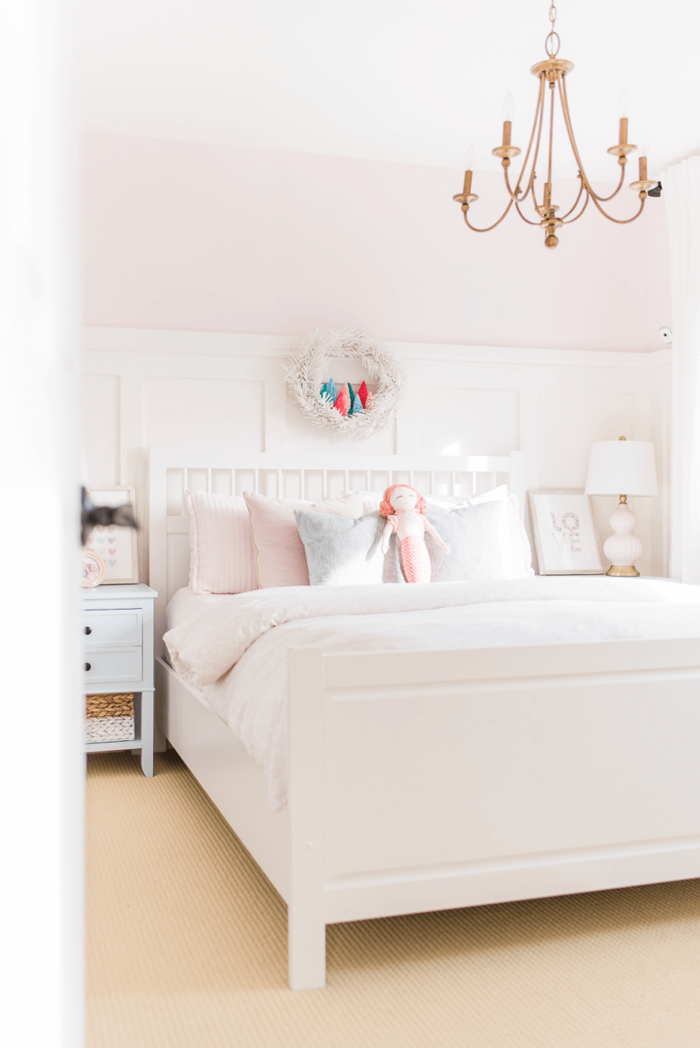
Bedroom
The softest shade should go for a space that requires as much of such a feature. The bedroom seems like the most appropriate place to apply this color. Undoubtedly, Pink Bliss goes for the walls, while the rest of the elements are chosen according to your style. What about a pink and white bedroom for the simplest yet most contemporary approach? Just opt for white furniture, white bedding, white everything, probably a bit of pink on the bedding for harmony, and a night of safe and sound sleep is ensured.
Still, you can always go for bolder options. As strange as it may sound, you can successfully make a Vintage statement by exposing units of the kind on the pinkish background so that they sparkle in a whole new way. For the latter, consider dark wood flooring particularly. Frankly speaking, you can opt for any style you want as long as you keep the contrasts under control.
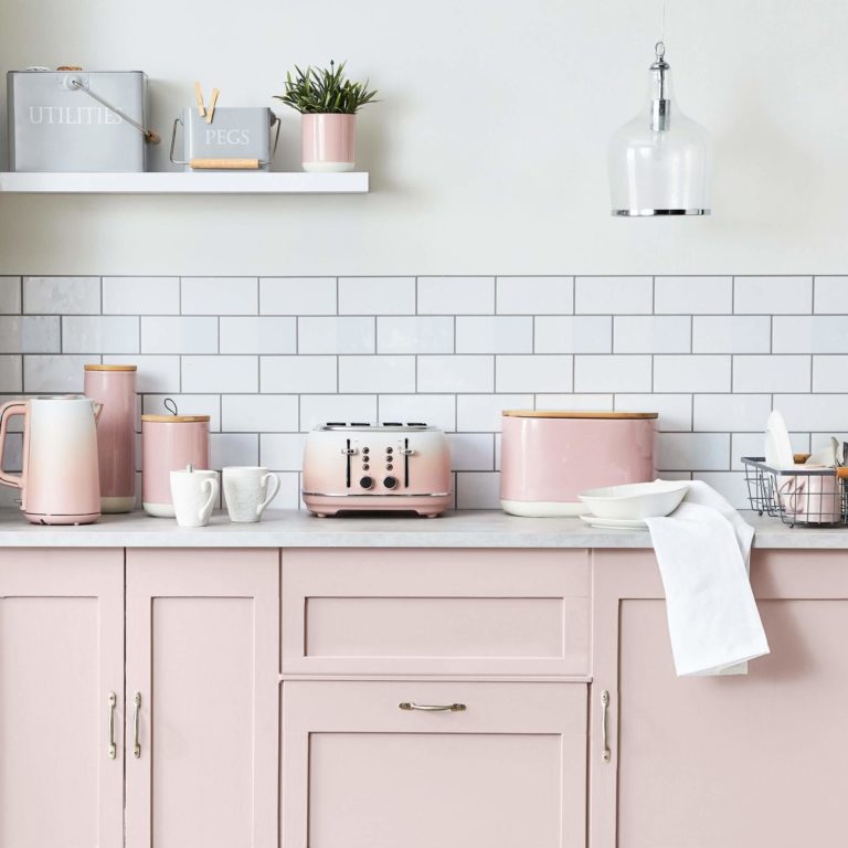
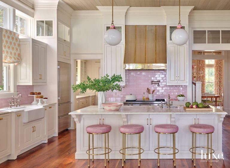
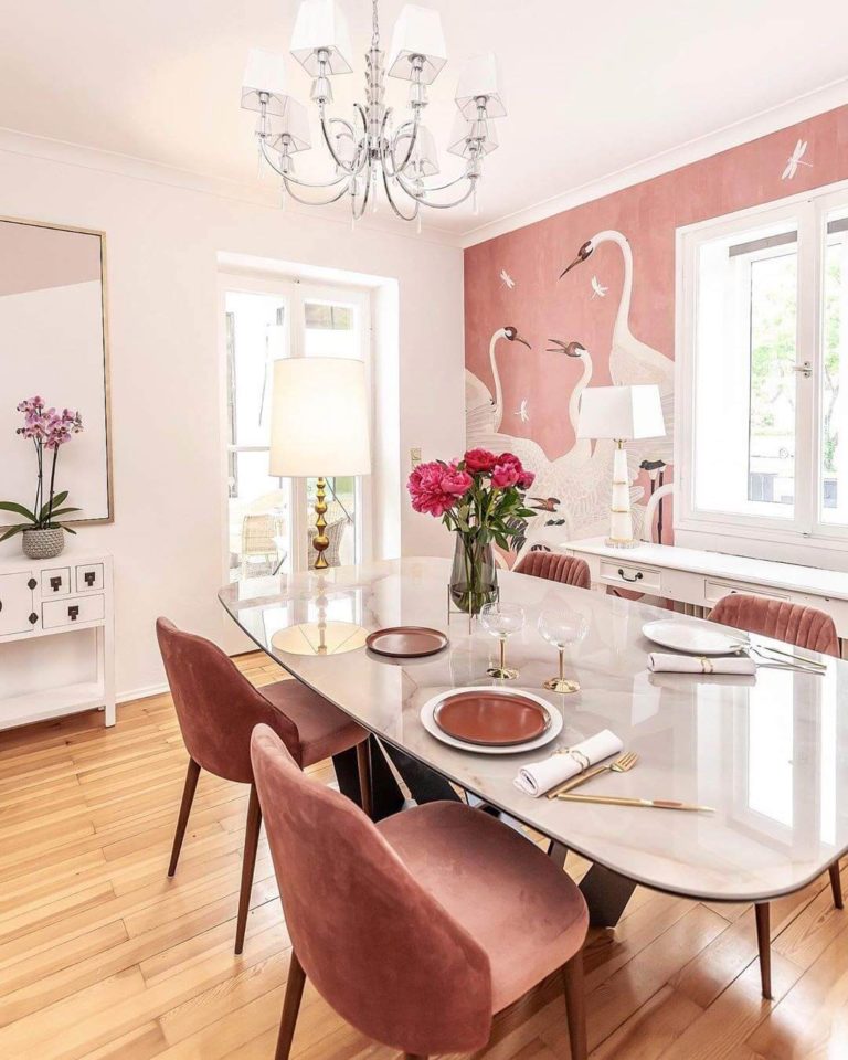
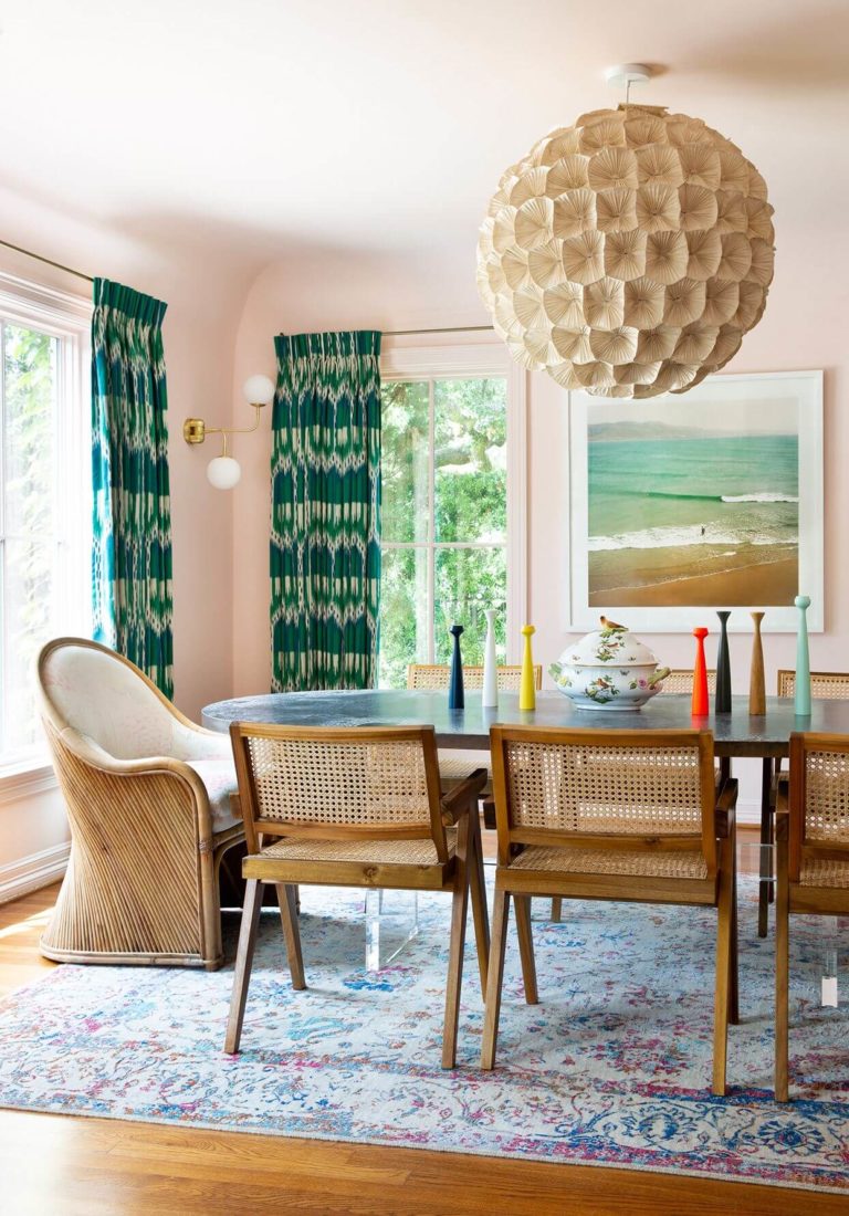
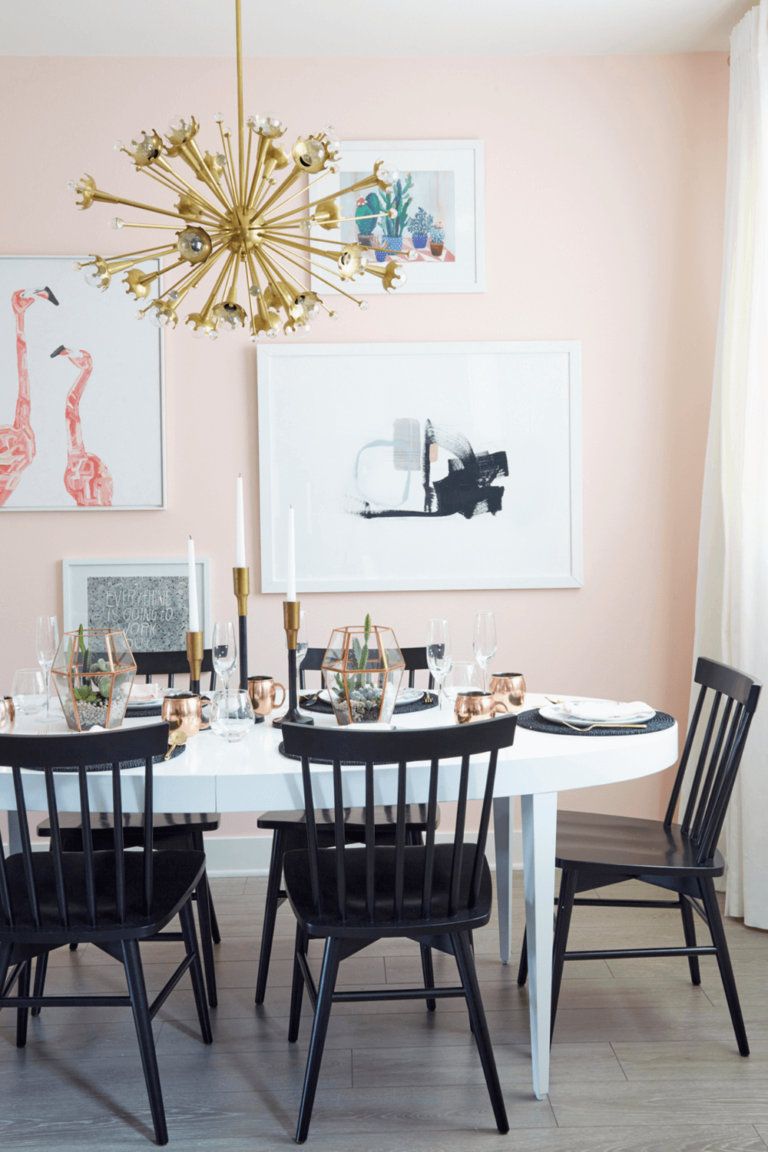
Kitchen and dining room
Soft shades of pink have been quite a thing lately when it comes to the kitchen. Furthermore, the range of possibilities is so vast that you will simply be impressed. Whether your kitchen is designed according to traditional or modern rules, Pink Bliss goes either way. Consider an all-pink kitchen with brass hardware and intricate cabinet design to bring your traditional interior to the next level. Alternatively, go with modern combinations of pink and black or pink and white.
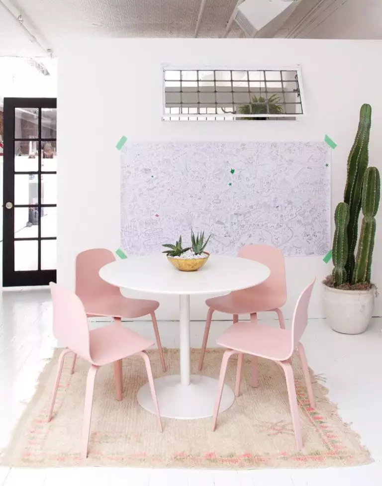
Once we enter the dining area, we realize that Pink Bliss works here no less fantastically. Designers suggest painting the walls in this soft shade and going on with one of the following solutions: an elegant marble table with velvet chairs for an Art Deco statement, a bold colored table with wood chairs and colorful details for a Retro accent, or a large wood table and black chairs for a Modern approach. You can go as far as painting the chairs pink and displaying them on a lighter background.
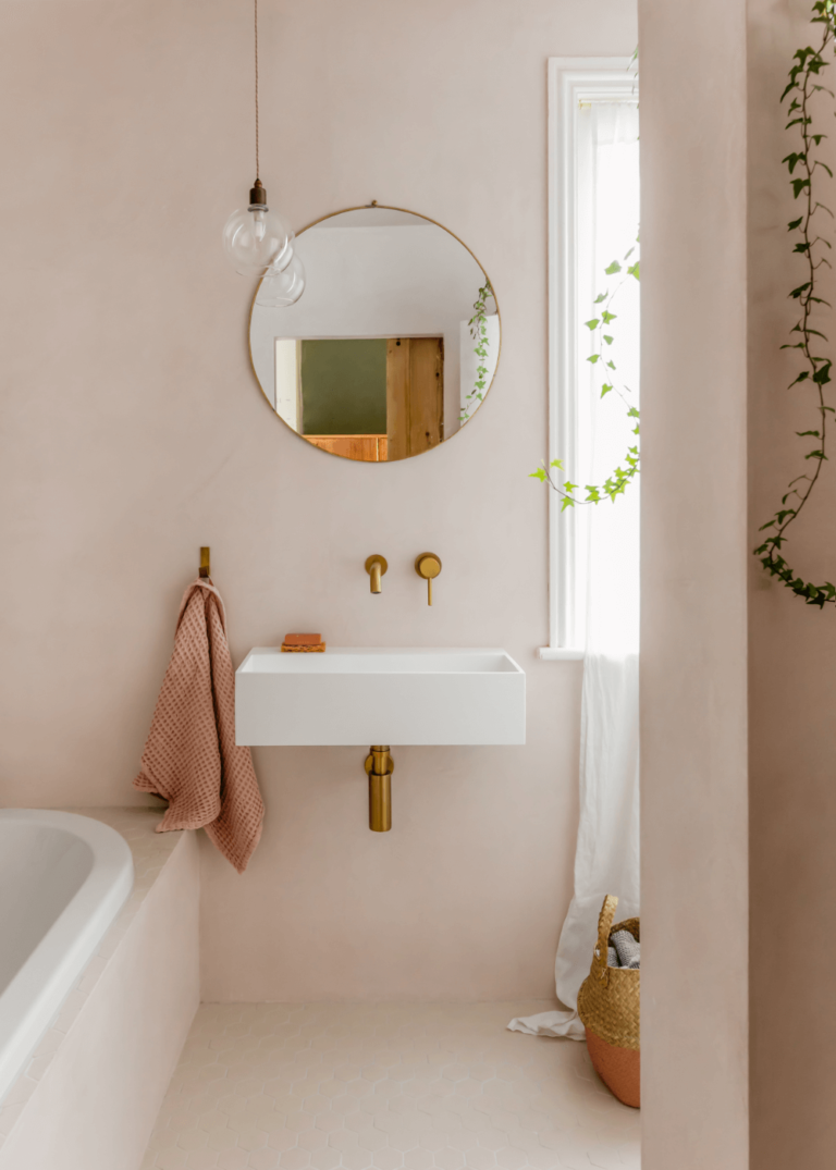
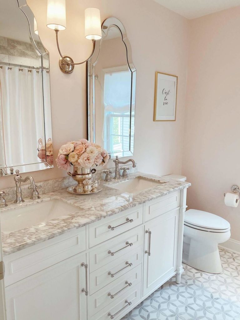
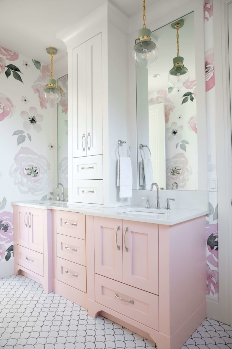
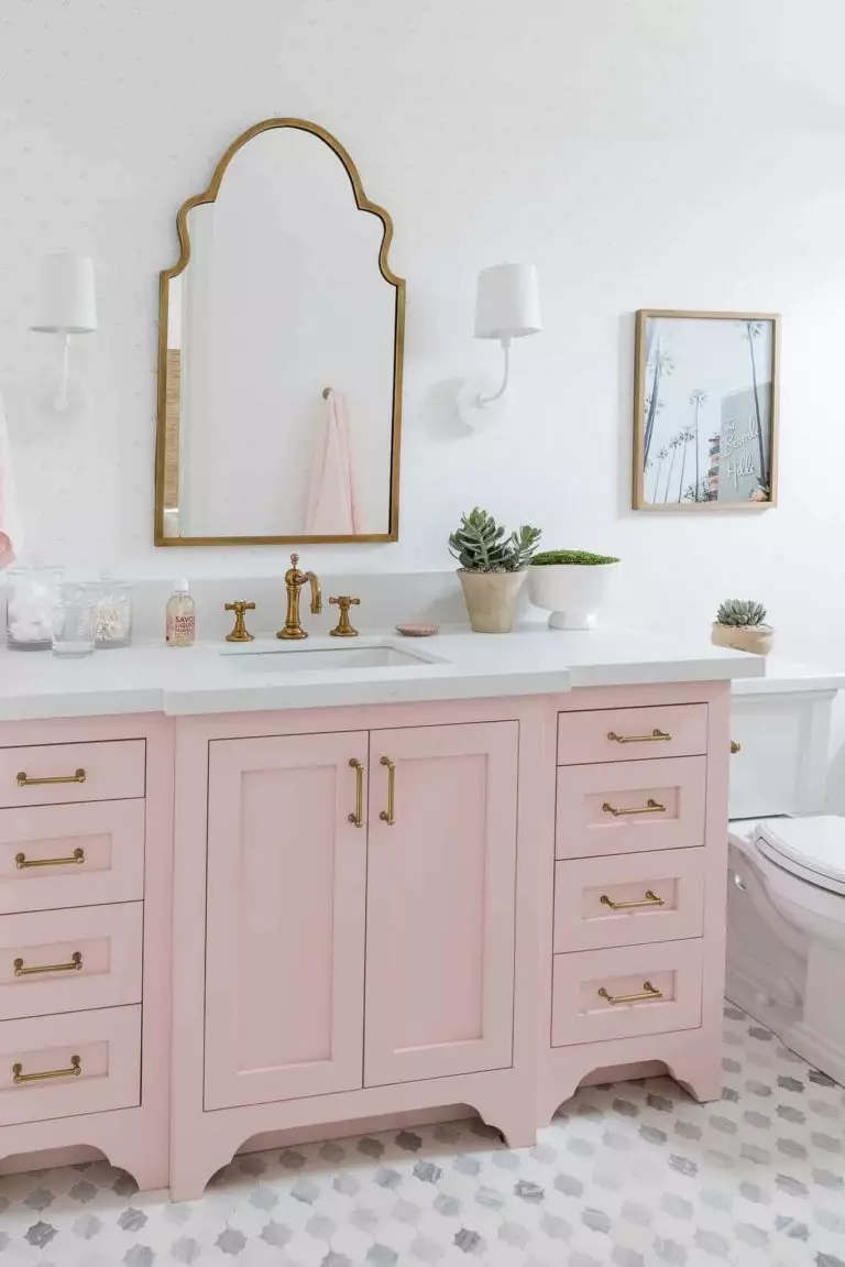
Bathroom
This space is the perfect place to consider the standout pairing between the soft pink and brass, which is not necessarily an Art Deco statement, although this would be a great option. You can either paint the walls or cabinets this way, enrich them with brass splashes, and complete the picture with a flamboyant mirror. If warm pink walls do not seem enough, add marble texture and make elegance the defining feature of your bathroom.
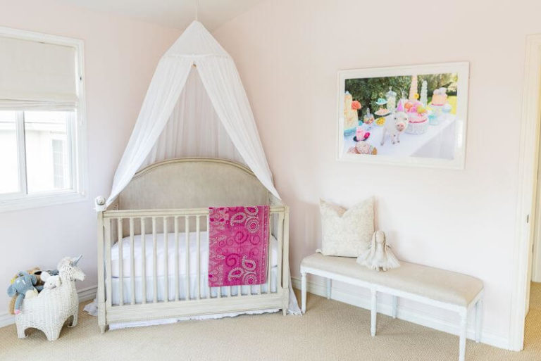
Girls room
You have to agree with us; the first room one would think about when seeing this astonishing pink variation is a girl’s room. Be it a nursery or a grown child’s room. Consider Pink Bliss for the walls and go on with white for the trim, furniture, and textiles; a perfect combination for a princess’s room. Furthermore, with its creamy base, this shade of pink will bring a sense of contemporaneity to the space.
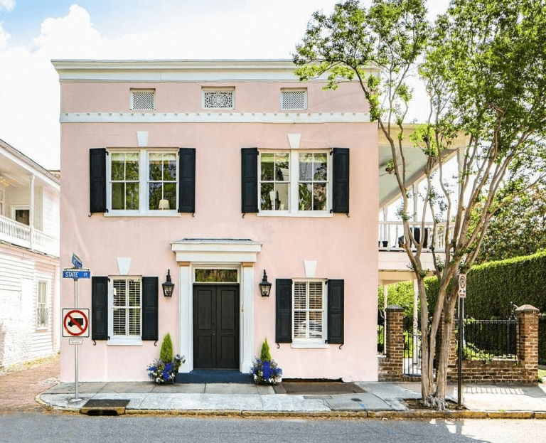
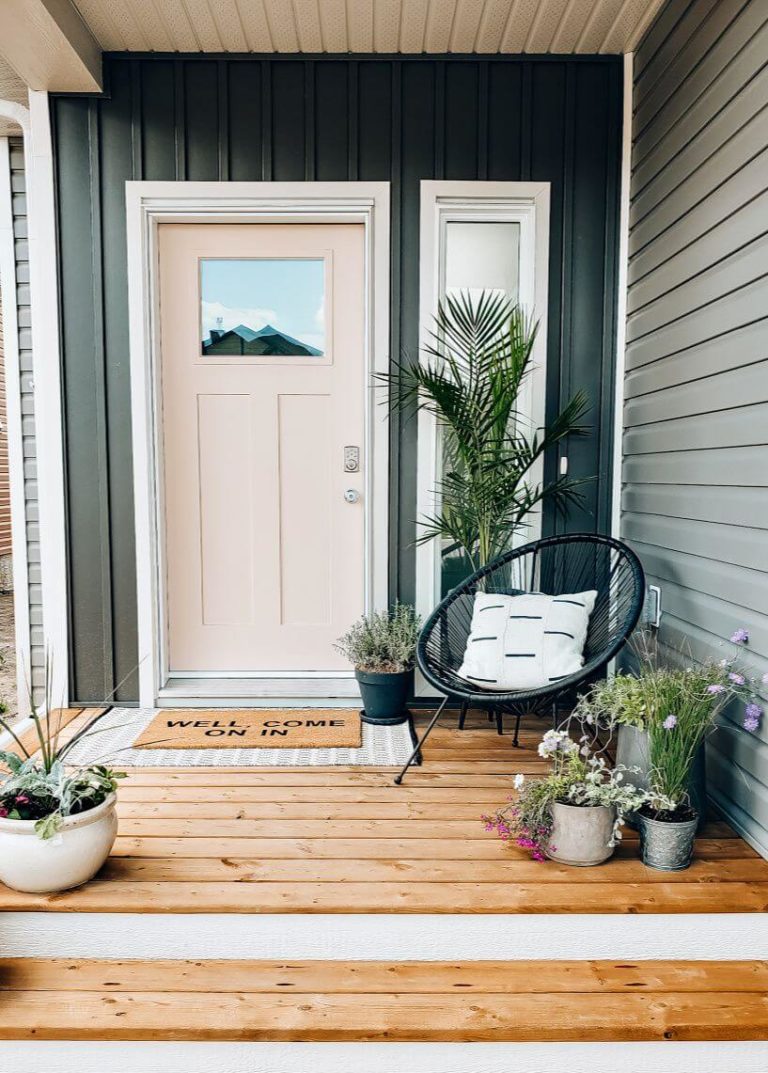
Use of Pink Bliss for house exterior
The popularity of Pink Bliss also extends to the house exterior. You can safely use it for the walls and pair it with black accents. Despite the vibrant base, this shade feels quite neutral yet inviting and perfect for the boldest minds. Don’t hesitate to use this splash of modern positivity for the front door on a dark background and make an accent out of your house exterior.
The Pink Bliss 2093-70 paint color from Benjamin Moore is one of the new neutrals you should definitely give a try if a bit of vibrance does not seem too extra to you. Besides its trendy look, this splash of softness is a no-fail option when comfort is a priority.
