Polar Sky 1674
Benjamin MooreA powdery blue with a trace of gray-green, reminiscent of the winter morning sky and known for its calming and refreshing abilities.
Polar Sky 1674 (Benjamin Moore): What Color Is, Review, and Use
Have you heard that green and blue are once again favorites among interior designers this season? Moreover, colorists claim light paint colors are making a comeback. No wonder Benjamin Moore’s 2024 color palette introduced us to one of the most precious light blue shades with a refreshing name – Polar Sky. It is one of the most unusual and sophisticated paint colors we’ve met so far. Let’s take a closer look at one of the best 2024 color trends!
Polar Sky Paint Color Features
A pretty bright shade of sky color, Polar Sky is a powdery blue as soft as the clouds and as light as the morning horizon. The slightest touch of gray offers this paint color a subtle winter morning effect. If you strive to bring balance and harmony into your home and life, you’ll undeniably love Polar Sky. It’s a color of serenity and peace, yet not without a charming personality. Reset your mind and give a fresh start to your lifestyle with a new paint color like this airy blue from Benjamin Moore.
Polar Sky: Is It Warm or Cold?
Undoubtedly, Polar Sky is not a cold paint color. Is it warm, though? Why guess when we can check some facts? Colorists use the RGB (Red, Green, Blue) value to determine a color’s temperature. At Polar Sky, the green and blue amounts slightly prevail over red. That’s how we know that we deal with a cool paint color.
How Does Lighting Affect Polar Sky?
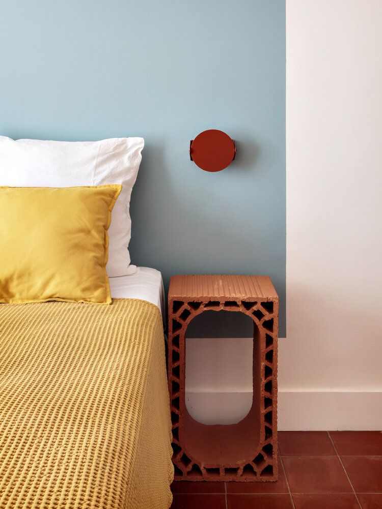
If there is one paint color that 100% deserves to be called chameleon, it is Polar Sky. Designers are impressed by how many interpretations a single paint color can reach. It all depends on lighting and exposure. For instance, if you have a living room with north-facing windows, you’ll witness a cool gray haze over a surface painted with Polar Sky. A slight change of plans – we speak about a south-facing space, and this baby blue shade embraces a new personality. A pale green-blue with creamy undertones will thrive bathed in sun rays.
The further we reach, the more exciting it gets. In rooms with eastern exposure, Polar Sky acquires a breezy mint effect under the fresh morning sunlight. Switching to the other side, a room with west-facing windows, the same powdery blue transforms into a warm off-white with green-blue undertones. What a magical paint color!
Frankly, that’s the effect lighting has on paint colors, especially on bright ones. We haven’t covered artificial lighting yet. At night, when ceiling pendants and wall sconces are the only sources, Polar Sky loses its blue pigment entirely, revealing a pale off-white shade with a crisp undertone.
Polar Sky LRV
We expected a much higher Light Reflectance Value for a paint color that seems so light. On a scale from 0 (true black) to 100 (pure white), Polar Sky has an LRV of almost 69. It is pretty close to the light side, making it professional at reflecting light throughout the space. With Polar Sky, you don’t have to worry about making a space seem small or poorly-lit. On the contrary, it will fill your room with light, making it airy and spacious.
Polar Sky Undertones
Interestingly, as complex as this paint color is, this baby blue doesn’t have so many undertones. The gray note keeps it well-balanced and pale, and the green hint offers a natural sky color. If you wonder why Polar Sky has so many interpretations in different spaces, it is entirely due to lighting. It can resurface color pigments that we might have never thought of.
Similar Colors
Explore the best similar colors to Benjamin Moore’s Polar Sky and find the perfect alternative whether you need an exact match, a lighter, or darker substitute:
Coordinating Colors
Let’s start with the trim! The best matching trim colors are off-white with green-blue undertones and bright white, depending on how much contrast you want. If you are searching for wall paint colors to pair with Polar Sky, try other neutrals with green or blue undertones. And the cherry on the pie – complementary colors, which stand on the other side of light blue on the color wheel. A pale apricot tone will work. That’s what you can find on Benjamin Moore’s website:
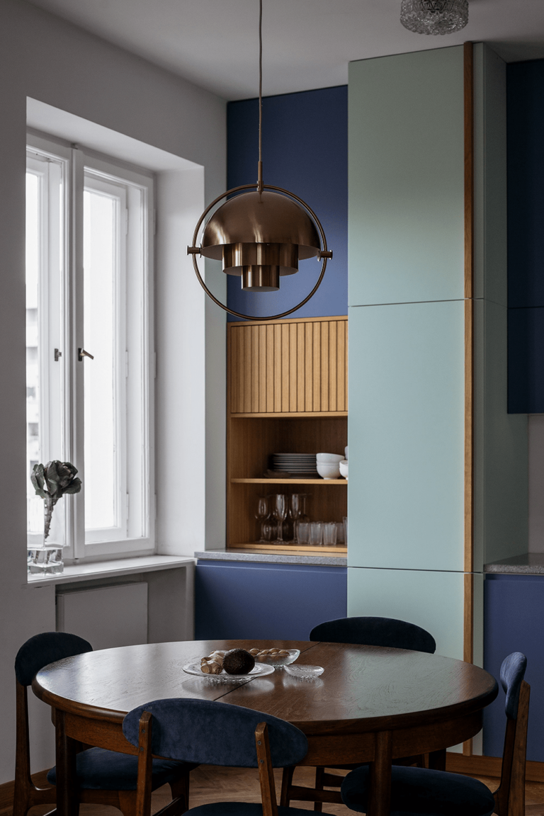
Use of Polar Sky in Interior Design
Designers use light blues primarily to create calming spaces. It’s a great color choice for a peaceful bedroom, a refreshing bathroom, a welcoming living room, and an airy kitchen. Still, there is more to Polar Sky that resonates with specific design styles and has a different meaning in every room. Let’s see how you can make the most of the new favorite blue from one of the top paint brands!
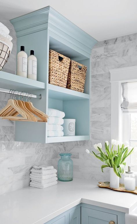
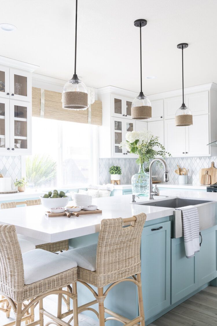
Updated Coastal
If you aim for a Modern Coastal redesign or want to renew your Coastal interior, consider a new color palette where Polar Sky is the main character. This contemporary pastel blue paired with white, light wood, wicker furniture, indoor greenery, and occasional marine accessories will delight your eye and taste. The secret is staying away from overly done Coastal decor, such as themed decor pieces on shelves or Coastal wall art. Focus on color.
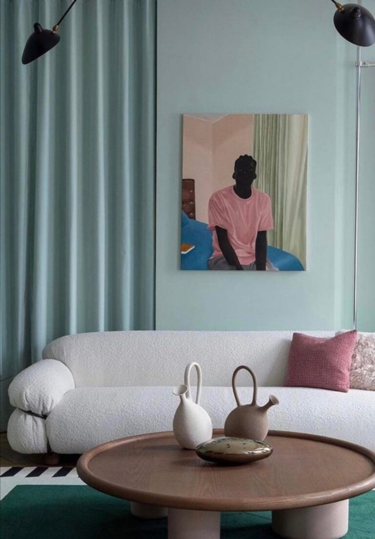
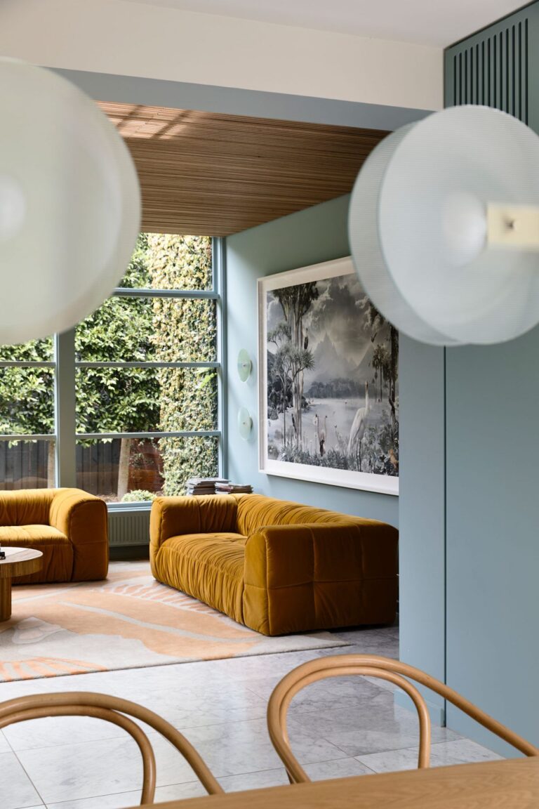
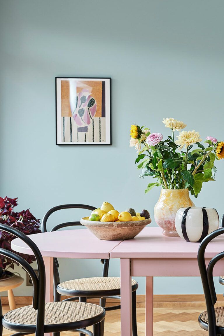
Modern Pastel Palette
Besides other impressive features, the baby blue tone from Benjamin Moore is a pretty pastel shade. A contemporary color palette featuring Polar Sky and other pastels or brighter paint colors, boldly paired, sounds like a modern design project that keeps pace with current design trends. If you’ve always liked daring color combinations, Polar Sky should definitely be part of your design project.
Contemporary Polar Blue
Unsurprisingly, interior designers call blue the new neutral. Now, you can safely use light blue variations instead of traditional white, gray, or beige. Bring more interest to your interior design with a light blue background or furniture. Boost your mood by contrasting Polar Sky with its complementary colors through furniture or keep it rich-textured through wood, stone, or concrete.
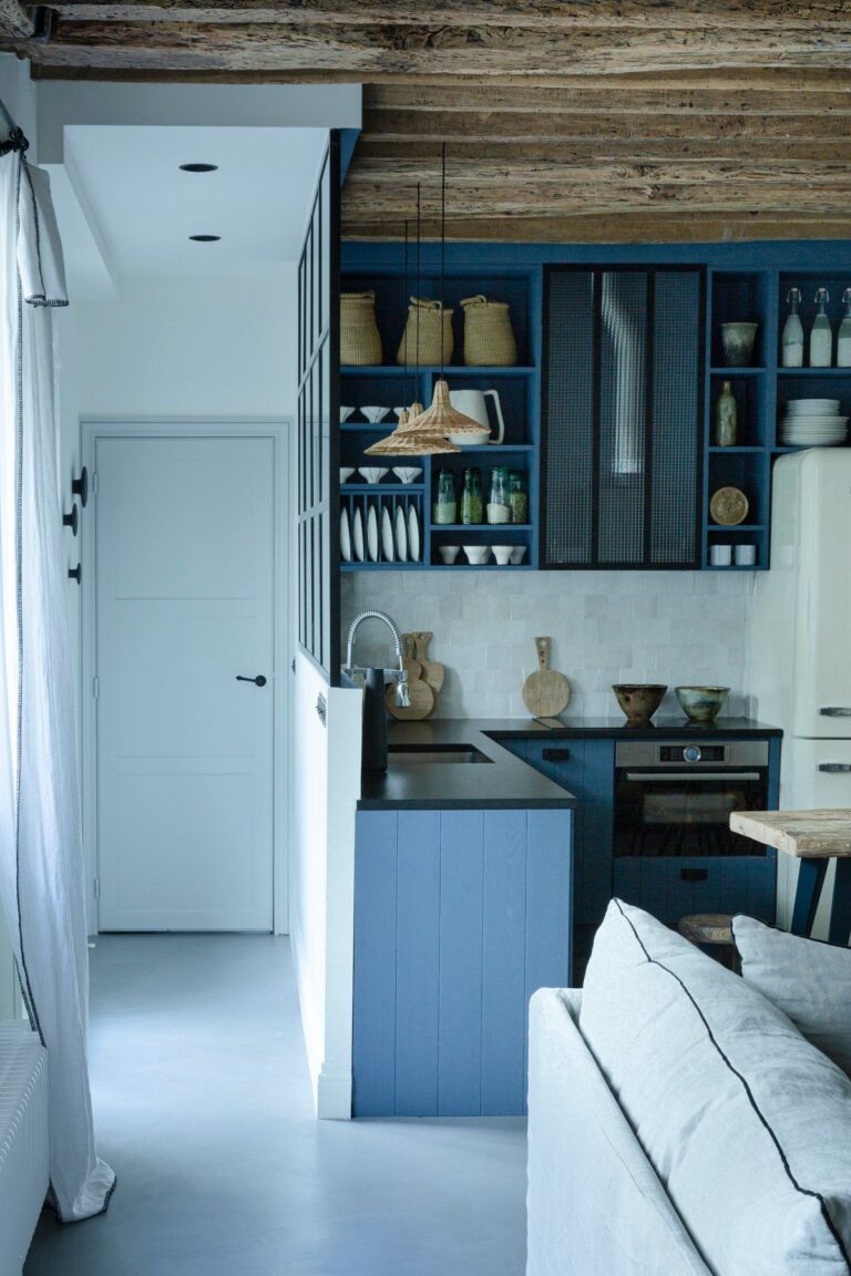
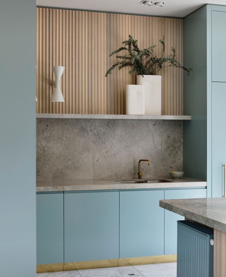
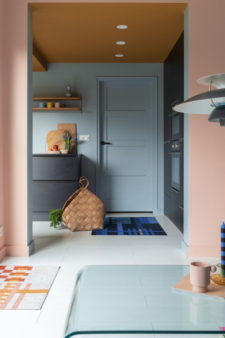
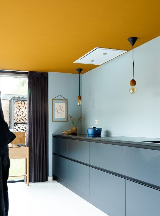
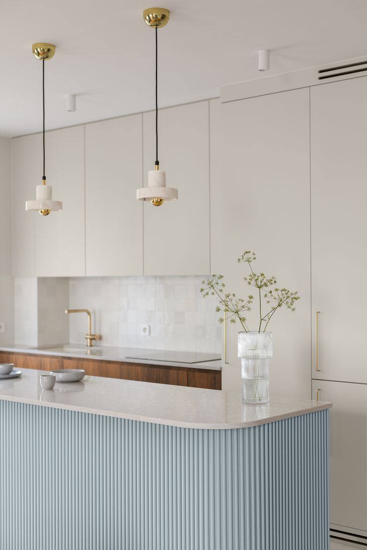
Kitchen
Decorators recommend a more creative approach to Polar Sky in the kitchen and dining area. Opt for an eclectic mix of colors to contrast the brightness of this powder blue that pairs so well with bold shades. It will add energy and, why not, taste to your kitchen. Bright color palettes are no longer viewed as exclusive. They are becoming mainstream.
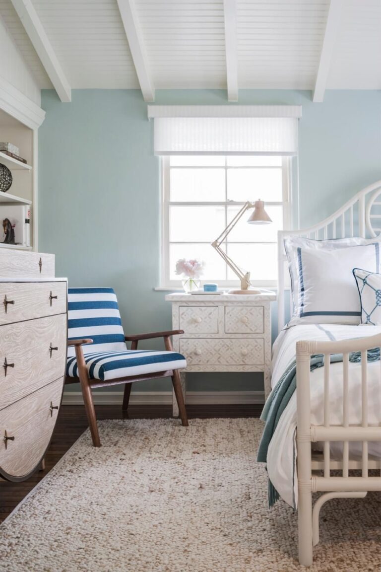
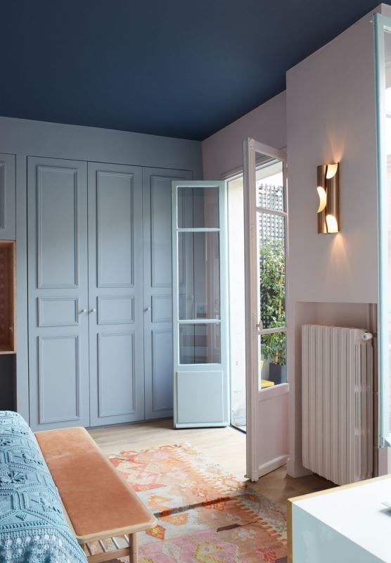
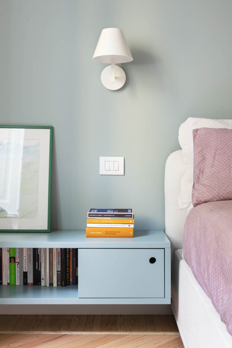
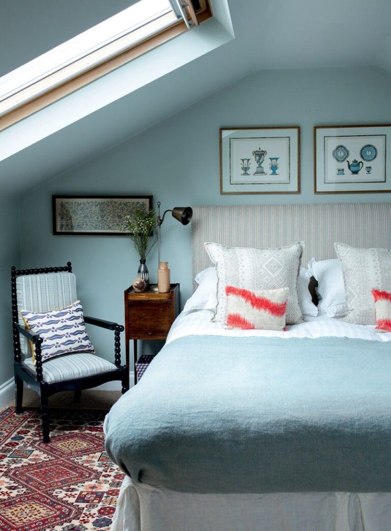
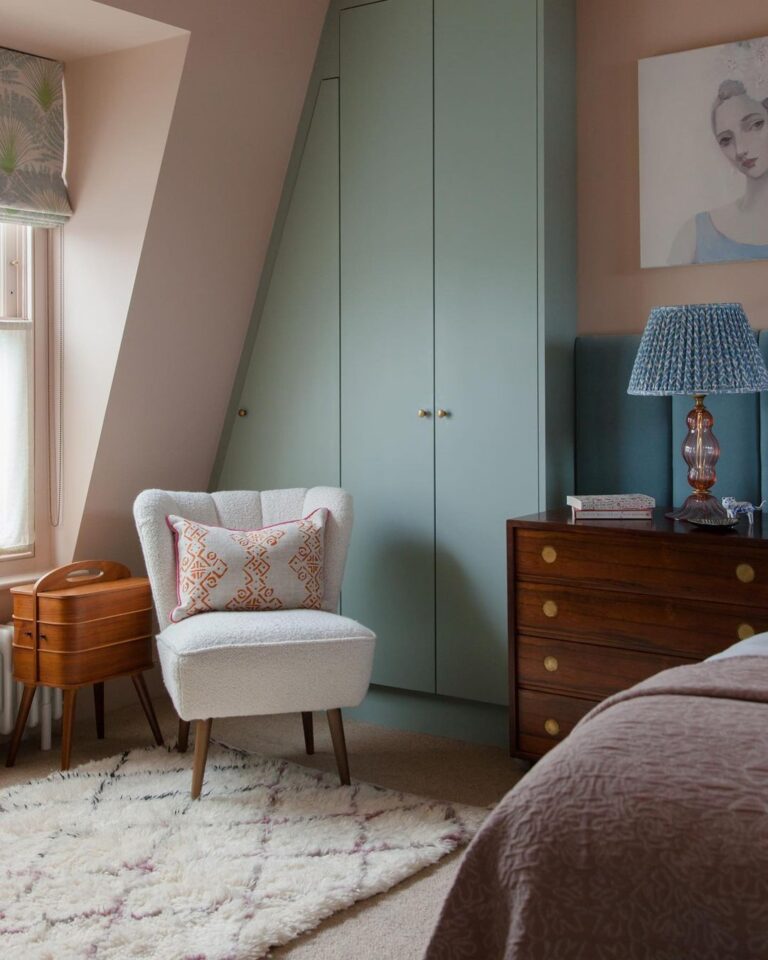
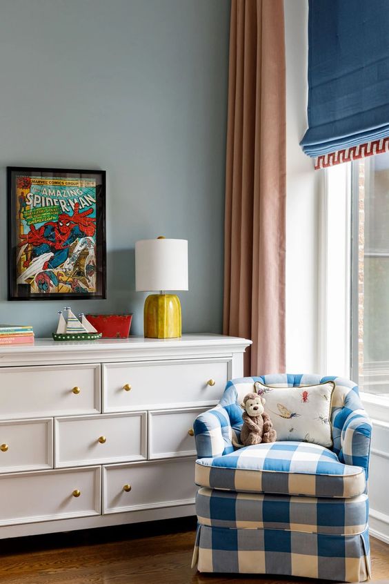
Bedroom
Polar Sky is that baby blue shade that works for any design style as long as it keeps calmness inside your bedroom. That’s why designers recommend it mainly as a paint color for walls. It’s a real find for small bedrooms that wouldn’t mind a few more inches.
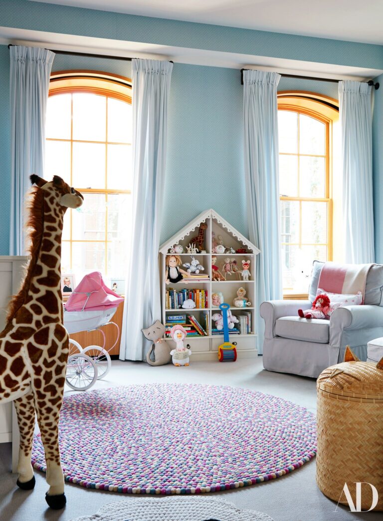
Nursery
A baby blue shade has always been a good idea for a nursery. It is gender-neutral, despite the stereotype that blues are for boys only. Besides, this unique pastel blue is primarily about comfort, serenity, peace, and calmness. Depending on what you pair Polar Sky with, you can underline its bright side or use it for a calm and undisturbed color palette.
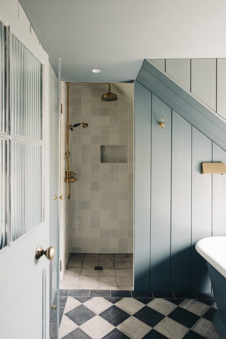
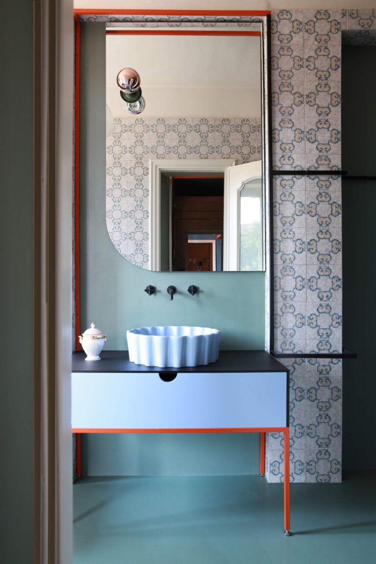
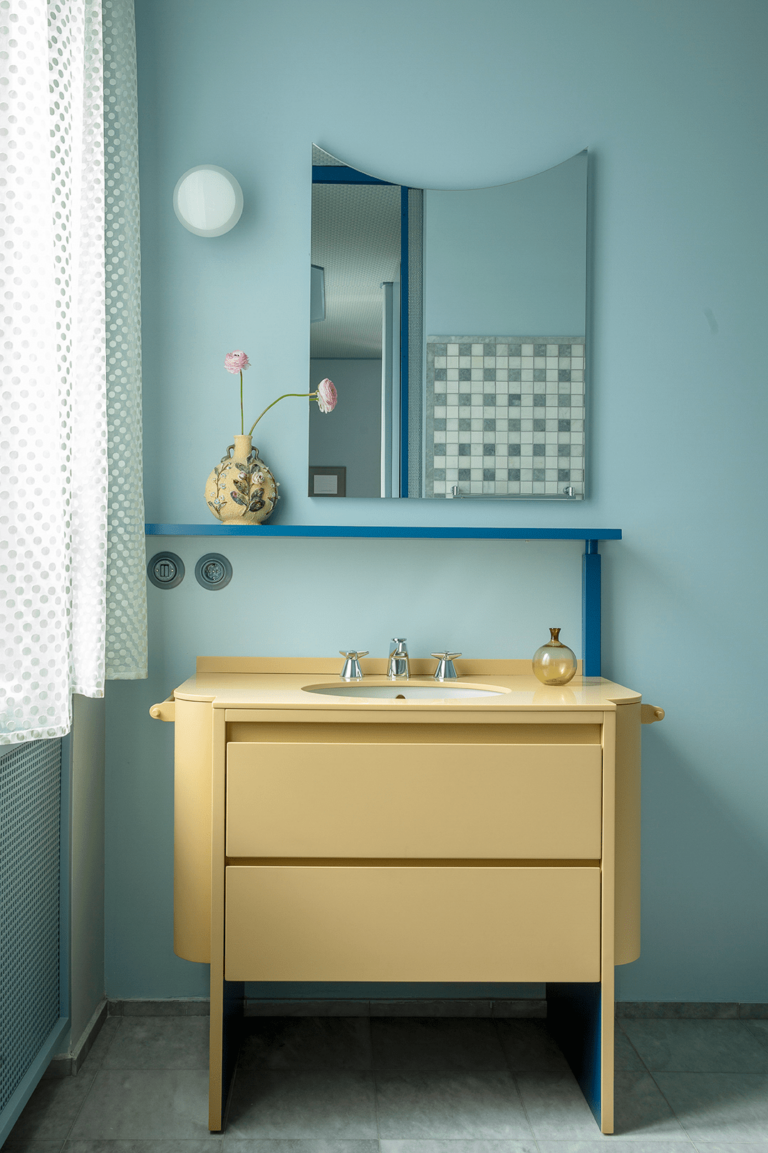
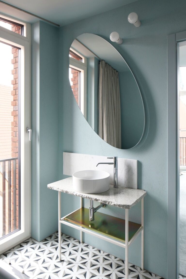
Bathroom
Since Polar Sky is good at reflecting light throughout a room, experts recommend using it on walls. The rest is up to you – considering a catchy color blend with complementary colors for furniture or keeping it sleek and airy. All types of textures and metallic finishes look great on the polar blue canvas.
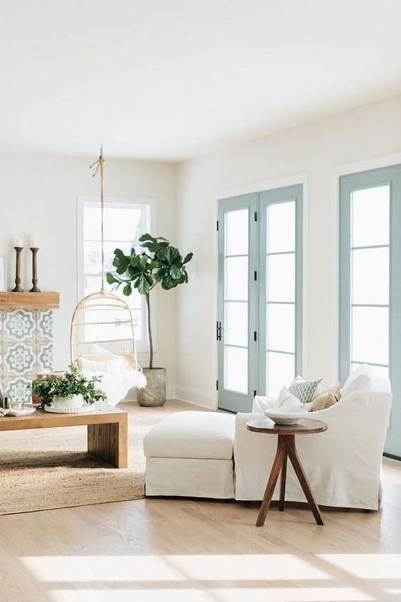
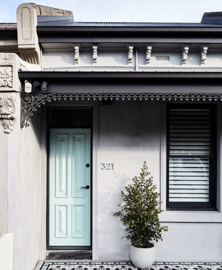
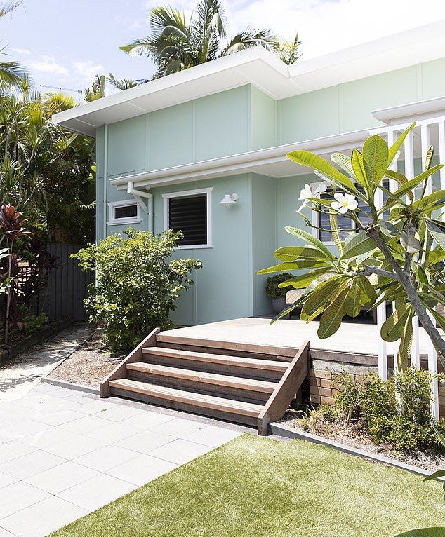
Use of Polar Sky for the House Exterior
The green undertone in Polar Sky resonates more with Coastal exteriors, especially if you decide to paint the exterior house walls. Pair them with a bright shade of white, and you can enjoy the result. Simultaneously, this powdery blue paint color is more versatile regarding front doors.
The Polar Sky 1674 paint color by Benjamin Moore redefines the sense of home. Nothing compares to the tranquility and harmony this blue tone brings to your home. Its versatility and ease of use in interior and exterior design make it more attractive.
