A sunny dusty rose diluted with nostalgia for the bright '80 trends and contemporary self-expressiveness; one of the trendiest bold colors on the Dulux's new palette.
Princess Pink (Dulux): What Color Is, Review, and Use
Unlike in other design seasons, current trendsetters inspire us to put aside everything neutral, impartial, and minimalist and embrace the wide range of the trending-now bright colors. Deviate from rules and find the courage to express your inner feelings with the most vivid colors while renowned color brands support you with bursts of unimaginable shades of festive colors.
You can start with lighter and softer tones and pave your way to the up-to-the-minute maximalist trend. Impactful pinks, hazy greens, and pale blues hold the lead. Today, we pay tribute to a nostalgic and simultaneously modern dusty pink from Dulux. The glorious shade from the Red color family with a royal name, Princess Pink, opens a new perspective on design. You can really stand out with a genuinely authentic design project with such a pink shade at hand. Find out how!
Princess Pink Paint Color Features
You should not be misled by the name and regard this powerful pink tone as a girly color. By the way, pink was associated in the past with masculinity as part of the Red color family. Princess Pink is a royal shade of dusty rose that has been integrated into interior design as an alternative to neutral shades once the Minimalist design style took the leading position.
Unlike usual pink shades, this foggy pink looks mature and elegant. Of course, we appreciate it involuntarily as feminine, yet there is more to it. Princess Pink bears such values as elegance, compassion, and nurture. PP ensures a peaceful ambiance in interior design, positively affects your creative abilities and enhances the mood. It feels romantic, healing, kind, expressive, original, attractive, and lively all at once.
Princess Pink: Is It Warm or Cold?
We’ve mentioned it a few times; Princess Pink is part of the Red color family. Consequently, we can notice a prevailing concentration of Red in the RGB value (Red, Green, Blue). This means nothing else but the fact that the trendy pink tone from Dulux is obviously a warm paint color.
How Does Lighting Affect Princess Pink?
It may seem neutral besides the vibrant shades in the sparkling Revive color collection, yet Princess Pink is a truly vivid pink shade when standing by itself. You can experience the entire range of rich feelings reflected by Princess Pink in a room kissed by sun rays. Here, you can enjoy the warm, slightly foggy pink at its best. If you think a less saturated rose tone would better match your taste, consider Princess Pink mandatorily in a north-facing room. As soon as the slightest shadow gets direct access to this paint color, Princess Pink gives itself up to the foggy gray undertone.
Princess Pink LRV
If you’re a constant guest of our color reviews, you probably know that the Light Reflectance Value shows how light or dark a color is by placing it within the two extremities – 0 for black and 100 for white. Princess Pink has an LRV of 55, the golden mean. A mid-tone paint color like this is pretty skillful at reflecting light. Yet, its bright color base still requires appropriate light conditions not to intimidate the overall color palette.
Princess Pink Undertones
Princess Pink is a pale red tone; allow us to call it rose. We can quickly notice the defining gray undertone and a subtle purplish vibe. Additionally, let’s take a second and admire the sunkissed feature in this pink tone as if it is constantly bathed in sunlight.
Similar Colors
We live in an era when pink is very popular with designers and homeowners. It is no longer a color associated with a girl’s room only. There is more to the emerging pink trend. In this respect, use this opportunity to discover other fantastic pink hues, especially the ones close to Princess Pink.
Coordinating Colors
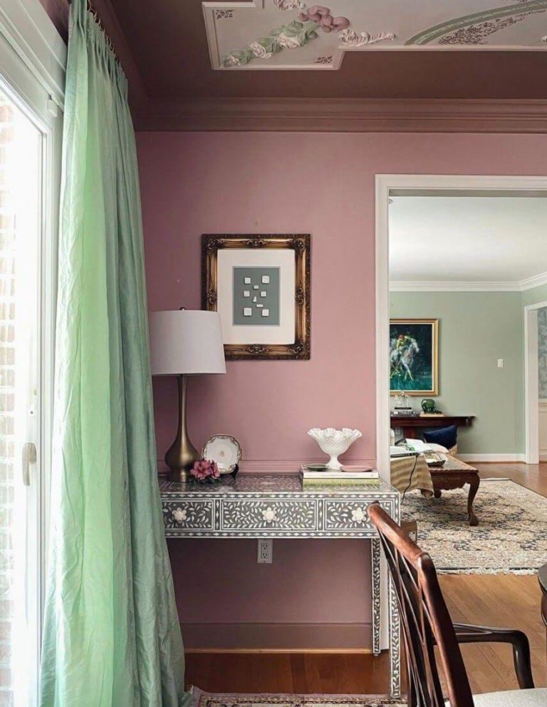
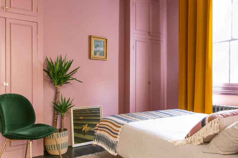
Princess Pink is a subdued rose tone. Therefore, its favorite companion is green in all its variations. Its nostalgic vibe pairs well with other vintage colors like delicate champagne or worn-by-time silverish gray. This trendy pink is shy yet brilliant in its elegant nature, pairing well with whites and grays. Don’t skip the monochromatic option; pair Princess Pink with a deeper pink hue.
Do you find it hard to choose a worthy matching color? Consider one of the following designer-choice paint colors from Dulux:
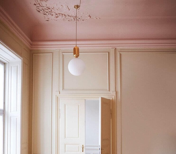
Use of Princess Pink in Interior Design
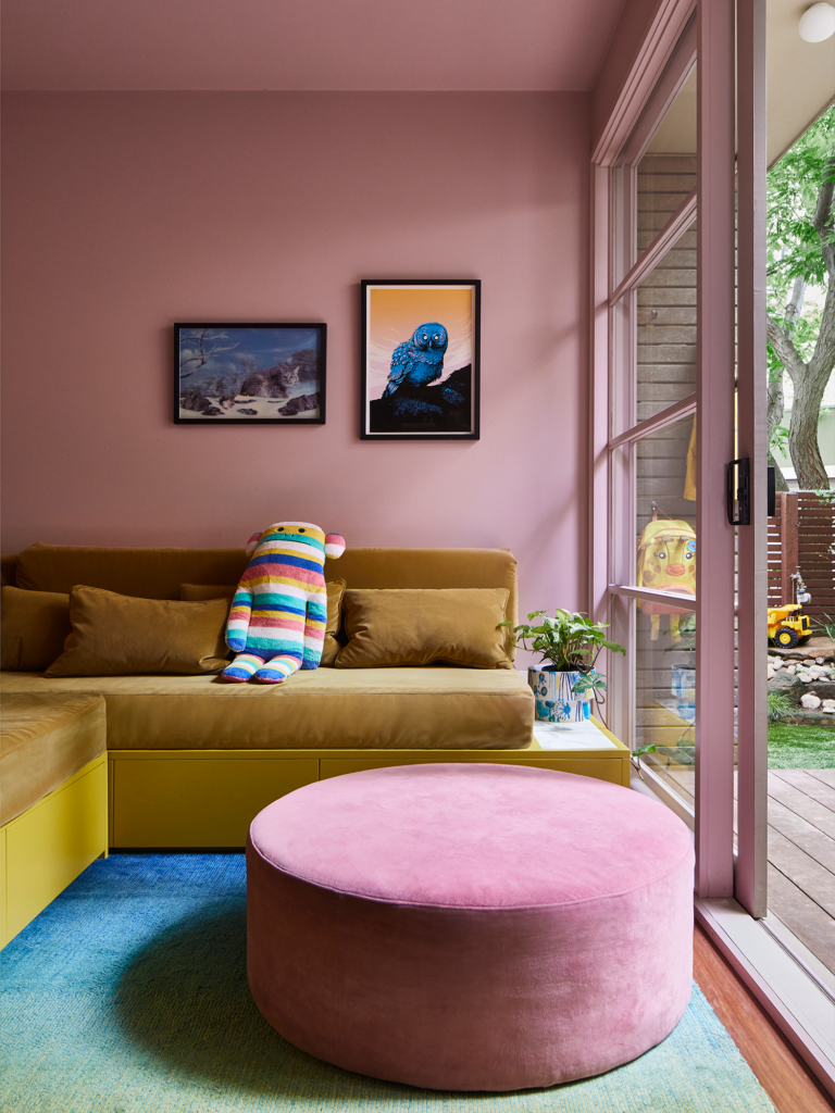
If you like the vintage note in Princess Pink, use it to create a nostalgic ambiance with worn-by-time texture and a familiar color scheme. On the other hand, the cheerful feel in this dusty pink, taking after the bright color trends of the last century, makes it a great color choice for eclectic interiors with rich patterns and bold colors. This elegant and positive rose tone brings energy and comfort to your home.
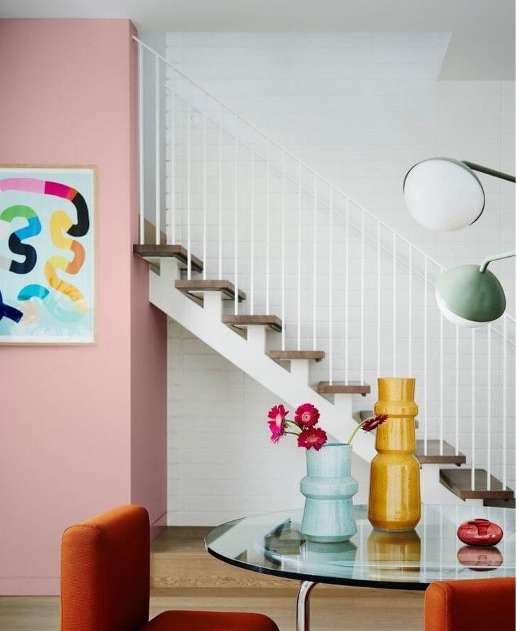
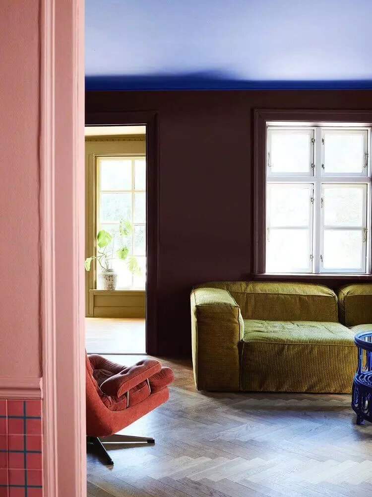
‘80s Design Inspo
Eye-catching colors and show-stealing patterns are no longer seen as untasteful and overpowering. On the contrary, they are the brand-new trend of the season, or should we say, a revived trend traced back to the last century. The pinnacle of the ‘80s design style is the bold combination of the brightest colors, impressive geometric shapes, elements from Art Deco, and expressive decor. Consider the vibrant Princess Pink as one of the defining colors in the room and enjoy the stylish design.
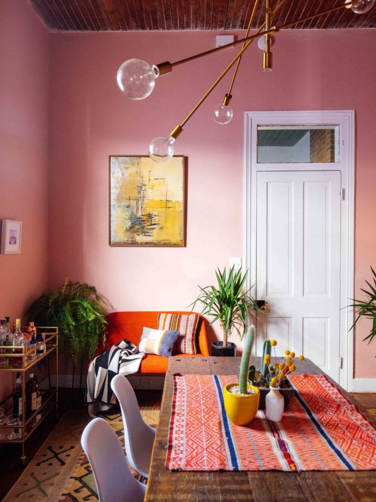
A Drop of Pink for Any Style
We know pink is a striking color in Modern design. What about the most unconventional styles? Add a bit of pinkish affection to Rustic, Mid-Century, Industrial, Classic, Neoclassical, Vintage, and any personalized design concept. Those styles wouldn’t normally choose pink, yet here we are, in a design era when everything is possible. Enliven your interior, stay on trend, and enjoy your abode in terms of comfort and style.
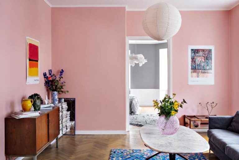
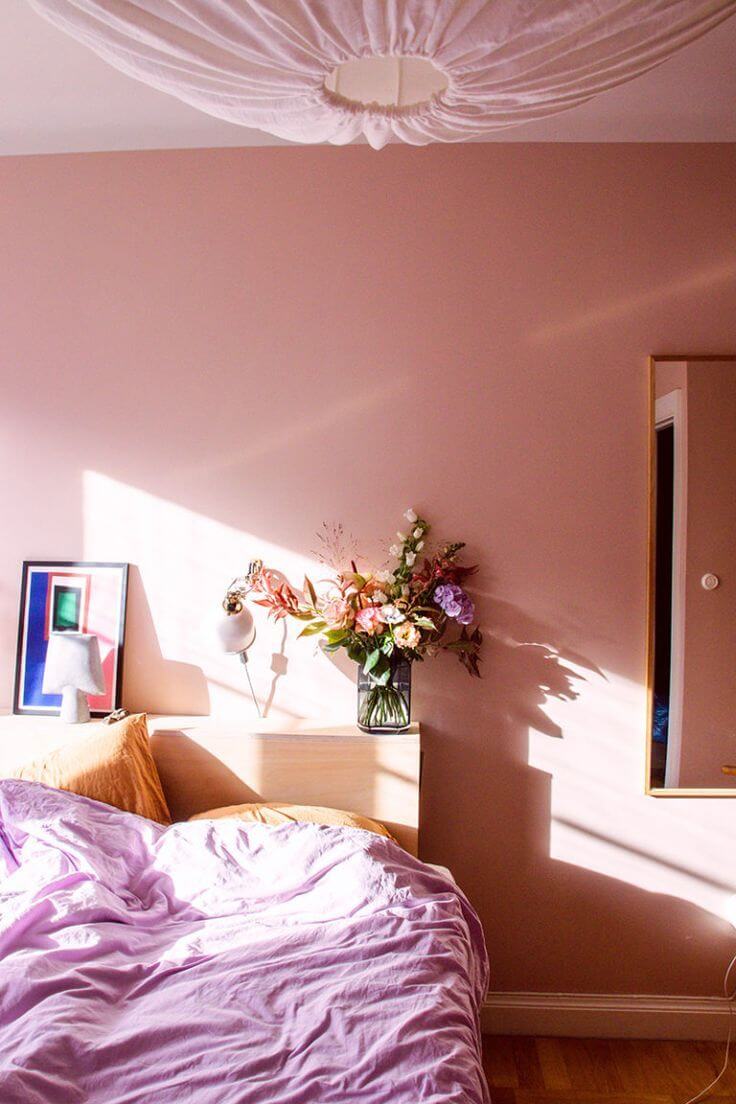
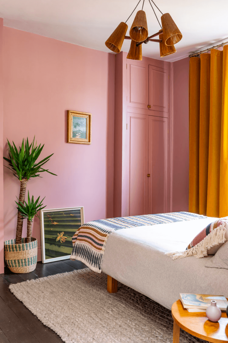
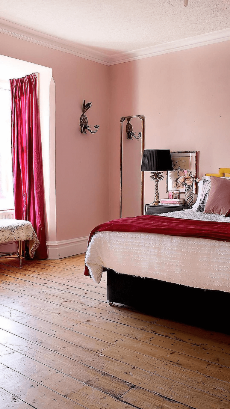
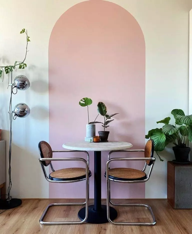
Sunkissed Bedroom
Do you want all-year-round summer in your sleeping space? No need to move to a southern location. Colors are a solid psychological tool. Take Princess Pink as an example. Its delightful dawn effect will cozy up the space. This trendy and lively color pairs with many natural materials and colors, considering a full-pink repainting or a pink feature wall.
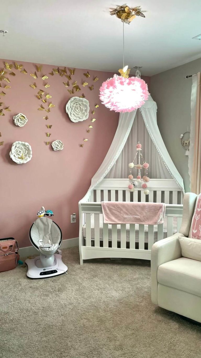
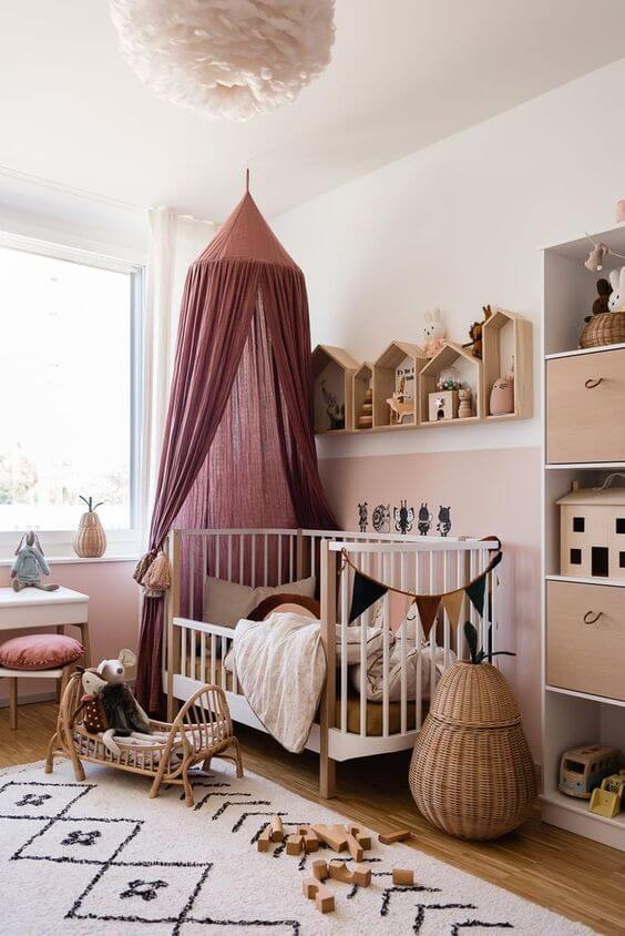
Princess Pink Nursery
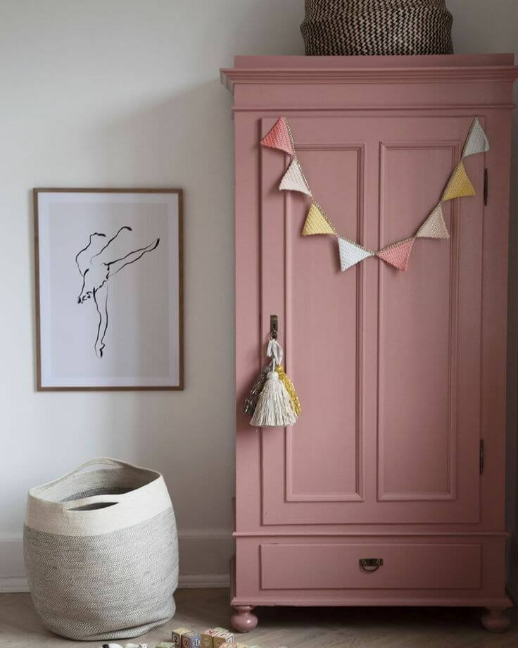
Although experts urge us to deviate from standards, nobody tells us to avoid sticking to the beloved standard – a pink girl’s nursery. This pink shade radiates a princess vibe. Still, don’t exaggerate; use it moderately by applying this color to wall accents or furniture paired with white or Bohemian natural texture.
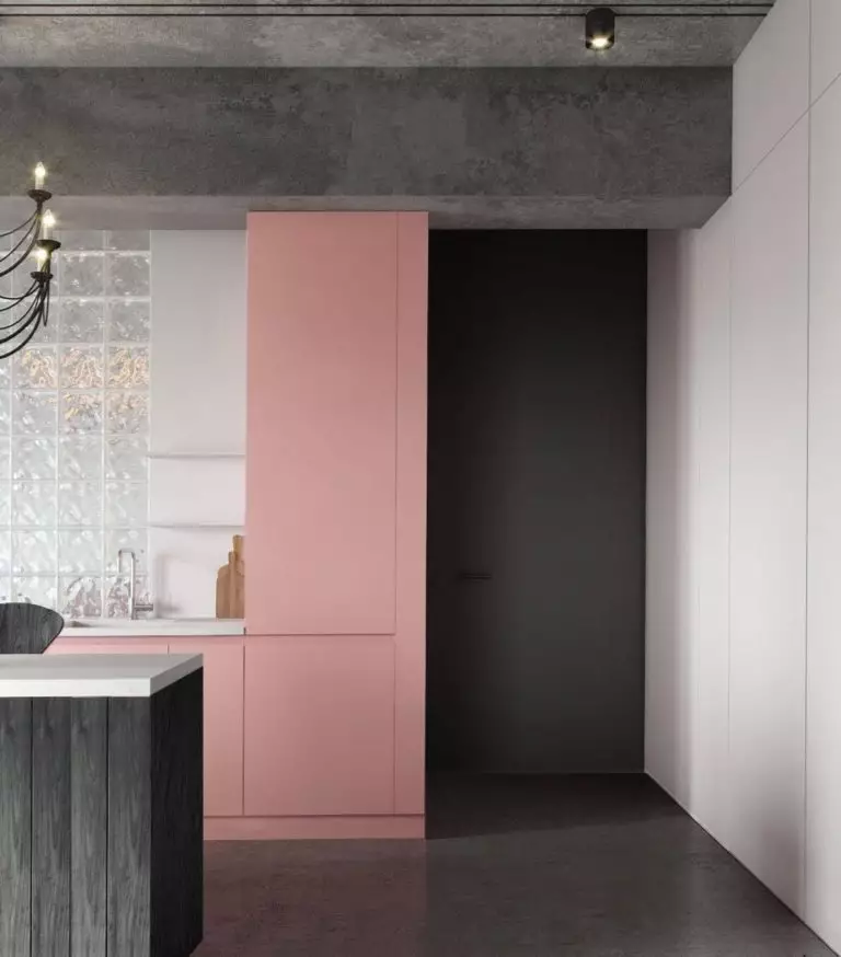
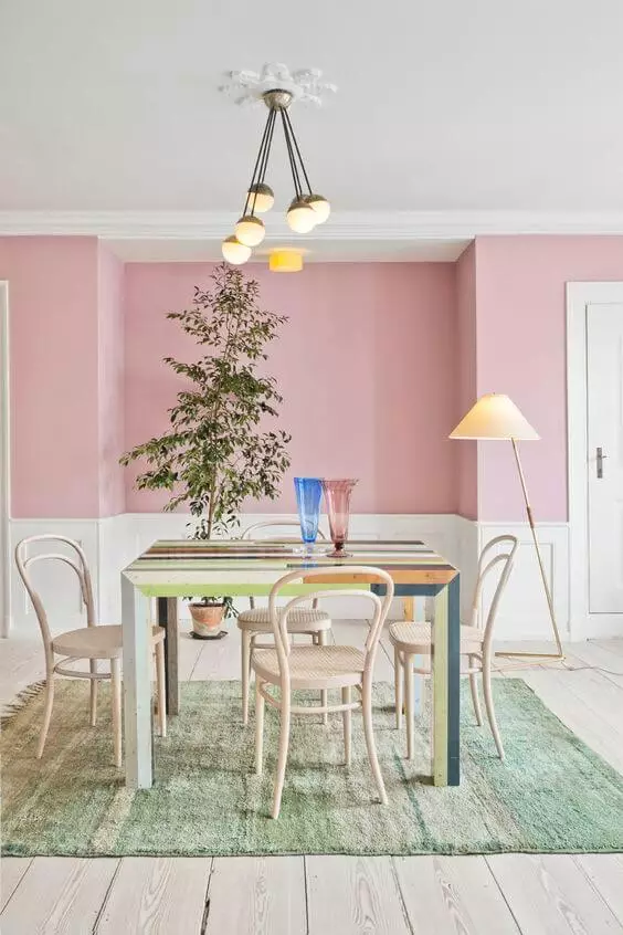
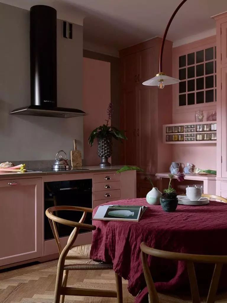
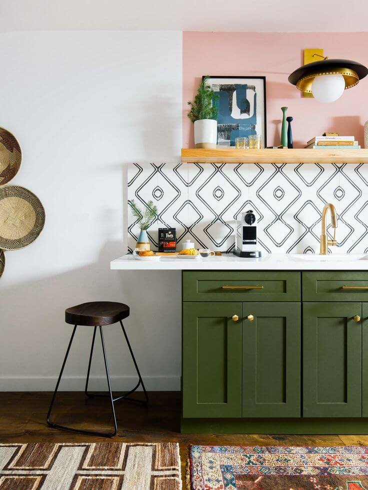
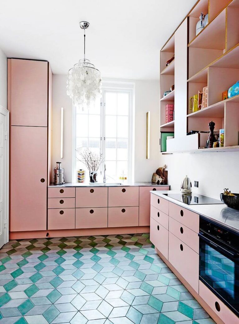
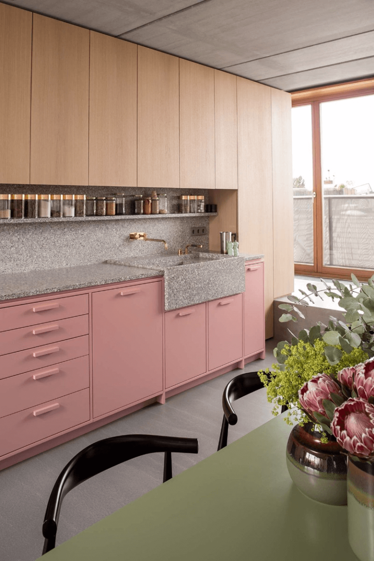
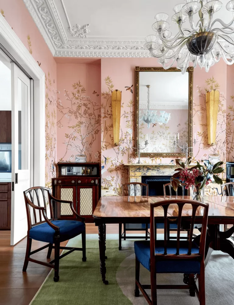
Kitchen and Dining Room
If you spend a lot of time in the cooking space and regularly take your meals in the dining area, pay utmost attention to the surrounding color. With Princess Pink, you will unconsciously feel creative, passionate, and positive in the kitchen. Professionals underline this dusty rose and green compatibility as much as they emphasize the pairing between pink and white or gray.
With the right decor, you can spruce up your dining room to outstanding aesthetical beauty since Princess Pink pairs well with wood, marble, and gold accessories – an elegant paint color for a timeless and engaging mood.
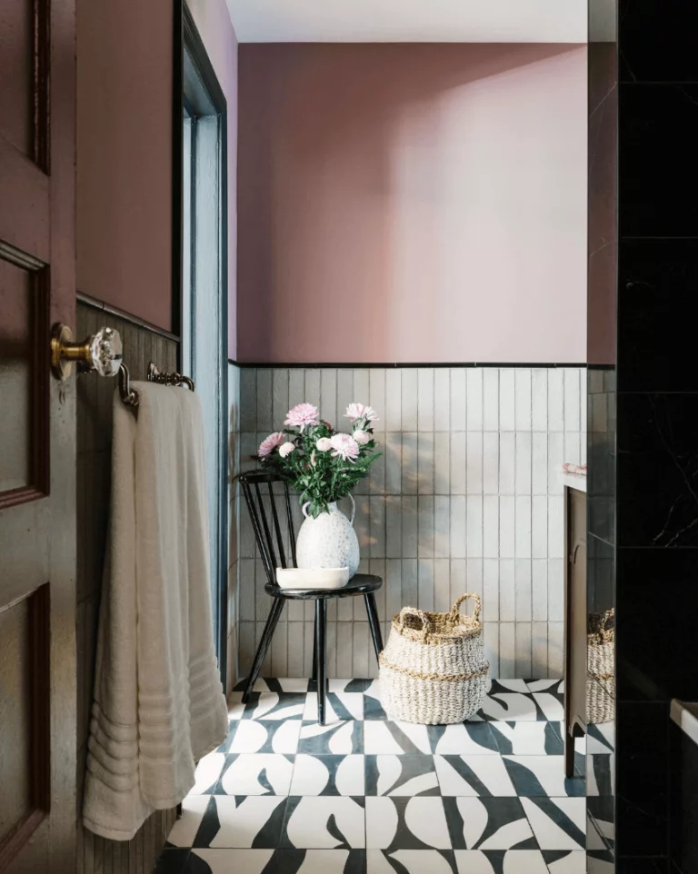
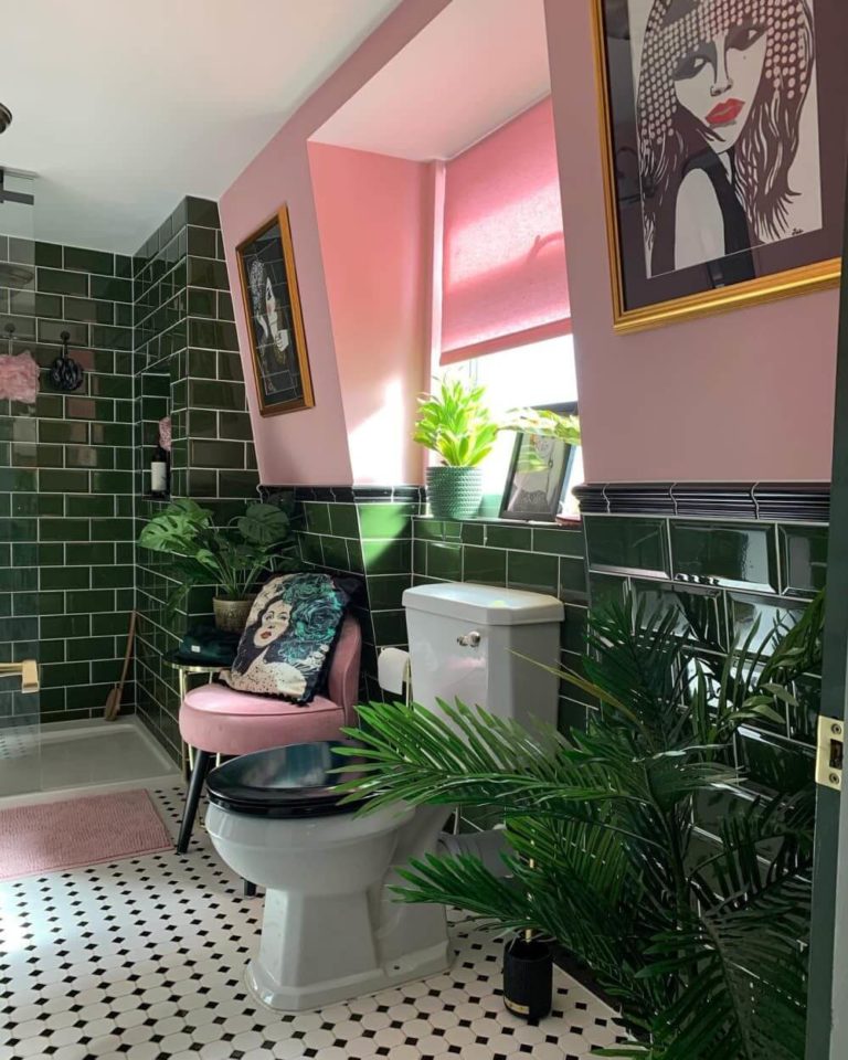
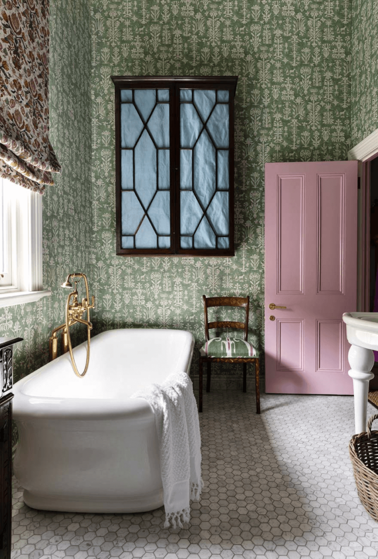
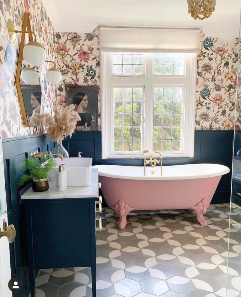
Bathroom
The partnering of pink and green really works, even better than you think. We are in love with this color combination in the bathroom. It lends this space an exquisite and nostalgic allure. Experts are also proud of how Princess Pink looks on freestanding bathtubs, an original accent to dilute your daily routine with entertaining energy.
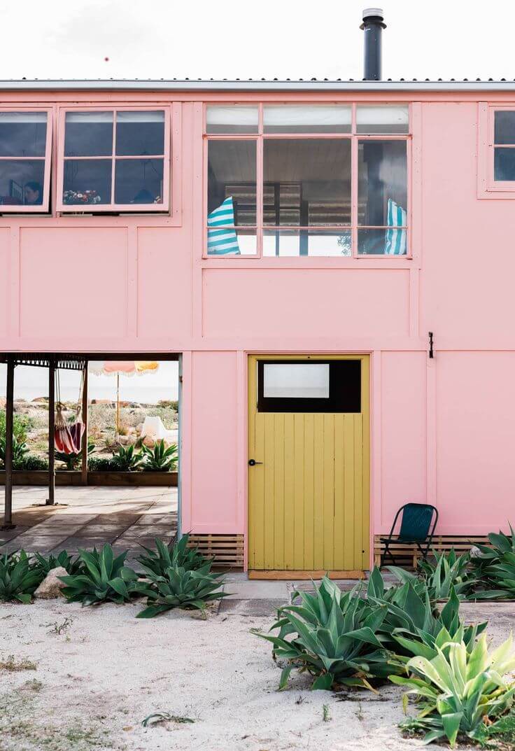
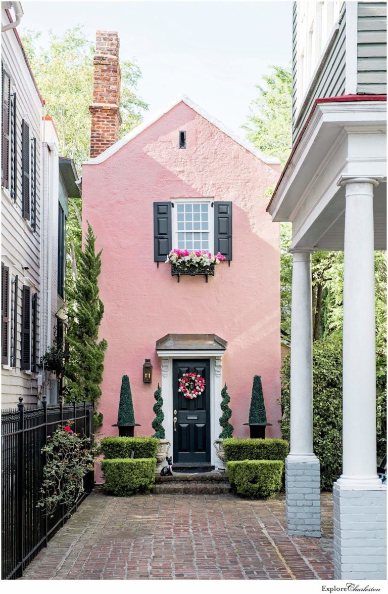
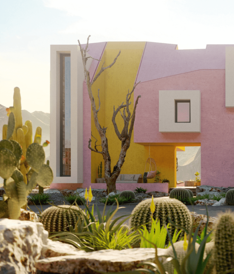
Use of Princess Pink for House Exterior
Princess Pink is a future-to-be high-demanded paint color for the house exterior. It preserves the bright effect under any lighting conditions and makes for an impressively inviting appearance. Mainly seen in southern locations, this trendy pink is popular among lovers of ultra-modern houses with unusual architectural features as much as among connoisseurs of traditional houses.
Princess Pink feels welcome in the company of white, black, or colorful paint for the trim and front door. Speaking of, a lively pink entrance door with white-colored walls may be the trendy accent you have been looking for.
Dulux’s lovely rose, Princess Pink, is a great color to start your journey in contemporary design trends that require more self-expressiveness, originality, and courage. If you decide on a makeover, do it right with the right colors.
