Pristine OC-75
Benjamin MooreA new-era neutral tone revealing the trendiest rose off-white, perfectly opening the season of the emerging light neutral paint colors.
Pristine OC-75 (Benjamin Moore): What Color Is, Review, and Use
Benjamin Moore’s 2024 paint color palette shares a gorgeous collection balanced by calm and vibrant shades that follow the concept of “home and beyond.” The clean and fresh rose off-white Pristine is undoubtedly closer to “home.” This sophisticated paint color has impressive properties, making any space feel like home. If you’ve always dreamt of the perfect neutral to redefine comfort and calmness in your home, don’t pass by this trendy off-white without discovering it. Read on to find out more about Benjamin Moore’s Pristine paint color.
Pristine Paint Color Features
Pristine is part of the Off-White Collection, a light rose neutral that reveals various undertones under specific lighting conditions. Well-balanced and, at the same time, so inviting – this new-age neutral shade is a real find for serene and peaceful spaces to unwind in and escape from daily worries. Still, the most interesting part is that this chameleon color easily adapts to any design style, from sleek Minimalism to sumptuous Neoclassical.
Pristine: Is It Warm or Cold?
Generally, this almond white is warm, and the RGB (Red, Green, Blue) value states the same, with an increased amount of Red. Still, if you look closely at Pristine, you may notice a few subtle cool notes, which give a slight sense of freshness and air to this relatively warm paint color.
How Does Lighting Affect Pristine?
It’s all about the lighting source, natural or artificial, and exposure. In a north-facing room, Pristine will seem muted and slightly cool. On the other side, in a space with southern exposure, you’ll witness the charm of a warmer and brighter rose off-white. Eastern exposure – vivid and warm in the morning yet slightly played down in the evening. Western exposure – fresh and cool in the morning and increasingly warming up in the evening.
Additionally, pay attention to artificial lighting. A more yellow-based lighting source will bring a warmer pink-yellow effect, while the slightly cooler LED bulbs will lead to a stately pigmented off-white.
Pristine LRV
For a start, paint colors with a high Light Reflectance Value make a room feel spacious and compensate for the lack of natural light. On a scale from 0 (black) to 100 (white), Pristine enters the light group of colors with an LRV of 75.08. That’s the percentage of light reflected by OC-75. Feel safe using this paint color in large and well-lit rooms for an enhanced bright and spacious effect, as well as in small and poorly lit rooms to make them seem larger and airy.
Pristine Undertones
That’s the part when everything gets clear. For a start, Pristine is an off-white shade pigmented primarily by a dusty rose undertone. Next, we can notice those subtle gray-blue undertones that keep this shade calm and fresh. That’s the uniqueness of OC-75 – a warm off-white that feels inviting and tranquil simultaneously, all due to the perfect combination of contrasting undertones.
Similar Colors
Searching through Benjamin Moore’s color palettes and collections from other top brands, we came across several similar colors you can easily use as alternatives to Pristine.
Coordinating Colors
The trendy off-white shade from Benjamin Moore is a great color match for fresh and warm whites. Colorists like the contrast between Pristine and deep, cool shades of blue or gray. Simultaneously, tans and warm neutrals are perfect for monochromatic color palettes with OC-75. Green and earthy browns will beautifully underline the rustic side of Pristine. Long story short, explore the best-coordinating colors from Benjamin Moore’s off-white tone.
Use of Pristine in the Interior
According to interior designers who worked with this paint color, Pristine is very adaptable. You can find it in any room of the house, paired with any design style, and it won’t lose its charm. A calm neutral for relaxation spaces and brilliant background color for sophisticated design ideas. Read on for inspiration.
Off-White and Vintage
Now that the cottagecore aesthetic is all the rage, paint colors with weathered effects are becoming popular. Undoubtedly, Pristine is one of the top retro-pigmented off-whites. If you are looking for a flawless background color to match a Rustic or Country style paired with vintage furniture pieces and cottage-like accessories, Pristine is the best.
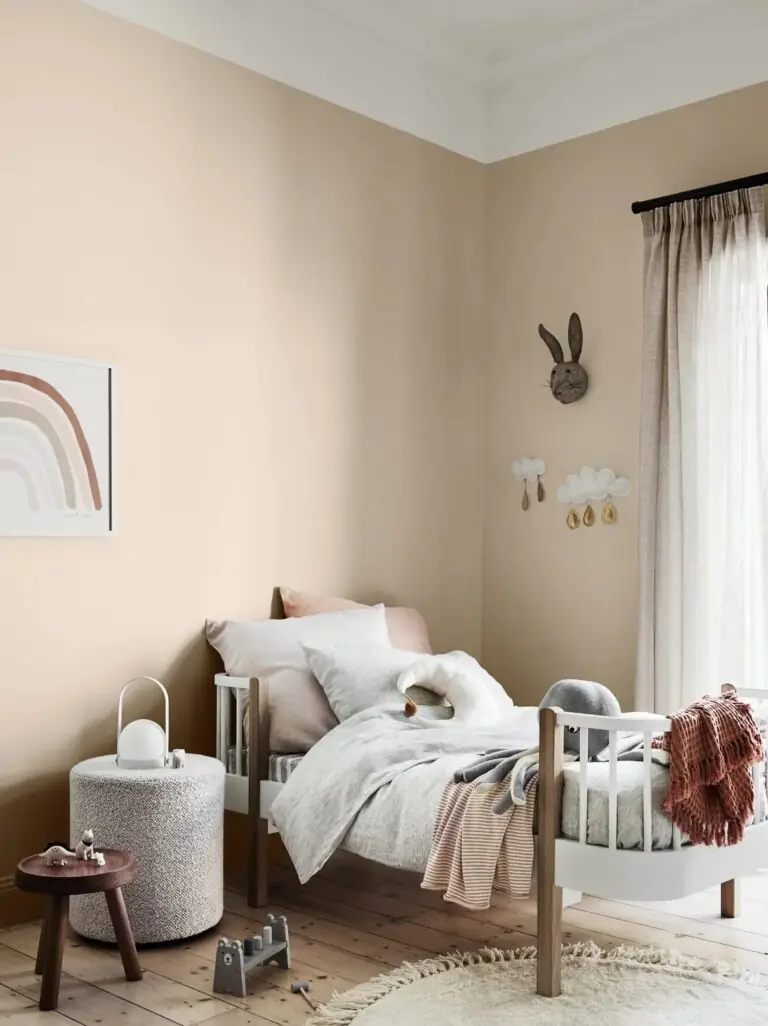
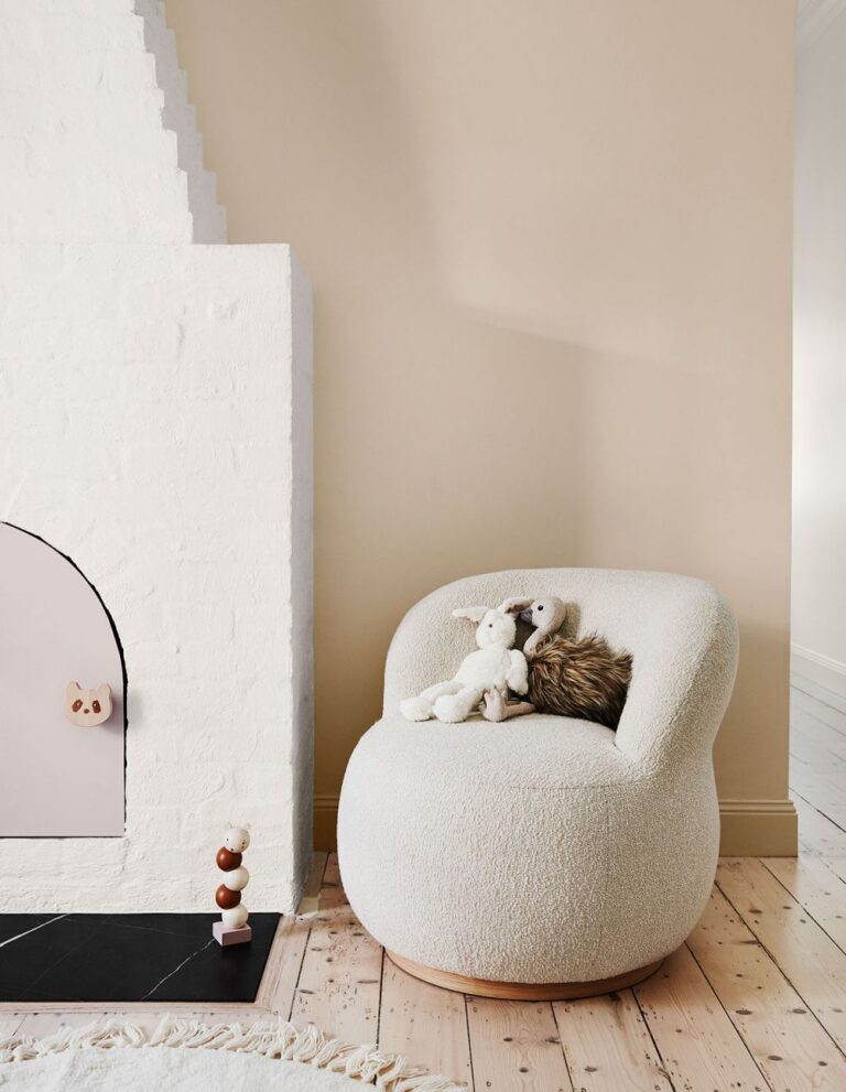
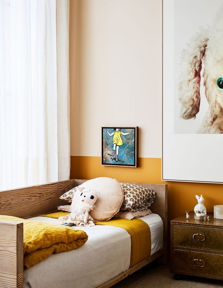
Kids’ Room
Using Pristine in the kids’ room is probably the best investment ever. First, you can start with the nursery. This calming color will create a serene and light ambiance. The gorgeous off-white shade with timeless appeal will last longer than expected. When your child grows up, it will also be a perfect background color for the furniture and decor in the kids’ room.
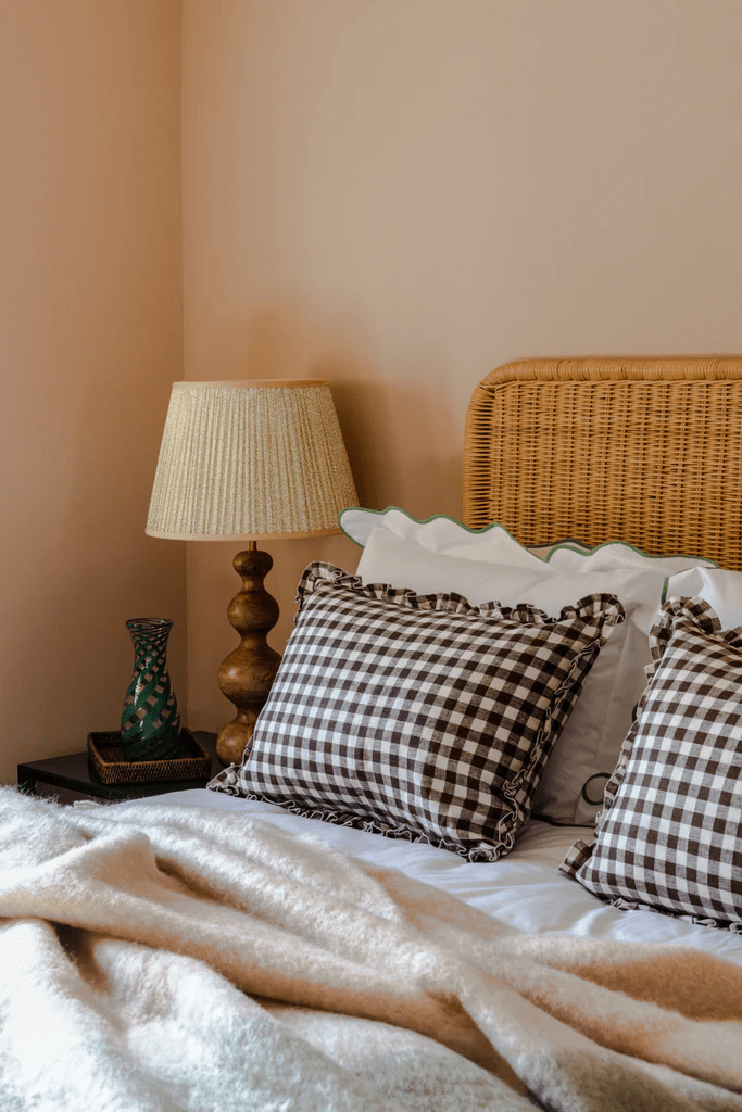
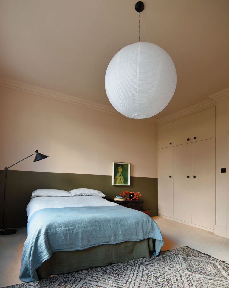
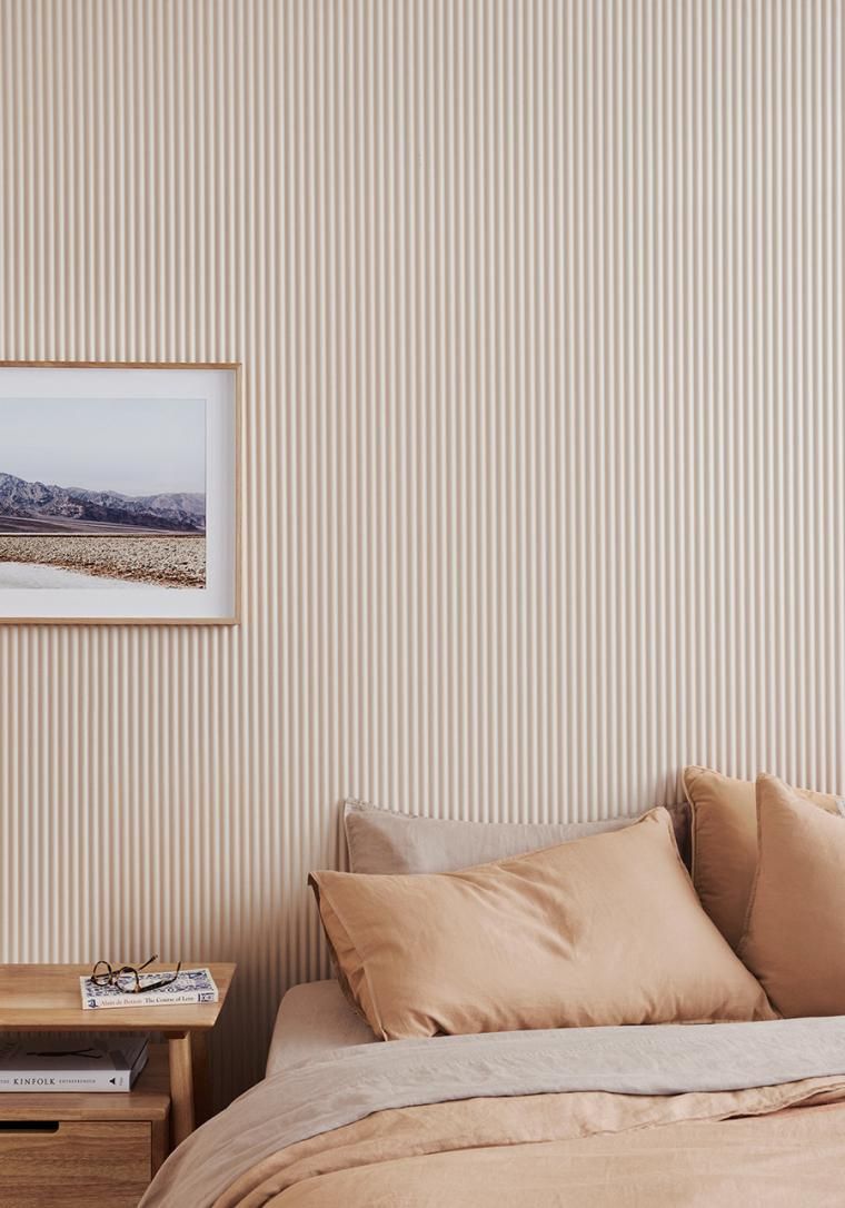
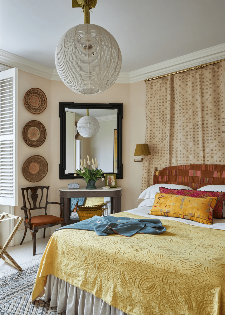
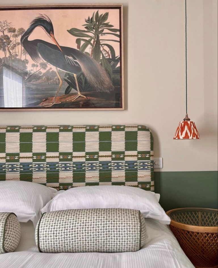
Bedroom
Feel free to use Pristine as a primary paint color in both modern and traditional bedrooms. We are especially fond of monochromatic schemes with this soft off-white on walls and slightly darker similar tones for bedding and other textiles. On the other hand, Pristine combined with green in retro bedrooms looks like out of a magazine. Enjoy the trendy off-white calm and soothing effect all year long and witness its beautiful transformation during the day.
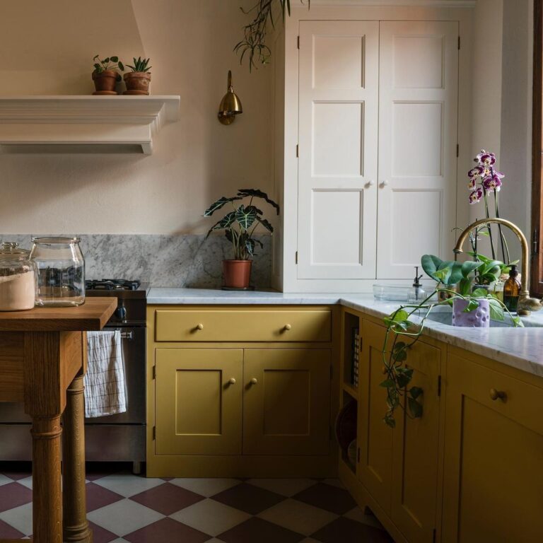
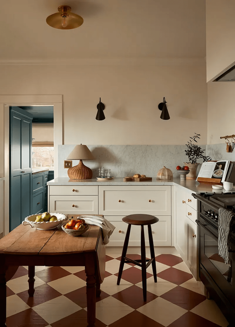
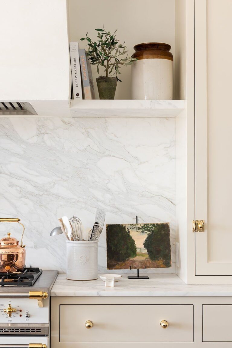
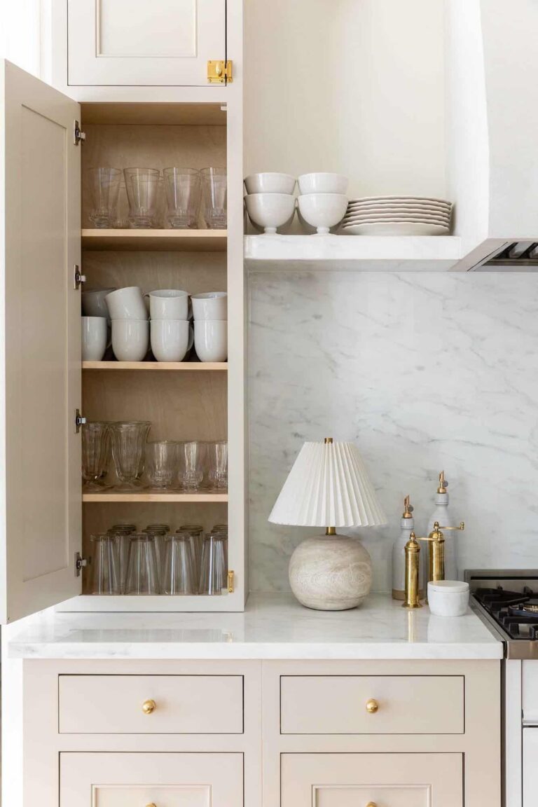
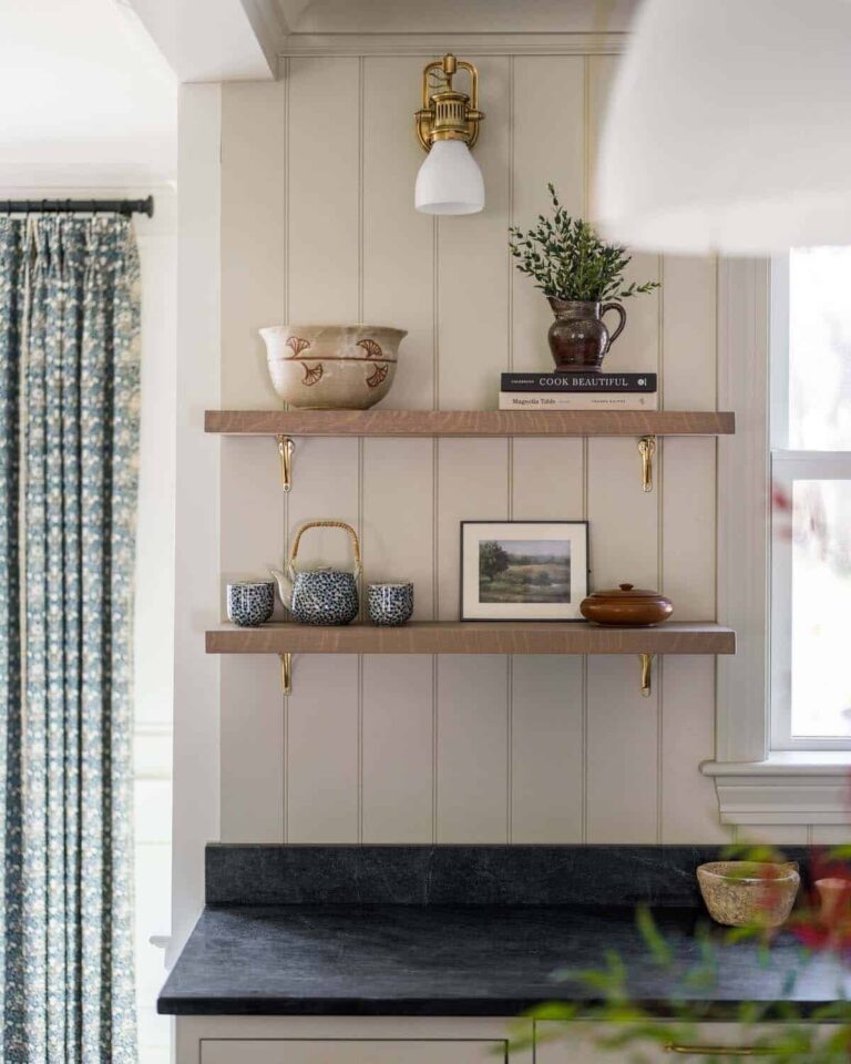
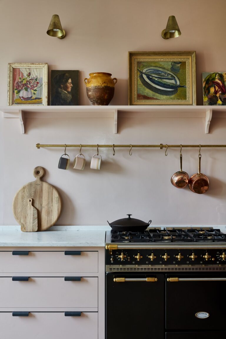
Kitchen
In the kitchen, designers like to use Pristine both on cabinets and walls. Although modern cooking spaces look no less stylish when polished with this delicate white tone, decorators prefer traditional, such as Farmhouse or Country kitchens in this shade. Metallic hardware and wood accents beautifully stand out on the pink-white background.
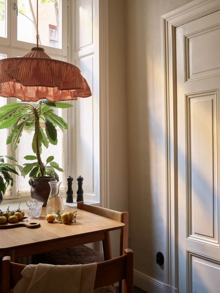
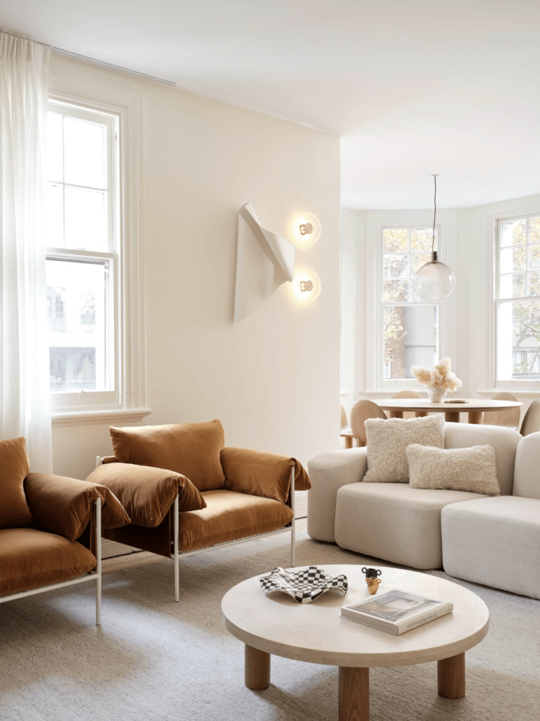
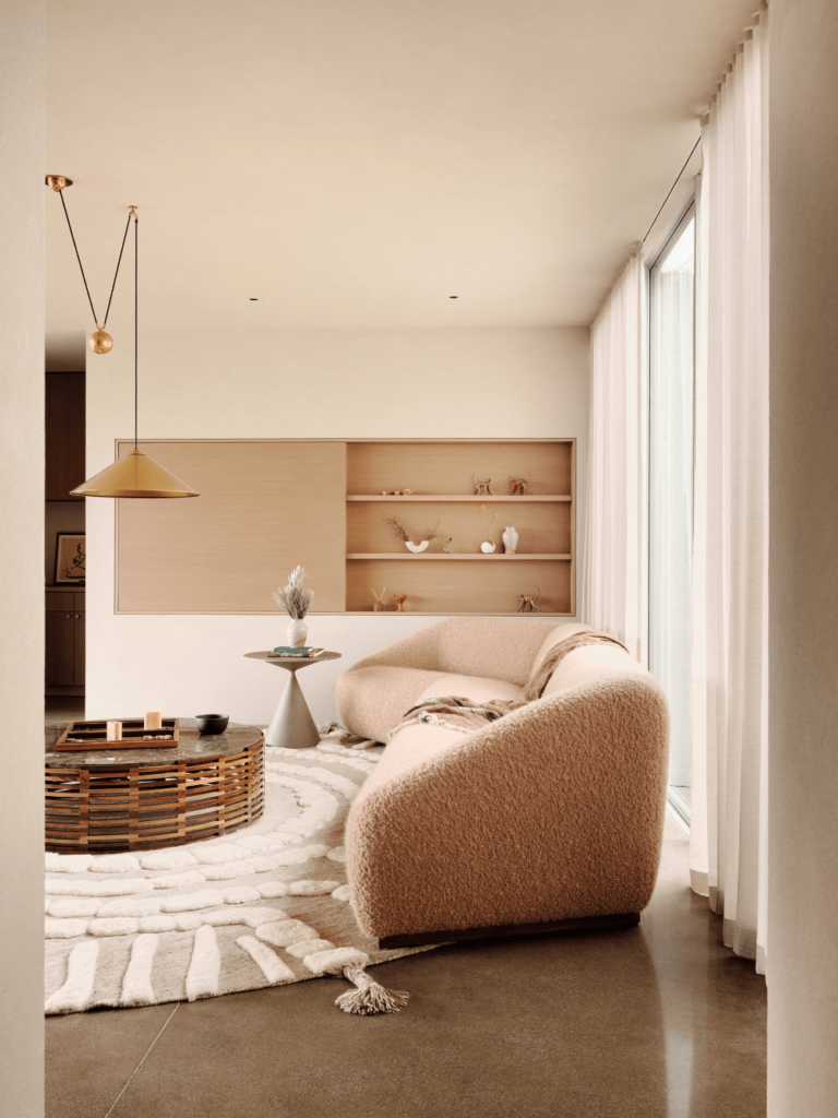
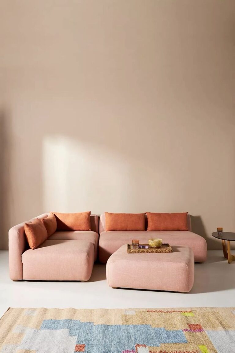
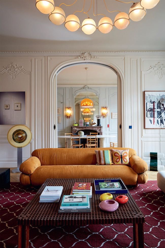
Living Room
It’s time to reveal the modern side of this fantastic off-white we cannot get enough of. Try rose-white walls in contemporary living rooms in the company of a sleek and decluttered layout, or make the most of this background color by contrasting it with colorful or textured accents. We’ve heard that the warm undertones in Pristine pair well with the wooden texture.
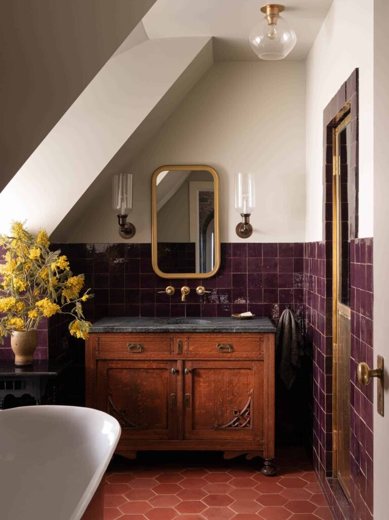
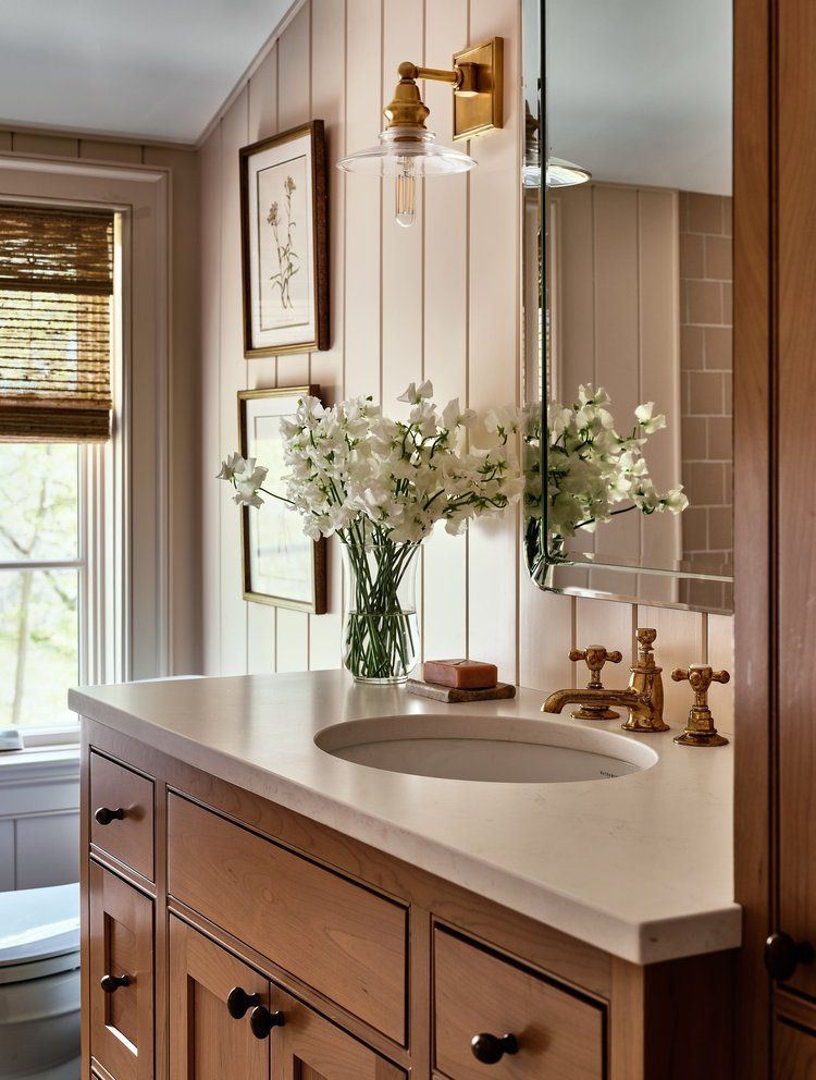
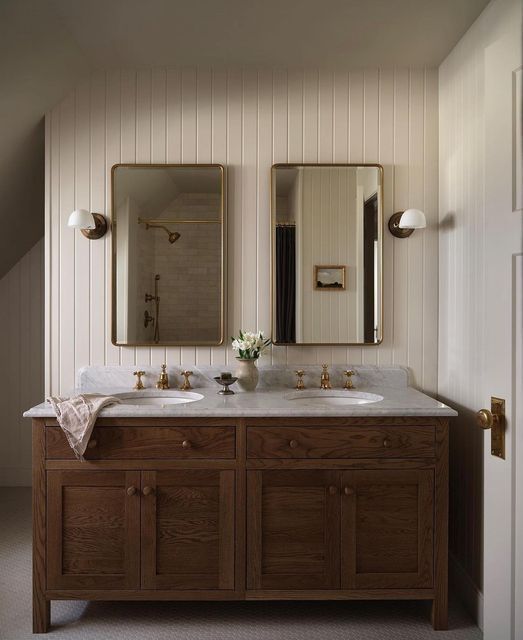
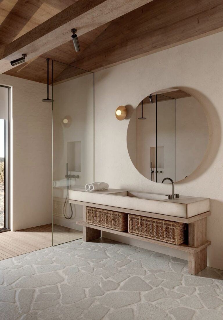
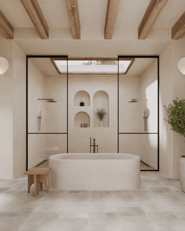
Bathroom
Let’s reveal a new secret about Pristine by Benjamin Moore. It actually has the slightest hint of summertime peach, which is perfect for bathrooms. At least that’s what designers say about the color of the year – peach. Warm up the cold and utilitarian bathroom with a tinge of peach-pink off-white on the walls. We like it in rustic bathrooms with a countryside appeal, yet nothing compares with the spa effect of Pristine in similarly designed bathrooms, full of natural texture.
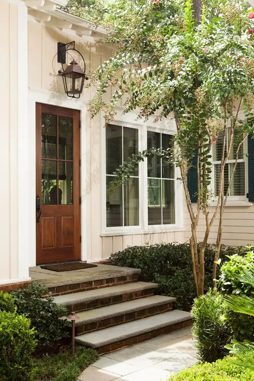
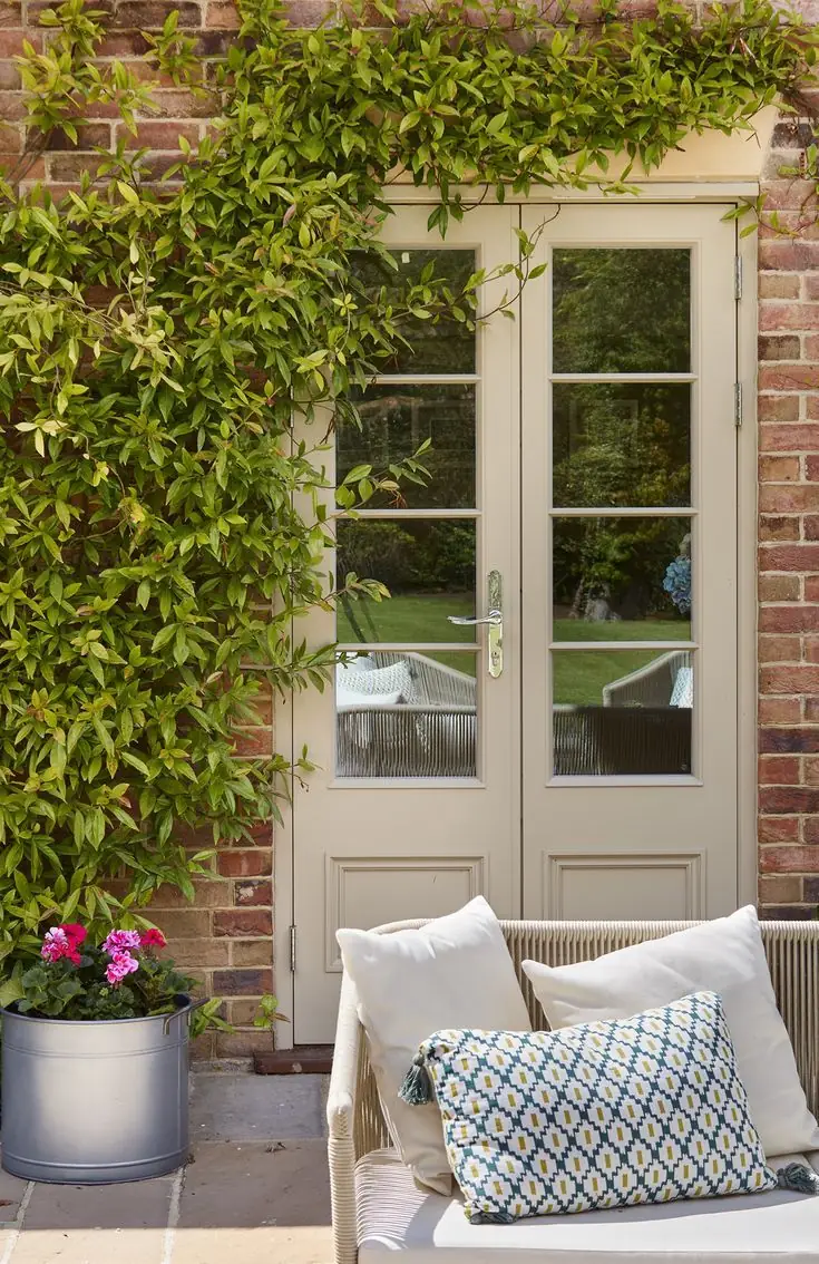
Use of Pristine for the Exterior
It seems Pristine is similarly flawless on the exterior house walls or accents, such as the front door, which works when paired with brick walls. That’s the unusual neutral paint color you’ve been looking for – to add character to your home while ensuring it looks stately and feels no less inviting.
The Pristine OC-75 paint color by Benjamin Moore proudly enters the category of new-age neutrals. Light neutral paint colors are expected to make a huge comeback. Be among the first to enjoy this new and unmatchable rose off-white.
