Proper Gray SW 6003
Sherwin-WilliamsThis neutral shade of gray reflects balance, bringing any contrasts to harmony, which appears to be an essential element for contemporary design ideas.
Proper Gray (SW 6003): what color is, review, and use
The current approaches to interior design tend to interpret such concepts as simplicity, functionality, and laconicism. One of the colors that are particularly popular in this respect is gray. Although it is neutral, besides serving as a perfect background, its variety of shades opens up new possibilities. Do you fancy an interior full of depth and focus, an environment penetrated by serenity and cohesion, or an unexpected rhythm and consistency? Gray is your solution.
Luckily, paint manufacturers have rich palettes for this particular color, including all possible shades for any style and standards. Sherwin Williams is not an exception. One of their gray paints stands out in particular. Not that it resembles anything or refers to a specific aspect. The essence of this shade is its simplicity; no secrets to be discovered or associations to be drawn out of it. It is not light, nor dark; not too eye-catching nor too blurry; it is an interpretation of balance. The name itself, “Proper Gray”, points out its existence as a basic neutral color that doesn’t try to prove anything since it is beautiful anyway. You probably wonder why it has gained so much attention from designers. This neutral shade of gray reflects balance, bringing any contrasts to harmony, which appears to be an essential element for contemporary design ideas. Let’s discover the main features that have led to such a result!
Proper Gray paint color features
Even such a neutral color as gray is divided into categories of various shades: lighter, darker, warmer, or colder. When it comes to Proper Gray, there is no doubt that it has a little from each of the groups. Nevertheless, we cannot help ourselves but notice its cool undertones, and it is not a surprise since gray in itself is a cool color. Such features as versatility, flexibility, and friendliness rate this neutral shade as one of the best choices for pairing. The explanation is clear as day: Proper Gray is happy to accompany any other colors and reveal their best parts. One may say that such a cool shade of gray can induce a subtle draining effect. Not this one! Our friendly gray tries to bring harmony rather than disturb it.
Proper Gray: is it warm or cold?
Not surprisingly at all, Proper Gray cannot be called a warm color. Nevertheless, it does not mean that it belongs to cold shades. What color is it then? This subtle splash of neutrality is indeed directed towards cold tones, although not reaching the limit, which makes us refer to it simply as a cool shade of gray. Such a statement proves one more time that a neutral shade of gray, which seems not to have much to impress you with, is trickier than you thought.
How does lighting affect Proper Gray?
As with any other cool shade, an appropriate amount of light will reveal the brightest parts of this color. It is worth bearing in mind that an enormous amount of light is required, be it artificial or natural. The opposite will darken the space. If natural light keeps you on the safe side during the day, appropriate artificial light will do the same at night. One should note that under the influence of the latter, Proper Gray acquires a slightly darkened look, although subtle warm undertones appear from nowhere and offer the room an appealing and comfy environment.
Proper Gray LRV
The LRV light reflectance of Proper Gray by Sherwin Williams is not that high, reaching a value of 39. It means that our shade is slightly touching the starting line of middle tones. Although not being able to reflect larger amounts of light, it still has the potential to brighten the space only under the condition that an appropriate amount of light is ensured. We cannot speak in this case about any expanding effect. To offer you a better insight in this sense, we would like to associate a room painted in this shade with a cocoon: light enough to keep it pleasant, surrounding from all sides to keep you comfy.
Proper Gray undertones
As you have probably understood it all by yourself, Proper Gray is devoid of undertones. It is a neutral combination of black and white with subtle notes of coolness. One may notice a slightly noticeable beige echo on the horizon when artificial light enters the game, which is not a surprise since lighting plays a great deal in the perception of color. Nevertheless, Proper Gray is an impartial color that can adapt to your situation and help you achieve the wanted effect.
Similar colors
At this point, we think that it is not a surprise that various color palettes from different paint manufacturers are ready to impress with their similarity when it comes to such a popular color as gray. Although we cannot doubt the uniqueness and unprecedented versatility of Proper Gray, we also cannot skip mentioning some of the best alternatives and open to you a wide range of possibilities. Let’s discover them little by little!
Coordinating colors
There is no need to mention once again the friendliness of Proper Gray. Its belonging to neutral colors is self-explanatory in this respect. That is when the real magic starts. Do you want to go bold? Do you want to keep it simple or as extra as possible? This versatile shade will accompany any of these options. Nevertheless, experts from Sherwin Williams stick to the concepts that we began our article with. A minimalist approach to design requires a similar perspective on colors. Let’s see what they have in store for us!
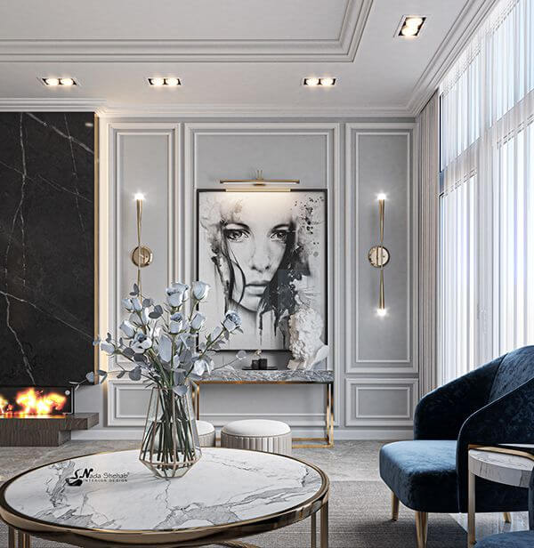
The use of Proper Gray in interior
The versatile feature of Proper Gray explains its wide use in the interior, regardless of the style. It is perfect to be paired with other neutrals for a slick and modern environment or to serve as a background for luxurious details. This is why we are impressed with this shade and are ready to make you feel the same way with various design ideas that include the use of one of our favorite shades of gray.
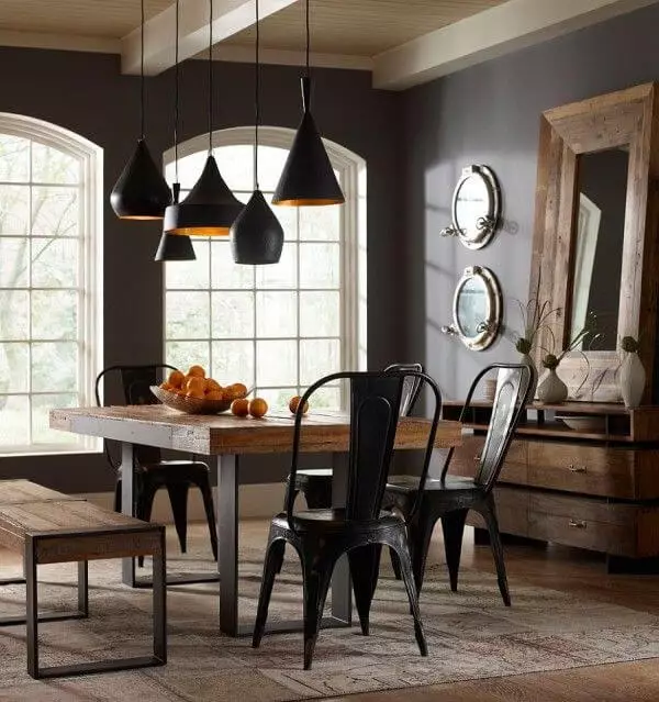
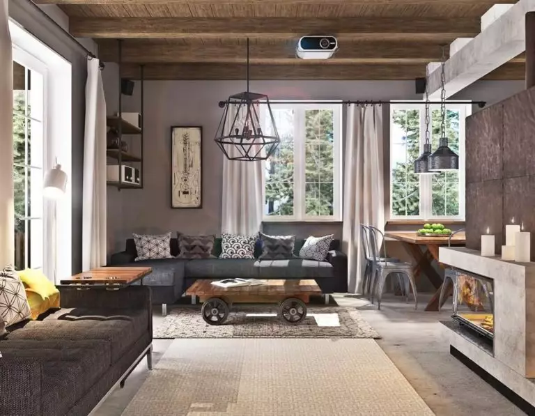
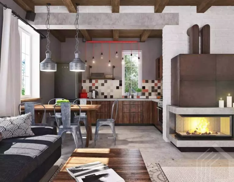
Industrial style at its finest
The concrete walls can be successfully replaced in an industrial interior with gray, and Proper Gray is the exact color we mean. Its cool undertones perfectly reflect the raw surface. An additional brick wall, a leather sofa or, a bold accent for the furniture, a few decorative elements peculiar to this style, and your industrial style is complete. Since such an approach requires consistency all over the house, you can easily go with this paint for every room. Functional, contemporary, and no less effective, Proper Gray is your true companion on this adventure.
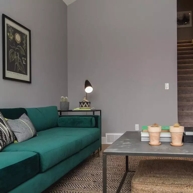
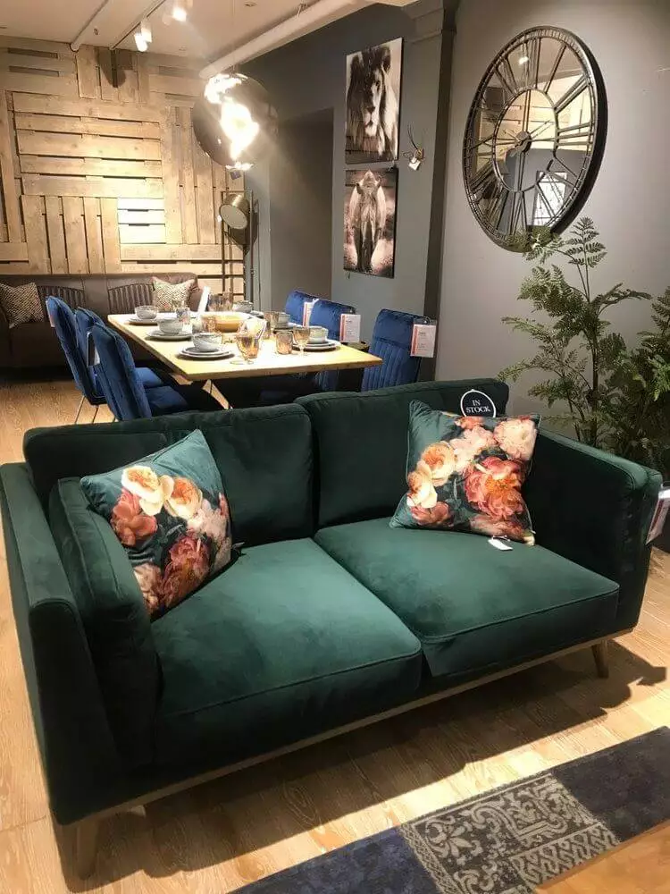
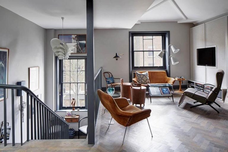
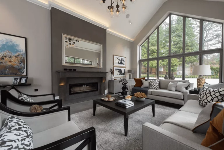
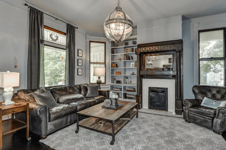
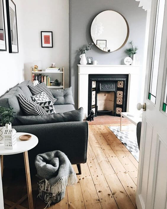
Modern sophistication
As we have mentioned, Proper Gray will go with any style and even with an eclectic combination with more styles. Such approaches require a neutral backdrop to reveal all their beauty. The living room seems like a perfect space for such experiences. Paint the walls in this surprisingly flexible shade of gray or opt for an accent wall, adding elements from particular styles, such as a classy leather sofa and a rustic coffee table, a modern comfy couch and an extravagant chandelier, a minimalist arrangement of furniture and a few colorful decor units. Proper Gray is a new white by means of using it as a canvas and painting on it your dream design.
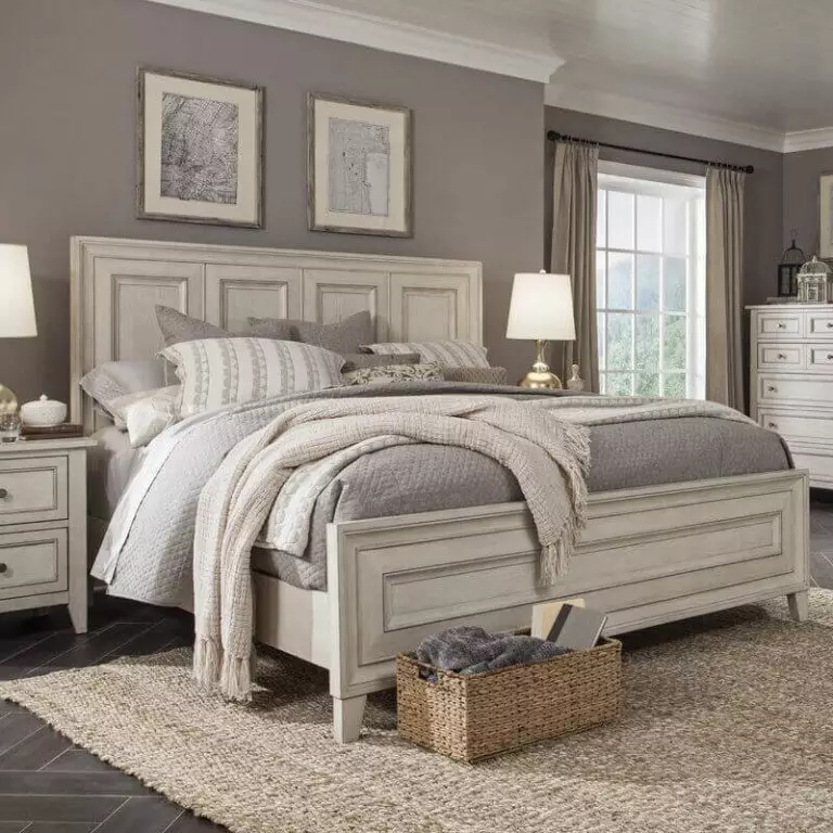
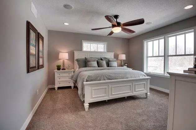
Bedroom
One may say that this color is too cold for a bedroom. We see it the following way: it is indeed cool, but don’t forget about the cocoon effect. What space would benefit from such an effect more than the bedroom? We don’t suggest stopping at an accent wall. Paint the walls entirely in Proper Gray and let it play its trick on your imagination. Accompany it with contrastive bedding for balance and wooden texture for increased comfort. Furthermore, this shade will be perfect as a backdrop for decorative units on the wall.
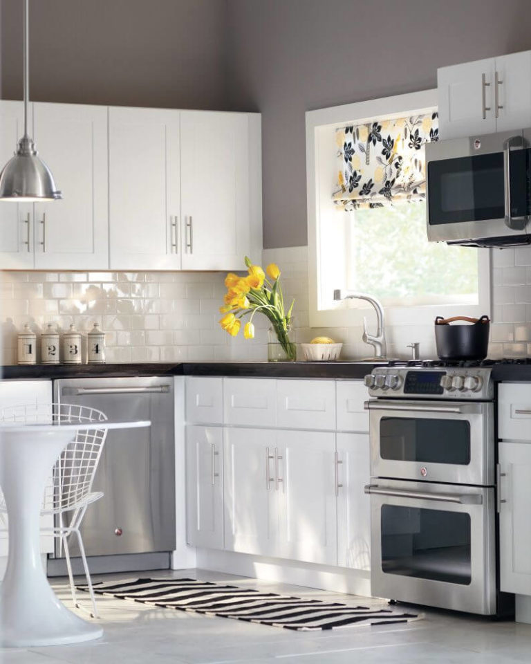
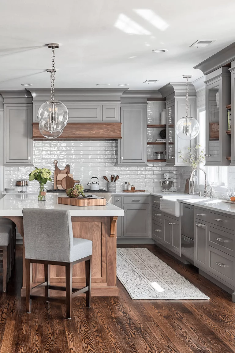
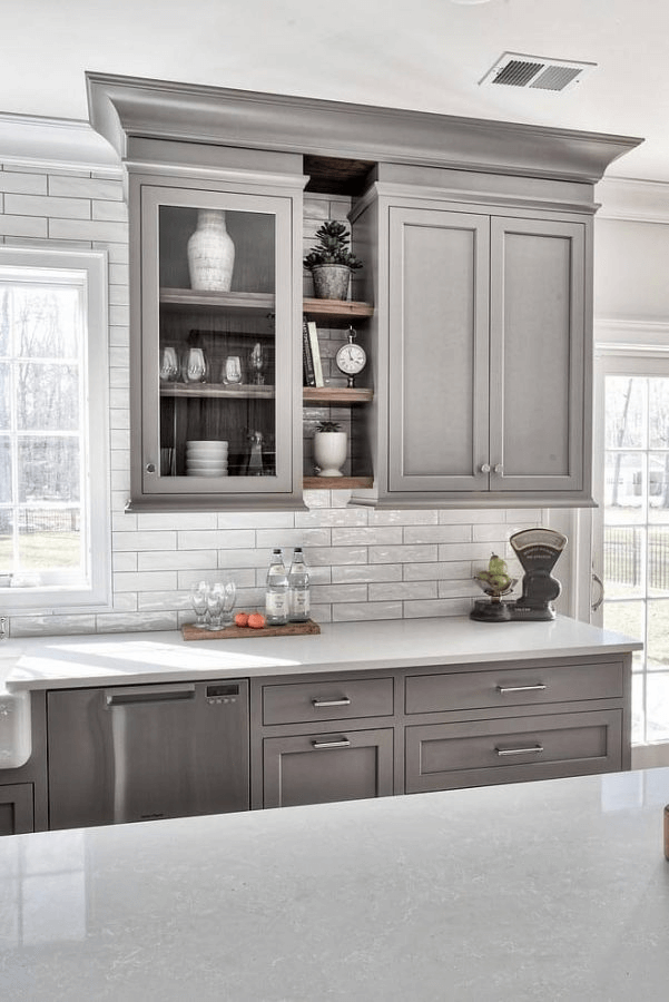
Kitchen
Proper Gray for the kitchen walls? Perfect. Proper Gray for the kitchen cabinets? Even better. Suitable for any style, adaptable to any color, this shade of gray will make you fall in love with your kitchen again and again. Although the range of possibilities is wide, we would like to emphasize two options in particular: gray walls and white cabinets and the opposite – white walls and gray cabinets. It is contrastive enough not to let you get bored and balanced enough to ensure a harmonious environment; slick, functional, and impressively outstanding.
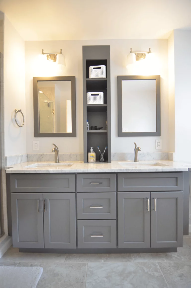
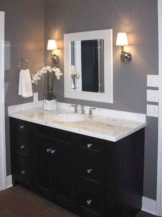
Bathroom
There is no way we could speak about gray and skip this space. Notwithstanding the perfect integration of Proper Gray in a bathroom, there is one aspect one should carefully consider. Bathrooms are usually not that big, and the use of a cool shade of gray may lead to a darkening effect. In order to avoid a result like that, it would be better to paint the cabinets in this color or opt for an accent wall. You can go as far as painting all the walls in Proper Gray, although an appropriate amount of light is required to brighten up the space and reveal the hidden warm undertones.
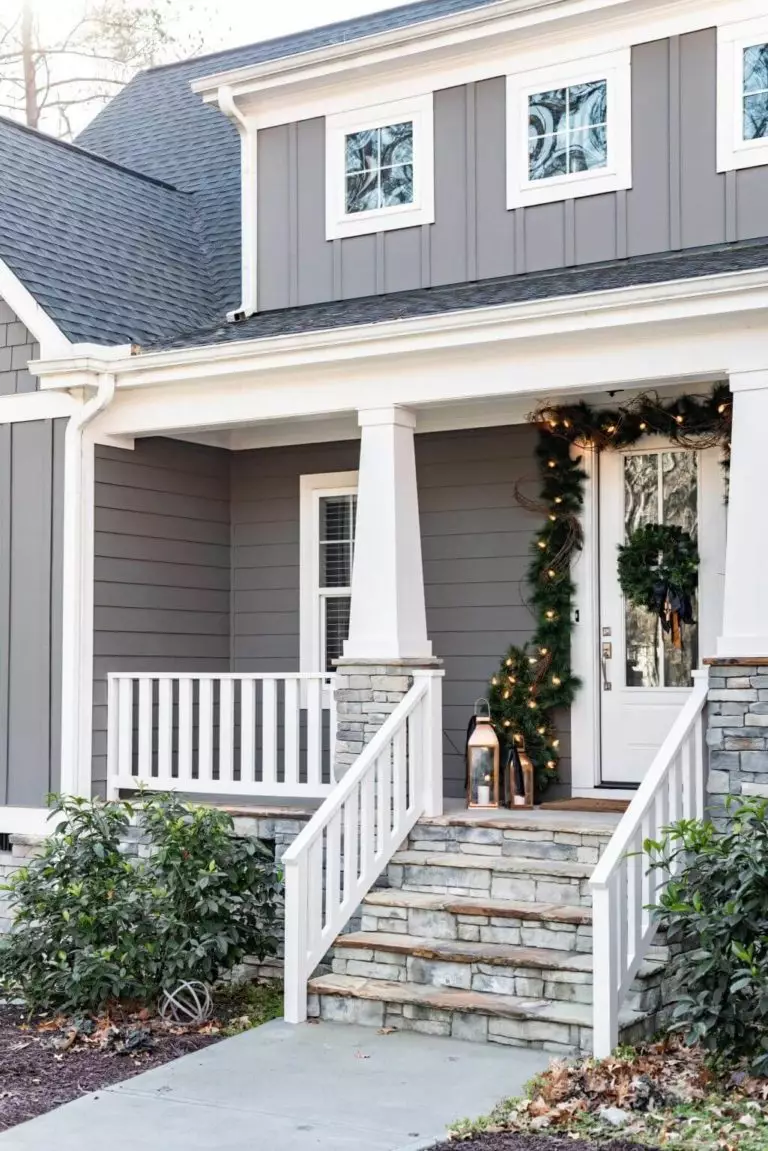
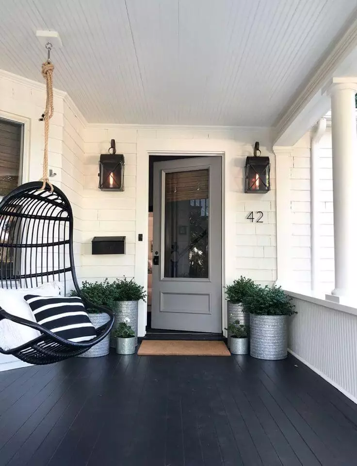
The use of Proper Gray for exterior
Do you remember what we said about lighting? The more of it, the better Proper Gray will look. Considering its use for exterior means exposing this color to the direct effect of natural light. It may seem a little darker on rainy days, but considering white elements as partners will solve the problem. If you want to use Proper Gray at the maximum, paint the entire house in this color, opting for a white front door and window frames. On the other hand, if a little splash of this neutral shade seems enough, paint the front door with this paint. Either way, the result will be a perfect first impression, where our already beloved shade of gray will point out the balance as the defining feature of your exterior.
The fantastic Proper Gray paint color from Sherwin Williams is that shade of gray that is always on your side. It adapts to your preferences, becomes friends with other colors, and complements any style. If you think that no color meets all your standards, be sure that this one will disappoint you, in a positive way, of course
