Pure White SW 7005
Sherwin-WilliamsOne of the most popular shades of white from Sherwin-Williams, a bright and clean hue devoid of highly noticeable undertones.
Pure White (SW 7005): what color is, review, and use
White is a classic when it comes to interior and exterior design. The number of white paint colors developed by paint manufacturers is impressive, and so is every shade in part due to the unique combination of undertones. There are bluish, yellowish, creamy, grayish whites for any style and preference. Still, some whites stay true to their values and don’t show off particular undertones. One paint color of the kind, which is extremely popular, prevailing in versatility, is Pure White SW 7005 by Sherwin-Williams.
As the name implies, one may think that Pure White is a true white untouched by undertones. This is not the case. SW 7005 is a bright white shade with a subtle hint of gray and almost unnoticeable yellow notes. You may wonder why Pure White then? This shade is neither too grayish nor yellowish, standing at the border between cool and warm colors. The fact that it has a bit from each category yet not too much of everything made the experts from Sherwin-Williams call it pure. Does it sound familiar? A similar story has another renowned white paint from the same manufacturer – Snowbound SW 7004, which is not that far from Pure White. Still, it is a whole new story. There is more to come! A no less popular manufacturer developed a no less pure shade of white, calling it the same – Pure White OC-64 by Benjamin Moore, which is visibly cooler and devoid of warm yellowish notes.
Back to SW 7005! Pure White is part of such collections as Timeless White, Trendsetter, 2021 Sanctuary, ABC’s and 123’s, and the list goes on and on. Quite a reliable reason to think that this paint color is very popular. It is indeed a no-fail option for designers and homeowners looking for this perfect shade of white that doesn’t look too cold nor too warm but a pure balance between those extremities. Let’s find out what stands behind such perfection!
Pure White paint color features
It is one of the most popular shades of white at Sherwin-Williams, a bright and clean hue devoid of highly noticeable undertones. Although in a limited amount, the latter are there to reduce a bit from the strength of white and make it appear as an exceptional combination of crispiness and softness that would go with any design approach. What does it feel like? At first glance, a simple shade of white. The more you look at it, the clearer its undertones become. When in a space painted in this shade, you feel surrounded by freshness, calmness, and no less hope. It is not enough to go with a simple splash of white and call it pure. There is a whole science behind such a shade, where one indeed has to play with appropriate undertones to achieve such results.
Pure White: is it warm or cold?
As with other aspects of this paint color, this one is also confusing. We already stated that Pure White interprets the border between cool and warm shades of this kind. It preserves such an appearance in ideal conditions. Still, a slight change in the light that penetrates the space may reveal different features of this color. It may read a rather warm or cool shade. Generally speaking, Pure White is part of neither of these categories, staying true to its inner beauty yet not refusing to adapt and even change within particular conditions.
How does lighting affect Pure White?
Regardless of how impartial SW 7005 tries to stay, it cannot help but get influenced by light. First comes daylight. In a space fully penetrated by sun rays, this shade reveals the balance of gray and yellow notes. In the north-facing rooms, the gray ones prevail, offering this shade a relatively coolish vibe, while in spaces with south-facing windows, Pure White brings its warm scents to the surface. Regarding east and west-facing rooms, it all depends on the particular time of the day. When the sunlight penetrates the space, this color feels extremely warm and comfy. A single shadow will instantly spread grayish notes all over the surface. The same play with light undertones goes for artificial lighting, which can be successfully used to achieve particular results.
Pure White LRV
LRV (Light Reflectance Value) works with a scale from 0 to 100, where the latter stands for a true white. Considering that Pure White is not that far from a true shade of the kind, one would assume that it has a very high LRV. It is not quite the case. Pure White reaches a value of 84, which is quite high but not enough for a color that pretends to be close to true whites. Another confusion. Let’s make it clear! The slightly perceived yet still present notes of gray and yellow reduce a bit from the solid white appearance. Nevertheless, its abilities to reflect light in a way that goes beyond the space borders, making the room look very spacious and limitless, is very impressive.
Pure White undertones
You have probably figured this out on your own. Still, let’s summarize it! Pure White is diluted with a subtle gray note that keeps this shade within limits and does not allow it to enter the category of very bright whites, while the slightly noticeable yellow scents make sure that SW 7005 does not feel too cool. The undertones of this shade collaborate efficiently with each other, which stands for a perfect balance of notes and feelings radiated by this paint color.
Similar colors
Behind every paint color stands a whole scientific process, which is not that easy to repeat, and it would have no sense. The more different these shades are, the wider the range of possibilities is. Such a sophisticated shade like Pure White, which is neither too cool nor too warm yet definitely has a bit of each and is very close to true whites, although it stays true to its nature, is not possible to repeat perfectly. Still, the collection of whites is so large and paint manufacturers so many that a thorough analysis would surely point at several similar shades, some of which are almost identical. This is how it worked in our case, and we would like to share the results with you.
Coordinating colors
It is no surprise that Pure White is very flexible when it comes to pairings with shades from different categories. Even other variations of white work perfectly with SW 7005. Undoubtedly, the most impressive combinations are the contrastive ones, where bolder neutrals and bright shades can reveal their richness on such a background as the one provided by Pure White. Let’s go through some of the most prominent companions, which this shade of white would work surprisingly well with!
Use of Pure White in interior
Let’s make it clear from the start! Pure White works for any room and style, regarded as a perfect choice for the walls, wall paneling, cabinetry, trim, ceiling, or other pieces of furniture. Additionally, its friendliness towards various colors enlarges the range of design possibilities. The approach, which can be traditional, modern, or transitional, doesn’t affect the flexibility of Pure White, which replicates a timeless paint color. Let’s take a look at its integration in real settings and admire its inspiring ability to adapt to different conditions!
White accent
Usually, bold colors are used as accents. Nevertheless, a contemporary setting implies neutral accents that stand out on other neutrals, and the result is no less impeccable and adapted to modern values. As we already stated, Pure White works perfectly with several neutral shades of white and particular gray and beige variations. Therefore, you can safely use it as an accent for the trim in your living room, wood paneling in the bedroom, or cabinetry in the kitchen on a slightly contrastive yet neutral background.
Perfect backdrop
White shades are usually viewed as a perfect background for bold accents. Pure White goes not only with bright shades but also with lighter variations. The slightly perceived undertones of SW 7005 are versatile and adapt to every companion in part, making even such colors as light gray and beige stand out on a white background that is not that far on the color palette. Consider this pure shade of white as a backdrop for a black accent wall for a classic effect, light blue pieces of furniture for an airy environment, or light gray cabinetry for an exceptional replication of harmony. Go with any accent you want on such a background, even beyond the color borders, opting for particular textures.
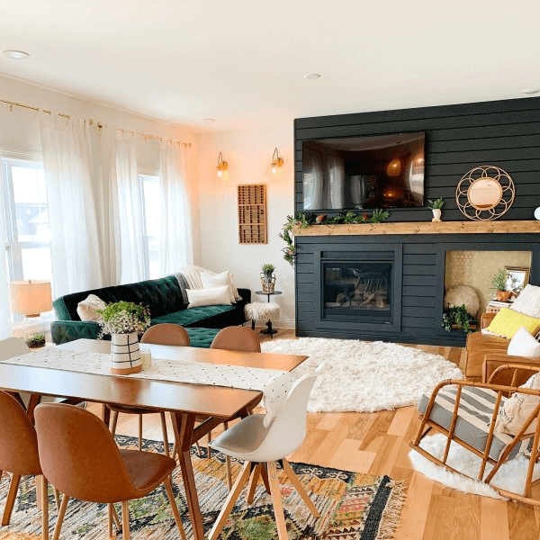
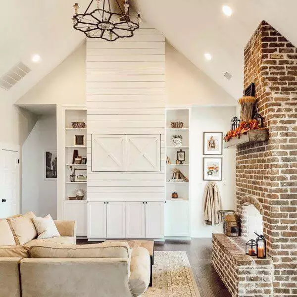
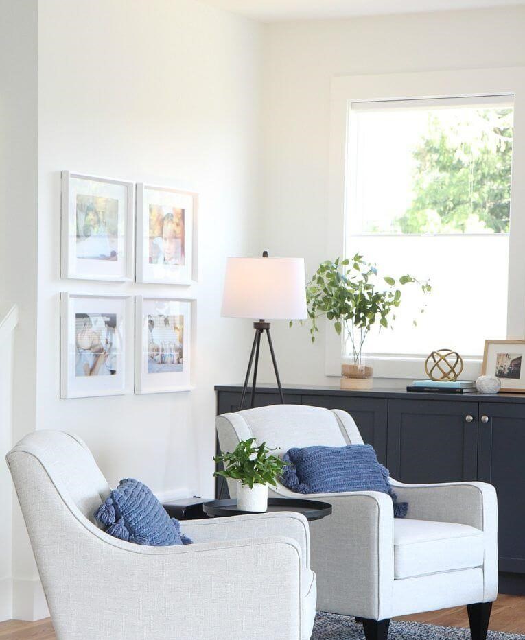
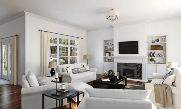
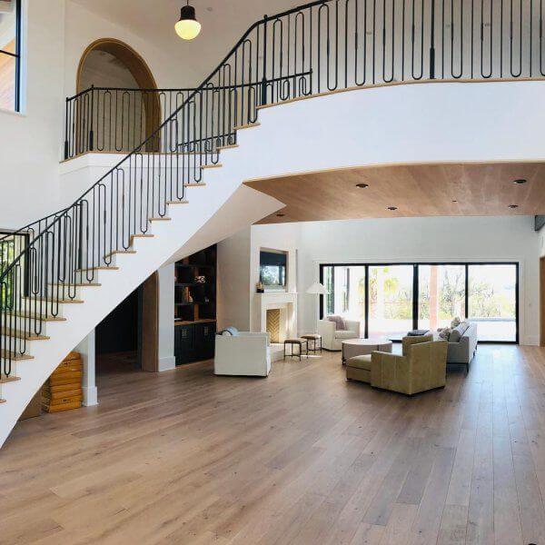
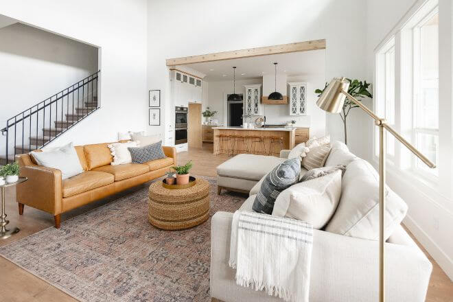
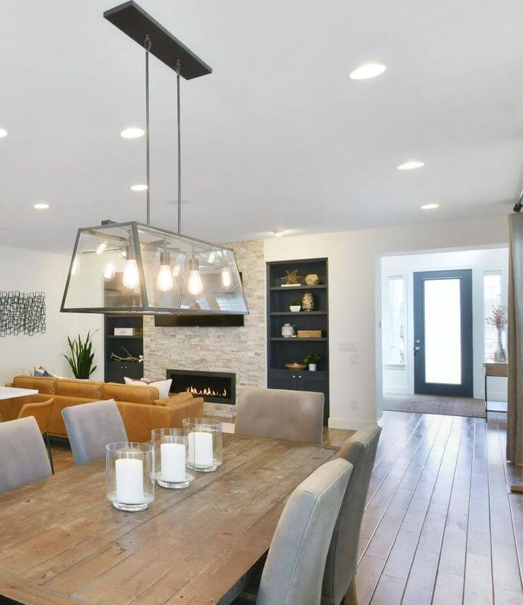
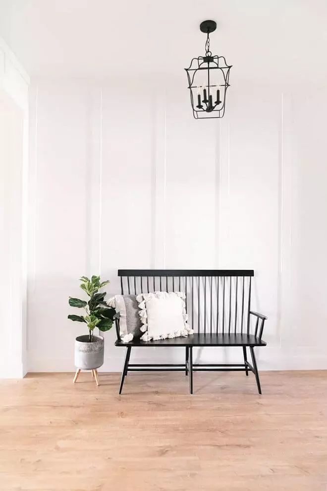
Living room
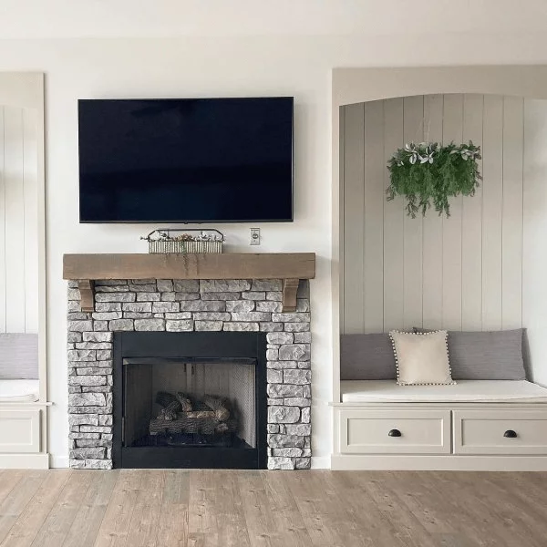
No other approach would work as perfectly as applying this shade to the walls. If you decide on sticking to traditional values, accompany Pure White with natural texture, such as wood beams, stone accent walls, and rich textiles for a comfy Modern Farmhouse. On the other hand, keep it simple with a monochromatic palette and use this pure shade of white to integrate contemporary values to the fullest. Not sure which way to go? Stay between the two extremities with a transitional approach where SW 7005 will smooth the transition the best it can, and be sure that it will manage this task at its finest.
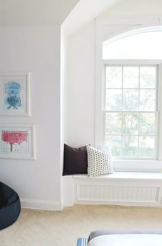
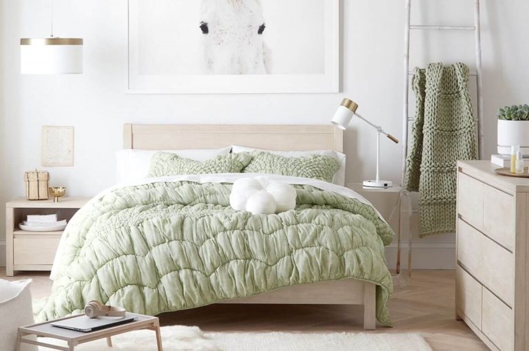
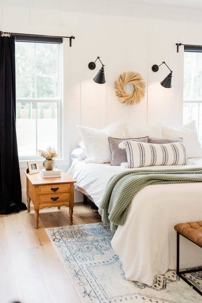
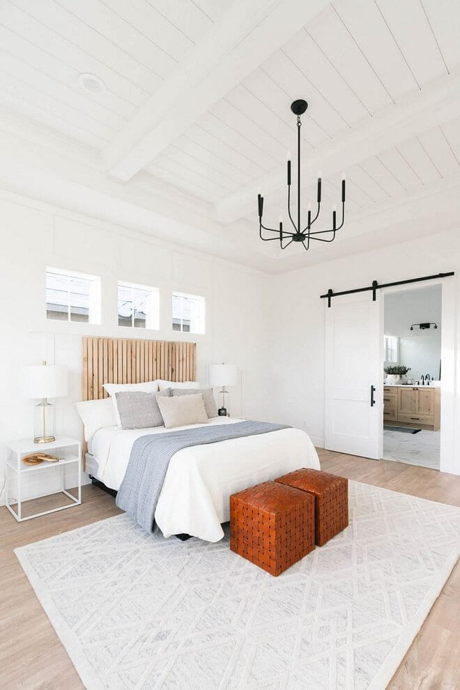
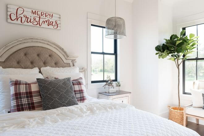
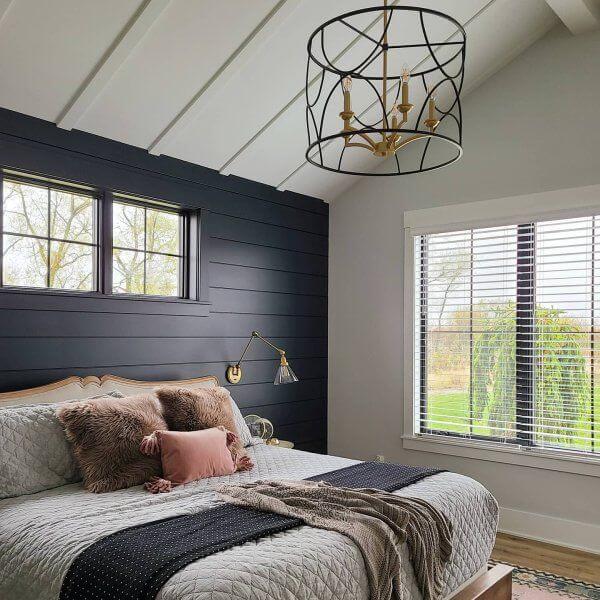
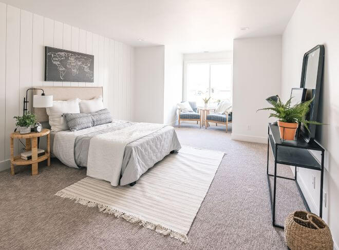
Bedroom
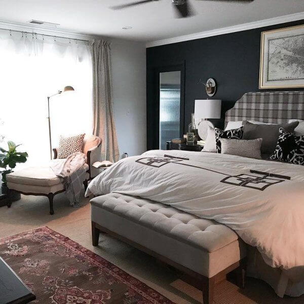
Such a personal space should be designed according to your preferences. Luckily, Pure White works with any style. Consider it for the walls and go on with any direction that feels closer to you. Keep it monochromatic for a sleek contemporary look. Opt for natural wood texture and black accents for a Modern Farmhouse approach. Consider a black accent wall and bright textiles for an eclectic combination of styles. Opt for soft pastels as companions to ensure an extra soft environment combined with pure white walls. The list of possibilities can go on and on. Use this shade of white as a canvas and be the author of your interior design.
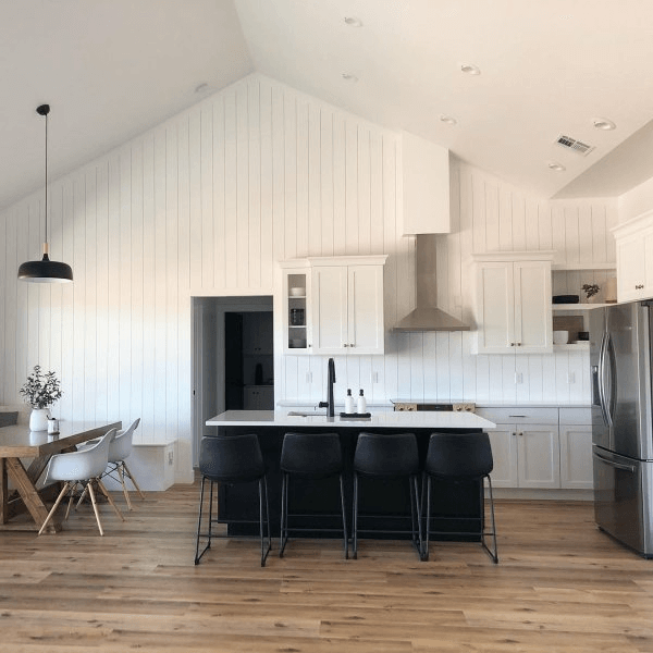
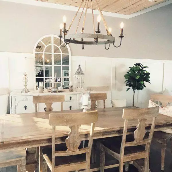
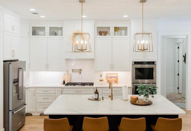
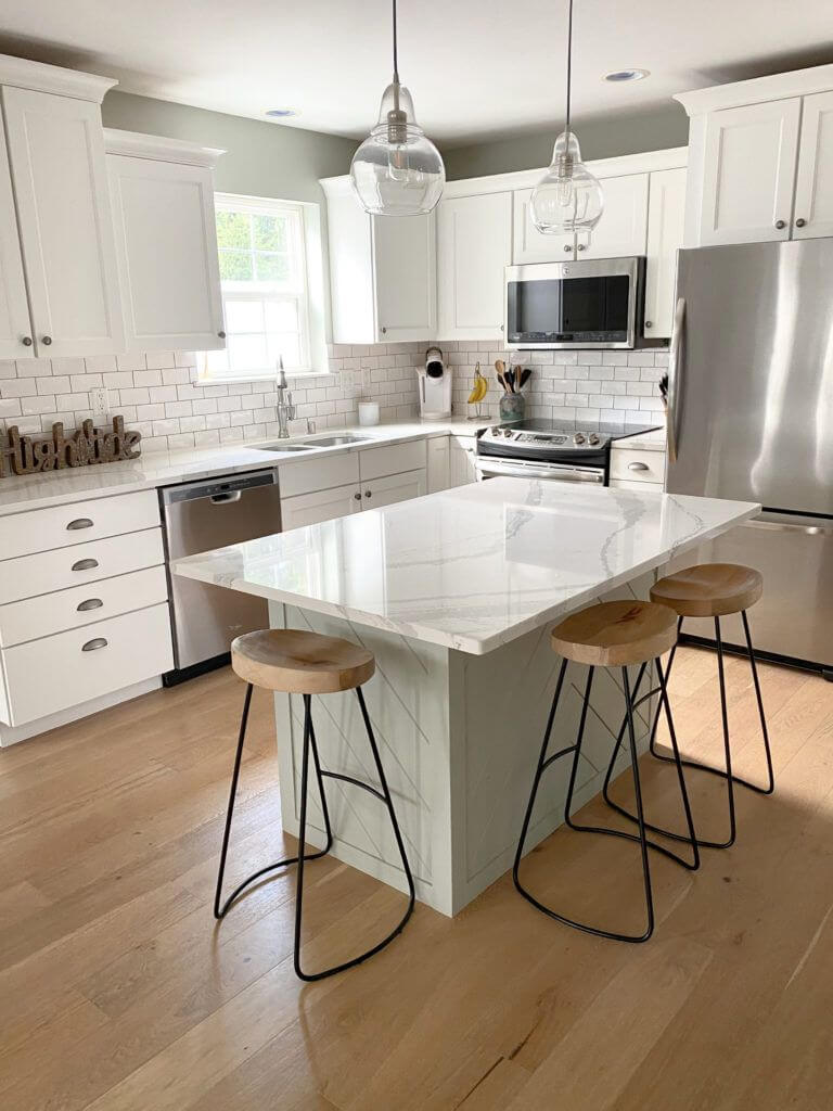
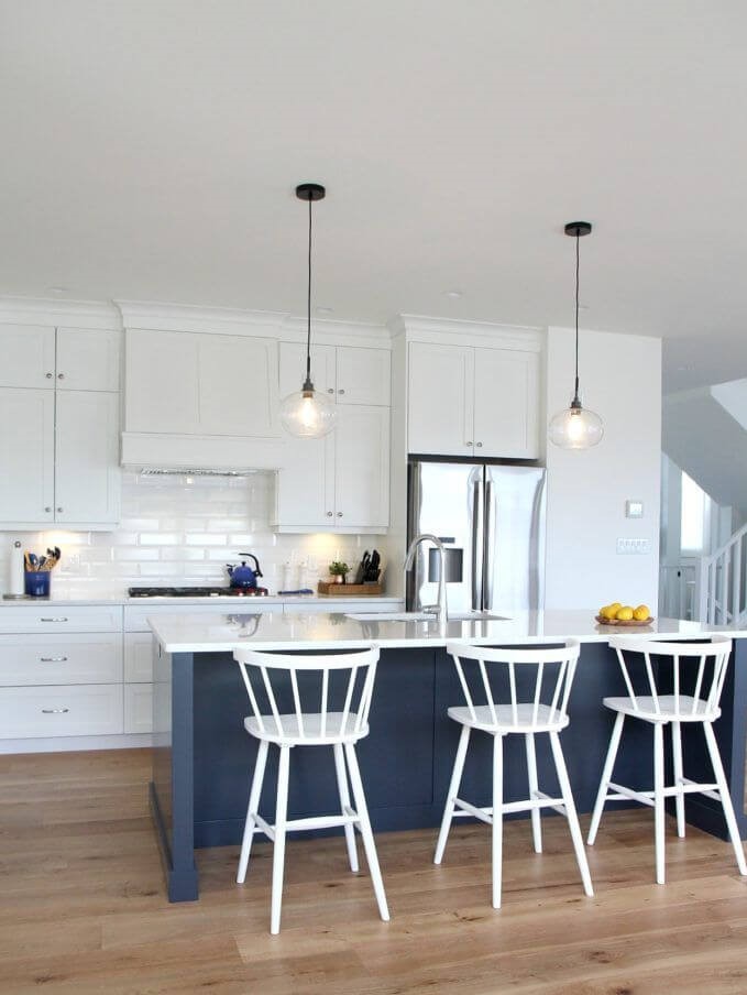
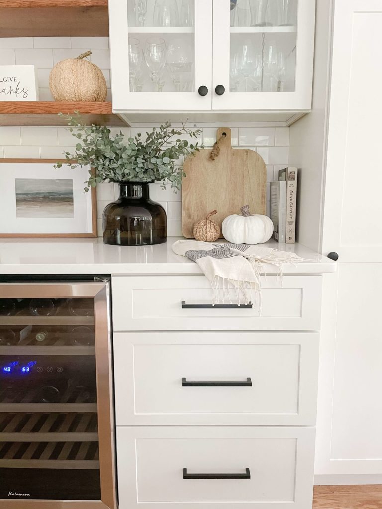
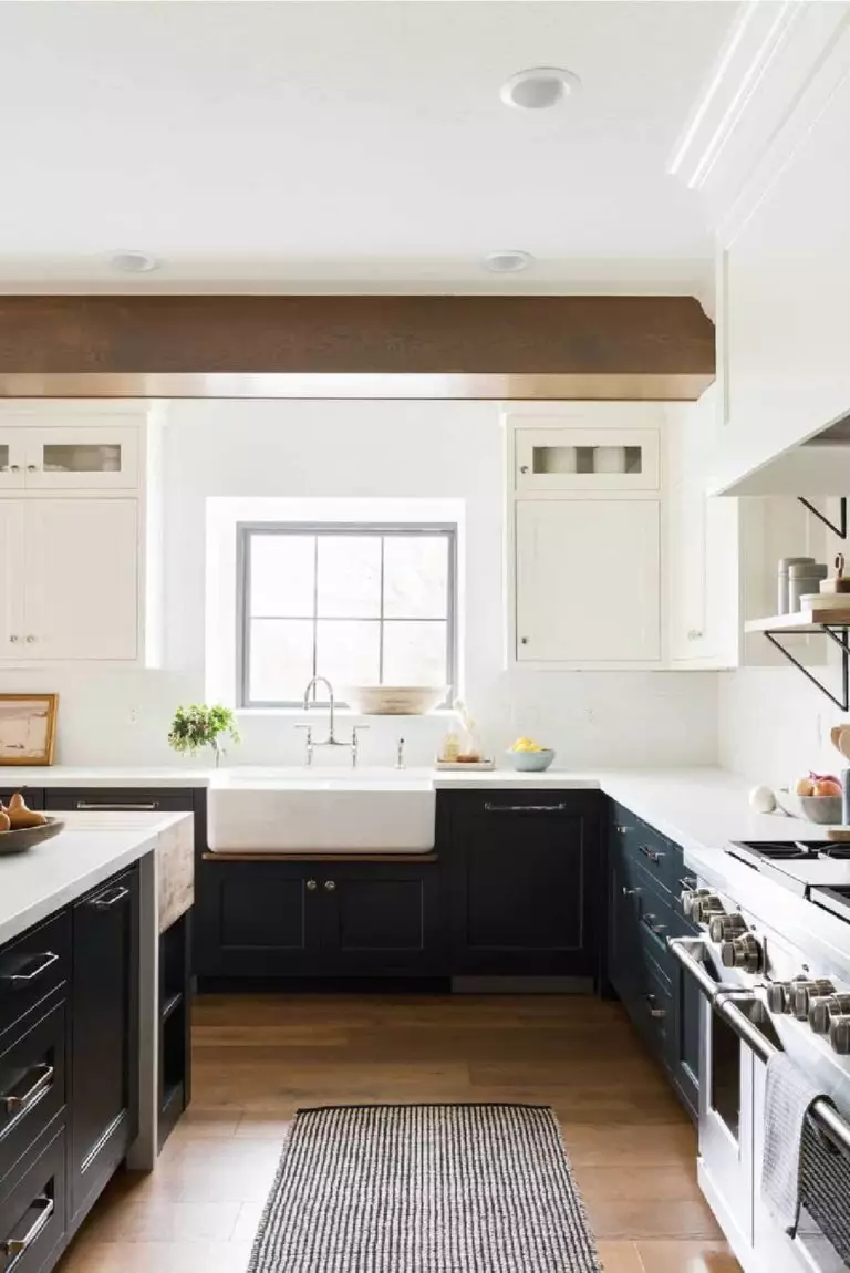
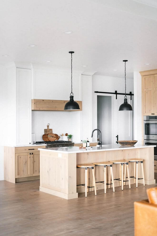
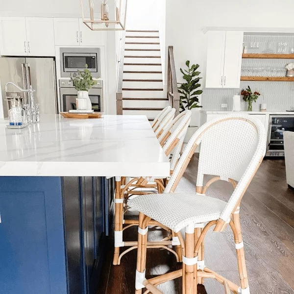
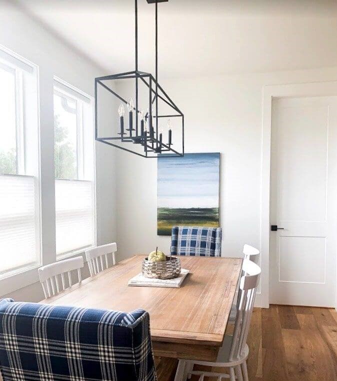
Kitchen and dining room
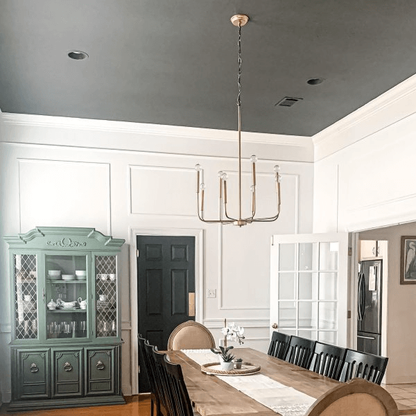
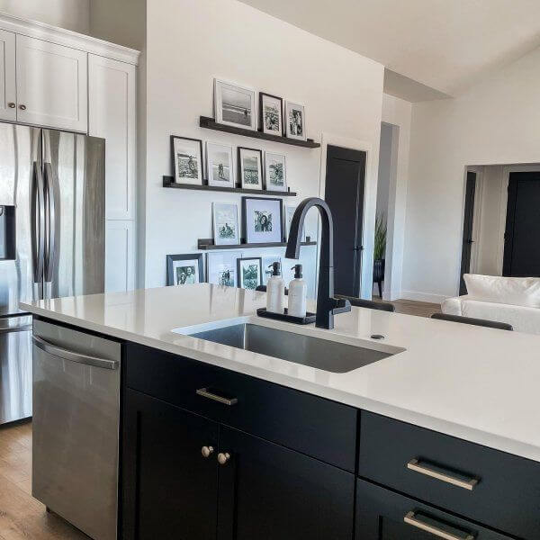
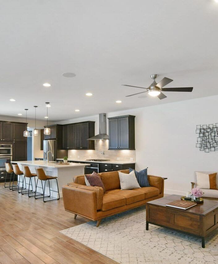
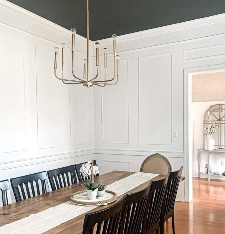
The wide range of possibilities does not skip the kitchen. Pure White will serve as a complement for modern and traditional kitchens. Consider it for the cabinetry on a slightly contrastive background or the opposite with an all-white approach or involving particular accents, such as a naval blue island, wood countertop, or black hardware. Let’s switch to the dining room! Surely, you will not paint the furniture in this shade, but white walls and a large wood table of natural texture would work perfectly. Are you looking for something more contemporary? Consider a dark gray accent ceiling with a modern chandelier for a timeless combination with white walls.
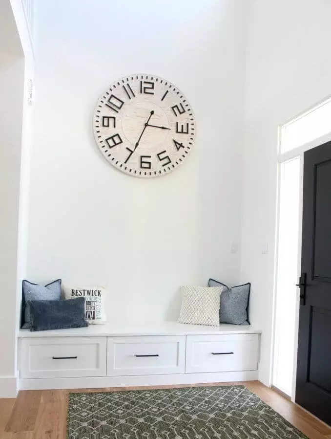
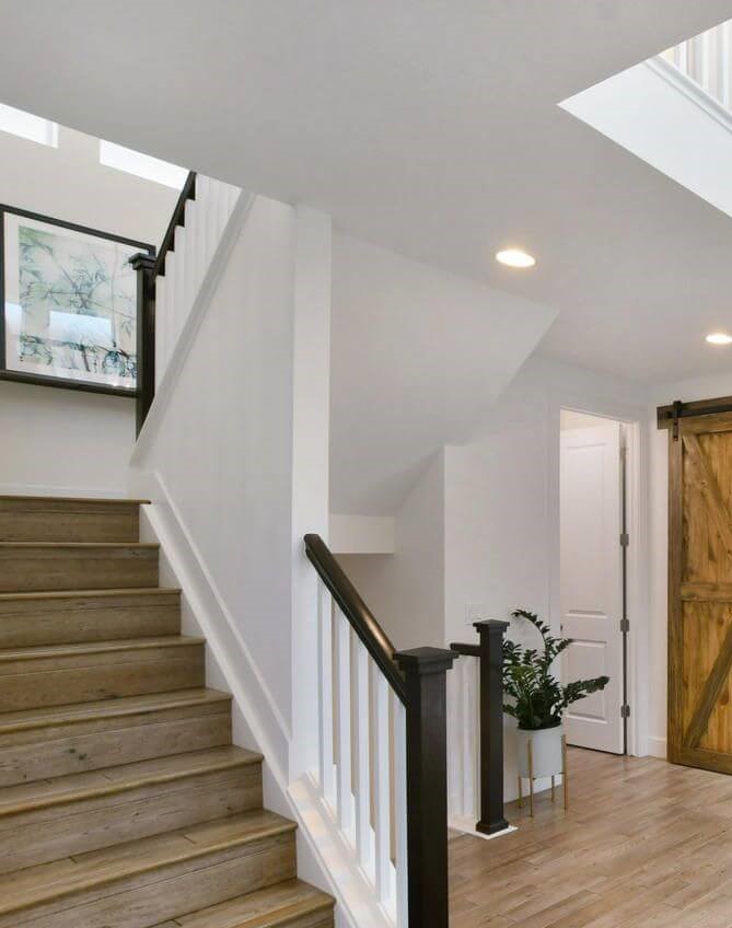
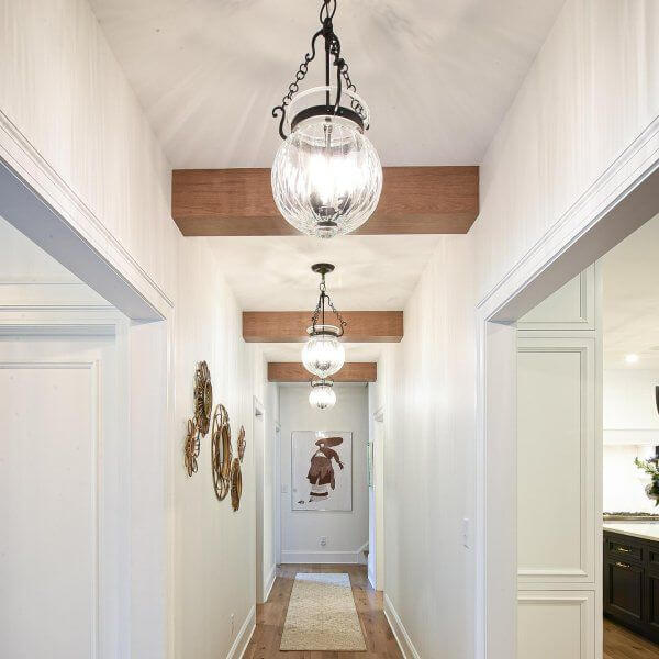
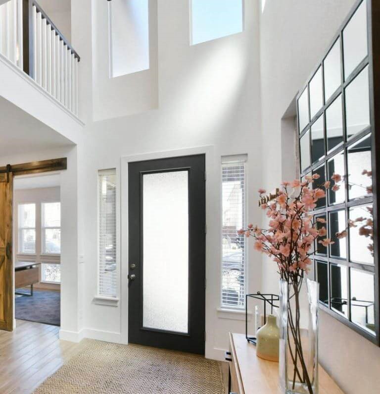
Hallway
Pure White is crispy enough for a new introduction to your interior and soft enough for a welcoming effect. Style and comfort in one step. For a traditional interior, consider combining the walls painted in this shade with wood flooring or pieces of furniture. A contemporary setting would benefit from a sleek pairing between SW 7005 and black accents. Every return home will feel close to the heart, while the exquisite look ensured by Pure White will leave your guests impressed.
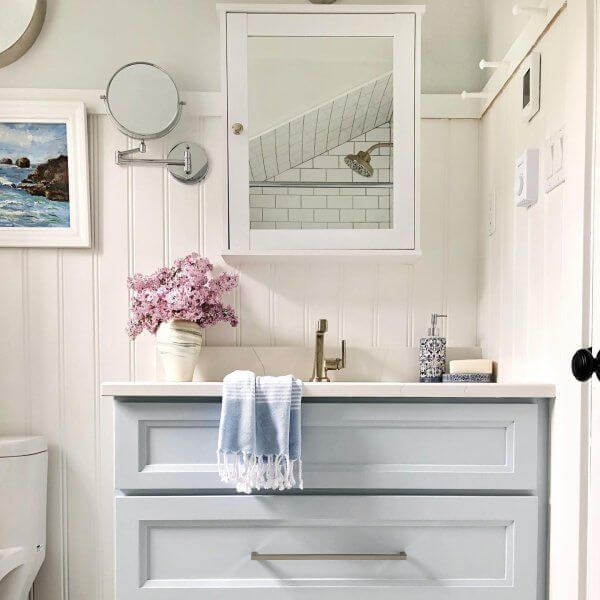
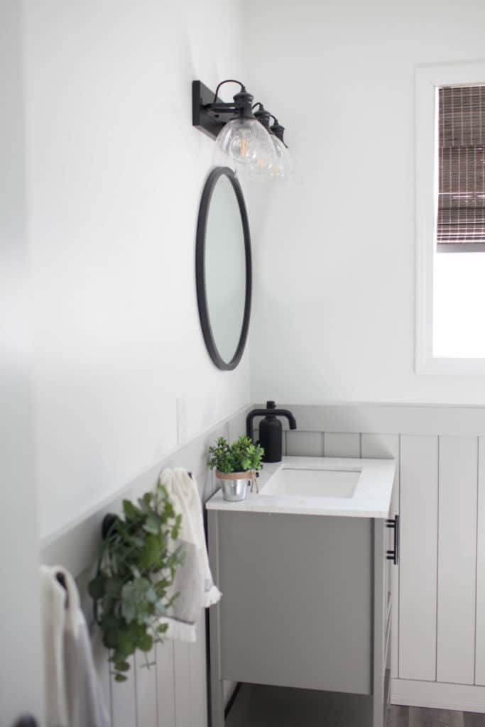
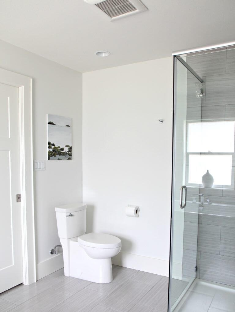
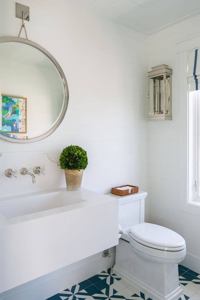
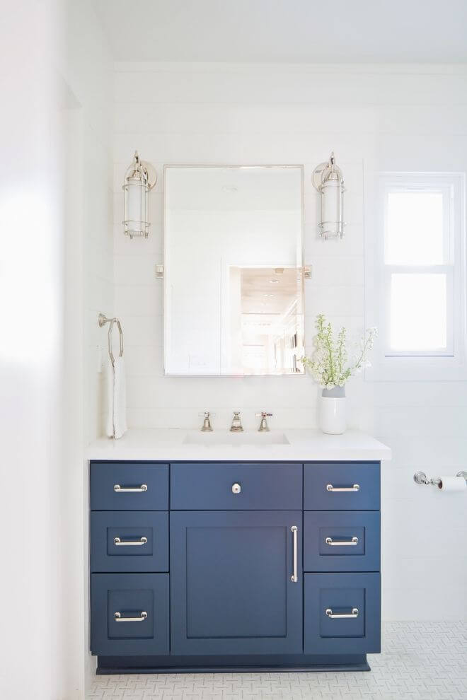
Bathroom
Put together all the knowledge you have gained this far about the complex shade of white from Sherwin-Williams and use it to achieve the finest bathroom interior. A bit of intrigue? Black accents such as wall sconces or window frames within an all-white bathroom with walls painted in SW 7005. Sleek contemporaneity? Pure White for the walls and neutral gray for the cabinetry. Would you like to embrace Modern Farmhouse? Go with shiplap walls painted in the same white shade and wood elements (a pot with greenery would not spoil the result). Do you want to add a bit of depth? Consider painting the cabinets in accent blue on the irreplaceable pure white background.
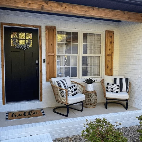
Use of Pure White for house exterior
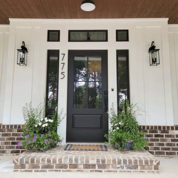
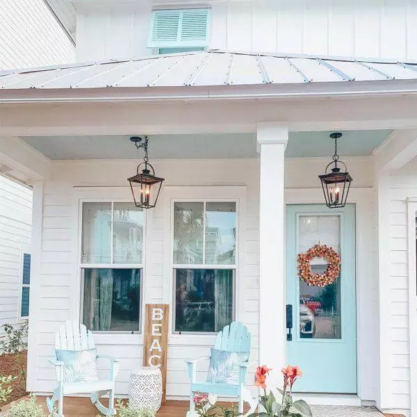
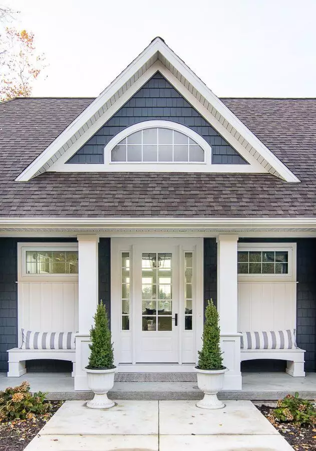
The same wide range of design solutions applies to the house exterior as well. It cannot go any other way with such a versatile shade like Pure White. Painting brick walls in neutral colors has been gaining more popularity. Of course, Sherwin-Williams’ fabulous white paint color would work in this sense. No less successful would be the effect of this paint on wooden walls. The missing element is a black or wood front door, depending on which values you want to embrace – traditional or modern. Nevertheless, designers suggest combining the house walls with any other shade from the list of coordinating colors, even a light blue for a coastal exterior.
You can make the most of the pairing between Pure White and a naval blue by considering the former for the front door on the deep blue background. Furthermore, the stately effect can be increased by applying the same shade of white to the trim.
The Pure White SW 7005 paint color from Sherwin-Williams cannot go unnoticed by the amateurs of whites. Even the ones looking for true whites will surely fall in love with this sophisticated shade that combines freshness, softness, and refinement in an exceptionally stylish way. There is not a style or color it would not turn its face to, which offers a timeless effect to any design solution you come up with.
