This soothing mix of blue and gray slightly touched by green repliactes serenity to the fullest. Its relatively deep notes induce tranquility and add an exceptional sense of originality.
Quiet Moments 1563 (Benjamin Moore): what color is, review, and use
For those looking for a source of serenity to bring calmness to their lifestyle, Benjamin Moore came up with a fascinating shade of soothing blue featuring a clear gray hint underlined by slightly noticeable green notes. The Quiet Moments 1563 paint color is a standout pastel that replicates a sense of tranquility inspired by the silence at dawn. There is no surprise this shade is a favorite, and designers simply fell in love with its beauty and softness. Besides, shades of blue-green with gray undertones are quite a thing now, and Quiet Moments holds a leading role in this category. What makes it stand out? Is it the name, the shade itself, or its behavior as a paint color? We can’t wait to share with you the results of our research.
Quiet Moments paint color features
As the name implies, the paint color known under the number 1563 is a pure reflection of serenity. Frankly speaking, no other color would replicate this feature the way a soothing shade of blue can. With a light base and smooth gray notes, slightly touched by green, Quiet Moments hides quite intense scents that induce a sense of ease. As experts from BM state, this paint color interprets a combination of the three mentioned colors, exuding tranquility and inspiring meditation.
Quiet Moments: is it warm or cold?
Although the subtle green scents bring a bit of softness to this shade, Quiet Moments give a rather cool vibe, yet a soothing one. The refreshing base keeps the space invigorating, while the deep notes offer space to dive deep into your thoughts and find peace with yourself. Quite strong feelings for a pastel shade, although it cannot go any other way when we speak about a combination of such colors.
How does lighting affect Quiet Moments?
As true as this paint color tries to stay to its nature, it cannot stand the effect of lighting. Designers suggest using this shade in rooms with southern and eastern exposure for a balance of cool and warm, while its integration in west and north-facing spaces would keep Quiet Moments as it is: cool, deep, and soothing. Nobody can stop you from playing with various lightning undertones for a personalized effect.
Quiet Moments LRV
Do you wonder what these letters stand for? Here you go: Light Reflectance Value indicates how light or dark a paint color is. On a scale from 0 to 100, with the latter for true shades of white, Quiet Moments reaches a value of 60.73, which places it between the medium and light color groups. The presence of deep blue notes explains it. Still, the shade seems much lighter when put into practice if an appropriate amount of light is ensured. Speaking about light, the 1563 paint color is perfect for small spaces due to its ability to impressively reflect the light and make the room feel spacious.
Quiet Moments undertones
Do you still wonder what undertones Quiet Moments has? Nothing new besides the already known green and gray notes. Still, there is a secret we should reveal. This paint color is quite tricky since its light base tends to reflect neighboring colors and take on various appearances depending on lighting conditions. We suggest experimenting with a sample within your interior and note what mask this color will put on.
Similar colors
Would you believe it if someone told you that there is not a single paint color similar to Quiet Moments? Neither would we. Undoubtedly, the combination of blue, green, and gray is popular among color brands, and there is a wide range of alternatives. Whether you cannot find this exact shade or are looking for a slightly more soothing or more intense variation, the following list will come in handy:
Coordinating colors
This shade may seem neutral since its soothing base is quite a reason to think so. Still, the intense notes, which stand behind the beauty of this paint color, are friendly towards particular variations. For instance, designers recommend using relatively neutral shades of white for the trim and molding to display them on the pastel background. If you opt for a contrasting palette, don’t hesitate to choose gray or black for accents and slightly warmer shades of beige for the base. Nevertheless, Quiet Moments is always a reason to consider a monochromatic approach by opting for paint colors that very closely replicate its inner beauty. It seems the range of possibilities is wide. Let’s get even more specific!
Use of Quiet Moments in interior
This soothing shade seems now more welcome within interiors than ever. We all fancy a bit of calmness and peace of mind, and Quiet Moments is the right paint color to start with. The relatively neutral base makes it versatile and adaptable to various design solutions, while the deep mix between green and blue adds individuality to any space. Undoubtedly, this paint color is defining for a few styles, yet its relevance in contemporary interiors, regardless of style, is as clear. Let’s see how this splash of freshness, peace, and originality works for the interior!
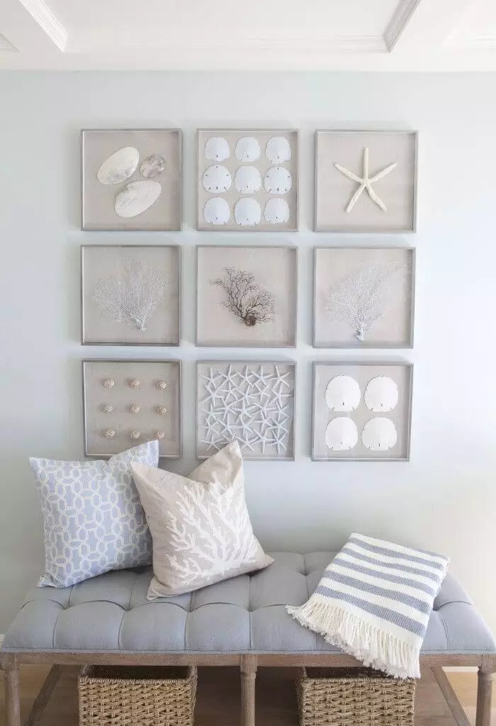
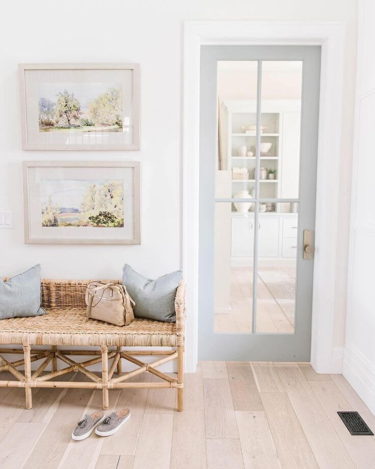
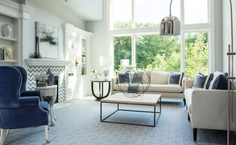
Perfect replication of Coastal
We usually associate a Coastal interior with a light shade of blue for the background. Luckily, Quiet Moments is what you should have in mind. The blue base perfectly resonates with the Coastal lifestyle, giving an ocean-breeze vibe and preserving the serenity of coastal life. The most relevant approach is to consider this shade for the walls, yet painting a built-in bookshelf or kitchen cabinets, even an interior door, seems no less appropriate.
The most important aspect is that you pair this soothing shade with crispy white as the main partner and go on with light wood texture or enrich the environment with rattan naturalness. If it seems too sleek to you, consider bolder splashes of navy blue for the decor while keeping it low-key.
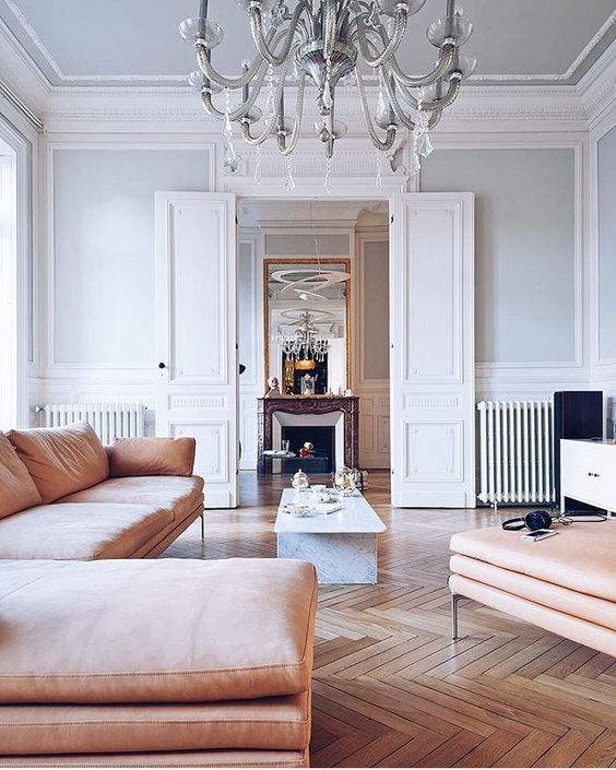
Did you say Neoclassical?
That’s right! From Coastal right to Neoclassical! It is impressive how versatile this shade is. The thing is that Neoclassical interiors have been integrating lately soothing shades of blue instead of the classic light gray for the walls to beautifully underline the molding. By applying Quiet Moments, you breathe new life into the renowned design solution by enriching the blend of classic and contemporary with a splash of naturalness due to the slightly visible green notes.
Now, pay utmost attention to the other room elements. To keep it neoclassic, stick to neutral partnering colors, particularly gray, to preserve the essence of this style. As regards the layout, go with the main principle – smartly combine the classic setting with modern pieces.
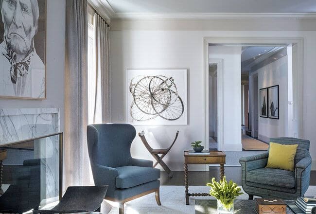
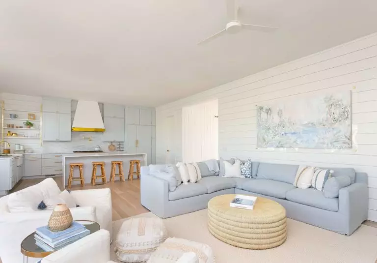
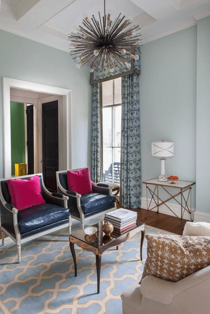
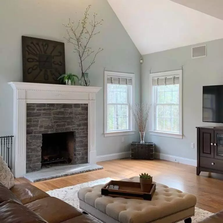
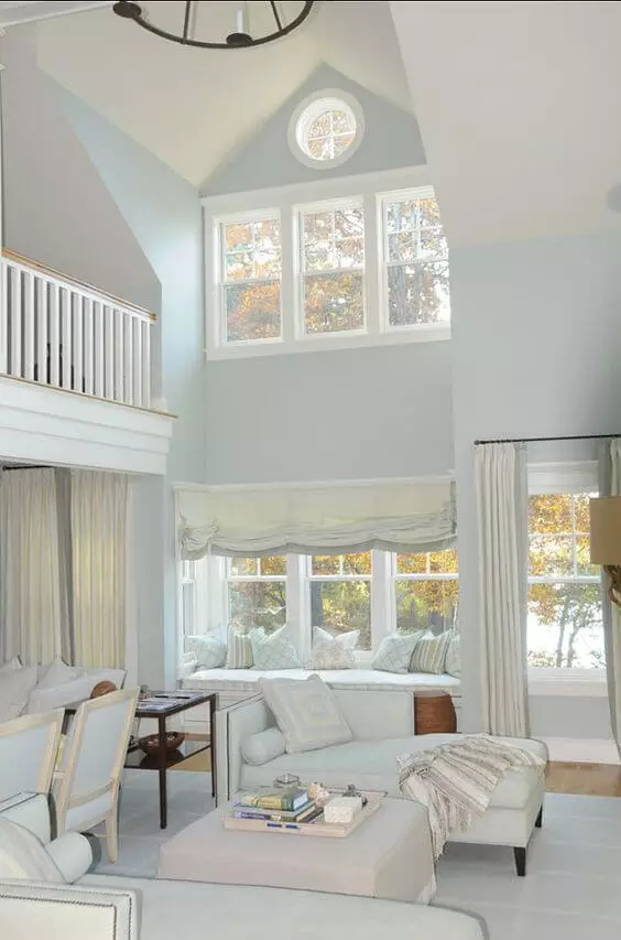
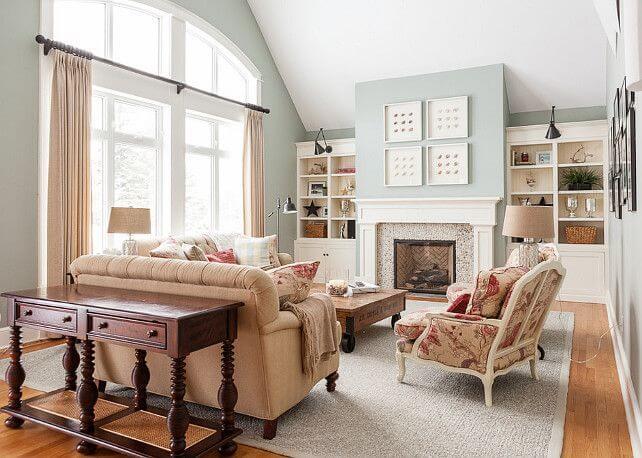
Living room
The Quiet Moments paint color impresses us mainly in the living room, where the range of possibilities is limitless. Consider this shade for the walls and pair them with white all over the space – pieces of furniture, textiles, and decor to preserve the tranquil environment set by the soothing blue.
For lovers of contrasts, Quiet Moments is ready to collaborate with wood texture and bold accents, such as for the most modern or classic interior. Don’t hesitate to display brighter colors, within limits, for an impressive statement, such as bold pink chairs within a monochromatic interior for a retro vibe.
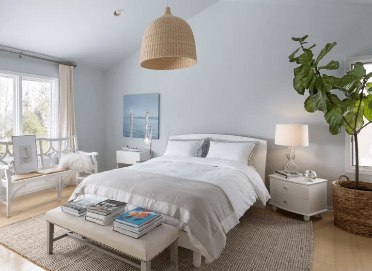
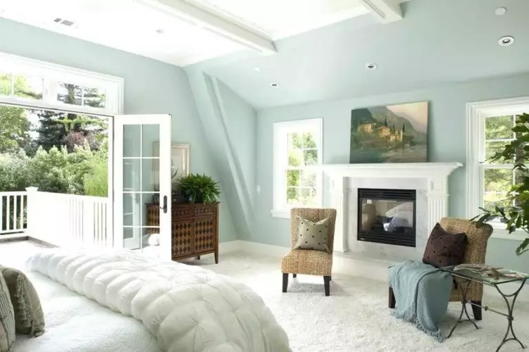
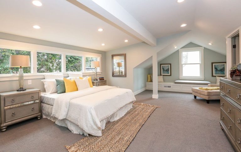
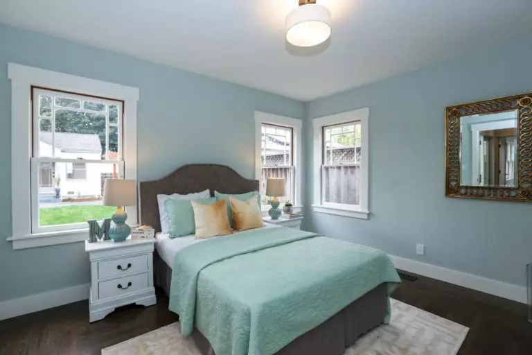
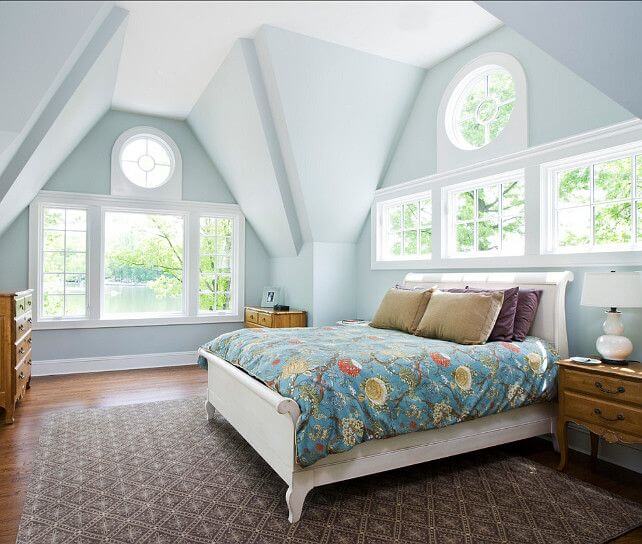
Bedroom
Is there any other room where a splash of calmness would feel more appropriate? Don’t you dare skip the bedroom when considering Quiet Moments (just kidding). Still, the beautiful mix of calming notes this paint color radiates that slightly refresh the space is a real find for a room where you want to go to sleep at peace and wake up ready for a new day.
You can either keep it exceptionally simple. Just add a few splashes of white, and they will play the magic together with the green-blue shade. A unique approach is displaying vintage dark wood pieces on the soothing background for a harmonious combination if this solution feels close to you. On the other hand, light wood and a few bright accents will take your bedroom to a new contemporary level.
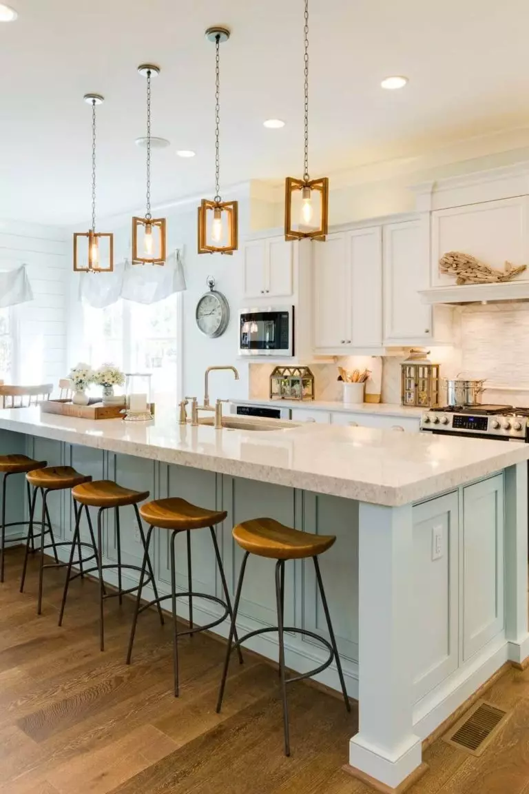
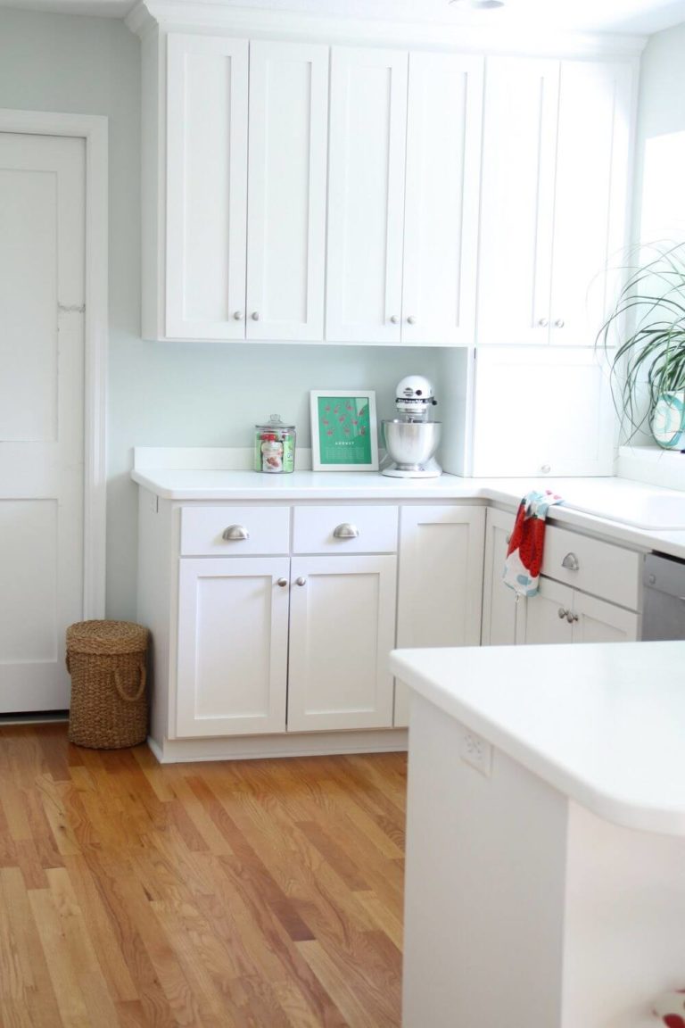
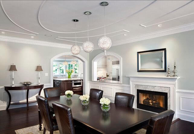
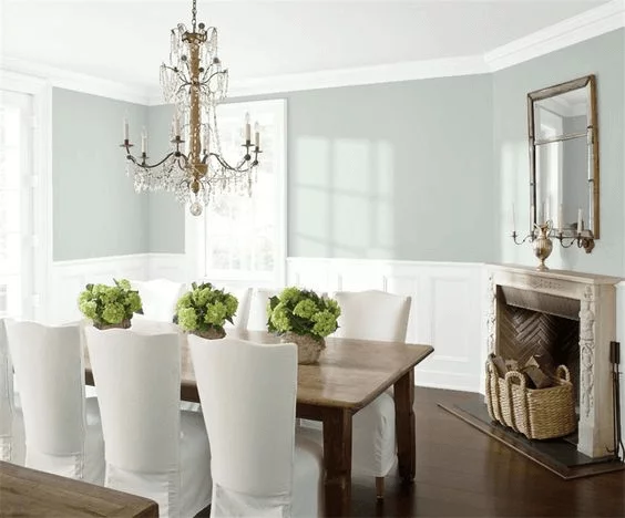
Kitchen and dining room
Despite the versatility of this paint color, Quiet Moments integrate best into kitchens as a background, paired with crisp white cabinets. Be it a traditional or modern interior. As we reach the dining room, we cannot help but mention the exquisite mix between the soothing blue and a classic layout with dark wood pieces of furniture, a flamboyant table, and no less luxurious chairs, all completed with a fabulous chandelier.
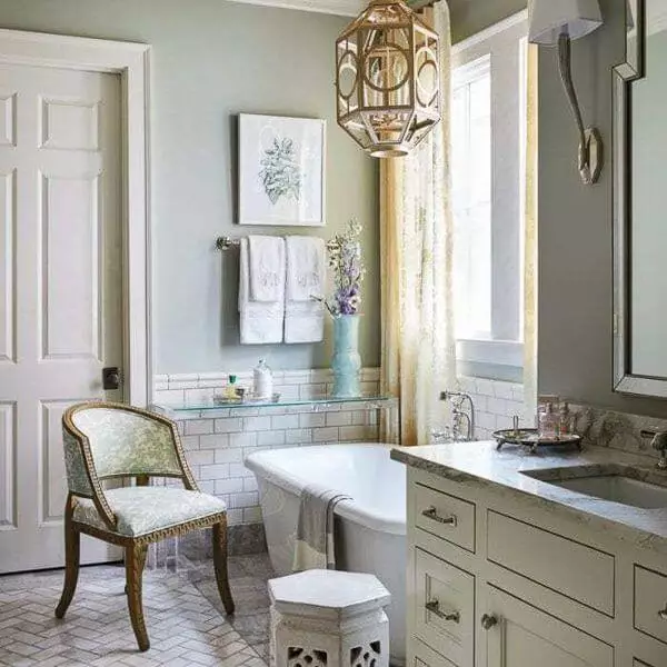
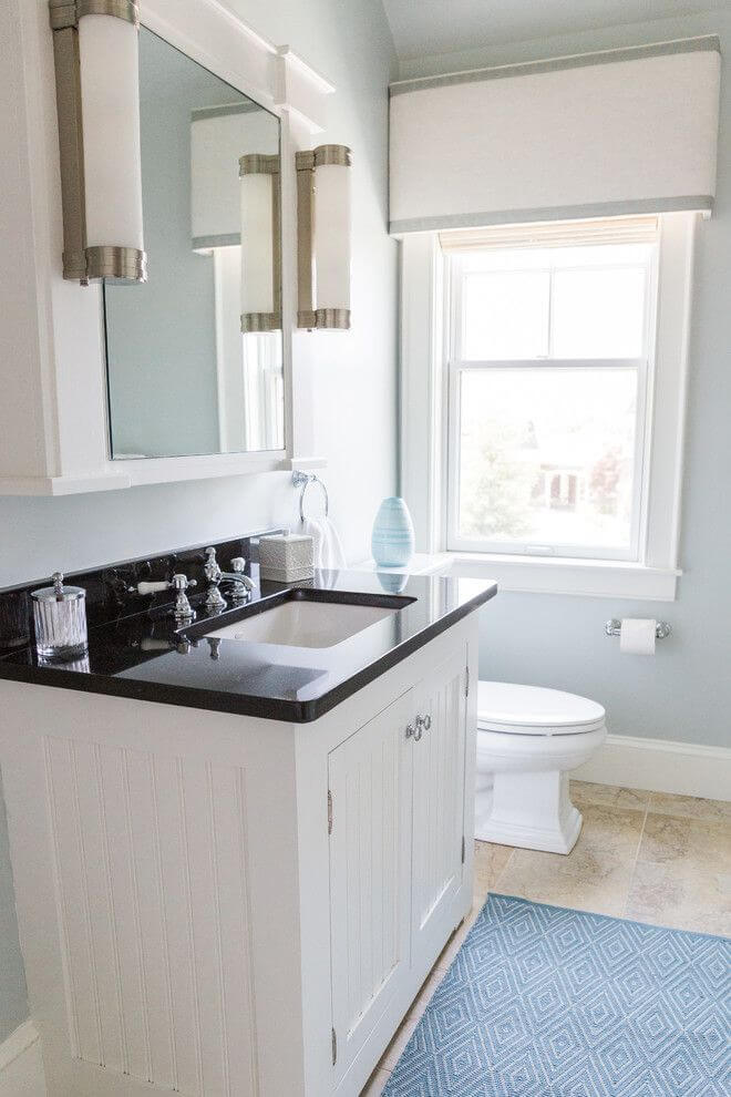
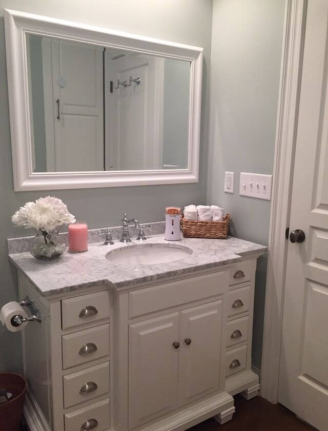
Bathroom
The further we go, the more it seems Quiet Moments perfectly defines the classic interiors. Therefore, you can safely go with this approach within the bathroom by considering traditional pieces of furniture on the soothing blue background. It would be great if you also exposed a classic white bathtub to enhance the effect. Either way, consider an appropriate amount of artificial lighting to avoid any draining effect. Don’t hesitate to add a few pots with greenery to enliven the slightly too neutral space.
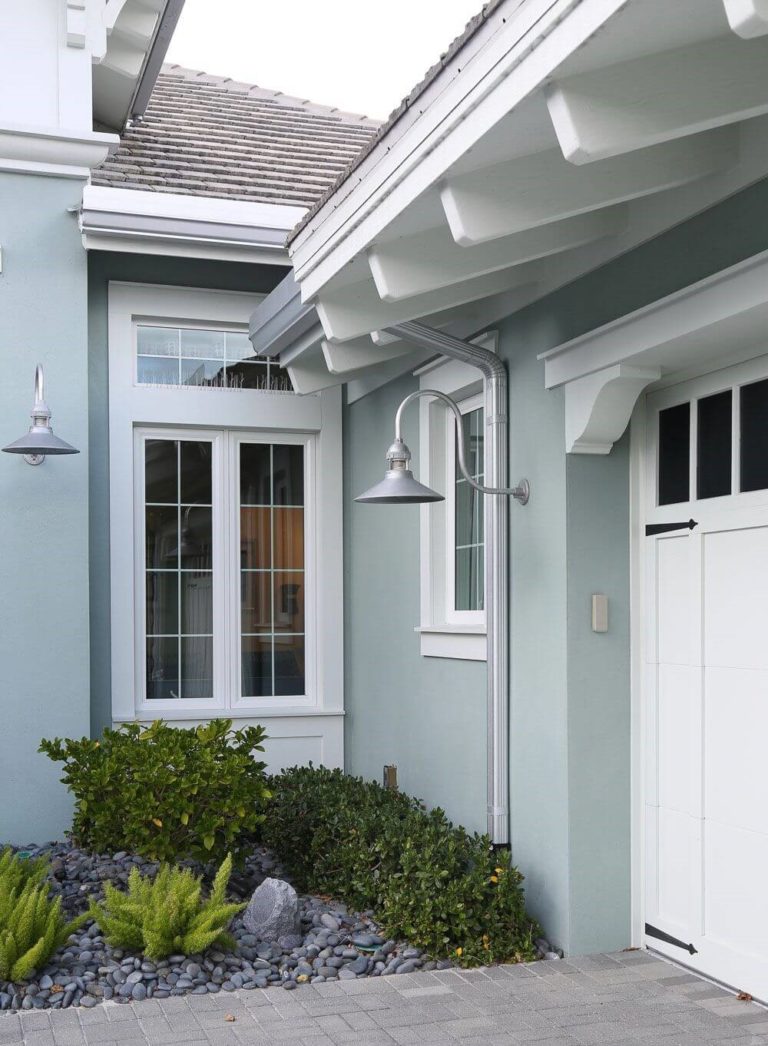
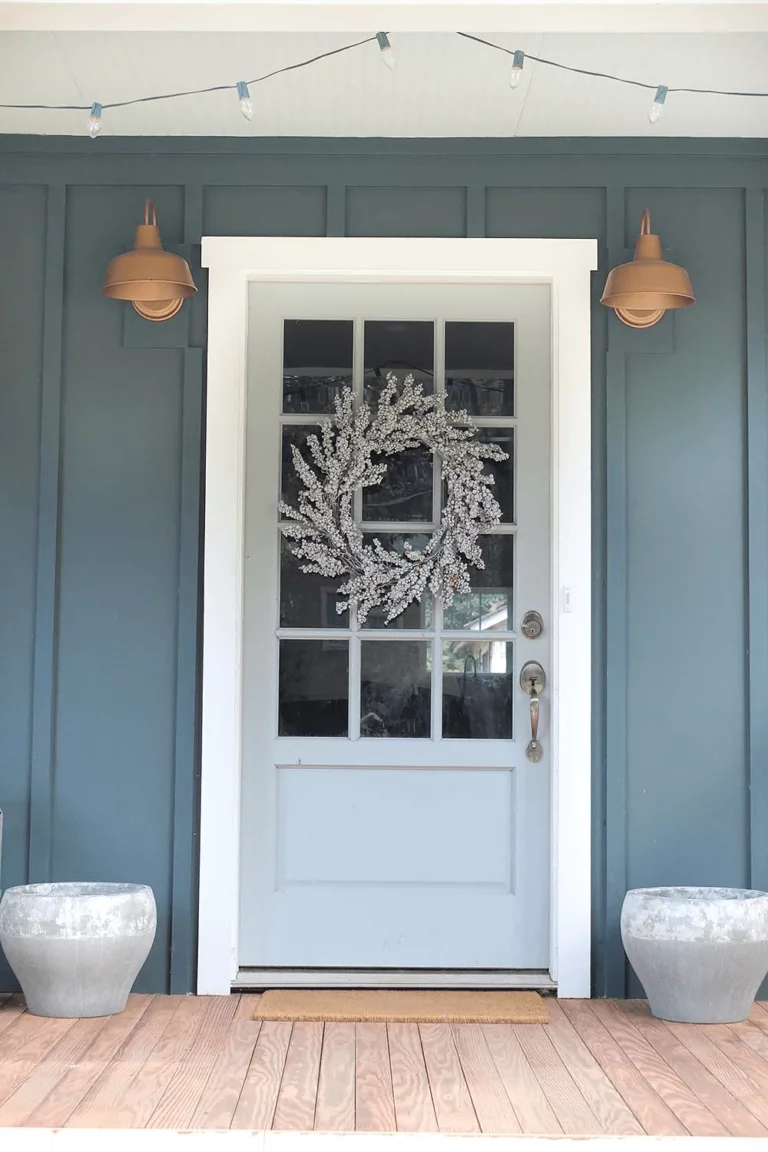
Use of Quiet Moments for house exterior
Considering the slight grayish hint, we can safely state that the fabulous paint color from Benjamin Moore is a real find for the house exterior. The deep notes preserve the color richness even under natural lighting. Underline the house borders with white trim and let the mix of slightly contrasting notes set the stately appearance of your exterior.
Luckily, you can also paint the front door this way and be sure that the color will look as beautiful as on the sample. For better integration, consider a darker background. The fascinating mix of blue, green, and gray will bring together more features – naturalness, neutrality, and uniqueness.
The Quiet Moments 1563 paint color from Benjamin Moore replicates calmness, modern freshness, and individuality to the fullest due to its beautiful mix of color variations. If you are looking for a paint color that perfectly combines contemporaneity with serenity, all completed with an impressive sense of originality, Quiet Moments is your true companion the next time you consider a makeover.
