Rainwashed SW 6211
Sherwin-WilliamsThe defining feature of this paint color is the light blue-green base underlined by a slight gray hint. It does not feel icy cool but rather softly cool, giving a subtle rainy-scented vibe.
Rainwashed (SW 6211): what color is, review, and use
If we go outside the neutral borders, the next category colors that impress with their balance and uniqueness are the nature-inspired ones, and Rainwashed SW 6211 from Sherwin-Williams holds a leading position. The popular mix of light green and blue, slightly touched by gray, is a beloved paint color that designers do not get bored using. Like a fresh breath of air early in the morning, the cool ocean breeze, the scented after-the-rain air – this is how the renowned shade from Sherwin-Williams feels like.
Rainwashed is traced to nature and everything that embodies harmony. One can easily invite this feature into their interior by applying this paint color to the walls or any other surface relevant in this sense. Is it enough to mix green and blue to reach such results? Usually, there is more to it, and we will try to reveal the secrets behind such a fascinating splash of natural freshness.
Rainwashed paint color features
As already stated, Rainwashed implies a mix of green and blue. Still, is it more of a blue or green shade? It depends on particular factors, although the paint color is part of the Green color collection. Therefore, SW 6211 has a green foundation, bluish pillars, and a few grayish bricks. The result is a cool shade of green with clearly perceived blue notes and a slight gray hint that balances the color. This is why it does not feel icy cool but softly cool.
Imagine the following scenario: going outside after a midday rain in the summer and breathing in the cool, scented air that reminds you of the good old days and fills you with an irreplaceable sense of freshness. This is what Rainwashed feels like, or at least, what you feel when entering a room painted this way.
Rainwashed: is it warm or cold?
Cool green, no less refreshing blue, and a tiny hint of invigorating gray: is there any other way this paint color can feel rather than cool? Still, this is a special kind of cool. It inspires, refreshes, and penetrates deep into your thoughts, adding an exceptional sense of hope. There is more to it! The gray undertones do not allow this shade to go too cool, offering it a relatively soft appearance.
How does lighting affect Rainwashed?
Designers state this paint color looks best in rooms with northern and eastern exposure, particularly in the evening when the slightly warm particles of light bring a soft effect on the cool shade, preserving its nature. Rainwashed reveals a less cool appearance in the south and west-facing spaces, although the slightly intense blue and green notes keep the essence of this paint color untouched. Still, one can always play with artificial lighting undertones for a result that better fits the interior.
Rainwashed LRV
Considering the quite intense blue-green notes, Rainwashed reaches a Light Reflectance Value of 59, on a scale from 0 to 100, where the latter stands for true shades of white. To make it clear, Rainwashed is a medium paint color, directing its attention towards the light side. This is why a poorly lit interior would instantly bring a noticeably darker appearance to this shade. Still, under appropriate lighting conditions, the organic mix of green and blue is impressively skilled at reflecting the light throughout the room, even making it feel a bit more spacious.
Rainwashed undertones
It is clear by now that we speak about a green shade with blue and slightly perceived gray undertones. The blue notes perfectly harmonize with the green base, while the gray hint makes the transitions smooth. The composition results in a fascinating blue-green paint color that bears so many features one could hardly count them all.
Similar colors
We will probably not surprise you by stating that there are lots of blue-green shades since the combination is popular. Furthermore, many of them are very similar to what Rainwashed replicates, with a few almost identical. That is not all! We can pass the threshold and dive into the color collections of other manufacturers for a wider range of alternatives.
Coordinating colors
Don’t forget to decide the color palette, whether it is a monochromatic or contrasting one. Then, we can speak about perfect matching partners. Due to its intense blue-green notes, Rainwashed works with lighter or darker grays, warmer or cooler whites, and even combinations of gray and beige, reaching vibrant yellow variations and not skipping the bold black accents. These are the exact paint colors you can consider:
Use of Rainwashed in interior
Let’s deviate from the usual neutrality and dive into the beautiful variations inspired by nature. Luckily, Rainwashed consists of both a neutral and vibrant part, making it a real find for almost any style and a source of individuality. Benefit from both features at once by applying SW 6211 to your interior. As you have probably guessed, this paint color works for any room and adapts to almost any design solution. Still, a few approaches stand out in this sense, and we shall reveal them as follows without skipping the general integration of Rainwashed.
A new shade for a new Coastal
Undoubtedly, Rainwashed is more of a green shade. Still, the blue note is so emphasized that it may sometimes show a bluish base. You can safely use it within a Coastal interior, where the blue scents will reveal themselves to the fullest. You may wonder why to pick this chameleon shade and not a usual light blue variation. A unique result requires original means, and the green-oriented shade of blue adds a new sense of ocean breeze to the space, filled with natural freshness. Go with darker blue shades to refer to the maritime traditions or opt for white shades to keep it modern. Either way, put the accent on the walls painted in Rainwashed so that the latter can spread its magic all over the space.
A bit Modern, a bit Traditional
Rainwashed implies a wide range of features simultaneously – ocean breeze freshness, after-the-rain coolness, forest naturalness, modern air; the list can go on and on. This paint color is a perfect tool for transitions since SW 6211 adapts to the particular approach. Why not give it a try within an interior that starts with Traditional and reaches Modern? For instance, you can opt for traditional pieces of furniture and complement them with modern paint colors – rather neutral and soothing, all this on the nature-inspired background provided by Rainwashed. You can also choose a particular element, such as a piece of furniture, interior door, or cabinetry, for this splash of color to bring together the two style directions.
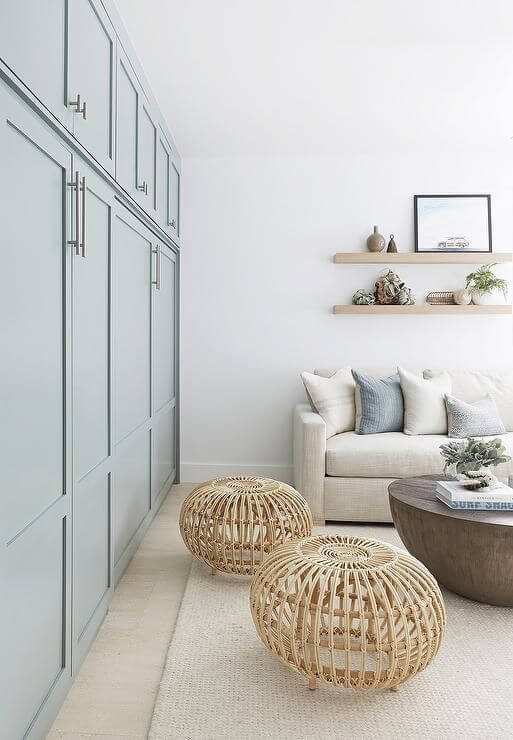
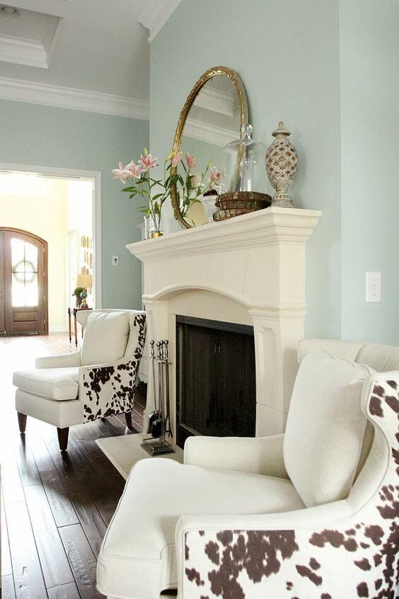
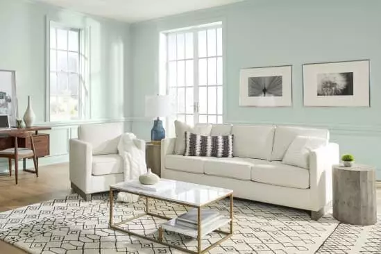
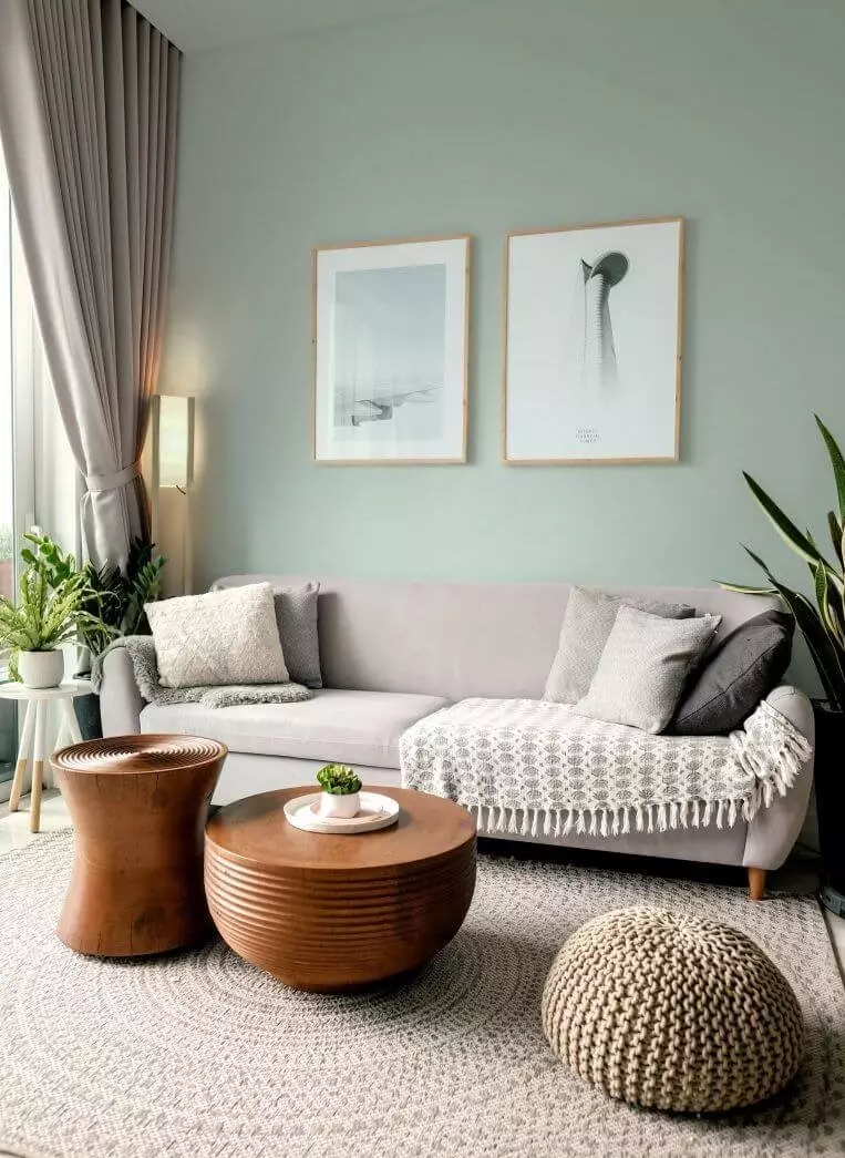
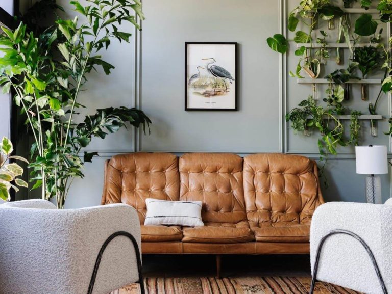
Living room
Go without hesitation with any style you want and use Rainwashed as a background. The relatively neutral base will provide the room with enough space for accents while serving as a perfect matching color for other shades alike for a contemporary approach. This paint color can transform into an astonishing shade of soothing blue that contemporary interiors would simply bloom in a new way. If you are particularly impressed by this shade, consider a monochromatic palette by surrounding Rainwashed with lighter or darker variations of the same kind.
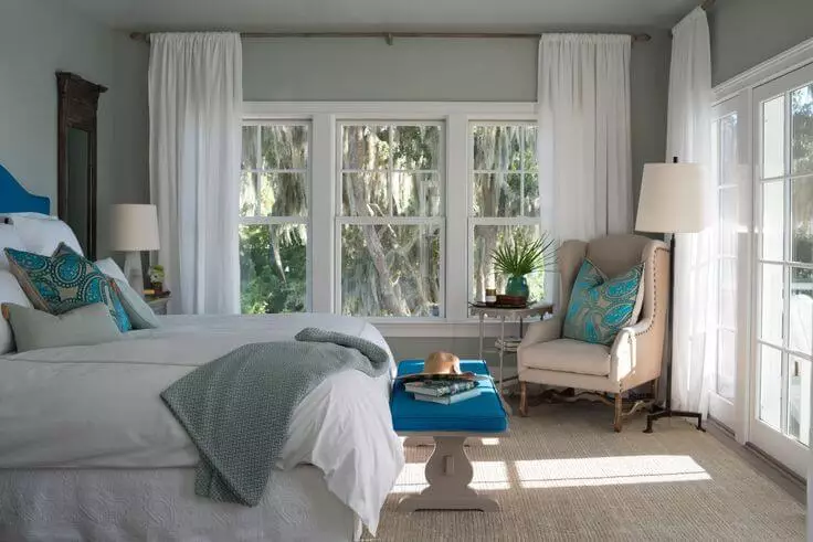
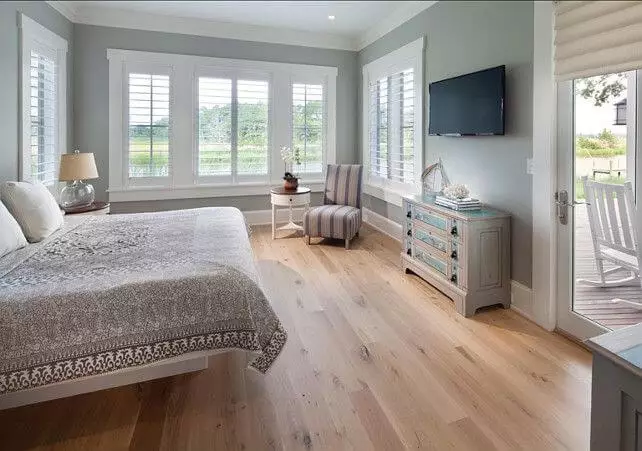
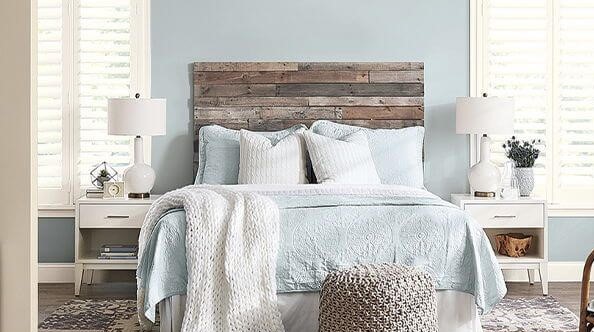
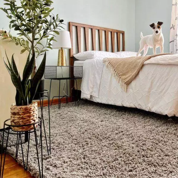
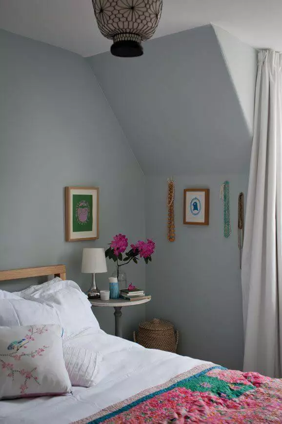
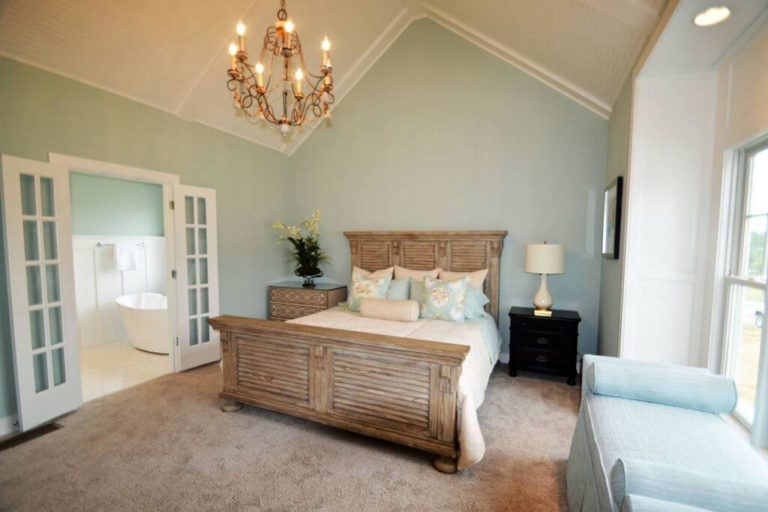
Bedroom
As cool as this beautiful blue-green variation is, it acquires an impeccable soft appearance in the bedroom, particularly when combined with wood texture. The artificial lighting offers this shade a pleasing effect during the night, while the natural morning light brings a refreshing look so that Rainwashed keeps pace with your lifestyle. Don’t overload the space with extra bold accents when the blue-green shade and natural wood texture are enough to keep it fresh and comfortable at the same time.
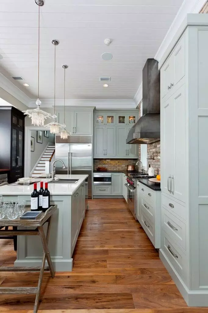
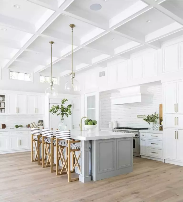
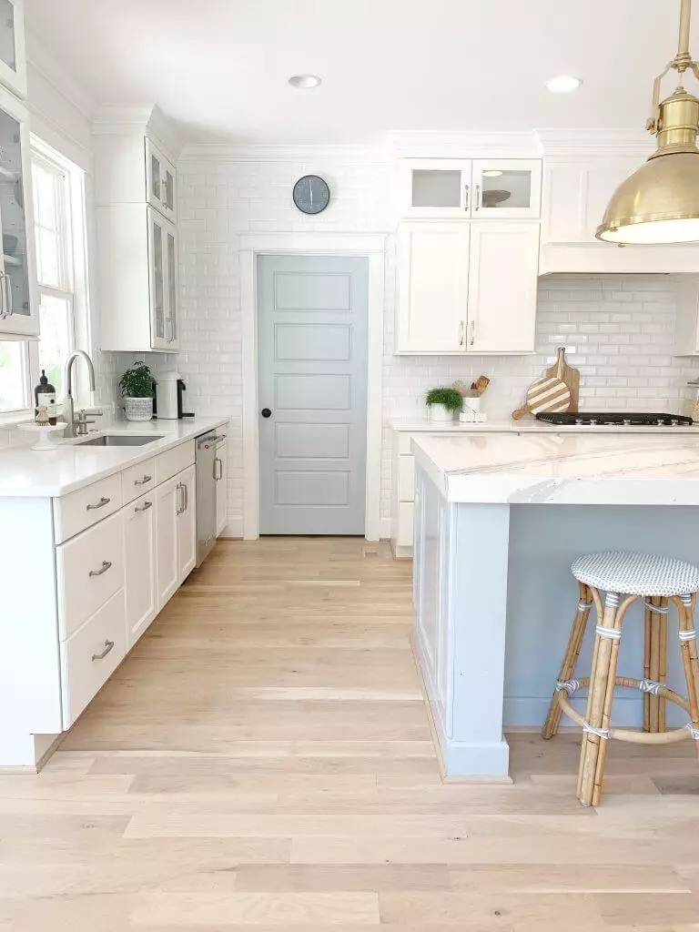
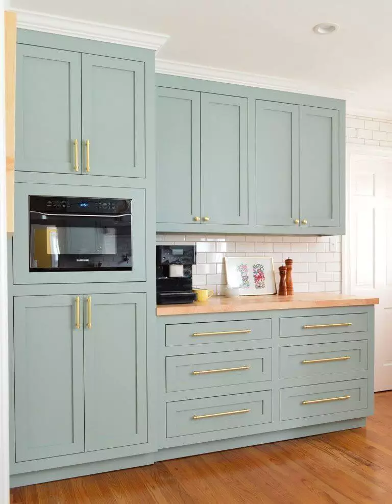
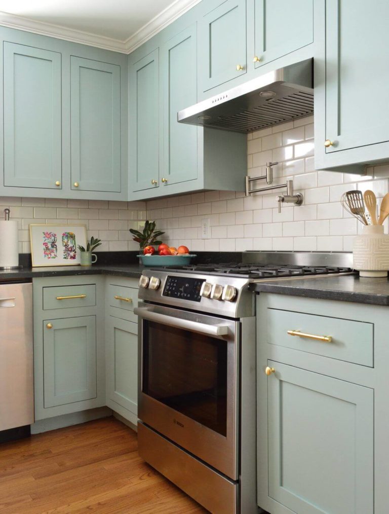
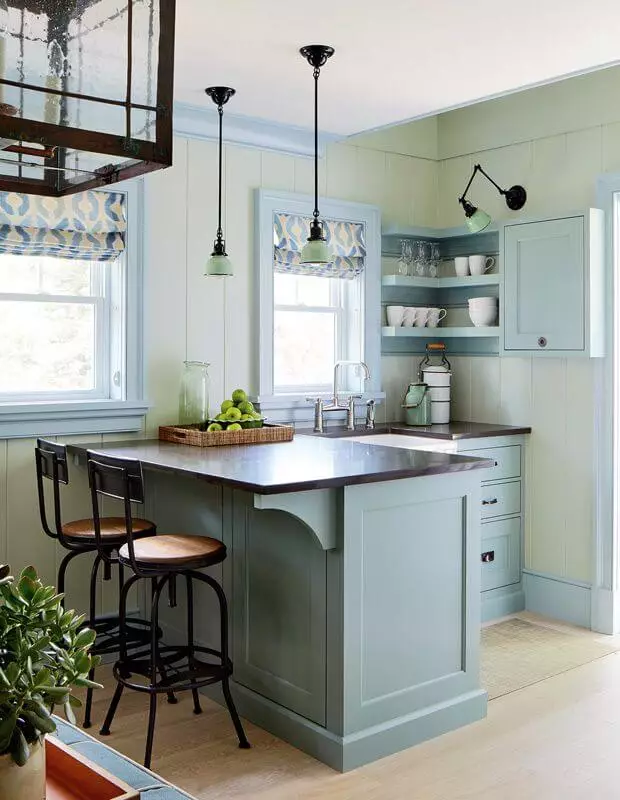
Kitchen and dining room
A modern kitchen would always benefit from a splash of soothing blue-green. Still, Rainwashed would acquire an even more successful effect within traditional kitchens, or at least transitional. The recipe for such a result is simple: paint the cabinets in SW 6211, make sure that the background is painted in a white shade, and add the irreplaceable brass hardware pieces. The once cool shade will instantly become softer and welcoming, while the unusual approach to the classic kitchen cabinets will add an endless sense of individuality.
The same goes for the dining area. Consider a combination of the beloved blue-green with soft beige variations and wood texture for a traditional interior that slightly embraces the modern design rules in terms of color.
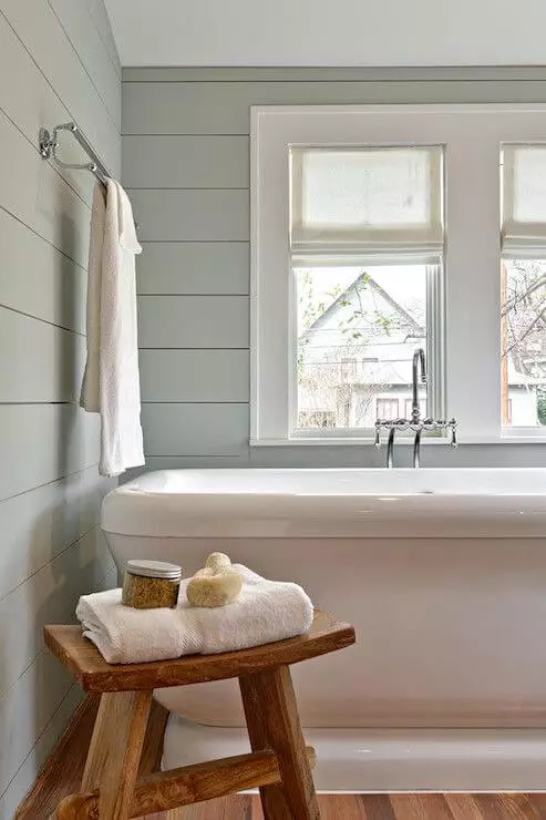
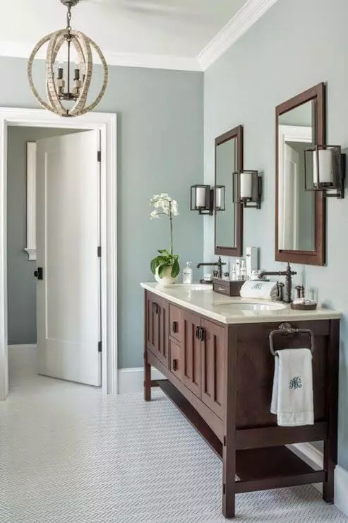
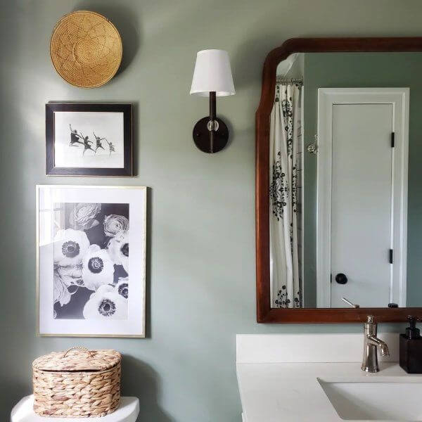
Bathroom
Since Rainwashed is quite intense, you probably think it goes best for the cabinetry. Well, you are not wrong. Still, this fabulous shade is more of a background paint color. Consider it for the walls and enrich the space with dark wood elements for a rather Vintage approach. This design solution shows that Rainwashed is indeed versatile. Who would have thought – blue-green and Vintage?
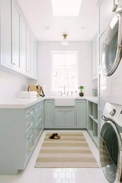
In this context, we would like to draw your attention to the relevance of this paint color in the laundry room. This is where Rainwashed goes for the cabinets. You can always opt for a neutral and keep this space rather functional or consider a unique shade of green with a slight hint of blue and neutralizing gray scents instead that would beautifully combine functionality with style.
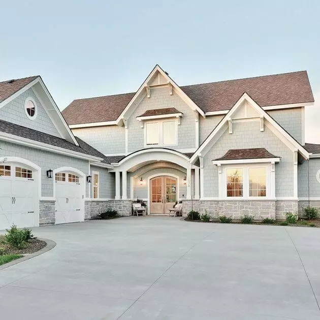
Use of Rainwashed for house exterior
Although Rainwashed is quite intense, this paint color looks much lighter when applied to the exterior as with any other neutral shade. Still, it does not lose its magic, acquiring an even more impressive appearance when bathed in the soft morning or evening sun rays. On one side – neutral; on the other – slightly filled with depth, and not least – perfectly working with the natural background. Don’t spoil the confident look, and consider a neutral gray roof and white trim to complete the exterior.
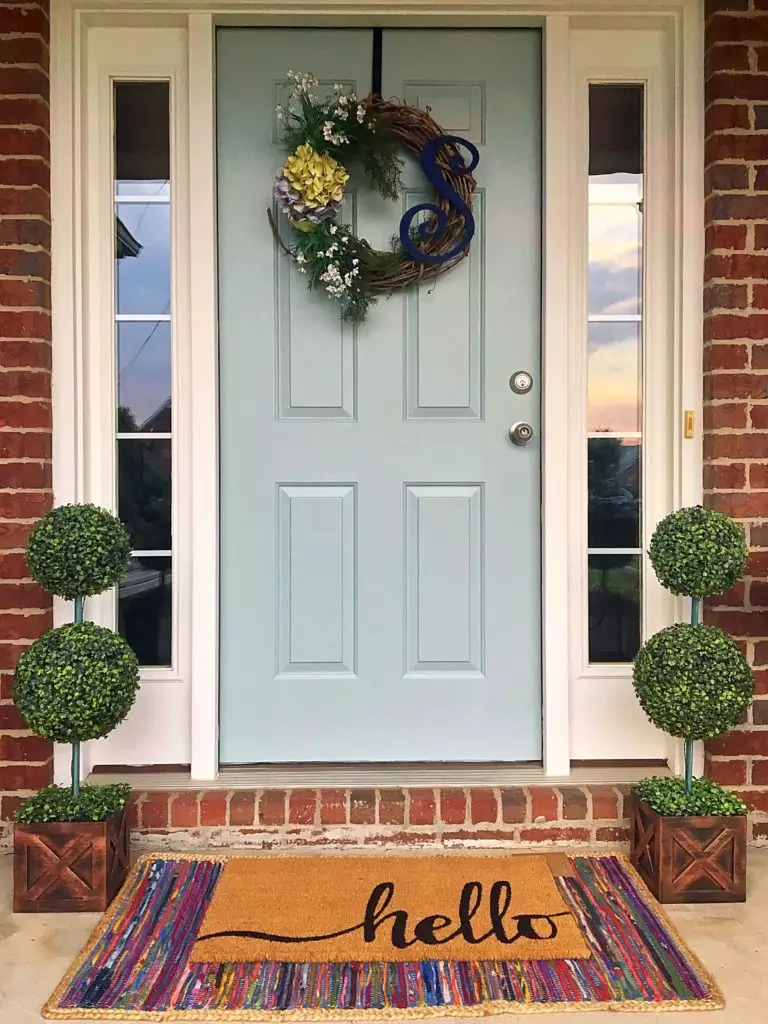
It gets even more interesting when it comes to the front door. You can always keep it low-key with a monochromatic palette, or consider a front door painted in the slightly vibrant blue-green on a brick background for a house exterior you will not get tired admiring.
The Rainwashed SW 6211 paint color from Sherwin-Williams may be new to some yet familiar to others. Still, this article proved once again what a unique shade it is. It is impressive how a relatively neutral paint color with hidden intense notes can bring so much personality to a space while staying low-key, besides the fact that it keeps pace with any design solution you decide to put into practice. The next time you are looking for a trendy and original neutral that not many have heard about, try the astonishing blue-green.
