Rock Salt (Dulux): what color is, review, and use
In an era when white prevails in almost any style, it is time to think about alternatives to the true shades of the kind to stay original. Fortunately, colorists from many color brands have developed standout shades in this sense. We suggest paying attention to the off-white category. A prominent representative, which designers continue to fall in love with, is Rock Salt from Dulux.
The almost white variation is a go-to option for those who do not fancy a bright white, although sticking to such a base is a priority. The thing is that Rock Salt has a slight gray undertone, which makes it shine in a new way. Therefore, consider this paint color if you want a discreet hint of gray to spread throughout your space. There is more to it than a neutral shade. Let’s discover this color from all perspectives!
Rock Salt paint color features
The fabulous neutral from Dulux is a unique off-white shade. The unobtrusive gray notes penetrate the surface in a very unexpected way. Sometimes, this paint color may seem a true white, other times – definitely a gray without excluding the combination of both. It all depends on particular factors that will be discussed as follows. If you wonder how this color feels, here is an insight: a space painted in Rock Salt is refreshing, inspiring, hope-inducing, and even calming – all this at a balanced level, thanks to the gray hint.
Rock Salt: is it warm or cold?
It seems like a white shade with gray undertones should certainly be cold. Well, it is not always like that. Those tiny gray particles are soft and relaxing instead of imposing and overly formal. Therefore, we cannot call this color cold, although “cool” feels right. Shortly, Rock Salt refreshes the space while keeping it pleasing to the soul.
How does lighting affect Rock Salt?
This is when things get interesting. Rock Salt is fully penetrated by gray notes in north-facing spaces, and even a tiny bluish hint may reveal itself. On the other hand, this paint color shows its brightest version in the west, east, and south-facing rooms – a cool white, slightly softened by calming gray scents. Designers claim that Rock Salt goes particularly well in spaces with south-facing windows, where the warm sun rays are neutralized by the cool base of this paint color. Regarding artificial lighting, you can easily play with its undertones and make this shade behave the way that suits your interior.
Rock Salt LRV
The Light Reflectance Value of Rock Salt is gravitating around figure 82. On a scale from 0 to 100, the latter stands for a true white. You can probably assume how close Rock Salt is to this extremity. All clear with the figures, but what does it mean? An LRV like this one points out that this paint color reflects substantial amounts of light and makes the room look outstandingly spacious.
Rock Salt undertones
Besides visible gray undertones, a tiny hint of blue reveals itself. We do not promise you will see it every time, but we cannot deny that it is visible under the influence of north light. Even when bathed in south sun rays, both gray and blue undertones are cool and stay true to this feature.
Similar colors
The range of off-white shades with gray undertones is vast, and you can certainly find a few similar paint colors to Rock Salt. This variation is popular, and paint manufacturers came up with many alternatives. Let’s discover some of them!
Coordinating colors
Rock Salt, as an off-white, works perfectly with whites and grays close to it for a harmonious tonal combination. Next are neutrals, from the lightest to darkest, for a contrastive mix of shades from the same category, particularly in monochromatic interiors. Dulux experts could not skip a few splashes of bold colors and suggested pairing Rock Salt with soft peachy shades and yellow accent variations. These shades are the exact paint colors you should consider:
Use of Rock Salt in interior
Rock Salt is neutral and a perfect alternative to the common shades of white, meaning that it suits almost any style and goes for any space. Don’t hesitate to integrate it within monochromatic interiors or use it as a background for your bold design solutions. To better understand its behavior, let’s look at some design approaches involving this paint color!
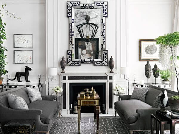
A new perspective on Neoclassical
Replace the common white walls within a Neoclassical interior with a new variation that feels no less fresh, trendier, and even calming, which is not that peculiar to the formality of this style. The slight gray hint will bring a bit of sophistication to the neutral background on which the combination of classic and modern elements will sparkle in a whole new way. Not least, the environment will seem slightly softer, which is a compliment according to the latest trends that tend to integrate as much comfort into interiors as possible.
Nordic lifestyle
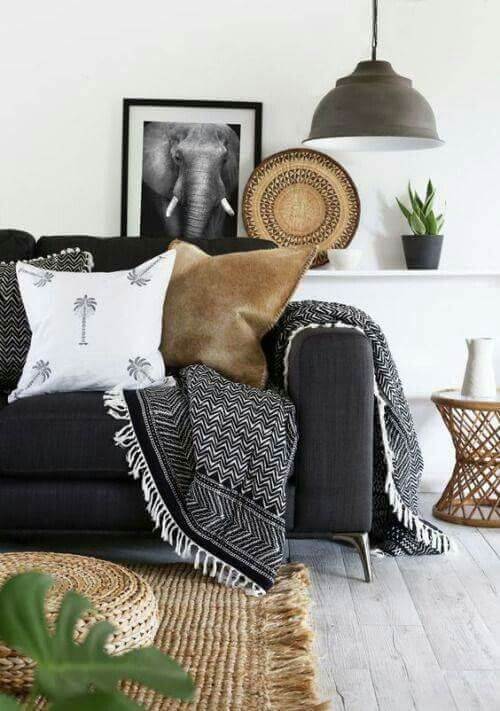
Rock Salt replicates the cool nordic weather just fine, which is undoubtedly about the Scandinavian style. As a pattern, this off-white brings a moody sense to the walls, enhancing the effect. Furthermore, the fact that this paint color stays true to its cool nature makes it possible to preserve the coolish Scandi vibe even within south-facing spaces. Still, a splash of wood texture, a fluffy carpet, and other soft textiles, specifically gray and brown, are a must.
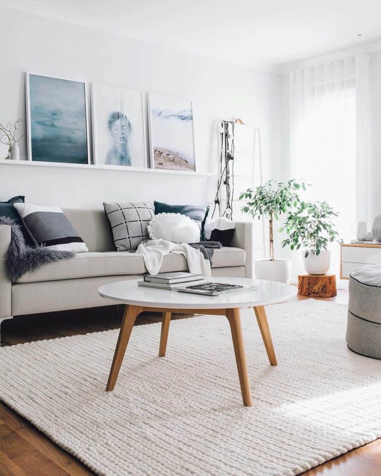
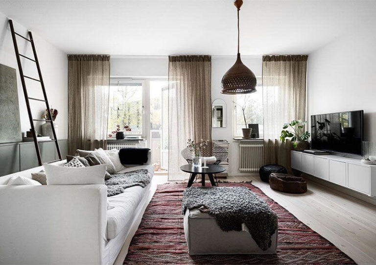
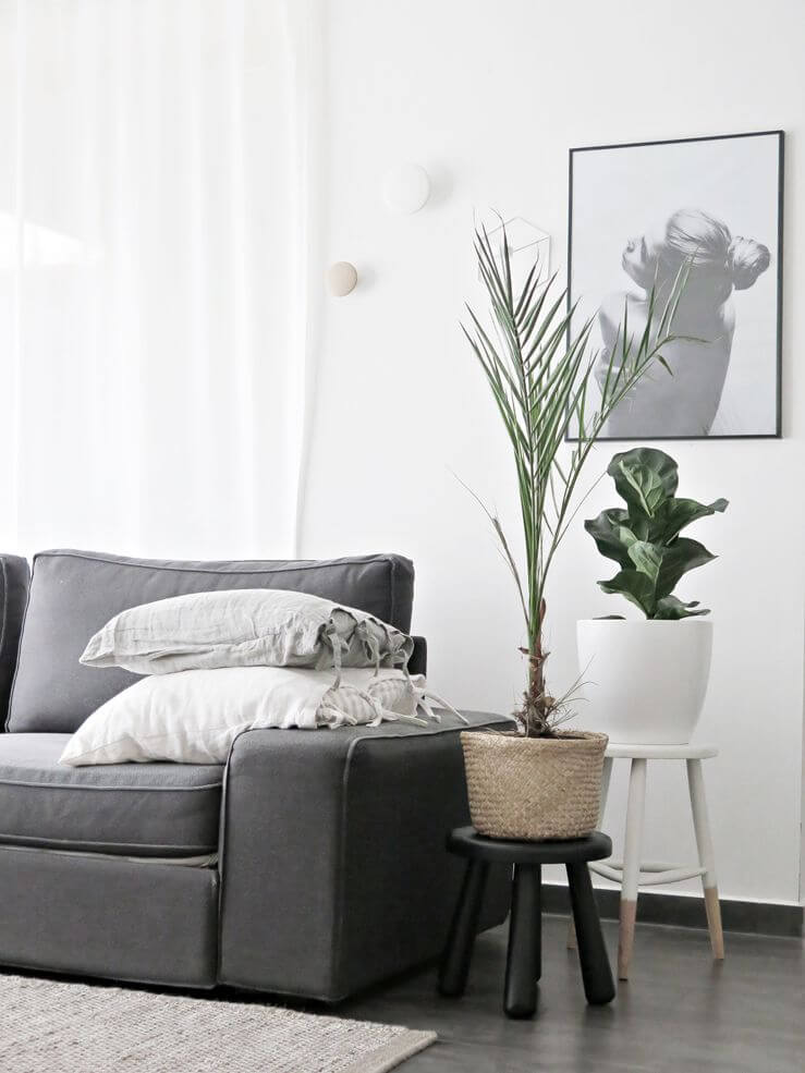
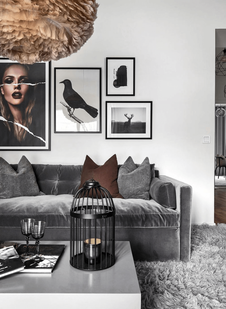
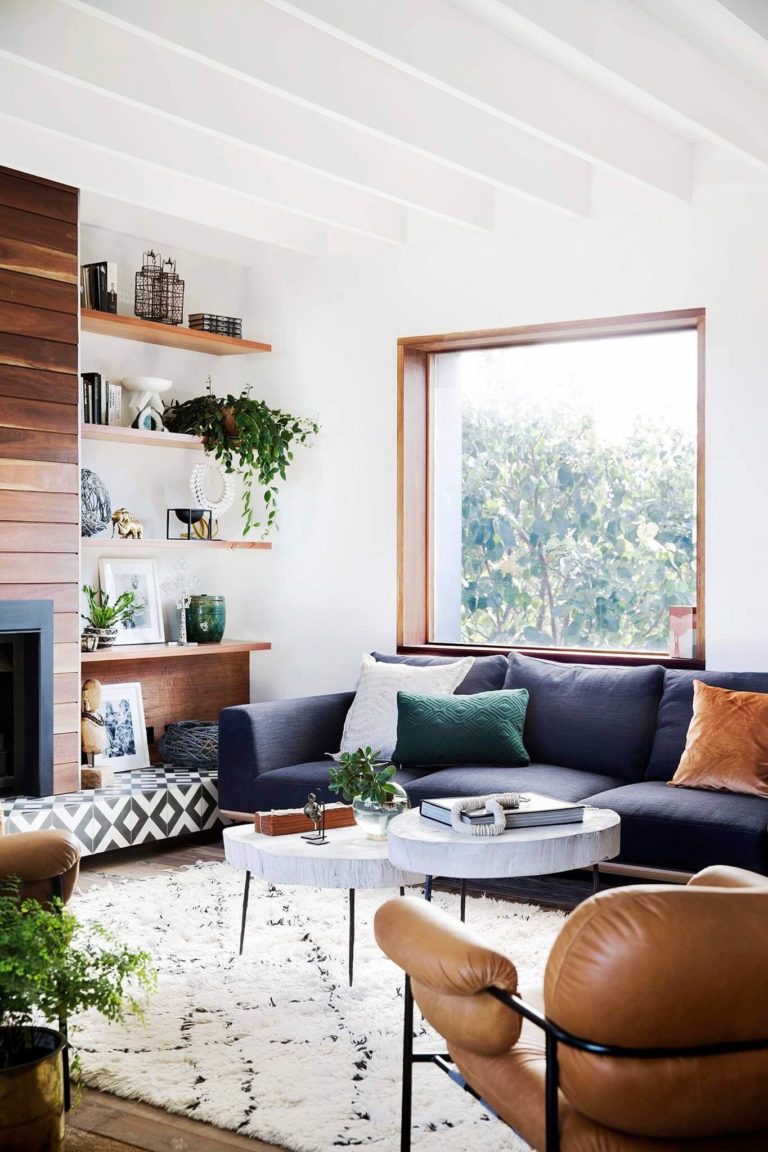
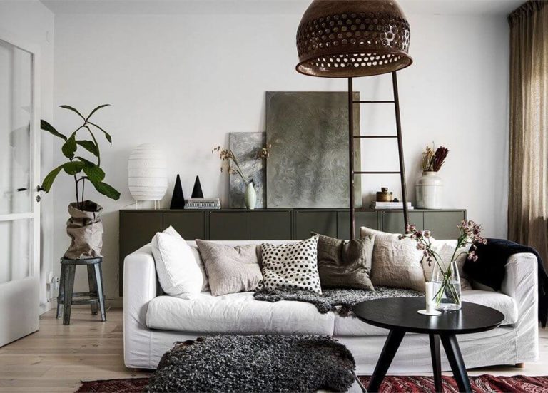
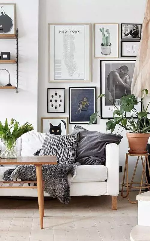
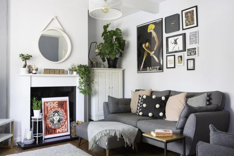
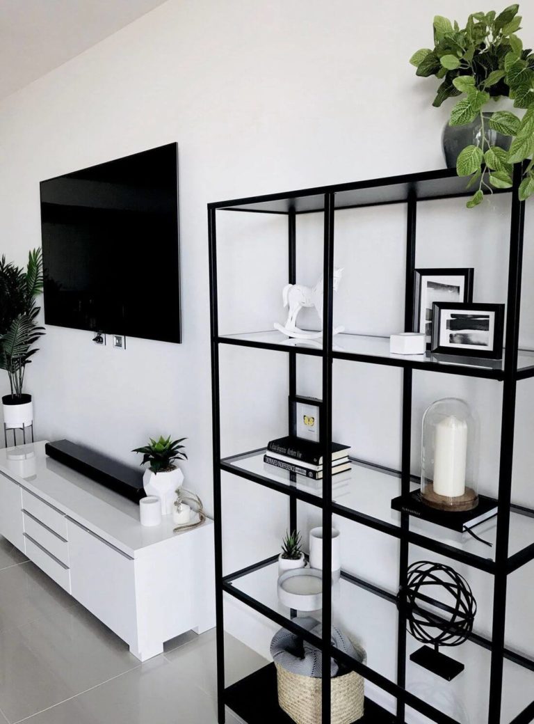
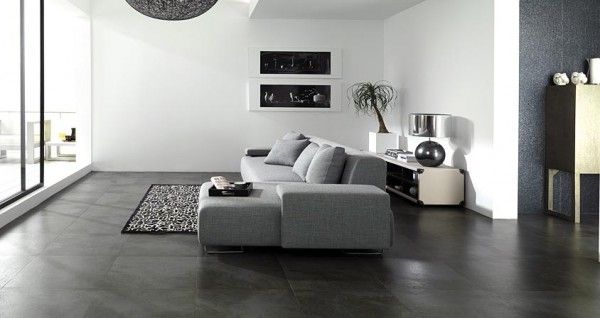
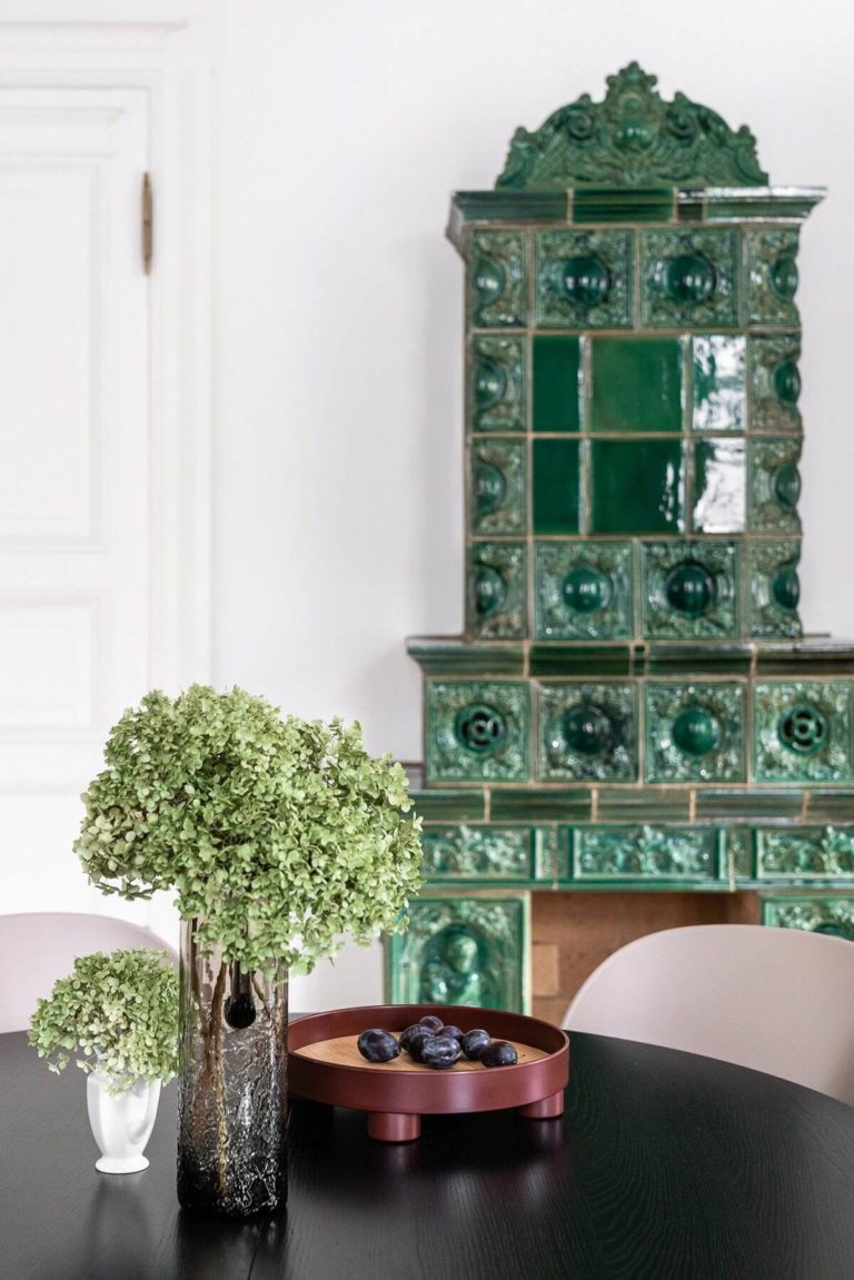
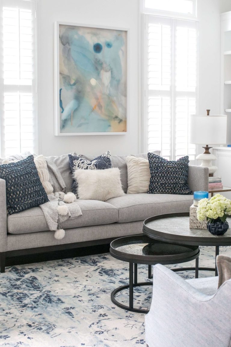
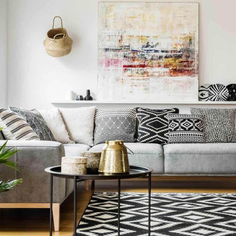
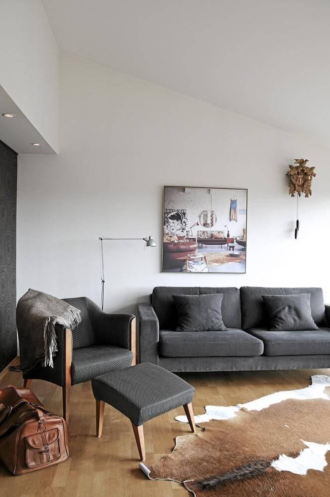
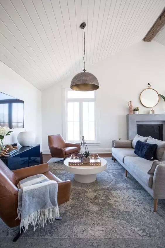
Living room
Rock Salt is your canvas; you are the author; the result is your future interior. You are free to paint on this neutral background with any accent you want. Still, if you would like to stick to the designers’ advice, consider gray variations for the furniture to pair with the walls painted in Rock Salt for a monochromatic interior. Additionally, you can add an art piece on the wall to dilute the overly formal setting. Don’t hesitate to consider elements from bold styles, such as Art Deco or Retro, and display them on this perfect background.

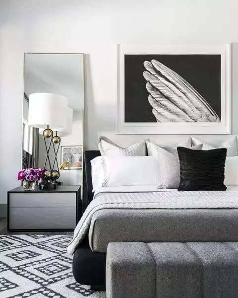
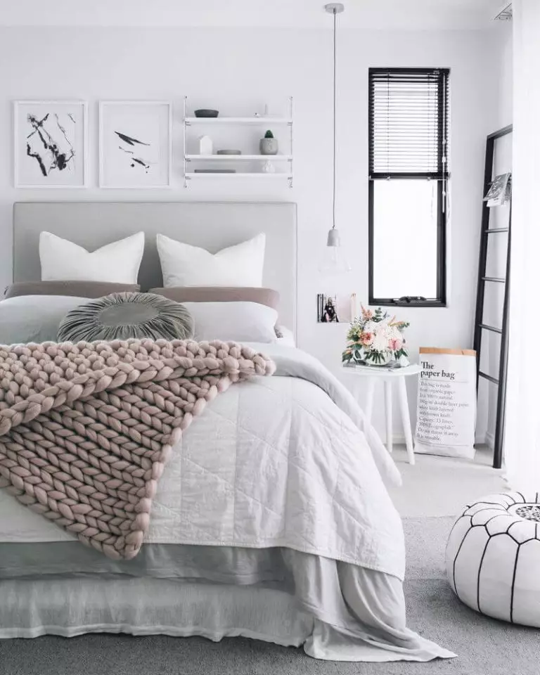
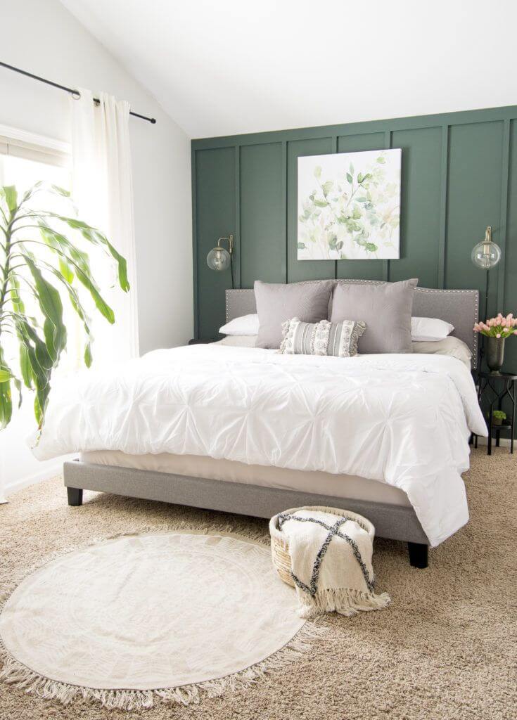
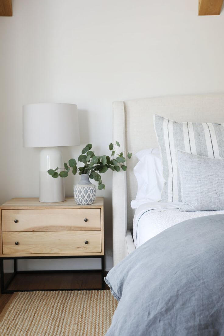
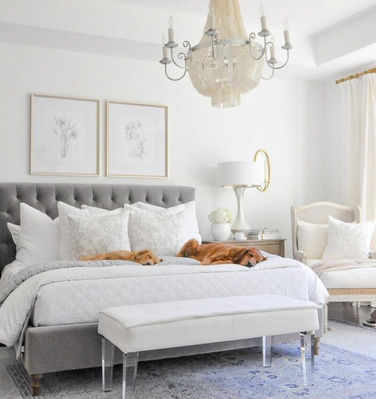
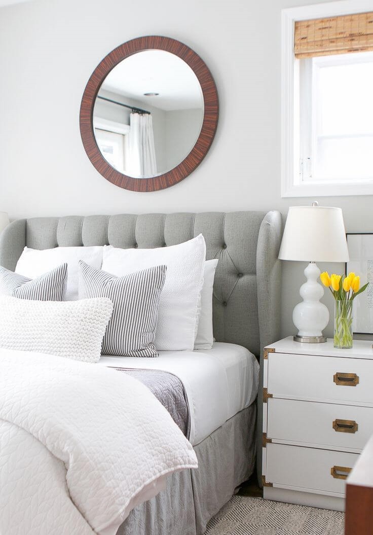
Bedroom
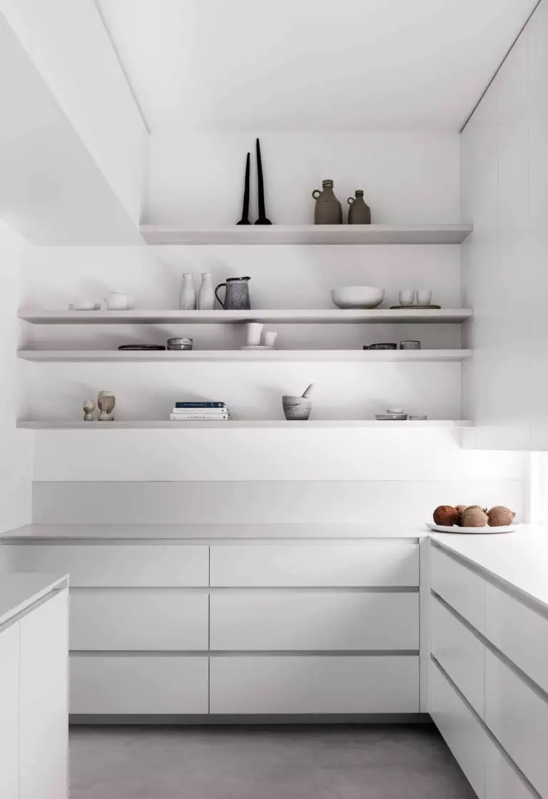
A single neutral color but so many design possibilities. Consider Rock Salt for the walls and go with one of the following ways. Opt for a monochromatic palette, considering white bedding and a single source of additional color, yet a soothing one, such as a soft pink blanket. What about a comfy Farmhouse interior? Pair the off-white walls with wood furniture and even vintage pieces if there are any for a familiar sense of comfort. Don’t hesitate to use the neutral background for a minimalist interior by pairing it with no less neutral shades and adding a few black accents. In the same flow of ideas, we suggest you stick to a black and white design that would perfectly stand out on an off-white backdrop.
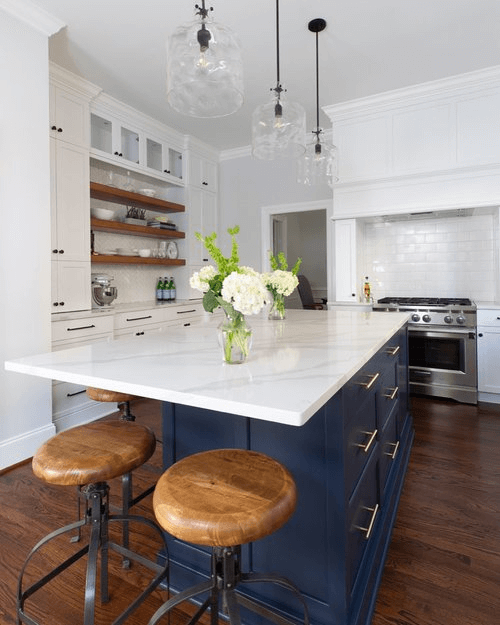
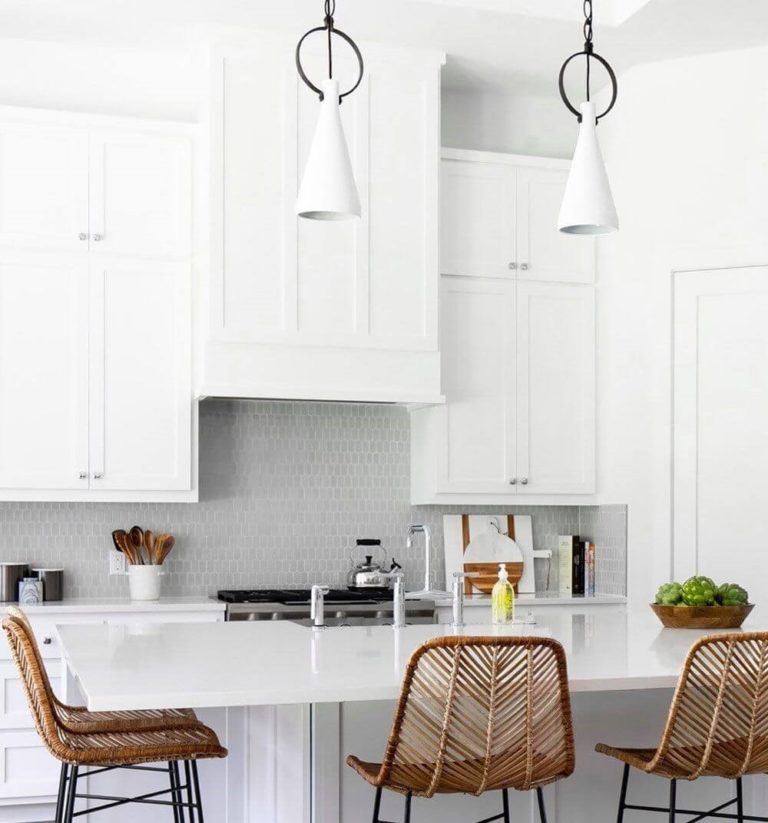
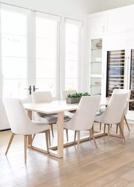
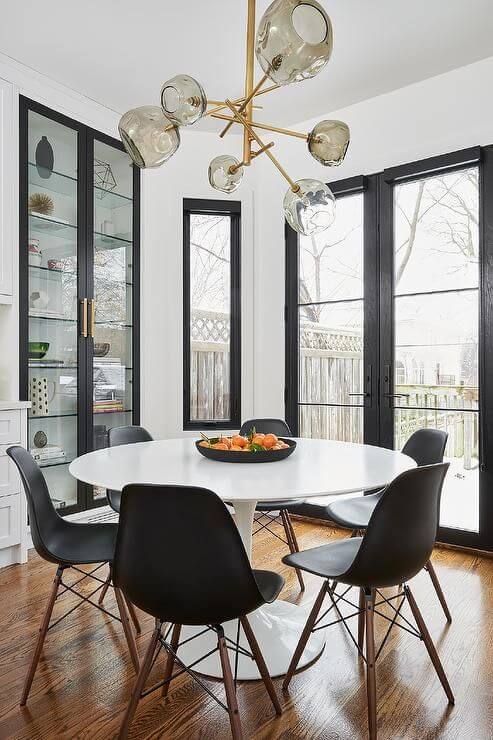
Kitchen and dining room
The off-white from Dulux seems meant for an all-white kitchen. Not far from a true white shade, still unique, Rock Salt would serve as a perfect background for pure white cabinets without risking the clean effect. Even open shelving looks fabulously on a backdrop like this.
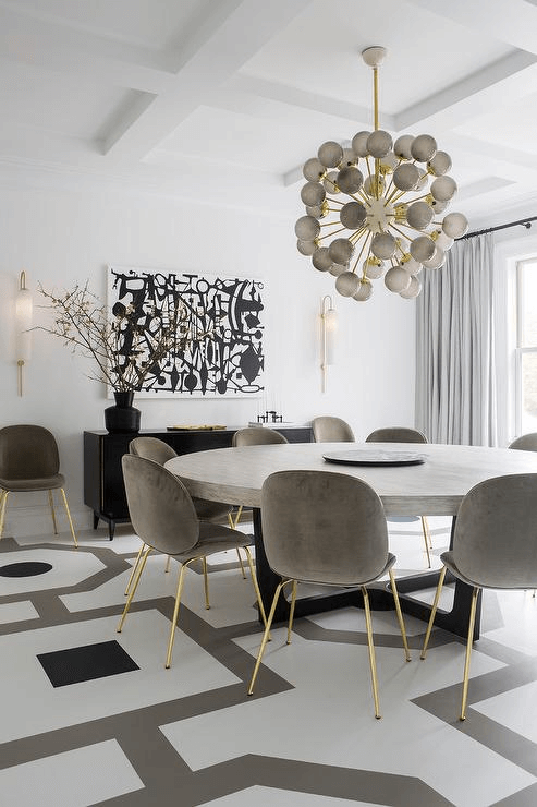
The range of possibilities is much broader in the dining room. We suggest painting the walls in Rock Salt and complementing them with similarly white furniture and maybe a splash of light wood for a contemporary sense of comfort. Replace the white chairs with gray upholstered ones, switch from wood to marble, add a few abstract paintings, a bit of brass, and your modern Art Deco dining area is ready. Still not impressed? Consider pairing the off-white background with black window frames and pieces of furniture for a contemporary contrast that would surely take your style to the next level.
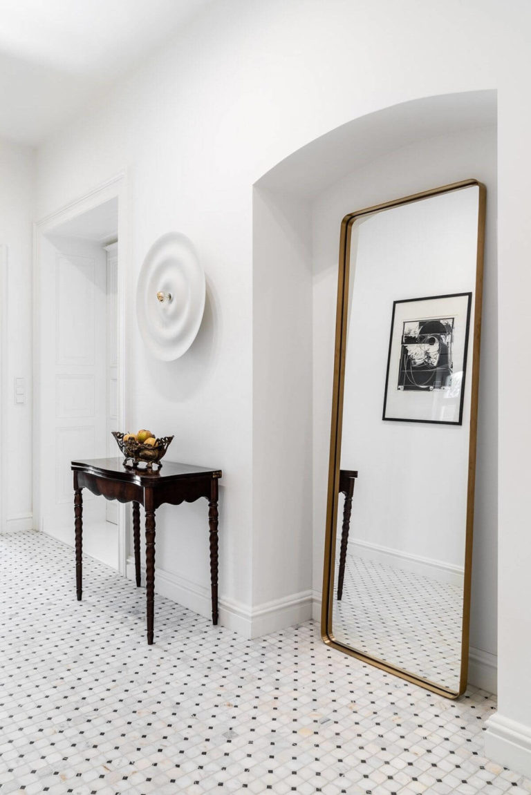
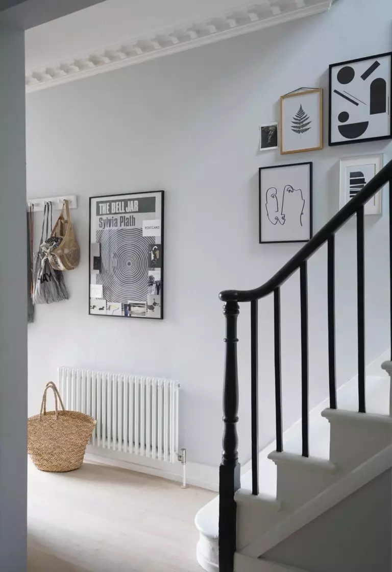
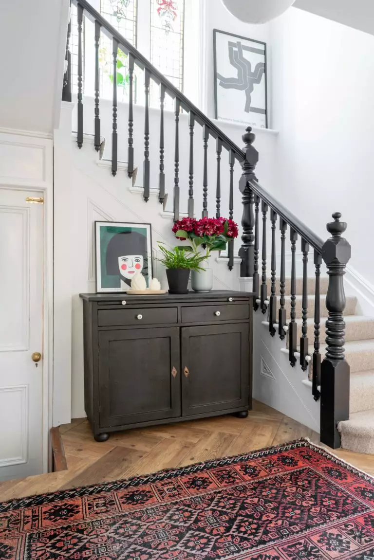
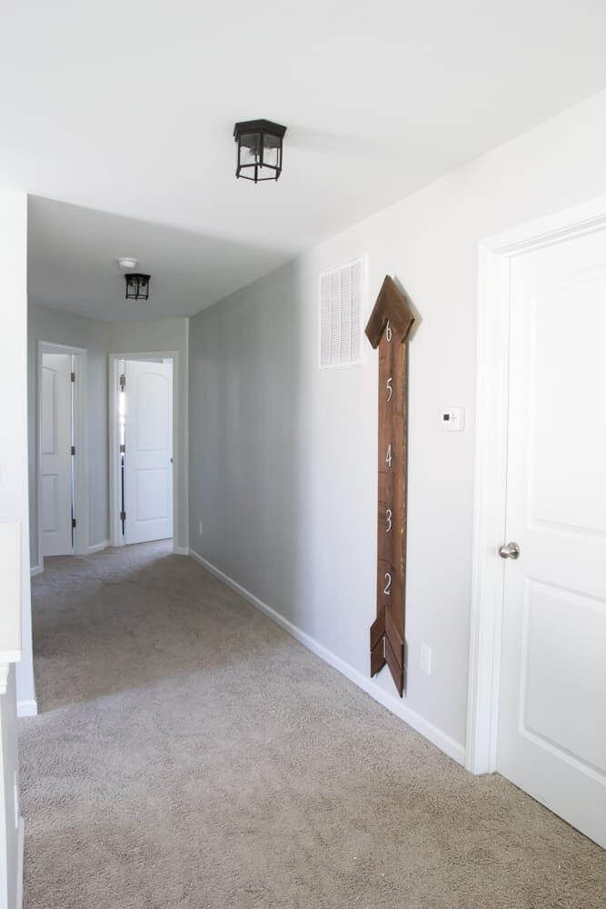
Hallway
Why opt for the standard whites when you can add the same splash of neutrality accompanied by a bit of depth, which compliments the contemporary settings? Designers insist on using off-whites, particularly with such sophisticated undertones, in the hallway for a modern introduction to your interior. The all-time favorites black and wood accents are the true companions in this sense. As regards the rest, stick to a clean and functional approach to preserve the moody vibe replicated by Rock Salt.
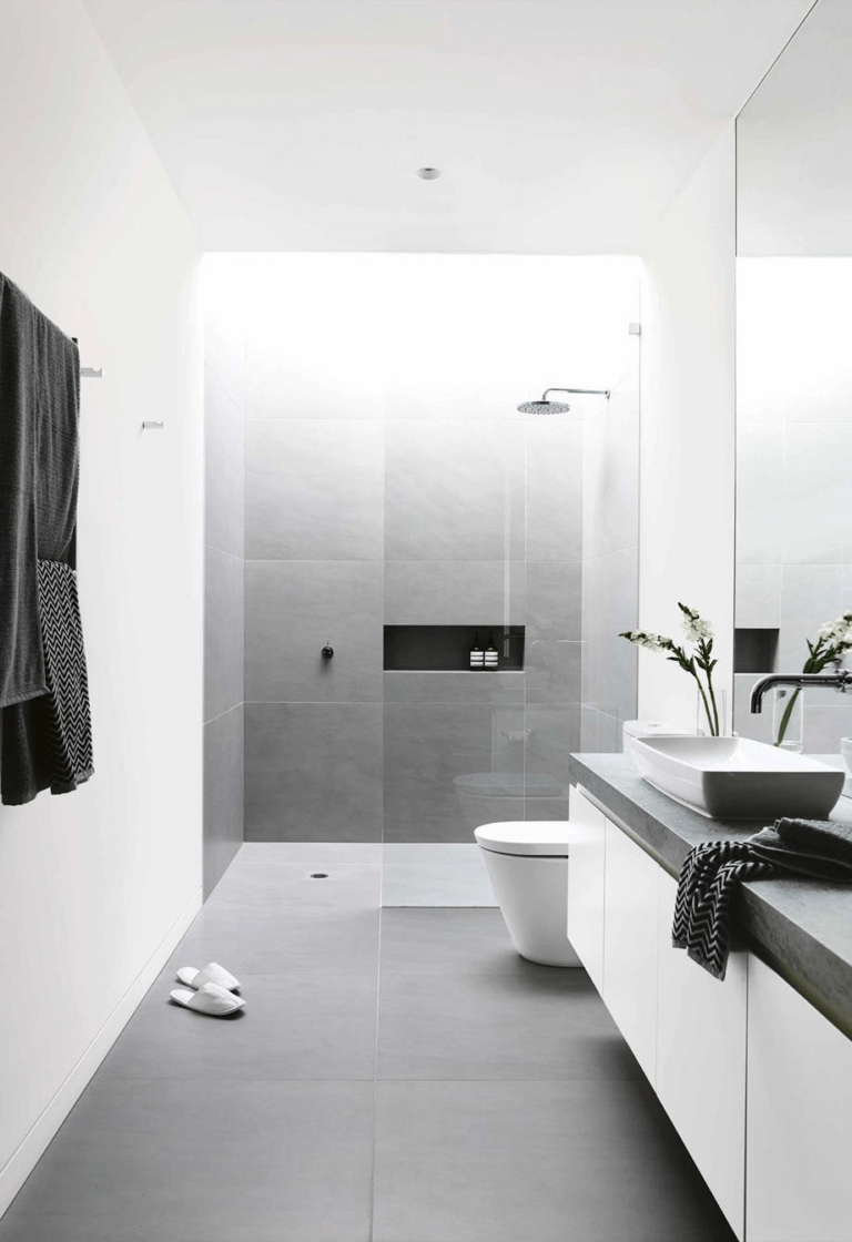
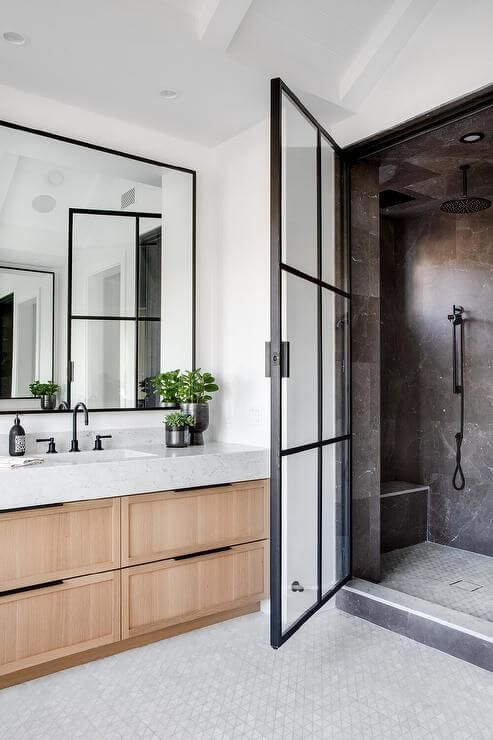
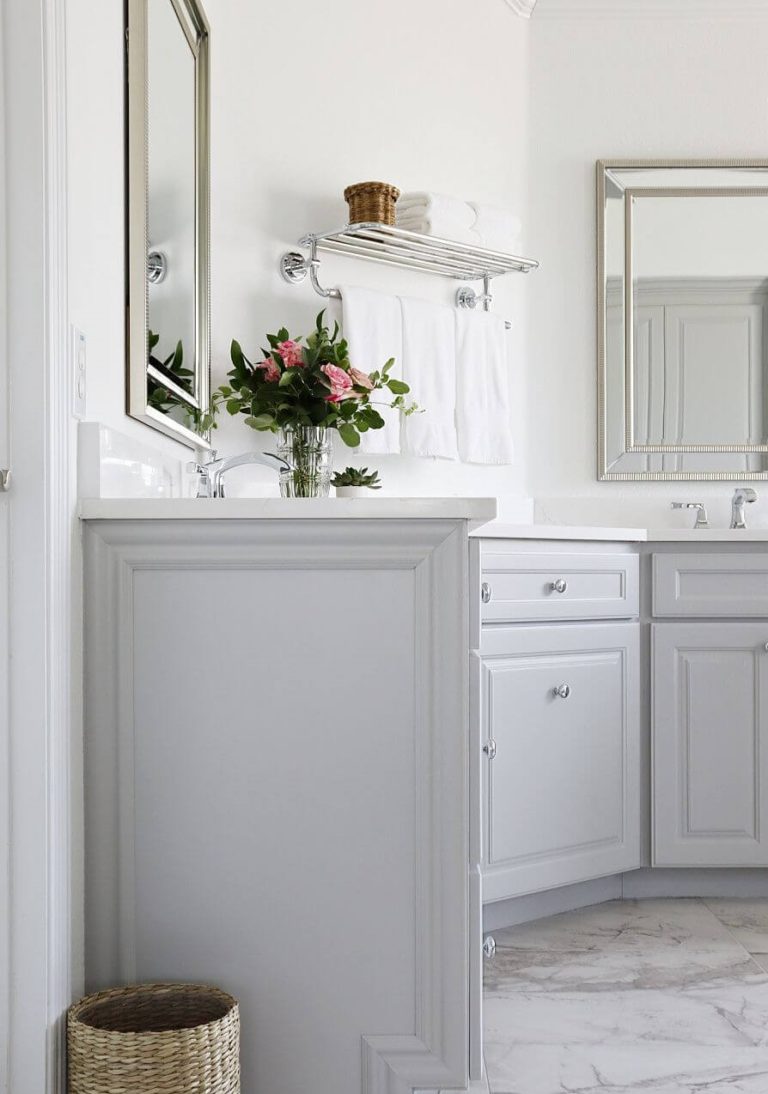
Bathroom
The modern approach to design also goes here, and Rock Salt ensures this result. Paint the walls in this shade and pair them with black accents. Be it the hardware, cabinets, or particular details. Add a bit of brass for an individual look. On the other hand, you can go with gray cabinets to resonate with the hidden notes of the background. Keep it functional, and the sleek contemporary sense of beauty will be your constant guest.
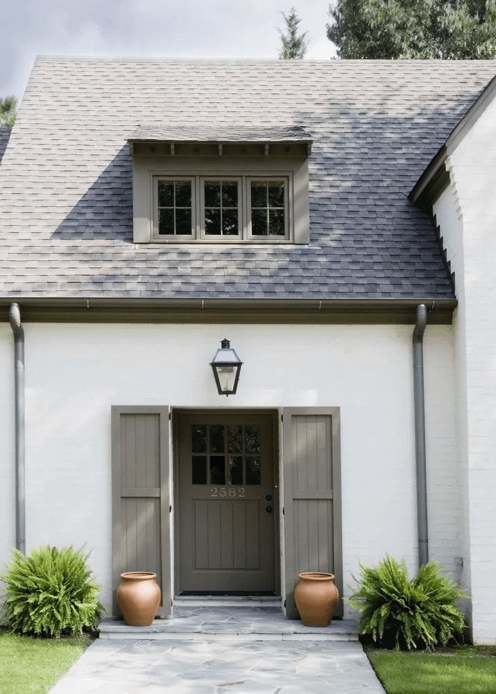
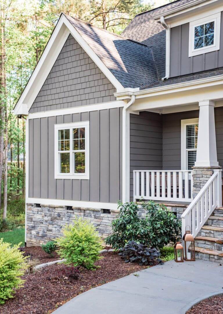
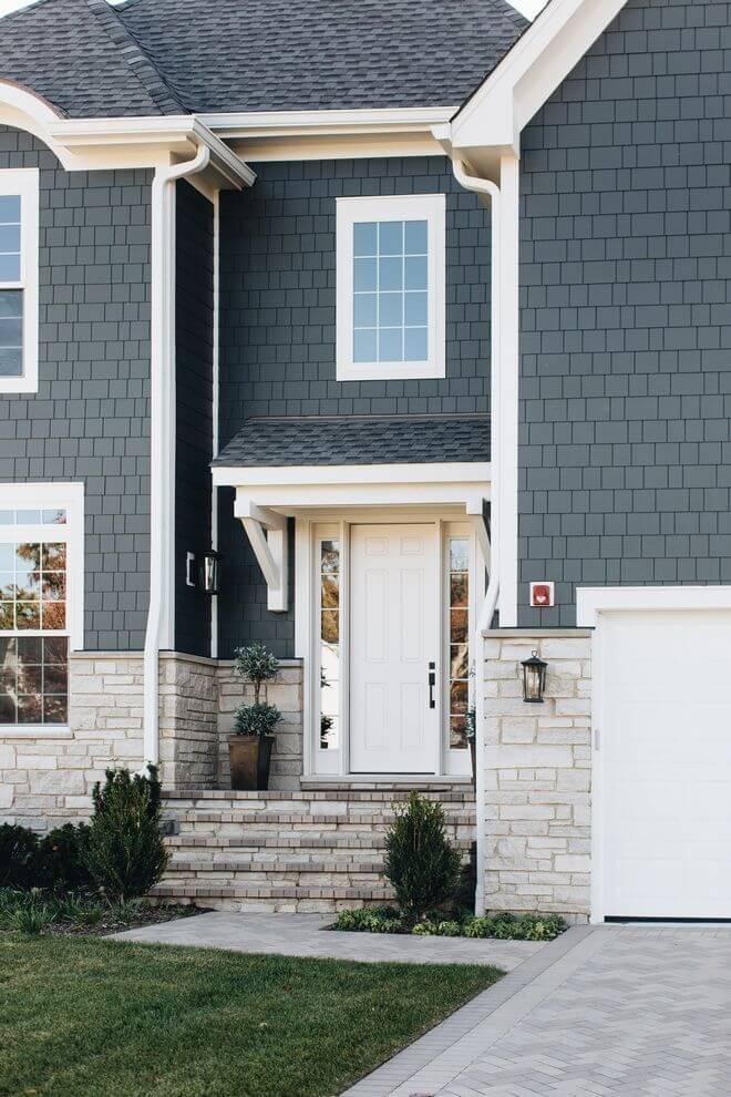
Use of Rock Salt for house exterior
This off-white paint color seems exceptionally light when used to paint the house exterior, resembling the same true white. It would not make sense to use one instead of another when the result is the same. Still, it slightly preserves the gray notes when combined with dark gray, leading to a harmonious effect. Therefore, you can safely paint the house walls in Rock Salt and pair them with a dark gray roof or go with tiny splashes, such as off-white trim and front door on a dark gray background.
The Rock Salt paint color from Dulux is a real find for white lovers that fancy a slight change that is not far from the true whites. Besides being versatile and going with almost any design solution, this neutral brings a sense of contemporaneity to interiors and exteriors. You should definitely consider it next time you search for a perfect off-white.
